


1 章节目录
4.3 scaleType 属性 android:scaleType
2 TextView
TextView (文本框),用于显示文本的一个控件。
2.1 TextView的基本使用
-
文本的字体尺寸单位为
sp -
sp: scaled pixels(放大像素). 主要用于字体显示。
-
文本常用属性:
属性名 作用 id 为TextView设置一个组件id,根据id,我们可以在Java代码中通过findViewById()的方法获取到该对象,然后进行相关属性的设置 layout_width 组件的宽度 layout_height 组件的高度 gravity 设置控件中内容的对齐方向,TextView中是文字,ImageView中是图片等等 text 设置显示的文本内容,一般我们是把字符串写到string.xml文件中,然后通过@String/xxx取得对应的字符串内容的 textColor 设置字体颜色,同上,通过colors.xml资源来引用 textStyle 设置字体风格,三个可选值:normal(无效果),bold(加粗),italic(斜体) textSize 字体大小,单位一般是用sp background 控件的背景颜色,可以理解为填充整个控件的颜色,可以是图片 autoLink 识别链接类型 (web, email, phone ,map ,none, all) -
案例:
<TextView
android:id="@+id/tv1"
android:layout_width="wrap_content"
android:layout_height="wrap_content"
android:text="Hello World" />
2.2 文本设置边框
-
实现原理:
编写一个ShapeDrawable的资源文件!然后TextView将 background 设置为这个drawable资源即可
-
ShapeDrawable的资源文件
-
<solid android:color="xxx" > 这个是设置背景颜色的
-
<stroke android:width="xdp" android:color="xxx"> 这个是设置边框的粗细,以及边
框颜色的
-
<padding androidLbottom="xdp"> 这个是设置边距的
-
<corners android:topLeftRadius="10px"> 这个是设置圆角的
-
<gradient> 这个是设置渐变色的,可选属性有: startColor:起始颜色 endColor:结束颜色 centerColor:中间颜色 angle:方向角度,等于0时,从左到右,然后逆时针方向转,当angle = 90度时从下往上 type:设置渐变的类型
-
编写矩形边框的Drawable:
<?xml version="1.0" encoding="utf-8"?> <shape xmlns:android="http://schemas.android.com/apk/res/android"> <!-- 设置一个黑色边框 --> <stroke android:width="2px" android:color="#000000"/> <!-- 渐变 --> <gradient android:angle="270" android:endColor="#C0C0C0" android:startColor="#FCD209" /> <!-- 设置一下边距,让空间大一点 --> <padding android:left="5dp" android:top="5dp" android:right="5dp" android:bottom="5dp"/> </shape>-
编写圆角矩形边框的Drawable
<?xml version="1.0" encoding="utf-8"?>
<shape xmlns:android="http://schemas.android.com/apk/res/android">
  <!-- 设置透明背景色 -->
  <solid android:color="#87CEEB" />
  <!-- 设置一个黑色边框 -->
  <stroke
    android:width="2px"
    android:color="#000000" />
  <!-- 设置四个圆角的半径 -->
  <corners
    android:bottomLeftRadius="10px"
    android:bottomRightRadius="10px"
    android:topLeftRadius="10px"
    android:topRightRadius="10px" />
  <!-- 设置一下边距,让空间大一点 -->
  <padding
    android:bottom="5dp"
    android:left="5dp"
    android:right="5dp"
    android:top="5dp" />
</shape>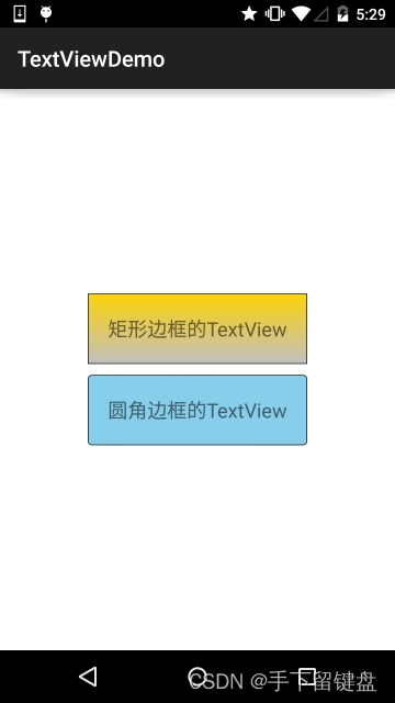
-
-
2.3 带图片(drawableXxx)的TextView
| 属性名 | 作用 |
|---|---|
| android:drawableLeft | 文本左边设置图片 |
| android:drawableRight | 文本右边设置图片 |
| android:drawableBottom | 文本下边设置图片 |
| android:drawableTop | 文本上边设置图片 |
-
应用场景

-
属性使用
<RelativeLayout
  xmlns:android="http://schemas.android.com/apk/res/android"
  xmlns:tools="h
最低0.47元/天 解锁文章


 467
467


 被折叠的 条评论
为什么被折叠?
被折叠的 条评论
为什么被折叠?
 到【灌水乐园】发言


