


|
|
|
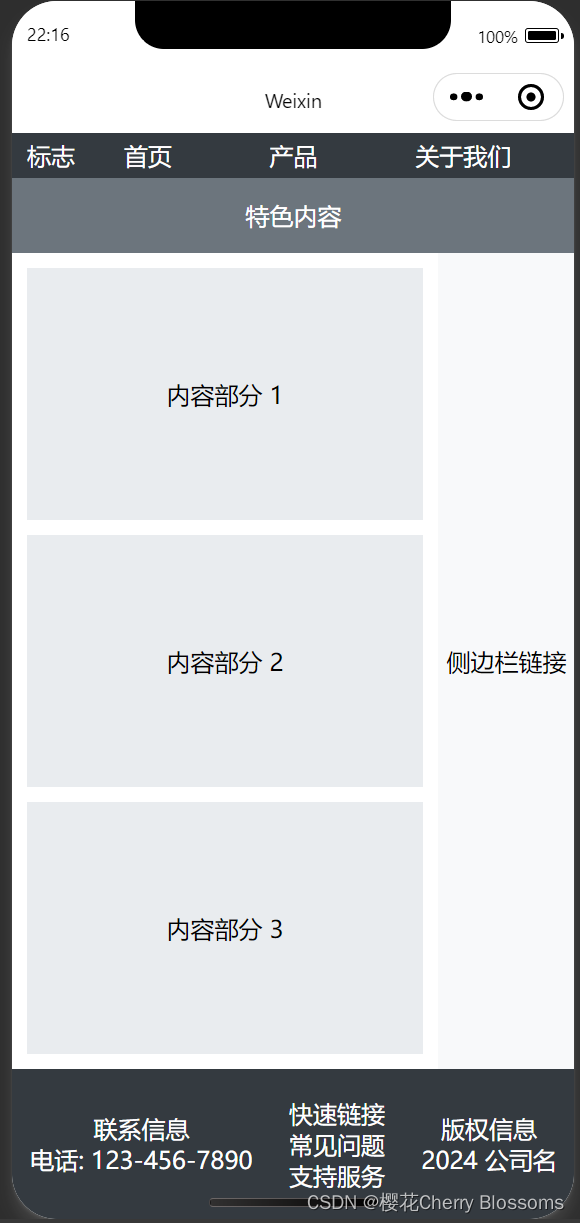
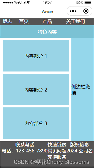
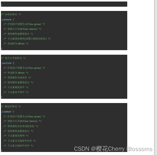
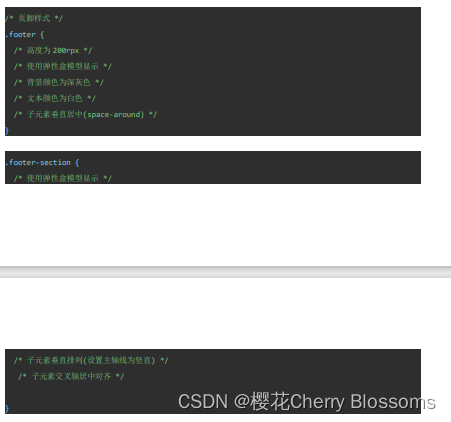
| 二、实验步骤与结果(给出对应的代码或运行结果截图) Wxml <view class="container"> <view class="header"> <view class="logo">标志</view> <view class="nav"> <view>首页</view> <view>产品</view> <view>关于我们</view> </view> </view> <view class="feature">特色内容</view> <view class="main"> <view class="content"> <view class="section">内容部分 1</view> <view class="section">内容部分 2</view> <view class="section">内容部分 3</view> </view> <view class="sidebar">侧边栏链接</view> </view> <view class="footer"> <view class="footer-section"> <view>联系电话</view> <view>电话:123-456-7890</view> </view> <view class="footer-section"> <view>快速链接</view> <view>常见问题</view> <view>支持服务</view> </view> <view class="footer-section"> <view>版权信息</view> <view>2024 公司名</view> </view> </view> </view> Wxss .container{ display: flex; flex-direction: column; height: 100vh; } .header{ display: flex; height: 60rpx; background-color: rgb(85, 84, 84); color: white; justify-content: center; padding: 0 20rpx; } .nav{ flex-grow: 2; display: flex; justify-content: space-around; } .feature{ height: 100rpx; background-color: rgb(123, 194, 212); display: flex; justify-content: center; align-items: center; color: white; } .main{ flex-grow: 1; flex-basis: 0; display: flex; } .content{ flex-grow: 3; flex-basis: 0; display: flex; flex-direction: column; padding: 10rpx; } .section{ flex-grow: 1; margin: 10rpx; background-color: rgb(153, 212, 230); display: flex; justify-content: center; align-items: center; } .sidebar{ flex-grow: 1; flex-basis: 0; background-color: rgb(149, 215, 235); display: flex; flex-direction: column; align-items: center; justify-content: center; } .footer{ height: 200rpx; display: flex; background-color: rgb(85, 84, 84); color: white; justify-content: center; } .footer-section{ display: flex; flex-direction: column; align-items: center; }
|
| 三、问题总结与体会 |
| 思路
|
实验十 智能手机互联网程序设计(微信程序方向)实验报告

于 2024-05-14 20:07:32 首次发布


 被折叠的 条评论
为什么被折叠?
被折叠的 条评论
为什么被折叠?
 到【灌水乐园】发言


