


对下面数据进行数据分析可视化。
导入包:
# coding:utf-8
import matplotlib
import matplotlib.pyplot as plt
import numpy as np
import pandas as pd
from wordcloud import WordCloud
import jieba
from collections import Counter
matplotlib.rcParams['font.sans-serif'] = ['SimHei']  # 显示中文
# 为了坐标轴负号正常显示。matplotlib默认不支持中文,设置中文字体后,负号会显示异常。需要手动将坐标轴负号设为False才能正常显示负号。
matplotlib.rcParams['axes.unicode_minus'] = False
data=pd.read_excel("当当网畅销书Top500 .xlsx")
print(data.head)
1.
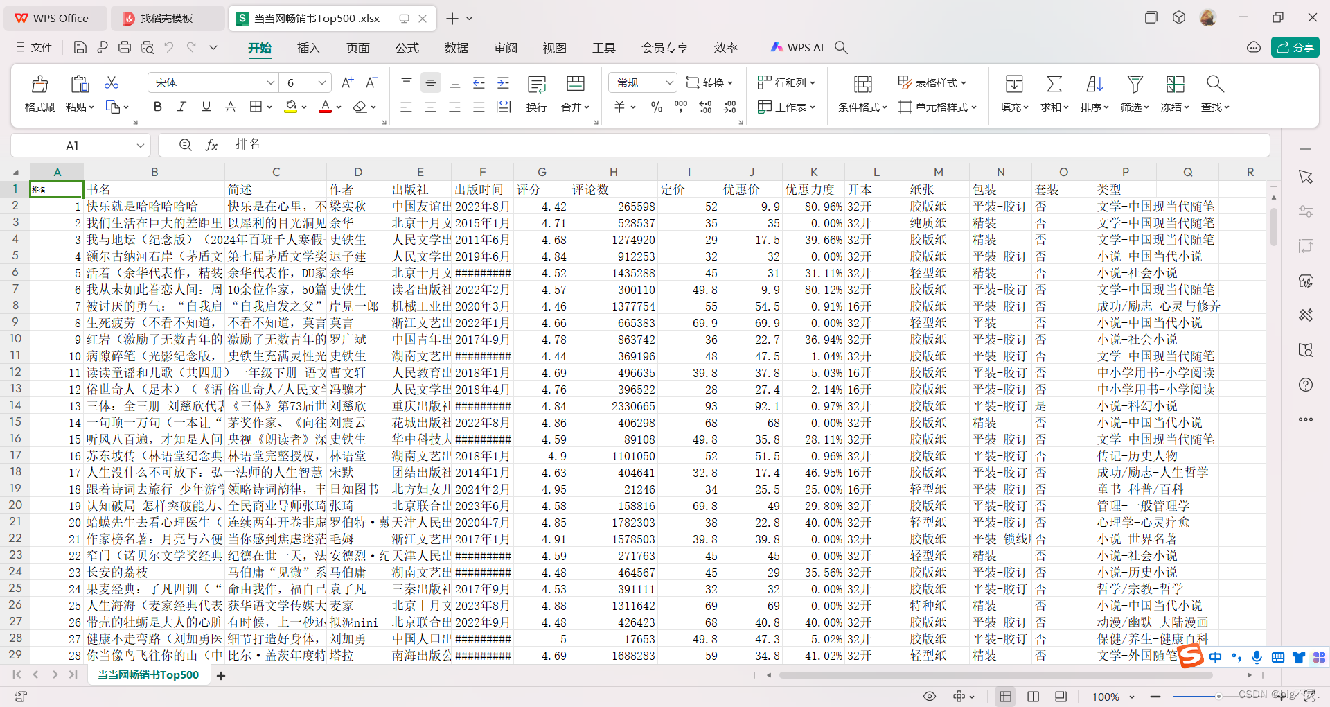
图一:饼图:前一百本书中 书本量前五作者占比
writer=data["作者"][:100]
writers=writer.value_counts().sort_values(ascending=False)[:7]
print(writers.index.tolist())
print(writers.values)

a=[]

for i in range(7):
    s=writers.index.tolist()[i]+":"+str(writers.values[i])
    a.append(s)

print(a)
plt.pie(writers.values,labels=a, autopct='%1.1f%%')

plt.show()
2.
图二:简介词云图
intro=data["简述"].tolist()
intros=[str(item) for item in intro]
intro="".join(intros)
print(intro)

# 分词

stop_words = [",",'的', '是', '在', '等',"。","、", '!', '《', '》', ' ', '“', '”',"你","和",";","+",","]

# 分词并去除停用词
filtered_words = [word for word in jieba.cut(intro) if word not in stop_words]

# 统计词频
word_counts = Counter(filtered_words)

# 绘制词云图
wordcloud = WordCloud(background_color='white', width=800, height=400, font_path='C:\Windows\Fonts\SimHei.ttf').generate_from_frequencies(word_counts)

plt.imshow(wordcloud)
plt.axis('off')
plt.show()
3.
图三:书名词云图
name=data["书名"].tolist()
names=[str(item) for item in name]
names="".join(names)
stop_words = ['(', ')', ',',",",'的', '是', '在', '等',"。","、", '!', '《', '》', ' ', '“', '”',"你","和",";","+"]
filtered_words = [word for word in jieba.cut(names) if word not in stop_words]
word_counts = Counter(filtered_words)
print(word_counts)
wordcloud = WordCloud(background_color='white', width=800, height=400, font_path='C:\Windows\Fonts\SimHei.ttf').generate_from_frequencies(word_counts)

plt.imshow(wordcloud)
plt.axis('off')
plt.show()
4.
图四:柱状图:按作者分类看平均定价
price=data.loc[:100,["作者","定价"]]

prices=price.groupby("作者")["定价"].mean().sort_values(ascending=False)[:10]
print(prices.index.tolist())
print(prices.values.tolist())

plt.bar(prices.index.tolist(),prices.values.tolist())
for i, v in enumerate(prices.values.tolist()):
    plt.text(i, v, str(v), ha='center', va='bottom')
plt.xticks(rotation=45)
plt.show()
5.
图五:饼图:开本占比
kaiben=data.groupby("开本").size()
plt.pie(kaiben, labels=kaiben.index, autopct='%1.1f%%')  # 绘制饼图,显示百分比
plt.title('Column Data Distribution')  # 添加饼图标题
plt.legend()  # 显示图例
plt.show()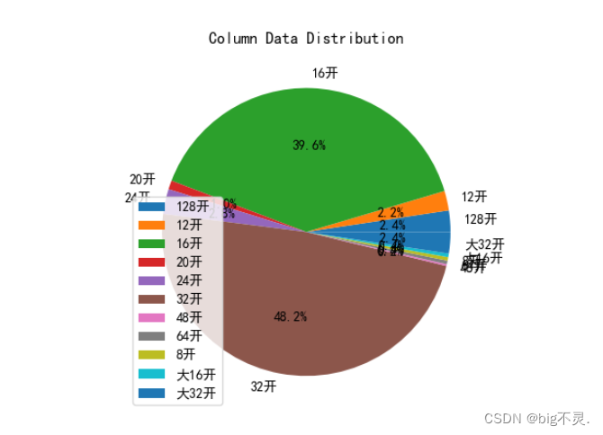
6.
图六:饼图: 对定价进行分类 画出占比饼图
prices=data["定价"]
ranges=[(0, 50), (50, 70), (70, 100), (100, 200), (200, 500)]
category_counts = {}
for price in prices:
    for min_price, max_price in ranges:
        if min_price <= price < max_price:
            if (min_price, max_price) in category_counts:
                category_counts[(min_price, max_price)] += 1
            else:
                category_counts[(min_price, max_price)] = 1
            break
labels = [f"{min_price}-{max_price} ({category_counts[(min_price, max_price)]})" for min_price, max_price in category_counts.keys()]
sizes = list(category_counts.values())
plt.pie(sizes, labels=labels, autopct='%1.1f%%')
plt.title("Category Distribution")
plt.show()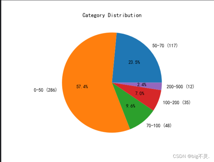


 2476
2476


 被折叠的 条评论
为什么被折叠?
被折叠的 条评论
为什么被折叠?
 到【灌水乐园】发言


