


一、选题的背景
选择此选题是因为掌上高考是一个提供本科院校信息的网站,通过爬取该网站的数据,可以获取到各个本科院校的相关信息,如学校名称、所在地、专业设置等。通过对这些数据进行分析和可视化,可以帮助学生更好地了解各个本科院校的情况,为他们的升学选择提供参考。预期目标是通过数据分析,找出各个本科院校的特点和优势,以及不同地区、不同专业的分布情况,为学生提供更全面、准确的信息。从社会方面来看,这有助于提高学生的就业竞争力;从经济方面来看,这有助于促进教育产业的发展;从技术方面来看,这需要运用爬虫技术和数据分析技术;数据来源主要是掌上高考网站。
二、主题式网络爬虫设计方案
1. 主题式网络爬虫名称:掌上高考高校数据爬取与可视化爬虫
2. 主题式网络爬虫爬取的内容与数据特征分析:
- 爬取内容:掌上高考网站上的高校数据,包括高校名称、所在地、类型(综合类、理工类等)、排名、学科门类等信息。
- 数据特征分析:高校数据具有结构化特点,可以通过HTML标签和属性进行定位和提取。同时,由于高校数据的多样性,需要对不同类型的高校进行分类处理
3. 主题式网络爬虫设计方案概述:
- 实现思路:
(1). 确定目标网站:掌上高考网站。
(2). 分析网页结构:使用浏览器开发者工具查看网页源代码,分析大学数据的HTML标签和属性。
(3). 编写爬虫代码:根据分析结果,使用Python的第三方库编写爬虫代码,实现对高校数据的爬取。
(4). 数据清洗与存储:对爬取到的数据进行清洗和格式化处理,将数据存储到合适的数据结构中,如列表、字典等。
(5). 数据可视化:使用Python的可视化库对高校数据进行可视化展示,如绘制柱状图、折线图等。
- 技术难点:
(1). 动态加载:部分网页数据是通过JavaScript动态加载的,需要使用Selenium等工具模拟浏览器操作,获取动态加载的数据。
(2). 反爬机制:目标网站可能采用反爬机制,如设置User-Agent、限制访问频率等,需要使用代理IP、设置请求头等方式绕过反爬策略。
(3). 数据清洗:爬取到的数据可能存在缺失值、异常值等问题,需要进行数据清洗和预处理,确保数据的准确性和完整性。
三、主题页面的结构特征分析
1.主题页面的结构与特征分析:


(1).主题页面包含多个大学的信息、
(2).每个大学的信息包括学校名称、所在地、类型、排名等。
(3).页面中可能存在分页功能,需要翻页获取更多高校信息。
2. Htmls 页面解析
3.节点(标签) 查找方法与遍历方法
- 查找方法:通过调用get_size()函数获取数据总数,然后调用get_university_info()函数进行分页爬取
- 遍历方法:是在get_university_info()函数中,使用for`循环遍历每一页的数据
四、网络爬虫程序设计
Part1: 爬取查学校里面院校库的网页数据并保存为“全国大学数据.csv”文件

1 # 导入所需模块
2 import json 3 import time 4 from time import sleep 5 import pandas as pd 6 import numpy as np 7 from bs4 import BeautifulSoup 8 from requests\_html import HTMLSession,UserAgent 9 import random
10 import os
11
12 def get\_header():
13 import fake\_useragent
14 location = os.getcwd() + '/fake\_useragent.json'
15 ua = fake\_useragent.UserAgent(path=location)
16 return ua.random
17
18 def get\_size(page=1):
19 url = 'https://api.eol.cn/gkcx/api/?access\_token=&admissions=¢ral=&department=&dual\_class=&f211=&f985=&is\_doublehigh=&is\_dual\_class=&keyword=&nature=&page={0}&province\_id=&ranktype=&request\_type=1&school\_type=&signsafe=&size=20&sort=view\_total&top\_school\_id=\[2941\]&type=&uri=apidata/api/gk/school/lists'\\
20 .format(page)
21 session = HTMLSession() #创建HTML会话对象
22 user\_agent = UserAgent().random #创建随机请求头
23 header = {"User-Agent": user\_agent}
24 res = session.post(url, headers=header)
25 data = json.loads(res.text)
26 size = 0
27 if data\["message"\] == '成功---success':
28 size = data\["data"\]\["numFound"\]
29 return size
30
31 def get\_university\_info(size, page\_size=20):
32 page\_cnt = int(size/page\_size) if size%page\_size==0 else int(size/page\_size)+1
33 print('一共{0}页数据,即将开始爬取...'.format(page\_cnt))
34 session2 = HTMLSession() #创建HTML会话对象
35 df\_result = pd.DataFrame()
36 for index in range(1, page\_cnt+1):
37 print('正在爬取第 {0}/{1} 页数据'.format(index, page\_cnt))
38 url = 'https://api.eol.cn/gkcx/api/?access\_token=&admissions=¢ral=&department=&dual\_class=&f211=&f985=&is\_doublehigh=&is\_dual\_class=&keyword=&nature=&page={0}&province\_id=&ranktype=&request\_type=1&school\_type=&signsafe=&size=20&sort=view\_total&top\_school\_id=\[2941\]&type=&uri=apidata/api/gk/school/lists' \\
39 .format(index)
40 user\_agent = UserAgent().random #创建随机请求头
41 header = {"User-Agent": user\_agent}
42 res = session2.post(url, headers=header)
43
44 with open("res.text", "a+", encoding="utf-8") as file:
45 file.write(res.text)
46
47 data = json.loads(res.text)
48
49 if data\["message"\] == '成功---success':
50 df\_data = pd.DataFrame(data\["data"\]\["item"\])
51 df\_result = pd.concat(\[df\_result, df\_data\], ignore\_index=True)
52 time.sleep(random.randint(5, 7))
53
54 return df\_result
55
56 size = get\_size()
57 df\_result = get\_university\_info(size)
58 df\_result.to\_csv('全国大学数据.csv', encoding='gbk', index=False)

Part2: 用访问量排序来查询保存下来的“全国大学数据.csv”文件
 1 # 导入所需模块
 2 import pandas as pd 3 import plotly as py 4 import numpy as np 5 # 读取数据
 6 university = pd.read\_csv('data/全国大学数据.csv',encoding='gbk')
 7
 8 # 对数据进行处理
 9 university = university.loc\[:,\['name','nature\_name','province\_name','belong',
10                          'city\_name', 'dual\_class\_name','f211','f985','level\_name' ,
11                          'type\_name','view\_month\_number','view\_total\_number',
12                          'view\_week\_number','rank'\]\]
13 c\_name = \['大学名称','办学性质','省份','隶属','城市','高校层次',
14           '211院校','985院校','级别','类型','月访问量','总访问量','周访问量','排名'\]
15 university.columns = c\_name
16
17 # 访问量排序
18 university.sort\_values(by='总访问量',ascending=False).head()
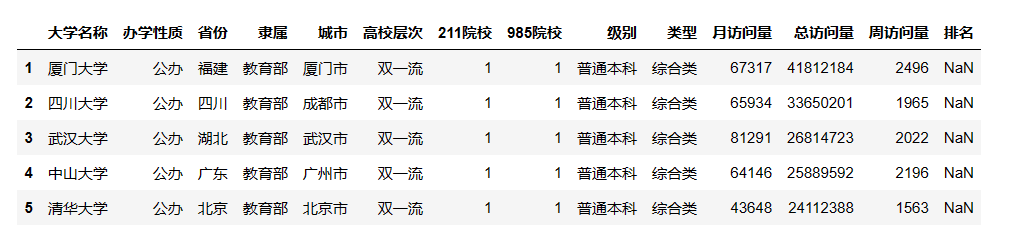
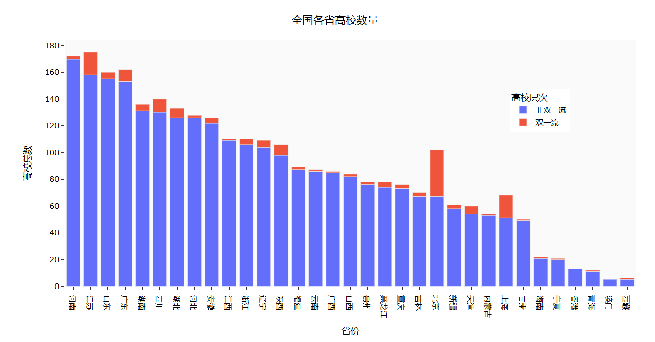
Part3: 用条形图显示全国各省的 “双一流” 和 “非双一流” 高校数量
 1 university\['高校总数'\] = 1
 2 university.fillna({'高校层次': '非双一流'},inplace=True)
 3 university\_by\_province = university.pivot\_table(index=\['省份','高校层次'\],
 4                                                  values='高校总数',aggfunc='count')
 5 university\_by\_province.reset\_index(inplace=True)
 6 university\_by\_province.sort\_values(by=\['高校总数'\],ascending=False,inplace=True)
 7
 8 #查询全国各省高校数量
 9 import plotly.express as px
10 fig = px.bar(university\_by\_province,
11              x="省份",
12              y="高校总数",
13              color="高校层次")
14 fig.update\_layout(
15     title='全国各省高校数量',
16     xaxis\_title="省份",
17     yaxis\_title="高校总数",
18     template='ggplot2',
19     font=dict(
20         size=12,
21         color="Black",
22 ),
23     margin=dict(l=40, r=20, t=50, b=40),
24     xaxis=dict(showgrid=False),
25     yaxis=dict(showgrid=False),
26     plot\_bgcolor="#fafafa",
27     legend=dict(yanchor="top",
28     y=0.8,
29     xanchor="left",
30     x=0.78)
31 )
32 fig.show()
Part4: 根据 “全国省市区行政区划.xlsx” 文件结合 “全国大学数据.csv” 中的经纬度生成全国高校地理分布图
 1 df = pd.read\_excel('./data/全国省市区行政区划.xlsx',header=1)
 2 # 筛选出层级为2的数据,并选择'全称'、'经度'和'纬度'列
 3 df\_l = df.query("层级==2").loc\[:,\['全称','经度','纬度'\]\]
 4 df\_l = df\_l.reset\_index(drop=True).rename(columns={'全称':'城市'})
 5 df7 = university.pivot\_table('大学名称','城市',aggfunc='count')
 6 df7 = df7.merge(df\_l,on='城市',how='left')
 7 # 按照大学数量降序排序
 8 df7.sort\_values(by='大学名称',ascending=False)
 9
10 import plotly.graph\_objects as go
11 import pandas as p
12 df7\['text'\] = df7\['城市'\] + '<br>大学总数 ' + (df7\['大学名称'\]).astype(str)+'个'
13
14 # 定义文本、颜色和范围
15 limits = \[(0,10),(11,20),(21,50),(51,100),(101,200)\]
16 colors = \["royalblue","crimson","lightseagreen","orange","red"\]
17 cities = \[\]
18 scale =.08
19
20 # 创建地理分布图对象
21 fig = go.Figure()
22
23 # 遍历范围,筛选出对应的城市数据,并添加到地理分布图中
24 for i in range(len(limits)):
25     lim = limits\[i\]
26     df\_sub = df7\[df7.大学名称.map(lambda x: lim\[0\] <= x <= lim\[1\])\]
27 fig.add\_trace(go.Scattergeo(
28         locationmode = 'ISO-3',
29         lon = df\_sub\['经度'\],
30         lat = df\_sub\['纬度'\],
31         text = df\_sub\['text'\],
32         marker = dict(
33             size = df\_sub\['大学名称'\],
34             color = colors\[i\],
35             line\_color='rgb(40,40,40)',
36             line\_width=0.5,
37             sizemode = 'area'
38 ),
39         name = '{0} - {1}'.format(lim\[0\],lim\[1\])))
40
41 # 更新地理分布图布局
42 fig.update\_layout(
43         title\_text = '全国高校地理分布图',
44         showlegend = True,
45         geo = dict(
46             scope = 'asia',
47             landcolor = 'rgb(217, 217, 217)',
48 ),
49         template='ggplot2',
50         font=dict(
51         size=12,
52         color="Black",),
53     legend=dict(yanchor="top",
54     y=1.,
55     xanchor="left",
56     x=1)
57 )
58
59 # 显示地理分布图
60 fig.show()

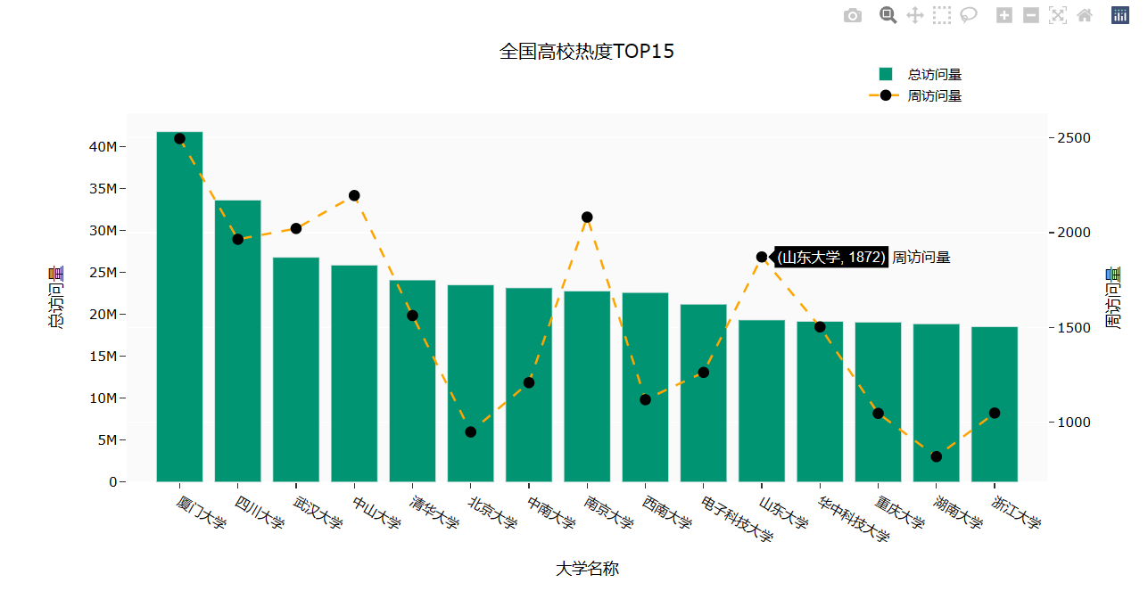
Part5: 针对全国高校的热度排行创建一个柱状图,并在其中创建一个散点图用来显示高校名称和周访问量。
 1 import plotly.graph\_objs as go 2
 3 # 创建一个空的图形对象
 4 fig=go.Figure()
 5
 6 # 对数据按照总访问量进行降序排序
 7 df3 = university.sort\_values(by='总访问量',ascending=False)
 8
 9 # 添加一个柱状图,表示大学名称、总访问量和颜色
10 fig.add\_trace(go.Bar(
11     x=df3.loc\[:15,'大学名称'\],
12     y=df3.loc\[:15,'总访问量'\],
13     name='总访问量',
14     marker\_color='#009473',
15     textposition='inside',
16     yaxis='y1'
17 ))
18
19 # 添加一个散点图,表示大学名称、周访问量和颜色
20 fig.add\_trace(go.Scatter(
21     x=df3.loc\[:15,'大学名称'\],
22     y=df3.loc\[:15,'周访问量'\],
23     name='周访问量',
24     mode='markers+text+lines',
25     marker\_color='black',
26     marker\_size=10,
27     textposition='top center',
28     line=dict(color='orange',dash='dash'),
29     yaxis='y2'
30
31 ))
32
33 # 更新图形布局
34 fig.update\_layout(
35     title='全国高校热度TOP15',
36     xaxis\_title="大学名称",
37     yaxis\_title="总访问量",
38     template='ggplot2',
39     font=dict(
40         size=12,
41         color="Black",
42
43 ),
44     xaxis=dict(showgrid=False),
45     yaxis=dict(showgrid=False),
46     plot\_bgcolor="#fafafa",
47     yaxis2=dict(showgrid=True,overlaying='y',side='right',title='周访问量'),
48     legend=dict(yanchor="top",
49     y=1.15,
50     xanchor="left",
51     x=0.8)
52 )
53
54 # 显示图形
55 fig.show()
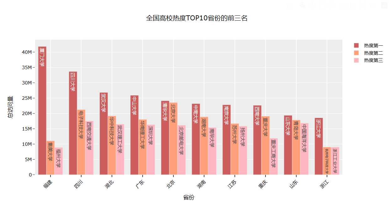
Part6: 查询热度排名前十的省份内前三的学校
# 从数据集中筛选出省份、大学名称和总访问量三列
df9 = university.loc\[:,\['省份','大学名称','总访问量'\]\]

# 根据省份对总访问量进行降序排名,得到每个省份的前三所大学
df9\['前三'\] = df9.drop\_duplicates()\['总访问量'\].groupby(by=df9\['省份'\]).rank(method='first', ascending=False)
df\_10 \= df9\[df9\['前三'\].map(lambda x: True if x < 4 else False)\]

df\_10\['前三'\] = df\_10.前三.astype(int)

# 使用pivot\_table方法创建一个透视表,以省份为行索引,前三名大学为列索引,总访问量为值
df\_pt = df\_10.pivot\_table(values='总访问量',index='省份',columns='前三')

# 按照总访问量降序排列透视表,并取前10个省份
df\_pt\_2 = df\_pt.sort\_values(by=1,ascending=False)\[:10\]

# 获取排名前三的大学名称
df\_labels\_1 = df9\[df9.前三 == 1\].set\_index('省份').loc\[df\_pt\_2.index,'大学名称'\]\[:10\]
df\_labels\_2 \= df9\[df9.前三 == 2\].set\_index('省份').loc\[df\_pt\_2.index,'大学名称'\]\[:10\]
df\_labels\_3 \= df9\[df9.前三 == 3\].set\_index('省份').loc\[df\_pt\_2.index,'大学名称'\]\[:10\]

#创建x轴数据和图形对象
x = df\_pt\_2.index
fig \= go.Figure()

# 添加柱状图,表示热度第一、热度第二、热度第三的大学
fig.add\_trace(go.Bar(
    x\=x,
    y\=df\_pt\_2\[1\],
    name\='热度第一',
    marker\_color\='indianred',
    textposition\='inside',
    text\=df\_labels\_1.values,
    textangle \= 90
))
fig.add\_trace(go.Bar(
    x\=x,
    y\=df\_pt\_2\[2\],
    name\='热度第二',
    marker\_color\='lightsalmon',
    textposition\='inside',
    text\=df\_labels\_2.values,
    textangle \= 90
))
fig.add\_trace(go.Bar(
    x\=x,
    y\=df\_pt\_2\[3\],
    name\='热度第三',
    marker\_color\='lightpink',
    textposition\='inside',
    text\=df\_labels\_3.values,
    textangle \= 90
))

# 修改x轴刻度标签的角度,使标签旋转
fig.update\_layout(barmode='group', xaxis\_tickangle=-45)

# 更新图形布局,包括标题、x轴和y轴标题、模板、字体和柱状图模式等
fig.update\_layout(
    title\='全国高校热度TOP10省份的前三名',
    xaxis\_title\="省份",
    yaxis\_title\="总访问量",
    template\='ggplot2',
    font\=dict(
        size\=12,
        color\="Black"),
    barmode\='group', xaxis\_tickangle=-45
    )

fig.show()
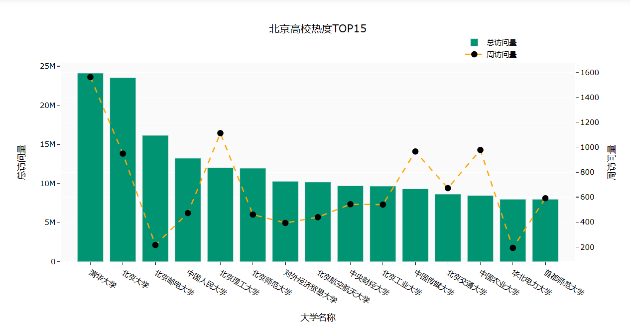
Part7: 查询北京市热度排名前十五的学校
import plotly.graph\_objs as go

# 筛选出北京市的双一流高校,并取前15名
df\_bj = university.query("高校层次 == '双一流' and 城市== '北京市'").iloc\[:15,:\]

# 创建图形对象并对总访问量进行降序排序
fig=go.Figure()
df3 \= university.sort\_values(by='总访问量',ascending=False)

# 添加柱状图,展示总访问量
fig.add\_trace(go.Bar(
    x\=df\_bj\['大学名称'\],
    y\=df\_bj\['总访问量'\],
    name\='总访问量',
    marker\_color\='#009473',
    textposition\='inside',
    yaxis\='y1'
))

# 添加散点图和折线图,展示周访问量
fig.add\_trace(go.Scatter(
    x\=df\_bj\['大学名称'\],
    y\=df\_bj\['周访问量'\],
    name\='周访问量',
    mode\='markers+text+lines',
    marker\_color\='black',
    marker\_size\=10,
    textposition\='top center',
    line\=dict(color='orange',dash='dash'),
    yaxis\='y2'
))

# 更新图形布局
fig.update\_layout(
    title\='北京高校热度TOP15',
    xaxis\_title\="大学名称",
    yaxis\_title\="总访问量",
    template\='ggplot2',
    font\=dict(
        size\=12,
        color\="Black",
    ),
    xaxis\=dict(showgrid=False),
    yaxis\=dict(showgrid=False),
    plot\_bgcolor\="#fafafa",
    yaxis2\=dict(showgrid=True,overlaying='y',side='right',title='周访问量'),
    legend\=dict(yanchor="top",
    y\=1.15,
    xanchor\="left",
    x\=0.78)
)

fig.show()
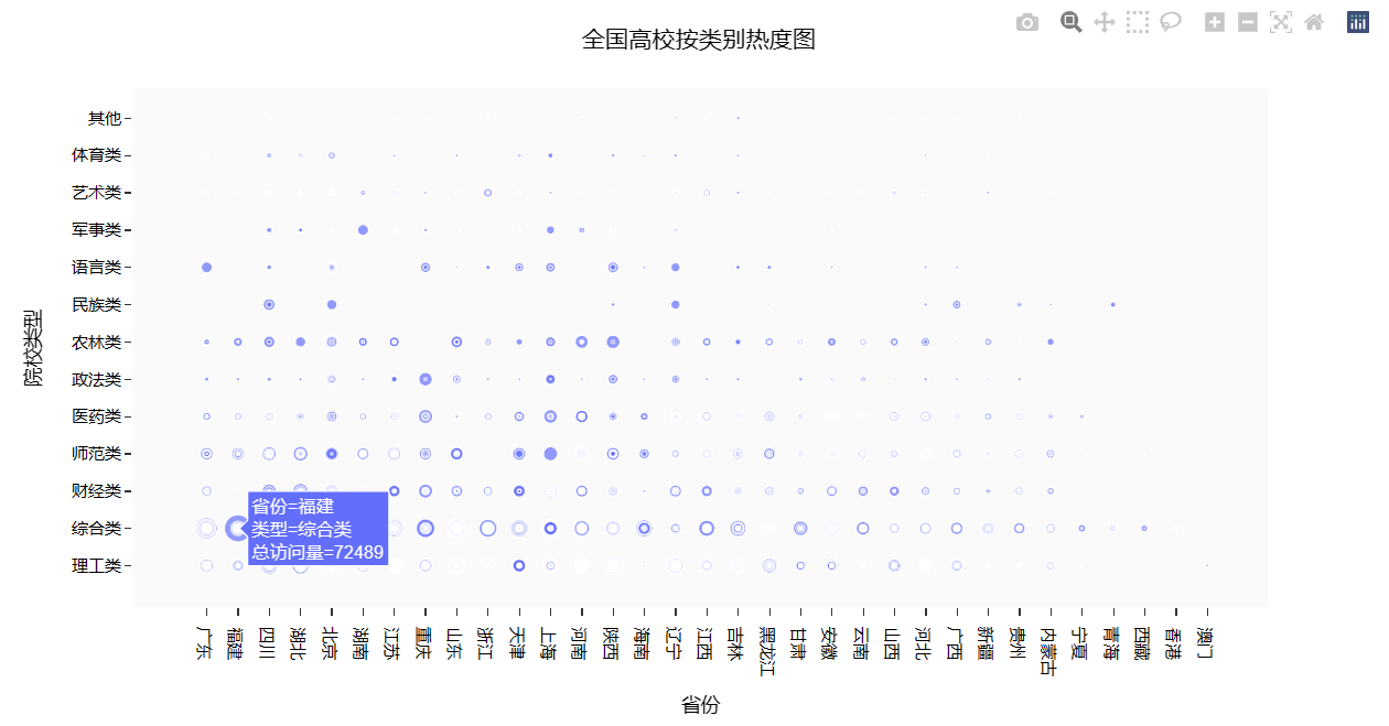
Part8: 查询全国高校按类别划分的热度图
 1 # 从university数据框中提取'城市'、'高校层次'、'211院校'和'985院校'列,并添加一列名为'总数'的全为1的新列
 2 df5 = university.loc\[:,\['城市','高校层次','211院校','985院校'\]\]
 3 df5\['总数'\] = 1
 4
 5 # 将 '211院校' 和 '985院校' 列中的值映射为'是'或'否'
 6 df5\['211院校'\] = df5\['211院校'\].map(lambda x: '是' if x == 1 else '否')
 7 df5\['985院校'\] = df5\['985院校'\].map(lambda x: '是' if x == 1 else '否')
 8
 9 # 将数据框重塑为以'城市'和'985院校'为索引的新数据框,并将'总数'列的值作为新数据框的值
10 df6  =df5.pivot\_table(index=\['城市','985院校'\],values='总数').reset\_index()
11
12 df6
13
14 df6.columns
15
16 # 使用plotly库绘制散点图
17 fig = px.scatter(university,x="省份", y="类型",size="总访问量")
18
19 # 更新图表布局设置
20 fig.update\_layout(
21     title='全国高校按类别热度图',
22     xaxis\_title="省份",
23     yaxis\_title="院校类型",
24     template='ggplot2',
25     font=dict(size=12,color="Black",),
26     xaxis=dict(showgrid=False),
27     yaxis=dict(showgrid=False),
28     plot\_bgcolor="#fafafa",
29 )
30
31 fig.show()
爬虫课程设计全部代码如下:
1 # 导入所需模块
2 import os 3 import json 4 import time 5 import random 6 import numpy as np 7 import pandas as pd 8 import plotly as py 9 from time import sleep 10 import plotly.express as px 11 from bs4 import BeautifulSoup 12 from requests\_html import HTMLSession,UserAgent 13
14
15
16 def get\_header(): 17 import fake\_useragent 18 location = os.getcwd() + '/fake\_useragent.json'
19 ua = fake\_useragent.UserAgent(path=location)
20 return ua.random 21
22 # 高校数据
23 def get\_size(page=1):
24 url = 'https://api.eol.cn/gkcx/api/?access\_token=&admissions=¢ral=&department=&dual\_class=&f211=&f985=&is\_doublehigh=&is\_dual\_class=&keyword=&nature=&page={0}&province\_id=&ranktype=&request\_type=1&school\_type=&signsafe=&size=20&sort=view\_total&top\_school\_id=\[2941\]&type=&uri=apidata/api/gk/school/lists'\\
25 .format(page)
26 session = HTMLSession() #创建HTML会话对象
27 user\_agent = UserAgent().random #创建随机请求头
28 header = {"User-Agent": user\_agent}
29 res = session.post(url, headers=header)
30 data = json.loads(res.text) 31 size = 0 32 if data\["message"\] == '成功---success':
33 size = data\["data"\]\["numFound"\]
34 return size 35
36 def get\_university\_info(size, page\_size=20):
37 page\_cnt = int(size/page\_size) if size%page\_size==0 else int(size/page\_size)+1
38 print('一共{0}页数据,即将开始爬取...'.format(page\_cnt))
39 session2 = HTMLSession() #创建HTML会话对象
40 df\_result = pd.DataFrame() 41 for index in range(1, page\_cnt+1):
42 print('正在爬取第 {0}/{1} 页数据'.format(index, page\_cnt))
43 url = 'https://api.eol.cn/gkcx/api/?access\_token=&admissions=¢ral=&department=&dual\_class=&f211=&f985=&is\_doublehigh=&is\_dual\_class=&keyword=&nature=&page={0}&province\_id=&ranktype=&request\_type=1&school\_type=&signsafe=&size=20&sort=view\_total&top\_school\_id=\[2941\]&type=&uri=apidata/api/gk/school/lists' \\ 44 .format(index)
45 user\_agent = UserAgent().random #创建随机请求头
46 header = {"User-Agent": user\_agent}
47 res = session2.post(url, headers=header)
48
49 with open("res.text", "a+", encoding="utf-8") as file:
50 file.write(res.text)
51
52 data = json.loads(res.text) 53
54 if data\["message"\] == '成功---success':
55 df\_data = pd.DataFrame(data\["data"\]\["item"\])
56 df\_result = pd.concat(\[df\_result, df\_data\], ignore\_index=True)
57 time.sleep(random.randint(5, 7))
58
59 return df\_result 60
61 size = get\_size() 62 df\_result = get\_university\_info(size) 63 df\_result.to\_csv('全国大学数据.csv', encoding='gbk', index=False)
64
65 #查询总访问量排序下的全国大学数据文件
66
67 # 读取数据
68 university = pd.read\_csv('data/全国大学数据.csv',encoding='gbk')
69
70 # 对数据进行处理
71 university = university.loc\[:,\['name','nature\_name','province\_name','belong',
72 'city\_name', 'dual\_class\_name','f211','f985','level\_name' , 73 'type\_name','view\_month\_number','view\_total\_number',
74 'view\_week\_number','rank'\]\]
75 c\_name = \['大学名称','办学性质','省份','隶属','城市','高校层次',
76 '211院校','985院校','级别','类型','月访问量','总访问量','周访问量','排名'\]
77 university.columns = c\_name 78
79 # 访问量排序
80 university.sort\_values(by='总访问量',ascending=False).head()
81
82 #显示全国双一流和非双一流的高校数量
83
84 university\['高校总数'\] = 1
85 university.fillna({'高校层次': '非双一流'},inplace=True)
86 university\_by\_province = university.pivot\_table(index=\['省份','高校层次'\],
87 values='高校总数',aggfunc='count')
88 university\_by\_province.reset\_index(inplace=True)
89 university\_by\_province.sort\_values(by=\['高校总数'\],ascending=False,inplace=True)
90
91 #查询全国各省高校数量
92
93 fig = px.bar(university\_by\_province, 94 x="省份",
95 y="高校总数",
96 color="高校层次")
97 fig.update\_layout(
98 title='全国各省高校数量',
99 xaxis\_title="省份",
100 yaxis\_title="高校总数",
101 template='ggplot2',
102 font=dict(
103 size=12,
104 color="Black",
105 ),
106 margin=dict(l=40, r=20, t=50, b=40),
107 xaxis=dict(showgrid=False),
108 yaxis=dict(showgrid=False),
109 plot\_bgcolor="#fafafa",
110 legend=dict(yanchor="top",
111 y=0.8,
112 xanchor="left",
113 x=0.78)
114 )
115 fig.show()
116
117 #生成全国高校地理分布图
118 df = pd.read\_excel('./data/全国省市区行政区划.xlsx',header=1)
119 # 筛选出层级为2的数据,并选择'全称'、'经度'和'纬度'列
120 df\_l = df.query("层级==2").loc\[:,\['全称','经度','纬度'\]\]
121 df\_l = df\_l.reset\_index(drop=True).rename(columns={'全称':'城市'})
122 df7 = university.pivot\_table('大学名称','城市',aggfunc='count')
123 df7 = df7.merge(df\_l,on='城市',how='left')
124
125 # 按照大学数量降序排序
126 df7.sort\_values(by='大学名称',ascending=False)
127 import plotly.graph\_objects as go
128 import pandas as p
129 df7\['text'\] = df7\['城市'\] + '<br>大学总数 ' + (df7\['大学名称'\]).astype(str)+'个'
130
131 # 定义文本、颜色和范围
132 limits = \[(0,10),(11,20),(21,50),(51,100),(101,200)\]
133 colors = \["royalblue","crimson","lightseagreen","orange","red"\]
134 cities = \[\]
135 scale =.08
136
137 # 创建地理分布图对象
138 fig = go.Figure()
139
140 # 遍历范围,筛选出对应的城市数据,并添加到地理分布图中
141 for i in range(len(limits)):
142 lim = limits\[i\]
143 df\_sub = df7\[df7.大学名称.map(lambda x: lim\[0\] <= x <= lim\[1\])\]
144 fig.add\_trace(go.Scattergeo(
145 locationmode = 'ISO-3',
146 lon = df\_sub\['经度'\],
147 lat = df\_sub\['纬度'\],
148 text = df\_sub\['text'\],
149 marker = dict(
150 size = df\_sub\['大学名称'\],
151 color = colors\[i\],
152 line\_color='rgb(40,40,40)',
153 line\_width=0.5,
154 sizemode = 'area'
155 ),
156 name = '{0} - {1}'.format(lim\[0\],lim\[1\])))
157
158 # 更新地理分布图布局
159 fig.update\_layout(
160 title\_text = '全国高校地理分布图',
161 showlegend = True,
162 geo = dict(
163 scope = 'asia',
164 landcolor = 'rgb(217, 217, 217)',
165 ),
166 template='ggplot2',
167 font=dict(
168 size=12,
169 color="Black",),
170 legend=dict(yanchor="top",
171 y=1.,
172 xanchor="left",
173 x=1)
174 )
175
176 # 显示地理分布图
177 fig.show()
178
179
180 # 全国高校热度TOP15
181 import plotly.graph\_objs as go
182
183 # 创建一个空的图形对象
184 fig=go.Figure()
185 # 对数据按照总访问量进行降序排序
186 df3 = university.sort\_values(by='总访问量',ascending=False)
187 # 添加一个柱状图,表示大学名称、总访问量和颜色
188 fig.add\_trace(go.Bar(
189 x=df3.loc\[:15,'大学名称'\],
190 y=df3.loc\[:15,'总访问量'\],
191 name='总访问量',
192 marker\_color='#009473',
193 textposition='inside',
194 yaxis='y1'
195 ))
196 # 添加一个散点图,表示大学名称、周访问量和颜色
197 fig.add\_trace(go.Scatter(
198 x=df3.loc\[:15,'大学名称'\],
199 y=df3.loc\[:15,'周访问量'\],
200 name='周访问量',
201 mode='markers+text+lines',
202 marker\_color='black',
203 marker\_size=10,
204 textposition='top center',
205 line=dict(color='orange',dash='dash'),
206 yaxis='y2'
207
208 ))
209 # 更新图形布局
210 fig.update\_layout(
211 title='全国高校热度TOP15',
212 xaxis\_title="大学名称",
213 yaxis\_title="总访问量",
214 template='ggplot2',
215 font=dict(
216 size=12,
217 color="Black",
218
219 ),
220 xaxis=dict(showgrid=False),
221 yaxis=dict(showgrid=False),
222 plot\_bgcolor="#fafafa",
223 yaxis2=dict(showgrid=True,overlaying='y',side='right',title='周访问量'),
224 legend=dict(yanchor="top",
225 y=1.15,
226 xanchor="left",
227 x=0.8)
228 )
229 # 显示图形
230 fig.show()
231
232 #全国高校热度TOP10省份的前三名
233 # 从数据集中筛选出省份、大学名称和总访问量三列
234 df9 = university.loc\[:,\['省份','大学名称','总访问量'\]\]
235 # 根据省份对总访问量进行降序排名,得到每个省份的前三所大学
236 df9\['前三'\] = df9.drop\_duplicates()\['总访问量'\].groupby(by=df9\['省份'\]).rank(method='first', ascending=False)
237 df\_10 = df9\[df9\['前三'\].map(lambda x: True if x < 4 else False)\]
238 df\_10\['前三'\] = df\_10.前三.astype(int)
239
240 # 使用pivot\_table方法创建一个透视表,以省份为行索引,前三名大学为列索引,总访问量为值
241 df\_pt = df\_10.pivot\_table(values='总访问量',index='省份',columns='前三')
242
243 # 按照总访问量降序排列透视表,取前10个省份
244 df\_pt\_2 = df\_pt.sort\_values(by=1,ascending=False)\[:10\]
245 # 获取排名前三的大学名称
246 df\_labels\_1 = df9\[df9.前三 == 1\].set\_index('省份').loc\[df\_pt\_2.index,'大学名称'\]\[:10\]
247 df\_labels\_2 = df9\[df9.前三 == 2\].set\_index('省份').loc\[df\_pt\_2.index,'大学名称'\]\[:10\]
248 df\_labels\_3 = df9\[df9.前三 == 3\].set\_index('省份').loc\[df\_pt\_2.index,'大学名称'\]\[:10\]
249
250 #创建x轴数据和图形对象
251 x = df\_pt\_2.index
252 fig = go.Figure()
253
254 # 添加柱状图,表示热度第一、热度第二、热度第三的大学
255 fig.add\_trace(go.Bar(
256 x=x,
257 y=df\_pt\_2\[1\],
258 name='热度第一',
259 marker\_color='indianred',
260 textposition='inside',
261 text=df\_labels\_1.values,
262 textangle = 90
263 ))
264 fig.add\_trace(go.Bar(
265 x=x,
266 y=df\_pt\_2\[2\],
267 name='热度第二',
268 marker\_color='lightsalmon',
269 textposition='inside',
270 text=df\_labels\_2.values,
271 textangle = 90
272 ))
273 fig.add\_trace(go.Bar(
274 x=x,
275 y=df\_pt\_2\[3\],
276 name='热度第三',
277 marker\_color='lightpink',
278 textposition='inside',
279 text=df\_labels\_3.values,
280 textangle = 90
281 ))
282
283 # 修改x轴刻度标签的角度,使标签旋转
284 fig.update\_layout(barmode='group', xaxis\_tickangle=-45)
285 # 更新图形布局,包括标题、x轴和y轴标题、模板、字体和柱状图模式等
286 fig.update\_layout(
287 title='全国高校热度TOP10省份的前三名',
288 xaxis\_title="省份",
289 yaxis\_title="总访问量",
290 template='ggplot2',
291 font=dict(
292 size=12,
293 color="Black"),
294 barmode='group', xaxis\_tickangle=-45
295 )
296 fig.show()
297
298 #查询北京市热度排名前十五的学校
299 import plotly.graph\_objs as go
300 # 筛选出北京市的双一流高校,并取前15名
301 df\_bj = university.query("高校层次 == '双一流' and 城市== '北京市'").iloc\[:15,:\]
302
303 # 创建图形对象并对总访问量进行降序排序
304 fig=go.Figure()
305 df3 = university.sort\_values(by='总访问量',ascending=False)
306
307 # 添加柱状图,展示总访问量
308 fig.add\_trace(go.Bar(
309 x=df\_bj\['大学名称'\],
310 y=df\_bj\['总访问量'\],
311 name='总访问量',
312 marker\_color='#009473',
313 textposition='inside',
314 yaxis='y1'
315 ))
316
317 # 添加散点图和折线图,展示周访问量
318 fig.add\_trace(go.Scatter(
319 x=df\_bj\['大学名称'\],
320 y=df\_bj\['周访问量'\],
321 name='周访问量',
322 mode='markers+text+lines',
323 marker\_color='black',
324 marker\_size=10,
325 textposition='top center',
326 line=dict(color='orange',dash='dash'),
327 yaxis='y2'
328
329 ))
330
331 # 更新图形布局
332 fig.update\_layout(
333 title='北京高校热度TOP15',
334 xaxis\_title="大学名称",
335 yaxis\_title="总访问量",
336 template='ggplot2',
337 font=dict(size=12,color="Black", ),
338 xaxis=dict(showgrid=False),
339 yaxis=dict(showgrid=False),
340 plot\_bgcolor="#fafafa",
341 yaxis2=dict(showgrid=True,overlaying='y',side='right',title='周访问量'),
342 legend=dict(yanchor="top",
343 y=1.15,
344 xanchor="left",
345 x=0.78)
346 )
347 fig.show()
348
349 #查询全国高校按类别划分的热度图
350 # 从university数据框中提取'城市'、'高校层次'、'211院校'和'985院校'列,并添加一列名为'总数'的全为1的新列
351 df5 = university.loc\[:,\['城市','高校层次','211院校','985院校'\]\]
352 df5\['总数'\] = 1
353
354 # 将 '211院校' 和 '985院校' 列中的值映射为'是'或'否'
355 df5\['211院校'\] = df5\['211院校'\].map(lambda x: '是' if x == 1 else '否')
356 df5\['985院校'\] = df5\['985院校'\].map(lambda x: '是' if x == 1 else '否')
357
358 # 将数据框重塑为以'城市'和'985院校'为索引的新数据框,并将'总数'列的值作为新数据框的值
359 df6 =df5.pivot\_table(index=\['城市','985院校'\],values='总数').reset\_index()
360 df6
361 df6.columns
362
363 # 绘制散点图
364 fig = px.scatter(university,
365 x="省份", y="类型",
366 size="总访问量"
367 )
368
369 # 更新图表布局设置
370 fig.update\_layout(
371 title='全国高校按类别热度图',
372 xaxis\_title="省份",
373 yaxis\_title="院校类型",
374 template='ggplot2',
375 font=dict(
376 size=12,
377 color="Black",),
378 xaxis=dict(showgrid=False),
379 yaxis=dict(showgrid=False),
380 plot\_bgcolor="#fafafa",
381 )
382 fig.show()
五.总结
1. 根据柱状图了解到河南的非双一流学校最多,北京的双一流学校最多。
2. 根据地图了解到国内大部分高校分在国家的东部和中部。
3. 根据柱状图了解到大家对厦门大学、四川大学比较感兴趣。
4. 根据柱状图了解到排名第一的福建省只有一所厦门大学热度超前,而四川省、湖北省、广东省、北京市的高校热度都较为平均。
5. 根据散点图了解到全国各省的综合类的热度均较为突出
综上所述,河南在高等教育方面有更多的资源和机会,而北京则拥有更多的顶尖高校。东部和中部地区的经济发展相对较好,教育资源相对集中。厦门大学和四川大学在学术研究、教学质量等方面具有较高的声誉和知名度。综合类高校在各个省份都受到较高的关注和认可。
源码和籽料👇↓↓↓

本文转自 https://www.cnblogs.com/sujinghe/p/17927166.html,如有侵权,请联系删除。


 3005
3005


 被折叠的 条评论
为什么被折叠?
被折叠的 条评论
为什么被折叠?
 到【灌水乐园】发言


