


目录
一、更多推荐
欢迎来到我的CSDN主页!Web前端网页制作、大学生期末大作业、课程设计、毕业设计、网页模版源码、学习资料等,更多优质博客文章、网页模板点击以下链接查阅:
5000+完整代码,主题涵盖30+种类型:

二、网页简介
本实例应用html5+css3+js: 导航菜单、图片轮翻效果、下拉菜单、无缝滚动插件、鼠标滑动特效、返回菜单按钮等。适用于大学生网页课程作业设计、公司网页制作等。响应式布局可以根据不同的设备屏幕大小自动调整页面布局,提高用户体验;本网页支持如Dreamweaver、HBuilder、Text 、Vscode 等任意html编辑软件进行编辑修改;支持包括IE、Firefox、Chrome、Safari主流浏览器浏览。
三、网页文件
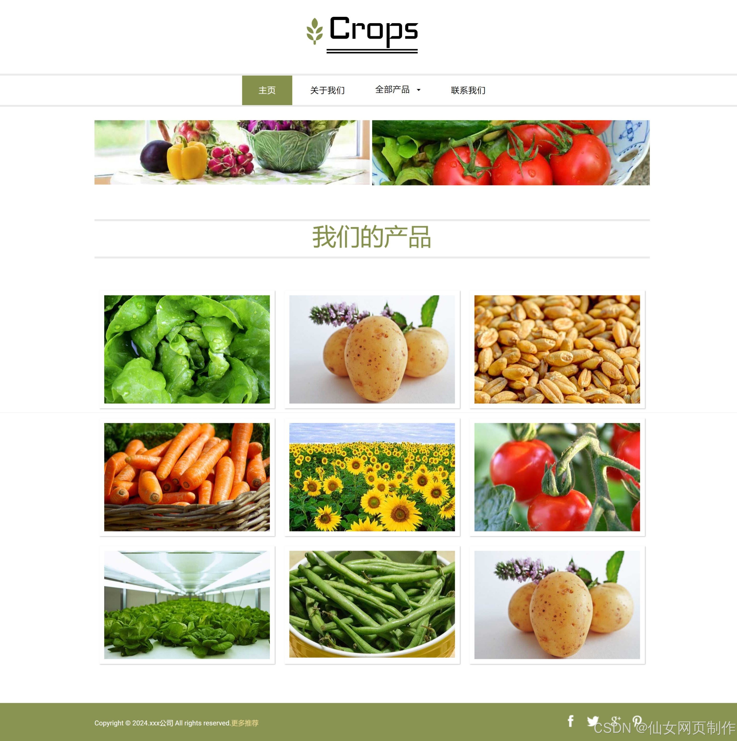
本网页实例共包含4个页面:
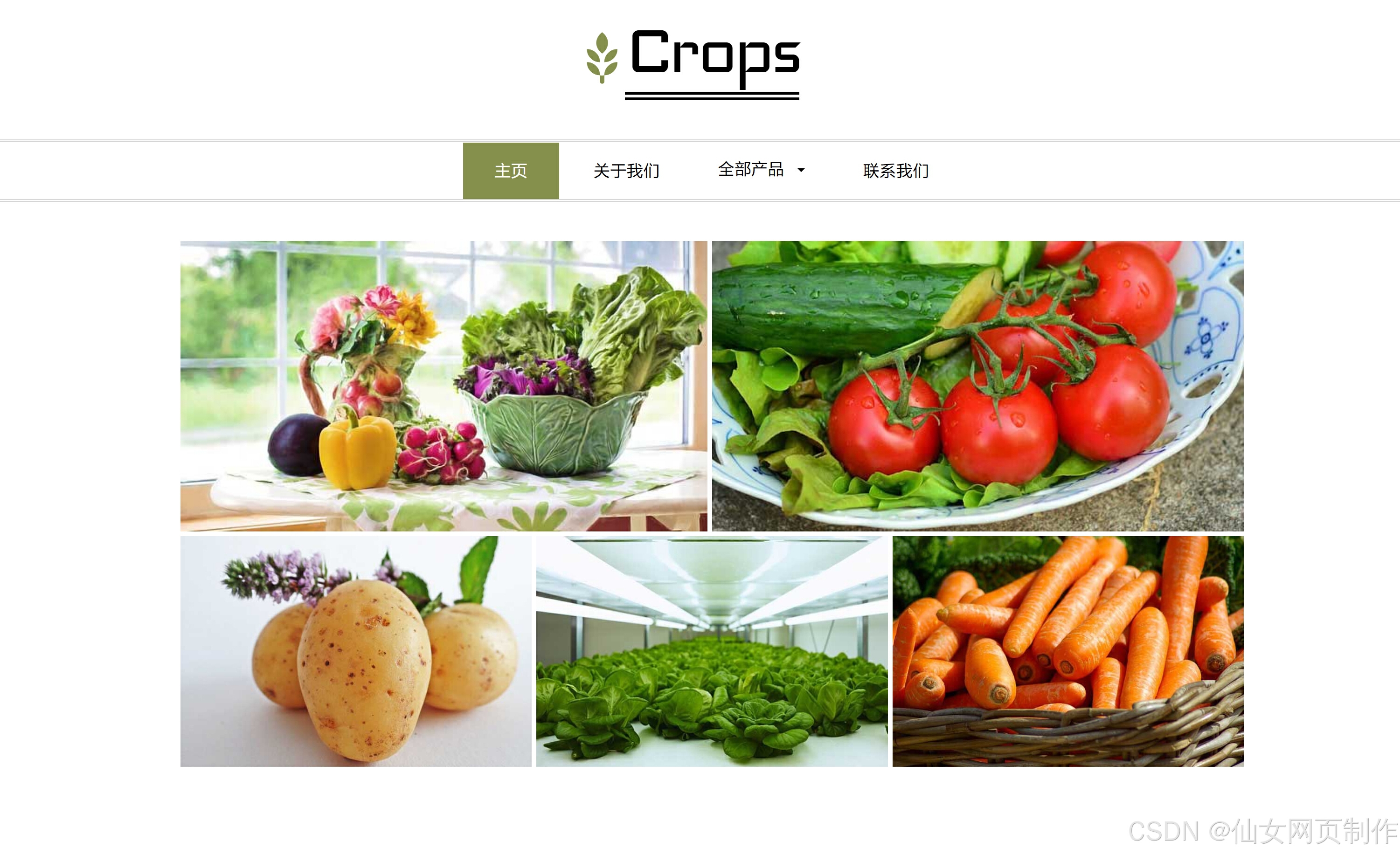
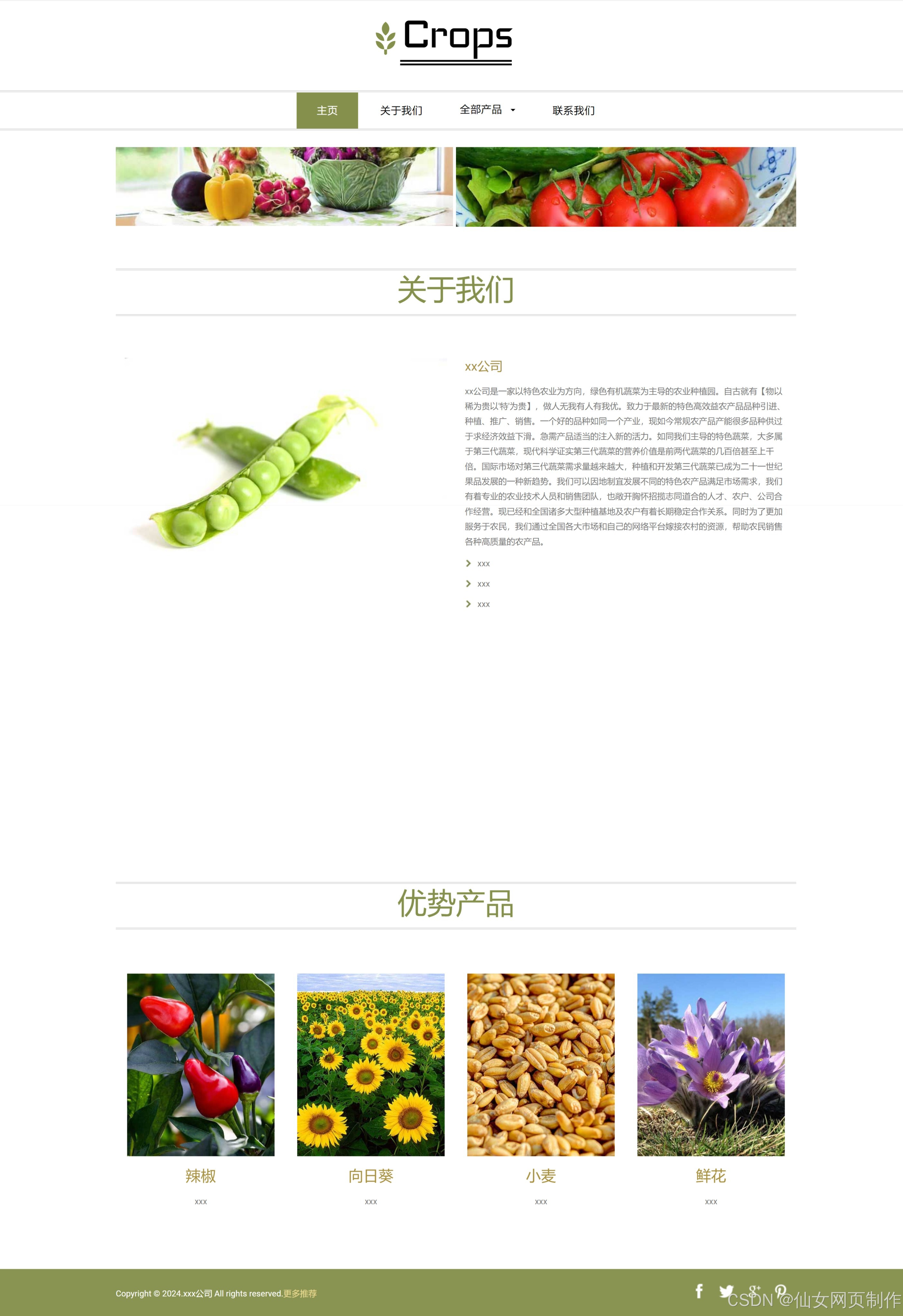
四、网页效果
以下是本篇文章正文内容,下面案例仅供参考(节选示例):

五、代码展示
1.html
<!DOCTYPE html>
<html>
<head>
<title>主页</title>
<link href="css/bootstrap.css" type="text/css" rel="stylesheet" media="all">
<link href="css/style.css" type="text/css" rel="stylesheet" media="all">
<!-- Custom Theme files -->
<meta name="viewport" content="width=device-width, initial-scale=1">
<meta http-equiv="Content-Type" content="text/html; charset=utf-8" />
<meta name="keywords" content="Crops Responsive web template, Bootstrap Web Templates, Flat Web Templates, Andriod Compatible web template,
Smartphone Compatible web template, free webdesigns for Nokia, Samsung, LG, SonyErricsson, Motorola web design" />
<script type="application/x-javascript"> addEventListener("load", function() { setTimeout(hideURLbar, 0); }, false); function hideURLbar(){ window.scrollTo(0,1); } </script>
<!-- //Custom Theme files -->
<!-- js -->
<script src="js/jquery-1.11.1.min.js"></script>
<!-- //js -->
<!-- start-smoth-scrolling-->
<script type="text/javascript" src="js/move-top.js"></script>
<script type="text/javascript" src="js/easing.js"></script>
<script type="text/javascript">
jQuery(document).ready(function($) {
$(".scroll").click(function(event){
event.preventDefault();
$('html,body').animate({scrollTop:$(this.hash).offset().top},1000);
});
});
</script>
<!--//end-smoth-scrolling-->
</head>
<body>
<div class="adcenter"><script src="js/ggad2_728x90.js"></script></div>
<!--header-->
<div class="logo">
<div class="container">
<div class="logo-info">
<a href="index.html">
<h1>Crops</h1>
<span class="glyphicon glyphicon-grain" aria-hidden="true"></span>
</a>
</div>
</div>
</div>
<!--//header-->
<!--navigation-->
<div class="top-nav">
<nav class="navbar navbar-default">
<div class="container">
<button type="button" class="navbar-toggle collapsed" data-toggle="collapse" data-target="#bs-example-navbar-collapse-1">Menu
</button>
</div>
<!-- Collect the nav links, forms, and other content for toggling -->
<div class="collapse navbar-collapse" id="bs-example-navbar-collapse-1">
<ul class="nav navbar-nav">
<li class="hvr-bounce-to-bottom active"><a href="index.html">主页</a></li>
<li class="hvr-bounce-to-bottom"><a href="about.html">关于我们</a></li>
<li><a href="#" class="dropdown-toggle hvr-bounce-to-bottom" data-toggle="dropdown" role="button" aria-haspopup="true" aria-expanded="false">全部产品<span class="caret"></span></a>
<ul class="dropdown-menu">
<li><a class="hvr-bounce-to-bottom" href="gallery.html">产品1</a></li>
<li><a class="hvr-bounce-to-bottom" href="gallery.html">产品2</a></li>
<li><a class="hvr-bounce-to-bottom" href="gallery.html">产品3</a></li>
</ul>
</li>
<li class="hvr-bounce-to-bottom"><a href="contact.html">联系我们</a></li>
</ul>
<div class="clearfix"> </div>
</div>
</nav>
</div>
<!--//navigation-->
<!--baner-->
<div class="baner">
<div class="container">
<div class="baner-grids">
<div class="col-md-6 baner-top">
<figure class="effect-bubba">
<img src="picture/img1.jpg" alt=""/>
<figcaption>
<h4>新鲜蔬菜</h4>
<p>全部蔬菜</p>
</figcaption>
</figure>
</div>
<div class="col-md-6 baner-top">
<figure class="effect-bubba">
<img src="picture/img2.jpg" alt=""/>
<figcaption>
<h4>新鲜蔬菜</h4>
<p>西红柿</p>
</figcaption>
</figure>
</div>
<div class="clearfix"> </div>
<div class="baner-row">
<div class="col-md-4 baner-bottom">
<figure class="effect-bubba">
<img src="picture/img3.jpg" alt=""/>
<figcaption>
<h4>新鲜蔬菜</h4>
<p>土豆</p>
</figcaption>
</figure>
</div>
<div class="col-md-4 baner-bottom">
<figure class="effect-bubba">
<img src="picture/img4.jpg" alt=""/>
<figcaption>
<h4>新鲜蔬菜</h4>
<p>青菜</p>
</figcaption>
</figure>
</div>
<div class="col-md-4 baner-bottom">
<figure class="effect-bubba">
<img src="picture/img5.jpg" alt=""/>
<figcaption>
<h4>新鲜蔬菜</h4>
<p>胡萝卜</p>
</figcaption>
</figure>
</div>
<div class="clearfix"> </div>
</div>
</div>
</div>
</div>
<!--//baner-->
<div class="copyrights">Collect from <a href="http://www.cssmoban.com/" title="网站模板">网站模板</a></div>
<!-- news -->
<div class="news-info">
<div class="container">
<h3 class="title">热销产品</h3>
</div>
</div>
<!-- container -->
<div class="container">
<div class="news">
<div class="news-grids">
<div class="col-md-4 news-grid">
<div class="news-grid-left news-grid-left-img">
<h6>青菜</h6>
</div>
<div class="news-grid-left-info">
<h5>新鲜蔬菜</h5>
<p>青菜</p>
</div>
</div>
<div class="col-md-4 news-grid">
<div class="news-grid-left news-grid-middle">
<h6>辣椒</h6>
</div>
<div class="news-grid-left-info">
<h5>新鲜蔬菜</h5>
<p>辣椒</p>
</div>
</div>
<div class="col-md-4 news-grid">
<div class="news-grid-left news-grid-right">
<h6>豆角</h6>
</div>
<div class="news-grid-left-info">
<h5>新鲜蔬菜</h5>
<p>豆角</p>
</div>
</div>
<div class="clearfix"> </div>
</div>
</div><!-- //container -->
</div>
<!-- //news -->
<!--main-->
<div class="main">
<div class="container">
<div class="main-grids">
<div class="col-md-6 main-left">
<img src="picture/img6.jpg" alt=""/>
<h4>新鲜蔬菜</h4>
<p>蚕豆</p>
<a href="#" class="more btn btn-1 btn-1b">查看更多</a>
</div>
<div class="col-md-6 main-right">
<div class="col-md-6 main-text">
<img src="picture/img7.jpg" alt=""/>
</div>
<div class="col-md-6 main-text">
<h4>新鲜蔬菜</h4>
<p>西红柿</p>
<a href="#" class="more btn btn-1 btn-1b">查看更多</a>
</div>
<div class="clearfix"> </div>
</div>
<div class="clearfix"> </div>
</div>
</div>
</div>
<!--//main-->
...
2.CSS
代码如下(节选示例):
body{
margin:0;
font-family: 'Roboto-Regular';
}
@font-face {
font-family: 'Roboto-Regular';
src: url(../fonts/roboto-regular.ttf) format('truetype');
}
@font-face {
font-family: 'Iceland-Regular';
src: url(../fonts/iceland-regular.ttf) format('truetype');
}
body a{
transition: 0.5s all ease;
-webkit-transition: 0.5s all ease;
-moz-transition: 0.5s all ease;
-o-transition: 0.5s all ease;
-ms-transition: 0.5s all ease;
text-decoration:none;
}
h1,h2,h3,h4,h5,h6{
margin:0;
}
p{
margin:0;
}
ul,label{
margin:0;
padding:0;
}
body a:hover{
text-decoration:none;
}
/*--header--*/
.logo {
padding: 0.8em 0 3em;
text-align: center;
}
.logo a{
display:inline-block;
}
.logo a h1 {
font-size: 6.5em;
font-family: 'Iceland-Regular';
color: #000;
letter-spacing: -5px;
border-bottom: 9px double #000;
line-height: 0.98em;
}
.logo-info {
position: relative;
}
.logo span.glyphicon.glyphicon-grain {
font-size: 4em;
position: absolute;
top: 26%;
left: 37%;
color: #84904b;
}
/*--top-nav--*/
.top-nav {
border-top: 3px double #D8D7D7;
border-bottom: 3px double #D8D7D7;
}
ul.nav.navbar-nav{
float: none;
text-align: center;
}
nav.navbar.navbar-default {
background-color: inherit;
border: none;
margin: 0;
}
.navbar-nav > li {
float: none;
display: inline-block;
}
.navbar-default .navbar-nav > li > a {
color: #000;
text-decoration: none;
letter-spacing: 1px;
font-size: 1.2em;
padding: 1.2em 2em;
}
.navbar-default .navbar-nav > li > a:hover, .navbar-default .navbar-nav > li > a:focus {
color: #377952;
}
/* Effect 11: text fill based on Lea Verou's animation http://dabblet.com/gist/6046779 */
/* Bounce To Bottom */
.hvr-bounce-to-bottom {
display: inline-block;
vertical-align: middle;
-webkit-transform: translateZ(0);
-ms-transform: translateZ(0);
-o-transform: translateZ(0);
-moz-transform: translateZ(0);
transform: translateZ(0);
box-shadow: 0 0 1px rgba(0, 0, 0, 0);
-webkit-backface-visibility: hidden;
backface-visibility: hidden;
-moz-osx-font-smoothing: grayscale;
position: relative;
-webkit-transition-property: color;
transition-property: color;
-webkit-transition-duration: 0.5s;
-moz-transition-duration: 0.5s;
transition-duration: 0.5s;
}
.hvr-bounce-to-bottom:before {
content: "";
position: absolute;
z-index: -1;
top: 0;
left: 0;
right: 0;
bottom: 0;
...
3.JS
代码如下(节选示例):
jQuery.extend( jQuery.easing,
{
easeInQuad: function (x, t, b, c, d) {
return c*(t/=d)*t + b;
},
easeOutQuad: function (x, t, b, c, d) {
return -c *(t/=d)*(t-2) + b;
},
easeInOutQuad: function (x, t, b, c, d) {
if ((t/=d/2) < 1) return c/2*t*t + b;
return -c/2 * ((--t)*(t-2) - 1) + b;
},
easeInCubic: function (x, t, b, c, d) {
return c*(t/=d)*t*t + b;
},
easeOutCubic: function (x, t, b, c, d) {
return c*((t=t/d-1)*t*t + 1) + b;
},
easeInOutCubic: function (x, t, b, c, d) {
if ((t/=d/2) < 1) return c/2*t*t*t + b;
return c/2*((t-=2)*t*t + 2) + b;
},
easeInQuart: function (x, t, b, c, d) {
return c*(t/=d)*t*t*t + b;
},
easeOutQuart: function (x, t, b, c, d) {
return -c * ((t=t/d-1)*t*t*t - 1) + b;
},
easeInOutQuart: function (x, t, b, c, d) {
if ((t/=d/2) < 1) return c/2*t*t*t*t + b;
return -c/2 * ((t-=2)*t*t*t - 2) + b;
},
easeInQuint: function (x, t, b, c, d) {
return c*(t/=d)*t*t*t*t + b;
},
easeOutQuint: function (x, t, b, c, d) {
return c*((t=t/d-1)*t*t*t*t + 1) + b;
},
easeInOutQuint: function (x, t, b, c, d) {
if ((t/=d/2) < 1) return c/2*t*t*t*t*t + b;
return c/2*((t-=2)*t*t*t*t + 2) + b;
},
easeInSine: function (x, t, b, c, d) {
return -c * Math.cos(t/d * (Math.PI/2)) + c + b;
},
easeOutSine: function (x, t, b, c, d) {
return c * Math.sin(t/d * (Math.PI/2)) + b;
},
easeInOutSine: function (x, t, b, c, d) {
return -c/2 * (Math.cos(Math.PI*t/d) - 1) + b;
},
easeInExpo: function (x, t, b, c, d) {
return (t==0) ? b : c * Math.pow(2, 10 * (t/d - 1)) + b;
},
easeOutExpo: function (x, t, b, c, d) {
return (t==d) ? b+c : c * (-Math.pow(2, -10 * t/d) + 1) + b;
},
easeInOutExpo: function (x, t, b, c, d) {
if (t==0) return b;
if (t==d) return b+c;
if ((t/=d/2) < 1) return c/2 * Math.pow(2, 10 * (t - 1)) + b;
return c/2 * (-Math.pow(2, -10 * --t) + 2) + b;
},
easeInCirc: function (x, t, b, c, d) {
return -c * (Math.sqrt(1 - (t/=d)*t) - 1) + b;
},
easeOutCirc: function (x, t, b, c, d) {
return c * Math.sqrt(1 - (t=t/d-1)*t) + b;
},
easeInOutCirc: function (x, t, b, c, d) {
if ((t/=d/2) < 1) return -c/2 * (Math.sqrt(1 - t*t) - 1) + b;
return c/2 * (Math.sqrt(1 - (t-=2)*t) + 1) + b;
},
easeInElastic: function (x, t, b, c, d) {
var s=1.70158;var p=0;var a=c;
if (t==0) return b; if ((t/=d)==1) return b+c; if (!p) p=d*.3;
if (a < Math.abs(c)) { a=c; var s=p/4; }
else var s = p/(2*Math.PI) * Math.asin (c/a);
return -(a*Math.pow(2,10*(t-=1)) * Math.sin( (t*d-s)*(2*Math.PI)/p )) + b;
},
easeOutElastic: function (x, t, b, c, d) {
var s=1.70158;var p=0;var a=c;
if (t==0) return b; if ((t/=d)==1) return b+c; if (!p) p=d*.3;
if (a < Math.abs(c)) { a=c; var s=p/4; }
else var s = p/(2*Math.PI) * Math.asin (c/a);
return a*Math.pow(2,-10*t) * Math.sin( (t*d-s)*(2*Math.PI)/p ) + c + b;
},
easeInOutElastic: function (x, t, b, c, d) {
var s=1.70158;var p=0;var a=c;
if (t==0) return b; if ((t/=d/2)==2) return b+c; if (!p) p=d*(.3*1.5);
if (a < Math.abs(c)) { a=c; var s=p/4; }
else var s = p/(2*Math.PI) * Math.asin (c/a);
if (t < 1) return -.5*(a*Math.pow(2,10*(t-=1)) * Math.sin( (t*d-s)*(2*Math.PI)/p )) + b;
return a*Math.pow(2,-10*(t-=1)) * Math.sin( (t*d-s)*(2*Math.PI)/p )*.5 + c + b;
},
easeInBack: function (x, t, b, c, d, s) {
if (s == undefined) s = 1.70158;
return c*(t/=d)*t*((s+1)*t - s) + b;
},
easeOutBack: function (x, t, b, c, d, s) {
if (s == undefined) s = 1.70158;
return c*((t=t/d-1)*t*((s+1)*t + s) + 1) + b;
},
...
六、总结
设计一个样式美观又人性化的网页,除了具备扎实的专业知识,还需具备美学和人机工程学等相关知识,优秀的网页应具备以下几个特点:
1.简洁实用
尽量以最高效率的方式将用户所要想得到的信息传送给他就是最好的,要去掉所有的冗余的东西;
2.使用方便
要满足使用者的要求,网页适合使用,显示出其功能美;
3.整体性好
围绕一个统一的目标设计,强调整体的功能性;
4.形象突出
尽量符合网页美的标准,能够使网站的形象得到最大限度的提升,追求雅俗共赏。页面用色协调,布局符合形式美的要求:布局有条理,充分利用美的形式,使网页富有可欣赏性,提高档次。
5.交互式强
发挥网络的优势,想方设法使每个使用者都参与到其中来。


 扫一扫
扫一扫


 647
647

 被折叠的 条评论
为什么被折叠?
被折叠的 条评论
为什么被折叠?
 到【灌水乐园】发言


