


Position属性定义及使用说明
position 属性指定一个元素(静态的,相对的,绝对或固定)的定位方法的类型。
| 属性值 | 描述 |
|---|---|
| absolute | 绝对定位元素 元素的位置可以通过 left、top、right、bottom 属性进行修改 |
| fixed | 固定定位元素 元素的位置可以通过 left、top、right、bottom 属性进行修改 |
| relative | 相对定位元素 |
| static | 默认值,没有定位(就是没有定位效果) |
| sticky | 粘性定位 |
| inherit | 继承父元素 position 的值 |
absolute
介绍:absolute 绝对定位
absolute 是相对于文档进行定位的。
absolute 作为子元素时,且父级元素也添加了定位属性,则是相对于父元素的左上角进行定位,否则还是相对于文档进行定位
代码展示
代码:示例一
<div class="content"></div>
<style>
	.content {
		width: 100px;
		height: 100px;
		position: absolute;
		top: 50px;
		left: 50px;
		background: #409EFF;
	}
</style>
代码:示例二
<div class="father">
	<div class="children"></div>
</div>
<style>
    .father {
        width: 200px;
        height: 200px;
        background: #409EFF;
        margin: 100px 0 0 100px;
        /* 修改后添加的代码 */
        position: relative;
    }

    .children {
        width: 50px;
        height: 50px;
        position: absolute;
        top: 10px;
        left: 10px;
        background: #F56C6C;
    }
</style>
效果展示
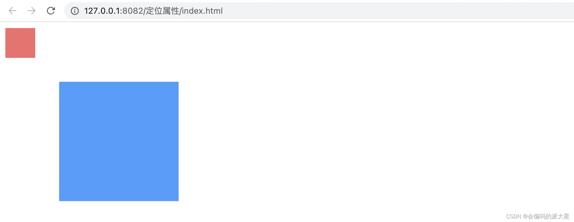
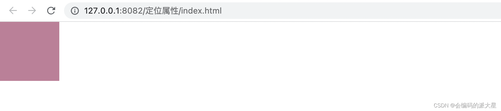
示例一

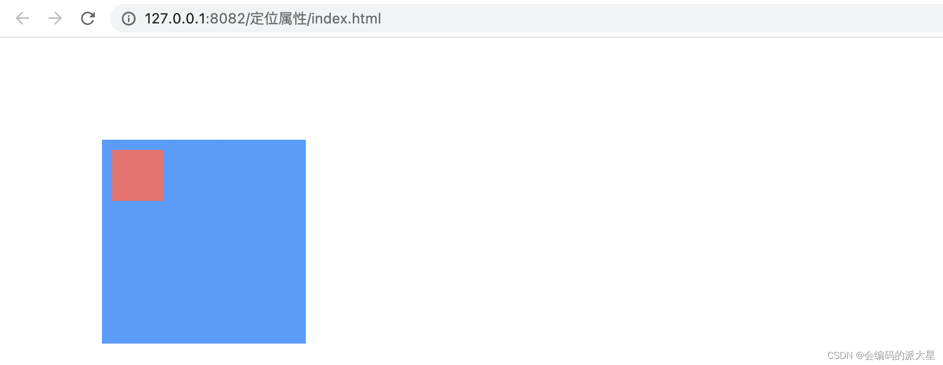
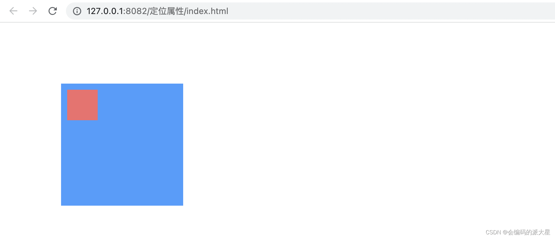
示例二
这里可以看到子元素设置了 position:absolute; 相对定位,但是是相对于文档进行定位的而不是相对于父级
如果想让子级相对于父级定位的话,需要也为父元素添加一个定位属性 position: relative;
修改后
fixed
使一个元素脱离文档,固定在某个地方,文档滚动时该元素也不会跟随文档滚动。
<!DOCTYPE html>
<html lang="en">

<head>
    <meta charset="UTF-8">
    <meta http-equiv="X-UA-Compatible" content="IE=edge">
    <meta name="viewport" content="width=device-width, initial-scale=1.0">
    <title>Document</title>
    <style>
        * {
            margin: 0;
            padding: 0;
        }

        .fixed {
            width: 100px;
            height: 100px;
            background: #409EFF;
            position: fixed;
            left: 50px;
            top: 200px;
        }

        .height {
            height: 10000px;
        }
    </style>
</head>

<body>
    <div class="fixed"></div>
    <div class="height"></div>
</body>

</html>

relative
一个对比带你了解 relative
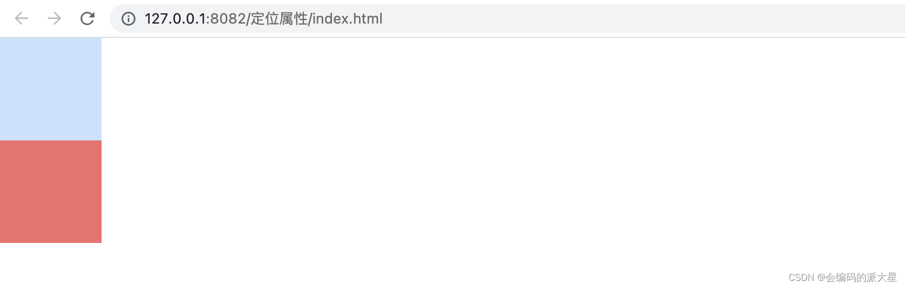
这里是两个元素
<div class="item1"></div>
<div class="item2"></div>
<style>
    .item1 {
        width: 100px;
        height: 100px;
        background: #409EFF;
    }

    .item2 {
        width: 100px;
        height: 100px;
        background: #F56C6C;
    }
</style>
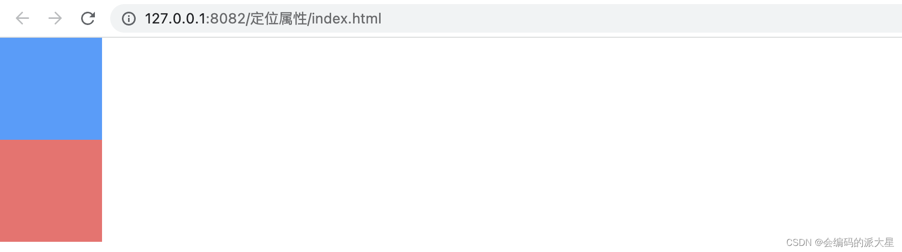
在给 item1 设置了 position: absolute; 绝对定位后的效果
你会发现 item2 不见了(其实是重叠了)给 item1 添加一个透明的
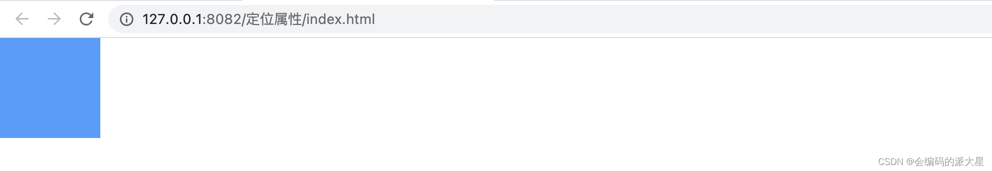
但是如果 item1 设置的是 position: relative; 就不会出现重叠的现象
即使使用left、top、right、bottom, item2 依旧不会占取 item1 之前的位置
这样说明了什么呢:
说明position: absolute; 脱离的文档在页面中不会占取位置
而 position: relative; 依旧占取文档的位置
偏移后

sticky
当元素在可视区域内不受left、top、right、bottom的影响
当页面开始滚动,元素即将离开可视区域时,定位会变成fxied,可以根据left、top、right、bottom的值进行定位。
<!DOCTYPE html>
<html lang="en">

<head>
    <meta charset="UTF-8">
    <meta http-equiv="X-UA-Compatible" content="IE=edge">
    <meta name="viewport" content="width=device-width, initial-scale=1.0">
    <title>Document</title>
    <style>
        * {
            margin: 0;
            padding: 0;
        }

        .fixed {
            width: 100px;
            height: 100px;
            background: #409EFF;
            position: sticky;
            top: 0px;
        }

        .height {
            height: 10000px;
        }
    </style>
</head>

<body>
    <div style="width:100%;height: 100px;"></div>
    <div class="fixed"></div>
    <div class="height"></div>
</body>

</html>

inherit
inherit 这个就是继承父元素的定位属性
<div class="father">
	<div class="children"></div>
	<div class="children"></div>
</div>
<style>
    * {
        margin: 0;
        padding: 0;
    }

    .father {
        width: 200px;
        height: 200px;Ï
        background: #409EFF;
        margin: 100px 0 0 100px;
        /* 来回切换一下父元素定位属性的值就可以看出效果了 absolute / relative */
        position: absolute;
    }

    .children {
        width: 50px;
        height: 50px;
        position: inherit;
        top: 10px;
        left: 10px;
        background: #F56C6C;
    }
</style>


 156
156


 被折叠的 条评论
为什么被折叠?
被折叠的 条评论
为什么被折叠?
 到【灌水乐园】发言


