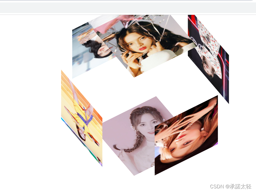
效果图(如下):
代码如下:
.box {
position: relative;
width: 200px;
height: 200px;
margin: 50px auto;
margin-top: 90px;
transform-style: preserve-3d;
}
.box:hover>.face .top {
transform: translateY(-200px) rotateX(-90deg);
}
.box:hover>.face .bottom {
transform: translateY(200px) rotateX(-90deg);
}
.box:hover>.face .left {
transform: translateX(-200px) rotateY(-270deg);
}
.box:hover>.face .right {
transform: translateX(200px) rotateY(90deg);
}
.box:hover>.face .font {
transform: translateZ(-200px);
}
.box:hover>.face .behind {
transform: translateZ(200px);
}
.face {
position: absolute;
width: 100%;
height: 100%;
transform-style: preserve-3d;
animation-name: donghua;
animation-duration: 8s;
animation-timing-function: linear;
animation-iteration-count: infinite;
}
img {
width: 100%;
height: 100%;
}
.top {
transform: translateY(-100px) rotateX(-90deg);
}
.bottom {
transform: translateY(100px) rotateX(-90deg);
}
.left {
transform: translateX(-100px) rotateY(270deg);
}
.right {
transform: translateX(100px) rotateY(270deg);
}
.font {
transform: translateZ(-100px);
}
.behind {
transform: translateZ(100px);
}
@keyframes donghua {
form {
transform: rotateX(0deg) rotateY(0deg);
}
to {
transform: rotateX(540deg) rotateY(360deg);
}
}
<div class="box">
<div class="face"><img class="top" src="./images/images/chaoYue_1.jpeg" alt=""></div>
<div class="face"><img class="bottom" src="./images/images/chaoYue_2.jpeg" alt=""></div>
<div class="face"><img class="left" src="./images/images/meiQi_1.jpeg" alt=""></div>
<div class="face"><img class="right" src="./images/images/meiQi_2.jpeg" alt=""></div>
<div class="face"><img class="font" src="./images/images/xuanYi_1.jpeg" alt=""></div>
<div class="face"><img class="behind" src="./images/images/xuanYi_2.jpeg" alt=""></div>
</div>


 953
953


 被折叠的 条评论
为什么被折叠?
被折叠的 条评论
为什么被折叠?
 到【灌水乐园】发言


