


构建函数-@BuilderParam 传递 UI
1. 引言
@BuilderParam 该装饰器用于声明任意UI描述的一个元素,类似slot占位符。 简而言之:就是自定义组件允许外部传递 UI
@Entry
@Component
struct Index {
  build() {
    Column({ space: 15 }) {
      SonCom() {
        // 直接传递进来(尾随闭包)
        Button('传入的结构')
          .onClick(() => {
            AlertDialog.show({ message: '点了 Button' })
          })
      }
    }
  }
}
2. 单个@BuilderParam参数
首先来看看单个的情况:
使用尾随闭包的方式传入:
- 组件内有且仅有一个使用 @BuilderParam 装饰的属性,即可使用尾随闭包
- 内容直接在 {} 传入即可 注意:
- 此场景下自定义组件不支持使用通用属性。
@Component
struct SonCom {
// 由外部传入 UI
@BuilderParam ContentBuilder: () => void = this.defaultBuilder
// 设置默认 的 Builder,避免外部不传入
@Builder
defaultBuilder() {
Text('默认的内容')
}
build() {
Column() {
this.ContentBuilder()
}
.width(300)
.height(200)
.border({ width: .5 })
}
}
@Entry
@Component
struct Index {
build() {
Column({ space: 15 }) {
SonCom() {
// 直接传递进来
Button('传入的结构')
.onClick(() => {
AlertDialog.show({ message: '点了 Button' })
})
}
}
}
}3. 多个@BuilderParam 参数
子组件有多个BuilderParam,必须通过参数的方式来传入
核心步骤:
-
自定义组件-定义: 添加多个 @BuilderParam ,并定义默认值
-
自定义组件-使用 通过参数的形式传入多个 Builder,比如这里的 SonCom({ titleBuilder: this.fTitleBuilder, contentBuilder: this.fContentBuilder })
需求:
-
调整 卡片自定义组件,支持传入 UI PanelComp(){ // 此处传入 }
思路:
-
直接大括号(尾随闭包)传入只需要设置一个BuilderParam即可:
@Component
struct PanelComp {
title: string = ''
more: string = ''
@BuilderParam contentBuilder: () => void = this.defaultContentBuilder
clickHandler: () => void = () => {
AlertDialog.show({ message: '默认提示' })
}
@Builder
defaultContentBuilder() {
Text('默认的内容~')
}
build() {
Column() {
Row() {
Text(this.title)
.layoutWeight(1)
.fontWeight(600)
Row() {
Text(this.more)
.fontSize(14)
.fontColor('#666666')
.onClick(() => {
this.clickHandler()
})
Image('/common/day08-10/ic_public_arrow_right.svg')
.width(16)
.fillColor('#666666')
}
}
.padding(10)
Row() {
this.contentBuilder()
}
.height(100)
}
.borderRadius(12)
.backgroundColor('#fff')
}
}
@Entry
@Component
struct Index {
build() {
Column({ space: 15 }) {
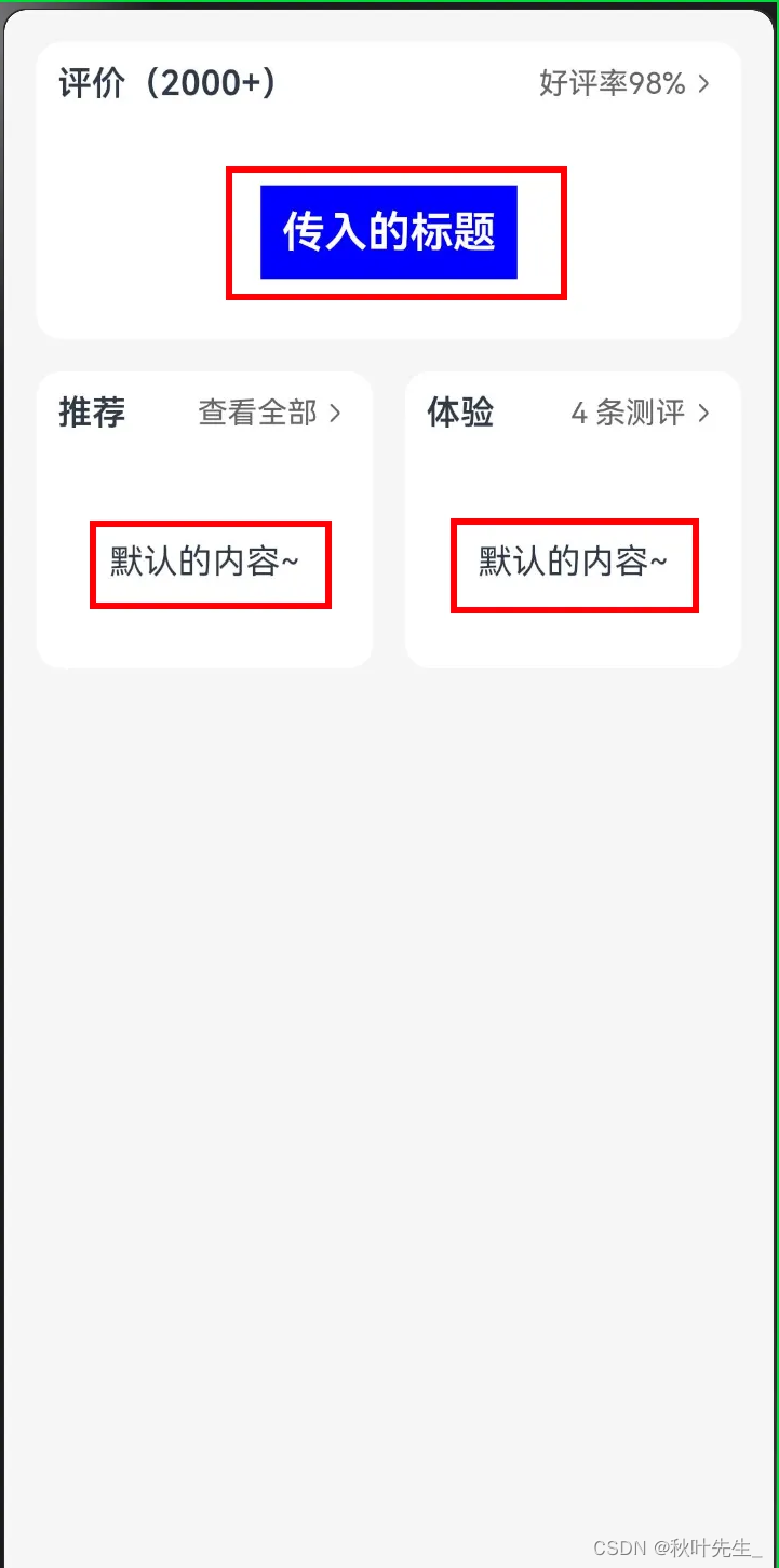
PanelComp({
title: '评价(2000+)', more: '好评率98%', clickHandler() {
console.log('传入的逻辑')
}
}) {
Text('传入的标题')
.fontSize(20)
.fontWeight(600)
.fontColor(Color.White)
.backgroundColor(Color.Blue)
.padding(10)
}
Row({ space: 15 }) {
PanelComp({ title: '推荐', more: '查看全部' })
.layoutWeight(1)
PanelComp({ title: '体验', more: '4 条测评' })
.layoutWeight(1)
}
}
.height('100%')
.padding(15)
.backgroundColor('#f5f5f5')
}
}4. 使用场景
这里简单举例两个关于我项目中适合使用的场景:
4.1. 任务列表页面
-
自定义插槽
@Preview
@Component
struct HmToggleCard {
title: string = "测试"
@State
toggleCard: boolean = true // 默认是展开的
@BuilderParam
CardContent: () => void
build() {
Column() {
Row() {
Text(this.title)
.fontSize(16)
.fontColor($r('app.color.text_primary'))
.fontWeight(600)
Image(this.toggleCard ? $r("app.media.ic_btn_cut") :
$r("app.media.ic_btn_add"))
.width(24)
.height(24)
.onClick(() => {
animateTo({ duration: 300 }, () => {
this.toggleCard = !this.toggleCard
})
})
}
.width('100%')
.justifyContent(FlexAlign.SpaceBetween)
.height(50)
// 放置传入的内容
if(this.CardContent && this.toggleCard) {
this.CardContent()
}
}
.padding({
left: 19.5,
right: 19.5,
bottom: 18.5
})
.margin({
left: 15,
right: 15,
top: 15
})
.backgroundColor($r('app.color.white'))
.borderRadius(10)
}
}
export { HmToggleCard }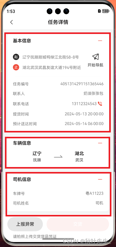
-
页面中进行复用的主要代码:
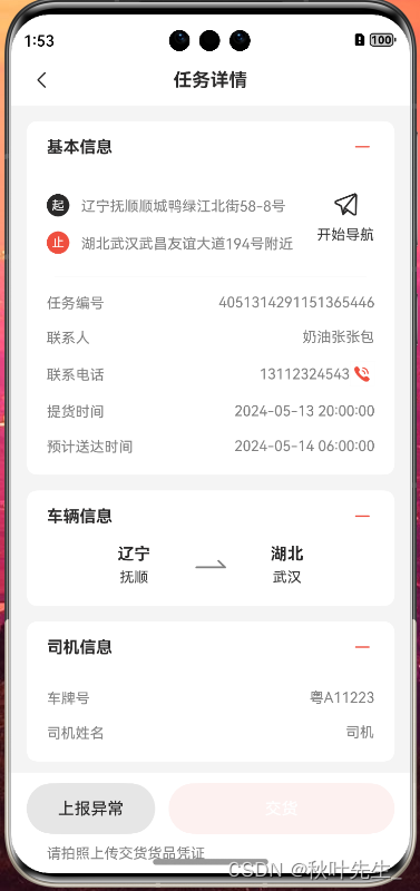
build() {
Column() {
HmNavBar({ title: '任务详情' })
Scroll(this.scroll) {
// Scroll里面只能有一个组件
Column() {
HmToggleCard({ title: '基本信息' }) {
this.getBaseContent()
}
HmToggleCard({ title: '车辆信息' }) {
this.getTransLineContent()
}
HmToggleCard({ title: '司机信息' }) {
this.getDriverContent()
}
if (this.taskDetailData.exceptionList?.length > 0) {
HmToggleCard({ title: '异常信息' }) {
this.getExceptionContent()
}
}
if (this.taskDetailData.status === TaskTypeEnum.Waiting ||
this.taskDetailData.status === TaskTypeEnum.Delivered ||
this.taskDetailData.status === TaskTypeEnum.Finish
) {
HmToggleCard({ title: '提货信息' }) {
this.getPickUpContent()
}
}
if (this.taskDetailData.status === TaskTypeEnum.Line ||
this.taskDetailData.status === TaskTypeEnum.Delivered
|| this.taskDetailData.status === TaskTypeEnum.Finish
) {
HmToggleCard({ title: '交货信息' }) {
this.getDeliverContent()
}
}
}
.padding({
bottom: 130
})
}
if (this.taskDetailData.status !== TaskTypeEnum.Finish) {
// 只有在非完成情况下 才显示底部按钮
this.getBottomBtn()
}
}.backgroundColor($r('app.color.background_page'))
.height('100%')
}4.2. 设置页面
-
自定义插槽
@Component
export struct MkCell {
@Prop label: string = ''
@Prop value: string = ''
@Prop icon: ResourceStr = $r('app.media.ic_public_right')
@Prop hasBorder: boolean = true
@Builder
DefaultLabelBuilder() {
Text(this.label)
.fontSize(14)
.fontColor($r('app.color.black'))
}
@Builder
DefaultIconBuilder() {
Image(this.icon)
.width(20)
.aspectRatio(1)
.fillColor($r('app.color.gray'))
}
@BuilderParam customLabel: () => void = this.DefaultLabelBuilder
@BuilderParam customIcon: () => void = this.DefaultIconBuilder
build() {
Row({ space: 8 }) {
this.customLabel()
Blank()
if (this.value) {
Text(this.value)
.fontSize(14)
.fontColor($r('app.color.gray'))
}
this.customIcon()
}
.width('100%')
.constraintSize({ minHeight: 50 })
.border({ width: { bottom: this.hasBorder ? 0.6 : 0 }, color: $r('app.color.under') })
}
}
@Component
export struct MkCellGroup {
@Builder
DefaultBuilder() {
}
@BuilderParam default: () => void = this.DefaultBuilder
build() {
Column() {
this.default()
}
.border({
width: { top: 0.6, bottom: 0.6 },
color: $r('app.color.under')
})
.padding({ left: 16, right: 16 })
.backgroundColor($r('app.color.white'))
}
}-
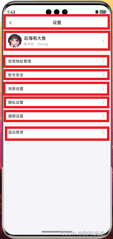
页面中进行复用的主要代码:
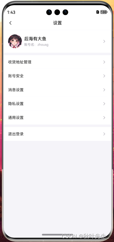
build() {
Column() {
MkNavbar({ title: '设置' })
Column({ space: 8 }) {
MkCellGroup() {
// 尾随闭包,MkCellGroup中只有一个 BuilderParam 即可使用尾随闭包
// 多个 BuilderParam 需要用{}进行传递
MkCell({
hasBorder: false, customLabel: () => {
this.ProfileBuilder()
}
})
}
MkCellGroup() {
MkCell({ label: '收货地址管理' })
MkCell({ label: '账号安全' })
MkCell({ label: '消息设置' })
MkCell({ label: '隐私设置' })
MkCell({ label: '通用设置', hasBorder: false })
}
MkCellGroup() {
MkCell({ label: '退出登录', hasBorder: false })
.onClick(() => {
auth.removeUser()
router.back()
})
}
}
}
.width('100%')
.height('100%')
.backgroundColor($r('app.color.under'))
}5.总结
当开发者创建了自定义组件,并想对该组件添加特定功能时,例如在自定义组件中添加一个点击跳转操作。若直接在组件内嵌入事件方法,将会导致所有引入该自定义组件的地方均增加了该功能。为解决此问题,ArkUI引入了@BuilderParam装饰器,@BuilderParam用来装饰指向@Builder方法的变量(@BuilderParam是用来承接@Builder函数的),开发者可在初始化自定义组件时对此属性进行赋值,为自定义组件增加特定的功能。该装饰器用于声明任意UI描述的一个元素,类似slot占位符。
1. 使用尾随闭包的方式传入:(开发者可以将尾随闭包内的内容看做@Builder装饰的函数传给@BuilderParam)
●组件内有且仅有一个使用 @BuilderParam 装饰的属性,即可使用尾随闭包。
●在初始化自定义组件时,组件后紧跟一个大括号“{}”形成尾随闭包场景。
注意:
●此场景下自定义组件不支持使用通用属性。
2. 多个@BuilderParam(无法使用尾随闭包)
需注意this指向正确。
Parent组件在调用this.componentBuilder()时,this指向其所属组件,即“Parent”。@Builder componentBuilder()通过this.componentBuilder的形式传给子组件@BuilderParam customBuilderParam,this指向在Child的label,即“Child”。@Builder componentBuilder()通过():void=>{this.componentBuilder()}的形式传给子组件@BuilderParam customChangeThisBuilderParam,因为箭头函数的this指向的是宿主对象,所以label的值为“Parent”。


 348
348


 被折叠的 条评论
为什么被折叠?
被折叠的 条评论
为什么被折叠?
 到【灌水乐园】发言


