


 博客主要介绍了Flex布局,先用div容器创建,在.container中加入display:flex。详细阐述了Flex常用属性,如display、flex-direction、justify-content等,说明了各属性作用及属性值含义,并对部分属性进行了演示,帮助理解Flex布局的使用。
文章目录
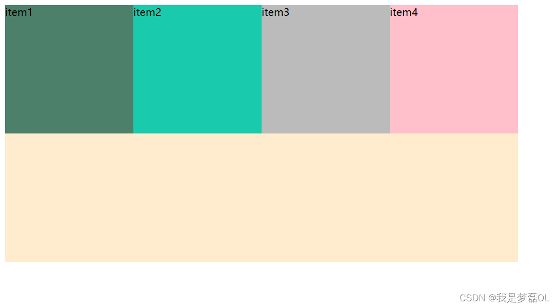
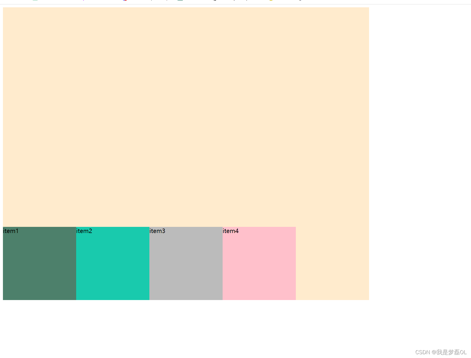
1,首先,先用div容器做这样几个容器
css
 .container{
            display: flex;
            width: 800px;
            height: 400px;
            background-color: blanchedalmond;


        }

        .one{
            width: 200px;
            height: 200px;
            background-color: #4d806b;
        }
        .two{
             width: 200px;
            height: 200px;
            background-color: #19CAAD;
        }
        .three{
             width: 200px;
            height: 200px;
            background-color: #bbbbbb;
        }
        .four{
             width: 200px;
            height: 200px;
            background-color: pink;
        }
html
<div class="container">
    <div class="one">item1</div>
    <div class="two">item2</div>
    <div class="three">item3</div>
    <div class="four">item4</div>

</div>
注意 :我们这里唯一特别的就是 .container中加入了一个 display:flex
2,flex的常用属性如下(后面会慢慢演示)
- display
display属性用于定义一个容器是Flex容器,直接设置该属性的值为flex即可,如:display: flex;
- flex-direction
该属性用于设置Flex容器内的主轴方向,属性值可以为:row(主轴为水平方向)、column(主轴为垂直方向)、row-reverse(反转水平方向)、column-reverse(反转垂直方向)。
- justify-content
该属性用于设置Flex容器内的项目在主轴方向上的对齐方式,属性值可以为:flex-start(默认,左对齐)、flex-end(右对齐)、center(居中对齐)、space-between(两端对齐)、space-around(四周对齐)。
- align-items
该属性用于设置Flex容器内的项目在交叉轴方向上的对齐方式,属性值可以为:flex-start(默认,顶部对齐)、flex-end(底部对齐)、center(竖直方向居中对齐)、baseline(基线对齐)、stretch(拉伸对齐)。
- flex-wrap
该属性用于设置Flex容器内项目的换行方式,属性值可以为:nowrap(不换行,全部展示)、wrap(自动换行)、wrap-reverse(反向换行)。
- align-content
该属性用于设置多行Flex容器的对齐方式,如果只有一行,则没有效果。属性值可以为:flex-start、flex-end、center、space-between、space-around、stretch。
3, flex-direction属性演示
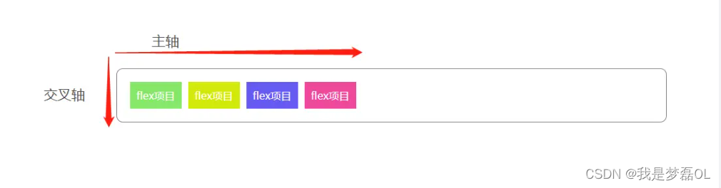
flex 布局有两个轴,主轴和交叉轴,至于哪个是主轴哪个是交叉轴则有flex 容器的flex-direction属性决定,默认为:flex-direction:row,既横向为主轴,纵向为交叉轴,
该属性用于设置Flex容器内的主轴方向,属性值可以为:row(主轴为水平方向)、column(主轴为垂直方向)、row-reverse(反转水平方向)、column-reverse(反转垂直方向)。
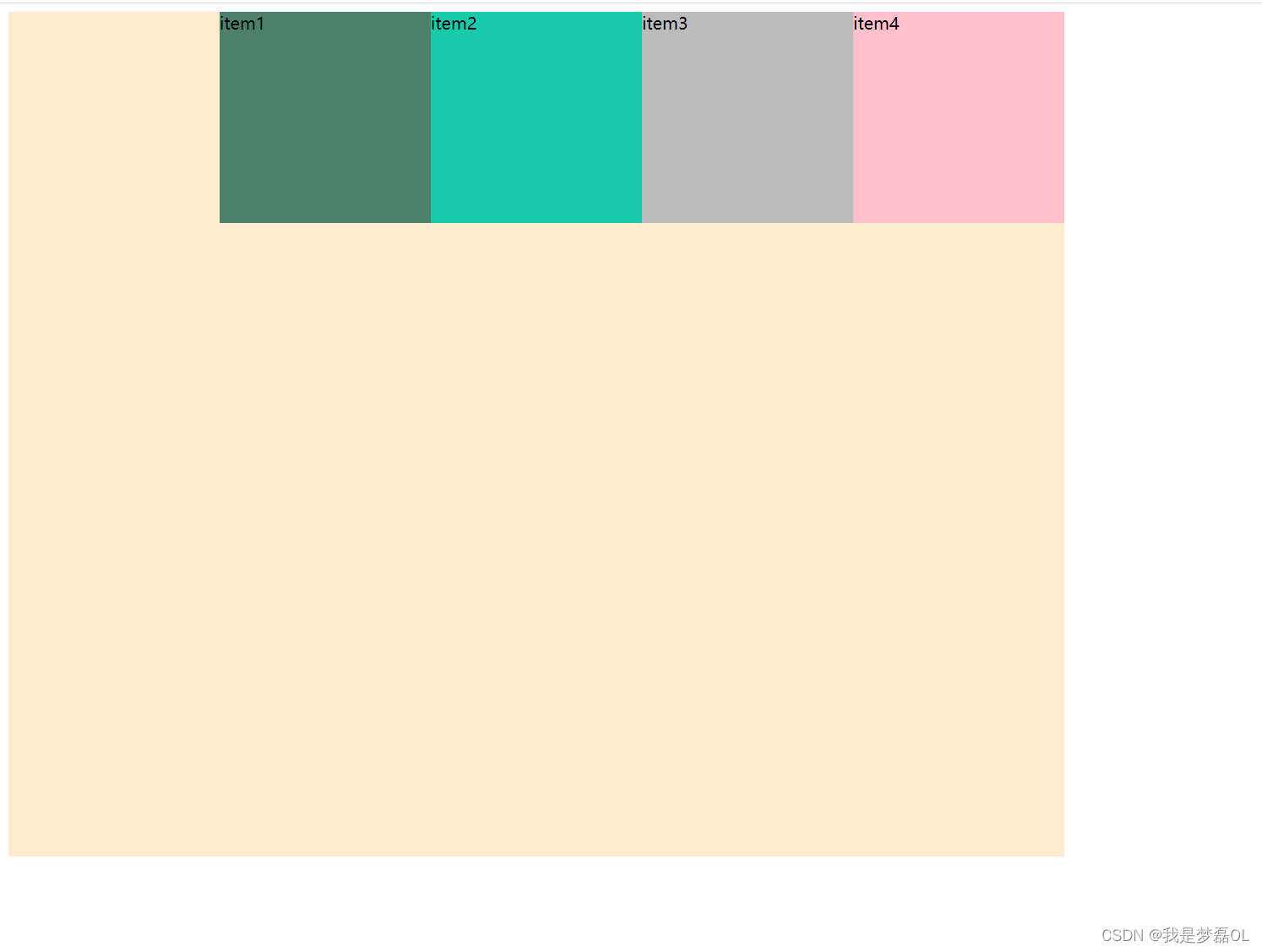
我们测试下flex-direction:column

css
.container{
            display: flex;
            width: 800px;
            height: 800px;
            background-color: blanchedalmond;
            flex-direction:column;

        }

        .one{
            width: 200px;
            height: 200px;
            background-color: #4d806b;
        }
        .two{
             width: 200px;
            height: 200px;
            background-color: #19CAAD;
        }
        .three{
             width: 200px;
            height: 200px;
            background-color: #bbbbbb;
        }
        .four{
             width: 200px;
            height: 200px;
            background-color: pink;
        }
html
<div class="container">
    <div class="one">item1</div>
    <div class="two">item2</div>
    <div class="three">item3</div>
    <div class="four">item4</div>

</div>
4,justify-content
该属性用于设置Flex容器内的项目在主轴方向上的对齐方式,属性值可以为:flex-start(默认,左对齐)、flex-end(右对齐)、center(居中对齐)、space-between(两端对齐)、space-around(四周对齐)。
当 justify-content: flex-end;
css
 .container{
            display: flex;
            width: 1000px;
            height: 800px;
            background-color: blanchedalmond;
            justify-content: flex-end;

        }

        .one{
            width: 200px;
            height: 200px;
            background-color: #4d806b;
        }
        .two{
             width: 200px;
            height: 200px;
            background-color: #19CAAD;
        }
        .three{
             width: 200px;
            height: 200px;
            background-color: #bbbbbb;
        }
        .four{
             width: 200px;
            height: 200px;
            background-color: pink;
        }
html
<div class="container">
    <div class="one">item1</div>
    <div class="two">item2</div>
    <div class="three">item3</div>
    <div class="four">item4</div>

</div>
其他属性演示类似
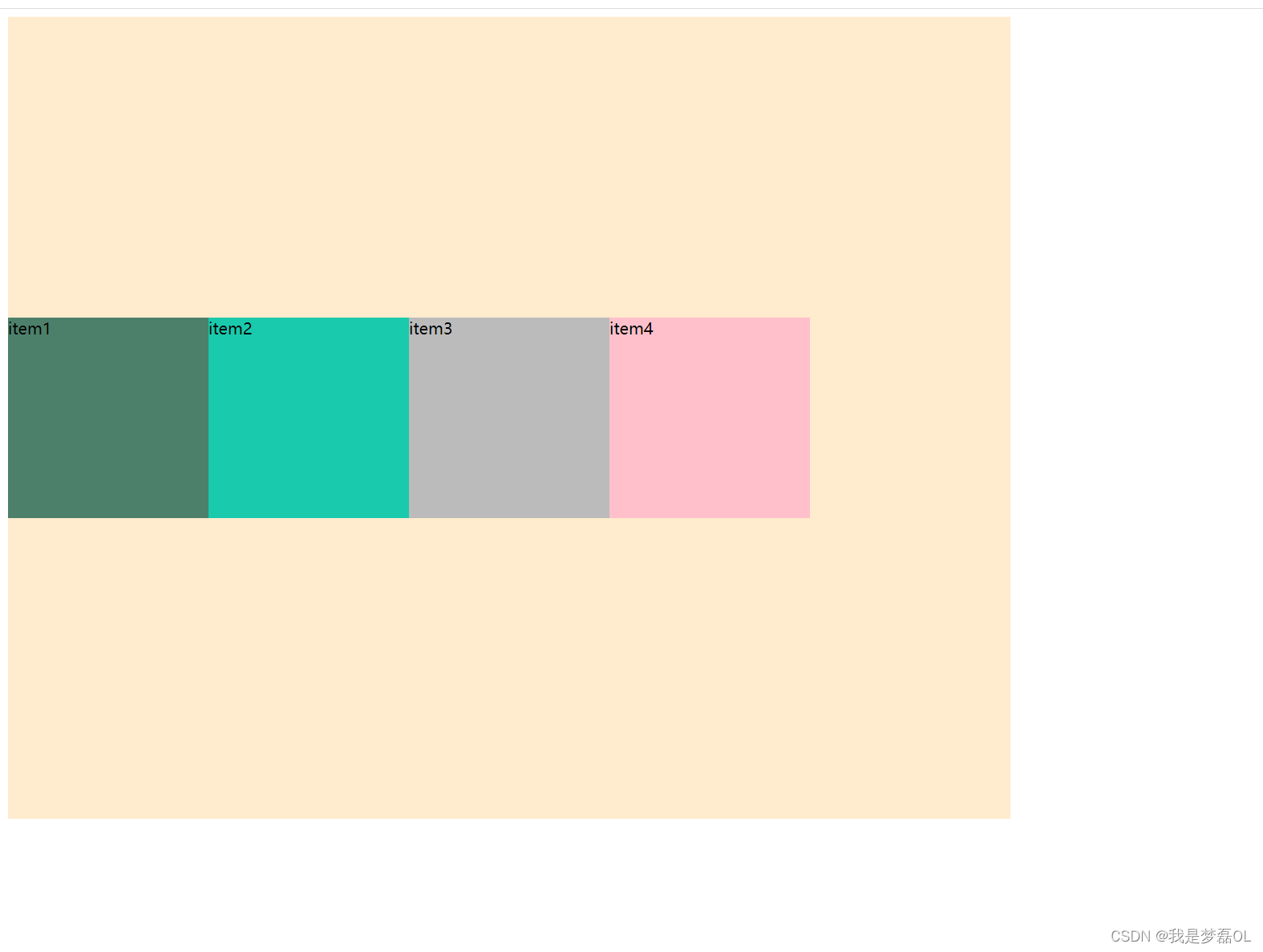
6,align-items
该属性用于设置Flex容器内的项目在交叉轴方向上的对齐方式,属性值可以为:flex-start(默认,顶部对齐)、flex-end(底部对齐)、center(竖直方向居中对齐)、baseline(基线对齐)、stretch(拉伸对齐)。
当align-items: center;在column方向上,位于中间的容器中间的位置
代码
<!DOCTYPE html>
<html lang="en">
<head>
    <meta charset="UTF-8">
    <title>Title</title>
    <style>
        .container{
            display: flex;
            width: 1000px;
            height: 800px;
            background-color: blanchedalmond;
            align-items: center;

        }

        .one{
            width: 200px;
            height: 200px;
            background-color: #4d806b;
        }
        .two{
             width: 200px;
            height: 200px;
            background-color: #19CAAD;
        }
        .three{
             width: 200px;
            height: 200px;
            background-color: #bbbbbb;
        }
        .four{
             width: 200px;
            height: 200px;
            background-color: pink;
        }
    </style>
</head>
<body>
<div class="container">
    <div class="one">item1</div>
    <div class="two">item2</div>
    <div class="three">item3</div>
    <div class="four">item4</div>

</div>
</body>
</html>
当 align-items: flex-end;位于容器的底部,
代码
<!DOCTYPE html>
<html lang="en">
<head>
    <meta charset="UTF-8">
    <title>Title</title>
    <style>
        .container{
            display: flex;
            width: 1000px;
            height: 800px;
            background-color: blanchedalmond;
            align-items: flex-end;

        }

        .one{
            width: 200px;
            height: 200px;
            background-color: #4d806b;
        }
        .two{
             width: 200px;
            height: 200px;
            background-color: #19CAAD;
        }
        .three{
             width: 200px;
            height: 200px;
            background-color: #bbbbbb;
        }
        .four{
             width: 200px;
            height: 200px;
            background-color: pink;
        }
    </style>
</head>
<body>
<div class="container">
    <div class="one">item1</div>
    <div class="two">item2</div>
    <div class="three">item3</div>
    <div class="four">item4</div>

</div>
</body>
</html>
flex-wrap
该属性用于设置Flex容器内项目的换行方式,属性值可以为:nowrap(不换行,全部展示)、wrap(自动换行)、wrap-reverse(反向换行)。
align-content
该属性用于设置多行Flex容器的对齐方式,如果只有一行,则没有效果。属性值可以为:flex-start、flex-end、center、space-between、space-around、stretch。
align-content属性用于设置多行Flex容器内各行项目在交叉轴方向上的对齐方式。如果Flex容器只有一行,则该属性无效。
下面解释一下各个属性值的含义:
- flex-start:各行项目对齐于容器的起始端;
- flex-end:各行项目对齐于容器的结束端;
- center:各行项目居中对齐;
- space-between:各行项目平均分布,首行对齐容器起始端,末行对齐容器结束端;
- space-around:各行项目平均分布,项目之间的空间相等,首行和末行都分别对齐容器的中间点;
- stretch:各行项目高度拉伸以占满整个容器的高度。
例如,有一个Flex容器包含多行项目,且设置了align-content: center,则各行项目会在容器的中心位置居中对齐。如果设置align-content: flex-start,则所有项目都靠近容器的顶部,而如果设置align-content: flex-end,则所有项目都靠近容器的底部。其他属性值类似,结果都会根据设置的对齐方式而发生变化。
当flex-wrap: wrap;
align-content: center;
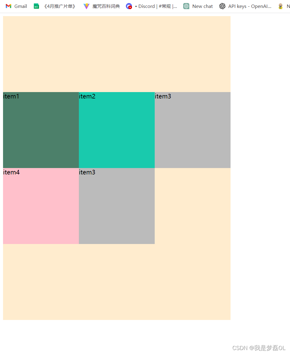
代码
<!DOCTYPE html>
<html lang="en">
<head>
    <meta charset="UTF-8">
    <title>Title</title>
    <style>
        .container{
            display: flex;
            width: 600px;
            height: 800px;
            background-color: blanchedalmond;
            flex-wrap: wrap;
            align-content: center;

        }

        .one{
            width: 200px;
            height: 200px;
            background-color: #4d806b;
        }
        .two{
             width: 200px;
            height: 200px;
            background-color: #19CAAD;
        }
        .three{
             width: 200px;
            height: 200px;
            background-color: #bbbbbb;
        }
        .four{
             width: 200px;
            height: 200px;
            background-color: pink;
        }
    </style>
</head>
<body>
<div class="container">
    <div class="one">item1</div>
    <div class="two">item2</div>
    <div class="three">item3</div>
    <div class="four">item4</div>
    <div class="three">item3</div>
</div>
</body>
</html>


 扫一扫
扫一扫


 4933
4933

 被折叠的 条评论
为什么被折叠?
被折叠的 条评论
为什么被折叠?
 到【灌水乐园】发言


