


css3过渡与动画
前言
在数字时代,网页不再是静态的画面,而是充满活力和动感的空间。CSS3的过渡与动画技术就像是一场魔法表演,能够赋予网页以生命。本文将引领你进入这个奇妙的世界,解锁CSS3过渡与动画的神奇效果。
过渡
过渡的基本使用 transition
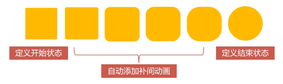
transition过渡属性时css3浓墨重彩的特性,过渡可以为一个元素在不同样式之间变化自动添加“补间动画”
兼容性
过渡从IE10开始兼容,移动端兼容良好
曾几何时,网页上的动画特效基本都是由JavaScript定时器实现的,现在逐步改为使用css3过渡
优点:动画更细腻,内存开销小
transition属性基本使用
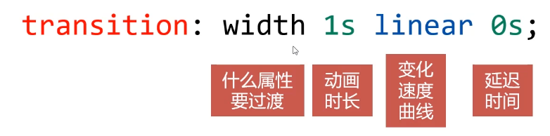
注意,这里的1s、0s里的s不能省略
哪些属性可以参与过渡
- 所有数值类型的属性,都可以参与过渡,比如width.height、left、top、border-radius
- 背景颜色和文字颜色都可以被过渡
- 所有变形(包括2D和3D)都能被过渡
all
如果要所有属性都参与过渡,可以写all
transition:all 1s linear 0s;
注意:不要滥用,会引发效益问题
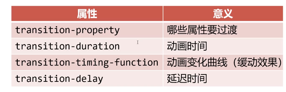
过渡的四个小属性
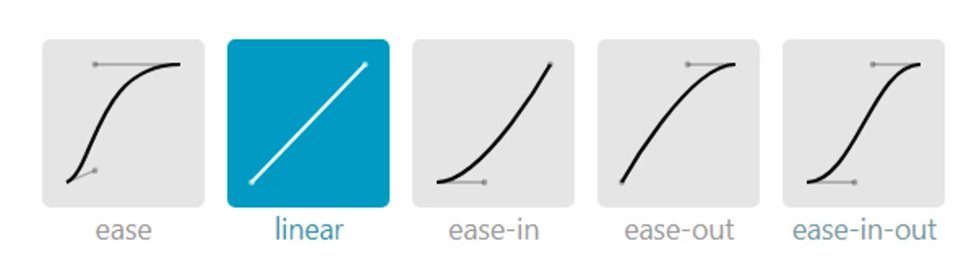
过渡的缓动效果
transition 的第三个参数就是缓动参数,也是变化速度曲线
常用缓动参数
贝塞尔曲线
网站https://cubic-bezier.com/可以生成贝塞尔曲线,可以自定义动画缓动参数
transition:width 1s cubic-bezier(.44,-0.62,.62,1.59) 0s;
过渡效果实战
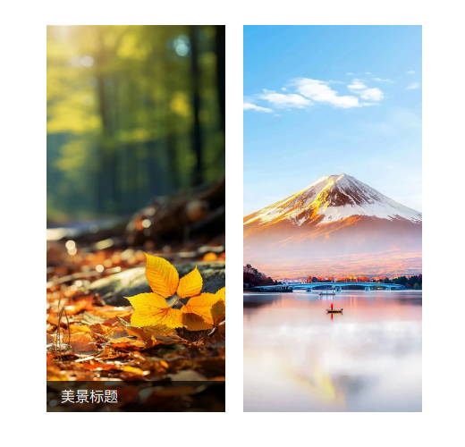
过渡效果实战_当鼠标移到图片上显示标题
<!DOCTYPE html>
<html lang="en">

<head>
    <meta charset="UTF-8">
    <meta name="viewport" content="width=device-width, initial-scale=1.0">
    <title>Document</title>
</head>
<style>
    * {
        margin: 0;
        padding: 0;
    }

    ul li {
        list-style: none;
    }

    img {
        vertical-align: middle;
    }

    .box {
        margin: 100px auto;
        width: 500px;
    }

    .box ul {
        display: flex;
    }

    .box ul li {
        position: relative;
        margin-right: 20px;
    }

    .box ul li img {
        width: 200px;
    }

    .box ul li .info {
        position: absolute;
        bottom: 0;
        text-indent: 1em;
        left: 0;
        width: 100%;
        height: 35px;
        line-height: 35px;
        background: rgba(0, 0, 0, .7);
        color: #fff;
        opacity: 0;
        transition: opacity .5s linear 0s;
    }

    .box ul li:hover .info {
        opacity: 1;
    }
</style>

<body>
    <div class="box">
        <ul>
            <li><img src="images/01.webp" alt="">
                <div class="info">美景标题</div>
            </li>
            <li><img src="images/02.webp" alt="">
                <div class="info">美景标题</div>

            </li>
        </ul>
    </div>

</body>

</html>
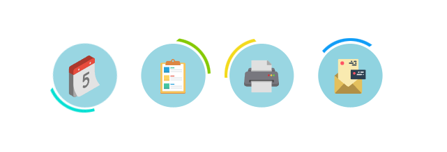
过渡效果实战_当鼠标移上去背景旋转自身放大
<!DOCTYPE html>
<html lang="en">

<head>
    <meta charset="UTF-8">
    <meta name="viewport" content="width=device-width, initial-scale=1.0">
    <title>Document</title>
</head>
<style>
    * {
        margin: 0;
        padding: 0;
    }

    ul li {
        list-style: none;
    }

    .box {
        margin: 100px auto;
        width: 600px;
    }


    .box ul {
        display: flex;
    }

    .box ul li::before {
        content: '';
        display: block;
        height: 100%;
        position: absolute;
        left: 0;
        top: 0;
        width: 100%;
        z-index: 1;
        transform: rotate(0);
        transition: transform 1s linear 0s;

    }

    .box ul li:nth-child(1)::before {
        background: url(images/a_1.png) no-repeat center;
    }

    .box ul li:nth-child(2)::before {
        background: url(images/a_2.png) no-repeat center;
    }

    .box ul li:nth-child(3)::before {
        background: url(images/a_3.png) no-repeat center;
    }

    .box ul li:nth-child(4)::before {
        background: url(images/a_4.png) no-repeat center;
    }

    .box ul li {
        width: 107px;
        height: 107px;
        position: relative;
        text-align: center;
        margin-right: 20px;

    }


    .box ul li img {
        width: 50px;
        position: relative;
        z-index: 2;
        margin-top: 30px;
        transform: scale(1);
        transition: transform .5s ease 0s;
    }

    /* 背景圆环旋转一周 */
    .box ul li:hover::before {
        transform: rotate(360deg);
    }

    /* 中心图标放大1.2倍 */
    .box ul li:hover img {
        transform: scale(1.2);
    }
</style>

<body>
    <div class="box">
        <ul>
            <li><img src="images/icon1.svg" alt=""></li>
            <li><img src="images/icon2.svg" alt=""></li>
            <li><img src="images/icon3.svg" alt=""></li>
            <li><img src="images/icon4.svg" alt=""></li>
        </ul>
    </div>

</body>

</html>

过渡效果实战_当鼠标移到图片上小狗打开里面是小猫
<!DOCTYPE html>
<html lang="en">

<head>
    <meta charset="UTF-8">
    <meta name="viewport" content="width=device-width, initial-scale=1.0">
    <title>Document</title>
</head>
<style>
    * {
        margin: 0;
        padding: 0;
    }

    .box {
        position: relative;
        width: 500px;
        margin: 50px auto;
        perspective: 1000px;
    }

    .box img {
        border: 1px solid #000;
        width: 120px;
        border-radius: 100px;
    }

    .dog {
        position: absolute;
        left: 0;
        top: 0;
        transform-origin: 0 0;
        transform: rotate(0);
        transition: transform 2s ease 0s;
    }

    .box:hover .dog {
        cursor: pointer;
        transform: rotateY(-180deg);
    }

    .n1 .dog {
        transform-origin: 100% 100%;
    }

    .n1:hover .dog {
        transform: rotateY(180deg);
    }

    .n2 .dog {
        transform-origin: 0 0;
    }

    .n2:hover .dog {
        transform: rotateX(-180deg);
    }
</style>

<body>
    <div class="box">
        <img class="cat" src="images/cat.jpg" alt="">
        <img class="dog" src="images/dog.jpg" alt="">
    </div>
    <div class="box n1">
        <img class="cat" src="images/cat.jpg" alt="">
        <img class="dog" src="images/dog.jpg" alt="">
    </div>
    <div class="box n2">
        <img class="cat" src="images/cat.jpg" alt="">
        <img class="dog" src="images/dog.jpg" alt="">
    </div>

</body>

</html>
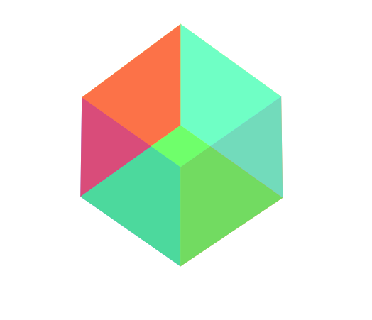
旋转的正方形
<!DOCTYPE html>
<html lang="en">

<head>
    <meta charset="UTF-8">
    <meta name="viewport"
        content="width=device-width,initial-scale=1, user-scalable=no, maximum-scale=1,minimum-scale=1">
    <!-- width=device-width, initial-scale=1.0 页面的宽度应该等于设备的宽度,并且初始缩放级别为 1.0。这有助于确保在移动设备上以正常大小呈现页面,而不是被过度缩放。 -->
    <title>Document</title>
    <style>
        * {
            margin: 0;
            padding: 0;
        }

        section {
            width: 202px;
            height: 202px;
            margin: 200px auto;
            perspective: 10000px;
        }

        .box1 {
            width: 202px;
            height: 202px;
            perspective: 10000px;
            position: relative;
            /* 设置变形类型,保留它内部的3D效果 */
            /* 这个box盒子又是舞台,又是演员,这个box整体带着里面的p旋转 */
            transform-style: preserve-3d;
            transition: all 10s ease 0s;
        }

        section:hover .box1 {
            transform: rotateX(360deg) rotateY(360deg);
        }

        p {
            width: 200px;
            height: 200px;
            position: absolute;
            top: 0;
            left: 0;
        }

        .box1 p:nth-child(1) {
            background: rgb(62 255 244 / 73%);
            /* 前面 */
            transform: translateZ(100px)
        }

        .box1 p:nth-child(2) {
            background: rgba(242, 255, 62, 0.959);
            /* 顶面 */
            transform: rotateX(90deg) translateZ(100px)
        }

        .box1 p:nth-child(3) {
            background: rgba(65, 62, 255, 0.73);
            /* 背面 */
            transform: rotateX(180deg) translateZ(100px)
        }

        .box1 p:nth-child(4) {
            background: rgba(62, 255, 120, 0.73);
            /* 底面 */
            transform: rotateX(-90deg) translateZ(100px)
        }

        .box1 p:nth-child(5) {
            background: rgb(255, 122, 34);
            /* 侧面 */
            transform: rotateY(90deg) translateZ(100px)
        }

        .box1 p:nth-child(6) {
            background: rgba(255, 62, 72, 0.73);
            /* 侧面 */
            transform: rotateY(-90deg) translateZ(100px)
        }
    </style>
</head>

<body>
    <section>
        <div class="box1">
            <p> </p>
            <p> </p>
            <p> </p>
            <p> </p>
            <p> </p>
            <p> </p>
        </div>
    </section>


</body>

</html>
动画
动画的定义和调用
可以使用@keyframes来定义动画,keyframes表示“关键帧”,在项目上线前,要补上@-webkit-这样的私有前缀
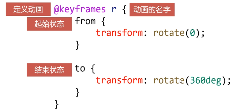
定义动画之后,就可以使用animation属性调用动画
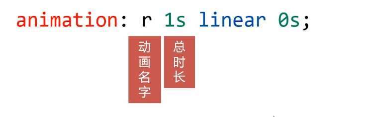
动画的执行次数
第五个参数就是动画的执行次数
animation:r 1s linear 0s 3; //3表示次数
如果想永远执行可以写infinite
animation:r 1s linear 0s infinite; //表示一直执行动画
如果想让动画的第2、4、6……偶数次自动逆向执行,那么要加上alternate参数即可
animation:r 1s linear 0s infinite alternate;
如果想让动画停止在最后结束状态,那么要加上forwards
animation:r 1s linear 0s forwards;
动画效果实战
<!DOCTYPE html>
<html lang="en">
<head>
<meta charset="UTF-8">
<meta name="viewport" content="width=device-width, initial-scale=1.0">
<title>Document</title>
</head>
<style>
* {
margin: 0;
padding: 0;
}
.box {
width: 200px;
height: 200px;
margin: 100px auto;
background-color: orange;
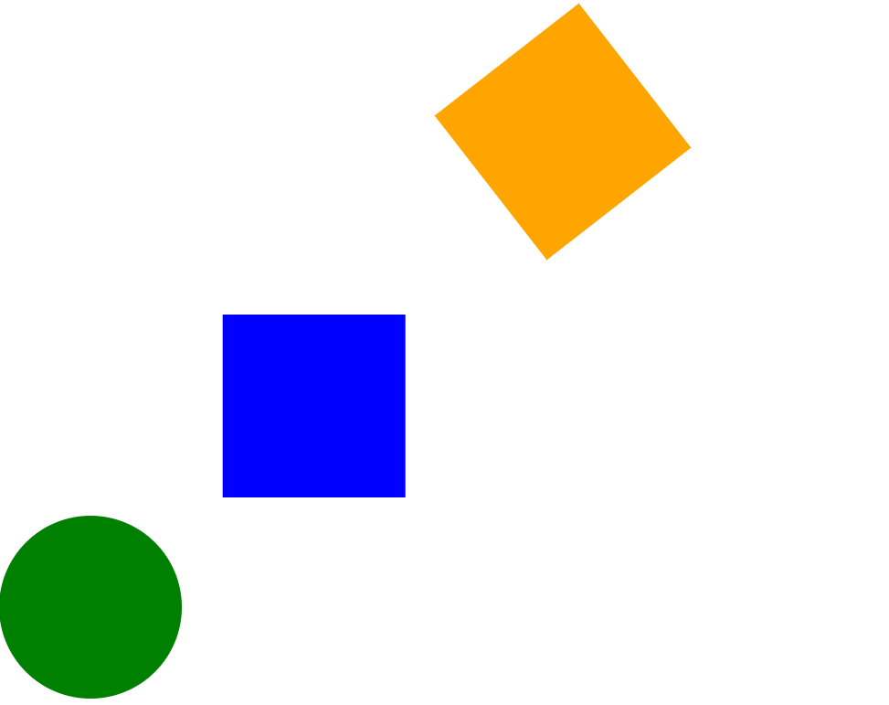
animation: r 3s linear 0s infinite;
}
.box1 {
width: 200px;
height: 200px;
background-color: blue;
animation: move 1s linear 0s infinite alternate;
margin-bottom: 20px;
}
.box2 {
width: 200px;
height: 200px;
background-color: green;
animation: radius 1s linear 0s forwards;
margin-bottom: 20px;
}
@keyframes r {
from {
transform: rotate(0);
}
to {
transform: rotate(360deg);
}
}
@keyframes move {
from {
transform: translateX(0)
}
to {
transform: translateX(300px)
}
}
@keyframes radius {
from {
border-radius: 0;
}
to {
border-radius: 100px;
}
}
</style>
<body>
<div class="box"></div>
<div class="box1"></div>
<div class="box2"></div>
</body>
</html>
案例:发光的灯泡

<!DOCTYPE html>
<html lang="en">

<head>
    <meta charset="UTF-8">
    <meta name="viewport" content="width=device-width, initial-scale=1.0">
    <title>Document</title>
</head>
<style>
    * {
        margin: 0;
        padding: 0;
    }

    .box {
        position: relative;
        margin: 100px;
        text-align: center;
        width: 200px;
        height: 200px;


    }

    .faguang {
        position: absolute;
        left: -70px;
        top: -60px;
        animation: faguang .5s linear 0s infinite alternate;
    }

    @keyframes faguang {
        0% {
            opacity: 1;
        }


        100% {
            opacity: 0;
        }
    }
</style>

<body>
    <div class="box">
        <img class="depao" src="images/dengpao.png" alt="">
        <img class="faguang" src="images/guang.png" alt="">
    </div>

</body>

</html>
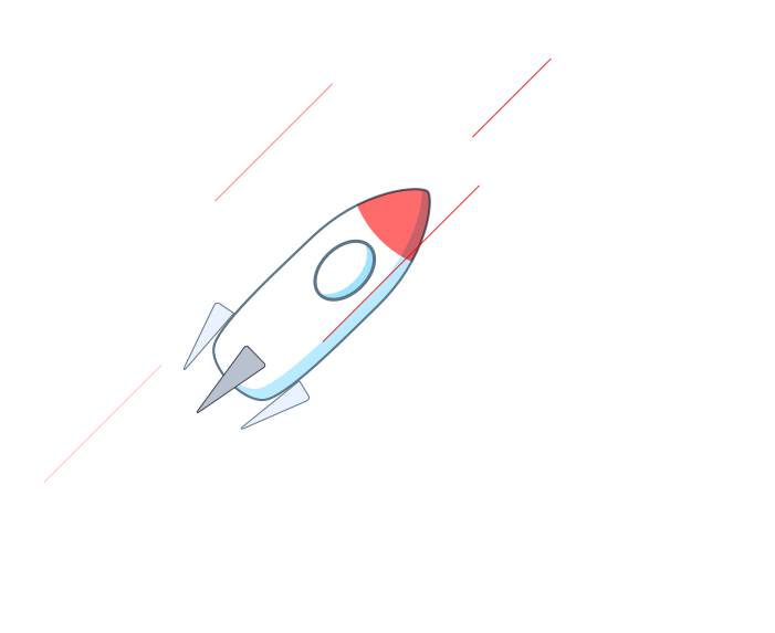
案例:飞行的火箭
<!DOCTYPE html>
<html lang="en">

<head>
    <meta charset="UTF-8">
    <meta name="viewport" content="width=device-width, initial-scale=1.0">
    <title>Document</title>
</head>
<style>
    * {
        padding: 0;
        margin: 0;
    }

    .hj {
        position: absolute;
        left: 400px;
        top: 400px;
        animation: fly .3s ease-in 0s infinite alternate;
    }

    .line {
        position: absolute;
        width: 1px;
        height: 150px;
        background: #f00;
        left: 400px;
        top: 400px;
        animation: linefly 1s linear 0s infinite;
        opacity: 0;
        transform: rotate(45deg)
    }

    .line1 {
        position: absolute;
        width: 1px;
        height: 150px;
        background: #f00;
        left: 500px;
        top: 400px;
        animation: linefly 1s linear .4s infinite;
        opacity: 0;
        transform: rotate(45deg)
    }

    .line2 {
        position: absolute;
        width: 1px;
        height: 200px;
        background: #f00;
        left: 600px;
        top: 400px;
        animation: linefly 1s linear .8s infinite;
        opacity: 0;
        transform: rotate(45deg)
    }

    .line3 {
        position: absolute;
        width: 1px;
        height: 100px;
        background: #f00;
        left: 700px;
        top: 300px;
        animation: linefly 1s linear .8s infinite;
        opacity: 0;
        transform: rotate(45deg)
    }


    @keyframes linefly {
        0% {
            opacity: 0;
            transform: rotate(45deg) translateY(-300px);
        }

        50% {
            opacity: 1;

        }

        100% {
            opacity: 0;
            transform: rotate(45deg) translateY(300px);
        }
    }

    @keyframes fly {
        from {
            transform: translateX(20px) translateY(20px);
        }

        to {
            transform: translateX(-20px) translateY(-20px);
        }
    }
</style>

<body>
    <div class="hj"><img src="images/huojian.png" alt=""></div>
    <div class="line"></div>
    <div class="line1"></div>
    <div class="line2"></div>
    <div class="line3"></div>

</body>

</html>
结语
通过深入学习CSS3的过渡与动画技术,你将能够为网页设计注入更多创意和动感。这不仅是技术的提升,更是对设计艺术的追求。让我们一同在动感的舞台上展示创意,用过渡与动画让网页焕发生机。


 1241
1241


 被折叠的 条评论
为什么被折叠?
被折叠的 条评论
为什么被折叠?
 到【灌水乐园】发言


