


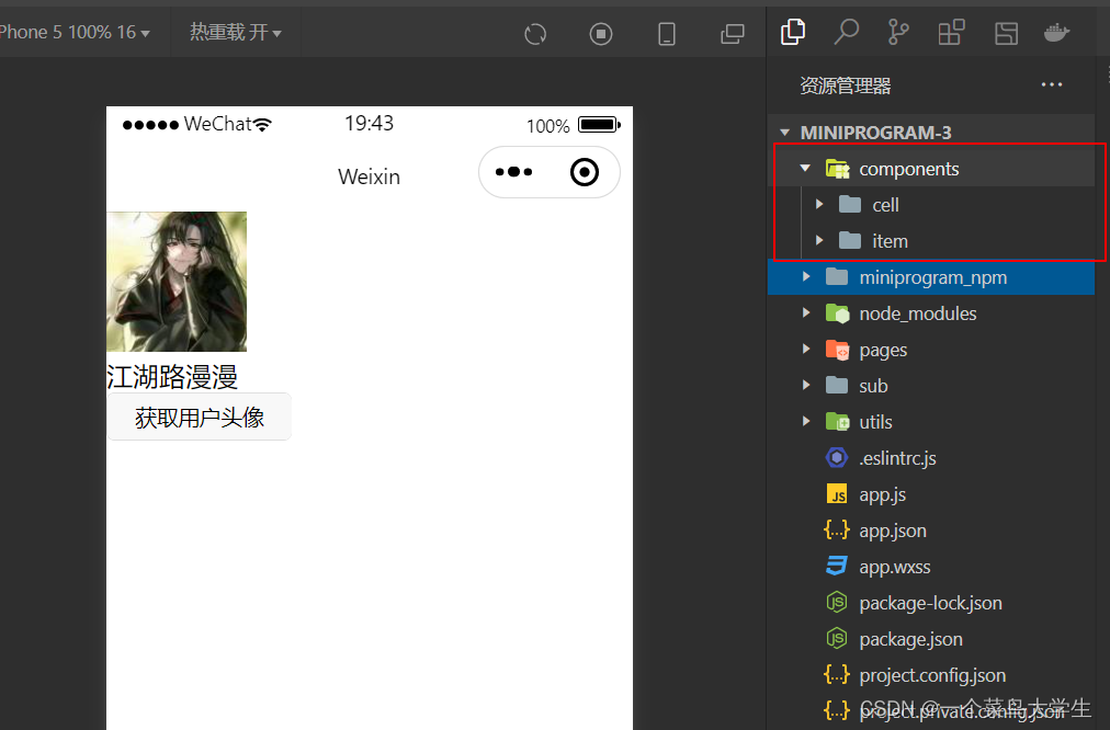
一,自定义组件的使用步骤
- 首先在我们的根目录创建一个components文件夹,专门用来存放我们自定义的组件
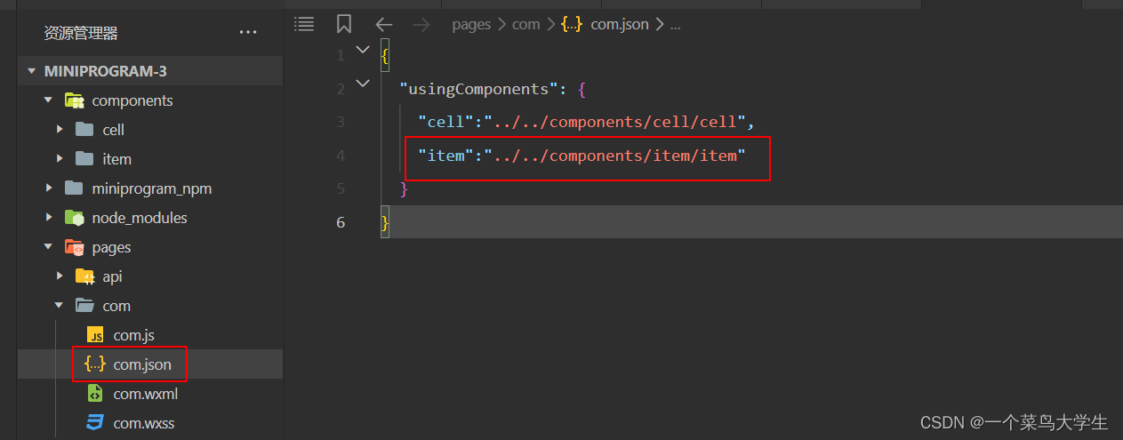
- 比如在item中,我们写好了一个顶部栏组件,我们想要在pages页面下的com文件中去使用这个组件,那么我们该怎么样去做呢?那么我们就需要来到com.json文件中将item组件给引入进来
当完成这两步的时候,其实你已经成功的引入进来了一个组件,只不过这个组件为空,没有编写内容,接下来我就教大家如何去写!
(1)组件的通信(父传子)
- 先来看一下代码,在父组件中
<cell title="今天吃大餐">我是父组件</cell>
- 在子组件中
<view>{{title}}</view> //今天吃大餐
- 子组件的js文件
  properties: {
    // 标题
    title:{
      type:String,
      value:""
    },
    // 显示右侧插槽
    showrslot:{
      type:Boolean,
      value:false,
    },
    // 图标
    icon:{
      type:String,
      value:""
    },
    tip:{
      type:String,
      value:"",
    },
    badge:{
      type:[Boolean,Number],
      value:false
    },
    url:{
      type:String,
      value:""
    },
    openType:{
      type:String,
      value:"navigate"
    }
  },
- 在item.js文件的properties属性中,我们接收到了父组件传递过来的title
父组件向子组件传递值的时候是通过properties属性的,在item组件的js文件写法跟平时有些不同,我们会将所有的配置对象,例如data,methods,properties,都写在options方法中

- properties,相当于我们所学vue中的props,是父组件向子组件传递数据的桥梁

2.子传父(triggerEvent)
- 父组件向子组件传递了一个值,
- 子组件接收该值之后会向父组件抛出一个反馈(命令)
- 父组件去执行子组件的命令
- 在子组件中
<view class="cell" bindtap="tapHd">
  <text>{{title}}</text>
  <text>{{count}}</text>
</view>
// components/cell/cell.js
Component({
  // 选项:
  options:{
    // 样式隔离:apply-shared 父影响子,shared父子相互影响, isolated相互隔离
    styleIsolation:"isolated",
    // 允许多个插槽
    multipleSlots:true,

  },
  // 通过组件的外部类实现父组件控制子自己的样式
  externalClasses:["cell-class"],

  /**
   * 组件的属性列表
   */
  properties: {
    title:{
      type:String,
      value:""
    },
    num:{
      // 定了类型
      type:Number,
      //定义默认值
      value:1
    }
  },

  /**
   * 组件的初始数据
   */
  data: {
     count:1
  },
  lifetimes:{
    // 当组件的生命周期被挂载时候
     attached(){
       console.log(this.data)
        // cout的值为父组件传递的num值
        this.setData({count:this.data.num})
      }
  },

  /**
   * 组件的方法列表
   */
  methods: {
    tapHd(){
      this.setData({count:this.data.count+1})
      // 发送一个事件
      this.triggerEvent("cellclick",this.data.count)
    }
  }
})
- 在父组件中
<cell bind:cellclick="clickHd"></cell>
// components/cell/cell.js
Component({
  // 选项:
  options:{
    // 样式隔离:apply-shared 父影响子,shared父子相互影响, isolated相互隔离
    styleIsolation:"isolated",
    // 允许多个插槽
    multipleSlots:true,

  },
  // 通过组件的外部类实现父组件控制子自己的样式
  externalClasses:["cell-class"],

  /**
   * 组件的属性列表
   */
  properties: {
    title:{
      type:String,
      value:""
    },
    num:{
      // 定了类型
      type:Number,
      //定义默认值
      value:1
    }
  },

  /**
   * 组件的初始数据
   */
  data: {
     count:1
  },
  lifetimes:{
    // 当组件的生命周期被挂载时候
     attached(){
       console.log(this.data)
        // cout的值为父组件传递的num值
        this.setData({count:this.data.num})
      }
  },

  /**
   * 组件的方法列表
   */
  methods: {
    tapHd(){
      this.setData({count:this.data.count+1})
      // 发送一个事件
      this.triggerEvent("cellclick",this.data.count)
    }
  }
})
3.样式隔离
- 因为组件具有很强的复用性,那么他们的样式是不应该互相干扰的,所以当styleIsolation为isolated时,各自的样式互相独立
  options:{
    // 样式隔离:apply-shared 父影响子,shared父子相互影响, isolated相互隔离
    styleIsolation:"isolated",
    // 允许多个插槽
    multipleSlots:true,

  },
3.定义外部类
- externalClass:[“cell-class”]

<view cell-class='mycell1'>
  我是cell组件
</view>
 <view cell-class='mycell2'>
  我是cell组件
</view>
.mycell1{
  color: #f70;
  background-color: seagreen;
  line-height: 88rpx;
}
.mycell2{
  color: 'black';
  background-color: sienna;
  line-height: 88rpx;
}
这样我们就能够分别定义组件的样式了
4.插槽
- 跟vue中的使用方式是一模一样的,直接看代码
- 在父组件中
<cell>我在这里</cell>
- 在子组件中
<view>父组件插件来的内容都放在slot里面
  <slot></slot>
<view>
5.具名插槽
- 在父组件中
<cell cell-class="mycell">
<text>胡萝卜</text>
<text slot="first">第一</text>
<text slot="second">第二</text>

</cell>
- 在子组件中
在cell.js文件中开启多命名插槽

<view>
  <slot name="first"></slot>
  <slot name="second"></slot>
</view>
三,案例
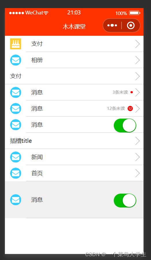
1.下面这张页面就可以用组件来实现
- 在components文件夹下,新建一个item文件
item.wxml文件:
<navigator class="item itemclass" url="{{url}}" open-type="{{openType}}" bindtap="itemclick">
  <view class="icon" wx:if="{{icon}}">
    <image src="{{icon}}" mode="aspectFill"></image>
  </view>
  <view class="content">
      <view class="title">
        <view class="title" wx:if="{{title}}">{{title}}</view>
        <slot name="title"  wx:else ></slot>
      </view>

      <view class="right" wx:if="{{!showrslot}}">
          <view class="tip">{{tip}}</view>
          <view class="badge" wx:if="{{badge}}">
            <view wx:if="{{badge===true}}" class="dot">
            </view>
            <view wx:else  class="redbadeg">
            {{badge}}
            </view>
          </view>
          <view class="arrow"></view>
      </view>
      <slot name="right" wx:else></slot>
  </view>
</navigator>

<!--
  icon 图标
  conent 内容
  title 标题
  right 右侧
  tip 提示
  badge 红点
  arrow 箭头
 -->
item.js文件
Component({
  options:{
    multipleSlots:true
  },
  externalClasses:["itemclass"],
  /**
   * 组件的属性列表
   */
  properties: {
    // 标题
    title:{
      type:String,
      value:""
    },
    // 显示右侧插槽
    showrslot:{
      type:Boolean,
      value:false,
    },
    // 图标
    icon:{
      type:String,
      value:""
    },
    tip:{
      type:String,
      value:"",
    },
    badge:{
      type:[Boolean,Number],
      value:false
    },
    url:{
      type:String,
      value:""
    },
    openType:{
      type:String,
      value:"navigate"
    }
  },

  /**
   * 组件的初始数据
   */
  data: {

  },

  /**
   * 组件的方法列表
   */
  methods: {
      itemclick(e){
        console.log(e);
        //发送一个事件
        this.triggerEvent("itemclick",e.detail)
      }
  }
})
item.wxss文件
/* components/item/item.wxss */
.item{
  line-height: 88rpx;

  display: flex;
  align-items: center;
  justify-content: space-between;
}
.icon{
  margin-left: 30rpx;
  margin-right: 30rpx;
  height: 100%;
  display: flex;
  align-items: center;
}
.icon image{
  width: 60rpx;
  height: 60rpx;
}
.content{
  padding: 0 30rpx;
  border-bottom: 1rpx solid #ccc;
  display: flex;
  flex:1;

}
.title{
  flex:1;
  color:#333;
  font-size: 32rpx;
}
.right{
  display: flex;
  align-items: center;
}
.right .arrow{
  height: 30rpx;
  width: 30rpx;
  border-top:3rpx solid #999;
  border-right: 3rpx solid #999;
  transform: rotate(45deg);
}

.tip{
  color:#999;
  font-size: 24rpx;
}
.dot{
  height: 14rpx;
  width: 14rpx;
  background-color: #f00;
  border-radius: 12rpx;
  margin-left: 15rpx;

}
.redbadeg{
  font-size: 18rpx;
  color:#fff;
  border-radius: 18rpx;
  background-color: #f00;
  max-height: 30rpx;
  width: 30rpx;
  line-height: 30rpx;
  text-align: center;
  margin-left: 15rpx;
}
- 在父组件中
com.wxml文件
<item title="支付" icon="/images/icon01.png"></item>
<item title="相册" icon="/images/icon02.png"></item>
<item title="支付" ></item>

<item title="消息" icon="/images/icon02.png"  badge="{{true}}" tip="3条未读"></item>

<item title="消息" icon="/images/icon02.png"  badge="{{12}}" tip="12条未读"></item>

<item title="消息" icon="/images/icon02.png" showrslot="{{true}}">
  <switch checked="true" slot="right"></switch>
</item>

<item>
  <view slot="title">插槽title</view>
</item>

<item title="新闻" icon="/images/icon02.png"  url="/pages/yidian/yidian" open-type="switchTab">
</item>
<item title="首页" icon="/images/icon02.png"  url="/pages/home/home" >
</item>

<item title="消息" icon="/images/icon02.png" showrslot="{{true}}" itemclass="myitem">
  <switch checked="true" slot="right"></switch>
</item>


<!-- <view class="title">自定义组件</view>
<cell bind:cellclick="cellHd"  title="中美两国和平相处" num="{{5}}"></cell>
<cell  bind:cellclick="cellHd" title="阶级不同立场也不同" ></cell> -->


<!-- <cell cell-class="mycell">
  <text slot="pre">💖</text>
  <text slot="next">🥗</text>
  <text>新冠肺炎消失了</text>
  <text>假的</text>
</cell>
<cell>
  <text slot="next">🚒</text>
  <text slot="pre">💥</text>
  <text>工资10倍</text>
  <text>鸡蛋50倍</text>
</cell> -->
在com.js文件中
// pages/com/com.js
Page({

  /**
   * 页面的初始数据
   */
  data: {

  },
  cellHd(e){
    console.log(e);
    wx.showToast({
      title: '你点击了'+e.detail,
    })
  },

  /**
   * 生命周期函数--监听页面加载
   */
  onLoad(options) {

  },

  /**
   * 生命周期函数--监听页面初次渲染完成
   */
  onReady() {

  },

  /**
   * 生命周期函数--监听页面显示
   */
  onShow() {

  },

  /**
   * 生命周期函数--监听页面隐藏
   */
  onHide() {

  },

  /**
   * 生命周期函数--监听页面卸载
   */
  onUnload() {

  },

  /**
   * 页面相关事件处理函数--监听用户下拉动作
   */
  onPullDownRefresh() {

  },

  /**
   * 页面上拉触底事件的处理函数
   */
  onReachBottom() {

  },

  /**
   * 用户点击右上角分享
   */
  onShareAppMessage() {

  }
})
在com.wxss文件中
/* pages/com/com.wxss */
.title{
  line-height: 88rpx;
  background-color: #f0f0f0;
  padding: 0 15rpx;
}
.cell{
  color:red;
}
.mycell{
  line-height: 120rpx !important;
  color:#F70;
}

.myitem{
  line-height: 200rpx !important;
  background-color: #F0f0f0;

}


 1288
1288


 被折叠的 条评论
为什么被折叠?
被折叠的 条评论
为什么被折叠?
 到【灌水乐园】发言


