


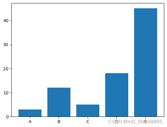
一、# 使用python和matplotlib完成条形图
# Libraries
import numpy as np
import matplotlib.pyplot as plt

# Create dataset
height = [3, 12, 5, 18, 45]
bars = ('A', 'B', 'C', 'D', 'E')
x_pos = np.arange(len(bars))

# Create bars
plt.bar(x_pos, height)

# Create names on the x-axis
plt.xticks(x_pos, bars)

# Show graphic
plt.show()
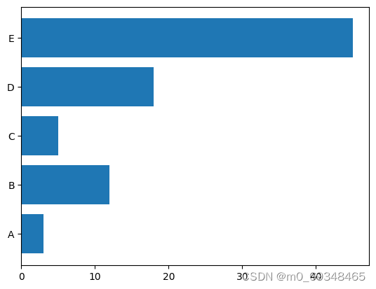
二、利用matplotlib构建水平条形图
# libraries
import matplotlib.pyplot as plt
import numpy as np

# create dataset
height = [3, 12, 5, 18, 45]
bars = ('A', 'B', 'C', 'D', 'E')
y_pos = np.arange(len(bars))

# Create horizontal bars
plt.barh(y_pos, height)

# Create names on the x-axis
plt.yticks(y_pos, bars)

# Show graphic
plt.show()
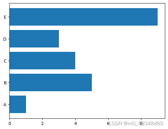
三、从Pandas数据框架
# import libraries
import pandas as pd
import matplotlib.pyplot as plt

# Create a data frame
df = pd.DataFrame ({
        'Group':  ['A', 'B', 'C', 'D', 'E'],
        'Value': [1,5,4,3,9]
})

# Create horizontal bars
plt.barh(y=df.Group, width=df.Value);
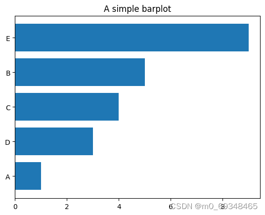
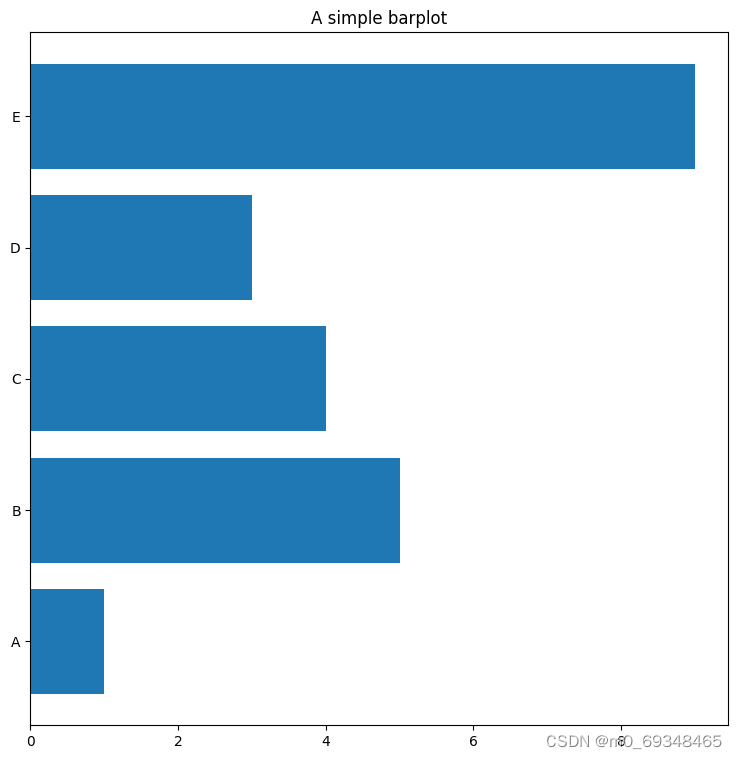
四、控制令
条形图在排序时总是更有洞察能力,它可以让你更快的利埃杰物品地排名。你只需要预先对pandas数据进行排序,就可以对图进行排序
# import libraries
import pandas as pd
import matplotlib.pyplot as plt

# Create a data frame
df = pd.DataFrame ({
        'Group':  ['A', 'B', 'C', 'D', 'E'],
        'Value': [1,5,4,3,9]
})

# Sort the table
df = df.sort_values(by=['Value'])

# Create horizontal bars
plt.barh(y=df.Group, width=df.Value);

# Add title
plt.title('A simple barplot');
五、面向对象地API
# import libraries
import pandas as pd
import matplotlib.pyplot as plt

# Create a data frame
df = pd.DataFrame ({
        'Group':  ['A', 'B', 'C', 'D', 'E'],
        'Value': [1,5,4,3,9]
})

# Initialize a Figure and an Axes
fig, ax = plt.subplots()

# Fig size
fig.set_size_inches(9,9)

# Create horizontal bars
ax.barh(y=df.Group, width=df.Value);

# Add title
ax.set_title('A simple barplot');
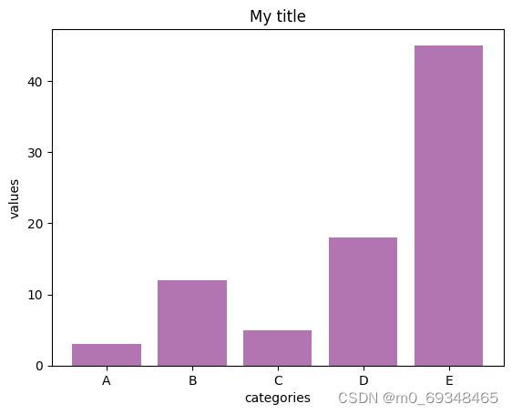
六、粉色的条形图
# libraries
import numpy as np
import matplotlib.pyplot as plt

# create dataset
height = [3, 12, 5, 18, 45]
bars = ('A', 'B', 'C', 'D', 'E')
x_pos = np.arange(len(bars))

# Create bars and choose color
plt.bar(x_pos, height, color = (0.5,0.1,0.5,0.6))

# Add title and axis names
plt.title('My title')
plt.xlabel('categories')
plt.ylabel('values')

# Create names on the x axis
plt.xticks(x_pos, bars)

# Show graph
plt.show()
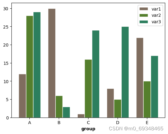
七、分组条形图
下面地例子显示了5个不同的组和他们地3个变量,这个图变成了堆叠地区域条形图
# libraries
import numpy as np
import matplotlib.pyplot as plt

# set width of bars
barWidth = 0.25

# set heights of bars
bars1 = [12, 30, 1, 8, 22]
bars2 = [28, 6, 16, 5, 10]
bars3 = [29, 3, 24, 25, 17]

# Set position of bar on X axis
r1 = np.arange(len(bars1))
r2 = [x + barWidth for x in r1]
r3 = [x + barWidth for x in r2]

# Make the plot
plt.bar(r1, bars1, color='#7f6d5f', width=barWidth, edgecolor='white', label='var1')
plt.bar(r2, bars2, color='#557f2d', width=barWidth, edgecolor='white', label='var2')
plt.bar(r3, bars3, color='#2d7f5e', width=barWidth, edgecolor='white', label='var3')

# Add xticks on the middle of the group bars
plt.xlabel('group', fontweight='bold')
plt.xticks([r + barWidth for r in range(len(bars1))], ['A', 'B', 'C', 'D', 'E'])

# Create legend & Show graphic
plt.legend()
plt.show()
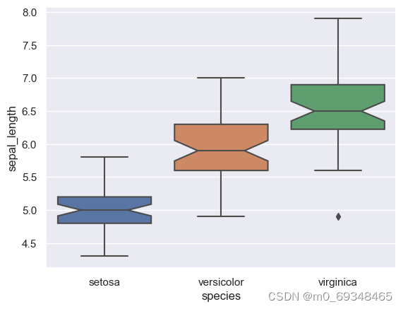
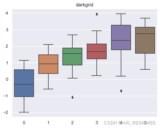
八、 32-箱线图,自定义线宽增加缺口
图书馆和数据集
# libraries & dataset
import seaborn as sns
import matplotlib.pyplot as plt
# set a grey background (use sns.set_theme() if seaborn version 0.11.0 or above)
sns.set(style="darkgrid")
df = sns.load_dataset('iris',cache=True,data_home="../seaborn-data-master")

sns.boxplot(x=df["species"], y=df["sepal_length"], notch=True)
plt.show()
九、123-折线图
突出特定组的技巧是首先用细而谨慎的线条绘制所有组。然后用有力的、真正可见的线条重新绘制感兴趣的群体。此外,用自定义的注释注释这个突出显示的组是一个很好的实践。
# libraries
import matplotlib.pyplot as plt
import numpy as np
import pandas as pd

# Make a data frame
df=pd.DataFrame({'x': range(1,11), 'y1': np.random.randn(10), 'y2': np.random.randn(10)+range(1,11), 'y3': np.random.randn(10)+range(11,21), 'y4': np.random.randn(10)+range(6,16), 'y5': np.random.randn(10)+range(4,14)+(0,0,0,0,0,0,0,-3,-8,-6), 'y6': np.random.randn(10)+range(2,12), 'y7': np.random.randn(10)+range(5,15), 'y8': np.random.randn(10)+range(4,14) })

# Change the style of plot
plt.style.use('seaborn-darkgrid')

# set figure size
my_dpi=96
plt.figure(figsize=(480/my_dpi, 480/my_dpi), dpi=my_dpi)

# plot multiple lines
for column in df.drop('x', axis=1):
    plt.plot(df['x'], df[column], marker='', color='grey', linewidth=1, alpha=0.4)

# Now re do the interesting curve, but biger with distinct color
plt.plot(df['x'], df['y5'], marker='', color='orange', linewidth=4, alpha=0.7)

# Change x axis limit
plt.xlim(0,12)

# Let's annotate the plot
num=0
for i in df.values[9][1:]:
    num+=1
    name=list(df)[num]
    if name != 'y5':
        plt.text(10.2, i, name, horizontalalignment='left', size='small', color='grey')

# And add a special annotation for the group we are interested in
plt.text(10.2, df.y5.tail(1), 'Mr Orange', horizontalalignment='left', size='small', color='orange')

# Add titles
plt.title("Evolution of Mr Orange vs other students", loc='left', fontsize=12, fontweight=0, color='orange')
plt.xlabel("Time")
plt.ylabel("Score")

# Show the graph
plt.show()
C:\Users\HONGPING\AppData\Local\Temp\ipykernel_55976\876129807.py:10: MatplotlibDeprecationWarning: The seaborn styles shipped by Matplotlib are deprecated since 3.6, as they no longer correspond to the styles shipped by seaborn. However, they will remain available as 'seaborn-v0_8-<style>'. Alternatively, directly use the seaborn API instead.
  plt.style.use('seaborn-darkgrid')
C:\Users\HONGPING\AppData\Roaming\Python\Python39\site-packages\matplotlib\text.py:758: FutureWarning: Calling float on a single element Series is deprecated and will raise a TypeError in the future. Use float(ser.iloc[0]) instead
  posy = float(self.convert_yunits(self._y))
C:\Users\HONGPING\AppData\Roaming\Python\Python39\site-packages\matplotlib\text.py:898: FutureWarning: Calling float on a single element Series is deprecated and will raise a TypeError in the future. Use float(ser.iloc[0]) instead
  y = float(self.convert_yunits(self._y))
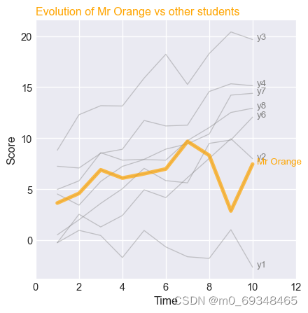
十、40-散点图
使用seaborn库的rezalcto函数制作散点图,虹膜数据集,该图显示了植物萼片长度和宽度之间的关系。
# library & dataset
import seaborn as sns
import matplotlib.pyplot as plt
df = sns.load_dataset('iris',cache=True,data_home="../seaborn-data-master")

# use the function regplot to make a scatterplot
sns.regplot(x=df["sepal_length"], y=df["sepal_width"])

# make a scatterplot without regression fit
#ax = sns.regplot(x=df["sepal_length"], y=df["sepal_width"], fit_reg=False)

plt.show()
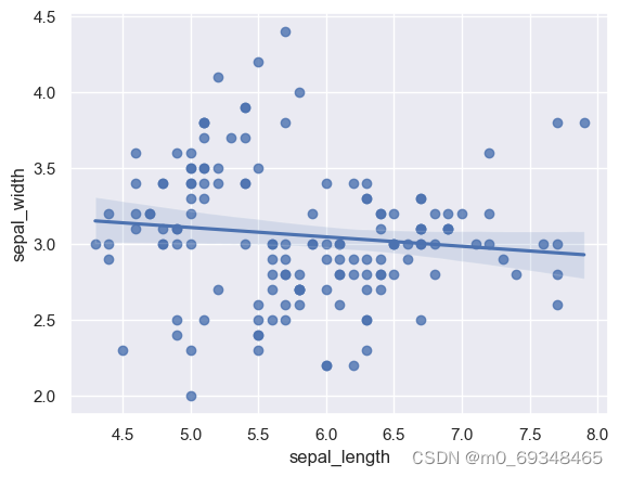
十一、50-千曲线图or密度图
只有一个数值变量
# libraries & dataset
import seaborn as sns
import matplotlib.pyplot as plt
# set a grey background (use sns.set_theme() if seaborn version 0.11.0 or above)
sns.set(style="darkgrid")
df = sns.load_dataset('iris',cache=True,data_home="../seaborn-data-master")

# Make boxplot for one group only
sns.violinplot(y=df["sepal_length"])
plt.show()
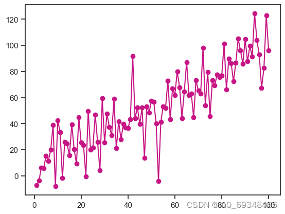
十二、106-花里胡哨
# library and dataset
from matplotlib import pyplot as plt
import pandas as pd
import numpy as np

# Create data
df=pd.DataFrame({'x_axis': range(1,101), 'y_axis': np.random.randn(100)*15+range(1,101), 'z': (np.random.randn(100)*15+range(1,101))*2 })

# plot with matplotlib
plt.plot( 'x_axis', 'y_axis', data=df, marker='o', color='mediumvioletred')
plt.show()
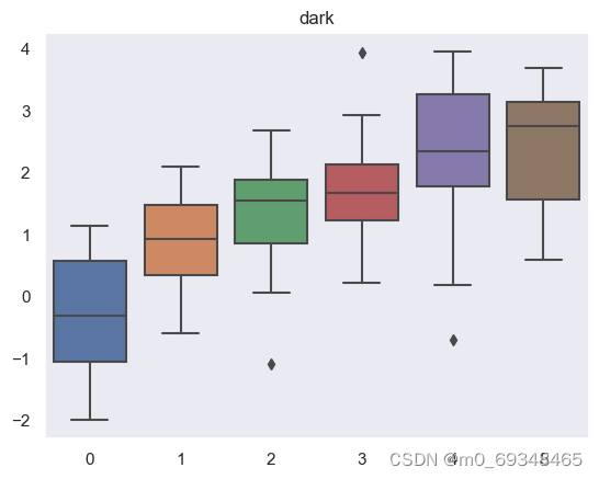
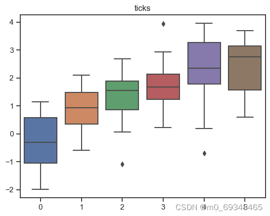
十三、104-多种风格箱线图
# libraries
import seaborn as sns
import numpy as np
import matplotlib.pyplot as plt

# Data
data = np.random.normal(size=(20, 6)) + np.arange(6) / 2

# Proposed themes: darkgrid, whitegrid, dark, white, and ticks

sns.set_style("whitegrid")
sns.boxplot(data=data)
plt.title("whitegrid")
plt.show()

sns.set_style("darkgrid")
sns.boxplot(data=data);
plt.title("darkgrid")
plt.show()

sns.set_style("white")
sns.boxplot(data=data);
plt.title("white")
plt.show()

sns.set_style("dark")
sns.boxplot(data=data);
plt.title("dark")
plt.show()

sns.set_style("ticks")
sns.boxplot(data=data);
plt.title("ticks")
plt.show()


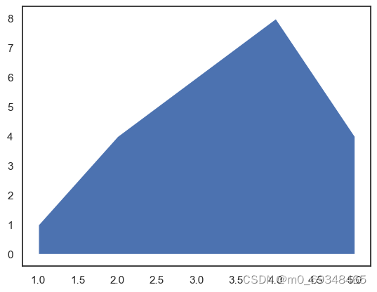
十四、240-使用matplotlib绘制基本面积图有2个主要函数。fill_between()函数允许更容易定制。stackplo()函数也可以工作,但它更适合堆叠面积图。两个函数的输入都是2个数值变量
# libraries
import numpy as np
import matplotlib.pyplot as plt

# Create data
x=range(1,6)
y=[1,4,6,8,4]

# Area plot
plt.fill_between(x, y)

# Show the graph
plt.show()

# Note that we could also use the stackplot function
# but fill_between is more convenient for future customization.
#plt.stackplot(x,y)
#plt.show()
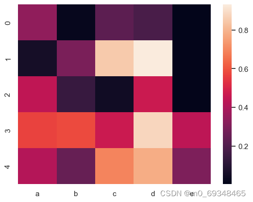
十五、90-热图
宽格式或者不整齐格式是一个矩阵,其中每行是一个个体,每列是一个观察者。热图对矩形进行了可视化的表示;热图的每一个正方形代表一个单元格。单元格个的颜色会根据它的值而变化
# library
import seaborn as sns
import pandas as pd
import numpy as np

# Create a dataset
df = pd.DataFrame(np.random.random((5,5)), columns=["a","b","c","d","e"])

# Default heatmap: just a visualization of this square matrix
sns.heatmap(df)
<Axes: >
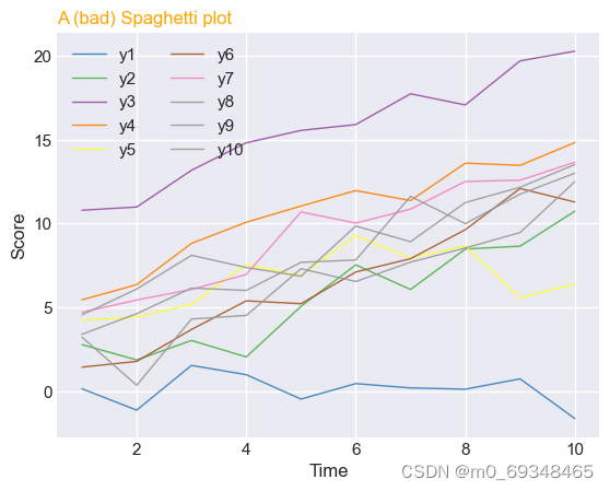
十六、124-意面图
# libraries
import matplotlib.pyplot as plt
import numpy as np
import pandas as pd

# Make a data frame
df=pd.DataFrame({'x': range(1,11), 'y1': np.random.randn(10), 'y2': np.random.randn(10)+range(1,11), 'y3': np.random.randn(10)+range(11,21), 'y4': np.random.randn(10)+range(6,16), 'y5': np.random.randn(10)+range(4,14)+(0,0,0,0,0,0,0,-3,-8,-6), 'y6': np.random.randn(10)+range(2,12), 'y7': np.random.randn(10)+range(5,15), 'y8': np.random.randn(10)+range(4,14), 'y9': np.random.randn(10)+range(4,14), 'y10': np.random.randn(10)+range(2,12) })

# Change the style of plot
plt.style.use('seaborn-darkgrid')

# Create a color palette
palette = plt.get_cmap('Set1')

# Plot multiple lines
num=0
for column in df.drop('x', axis=1):
    num+=1
    plt.plot(df['x'], df[column], marker='', color=palette(num), linewidth=1, alpha=0.9, label=column)

# Add legend
plt.legend(loc=2, ncol=2)

# Add titles
plt.title("A (bad) Spaghetti plot", loc='left', fontsize=12, fontweight=0, color='orange')
plt.xlabel("Time")
plt.ylabel("Score")

# Show the graph
plt.show()
C:\Users\HONGPING\AppData\Local\Temp\ipykernel_55976\4128107253.py:10: MatplotlibDeprecationWarning: The seaborn styles shipped by Matplotlib are deprecated since 3.6, as they no longer correspond to the styles shipped by seaborn. However, they will remain available as 'seaborn-v0_8-<style>'. Alternatively, directly use the seaborn API instead.
  plt.style.use('seaborn-darkgrid')
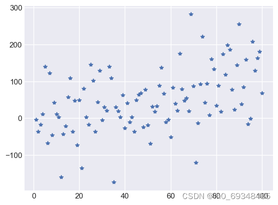
十七、散点图
标志形状的散点图
# libraries
import matplotlib.pyplot as plt
import numpy as np
import pandas as pd
# dataset
df=pd.DataFrame({'x_values': range(1,101), 'y_values': np.random.randn(100)*80+range(1,101) })
# === Left figure:
plt.plot( 'x_values', 'y_values', data=df, linestyle='none', marker='*')
plt.show()
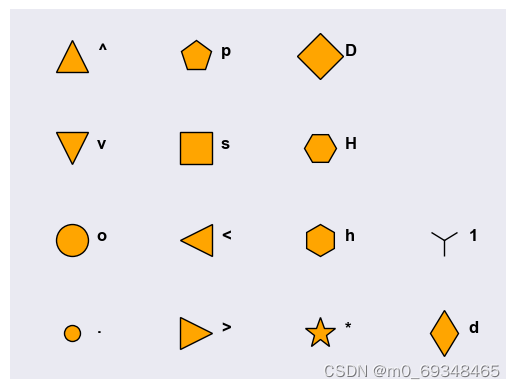
# === Right figure:
all_poss=['.','o','v','^','>','<','s','p','*','h','H','D','d','1','','']
# to see all possibilities:
# markers.MarkerStyle.markers.keys()
# set the limit of x and y axis:
plt.xlim(0.5,4.5)
plt.ylim(0.5,4.5)
# remove ticks and values of axis:
plt.xticks([])
plt.yticks([])
#plt.set_xlabel(size=0)
# Make a loop to add markers one by one
num=0
for x in range(1,5):
for y in range(1,5):
num += 1
plt.plot(x,y,marker=all_poss[num-1], markerfacecolor='orange', markersize=23, markeredgecolor="black")
plt.text(x+0.2, y, all_poss[num-1], horizontalalignment='left', size='medium', color='black', weight='semibold')
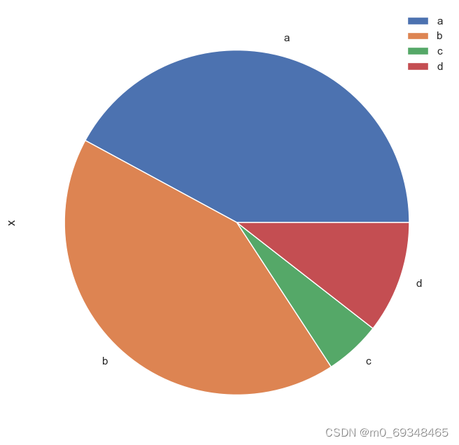
十八、饼状图
# library
import pandas as pd
import matplotlib.pyplot as plt

# --- dataset 1: just 4 values for 4 groups:
df = pd.DataFrame([8,8,1,2], index=['a', 'b', 'c', 'd'], columns=['x'])

# make the plot
df.plot(kind='pie', subplots=True, figsize=(8, 8))

# show the plot
plt.show()
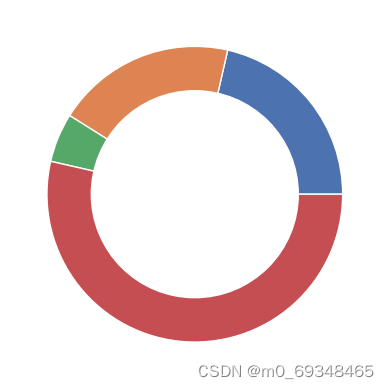
十九、甜甜圈图
绘制一个饼图,并在中间添加一个白色圆圈
# library
import matplotlib.pyplot as plt

# create data
size_of_groups=[12,11,3,30]

# Create a pie plot
plt.pie(size_of_groups)
#plt.show()

# add a white circle at the center
my_circle=plt.Circle( (0,0), 0.7, color='white')
p=plt.gcf()
p.gca().add_artist(my_circle)

# show the graph
plt.show()
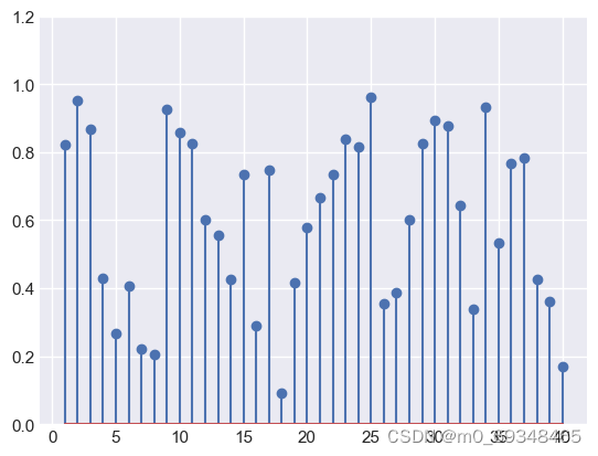
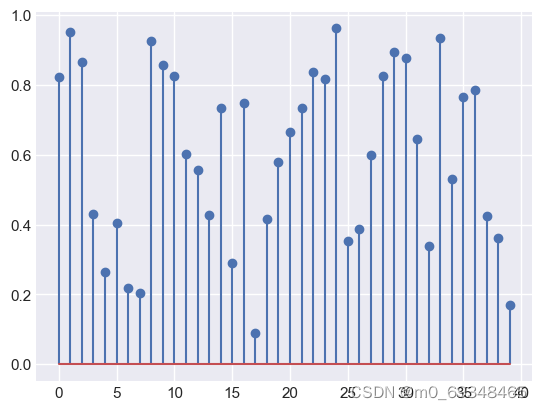
二十、棒棒糖图
# libraries
import matplotlib.pyplot as plt
import numpy as np

# create data
x=range(1,41)
values=np.random.uniform(size=40)

# stem function
plt.stem(x, values)
plt.ylim(0, 1.2)
plt.show()

# stem function: If x is not provided, a sequence of numbers is created by python:
plt.stem(values)
plt.show()
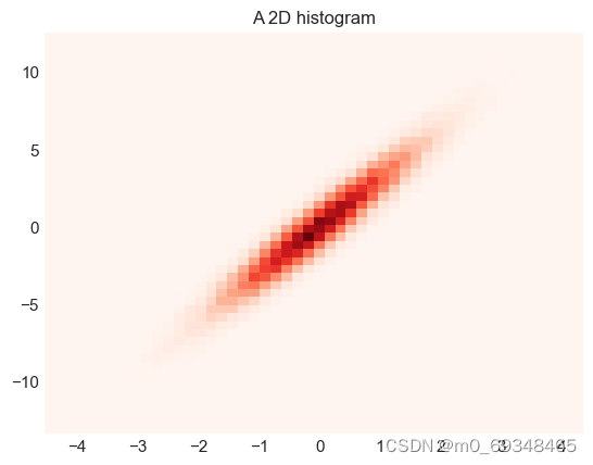
二十一、星系图
# libraries
import matplotlib.pyplot as plt
import numpy as np

# Data
x = np.random.normal(size=50000)
y = x * 3 + np.random.normal(size=50000)

# A histogram 2D
plt.hist2d(x, y, bins=(50, 50), cmap=plt.cm.Reds)

# Add a basic title
plt.title("A 2D histogram")

# Show the graph
plt.show()
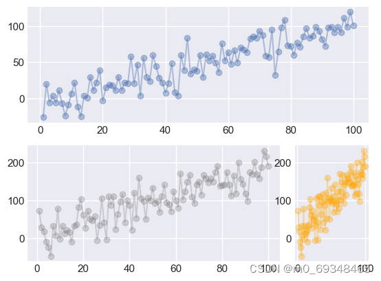
二十二、细胞图
# libraries and data
from matplotlib import pyplot as plt
import pandas as pd
import numpy as np
df=pd.DataFrame({'x_values': range(1,101), 'y_values': np.random.randn(100)*15+range(1,101), 'z_values': (np.random.randn(100)*15+range(1,101))*2 })

# 4 columns and 2 rows
# The first plot is on line 1, and is spread all along the 4 columns
ax1 = plt.subplot2grid((2, 4), (0, 0), colspan=4)
ax1.plot( 'x_values', 'y_values', data=df, marker='o', alpha=0.4)

# The second one is on column2, spread on 3 columns
ax2 = plt.subplot2grid((2, 4), (1, 0), colspan=3)
ax2.plot( 'x_values','z_values', data=df, marker='o', color="grey", alpha=0.3)

# The last one is spread on 1 column only, on the 4th column of the second line.
ax3 = plt.subplot2grid((2, 4), (1, 3), colspan=1)
ax3.plot( 'x_values','z_values', data=df, marker='o', color="orange", alpha=0.3)

# Show the graph
plt.show()
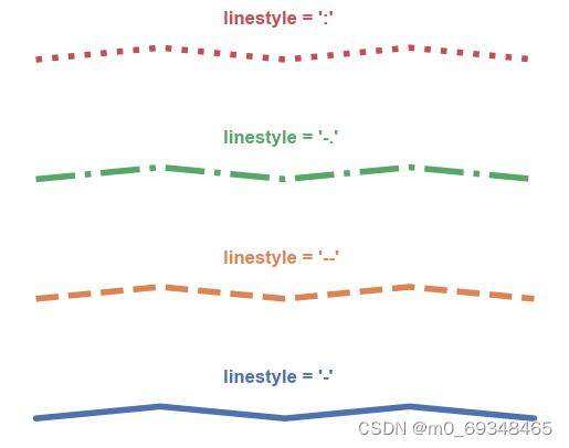
二十三、不同类型的线条图
plt.plot( [1,1.1,1,1.1,1], linestyle='-' , linewidth=4)
plt.text(1.5, 1.3, "linestyle = '-' ", horizontalalignment='left', size='medium', color='C0', weight='semibold')
plt.plot( [2,2.1,2,2.1,2], linestyle='--' , linewidth=4 )
plt.text(1.5, 2.3, "linestyle = '--' ", horizontalalignment='left', size='medium', color='C1', weight='semibold')
plt.plot( [3,3.1,3,3.1,3], linestyle='-.' , linewidth=4 )
plt.text(1.5, 3.3, "linestyle = '-.' ", horizontalalignment='left', size='medium', color='C2', weight='semibold')
plt.plot( [4,4.1,4,4.1,4], linestyle=':' , linewidth=4 )
plt.text(1.5, 4.3, "linestyle = ':' ", horizontalalignment='left', size='medium', color='C3', weight='semibold')
plt.axis('off')
plt.show()
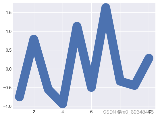
## 二十四、线条图
# Libraries and data
import matplotlib.pyplot as plt
import numpy as np
import pandas as pd
df=pd.DataFrame({'x_values': range(1,11), 'y_values': np.random.randn(10) })

# Modify line width of the graph
plt.plot( 'x_values', 'y_values', data=df, linewidth=22)

# Show graph
plt.show()
二十五、意大利面图
从几个子图中切割窗口,每个组一个,然后选择离散地显示每一个组
# libraries
import matplotlib.pyplot as plt
import numpy as np
import pandas as pd

# Make a data frame
df=pd.DataFrame({'x': range(1,11), 'y1': np.random.randn(10), 'y2': np.random.randn(10)+range(1,11), 'y3': np.random.randn(10)+range(11,21), 'y4': np.random.randn(10)+range(6,16), 'y5': np.random.randn(10)+range(4,14)+(0,0,0,0,0,0,0,-3,-8,-6), 'y6': np.random.randn(10)+range(2,12), 'y7': np.random.randn(10)+range(5,15), 'y8': np.random.randn(10)+range(4,14), 'y9': np.random.randn(10)+range(4,14) })

# Initialize the figure style
plt.style.use('seaborn-darkgrid')

# create a color palette
palette = plt.get_cmap('Set1')

# multiple line plot
num=0
for column in df.drop('x', axis=1):
    num+=1

    # Find the right spot on the plot
    plt.subplot(3,3, num)

    # Plot the lineplot
    plt.plot(df['x'], df[column], marker='', color=palette(num), linewidth=1.9, alpha=0.9, label=column)

    # Same limits for every chart
    plt.xlim(0,10)
    plt.ylim(-2,22)

    # Not ticks everywhere
    if num in range(7) :
        plt.tick_params(labelbottom='off')
    if num not in [1,4,7] :
        plt.tick_params(labelleft='off')

    # Add title
    plt.title(column, loc='left', fontsize=12, fontweight=0, color=palette(num) )

# general title
plt.suptitle("How the 9 students improved\nthese past few days?", fontsize=13, fontweight=0, color='black', style='italic', y=1.02)

# Axis titles
plt.text(0.5, 0.02, 'Time', ha='center', va='center')
plt.text(0.06, 0.5, 'Note', ha='center', va='center', rotation='vertical')

# Show the graph
plt.show()
C:\Users\HONGPING\AppData\Local\Temp\ipykernel_55976\2721885833.py:10: MatplotlibDeprecationWarning: The seaborn styles shipped by Matplotlib are deprecated since 3.6, as they no longer correspond to the styles shipped by seaborn. However, they will remain available as 'seaborn-v0_8-<style>'. Alternatively, directly use the seaborn API instead.
plt.style.use('seaborn-darkgrid')

二十六、方块图
# libraries
import matplotlib.pyplot as plt
import numpy as np
import pandas as pd

# dataset
df=pd.DataFrame({'x_values': range(1,101), 'y_values': np.random.randn(100)*80+range(1,101) })

# scatter plot
plt.plot( 'x_values', 'y_values', data=df, linestyle='none', marker='D', markersize=16)
plt.show()
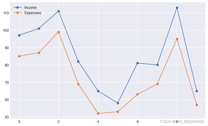
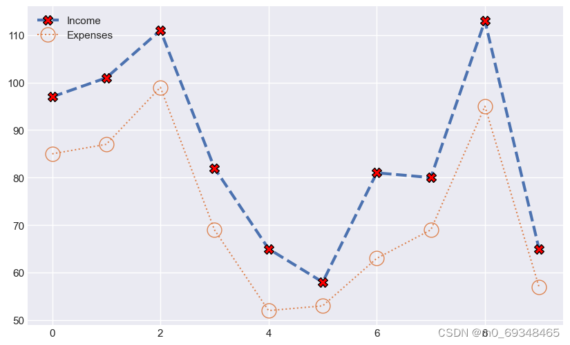
二十七、标记折线图
# Libraries
import matplotlib.pyplot as plt
import numpy as np
import pandas as pd

# Set figure default figure size
plt.rcParams["figure.figsize"] = (10, 6)
# Create a random number generator for reproducibility
rng = np.random.default_rng(1111)

# Get some random points!
x = np.array(range(10))
y = rng.integers(10, 100, 10)
z = y + rng.integers(5, 20, 10)
plt.plot(x, z, linestyle="-", marker="o", label="Income")
plt.plot(x, y, linestyle="-", marker="o", label="Expenses")
plt.legend()
plt.show()
plt.plot(
    x, z, ls="--", lw=3,
    marker="X", markersize=10, markerfacecolor="red", markeredgecolor="black",
    label="Income"
)
plt.plot(
    x, y, ls=":",
    marker="o", markersize=15, markerfacecolor="None",
    label="Expenses"
)
plt.legend()
plt.show()
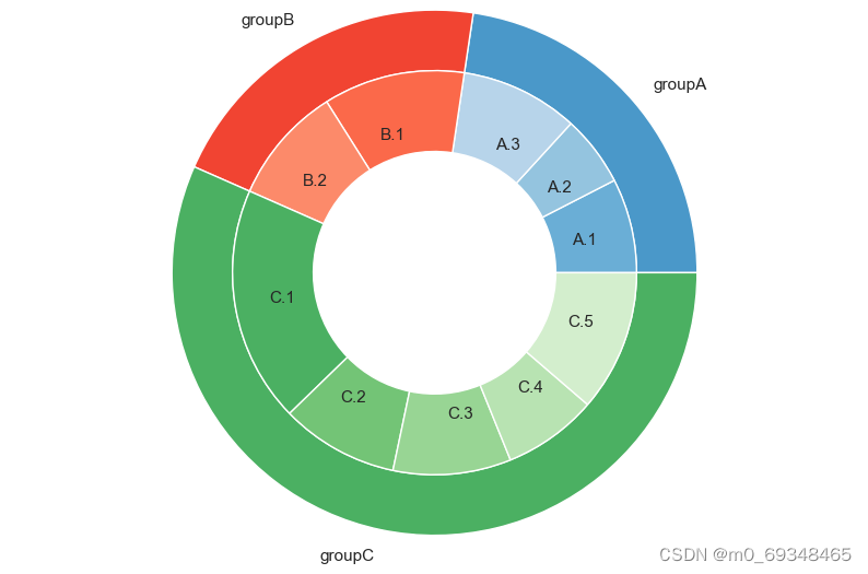
二十八、有三组甜甜圈图,每组有几个子组,可以使用半径和宽度选项设置2个圈级别的位置。然后,我们地想法是为每一个组设置一个调色板。
# Libraries
import matplotlib.pyplot as plt

# Make data: I have 3 groups and 7 subgroups
group_names=['groupA', 'groupB', 'groupC']
group_size=[12,11,30]
subgroup_names=['A.1', 'A.2', 'A.3', 'B.1', 'B.2', 'C.1', 'C.2', 'C.3', 'C.4', 'C.5']
subgroup_size=[4,3,5,6,5,10,5,5,4,6]

# Create colors
a, b, c=[plt.cm.Blues, plt.cm.Reds, plt.cm.Greens]

# First Ring (outside)
fig, ax = plt.subplots()
ax.axis('equal')
mypie, _ = ax.pie(group_size, radius=1.3, labels=group_names, colors=[a(0.6), b(0.6), c(0.6)] )
plt.setp( mypie, width=0.3, edgecolor='white')

# Second Ring (Inside)
mypie2, _ = ax.pie(subgroup_size, radius=1.3-0.3, labels=subgroup_names, labeldistance=0.7, colors=[a(0.5), a(0.4), a(0.3), b(0.5), b(0.4), c(0.6), c(0.5), c(0.4), c(0.3), c(0.2)])
plt.setp( mypie2, width=0.4, edgecolor='white')
plt.margins(0,0)
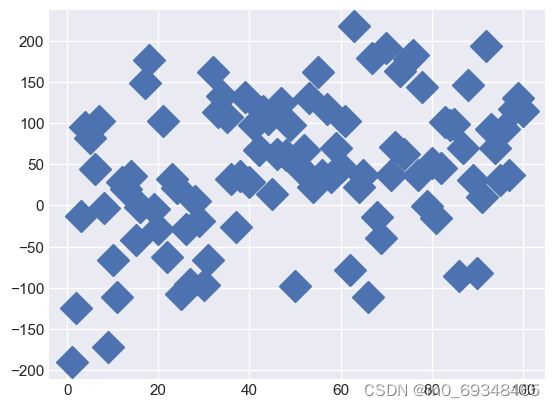
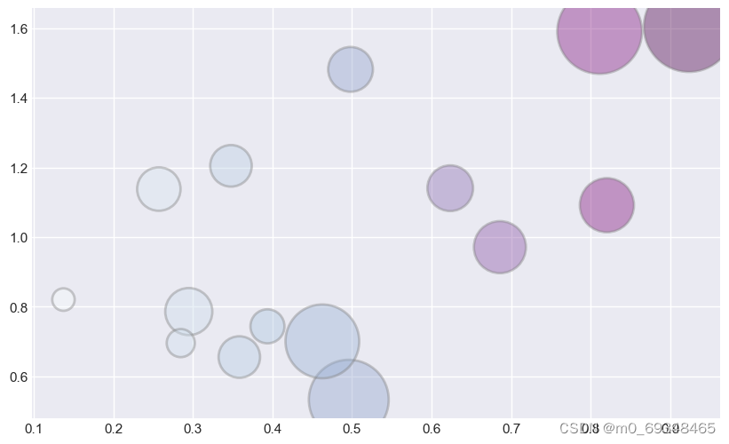
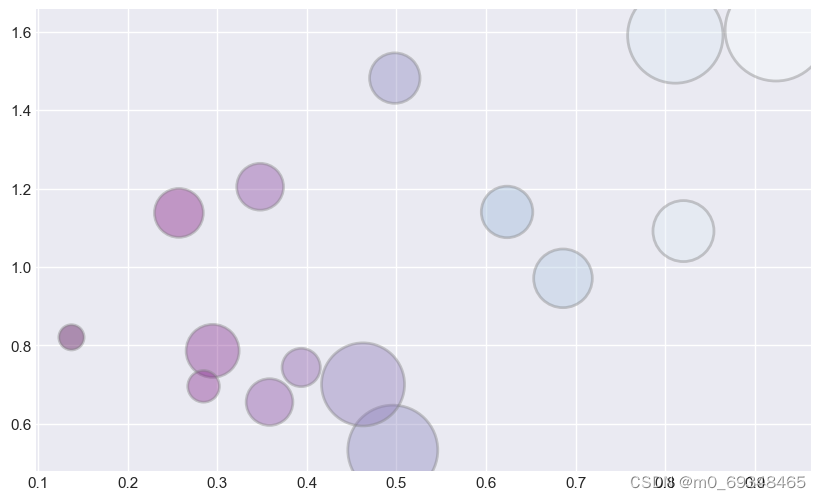
二十九、气泡图
三种类型:顺序、离散和发散
# libraries
from matplotlib import pyplot as plt
import numpy as np

# create data
x = np.random.rand(15)
y = x+np.random.rand(15)
z = x+np.random.rand(15)
z=z*z

# call pallette in cmap
plt.scatter(x, y, s=z*2000, c=x, cmap="BuPu", alpha=0.4, edgecolors="grey", linewidth=2)
plt.show()

# You can reverse it by adding "_r" to the end:
plt.scatter(x, y, s=z*2000, c=x, cmap="BuPu_r", alpha=0.4, edgecolors="grey", linewidth=2)
plt.show()
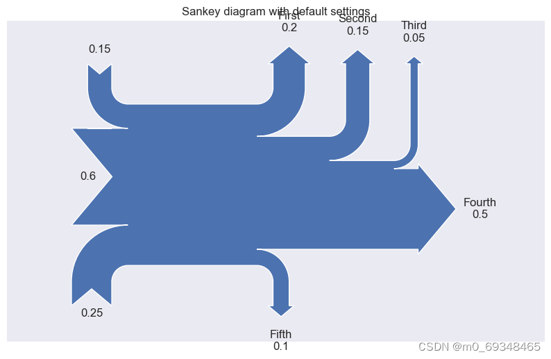
三十、桑基图
# Libraries
import numpy as np
import matplotlib.pyplot as plt
from matplotlib.sankey import Sankey

# basic sankey chart
Sankey(flows=[0.25, 0.15, 0.60, -0.20, -0.15, -0.05, -0.50, -0.10], labels=['', '', '', 'First', 'Second', 'Third', 'Fourth', 'Fifth'], orientations=[-1, 1, 0, 1, 1, 1, 0,-1]).finish()
plt.title("Sankey diagram with default settings")
plt.show()
三十一、山峰网格图
# libraries
import numpy as np
import seaborn as sns
import matplotlib.pyplot as plt

# set the seaborn style
sns.set_style("whitegrid")

# Color palette
blue, = sns.color_palette("muted", 1)

# Create data
x = np.arange(23)
y = np.random.randint(8, 20, 23)

# Make the plot
fig, ax = plt.subplots()
ax.plot(x, y, color=blue, lw=3)
ax.fill_between(x, 0, y, alpha=.3)
ax.set(xlim=(0, len(x) - 1), ylim=(0, None), xticks=x)

# Show the graph
plt.show()
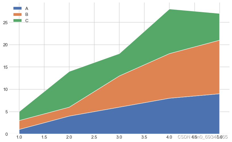
三十二、基本的堆叠面积图
# libraries
import numpy as np
import matplotlib.pyplot as plt

# --- FORMAT 1

# Your x and y axis
x=range(1,6)
y=[ [1,4,6,8,9], [2,2,7,10,12], [2,8,5,10,6] ]

# Basic stacked area chart.
plt.stackplot(x,y, labels=['A','B','C'])
plt.legend(loc='upper left')
plt.show()

# --- FORMAT 2
x=range(1,6)
y1=[1,4,6,8,9]
y2=[2,2,7,10,12]
y3=[2,8,5,10,6]

# Basic stacked area chart.
plt.stackplot(x,y1, y2, y3, labels=['A','B','C'])
plt.legend(loc='upper left')
plt.show()

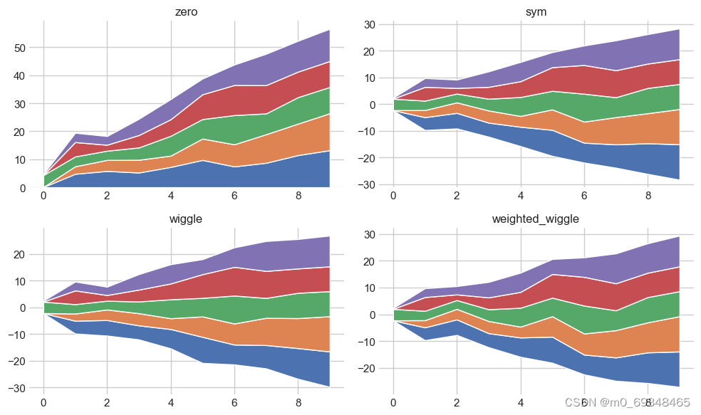
三十三、它提供了一个基线参数,允许自定义基线周围区域地位置,存在四种可能
# libraries
import numpy as np
import matplotlib.pyplot as plt
import seaborn as sns

# Create data
X = np.arange(0, 10, 1)
Y = X + 5 * np.random.random((5, X.size))

# There are 4 types of baseline we can use:
baseline = ["zero", "sym", "wiggle", "weighted_wiggle"]

# Let's make 4 plots, 1 for each baseline
for n, v in enumerate(baseline):
    if n<3 :
        plt.tick_params(labelbottom='off')
    plt.subplot(2 ,2, n + 1)
    plt.stackplot(X, *Y, baseline=v)
    plt.title(v)
    plt.tight_layout()
C:\Users\HONGPING\AppData\Local\Temp\ipykernel_55976\3218836517.py:17: MatplotlibDeprecationWarning: Auto-removal of overlapping axes is deprecated since 3.6 and will be removed two minor releases later; explicitly call ax.remove() as needed.
  plt.subplot(2 ,2, n + 1)
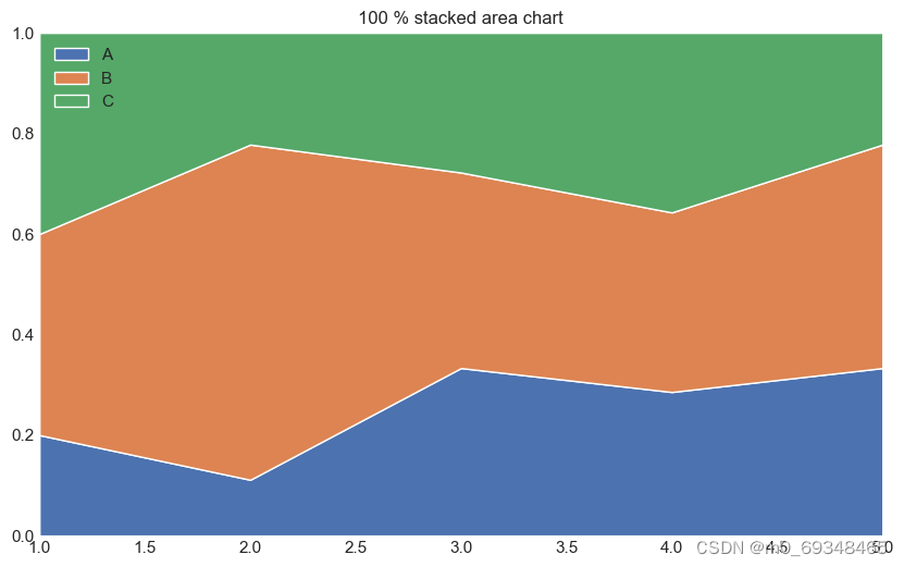
三十四、三组
# libraries
import numpy as np
import matplotlib.pyplot as plt
import seaborn as sns
import pandas as pd

# Make data
data = pd.DataFrame({  'group_A':[1,4,6,8,9], 'group_B':[2,24,7,10,12], 'group_C':[2,8,5,10,6], }, index=range(1,6))

# We need to transform the data from raw data to percentage (fraction)
data_perc = data.divide(data.sum(axis=1), axis=0)

# Make the plot
plt.stackplot(range(1,6),  data_perc["group_A"],  data_perc["group_B"],  data_perc["group_C"], labels=['A','B','C'])
plt.legend(loc='upper left')
plt.margins(0,0)
plt.title('100 % stacked area chart')
plt.show()
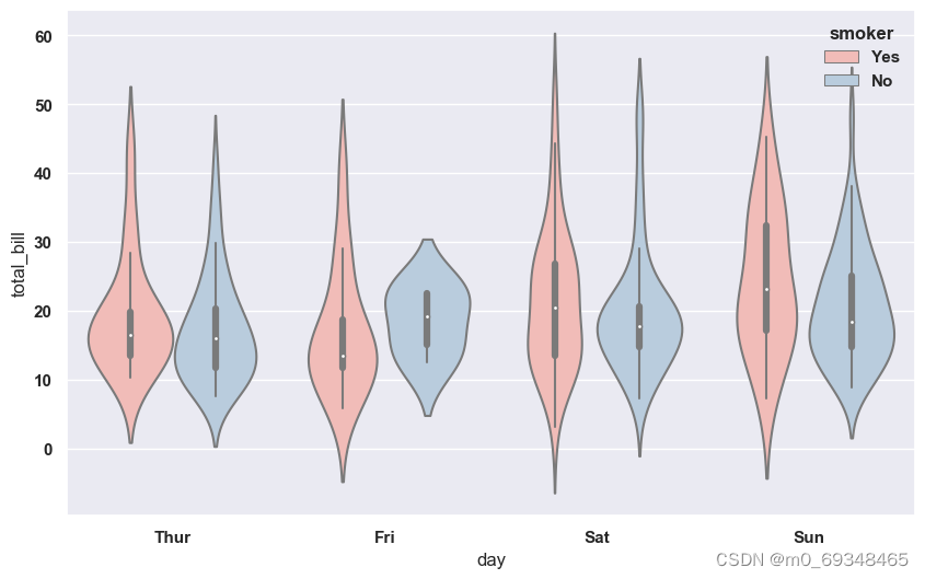
三十五、这是对吸烟者和不吸烟者在一周内给小费的方式给出一个概述,
# libraries & dataset
import seaborn as sns
import matplotlib.pyplot as plt
# set a grey background (use sns.set_theme() if seaborn version 0.11.0 or above)
sns.set(style="darkgrid")
df = sns.load_dataset('tips',cache=True,data_home="../seaborn-data-master")

# Grouped violinplot
sns.violinplot(x="day", y="total_bill", hue="smoker", data=df, palette="Pastel1")
plt.show()
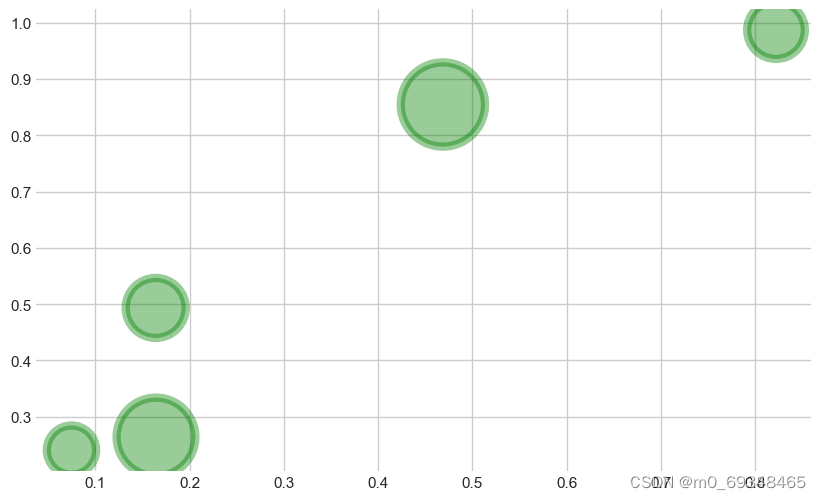
三十六、细菌气泡图
#%%
# libraries
import matplotlib.pyplot as plt
import numpy as np

# create data
x = np.random.rand(5)
y = np.random.rand(5)
z = np.random.rand(5)

# Change line around dot
plt.scatter(x, y, s=z*4000, c="green", alpha=0.4, linewidth=6)

# show the graph
plt.show()
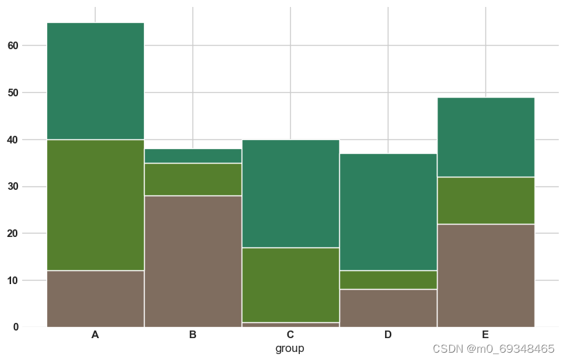
三十七、分段条形图
# libraries
import numpy as np
import matplotlib.pyplot as plt
from matplotlib import rc
import pandas as pd

# y-axis in bold
rc('font', weight='bold')

# Values of each group
bars1 = [12, 28, 1, 8, 22]
bars2 = [28, 7, 16, 4, 10]
bars3 = [25, 3, 23, 25, 17]

# Heights of bars1 + bars2
bars = np.add(bars1, bars2).tolist()

# The position of the bars on the x-axis
r = [0,1,2,3,4]

# Names of group and bar width
names = ['A','B','C','D','E']
barWidth = 1

# Create brown bars
plt.bar(r, bars1, color='#7f6d5f', edgecolor='white', width=barWidth)
# Create green bars (middle), on top of the first ones
plt.bar(r, bars2, bottom=bars1, color='#557f2d', edgecolor='white', width=barWidth)
# Create green bars (top)
plt.bar(r, bars3, bottom=bars, color='#2d7f5e', edgecolor='white', width=barWidth)

# Custom X axis
plt.xticks(r, names, fontweight='bold')
plt.xlabel("group")

# Show graphic
plt.show()
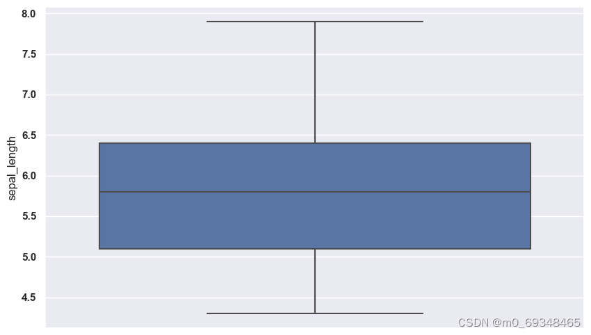
## 三十八、
# libraries & dataset
import seaborn as sns
import matplotlib.pyplot as plt
# set a grey background (use sns.set_theme() if seaborn version 0.11.0 or above)
sns.set(style="darkgrid")
df = sns.load_dataset('iris',cache=True,data_home="../seaborn-data-master")

sns.boxplot(y=df["sepal_length"])
plt.show()
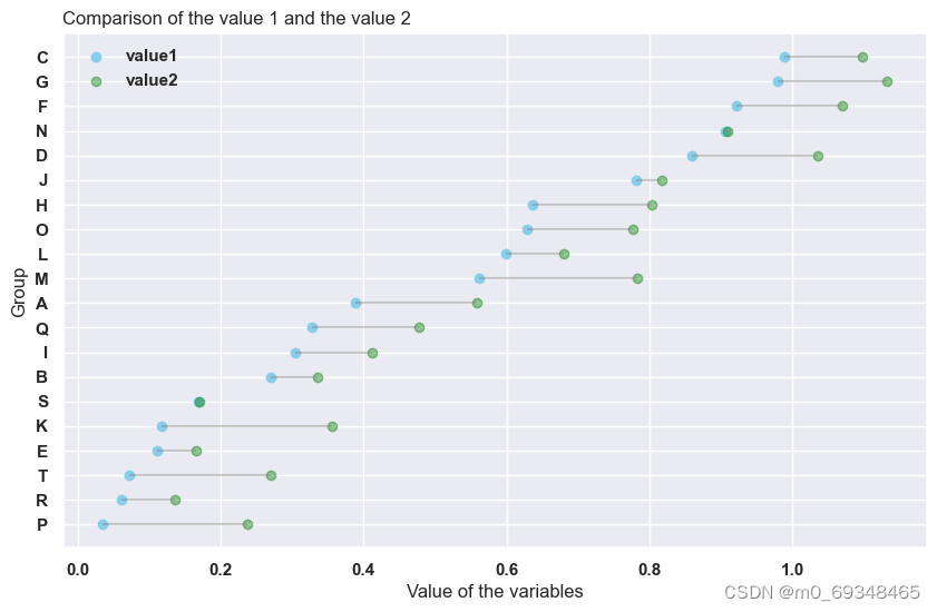
三十九、展示如何使用hlines()和三点函数显示水平棒棒糖图中每个组的两个观测值之间的差异
# libraries
import numpy as np
import pandas as pd
import matplotlib.pyplot as plt

# Create a dataframe
value1=np.random.uniform(size=20)
value2=value1+np.random.uniform(size=20)/4
df = pd.DataFrame({'group':list(map(chr, range(65, 85))), 'value1':value1 , 'value2':value2 })

# Reorder it following the values of the first value:
ordered_df = df.sort_values(by='value1')
my_range=range(1,len(df.index)+1)

# The horizontal plot is made using the hline function
plt.hlines(y=my_range, xmin=ordered_df['value1'], xmax=ordered_df['value2'], color='grey', alpha=0.4)
plt.scatter(ordered_df['value1'], my_range, color='skyblue', alpha=1, label='value1')
plt.scatter(ordered_df['value2'], my_range, color='green', alpha=0.4 , label='value2')
plt.legend()

# Add title and axis names
plt.yticks(my_range, ordered_df['group'])
plt.title("Comparison of the value 1 and the value 2", loc='left')
plt.xlabel('Value of the variables')
plt.ylabel('Group')

# Show the graph
plt.show()
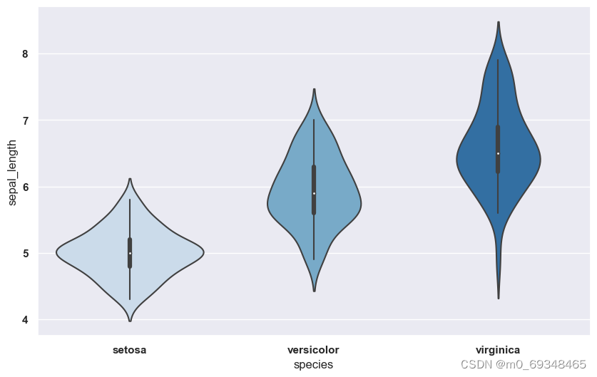
四十、小提琴魔鬼
# libraries & dataset
import seaborn as sns
import matplotlib.pyplot as plt
# set a grey background (use sns.set_theme() if seaborn version 0.11.0 or above)
sns.set(style="darkgrid")
df = sns.load_dataset('iris',cache=True,data_home="../seaborn-data-master")

# Use a color palette
sns.violinplot(x=df["species"], y=df["sepal_length"], palette="Blues")
plt.show()


 585
585


 被折叠的 条评论
为什么被折叠?
被折叠的 条评论
为什么被折叠?
 到【灌水乐园】发言


