


学习目标:
为了更好了解web的用法,学习使用3D旋转相册
HTML部分
<!DOCTYPE html>
<html>
	<head>
		<meta charset="UTF-8">
		<title>BLACKPINK</title>
		<link href="../css/css.css" type="text/css" rel="stylesheet"/>
	</head>
	<body>
		<div id="box">
			<div class="header">
				<div class="logopic"><img src="../img/logo.jpg"/></div>
				<div class="logo"><h1>BLACKPINK</h1></div>
				<div class="topmenu">
					<ul>
						<li><a href="#">网站内容 |</a></li>
						<li><a href="#">设为首页 |</a></li>
						<li><a href="#">加入收藏</a></li>
					</ul>
				</div>
			</div>
			<div class="daohang">
				<div class="menu">
					<ul>
						<li><a href="../index.html">首页 |</a></li>
						<li><a href="sub1.html">成员简介 |</a></li>
						<li><a href="sub2.html">作品展示 |</a></li>
						<li><a href="sub3.html">奖项获得 |</a></li>
						<li><a href="sub4.html">演艺经历 |</a></li>
						<li><a href="sub5.html">相册</a></li>
					</ul>
				</div>
			</div>


			<div class="box">
				<ul class="minbox">
					<li></li>
					<li></li>
					<li></li>
					<li></li>
					<li></li>
					<li></li>
				</ul>
				<ol class="maxbox">
					<li></li>
					<li></li>
					<li></li>
					<li></li>
					<li></li>
					<li></li>
				</ol>
			</div>

		</div>
	</body>
</html>
css部分
.container5{
width: 1000px;
height: 670px;
background: url(../img/sub5.jpg);
}
.mainbox5{
width: 1000px;
height: 600px;
margin: 150px 0px;
}
.sub5-text1{
width: 1000px;
height: 400px;
font-size: 20px;
line-height: 50px;
padding: 50px 20px;
font-weight: 800;
}
.sub5-text1 input{
height: 25px;
background-color: rgba(255,255,255,0.5);
}
.sub5-text1 select{
height: 30px;
width: 140px;
font-size: 18px;
text-align: center;
background-color: rgba(255,255,255,0.5);
}
.sub5-text1 textarea{
background-color: rgba(255,255,255,0.5);
}
.sub5-text2{
margin-left: 150px;
}
.sub5-text2 input{
width: 50px;
height: 30px;
font-size: 15px;
}
.box{
width: 1000px;
height: 400px;
}
@charset "utf-8";
*{
margin:0;
padding:0;
}
body{
max-width: 100%;
min-width: 100%;
height: 100%;
background-size: cover;
background-repeat: no-repeat;
background-attachment: fixed;
background-size:100% 100%;
position: absolute;
margin-left: auto;
margin-right: auto;
}
li{
list-style: none;
}
.box{
width:200px;
height:200px;
background-size: cover;
background-repeat: no-repeat;
background-attachment: fixed;
background-size:100% 100%;
position: absolute;
margin-left: 42%;
margin-top: 22%;
transform-style:preserve-3d;
transform:rotateX(13deg);
animation:move 5s linear infinite;
}
.minbox{
width:100px;
height:100px;
position: absolute;
left:50px;
top:30px;
transform-style:preserve-3d;
}
.minbox li{
width:100px;
height:100px;
position: absolute;
left:0;
top:0;
}
.minbox li:nth-child(1){
background: url(..\\img\\1.jpg) no-repeat 0 0;
transform:translateZ(50px);
}
.minbox li:nth-child(2){
background: url(..\\img\\3jpgg) no-repeat 0 0;
transform:rotateX(180deg) translateZ(50px);
}
.minbox li:nth-child(3){
background: url(..\\img\\2.jpg) no-repeat 0 0;
transform:rotateX(-90deg) translateZ(50px);
}
.minbox li:nth-child(4){
background: url(..\\img\\4.jpg) no-repeat 0 0;
transform:rotateX(90deg) translateZ(50px);
}
.minbox li:nth-child(5){
background: url(..\\img\\5.jpg) no-repeat 0 0;
transform:rotateY(-90deg) translateZ(50px);
}
.minbox li:nth-child(6){
background: url(..\\img\\6.jpg) no-repeat 0 0;
transform:rotateY(90deg) translateZ(50px);
}
.maxbox li:nth-child(1){
background: url(..\\img\\lisa.jpg) no-repeat 0 0;
transform:translateZ(50px);
}
.maxbox li:nth-child(2){
background: url(..\\img\\朴彩英.jpg) no-repeat 0 0;
transform:translateZ(50px);
}
.maxbox li:nth-child(3){
background: url(..\\img\\金珍妮.jpg) no-repeat 0 0;
transform:rotateX(-90deg) translateZ(50px);
}
.maxbox li:nth-child(4){
background: url(..\\img\\lisa1.jpg) no-repeat 0 0;
transform:rotateX(90deg) translateZ(50px);
}
.maxbox li:nth-child(5){
background: url(..\\img\\金智秀.jpg) no-repeat 0 0;
transform:rotateY(-90deg) translateZ(50px);
}
.maxbox li:nth-child(6){
background: url(..\\img\\朴彩英1.jpg) no-repeat 0 0;
transform:rotateY(90deg) translateZ(50px);
}
.maxbox{
width: 800px;
height: 400px;
position: absolute;
left: 0;
top: -20px;
transform-style: preserve-3d;
}
.maxbox li{
width: 200px;
height: 200px;
background: #fff;
border:1px solid #ccc;
position: absolute;
left: 0;
top: 0;
opacity: 0.2;
transition:all 1s ease;
}
.maxbox li:nth-child(1){
transform:translateZ(100px);
}
.maxbox li:nth-child(2){
transform:rotateX(180deg) translateZ(100px);
}
.maxbox li:nth-child(3){
transform:rotateX(-90deg) translateZ(100px);
}
.maxbox li:nth-child(4){
transform:rotateX(90deg) translateZ(100px);
}
.maxbox li:nth-child(5){
transform:rotateY(-90deg) translateZ(100px);
}
.maxbox li:nth-child(6){
transform:rotateY(90deg) translateZ(100px);
}
.box:hover ol li:nth-child(1){
transform:translateZ(300px);
width: 400px;
height: 400px;
opacity: 0.8;
left: -100px;
top: -100px;
}
.box:hover ol li:nth-child(2){
transform:rotateX(180deg) translateZ(300px);
width: 400px;
height: 400px;
opacity: 0.8;
left: -100px;
top: -100px;
}
.box:hover ol li:nth-child(3){
transform:rotateX(-90deg) translateZ(300px);
width: 400px;
height: 400px;
opacity: 0.8;
left: -100px;
top: -100px;
}
.box:hover ol li:nth-child(4){
transform:rotateX(90deg) translateZ(300px);
width: 400px;
height: 400px;
opacity: 0.8;
left: -100px;
top: -100px;
}
.box:hover ol li:nth-child(5){
transform:rotateY(-90deg) translateZ(300px);
width: 400px;
height: 400px;
opacity: 0.8;
left: -100px;
top: -100px;
}
.box:hover ol li:nth-child(6){
transform:rotateY(90deg) translateZ(300px);
width: 400px;
height: 400px;
opacity: 0.8;
left: -100px;
top: -100px;
}
@keyframes move{
0%{
-webkit-transform: rotateX(13deg) rotateY(0deg);
}
100%{
-webkit-transform:rotateX(13deg) rotateY(360deg);
}
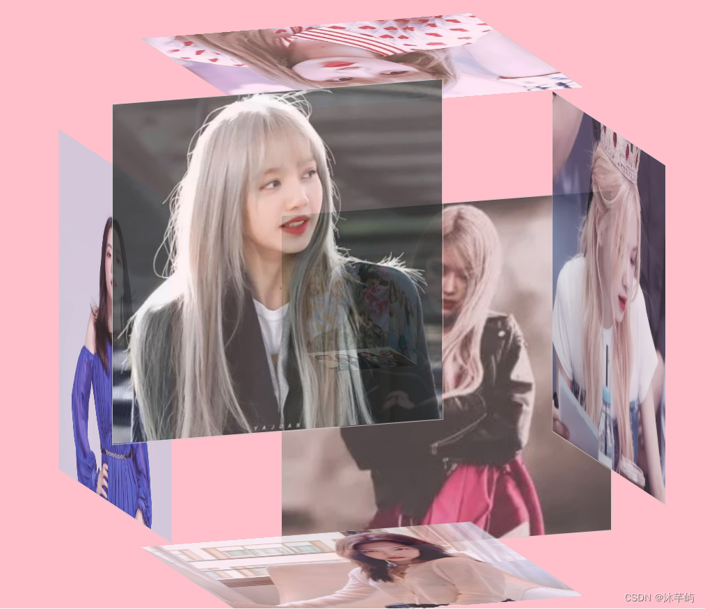
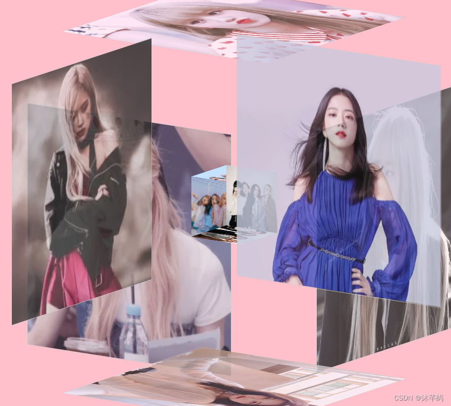
}注意:两个正方形的第二张图片都是倒放,为了效果图最佳,大正方形的像素是400x400,小正方形的像素是100x100
展示效果如下:
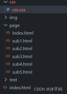
文件的分布如下图所示:


 1万+
1万+


 被折叠的 条评论
为什么被折叠?
被折叠的 条评论
为什么被折叠?
 到【灌水乐园】发言


