


目录
前言
对css中的浮动和定位进行了复习
注:本篇笔记主要参考了黑马程序员前端有关文档。
传统网页布局的三种方式
浮动
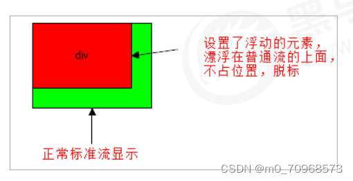
浮动:可以改变元素标签默认的排列方式.
浮动特性
<!DOCTYPE html>
<html lang="en">
<head>
    <meta charset="UTF-8">
    <meta http-equiv="X-UA-Compatible" content="IE=edge">
    <meta name="viewport" content="width=device-width, initial-scale=1.0">
    <title>Document</title>
    <style>
        /*
        .div1{
            width: 200px;
            height: 200px;
            background-color: aqua;
            float: left;
        }
        .div2{
            width: 300px;
            height: 300px;
            background-color: pink;
        }
        */

        /* div{
            height: 200px;
            width: 200px;
            background-color: pink;
            float: left;
        }
        .box2{
            background-color: blueviolet;

        }
        .box4{
            background-color: orangered;
        } */

        span,div{
            float: left;
            width: 200px;
            height: 100px;
            background-color: orange;
        }
        p{
            height: 200px;
            background-color: aqua;
            float: left;
        }
    </style>
</head>
<body>
    <!--浮动特性:
            1 脱标(脱离标准流)
            2 浮动元素一行显示,中间没有空隙,宽度不足会另起一行
            3 浮动元素具有行内块特性
                如果行内元素有了浮动,则不需要转换块级或者行内块元素就可以直接给高度和宽度设置
    -->
     <!-- <div class="box1">浮动的盒子</div>
     <div class="box2">标准流的盒子</div> -->

     <!-- <div class="box1">1</div>
     <div class="box2">2</div>
     <div class="box3">3</div>
     <div class="box4">4</div> -->

     <span>1</span>
     <span>2</span>
     <span>3</span>
     <span>4</span>
     <div>div</div>
     <p>p</p>

     <!-- 网页布局策略:标准流的父元素排列上下位置,之后内部元素采取浮动排列左右位置 -->
</body>
</html>
浮动的注意点
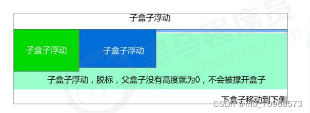
1 浮动与标准流父元素搭配
2 一个元素浮动了,其他兄弟元素应该都要浮动
盒子浮动之后影响浮动盒子后面的标准流,不会影响前面的标准流
3 由于父级盒子很多情况下,不方便给高度,但是子盒子浮动又不占有位置,最后父级盒子高度为 0 时,就会影响下面的标准流盒子
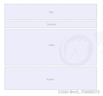
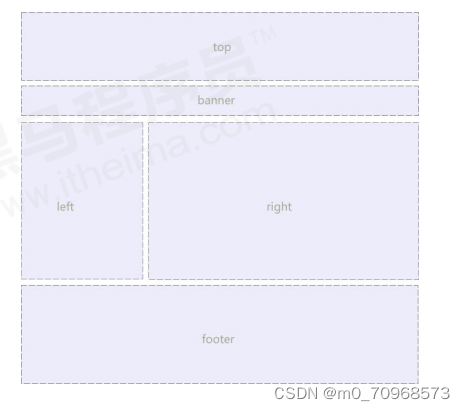
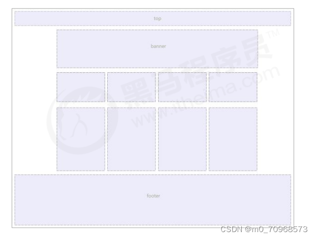
常见网页布局
清除浮动
方法:
1 额外标签法
<!DOCTYPE html>
<html lang="en">

<head>
    <meta charset="UTF-8">
    <meta http-equiv="X-UA-Compatible" content="IE=edge">
    <meta name="viewport" content="width=device-width, initial-scale=1.0">
    <title>Document</title>
    <style>
        .box {
            width: 800px;
            border: 1px solid blue;
            margin: 0 auto;
        }

        .damao {
            float: left;
            width: 300px;
            height: 200px;
            background-color: purple;
        }

        .ermao {
            float: left;
            width: 200px;
            height: 200px;
            background-color: pink;
        }

        .footer {
            height: 200px;
            background-color: black;
        }

        .clear {
            clear: both;
        }
    </style>
</head>

<body>
    <!-- 清除浮动的策略:闭合浮动 -->
    <!-- 1 额外标签法
         2 父级添加overflow属性
         3 父级添加after伪元素
         4 父级添加双伪元素 -->
    <div class="box">
        <div class="damao">大毛</div>
        <div class="ermao">二毛</div>
        <div class="ermao">二毛</div>
        <div class="ermao">二毛</div>
        <div class="ermao">二毛</div>
        <!-- <div class="clear"></div> -->
        <!-- 这个新增的盒子要求必须是块级元素不能是行内元素 -->
        <span class="clear"></span>
    </div>
    <div class="footer"></div>
</body>

</html>
2 父级添加overflow属性
<!DOCTYPE html>
<html lang="en">

<head>
    <meta charset="UTF-8">
    <meta name="viewport" content="width=device-width, initial-scale=1.0">
    <meta http-equiv="X-UA-Compatible" content="ie=edge">
    <title>为什么需要清除浮动</title>
    <style>
        .box {
            /* 清除浮动 */
            overflow: hidden;
            width: 800px;
            border: 1px solid blue;
            margin: 0 auto;
        }

        .damao {
            float: left;
            width: 300px;
            height: 200px;
            background-color: purple;
        }

        .ermao {
            float: left;
            width: 200px;
            height: 200px;
            background-color: pink;
        }

        .footer {
            height: 200px;
            background-color: black;
        }
    </style>
</head>

<body>
    <div class="box">
        <div class="damao">大毛</div>
        <div class="ermao">二毛</div>
    </div>
    <div class="footer"></div>

</body>

</html>
3 父级添加after伪元素
<!DOCTYPE html>
<html lang="en">

<head>
    <meta charset="UTF-8">
    <meta name="viewport" content="width=device-width, initial-scale=1.0">
    <meta http-equiv="X-UA-Compatible" content="ie=edge">
    <title>伪元素清除浮动</title>
    <style>
        .clearfix:after {
            /* 伪元素默认为行内块元素 */
            content: "";
            display: block;
            height: 0;
            clear: both;
            visibility: hidden;
        }

        .clearfix {
            /* IE6、7 专有 */
            *zoom: 1;
        }

        .box {
            width: 800px;
            border: 1px solid blue;
            margin: 0 auto;
        }

        .damao {
            float: left;
            width: 300px;
            height: 200px;
            background-color: purple;
        }

        .ermao {
            float: left;
            width: 200px;
            height: 200px;
            background-color: pink;
        }

        .footer {
            height: 200px;
            background-color: black;
        }
    </style>
</head>

<body>
    <div class="box clearfix">
        <div class="damao">大毛</div>
        <div class="ermao">二毛</div>
    </div>
    <div class="footer"></div>

</body>

</html>
4 父级添加双伪元素
<!DOCTYPE html>
<html lang="en">

<head>
    <meta charset="UTF-8">
    <meta name="viewport" content="width=device-width, initial-scale=1.0">
    <meta http-equiv="X-UA-Compatible" content="ie=edge">
    <title>伪元素清除浮动</title>
    <style>
        .clearfix:before,
        .clearfix:after {
            content: "";
            display: table;
        }

        .clearfix:after {
            clear: both;
        }

        .clearfix {
            *zoom: 1;
        }

        .box {
            width: 800px;
            border: 1px solid blue;
            margin: 0 auto;
        }

        .damao {
            float: left;
            width: 300px;
            height: 200px;
            background-color: purple;
        }

        .ermao {
            float: left;
            width: 200px;
            height: 200px;
            background-color: pink;
        }

        .footer {
            height: 200px;
            background-color: black;
        }
    </style>
</head>

<body>
    <div class="box clearfix">
        <div class="damao">大毛</div>
        <div class="ermao">二毛</div>
    </div>
    <div class="footer"></div>

</body>

</html>
定位
定位:将盒子定在某一个位置,其实也是在摆放盒子,但是按照定位的方式移动盒子
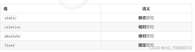
定位=定位模式+边偏移
定位模式: 决定元素的定位方式 ,它通过 CSS 的 position 属性来设置,其值可以分为四个:static relative absolute fixed
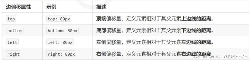
边偏移:就是定位的盒子移动到最终位置。有 top、bottom、left 和 right 4 个属性
注:
定位可以让盒子自由的在某个盒子内移动位置或者固定屏幕中某个位置,并且可以压住其他盒子。
定位模式用于指定一个元素在文档中的定位方式,边偏移则决定了该元素的最终位置
静态定位
静态定位是元素的默认定位方式,无定位的意思。
静态定位按照标准流特性摆放位置,它没有边偏移。
相对定位
相对定位是元素在移动位置的时候,是相对于它原来的位置来说的
特点:
1. 它是相对于自己原来的位置来移动的(移动位置的时候参照点是自己原来的位置)。
2. 原来在标准流的位置继续占有,后面的盒子仍然以标准流的方式对待它。
<!DOCTYPE html>
<html lang="en">
<head>
    <meta charset="UTF-8">
    <meta name="viewport" content="width=device-width, initial-scale=1.0">
    <meta http-equiv="X-UA-Compatible" content="ie=edge">
    <title>相对定位</title>
    <style>
        /* 静态定位是元素的默认定位方式,无定位的意思
            按照标准流特性摆放位置,它没有边偏 */

        /* 相对定位是元素在移动位置的时候,是相对于它原来的位置来说的
            原来在标准流的位置继续占有,后面的盒子仍然以标准流的方式对待它 */
        .box1 {
            position: relative;
            top: 100px;
            left: 100px;
            width: 200px;
            height: 200px;
            background-color: pink;
        }
        .box2 {
            width: 200px;
            height: 200px;
            background-color: deeppink;
        }
    </style>
</head>
<body>
    <div class="box1">

    </div>
    <div class="box2">

    </div>

</body>
</html>
绝对定位
绝对定位是元素在移动位置的时候,是相对于它祖先元素来说的
特点:
1. 如果没有祖先元素或者祖先元素没有定位,则以浏览器为准定位。
2. 如果祖先元素有定位(相对、绝对、固定定位),则以最近一级的有定位祖先元素为参考点移动位置。
3. 绝对定位不再占有原先的位置。(脱标)
<!DOCTYPE html>
<html lang="en">
<head>
    <meta charset="UTF-8">
    <meta http-equiv="X-UA-Compatible" content="IE=edge">
    <meta name="viewport" content="width=device-width, initial-scale=1.0">
    <title>Document</title>
    <style>
        /* 绝对定位是元素在移动位置的时候,是相对于它祖先元素来说的
            1. 如果没有祖先元素或者祖先元素没有定位,则以浏览器为准定位。
            2. 如果祖先元素有定位(相对、绝对、固定定位),则以最近一级的有定位祖先元素为参考点移动位置。
            3. 绝对定位不再占有原先的位置。(脱标)*/
        /*
        .father {
            width: 500px;
            height: 500px;
            background-color: skyblue;
        }
        .son {
            position: absolute;
            */
            /* top: 10px;
            left: 10px; */
            /* top: 100px;
            right: 200px; */
            /*
            left: 0;
            bottom: 0;
            width: 200px;
            height: 200px;
            background-color: pink;
        }*/


        .yeye {
            position: relative;
            width: 800px;
            height: 800px;
            background-color: hotpink;
            padding: 50px;
        }
        .father2 {
            width: 500px;
            height: 500px;
            background-color: skyblue;
        }
        .son2 {
            position: absolute;
            left: 30px;
            bottom: 10px;
            width: 200px;
            height: 200px;
            background-color: pink;
        }
    </style>
</head>
<body>
    <!-- <div class="father">
        <div class="son"></div>
    </div> -->


    <div class="yeye">
        <div class="father2">
                <div class="son2"></div>
        </div>
</div>
</body>
</html>
子绝父相
子级是绝对定位的话,父级要用相对定位。
原因:
① 子级绝对定位,不会占有位置,可以放到父盒子里面的任何一个地方,不会影响其他的兄弟盒子。
② 父盒子需要加定位限制子盒子在父盒子内显示。
③ 父盒子布局时,需要占有位置,因此父亲只能是相对定位。
即:
因为父级需要占有位置,又要开启定位限制子盒子,所以只能是相对定位,子盒子不需要占有位置,可以随意摆放,所以是绝对定位
固定定位
固定定位是元素固定于浏览器可视区的位置。
固定定位的特点:
1. 以浏览器的可视窗口为参照点移动元素。 跟父元素没有任何关系 不随滚动条滚动。
2. 固定定位不在占有原先的位置。
<!DOCTYPE html>
<html lang="en">
<head>
    <meta charset="UTF-8">
    <meta name="viewport" content="width=device-width, initial-scale=1.0">
    <meta http-equiv="X-UA-Compatible" content="ie=edge">
    <title>固定定位</title>
    <style>
        /* 固定定位是元素固定于浏览器可视区的位置。主要使用场景: 可以在浏览器页面滚动时元素的位置不会改变。
            1. 以浏览器的可视窗口为参照点移动元素。跟父元素没有任何关系 不随滚动条滚动。
            2. 固定定位不在占有原先的位置。
 */
        .dj {
            position: fixed;
            top: 100px;
            right: 40px;
        }
    </style>
</head>
<body>
    <div class="dj">
        <img src="images/pvp.png" alt="">
    </div>
    <p>请尽情吩咐妲己,主人</p>
    <p>请尽情吩咐妲己,主人</p>
    <p>请尽情吩咐妲己,主人</p>
    <p>请尽情吩咐妲己,主人</p>
    <p>请尽情吩咐妲己,主人</p>
    <p>请尽情吩咐妲己,主人</p>
    <p>请尽情吩咐妲己,主人</p>
    <p>请尽情吩咐妲己,主人</p>
    <p>请尽情吩咐妲己,主人</p>
    <p>请尽情吩咐妲己,主人</p>
    <p>请尽情吩咐妲己,主人</p>
    <p>请尽情吩咐妲己,主人</p>
    <p>请尽情吩咐妲己,主人</p>
    <p>请尽情吩咐妲己,主人</p>
    <p>请尽情吩咐妲己,主人</p>
    <p>请尽情吩咐妲己,主人</p>
    <p>请尽情吩咐妲己,主人</p>
    <p>请尽情吩咐妲己,主人</p>
    <p>请尽情吩咐妲己,主人</p>
    <p>请尽情吩咐妲己,主人</p>
    <p>请尽情吩咐妲己,主人</p>
    <p>请尽情吩咐妲己,主人</p>
    <p>请尽情吩咐妲己,主人</p>
    <p>请尽情吩咐妲己,主人</p>
    <p>请尽情吩咐妲己,主人</p>
    <p>请尽情吩咐妲己,主人</p>
    <p>请尽情吩咐妲己,主人</p>
    <p>请尽情吩咐妲己,主人</p>
    <p>请尽情吩咐妲己,主人</p>
    <p>请尽情吩咐妲己,主人</p>
    <p>请尽情吩咐妲己,主人</p>
    <p>请尽情吩咐妲己,主人</p>
    <p>请尽情吩咐妲己,主人</p>
    <p>请尽情吩咐妲己,主人</p>
    <p>请尽情吩咐妲己,主人</p>


</body>
</html>
固定定位的用法之固定在版心右侧位置。
算法:
1. 让固定定位的盒子 left: 50%. 走到浏览器可视区(也可以看做版心) 的一半位置。
2. 让固定定位的盒子 margin-left: 版心宽度的一半距离。 多走版心宽度的一半位置
<!DOCTYPE html>
<html lang="en">
<head>
    <meta charset="UTF-8">
    <meta http-equiv="X-UA-Compatible" content="IE=edge">
    <meta name="viewport" content="width=device-width, initial-scale=1.0">
    <title>Document</title>
    <style>
        .w {
            width: 800px;
            height: 1400px;
            background-color: pink;
            margin: 0 auto;
        }
        .fixed {
            position: fixed;
            /* 1. 走浏览器宽度的一半 */
            left: 50%;
            /* 2. 利用margin 走版心盒子宽度的一半距离 */
            margin-left: 405px;
            width: 50px;
            height: 150px;
            background-color: skyblue;
        }
    </style>
</head>
<body>
    <div class="fixed"></div>
    <div class="w">版心盒子 800像素</div>
</body>
</html>
粘性定位
粘性定位可以被认为是相对定位和固定定位的混合。
粘性定位的特点:
1. 以浏览器的可视窗口为参照点移动元素(固定定位特点)
2. 粘性定位占有原先的位置(相对定位特点)
3. 必须添加 top 、left、right、bottom 其中一个才有效
4 跟页面滚动搭配使用。 兼容性较差,IE 不支持。
<!DOCTYPE html>
<html lang="en">
<head>
    <meta charset="UTF-8">
    <meta name="viewport" content="width=device-width, initial-scale=1.0">
    <meta http-equiv="X-UA-Compatible" content="ie=edge">
    <title>粘性定位</title>
    <style>
        /* 粘性定位可以被认为是相对定位和固定定位的混合。
            1. 以浏览器的可视窗口为参照点移动元素(固定定位特点)
            2. 粘性定位占有原先的位置(相对定位特点)
            3. 必须添加 top 、left、right、bottom 其中一个才有效
            跟页面滚动搭配使用。 兼容性较差,IE 不支持。 */
        body {
            height: 3000px;
        }
        .nav {
            /* 粘性定位 */
            position: sticky;
            top: 0;
            width: 800px;
            height: 50px;
            background-color: pink;
            margin: 100px auto;
        }
    </style>
</head>
<body>
    <div class="nav">我是导航栏</div>
</body>
</html>
定位叠放次序 z-index
在使用定位布局时,可能会出现盒子重叠的情况。此时,可以使用 z-index 来控制盒子的前后次序 (z轴)
数值可以是正整数、负整数或 0, 默认是 auto,数值越大,盒子越靠上
如果属性值相同,则按照书写顺序,后来居上
数字后面不能加单位
只有定位的盒子才有 z-index 属性
<!DOCTYPE html>
<html lang="en">
<head>
    <meta charset="UTF-8">
    <meta name="viewport" content="width=device-width, initial-scale=1.0">
    <meta http-equiv="X-UA-Compatible" content="ie=edge">
    <title>定位的堆叠顺序</title>
    <style>
        .box {
            position: absolute;
            top: 0;
            left: 0;
            width: 200px;
            height: 200px;
        }
        .xiongda {
            background-color: red;
            z-index: 1;
        }
        .xionger {
            background-color: green;
            left: 50px;
            top: 50px;
            z-index: 2;
        }
        .qiangge {
            background-color:blue;
            left: 100px;
            top: 100px;
        }
    </style>
</head>
<body>
    <div class="box xiongda">熊大</div>
    <div class="box xionger">熊二</div>
    <div class="box qiangge">光头强</div>
</body>
</html>
绝对定位的盒子居中
加了绝对定位的盒子不能通过 margin:0 auto 水平居中,但是可以通过以下计算方法实现水平和垂直居中。
① left: 50%;:让盒子的左侧移动到父级元素的水平中心位置。
② margin-left: -100px;:让盒子向左移动自身宽度的一半。
<!DOCTYPE html>
<html lang="en">
<head>
    <meta charset="UTF-8">
    <meta name="viewport" content="width=device-width, initial-scale=1.0">
    <meta http-equiv="X-UA-Compatible" content="ie=edge">
    <title>绝对定位水平垂直居中</title>
    <style>
        .box {
            position: absolute;
            /* 1. left 走 50%  父容器宽度的一半 */
            left: 50%;
            /* 2. margin 负值 往左边走 自己盒子宽度的一半 */
            margin-left: -100px;
            top: 50%;
            margin-top: -100px;
            width: 200px;
            height: 200px;
            background-color: pink;
            /* margin: auto; */
        }
    </style>
</head>
<body>
    <div class="box"></div>
</body>
</html>
定位特殊特性
1. 行内元素添加绝对或者固定定位,可以直接设置高度和宽度。
2. 块级元素添加绝对或者固定定位,如果不给宽度或者高度,默认大小是内容的大小。
3. 脱标的盒子不会触发外边距塌陷 浮动元素、绝对定位(固定定位)元素的都不会触发外边距合并的问题。
4 绝对定位(固定定位)会完全压住盒子
浮动元素不同,只会压住它下面标准流的盒子,但是不会压住下面标准流盒子里面的文字(图片) 但是绝对定位(固定定位) 会压住下面标准流所有的内容。
浮动之所以不会压住文字,因为浮动产生的目的最初是为了做文字环绕效果的。 文字会围绕浮动元素
元素的显示与隐藏
display 属性
display 属性用于设置一个元素应如何显示。
display: none ;隐藏对象
display:block ;除了转换为块级元素之外,同时还有显示元素的意思
display 隐藏元素后,不再占有原来的位置。
visibility属性
visibility 属性用于指定一个元素应可见还是隐藏。
visibility:visible ; 元素可视
visibility:hidden; 元素隐藏
visibility 隐藏元素后,继续占有原来的位置。
overflow属性
overflow 属性指定了如果内容溢出一个元素的框(超过其指定高度及宽度) 时,会发生什么。

注:如果有定位的盒子, 请慎用overflow:hidden
总结
对css的浮动和定位进行了复习。


 915
915


 被折叠的 条评论
为什么被折叠?
被折叠的 条评论
为什么被折叠?
 到【灌水乐园】发言


