本文实例为大家分享了Css3实现太极旋转效果的具体代码,供大家参考,具体内容如下
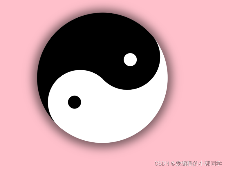
效果图如下
代码部分
css部分
<style>
        body{
            background-color: pink;
        }
        .box{
            width: 300px;
            height: 300px;
            margin: 100px auto;
            /* border: 1px solid; */
            border-radius: 50%;
            background-color: #fff;
            position: relative;
            transform: rotate(180deg);
            animation: taiji 5s infinite linear;
            box-shadow: 1px 1px 20px 10px rgba(0, 0, 0, .5);
        }
        .left-yuan{
            width: 151px;
            height: 151px;
            background-color: black;
            border-radius: 50%;
            position: absolute;
            top: 0;
            left: 80px;
        }
        .right-yuan{
            width: 149px;
            height: 149px;
            background-color: #fff;
            border-radius: 50%;
            position: absolute;
            bottom: 0;
            left: 80px;
        }
        .left{
            width: 150px;
            height: 300px;
            background-color: black;
            border-top-left-radius: 150px;
            border-bottom-left-radius: 150px;
        }
        .bai{
            width: 30px;
            height: 30px;
            border-radius: 50%;
            background-color: #fff;
            position: absolute;
            top: 60px;
            left: 150px;
            z-index: 999;
        }
        .hei{
            width: 30px;
            height: 30px;
            border-radius: 50%;
            background-color: black;
            position: absolute;
            top: 220px;
            left: 130px;
            z-index: 999;
        }
        @keyframes taiji{
            0%{
                transform: rotate(0deg);
            }
            100%{
                transform: rotate(360deg);
            }
        }
    </style>
html部分
<div class="box">
        <div class="bai"></div>
        <div class="hei"></div>
        <div class="left"></div>
        <div class="left-yuan"></div>
        <div class="right-yuan"></div>
    </div>


 303
303


 被折叠的 条评论
为什么被折叠?
被折叠的 条评论
为什么被折叠?
 到【灌水乐园】发言


