


学习笔记
1. 导入库
import matplotlib.pyplot as plt2. 创建figure
figure这个函数的基本语法:
matplotlib.pyplot.figure(figsize = None, 传入一个(float,float)以英尺为单位 的宽和高
dpi = None, 像素分辨率
facecolor = None, 背景色'w'白色
edgecolor = None, 边框色
frameon = True) 默认绘制边框
1   fig = plt.figure()
2   fig = plt.figure(figsize = (12,6))
3   fig,((ax1,ax3)(ax2,ax4)) = plt.subplots(2, 2, figsize=(15, 8), subplot_kw=dict(projection=ccrs.PlateCarree()))
3. 创建axes
一:fig.add_subplot()直接创建
fig = plt.figure()
ax1 = fig.add_subplot(231) # 创建2行3列排布的第1个子图
ax2 = fig.add_subplot(232, frameon=False) # 创建2行3列排布的第2个子图,不添加边框
ax3 = fig.add_subplot(233, projection='polar'); # 创建2行3列排布的第3个子图,使用极坐标系
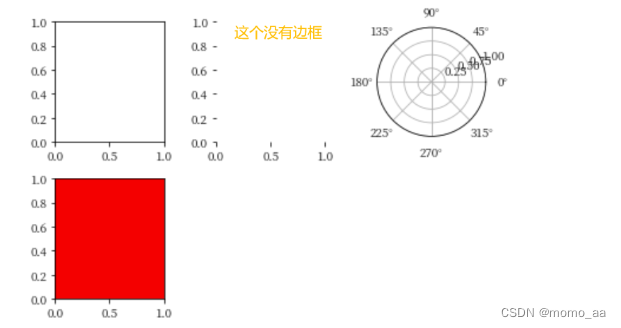
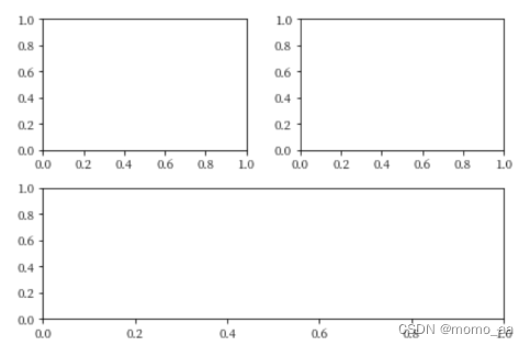
fig = plt.figure()
# 创建2行2列排布的第一个图
ax1 = fig.add_subplot(221)
# 创建2行2列排布的第二个图
ax2 = fig.add_subplot(222)
# 新增:创建2行1列排布的第二个图
ax3 = fig.add_subplot(212)
plt.show()
二:add_axes 函数:自由设置子图的位置、大小
left = 0.1 # 子图左下角的x坐标
below = 0.1 # 子图左下角的y坐标
wide = 0.4 # 子图的宽度
high = 0.3 # 子图高度
rect = left, below, wide, high
fig = plt.figure()
fig.set_tight_layout(False)
fig.add_axes(rect);

三 :综合1、2
import matplotlib.pyplot as plt
from matplotlib.gridspec import GridSpec
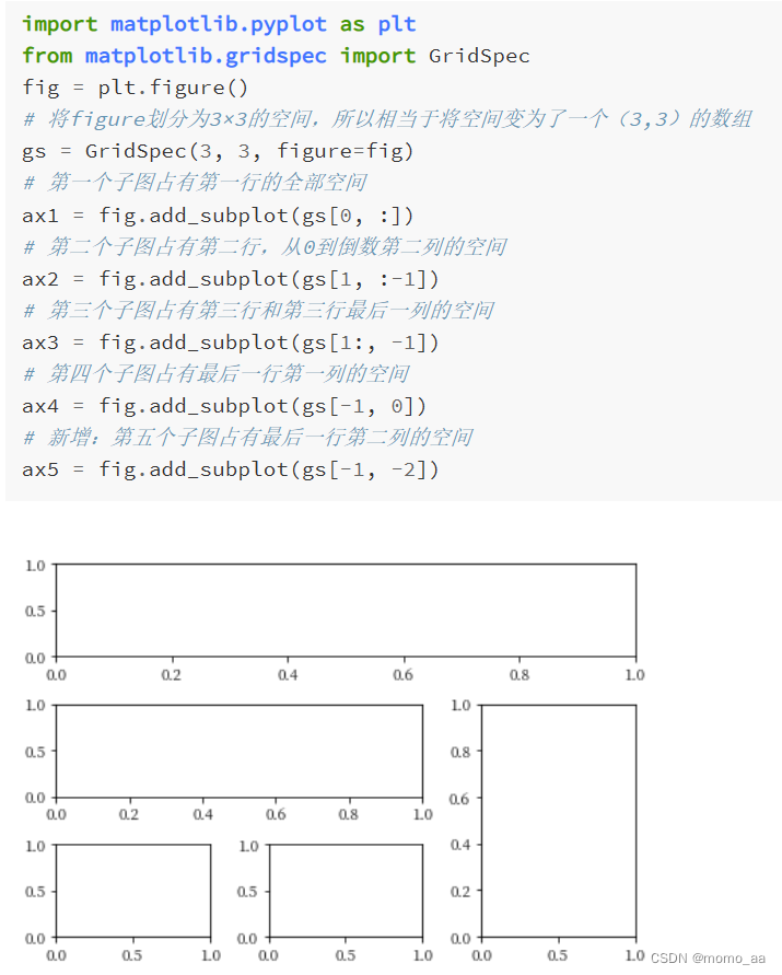
fig = plt.figure()
# 将figure划分为3×3的空间,所以相当于将空间变为了一个(3,3)的数组
gs = GridSpec(3, 3, figure=fig)
# 第一个子图占有第一行的全部空间
ax1 = fig.add_subplot(gs[0, :])
# 第二个子图占有第二行,从0到倒数第二列的空间
ax2 = fig.add_subplot(gs[1, :-1])
# 第三个子图占有第三行和第三行最后一列的空间
ax3 = fig.add_subplot(gs[1:, -1])
# 第四个子图占有最后一行第一列的空间
ax4 = fig.add_subplot(gs[-1, 0])
# 新增:第五个子图占有最后一行第二列的空间
ax5 = fig.add_subplot(gs[-1, -2])
4. axes的各个参数含义
| 关于坐标轴 |
|---|
首先 确定x/y轴的刻度 ax.set_xticks() |
| 然后确定x/y刻度对应的标签 ax.set_xticklabels() |
° 在python中的表示方式: $^\degree$
import matplotlib.pyplot as plt
fig = plt.figure(facecolor='w')
ax = fig.add_subplot(111)
# 确定x轴刻度
ax.set_xticks([0, 60,120, 180, 240,300,360])
# 确定x轴刻对应的标签,这里用到了转义字符,在字符串中用两个$括起来需要转义的部分,^表示后边部分进行上标处理,\degree表示°的特殊符号
ax.set_xticklabels(['0$^\degree$','60$^\degree$E', '120$^\degree$E', '180$^\degree$E', '120$^\degree$W', '60$^\degree$W','0$^\degree$'])
# 确定y轴刻度
ax.set_yticks([-90,-60,-30,0, 30,60,90])
# 确定y轴刻对应的标签
ax.set_yticklabels(['90$^\degree$S','60$^\degree$S', '30$^\degree$S', '0$^\degree$', '30$^\degree$N', '60$^\degree$N','90$^\degree$N'])
plt.show()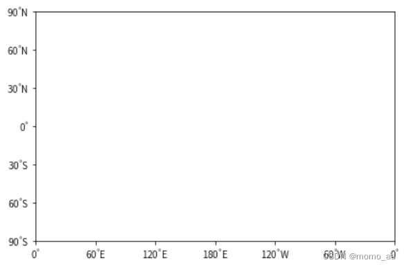
练习1
创建一个 x 轴从左到右时间为“Jan.”,“Feb.”,“Mar.”..."Dec."共 12 个月份刻度,y 轴从下到上为高度“1000hPa”,“850hPa”,“700hPa”,“500hPa”,“300hPa”,“200hPa”,“100hPa”共 7 个高度刻度的子图。
import matplotlib.pyplot as plt
fig = plt.figure(facecolor='w')
ax = fig.add_subplot(111)
# 确定x轴刻度
ax.set_xticks(np.arange(12))
# 确定x轴刻对应的标签,这里用到了转义字符,在字符串中用两个$括起来需要转义的部分,^表示后边部分进行上标处理,\degree表示°的特殊符号
ax.set_xticklabels(['Jan','Feb','Mar','Apr','May','Jun','Jul','aug','sep','oct','Nov','Dec'])
# 确定y轴刻度
ax.set_yticks([100,200,300,500,700,850,1000])
# 确定y轴刻对应的标签
ax.set_yticklabels(['100hPa', '200hPa', '300hPa', '500hPa', '700hPa','850hPa','1000hPa'])
plt.show()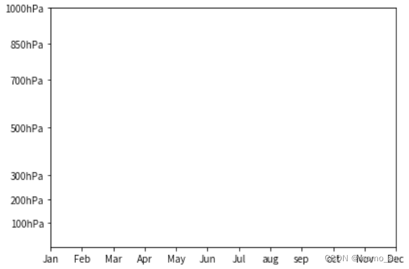
4. 官网图及代码
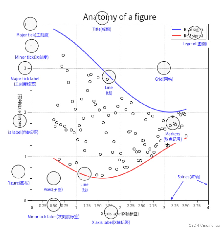
# 试试这个经典示例
# 引入库
import numpy as np
import matplotlib as mpl
import matplotlib.pyplot as plt
from matplotlib.ticker import AutoMinorLocator, MultipleLocator, FuncFormatter
import matplotlib.font_manager as font_manager
# 设置中文字体
path = '/opt/conda/lib/python3.7/site-packages/matplotlib/mpl-data/fonts/ttf/SourceHanSansSC-Regular.ttf'
prop = font_manager.FontProperties(fname=path)
mpl.rcParams['font.family'] = prop.get_name()

# 创建一组随机数据用于生成图中的散点(小圆圈)
np.random.seed(19680801)
X = np.linspace(0.5, 3.5, 100)
Y1 = 3+np.cos(X)
Y2 = 1+np.cos(1+X/0.75)/2
Y3 = np.random.uniform(Y1, Y2, len(X))

# 创建Figure和Axes
fig = plt.figure(figsize=(8, 8))
ax = fig.add_subplot(1, 1, 1, aspect=1)

# major为主刻度,minor为次刻度;MultipleLocator(1)指主刻度以1为间隔,AutoMinorLocator(4)指自动将次刻度分主刻度为4段
ax.xaxis.set_major_locator(MultipleLocator(1))
ax.xaxis.set_minor_locator(AutoMinorLocator(4))
ax.yaxis.set_major_locator(MultipleLocator(1))
ax.yaxis.set_minor_locator(AutoMinorLocator(4))
# 设置X轴的次刻度格式为含有两位小数点


def minor_tick(x, pos):
    if not x % 1.0:
        return ""
    return f"{x:.2f}"


ax.xaxis.set_minor_formatter(FuncFormatter(minor_tick))

# 设置x,y轴上下限
ax.set_xlim(0, 4)
ax.set_ylim(0, 4)
# 设置主刻度的长和宽
ax.tick_params(which='major', length=10)
# 设置次刻度的字体和颜色透明度
ax.tick_params(which='minor', labelsize=10, labelcolor='0.5')
# 设置图中网格线
ax.grid(linestyle="--", linewidth=0.5, color='.25', zorder=-10)
# 绘制图中散点,红蓝线条(绘图函数后边会具体介绍)
ax.plot(X, Y1, c=(0.25, 0.25, 1.00), lw=2, label="Blue signal", zorder=10)
ax.plot(X, Y2, c=(1.00, 0.25, 0.25), lw=2, label="Red signal")
ax.plot(X, Y3, linewidth=0,
        marker='o', markerfacecolor='w', markeredgecolor='k')

# 设置图题,字体大小20
ax.set_title("Anatomy of a figure", fontsize=20)
# 设置x轴和y轴标题
ax.set_xlabel("X axis label(X轴标签)")
ax.set_ylabel("Y axis label(Y轴标签)")
# 添加图例
ax.legend()

# 设置大圆圈和文字函数


def circle(x, y, radius=0.15):
    from matplotlib.patches import Circle
    from matplotlib.patheffects import withStroke
    circle = Circle((x, y), radius, clip_on=False, zorder=10, linewidth=1,
                    edgecolor='black', facecolor=(0, 0, 0, .0125),
                    path_effects=[withStroke(linewidth=5, foreground='w')])
    ax.add_artist(circle)


def text(x, y, text):
    ax.text(x, y, text, backgroundcolor="white",
            ha='center', va='top', weight='bold', color='blue')


# Minor tick
circle(0.50, -0.10)
text(0.50, -0.32, "Minor tick label(次刻度标签)")

# Major tick
circle(-0.03, 4.00)
text(0.03, 3.80, "Major tick(主刻度)")

# Minor tick
circle(0.00, 3.50)
text(0.00, 3.30, "Minor tick(次刻度)")

# Major tick label
circle(-0.15, 3.00)
text(-0.15, 2.80, "Major tick label\n(主刻度标签)")

# X Label
circle(1.80, -0.27)
text(1.80, -0.45, "X axis label(X轴标签)")

# Y Label
circle(-0.27, 1.80)
text(-0.27, 1.6, "Y axis label(Y轴标签)")

# Title
circle(1.60, 4.13)
text(1.60, 3.93, "Title(标题)")

# Blue plot
circle(1.75, 2.80)
text(1.75, 2.60, "Line\n(线)")

# Red plot
circle(1.20, 0.60)
text(1.20, 0.40, "Line\n(线)")

# Scatter plot
circle(3.20, 1.75)
text(3.20, 1.55, "Markers\n(散点记号)")

# Grid
circle(3.00, 3.00)
text(3.00, 2.80, "Grid(网格)")

# Legend
circle(3.70, 3.80)
text(3.70, 3.60, "Legend(图例)")

# Axes
circle(0.5, 0.5)
text(0.5, 0.3, "Axes(子图)")

# Figure
circle(-0.3, 0.65)
text(-0.3, 0.45, "Figure(画布)")

# 绘制图中左下角的箭头,指向边框
color = 'blue'
ax.annotate('Spines(框轴)', xy=(4.0, 0.35), xytext=(3.3, 0.5),
            weight='bold', color=color,
            arrowprops=dict(arrowstyle='->',
                            connectionstyle="arc3",
                            color=color))

ax.annotate('', xy=(3.15, 0.0), xytext=(3.45, 0.45),
            weight='bold', color=color,
            arrowprops=dict(arrowstyle='->',
                            connectionstyle="arc3",
                            color=color))

plt.show()
4. 课后题
import matplotlib.pyplot as plt

# 在子图上生成对应的文字
def format_axes(fig):
    for i, ax in enumerate(fig.axes):
        ax.text(0.5, 0.5, "ax%d" % (i+1), va="center", ha="center",fontsize=14) # 在子图中心位置生成文字
        ax.tick_params(labelbottom=False, labelleft=False) # 隐藏坐标刻度

a1 =7 # 请填写合适的数字
a2 = 3# 请填写合适的数字

fig = plt.figure()
ax1 = fig.add_subplot(3,1,1) # 3行1列排布的第1张子图
ax2 = fig.add_subplot(3,3,a1) # 3行3列排布的第7张子图
ax3 = fig.add_subplot(3,3,8) # 3行3列排布的第8张子图
ax4= fig.add_subplot(3,3,9) # 3行3列排布的第9张子图
ax5 = fig.add_subplot(3,2,a2) # 3行2列排布的第3张子图
ax6 = fig.add_subplot(3,2,4) # 3行2列排布的第4张子图
format_axes(fig) # 对fig使用我们定义好的生成文字代码
plt.show()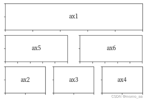


 3687
3687


 被折叠的 条评论
为什么被折叠?
被折叠的 条评论
为什么被折叠?
 到【灌水乐园】发言


