


1.使用css制作一个爱心
使用到了CSS的基本知识,绝对定位和相对定位确定好位置后用transform旋转来完成此案例
以下是详细代码:
<!DOCTYPE html>
<html lang="en">

<head>
    <meta charset="UTF-8">
    <meta http-equiv="X-UA-Compatible" content="IE=edge">
    <meta name="viewport" content="width=device-width, initial-scale=1.0">
    <title>Document</title>
</head>
<style>
    .fu {
        position: relative;
        transform: rotate(180deg);
        width: 800px;
        height: 800px;
    }

    .z1,
    .z2,
    .z3 {
        position: absolute;
        background-color: red;
        width: 300px;
        height: 300px;
    }

    .z1 {
        top: 100px;
        left: 200px;
        border-radius: 50%;
    }

    .z2 {
        top: 200px;
        left: 300px;
        transform: rotate(45deg);
    }

    .z3 {
        top: 100px;
        left: 400px;
        border-radius: 50%;
    }

    .z4 {
        width: 400px;
        height: 200px;
        background-color: black;
        display: inline-block;
    }

    .z4>div {
        background-color: white;
        width: 200px;
        height: 200px;
        border-radius: 50%;
        display:inline-block;
    }
</style>

<body>
    <div class="fu">
        <div class="z1"></div>
        <div class="z2"></div>
        <div class="z3"></div>

    </div>
</body>

</html>
运行结果如下:
2.旋转的太极八卦
这里面运用了CSS中的动画效果,动画使用的infinite会让动画无线循环,然后还是用了CSS通过定位来完成八卦的绘制,详细代码如下:
<!DOCTYPE html>
<html lang="en">
<head>
    <meta charset="UTF-8">
    <meta http-equiv="X-UA-Compatible" content="IE=edge">
    <meta name="viewport" content="width=device-width, initial-scale=1.0">
    <title>Document</title>
</head>
<style>
    .fu{
        position: relative;
        width: 500px;
        height: 500px;
        animation: move 2s infinite;
    }
    @keyframes move{
        from{
            transform: rotate(0deg);
        }to{
            transform: rotate(360deg);
        }
    }
    .fu>div{
        position: absolute;
    }
    .z1,.z2{
        width: 250px;
        height: 500px;
    }
    .z1{
        border-radius: 250px 0px 0px 250px;
        background-color: aliceblue
    }
    .z2{
        border-radius: 0px 250px 250px 0px;
        background-color: black;
        left: 250px;

    }
    .z3{
        width: 250px;
        height: 250px;
        background-color: black;
        border-radius: 50%;
        left: 125px;
        z-index: 1;
    }
    .z4{
        width: 250px;
        height: 250px;
        background-color: aliceblue;
        border-radius: 50%;
        left: 125px;
        top: 250px;
        z-index: 1;
    }
    .z5{
        width: 80px;
        height: 80px;
        background-color: aliceblue;
        border-radius: 50%;
        left: 200px;
        top: 85px;
        z-index: 2;
    }
    .z6{
        width: 80px;
        height: 80px;
        background-color: black;
        border-radius: 50%;
        left: 200px;
        top: 335px;
        z-index: 2;
    }
</style>
<body>
   <div class="fu">
    <div class="z1"></div>
    <div class="z2"></div>
    <div class="z3"></div>
    <div class="z4"></div>
    <div class="z5"></div>
    <div class="z6"></div>
   </div>
</body>
</html>
运行结果如下:
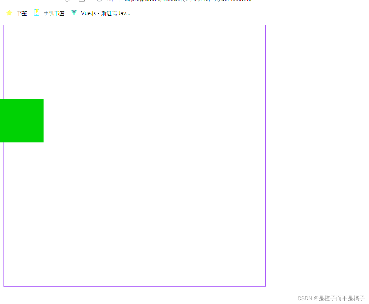
3.跳动的小方块
使用了css动画让动画循环,然后小方块和大方块用的css进行绘制,代码如下:
<!DOCTYPE html>
<html lang="en">
<head>
    <meta charset="UTF-8">
    <meta http-equiv="X-UA-Compatible" content="IE=edge">
    <meta name="viewport" content="width=device-width, initial-scale=1.0">
    <title>css动画</title>
</head>
<style>
    .f{
        width: 600px;
        height: 600px;
        border: 1px solid rebeccapurple;
    }
    .z{
        width: 100px;
        height: 100px;
        background-color: green;
        position: absolute;
        animation: move1 2s 0.1s infinite linear alternate;
    }
    @keyframes move1{
        0%{
            top: 0px;
            left: 0px;
        }25%{
            top: 0px;
            left: 500px;
        }50%{
            top: 500px;
            left: 500px;
        }75%{
            top: 500px;
            left: 0px;
        }100%{
            top: 0px;
            left: 0px;
        }
    }
</style>
<body>
    <div class="f">
        <div class="z"></div>
    </div>
</body>
</html>
运行结果如下:
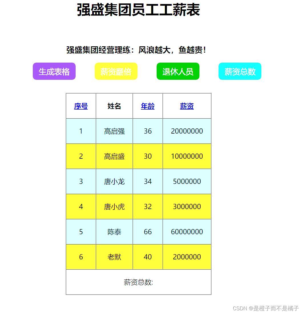
4.强盛集团员工工薪表
这个网页使用了js的技术,实现了生成表格,可以生成多个表格并且表格内会有内容,还可以让每个人的资金翻倍,还有可以筛选出退休人员的信息,薪资总数也可以显示,还可以对表格进行排序,使用了js中map,filer,reduce实现循环然后实现效果,还是用了``代码直接把js中的内容弄到body中,实现代码如下:
<!DOCTYPE html>
<html lang="en">

<head>
    <meta charset="UTF-8">
    <meta name="viewport" content="width=device-width, initial-scale=1.0">
    <title>Document</title>
</head>
<style>
    button {
        width: 100px;
        height: 40px;
        margin-left: 40px;
        border: none;
        /* 去掉轮廓 */
        outline: none;
        border-radius: 8px;
        color: white;
        font-size: large;
        cursor: pointer;
    }

    .fb>button:nth-child(1) {
        background-color: rebeccapurple;
    }

    .fb>button:nth-child(2) {
        background-color: goldenrod;
    }

    .fb>button:nth-child(3) {
        background-color: green;
    }

    .fb>button:nth-child(4) {
        background-color: rgb(11, 160, 219);
    }

    tbody>tr:nth-child(odd) {
        background-color: skyblue;
    }

    tbody>tr:nth-child(even) {
        background-color: goldenrod;
    }
</style>
<style>
    body {
        text-align: center;
    }

    #btn {
        border: none;
        background-color: aqua;
        cursor: pointer;
    }
</style>

<body>
    <h1 style="text-align: center;">强盛集团员工工薪表</h1><br>
    <h3 style="text-align: center;">强盛集团经营理练:风浪越大,鱼越贵!</h3>
    <div class="fb" style="text-align: center;">
        <button onclick="generateTab()">生成表格</button>
        <button onclick="doublesalary()">薪资翻倍</button>
        <button onclick="restEmp()">退休人员</button>
        <button onclick="sumSalary()">薪资总数</button>
    </div>

    <table style="margin-top: 30px;" border="1" cellspacing="0" cellpadding="18" align="center">
        <thead>
            <tr>
                <th><a href="javascript:orderEmp('id')">序号</a></th>
                <th>姓名</th>
                <th><a href="javascript:orderEmp('age')">年龄</a></th>
                <th></t><a href="javascript:orderEmp('salary')">薪资</a></th>
            </tr>
        </thead>
        <tbody id="mainin">
            <tr>
                <td>1</td>
                <td>高启强</td>
                <td>36</td>
                <td>20000000</td>
            </tr>
        </tbody>
        <tfoot id="tfoot">
            <tr style="text-align: center;">
                <td colspan="4">薪资总数:</td>
            </tr>
        </tfoot>
    </table>
</body>
<script>
    let emps = [
        { id: 1, name: '高启强', age: 36, salary: 20000000 },
        { id: 2, name: '高启盛', age: 30, salary: 10000000 },
        { id: 3, name: '唐小龙', age: 34, salary: 5000000 },
        { id: 4, name: '唐小虎', age: 32, salary: 3000000 },
        { id: 5, name: '陈泰', age: 66, salary: 60000000 },
        { id: 6, name: '老默', age: 40, salary: 2000000 },
    ]
    let mainin = document.getElementById('mainin')
    function generateTab() {
        createTab(emps)
    }
    function createTab(arr) {
        let s = ''
        arr.forEach((e) => {
            s += `<tr>
                <td>${e.id}</td>
                <td>${e.name}</td>
                <td>${e.age}</td>
                <td>${e.salary}</td>
            </tr>`
        })
        mainin.innerHTML = s
    }
    let newEmps;
    function doublesalary() {
        newEmps = emps.map((e) => {
            e.salary *= 2
            return e;
        })
        createTab(newEmps)
    }

    function restEmp() {
        let newEmps = emps.filter((e) => {
            return e.age > 65
        })
        createTab(newEmps)
    }

    function sumSalary() {
        let salarySum
        if (newEmps) {
            salarySum = newEmps.reduce((sum, e) => {
                return sum += e.salary
            }, 0)
        } else {
            salarySum = emps.reduce((sum, e) => {
                return sum += e.salary
            }, 0)
        }
        tfoot.innerHTML =
        `<tr style="text-align: center;">
            <td colspan="4">薪资总数:${salarySum}</td>
            </tr>`
    }
    let a=true
    function orderEmp(type){
        a=!a
        let newEmps2
        switch (type) {
            case 'id':
                newEmp2=emps.sort((e1,e2)=>{
                    return a? e2.id-e1.id : e1.id-e2.id
                })
                break;
            case 'age':
                newEmp2=emps.sort((e1,e2)=>{
                    return a? e2.age-e1.age : e1.age-e2.age
                })
                break;
            case 'salary':
                newEmp2=emps.sort((e1,e2)=>{
                    return a? e2.salary-e1.salary : e1.salary-e2.salary
                })
                break;
        }
        createTab(newEmp2)
    }
</script>

</html>
运行结果如下:


 305
305

 被折叠的 条评论
为什么被折叠?
被折叠的 条评论
为什么被折叠?
 到【灌水乐园】发言


