


1、访问网站:
https://www.csindex.com.cn/#/indices/family/detail?indexCode=000016
2、下载2012-09-18 至 2023-07-15上证50指数的数据:
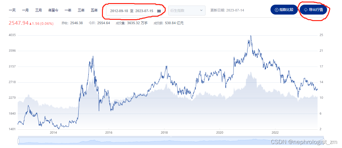
下载得到文件“000016perf.xlsx”
3、将“000016perf.xlsx”导入Python:
import pandas as pd

df = pd.read_excel(r"000016perf.xlsx",
                   sheet_name = 0,
                   usecols = [0, 1, 6, 7, 8,9,10,11,12,13])
4、更改列名:
df.rename(columns={'日期Date':'date',
                   '指数代码Index Code':'index_code',
                   '开盘Open':'open',
                   '最高High':'high',
                   '最低Low':'low',
                   '收盘Close':'close'},
          inplace=True)
5、生成新的一列,代表天数,2012-09-18代表第0天,2012-09-19代表第1天,以此类推:
df['date'] = pd.to_datetime(df['date'],format='%Y%m%d')
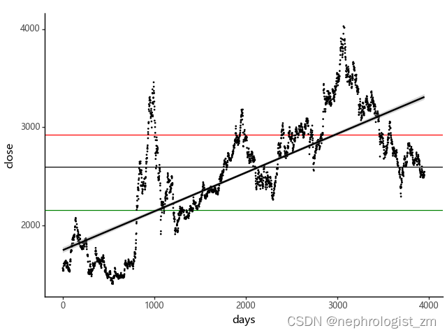
df['days'] = df.apply(lambda x: (x['date']-df['date'][0]).days, axis=1)6、绘制上证50指数的图、绘制收盘价关于时间的线性回归曲线、根据历史数据计算出收盘价的25%位数、中位数、75%位数:
from plotnine import *
import numpy as np
import matplotlib.pyplot as plt
plt.rcParams['font.sans-serif'] = ['Microsoft YaHei']

print(ggplot(df,aes(y='close', x='days'))
          +geom_hline(yintercept =np.percentile(df['close'], 75),color='red') # 红色水平线代表历史收盘价的75%位数
          +geom_hline(yintercept =np.percentile(df['close'], 50)) # 黑色水平线代表历史收盘价的50%位数
          +geom_hline(yintercept =np.percentile(df['close'], 25),color='green') # 绿色水平线代表历史收盘价的25%位数
          +geom_point(size=0.1) # 每个点对应的纵坐标是收盘价,对应的横坐标是时间(天)
          +geom_smooth(method="lm") # 斜线是收盘价关于时间的线性回归曲线
          +theme_classic()
          +theme(plot_title=element_text(hjust=0.5)))
输出为:
两者对比一下:


 被折叠的 条评论
为什么被折叠?
被折叠的 条评论
为什么被折叠?
 到【灌水乐园】发言


