


绘制这些的思路有svg、裁剪clip-path、伪类。
①svg知识讲解:
定义:
svg是基于XML的矢量图形格式,允许创建可缩放的、高质量的图形
基本结构:
<svg width="100" height="100" xmlns="http://www.w3.org/2000/svg">
  <!-- SVG内容 -->
</svg>
<!--对于嵌入HTML的SVG:可以省略 xmlns
对于独立SVG文件:建议包含 xmlns
-->
基本图形:
矩形 (<rect>)
代码片段:
<svg viewBox="0 0 200 150" width="200" height="150">
<!-- 背景网格 -->
<defs>
<pattern id="smallGrid" width="10" height="10" patternUnits="userSpaceOnUse">
<path d="M 10 0 L 0 0 0 10" fill="none" stroke="gray" stroke-width="0.5"/>
</pattern>
</defs>
<rect width="100%" height="100%" fill="url(#smallGrid)" />
<!-- 示例矩形 -->
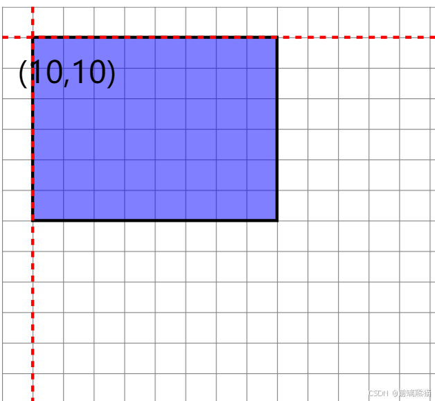
<rect x="10" y="10" width="80" height="60" fill="blue" fill-opacity="0.5" stroke="black" />
<!-- 坐标标记 -->
<text x="5" y="25" font-size="10">(10,10)</text>
<line x1="0" y1="10" x2="200" y2="10" stroke="red" stroke-width="1" stroke-dasharray="2,2"/>
<line x1="10" y1="0" x2="10" y2="150" stroke="red" stroke-width="1" stroke-dasharray="2,2"/>
</svg>
<!--
SVG坐标系统:
原点 (0,0) 位于左上角。
x轴向右为正。
y轴向下为正。
单位:
默认单位是像素。
可以使用其他单位如em, cm, mm等。
rect 中的x定义矩形左边缘距SVG画布左边的距离。y定义矩形顶边距SVG画布顶部的距离
-->效果:
圆形 (<circle>)
代码学习:
<svg viewBox="0 0 150 150" width="150" height="150">
<!-- 背景网格 -->
<defs>
<pattern id="smallGrid" width="10" height="10" patternUnits="userSpaceOnUse">
<path d="M 10 0 L 0 0 0 10" fill="none" stroke="gray" stroke-width="0.5"/>
</pattern>
</defs>
<rect width="100%" height="100%" fill="url(#smallGrid)" />
<!-- 示例圆 -->
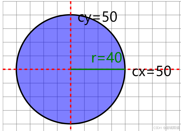
<circle cx="50" cy="50" r="40" fill="blue" fill-opacity="0.5" stroke="black" />
<!-- 坐标轴 -->
<line x1="0" y1="50" x2="150" y2="50" stroke="red" stroke-width="1" stroke-dasharray="2,2"/>
<line x1="50" y1="0" x2="50" y2="150" stroke="red" stroke-width="1" stroke-dasharray="2,2"/>
<!-- 标记 -->
<text x="55" y="15" font-size="10">cy=50</text>
<text x="95" y="55" font-size="10">cx=50</text>
<line x1="50" y1="50" x2="90" y2="50" stroke="green" stroke-width="1"/>
<text x="65" y="45" font-size="10" fill="green">r=40</text>
</svg>
<!--在SVG中,<circle> 元素的属性定义如下:
cx:圆心的 x 坐标(不是半径)
cy:圆心的 y 坐标(不是半径)
r:圆的半径 -->效果:
椭圆 (<ellipse>)
<ellipse cx="50" cy="50" rx="40" ry="30" />线段 (<line>)
<line x1="10" y1="10" x2="90" y2="90" />多边形 (<polygon>)
<polygon points="50,10 90,90 10,90" />路径:
<path> 元素是SVG中最灵活的图形元素。
路径命令:
- M: 移动到
- L: 画线到
- H: 水平线到
- V: 垂直线到
- C: 三次贝塞尔曲线
- Q: 二次贝塞尔曲线
- A: 弧线
- Z: 闭合路径
<path d="M10 10 L90 90 L90 10 Z" />文本:
SVG允许在图形中添加文本。
基本文本:
<text x="10" y="50" font-family="Arial" font-size="20">Hello, SVG!</text>文本路径:
<path id="myPath" d="M10 80 Q 95 10 180 80" />
<text>
  <textPath href="#myPath">Text along a curved path</textPath>
</text>
填充和描边:
使用fill和stroke属性来设置图形的填充色和描边
<rect x="10" y="10" width="80" height="60" fill="blue" stroke="red" stroke-width="2" />渐变和图案:
线性渐变
<defs>
  <linearGradient id="grad1" x1="0%" y1="0%" x2="100%" y2="0%">
    <stop offset="0%" style="stop-color:rgb(255,255,0);stop-opacity:1" />
    <stop offset="100%" style="stop-color:rgb(255,0,0);stop-opacity:1" />
  </linearGradient>
</defs>
<rect x="10" y="10" width="80" height="60" fill="url(#grad1)" />
变形
平移
<rect x="10" y="10" width="20" height="20" transform="translate(30,40)" />旋转
<rect x="10" y="10" width="20" height="20" transform="rotate(45 20 20)" />缩放
<rect x="10" y="10" width="20" height="20" transform="scale(2)" />②cilp-path学习:
第一个参数左下,第二个参数左上,第三个参数右上,第四个参数右下;每个参数都是一对值,表示为 x y,其中:
x是距离元素左边缘的水平距离y是距离元素上边缘的垂直距离
③伪类学习:
CSS伪类是一种用于选择特定状态元素的选择器,不在DOM节点上
代码:
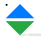
 .triangle {
            width: 0;
            height: 0;
            position: relative;
            margin: 50px;
        }

        .triangle::before,
        .triangle::after {
            content: '';
            position: absolute;
            border-style: solid;
        }

        /* 向上的三角形 */
        .triangle-up::before {
            border-width: 0 50px 50px 50px;
            border-color: transparent transparent #007bff transparent;
        }

        /* 向下的三角形 */
        .triangle-down::after {
            top: 60px;
            border-width: 50px 50px 0 50px;
            border-color: #28a745 transparent transparent transparent;
        }
<div class="triangle triangle-up"></div>
<div class="triangle triangle-down"></div>效果:
svg梯形:
应用:
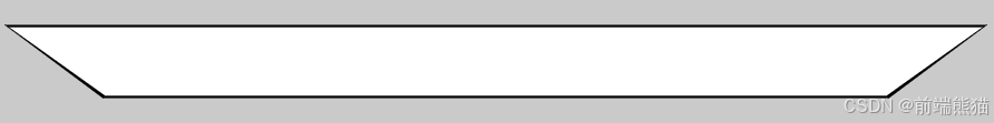
<svg width="400" height="30" viewBox="0 0 400 30">
  <path d="M40 30 L0 0 L400 0 L360 30 Z" fill="black" />
  <path d="M41 29 L2 1 L398 1 L359 29 Z" fill="white" />
</svg>
效果:
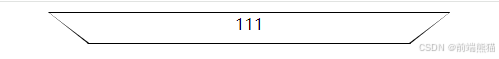
clip-path:
代码片段:
 <div
    style="background-color: black; margin-top: 10px; position: absolute; top: 0; left: 26%; width: 400px; height: 30px; text-align: center; border-top: 1px solid black; border-left: 1px solid black; border-right: 1px solid black; border-bottom: 1px solid black; clip-path: polygon(10% 100%, 0% 0%, 100% 0%, 90% 100%); z-index: 1;">
    <div
      style="content: ''; position: absolute; top: 0px; left: 0px; right: 0px; bottom: 1px; width: 100%; height: 30px; background-color: #fff; z-index: -1; clip-path: polygon(10% 100%, 0% 0%, 100% 0%, 90% 100%);">
      111
    </div>
  </div>
效果:
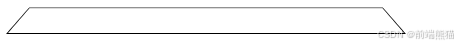
伪类:
代码片段:
  .trapezoid {
      width: 400px;
      height: 30px;
      position: relative;
      overflow: hidden;
    }

    .trapezoid::before {
      content: '';
      position: absolute;
      top: 0;
      left: 0;
      right: 0;
      bottom: 0;
      background: black;
      transform: perspective(20px) rotateX(5deg);
      transform-origin: bottom;
    }

    .trapezoid::after {
      content: '';
      position: absolute;
      top: 1px;
      left: 2px;
      right: 2px;
      bottom: 1px;
      background: white;
      transform: perspective(20px) rotateX(5deg);
      transform-origin: bottom;
    }
<div class="trapezoid"></div>效果:


 扫一扫
扫一扫


 被折叠的 条评论
为什么被折叠?
被折叠的 条评论
为什么被折叠?
 到【灌水乐园】发言


