


简介:
1、前言:
- 位图:放大会失真图像边缘有锯齿;是由像素点组成;前端的 Canvas 就是位图效果。
- 矢量图:放大不会失真;使用 XML 描述图形。
- 对于初学 SVG 的前端来说,可以简单的理解为 “SVG 是一套新标签”。所以可以使用 CSS 来设置样式,也可以使用 JS 对 SVG 进行操作。
- 在不设置宽高的情况下,默认为300 * 150,当内部元素大于300 * 150时,大于部分会被隐藏
2、viewBox 属性定义了SVG中可以显示的区域。
语法:viewBox=“x y w h” x、y为起始点,w、h为显示区域的宽高。
示例:
<svg width="300" height="300" viewBox="0 0 100 100">
  <circle cx="100" cy="100" r="100" />
</svg>
为什么不是一个100大小的圆显示在画布上呢?
viewBox定义了一个:从(0, 0)点开始,宽高为100 * 100的显示区域。而这个100 * 100的显示区域会放到300 * 300(svg宽高)的SVG中去显示,整体就放大了3倍
3、version
version属性用于指明SVG的版本,也就是指明SVG文档应该遵循的规范。version属性纯粹就是一个说明,对渲染或处理没有任何影响。且目前只有1.0 和 1.1这两个版本。
<svg version="1.1">
  // ...
</svg>
4、xmlns和xmlns:xlink
5、用
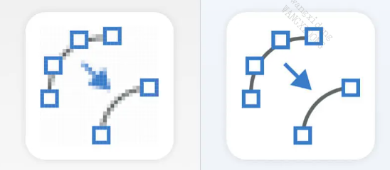
创建组合对象
两种方法可以使我们的图标随时可用:将它们转换为组合,或转换为模板。我们将把前面的一半图标转换成组合,然后把剩下的一半变成模板,这样我们就可以说明他们之间的区别
要把我们的一个图标转换成一个组合,我们要做的就是用标签
<g id="leftalign">
    <!-- 左对齐图标 -->
    <line x1="3" y1="3" x2="48" y2="3"></line>
    <line x1="3" y1="19" x2="65" y2="19"></line>
    <line x1="3" y1="35" x2="48" y2="35"></line>
    <line x1="3" y1="51" x2="65" y2="51"></line>
</g>
6、使用
在
<use href="#leftalign" x="100" y="100"></use>
7、使用 symbols 创建模板对象
除了组合之外,你也可以使用模板来定义你的图标
模板几乎和组合一样,但是你可以获得额外的设置来控制视口(viewbox)和长宽比。
viewBox的属性 让我们可以定义每个模板的可见部分应该是什么。属性4个值。前两个定义图标的左上角,第三和第四分别定义它的宽度和高度
<symbol id="alert" viewBox="0 0 86 86">
    <!-- 警示图标 -->
    <ellipse cx="43" cy="43" rx="40" ry="40"></ellipse>
    <ellipse style="fill:black;" cx="43" cy="65" rx="5" ry="5"></ellipse>
    <line style="stroke-width: 8;" x1="43" y1="19" x2="43" y2="48"></line>
</symbol>
8、使用
我们可以像使用我们的组合一样使用我们的模板图标。不过我们也会提供已经设好了宽高属性为 100px 的图标。
试着给使用基于组合图标的
一、图形标签
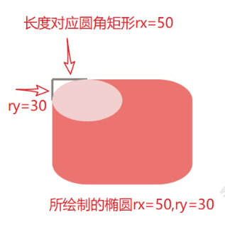
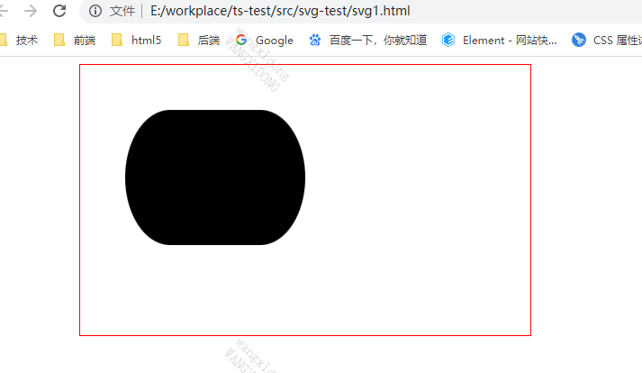
1、矩形
矩形使用
矩形基础属性
- x: 左上角x轴坐标 偏移距离
- y: 左上角y轴坐标
- width: 宽度
- height: 高度
- rx: 圆角,x轴的半径
- ry: 圆角,y轴的半径
<!DOCTYPE html>
<svg width="500" height="300" style="border: 1px solid red; margin-left: 100px;">
  <rect x="50" y="50" width="200" height="150" rx="50" ry="50">
  </rect>
</svg>
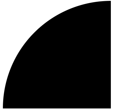
rx\ry 理解,画一个椭圆来切调不相交的部分
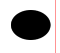
2、圆形
圆形使用
- cx: 圆心在x轴的坐标
- cy: 圆心在y轴的坐标
- r: 半径
<!DOCTYPE html>
<svg width="500" height="300" style="border: 1px solid red; margin-left: 100px;">
  <circle cx="350" cy="150" r="20"></circle>
</svg>

3、椭圆 ellipse
椭圆使用
- cx: 圆心在x轴的坐标
- cy: 圆心在y轴的坐标
- rx: x轴的半径
- ry: y轴的半径
<!DOCTYPE html>
<svg width="500" height="300" style="border: 1px solid red; margin-left: 100px;">
  <ellipse cx="450" cy="150" rx="40" ry="30"></ellipse>
</svg>
4、直线 line
直线使用
- x1: 起始点x坐标
- y1: 起始点y坐标
- x2: 结束点x坐标
- y2: 结束点y坐标
- stroke: 描边颜色
<svg width="400" height="300" style="border: 1px solid red; margin: 10px">
  <line x1="10" y1="10" x2="10" y2="50" stroke="#000"></line>
</svg>

5、折线polyline
使用
- points: 点集
- stroke: 描边颜色
- fill: 填充颜色
<svg width="400" height="300" style="border: 1px solid red; margin: 10px">
  <polyline points="20 10, 100 10, 100 40" stroke="red" fill="none"></polyline>
  <polyline points="20 10, 100 10, 100 40" stroke="red" fill="red"></polyline>
</svg>

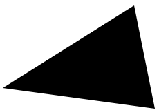
6、多边形 polygon
多边形使用
- points: 点集
- stroke: 描边颜色
- fill: 填充颜色
<svg width="400" height="300" style="border: 1px solid red; margin: 10px">
  <polygon points="10 200, 200 80, 230 230" ></polygon>
</svg>
二、路径path
在 SVG 里,所有基本图形都是
d 属性又包括以下主要的关键字(注意大小写!):
- M: 起始点坐标,moveto 的意思。每个路径都必须以 M 开始。M 传入 x 和 y 坐标,用逗号或者空格隔开。
- L: 轮廓坐标,lineto 的意思。L 是跟在 M 后面的。它也是可以传入一个或多个坐标。大写的 L 是一个绝对位置。
- l: 这是小写 L,和 L 的作用差不多,但 l 是一个相对位置。
- H: 和上一个点的Y坐标相等,是 horizontal lineto 的意思。它是一个绝对位置。
- h: 和 H 差不多,但 h 使用的是相对定位。
- V: 和上一个点的X坐标相等,是vertical lineto 的意思。它是一个绝对位置。
- v: 这是一个小写的 v ,和大写 V 的差不多,但小写 v 是一个相对定位。
- Z: 关闭当前路径,closepath 的意思。它会绘制一条直线回到当前子路径的起点。
- Q 二次贝塞尔曲线
- T 延长二次贝塞尔曲线的简化命令
- C 用来绘制一条三次贝塞尔曲线,相对于二次贝塞尔曲线多了一个控制点
- S 三次贝塞尔曲线的S命令和二次贝塞尔曲线的T命令比较相似。S命令也可以用来创建与前面一样的贝塞尔曲线,但如果S命令跟在一个C命令或者另一个S命令的后面,那么它的第一个控制点,就会被假设成前一个控制点的对称点。
- A 用于画弧形,它可以截取圆或椭圆的弧形成的曲线
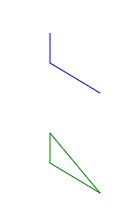
画直线demo
<svg width="400" height="300" style="border: 1px solid red; margin: 10px">
  <path d="M 300 100 L 300 130 L 350 160" stroke="blue" fill="none"></path>
  <path d="M 300 200 L 300 230 L 350 260 Z" stroke="green" fill="none"></path>

	<!--  同上,用 V 省略了 水平坐标 -->
  <path d="M 300 200 V 230 L 350 260 Z" stroke="green" fill="none"></path>

	<!--  同上 全L 可直接省略  -->
  <path d="M 300 200 300 230 350 260 Z" stroke="green" fill="none"></path>
</svg>
画圆弧demo
A(rx, ry, xr, laf, sf, x, y)
在 SVG 中可以使用 path 配合 A属性 绘制椭圆弧。
- rx: 椭圆X轴半径
- ry: 椭圆Y轴半径
- xr: 椭圆旋转角度
- laf: 是否选择弧长较长的那一段。0: 短边(小于180度); 1: 长边(大于等于180度)
- sf: 是否顺时针绘制。0: 逆时针; 1: 顺时针
- x: 终点X轴坐标
- y: 终点Y轴坐标
上面的公式中并没有开始点,开始点是由 M 决定的。
<path d="M 300 200 A 50 50 0 0 1 400 200 Z" stroke="green" fill="none"></path>
三、设置样式的方式和css一样
fill + style + class + 外部引入, 注意这个样式只能是svg自己的样式才生效
比如我设置一个style=“background-color: red” 不管用,得设置成 style=“fill: red”
四、常用样式设置
1、fill 填充
填充图案颜色,可以设置 fill 属性。这个属性在前面的例子也使用过多次。
可以使用 none 或者 transparent 将填充色设置成透明
2、填充色的不透明度 fill-opacity
可以设置 fill-opacity 属性,也可以在 fill 属性中使用 RGBA 或者 HSLA。
本例使用 fill-opacity 设置,它的取值是 0 - 1,0 代表完全透明,1 代表完全不透明。小于 0 的值会被改为 0,大于 1 的值会被改为 1 。
<svg width="400" height="400" style="border: 1px solid red;">
  <rect
    x="100"
    y="100"
    width="200"
    height="100"
    fill="red"
    fill-opacity="0.2"
  />
</svg>
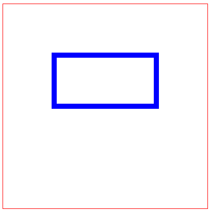
3、描边stroke
(1)描边宽度 stroke-width
<svg width="400" height="400" style="border: 1px solid red;">
  <rect
    x="100"
    y="100"
    width="200"
    height="100"
    fill="none"
    stroke="blue"
    stroke-width="10"
  />
</svg>
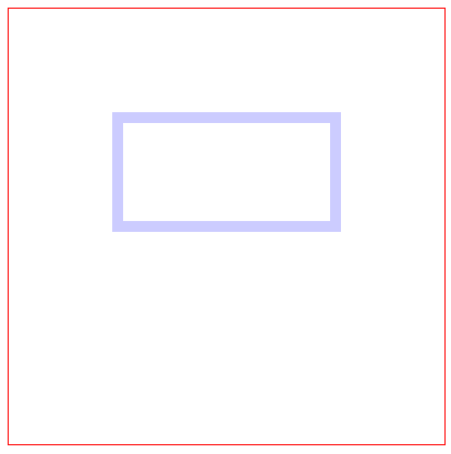
(2)描边的透明度stroke-opacity
<svg width="400" height="400" style="border: 1px solid red;">
  <rect
    x="100"
    y="100"
    width="200"
    height="100"
    fill="none"
    stroke="blue"
    stroke-opacity="0.3"
  />
</svg>
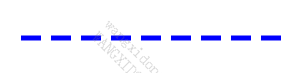
(3)描边虚线 stroke-dasharray
stroke-dasharray 接收一串数字,这串数字可以用来代表 线的长度和空隙的长度,数字之间用逗号或者空格分隔。
建议传入偶数个数字。但如果你传入了奇数个数字,SVG 会将这串数字重复一遍,使它的数量变成 偶数个 。
<svg>
  <line x1="30" y1="70" x2="300" y2="70" stroke="blue" stroke-width="5"
    stroke-dasharray="20 10" />
</svg>
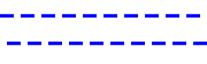
(4)虚线偏移量 stroke-dashoffset
接收一个数值类型的值
<svg>
  <line x1="0" y1="30" x2="300" y2="30" stroke="blue" stroke-width="5"
    stroke-dasharray="20 10" />
  <line x1="0" y1="70" x2="300" y2="70" stroke="blue" stroke-width="5"
    stroke-dasharray="20 10" stroke-dashoffset="20" />
</svg>
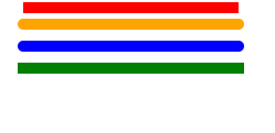
(5)线帽 stroke-linecap
线的起始点和结束点的样式,用 stroke-linecap 属性可以设置线帽样式。
线帽有3个值:
- butt: 平头(默认值)
- round: 圆头
- square: 方头
默认的linecap是占用线条的长度的,所以在一个svg画布上需要预留线帽的空间。
<svg width="300" height="300">
  <!-- 默认 平头 -->
  <line x1="5" y1="5" x2="200" y2="5" stroke="red" stroke-width="10"
    style="stroke-linecap: butt;" />
  <!-- 圆头 -->
  <path stroke-linecap="round" stroke="orange" stroke-width="10" d="M5 20 L200 20" />
  <line x1="5" y1="40" x2="200" y2="40" stroke="blue" stroke-width="10"
    stroke-linecap="round" />
  <!-- 方头 -->
  <line x1="5" y1="60" x2="200" y2="60" stroke="green" stroke-width="10"
    stroke-linecap="square" />
</svg>
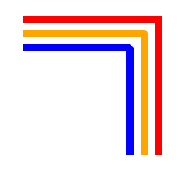
(6)拐角 stroke-linejoin
拐角就是折线的交接点,可以使用 stroke-linejoin 设置,它接收以下属性:
- miter: 尖角(默认)
- round: 圆角
- bevel: 平角
<svg width="260" height="260">
  <!-- 尖角 默认 -->
  <path d="M10 10 200 10 200 200" stroke-width="10" stroke="red"
    stroke-linejoin="miter" fill="none"></path>
  <!-- 圆角 -->
  <path d="M10 30 180 30 180 200" stroke-width="10" stroke="orange"
    stroke-linejoin="round" fill="none"></path>
  <!-- 平角 -->
  <path d="M10 50 160 50 160 200" stroke-width="10" stroke="blue"
    stroke-linejoin="bevel" fill="none"></path>
</svg>
(7)消除锯齿 shape-rendering
如果你觉得 SVG 在浏览器显示出来的图像有点模糊,那可能是开启了 反锯齿 功能,可以通过 CSS 属性关闭该功能。
shape-rendering: crispEdges;
将该属性设置到对应的 svg 元素上,就会关闭反锯齿功能,突显看起来就会清晰很对,但在某些情况关闭了该功能会让图像看起来有点毛躁的感觉。
如果想开启反锯齿功能,可以这样设置:shape-rendering: geometricPrecision;
- 示例 ( 没有看出来效果 )
<svg>
  <rect x="10" y="10" width="100" height="100" fill="orange"
    style="shape-rendering: crispEdges"></rect>
</svg>
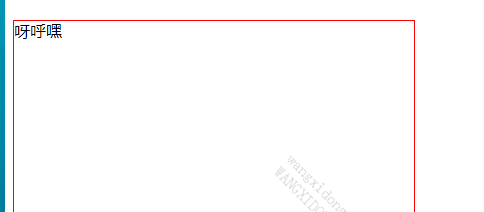
五、文本元素 text
使用
<svg width="400" height="400" style="border: 1px solid red;">
  <text>呀呼嘿</text>
</svg>
如图所示文字并没有显示出来,因为对齐方式是以第一个字的基线的左下角为参考,默认的位置坐标是 (0, 0)
如果想显示出来必须向下移动字体的px,默认为html高度 16px, 此处移动16px
1、设置字号 font-size
2、设置字体粗细 font-weight
使用 font-weight 可以将文本设置成粗体。
- normal: 默认(非粗体)
- bold: 粗体
这和 CSS 是一样的
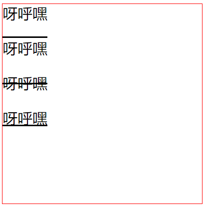
3、装饰线 text-decoration
和 CSS 一样,可以使用 text-decoration 设置装饰线
- none:默认
- underline: 下划线
- overline: 上划线
- line-through: 删除线
<svg width="400" height="400" style="border: 1px solid red;">
  <!-- 默认 -->
  <text
    y="30"
    font-size="30"
    text-decoration="none"
  >
    呀呼嘿
  </text>

  <!-- 上划线 -->
  <text
    y="100"
    font-size="30"
    text-decoration="overline"
  >
    呀呼嘿
  </text>

  <!-- 删除线 -->
  <text
    y="170"
    font-size="30"
    text-decoration="line-through"
  >
    呀呼嘿
  </text>

  <!-- 下划线 -->
  <text
    y="240"
    font-size="30"
    text-decoration="underline"
  >
    呀呼嘿
  </text>
</svg>
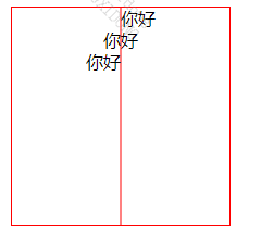
4、文本对齐
(1)水平对齐方式 text-anchor
可以通过 text-anchor 属性设置文本水平对齐方式。
如果本子是从左向右书写,那这几个参数的意思就是:
- start: 左对齐
- middle: 居中对齐
- end: 右对齐
<svg width="200" height="200" style="border: 1px solid red;">
  <!-- 参考线 -->
  <path d="M 100 0 100 200" stroke="red"></path>
  <text x="100" y="16" text-anchor="start">你好</text>
  <text x="100" y="36" text-anchor="middle">你好</text>
  <text x="100" y="56" text-anchor="end">你好</text>
</svg>
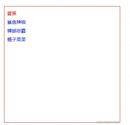
(2)多行文可以使用本
标签辅助实现
<svg width="400" height="400" style="border: 1px solid red;">
  <text fill="blue">
    <tspan x="10" y="30" fill="red">雷猴</tspan>
    <tspan x="10" y="60">鲨鱼辣椒</tspan>
    <tspan x="10" y="90">蟑螂恶霸</tspan>
    <tspan x="10" y="120">蝎子莱莱</tspan>
  </text>
</svg>
如果在
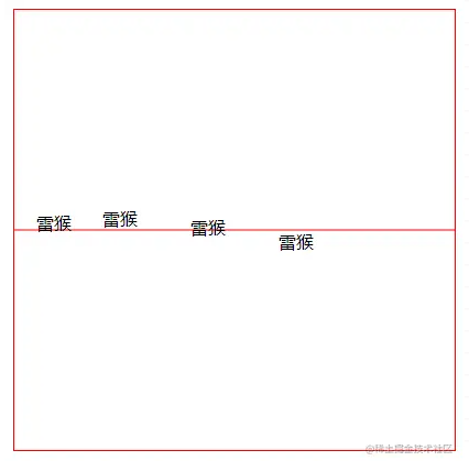
(3)垂直对齐方式 dominant-baseline
可以通过 dominant-baseline 属性设置文本垂直对齐方式
- auto: 默认的对齐方式,保持与父元素相同的配置。
- text-after-edge: 在基线上方
- middle: 居中基线
- text-before-edge: 在基线下方
<svg width="400" height="400" style="border: 1px solid red;">
  <!-- 参考线 -->
  <path d="M 0 200 400 200" stroke="red"></path>

  <!-- 默认 -->
  <text
    x="20"
    y="200"
    dominant-baseline="auto"
  >
    雷猴
  </text>

  <!-- 在基线上方 -->
  <text
    x="80"
    y="200"
    dominant-baseline="text-after-edge"
  >
    雷猴
  </text>

  <!-- 居中基线 -->
  <text
    x="160"
    y="200"
    dominant-baseline="middle"
  >
    雷猴
  </text>

  <!-- 在基线下方 -->
  <text
    x="240"
    y="200"
    dominant-baseline="text-before-edge"
  >
    雷猴
  </text>
</svg>
(4)纵向文字 writing-mode
将 writing-mode 设置成 tb 就可以让文字纵向排列。
需要注意英文和中文的文字角度!
<svg width="400" height="400" style="border: 1px solid red;">
  <text x="20" y="20" writing-mode="tb">Hello World!</text>
  <text x="100" y="20" writing-mode="tb">鲨鱼辣椒</text>
</svg>
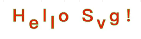
5、属性
(1) x和y属性决定了文字的绘制起点。
x和y的值可以是一个数列。如果设置为了一个数列则会应用到每一个字符上
 <svg width="300" height="300">
  <text
    x="30 60 90 120 150 180 210 240 270"
    y="60 90 120 150 180 150 120 90 60"
    fill="#f00"
    stroke="#0f0"
    font-size="50"
    font-weight="bold" >
    Hello Svg !
  </text>
</svg>
(2) dx和dy
dx和dy属性与x和y属性不同的是,x和y属性是绝对的坐标,而dx和dy属性是相对于当前位置的偏移量。
参数也可以是一个数列。如果设置为了一个数列则会应用到每一个字符上
<svg width="500" height="500">
  <text
    dx="50 10 10 10 10 10 10 10 10"
    dy="50 20 -20 20 -20 20 -20 20 -20"
    fill="#f00"
    stroke="#0f0"
    font-size="50"
    font-weight="bold" >
    Hello Svg !
  </text>
</svg>
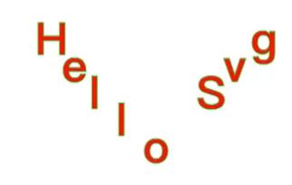
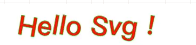
(3) rotate属性
rotate属性可以把文字旋转一个角度。也可以是数列同上
<svg width="500" height="500">
  <text
    x="50"
    y="50"
    rotate="10"
    fill="#f00"
    stroke="#0f0"
    font-size="50"
    font-weight="bold" >
    Hello Svg !
  </text>
</svg>
(4) textLength
textLength属性给定了一个字符串的计算长度。在文字的长度和textLength属性给定的长度不一致的情况下渲染引擎会精细调整字型的位置。
<svg width="550" height="500">
  <text x="50" y="50" textLength="150" fill="#f00" stroke="#0f0" font-size="50"font-weight="bold" >
    Hello Svg !
  </text>
  <text  x="50" y="100" textLength="500" fill="#f00" stroke="#0f0" font-size="50" font-weight="bold" >
    Hello Svg !
  </text>
</svg>

(5) lengthAdjust
lengthadjust属性可以控制文本以什么方式伸展到由_textLength_属性定义的长度。
- spacing:只拉伸或压缩间距(文字不变形)
- spacingAndGlyphs:同时拉伸或压缩间距和文字本身(文字变形)
<svg width="500" height="500">
  <text  x="50" y="50" textLength="200" lengthadjust="spacing" fill="#f00" stroke="#0f0" font-size="50" font-weight="bold" >
    Welcome to the world of svg !
  </text>
  <text  x="50" y="100" textLength="200" lengthadjust="spacingAndGlyphs" fill="#f00" stroke="#0f0" font-size="50" font-weight="bold" >
    Welcome to the world of svg !
  </text>
  <text  x="50" y="150" textLength="400" lengthadjust="spacing" fill="#f00" stroke="#0f0" font-size="50" font-weight="bold" >
    Hi svg !
  </text>
  <text  x="50" y="200" textLength="400" lengthadjust="spacingAndGlyphs" fill="#f00" stroke="#0f0" font-size="50" font-weight="bold" >
    Hi svg !
  </text>
</svg>

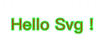
(6) fill和stroke
填充和轮廓也都可以应用于文字
<svg width="300" height="300">
  <text x="50" y="50" fill="#f00" stroke="#0f0" font-weight="bold">Hello Svg !</text>
</svg>
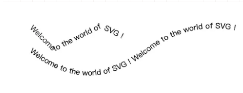
重要 (7) textPath 非常牛
textPath标签可以利用它的xlink:href属性取得一个任意路径,并且可以让字符顺着路径渲染。
 <svg width="600" height="500">
  <path id="pathM" d="M 50 50 100 100 200 50 300 100" fill="none" />
  <path id="pathQ" d="M50 100 Q 175 200 300 100 T 600 100" fill="none" />
  <text>
    <textPath xlink:href="#pathM"> Welcome to the world of SVG ! </textPath>
  </text>
  <text>
    <textPath xlink:href="#pathQ"> Welcome to the world of SVG ! Welcome to the world of SVG ! </textPath>
  </text>
</svg>
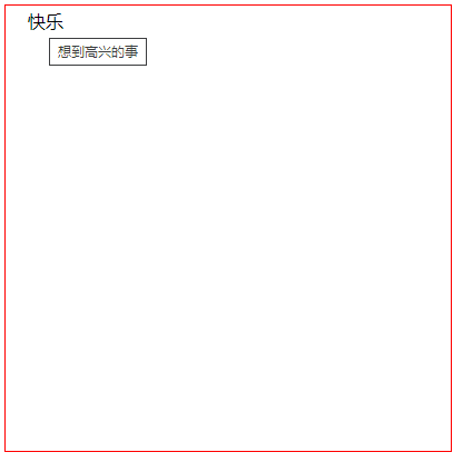
六、超链接
和 HTML 一样,超链接可以使用 标签实现。
在 SVG 里,链接要放在 xlink:href 属性里。
如果希望鼠标放到链接上出现提示信息,可以在 xlink:title 属性里编写提示信息。
- 如需在新窗口打开链接,可以设置 target=“_blank” 。不设置的话就在当前窗口打开
<svg width="400" height="400" style="border: 1px solid red;">
  <a xlink:href="../imgs/1.jpg" xlink:title="想到高兴的事">
    <text x="20" y="20">快乐</text>
  </a>
</svg>
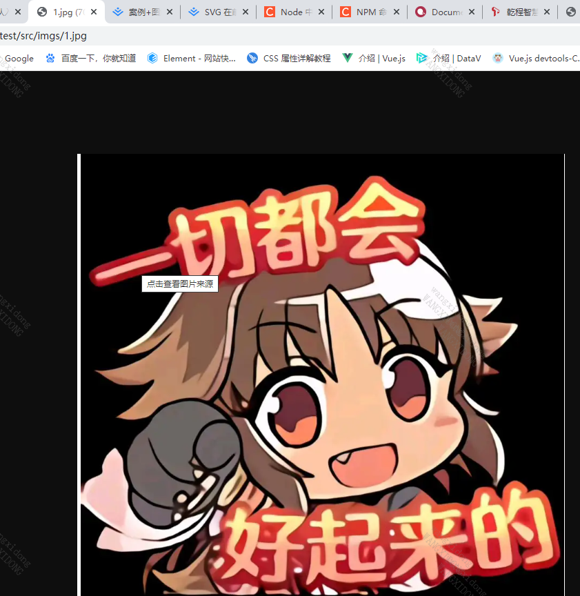
七、图片
在 SVG 中可以使用 标签加载图片,包括位图。
是使用 xlink:href 属性获取图片的
<svg width="400" height="400" style="border: 1px solid red;">
  <image xlink:href="./img.jpg"></image>
</svg>
有问题:会在地址前自动加上 file:///,在我电脑上正常,公司电脑不行,这是为什么呢
八、渐变
渐变都分为两种渐变:线性渐变和径向渐变
但需要注意的是这里我们需要接触两个新的标签:
- defs标签用来定义渐变
- stop标签用来定义渐变的颜色坡度,具有三个属性:offset定义渐变开始和结束的位置、stop-color(定义颜色)和stop-opacity(定义透明度)
参数:x1、y1定义线性渐变的起点, x2、y2定义渐变的终点。仅仅是控制渐变的方向
1、线性渐变
<svg width="300" height="300">
  <defs>
    <linearGradient id="linearGradient" x1="0" y1="0" x2="100%" y2="0">
      <stop offset="0%" stop-color="#189faa"></stop>
      <stop offset="100%" stop-color="#fff382"></stop>
    </linearGradient>
    <linearGradient id="linearGradient1" x1="0" y1="0" x2="0%" y2="100%">
      <stop offset="0%" stop-color="#189faa"></stop>
      <stop offset="100%" stop-color="#fff382"></stop>
    </linearGradient>
  </defs>
  <ellipse cx="150" cy="100" rx="100" ry="50" fill="url(#linearGradient)"></ellipse>
  <ellipse cx="150" cy="220" rx="100" ry="50" fill="url(#linearGradient1)"></ellipse>
</svg>

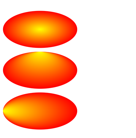
2、径向渐变
径向渐变(radialGradient)其实就是以一个点做放射性的渐变。
参数: cx、cy、r分别为圆的坐标和半径,也就是渐变的范围,fx、fy定义渐变的中心点,也叫渐变的焦点。
<svg width="500" height="400">
  <defs>
    <radialGradient id="radialGradient" cx="50%" cy="50%" r="50%" fx="50%" fy="50%">
      <stop offset="0%" stop-color="rgb(255, 255, 0)" />
      <stop offset="100%" stop-color="rgb(255, 0, 0)" />
    </radialGradient>
    <radialGradient id="radialGradient1" cx="50%" cy="50%" r="50%" fx="50%" fy="0%">
      <stop offset="0%" stop-color="rgb(255, 255, 0)" />
      <stop offset="100%" stop-color="rgb(255, 0, 0)" />
    </radialGradient>
    <radialGradient id="radialGradient2" cx="50%" cy="50%" r="50%" fx="0%" fy="50%">
      <stop offset="0%" stop-color="rgb(255, 255, 0)" />
      <stop offset="100%" stop-color="rgb(255, 0, 0)" />
    </radialGradient>
  </defs>
  <ellipse cx="100" cy="100" rx="100" ry="50" fill="url(#radialGradient)" />
  <ellipse cx="100" cy="210" rx="100" ry="50" fill="url(#radialGradient1)" />
  <ellipse cx="100" cy="320" rx="100" ry="50" fill="url(#radialGradient2)" />
</svg>
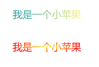
不管是线性渐变还是径向渐变,他们不仅可以用于图形还是用于文字
<svg width="500" height="400">
    <defs>
      <linearGradient id="linearGradient" x1="0" y1="0" x2="100%" y2="0">
        <stop offset="0%" stop-color="rgb(255,255,0)" />
        <stop offset="100%" stop-color="rgb(255,0,0)" />
      </linearGradient>
      <radialGradient id="radialGradient" cx="50%" cy="50%" r="50%" fx="50%" fy="100%">
        <stop offset="0%" stop-color="rgb(255, 255, 0)" />
        <stop offset="100%" stop-color="rgb(255, 0, 0)" />
      </radialGradient>
    </defs>
    <text fill="url(#linearGradient)" font-size="30" font-family="Verdana" x="50" y="100">我是一个小苹果</text>
    <text fill="url(#radialGradient)" font-size="30" font-family="Verdana" x="50" y="200">我是一个小苹果</text>
  </svg>
九、裁剪和蒙版
1、裁剪
裁剪的功能主要是使用clipPath标签定义一条裁剪路径,然后用来裁剪掉元素的部分内容。且任何透明度的效果都是无效的,它只能要么裁剪掉要么不裁剪。
<svg width="300" height="300">
    <defs>
      <clipPath id="clipPath">
        <path d="M10 50 A50 50 0 0 1 100 50 A50 50 0 0 1 190 50 Q210 100 100 200  Q-5 100 10 50 Z" />
      </clipPath>
    </defs>


    <rect x="0" y="0" width="200" height="200" fill="#f00" clip-path="url(#clipPath)" />
  </svg>

2、蒙版
蒙层的功能主要实现标签就是mask标签,他的功能和名字正好相反,他不是用来遮住元素的部分内容,而是用来显示元素中mask标签遮住的内容。 他和clipPath标签不同的是他允许使用透明度(透明度为0则无蒙层效果)和灰度值遮罩计算得的软边缘
<svg width="300" height="300">
  <defs>
    <mask id="Mask">
      <path d="M10 50 A50 50 0 0 1 100 50 A50 50 0 0 1 190 50 Q210 100 100 200  Q-5 100 10 50 Z"
        fill="#fff" fill-opacity="0.5" />
    </mask>
  </defs>
  <rect x="0" y="0" width="200" height="200" fill="#f00" mask="url(#Mask)" />
</svg>
十、动画 (核心)
1、基础动画
1)translate(平移)
语法:transform=“translate(x, y)”
参数:x为X轴上的平移距离,y为Y轴上的平移距离
<svg width="300" height="300">
  <rect x="10" y="10" width="50" height="50" fill="#189faa"></rect>
  <rect x="10" y="10" width="50" height="50" fill="#189faa" transform="translate(50, 50)"></rect>
  <rect x="10" y="10" width="50" height="50" fill="#189faa" transform="translate(100, 100)"></rect>
</svg>

2)scale(缩放)
语法:transform=“scale(x, y)”
参数:x为X轴上的缩放大小,y为Y轴上的缩放大小,当两个值一样时,写一个值就可以。
<svg width="500" height="500">
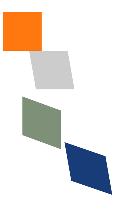
<rect x="0" y="0" width="100" height="100" fill="#ff770f" />
<rect x="0" y="200" width="100" height="100" fill="#7e9178" transform="scale(0.5)" />
<rect x="0" y="100" width="100" height="100" fill="#183c78" transform="scale(1.5)" />
<rect x="200" y="100" width="100" height="100" fill="#cccccc" transform="scale(1, 0.5)" />
</svg>

3) rotate(旋转)
语法:transform=“rotate(deg)”
参数:deg为旋转的角度,45度就写45度。
<svg width="500" height="500">
  <rect x="200" y="0" width="100" height="100" fill="#ff770f"/>
  <rect x="200" y="0" width="100" height="100" fill="#cccccc" transform="rotate(20)"/>
  <rect x="200" y="0" width="100" height="100" fill="#7e9178" transform="rotate(40)"/>
  <rect x="200" y="0" width="100" height="100" fill="#183c78"  transform="rotate(60)"/>
</svg>

是不是觉得效果和我们想想中的不一样?我就只想旋转,为什么感觉还发生了位移呢?
其实这是因为元素的旋转中心点是(0, 0)。如果我们想要只是选中而不位移,那么就需要把旋转的中心点设置在元素的中心点。
上面橙色方块的中心点经过计算可知 (250, 50)
通过 transform-origin 设置中心点
<svg width="500" height="500">
  <rect x="200" y="0" width="100" height="100" fill="#ff770f" />
  <rect x="200" y="0" width="100" height="100" fill="#cccccc" transform-origin="250 50" transform="rotate(20)" />
  <rect x="200" y="0" width="100" height="100" fill="#7e9178" transform-origin="250 50" transform="rotate(40)" />
  <rect x="200" y="0" width="100" height="100" fill="#183c78" transform-origin="250 50" transform="rotate(60)" />
</svg>

4) skew(倾斜)
语法:transform=“skewX(x) skewY(y)”
参数:x为X轴上的倾斜度,y为Y轴上的倾斜度。
在SVG中skew属性需要分开设置,x轴设置为skewX,y轴设置为skewY,不能合并起来用,写成 skew(x, y) 是不生效的。
<svg width="500" height="500">
  <rect x="0" y="0" width="100" height="100" fill="#ff770f" />
  <rect x="50" y="100" width="100" height="100" fill="#cccccc" transform="skewX(10)" />
  <rect x="50" y="200" width="100" height="100" fill="#7e9178" transform="skewY(20)" />
  <rect x="100" y="300" width="100" height="100" fill="#183c78" transform="skewX(10) skewY(20)" />
</svg>
2、js动画
SVG不能动态的修改动画内容
所以考虑用js实现
<svg width="300" height="300">
  <rect id="rect" x="0" y="0" width="50" height="50" fill="#189faa"></rect>
</svg>


<script>
  let dom = document.getElementById('rect')
  let x = 0
  let y = 1


  let temp = setInterval(() => {
    if (x < 300 && y < 300) {
      x++
      y++
      dom.setAttribute('transform', `translate(${x}, ${y})`)
    } else {
      dom.setAttribute('transform', `translate(0, 0)`)
      x = 0
      y = 0
    }
  }, 10)

</script>

3、css动画
结合CSS来尝试做一下svg的线条动画。这里我们需要用上三个属性:分别是 stroke、stroke-dasharray、stroke-dashoffset。
<head>
  <meta name="viewport" content="width=device-width, initial-scale=1.0">
  <meta http-equiv="Content-Type" content="text/html;charset=UTF-8">
  <style>
    svg {
      display: block;
      margin: 50px auto;
    }


    #line {
      stroke-dasharray: 500;
      stroke-dashoffset: 500;
      animation: move 2s linear infinite;
    }


    @keyframes move {
      to {
        stroke-dashoffset: 0;
      }
    }
  </style>
</head>


<body>
  <svg width="500" height="500" xmlns="http://www.w3.org/2000/svg" version="1.1">
    <line id="line" x1="0" x2="500" y1="0" y2="0" stroke="orange" stroke-width="10" />
  </svg>
</body>


 扫一扫
扫一扫


 846
846

 被折叠的 条评论
为什么被折叠?
被折叠的 条评论
为什么被折叠?
 到【灌水乐园】发言


