


CSS入门学习笔记+案例
一、CSS简介
1、什么是CSS
CSS:Cascading Style Sheet 层叠样式表
是一组样式设置的规则,用于控制页面的外观样式
2、为什么使用CSS
实现内容与样式的分离,便于团队开发
样式复用,便于网站的后期维护
页面的精确控制,让页面更精美
3、CSS作用
页面外观美化
布局和定位
————————————————
版权声明:本文为CSDN博主「是叽叽呀」的原创文章,遵循CC 4.0 BY-SA版权协议,转载请附上原文出处链接及本声明。
原文链接:https://blog.csdn.net/weixin_43331963/article/details/106784229
第一章 css简介及引入
1-1 css简介
HTML:用来搭建网页结构
CSS:用来给网页添加样式
CSS3:是CSS最新的版本
样式例子:
字体样式、文本样式、列表样式、背景样式、边框样式、内边距、外边距、定位、浮动、链接样式、鼠标样式、css滤镜、盒子模型等等
1-2 css优缺点
css:层叠样式表,给网页添加样式
css优点:
1.丰富的样式描述
2.样式和结构的分离,便于维护和管理
3.减少代码量,加快页面的加载
4.样式代码的复用性强
5.多个页面可以使用同一个css样式表
css缺点:
1.功能,学习的知识多
2.浏览器对css的支持程度不一样
1-3 css书写格式
css书写:
1.属性名:属性值
2.属性值是对属性名的相关描述
3.属性名必须是一个合法的有标识符(存在于css规则中的属性)
注意:
1.css不用区分大小写,推荐使用小写
2.多个样式用”;“隔开
文本颜色:color:合法的颜色值;
文本大小:font-size:合法的尺寸单位;
文本加粗:font-weight:600;
尺寸样式:宽度设置:width:合法的尺寸单位;
高度设置:height:合法的尺寸单位;
1-4 css引入方式
css引入方式:
1.行内样式:
将css代码写在元素开始标签的style属性中
可以设置多个样式,使用“;”隔开
<p style="color:red;">csdn</p>
2.内部样式:
在当前网页head标签中,写在一对style标签,然后在style标签中使用选择器编写css代码
<style type="text/css">

</style>
3.外部样式:
需要一个单独的css文件来书写css样式
4.导入样式:
把一个css文件通过@import url(“要导入的文件路径”);导入到另一个css文件中
使用导入样式,会先加载html,再加载css,会造成页面样式延迟
@import url("要导入的文件路径");
不常用,不建议使用
1-5 css注释
1.合理使用注释可以使代码更清晰,更易修改
2.css注释快捷键“ctrl+/”
第二章 css选择器
2-1 标签选择器
1.通过标签选择元素
2.无论标签隐藏有多深,标签选择器都可以选中
3.标签选择器,选择的是所有而不是一个元素(指的是在一个html中同一个标签出现过好几次,选中的是所有的标签而不是一个标签)
4.所有的标签都可以是选择器
<!DOCTYPE html>
<html>
	<head>
		<meta charset="UTF-8">
		<title></title>
		<style type="text/css">
			div{
				color:red;
			}
			p{
				color:aqua;
			}
		</style>
	</head>
	<body>
		<div>我要自学网1</div>
		<p>我要自学网2</p>
	<header>
		<div>我要自学网3</div>
		<p>我要自学网4</p>
	</header>
	</body>
</html>

2-2 ID选择器
1.id属性是标准属性,任何元素都可以有id属性
2.使用id选择器时,要在id值前加上"#"
3.id选择器只能选中一个元素,同一个页面要保证id的唯一性。不同的元素有相同的id也属于非法(错误的)
4.定义id时,必须要以字母开头,可以包含数字、下划线等符号
5.定义id时,不要与标签名相同
<!DOCTYPE html>
<html>
	<head>
		<meta charset="UTF-8">
		<title></title>
		<style type="text/css">
			#one{
				color: red;
			}
			#two{
				font-size: 30px;
			}
		</style>
	</head>
	<body>
		<ul>
			<li id="one">我要自学网1</li>
			<li id="two">我要自学网2</li>
			<li>我要自学网3</li>
		</ul>
	</body>
</html>

2-3 类选择器
1.class属性是标准属性,任何元素都可以有class属性
2.使用css选择器时,要在class值前面加上"."
3.class选择器可以被多个元素共同使用,不同元素可以有相同的class值
4.同一个元素可以有多个类名,要使用空格隔开
5.尽量使用类选择器,而不是id选择器
<!DOCTYPE html>
<html>
	<head>
		<meta charset="UTF-8">
		<title></title>
		<style type="text/css">
		.zxw{
			color: red;
			font-weight: 600;
		}
		.abc{
			font-size: 30px;
		}
		</style>
	</head>
	<body>
		<div class="zxw">我要自学网1</div>
		<span class="zxw abc">我要自学网2</span>
		<p class="zxw">我要自学网3</p>
	</body>
</html>

2-4 通用选择器
1.可以选中页面中的所有元素
2.使用通配符"*"进行选择
<!DOCTYPE html>
<html>
	<head>
		<meta charset="UTF-8">
		<title>通用选择器</title>
		<style type="text/css">
			*{
				color: red;
			}
		</style>
	</head>
	<body>
		<div>我要自学网1</div>
		<span>我要自学网2</span>
		<p>我要自学网3</p>
		<header>
			<p>我要自学网4</p>
			<div>我要自学网5</div>
		</header>
	</body>
</html>

2-5后代选择器
1.描述是一种祖先结构关系,并不一定是父子关系
2.祖先和后代之间要有一个空格隔开
3.三种选择器都可以使用(标签选择器、类选择器、ID选择器)
<!DOCTYPE html>
<html>
	<head>
		<meta charset="UTF-8">
		<title>后代选择器</title>
		<style type="text/css">
			.sb .ls{
				color:red;
			}
			ul .ww{
				color:blue;
			}
		</style>
	</head>
	<body>
		<div class="ynj">
			<ul class="yb">
				<li class="zs">张三</li>
				<li class="ls">李四</li>
				<li class="ww">王五</li>
			</ul>
		</div>
		<div class="ynj">
			<ul class="sb">
				<li class="zs">张三</li>
				<li class="ls">李四</li>
				<li class="ww">王五</li>
			</ul>
		</div>
	</body>
</html>

三种选择器搭配达到不同的选择效果
2-6 并集选择器
1.同时选中多个元素
2.选择时要用","隔开
3.三种选择器都可以使用(标签选择器、类选择器、ID选择器)
4.位置能随便换
<!DOCTYPE html>
<html>
	<head>
		<meta charset="UTF-8">
		<title>并集选择器</title>
		<style type="text/css">
			div,.abc,#one{
				color:red;
			}
		</style>
	</head>
	<body>
		<div>我要自学网1</div>
		<p class="abc">我要自学网2</p>
		<p id="one">我要自学网3</p>
	</body>
</html>

2-7 交集选择器
1.选择的元素要同时满足多个条件
2.选择器之间没有空格
3.标签选择器放在前,类选择器在后(当同时使用标签和类选择器时)
4.只能使用标签选择器和类选择器(一个ID值在一个页面只能出现一次)
<!DOCTYPE html>
<html>
	<head>
		<meta charset="UTF-8">
		<title>交集选择器</title>
		<style type="text/css">
			div.abc{
				color:#0000FF;
			}
		</style>
	</head>
	<body>
		<div>我要自学网1</div>
		<div class="abc">我要自学网2</div>
		<p class="abc">我要自学网3</p>
	</body>
</html>

2-8 第一和最后子元素选择器(序列选择器)
序列选择器一般用在列表中
<!DOCTYPE html>
<html>
	<head>
		<meta charset="UTF-8">
		<title>序列选择器</title>
		<style type="text/css">
			h3:first-child{
				color:red;
			}
			div:last-child{
				color: blue;
			}
		</style>
	</head>
	<body>
		<h3>我要自学网1</h3>
		<h3>我要自学网2</h3>
		<div>我要自学网5</div>
		<div>我要自学网6</div>
	</body>
</html>

2-9 nth-child选择器
nth-child选择器一般用在列表中
<!DOCTYPE html>
<html>
	<head>
		<meta charset="UTF-8">
		<title>nth-child选择器</title>
		<style type="text/css">
			li:nth-child(2){
				color:red;
			}
			/*选择的是li的父元素中的第2个li子元素*/
			li:nth-child(2n+1){
				color:blue;
			}
			/*选择的是li父元素中的奇数个li子元素*/
			li:nth-child(2n){
				/*偶数*/
			}
			li:nth-child(-n+6){
				/*前五个*/
			}
			li:nth-child(n+4){
				/*四之后*/
			}
			li:nth-child(n+3):li:nth-child(-n+10){
				/*第三个到第十个*/
			}
			li:nth-child(3n+1){
				/*1,4,7,10......*/
			}
		</style>
	</head>
	<body>
		<ul>
			<li>我要自学网1</li>
			<li>我要自学网2</li>
			<li>我要自学网3</li>
			<li>我要自学网4</li>
			<li>我要自学网5</li>
			<li>我要自学网6</li>
			<li>我要自学网7</li>
			<li>我要自学网8</li>
			<li>我要自学网9</li>
			<li>我要自学网10</li>
		</ul>
	</body>
</html>

2-10 css继承性
1.后代元素继承祖先元素的样式
2.只能继承文字,文本样式,其他样式不能继承
3.color,text-开头,font-开头,line-开头,可以继承
2-11 css叠加性和层叠性
css叠加性:当多个选择器选中的是同一个(类)元素时,加的是不一样的样式,所有选择器都会生效
css层叠性:当多个选择器选中的是同一个(类)元素时,加的是一样的样式,只有一个选择器会生效
2-12 css优先级
优先级从低到高:
继承样式<l浏览器预设的样式<通用选择器<标签选择器<类选择器<id选择器<行内样式(style属性)
选择的越精确,优先级越高
当优先级相同时,后面的样式会覆盖前面先写的样式
第三章 伪类和伪元素
3-1 静态伪类
伪类:元素不同状态表现不同样式
静态伪类:只能用于超链接,用的少
link:超链接点击之前的样式
visited:超链接点击之后的样式
<!DOCTYPE html>
<html>
	<head>
		<meta charset="UTF-8">
		<title>静态伪类</title>
		<style type="text/css">
			a:link{
				color:red;
			}
			a:visited{
				color: aqua;
			}
		</style>
	</head>
	<body>
		<a href="http://www.baidu.com">百度</a>
	</body>
</html>
点击前:

点击后:
3-2 动态伪类
动态伪类:能用任何元素
hover:鼠标放在元素上的状态,是最常用的状态
active:点击时没有松开鼠标时的状态,用的不多
focus:输入框在获得焦点时的状态
<!DOCTYPE html>
<html>
	<head>
		<meta charset="UTF-8">
		<title>动态伪类</title>
		<style type="text/css">
			div:hover{
				color: red;font-size: 20px;font-weight: 200;
			}
			div:active{
				color:blue;
			}
			input:focus{
				color: aquamarine;
			}
		</style>
	</head>
	<body>
		<div>我要自学网</div>
		<input type="text" value="请输入..." />
	</body>
</html>
3-3 实战我要自学网导航栏hover伪类
<!DOCTYPE html>
<html>
	<head>
		<meta charset="UTF-8">
		<title>我要自学网导航栏hover伪类</title>
		<style type="text/css">
			nav{width: 1000px;height:40px;background:black;margin:100px;}
			nav div{width:100px;height:40px;line-height:40px;float: left;color:#0000FF;text-align: center;
			font-size:12px;color:white;
			}
			nav div:hover{
				font-size:16px;color:blue;
			}
		</style>
	</head>
	<body>
		<nav>
			<div>电脑办公</div>
			<div>平面设计</div>
			<div>室内设计</div>
			<div>机械设计</div>
			<div>工业自动化</div>
			<div>影视动画</div>
			<div>程序开发</div>
			<div>网页设计</div>
			<div>会计课程</div>
			<div>兴趣成长</div>
		</nav>
	</body>
</html>

3-4 伪元素
伪元素:文档结构中没有出现的元素
伪元素使用:“::”(双冒号)
::first-letter 选择的是元素中第一个文字
::first-line 选择的是元素中的第一行文字,会根据浏览器的缩放自动调整
<!DOCTYPE html>
<html>
	<head>
		<meta charset="UTF-8">
		<title>伪元素</title>
		<style type="text/css">
			div::first-letter{
				color:red;
			}
			div::first-line{
				color:blue;
			}
		</style>
	</head>
	<body>
		<div>我要自学网我要自学网我要自学网我要自学网我要自学网我要自学网我要自学网我要自学网我要自学网我要自学网我要自学网我要自学网我要自学网我要自学网我要自学网我要自学网我要自学网我要自学网我要自学网我要自学网</div>
	</body>
</html>

::before 在元素内容之前添加新内容。必须配合content使用
::after 在元素内容之后添加新内容。必须配合content使用
可以把伪元素当成元素来使用
<!DOCTYPE html>
<html>
	<head>
		<meta charset="UTF-8">
		<title>伪元素</title>
		<style type="text/css">
			div::before{
				content:"www.51zxw.net";color:red;
			}
			div::after{
				content:"www.51zxw.net";color:blue;font-size:30px;
			}
		</style>
	</head>
	<body>
		<div>我要自学网</div>
	</body>
</html>

3-5 实战after伪元素
<!DOCTYPE html>
<html>
	<head>
		<meta charset="UTF-8">
		<title>实战after伪元素</title>
		<style type="text/css">
			ul{
				width:200px;
				margin:0 auto
			}
			ul li{
				width: 200px;
				height:50px;
				line-height:50px;
				text-align: center;

				两种方法效果相同:
			}
			ul li::after{
				content:"";/*添加空的内容*/
				display:block;
				border-bottom:1px solid red;
							}
			/*ul li div{
				border-bottom:1px solid red;

			}*/

		</style>
	</head>
	<body>
		<ul>
			<li>我要自学网1</li>
			<li>我要自学网2</li>
			<li>我要自学网3</li>
			<li>我要自学网4</li>
			<li>我要自学网5</li>
		</ul>
		<!--<ul>
			<li>我要自学网1<div></div></li>
			<li>我要自学网2<div></div></li>
			<li>我要自学网3<div></div></li>
			<li>我要自学网4<div></div></li>
			<li>我要自学网5<div></div></li>
		</ul>-->
	</body>
</html>

第四章 字体属性
4-1 字号设置
字号设置:
font-size:合法的尺寸单位;
可以使用所有css尺寸单位,常见单位有:px em rem %…
当没有设置字号时,浏览器会添加默认字号,一般是16px
<!DOCTYPE html>
<html>
	<head>
		<meta charset="UTF-8">
		<title>字号设置</title>
	</head>
	<body>
		<div>我要自学网1</div>
		<div style="font-size:14px;">我要自学网2</div>
		<div style="font-size:4em;">我要自学网3</div>
		<div style="font-size:3rem;">我要自学网4</div>
		<div style="font-size:200%;">我要自学网5</div>
	</body>
</html>

4-2 字体设置
font-family:‘字体1’,‘字体2’;
不同设置,不同系统,默认字体不一样当前电脑的默认字体是“微软雅黑”
当设置的字体没有生效,会显示默认字体
可以设置多种字体,用","隔开。当浏览器不支持第一个字体,就会尝试下一个,直到找到可识别的字样,如果都不能识别,会按设备默认字体输出
<!DOCTYPE html>
<html>
	<head>
		<meta charset="UTF-8">
		<title>字体设置</title>
	</head>
	<body>
		<div>我要自学网1</div>
		<div style="font-family: '黑体';">我要自学网2</div>
		<div style="font-family: '宋体';">我要自学网3</div>
		<div style="font-family: '楷体';">我要自学网4</div>
		<div style="font-family:'微软雅黑';">我要自学网5</div>
	</body>
</html>

4-3 字体颜色
字体颜色:
color:合法的颜色值;
合法的颜色值:颜色名 16进制颜色值 rgb颜色值 rgba颜色值(第四个是透明度)
当字体没有设置颜色时,默认为黑色
颜色名可能不被一些浏览器接受,使用十六进制颜色值,或rgb颜色值能被所有浏览器识别并正常显示
<!DOCTYPE html>
<html>
	<head>
		<meta charset="UTF-8">
		<title>字体颜色</title>
	</head>
	<body>
		<div>我要自学网1</div>
		<div style="color:red;">我要自学网2</div>
		<div style="color: #0000FF;">我要自学网5</div>
		<div style="color:rgb(122,98,122);">我要自学网3</div>
		<div style="color:rgba(122,98,134,0.6);">我要自学网4</div>
	</body>
</html>

4-4 字体粗细
字体粗细:
1.font-weight:字体粗度值
2.字体粗度值:
1.数字 100-900 没有单位 一般设置成整百 数字越大,字体越粗
2.bold 表示粗体 相当于数字700
3.bolder 表示特粗体 比继承字体粗
4.lighter 表示特细体 比继承字体细
5.normal 表示正常字体粗细 相当于数字400
<!DOCTYPE html>
<html>
	<head>
		<meta charset="UTF-8">
		<title>字体粗细</title>
	</head>
	<body>
		<h4 style="font-weight: normal;">我要自学网7</h4>
		<div>我要自学网</div>
		<div style="font-weight: 100;">我要自学网1</div>
		<div style="font-weight: 400;">我要自学网2</div>
		<div style="font-weight: 700;">我要自学网3</div>
		<div style="font-weight: 900;">我要自学网4</div>
		<div style="font-weight: bold;">我要自学网5</div>
		<div style="font-weight: bolder;">我要自学网6</div>
		<div style="font-weight: lighter;">我要自学网7</div>
	</body>
</html>

4-5 字体风格
字体风格,设置文字为倾斜效果
font-style:样式取值;
样式取值:
1.italic 表示倾斜的字体
2.oblique 表示中间状态的倾斜,偏倾斜字体
3.normal 表示正常的字体,经常用来重置字体样式
<!DOCTYPE html>
<html>
	<head>
		<meta charset="UTF-8">
		<title>字体风格</title>
	</head>
	<body>
		<div>我要自学网1</div>
		<div style="font-style: italic;">我要自学网2</div>
		<div style="font-style: oblique;">我要自学网3</div>
		<i style="font-style: normal;">我要自学网4</i>
		<br />
		<em style="font-style:normal;">我要自学网5</em>
	</body>
</html>

4-6 字体样式重置
<!DOCTYPE html>
<html>
	<head>
		<meta charset="UTF-8">
		<title>字体样式重置</title>
		<link rel="stylesheet" type="text/css" href="css/reset.css" />
	</head>
	<body>
		<div>我要自学网1</div>
		<p>我要自学网2</p>

		<b>我要自学网3</b><br />
		<strong>我要自学网4</strong><br />

		<i>我要自学网5</i><br />
		<em>我要自学网6</em>
	</body>
</html>
reset.css
body{font-size: 24px;font-family: "楷体";color:red;}
b{font-weight: normal;}
i{font-style: normal;}

第五章 文本属性
5-1 字间距
字间距:
letter-spacing:合法的尺寸单位/normal;
可以设置复值,当设置成负值,字间距会比正常间距小
normal:正常的字间距
<!DOCTYPE html>
<html>
	<head>
		<meta charset="UTF-8">
		<title>字间距</title>
		<style type="text/css">
			div{
				letter-spacing: 10px;
			}
			p{
				letter-spacing: -4px;
			}
			span{
				letter-spacing: normal;
			}
		</style>
	</head>
	<body>
		<div>我要自学网</div>
		<p>我要自学网</p>
		<span>我要自学网</span>
	</body>
</html>

5-2 行高
行高:行高可以控制行与行之间的间距,但不是行间距。一行的高度
line-height:值;
1.合理的行高 normal 默认值
2.尺寸单位 固定的行高
3.数字 当前字体尺寸的倍数来设置行高
4.百分比 当前字体尺寸的倍数的百分比来设置行高
行高经常用来使单行文本垂直居中
<!DOCTYPE html>
<html>
	<head>
		<meta charset="UTF-8">
		<title>行高</title>
		<style type="text/css">
			div{
				font-size:30px;
				/*line-height: 2;*/
				line-height: 200%;
			}
			p{
				width: 200px;height:100px;background: #FF0000;
				line-height: 100px;
			}
		</style>
	</head>
	<body>
		<div>我要自学网我要自学网我要自学网我要自学网我要自学网我要自学网我要自学网我要自学网我要自学网我要自学网我要自学网</div>
		<p>我要自学网</p>
	</body>
</html>

5-3 首行缩进
首行缩进:
text-indent:尺寸单位;
1.默认值:0
2.使用em作为首行缩进的尺寸单位,1em就表示一个汉字的长度
3.允许使用负值,首行会缩进到左边
4.使用百分比,基于父元素宽度的百分比进行缩进,不建议使用
<!DOCTYPE html>
<html>
	<head>
		<meta charset="UTF-8">
		<title>首行缩进</title>
		<style type="text/css">
			p{
				/*font-size: 20px;*/
				/*text-indent: 40px;*/
				text-indent: 2em;
				/*text-indent:-2em;*/
				/*text-indent:10%;*/
			}
		</style>
	</head>
	<body>
		<p>基本内容是企业中层经理的管理常识培训+作者自己打工与管理企业的一些感悟+一些管理经典上看来的内容,三者经常混在一起分不清楚。全书应该是樊登依据自己做领导力培训的讲稿润色加工而成。

  早就知道樊登读书会,不知道樊登居然做过企业管理培训。读后感觉樊登的培训的主要对象是江浙的小企业主。</p>

  			<p>书中樊登自述以前在央视给几个名嘴打过下手,从央视离职后自己办过杂志,还在华章教育干过,做了十年企业领导力培训,然后创办了读书会。不知为什么现在高调地出这么一本跟读书会无关的书。

  书中的管理常识部分没啥问题,小企业主常犯,比如不愿放权,管的太细等。</p>

  			<p>书中作者自己归纳总结的管理经验则欠缺逻辑推理,还处在用个案说道理的阶段,另外举的例子总体偏肤浅,也不懂得给出信息来源。经常把看过的书中的信息搬出来,但是往往又极大地简化相关的场景。

  樊登的一大缺陷是没接受过理工科训练,不知道怎么严谨地推导出一个结论。不认可我这个观点的朋友可以找一期《哈佛商业评论》看看,了解一下学者是如何在管理学领域下结论的。

  总体水平跟我见过的企业管理培训的讲师接近,比较能说,有意无意吹嘘自己给大企业做培训的经历,但是实际的企业管理经验与能力比较欠缺,也欠缺真正给企业做管理咨询的经验,讲的内容经常是举个案,以偏概全,偏肤浅,对自己有利的例子讲的多,对自己不利的案例则有意无意忽略。

  书中始终没给出领导力的定义,经常是指管理能力。</p>


	</body>
</html>

5-4 水平排列方式
水平排列方式:
text-align:left/right/center/justify
1.left 默认值,文本排列到左边
2.right 文本排列到右边
3.center 文本排列到中间
4.justify 文本两端对齐 对单行文本无效,不建议使用
<!DOCTYPE html>
<html>
	<head>
		<meta charset="UTF-8">
		<title>水平排列方式</title>
		<style type="text/css">
			div{
				font-size: 20px;
				letter-spacing: 5px;
				width:200px;
				height: 100px;
				line-height: 100px;
				background: #FF0000;
			}
			#one{
				text-align: left;
			}
			#two{
				text-align:right;
			}
			#three{
				text-align: center;
			}
			#four{
				text-align: justify;
			}
		</style>
	</head>
	<body>
		<div id="one">我要自学网</div><br />
		<div id="two">我要自学网</div><br />
		<div id="three">我要自学网</div><br />
		<div id="four">我要自学网</div><br />
	</body>
</html>

5-5 垂直对齐方式
垂直对齐方式:对行级元素 行内块级元素 表格元素有效(加粗常用)
vertical-align:值;
1.baseline 默认值,对齐父元素基线
2.sub 对齐下标
3.super 对齐上标
4.top 顶部对齐
5.bottom 底部对齐
6.middle 垂直居中对齐
7.text-top
8.text-bottom
<!DOCTYPE html>
<html>
	<head>
		<meta charset="UTF-8">
		<title>垂直对齐方式</title>
	</head>
	<style type="text/css">
		.a{
			font-size: 40px;
			background: #FF0000;
		}
		.b{
			font-size: 40px;
			/*vertical-align: baseline;
			vertical-align: sub;
			vertical-align: super;
			vertical-align: top;
			vertical-align: bottom;*/
			vertical-align: middle;

			background: aqua;
		}
	</style>
	<body>
		<!--<p>19.9 <sub>元</sub></p>
		<p>19.9 <sup>元</sup></p>-->

	<div>
		<span class="a">19.9</span>
		<span class="b">元</span>
	</div>
</html>

5-6 文本修饰
文本修饰:
text-decoration:值;
1.underline 定义下划线
2.overline 定义上划线
3.line-through 定义删除线
4.blink 闪烁的文字效果,当前浏览器都不支持,低版本的火狐浏览器支持,不建议使用
重点:默认值 none 表示没有
去掉a元素的下划线 text-decoration:none;
<!DOCTYPE html>
<html>
	<head>
		<meta charset="UTF-8">
		<title>文本修饰</title>
		<style type="text/css">
			p{
				text-decoration: underline;
				/*text-decoration: overline;
				text-decoration: line-through;*/
				/*text-decoration: blink;*/
			}
			a{
				text-decoration: none;
			}
		</style>
	</head>
	<body>
		<!--<ins>我要自学网</ins><!--下划线-->
	<!--	<del>我要自学网</del><!--删除线-->

		<p>我要自学网</p>

		<a href="#">我要自学网</a>
	</body>
</html>

5-7 文本阴影
文本阴影:
text-shadow:值1 值2 值3 值4;
值1: 水平阴影位置,必须。正值时,阴影在右,负值时,阴影在左
值2:垂直阴影位置,必须。正值时,阴影在下,负值时,阴影在上
值3:阴影模糊距离,可选值
值4:阴影颜色,合法颜色值,可选。默认和文字颜色相同
向周围产生阴影:
text-shadow:0px 0px 2px red;
值1和值2设置为零即可
<!DOCTYPE html>
<html>
	<head>
		<meta charset="UTF-8">
		<title>文本阴影</title>
		<style type="text/css">
			p{
				color:red;
				font-size: 30px;
				font-weight: 700;
				text-shadow: 0px 0px 3px blue;
			}
		</style>
	</head>
	<body>
		<p>我要自学网</p>
	</body>
</html>

5-8 文本属性重置
文本属性重置:
reset.css
body{font-size: 24px;font-family: "楷体";color:#0000FF;}
b{font-weight: normal;}
i{font-style: normal;}
a,a:hover,a:active{text-decoration: none;color:#0000FF}
第六章 css必学基础
6-1 元素宽高特点1
块级元素:
(常见的有:div,h1-h6,p,ul.li…)
1.可以设置宽高
2.不可以和其他元素呆在一行
3.当没有设置宽高时,宽度和父级元素宽度一样,高度由元素内容的高度决定
4.当设置有宽高时,元素的宽高就是设置的值
行级元素:
(常见的有:a,span,strong,b,i,sub,sup…)
1.不可以设置宽高,设置的宽高无效
2.可以和其他元素呆在一行
3.宽高由元素内容决定
行内块级元素:
(常见的有:img,input,video,audio…)
1.可以设置宽高
2.可以和其他元素呆在一行
3.当没有设置宽高时,宽高由元素内容决定
6-2 元素类型转换
元素类型转换:
任何元素都可以进行类型转换,元素类型之间可以相互转换
元素类型转换不会影响元素自身性质
1.转块级元素:display:block;
2.转成行级元素:display:inline;
3.转成行内块级元素:display:inline-block;
<!DOCTYPE html>
<html>
	<head>
		<meta charset="UTF-8">
		<title></title>
		<style type="text/css">
			a{
			background-color: red;
			}
		</style>
	</head>
	<body>
		<a href="">我要自学网</a><!--a元素是行级元素(不可以设置宽高,但可以和其他元素呆在一行)-->
	</body>
</html>
效果:
行级元素准换为块级元素(加上display:block;)
<!DOCTYPE html>
<html>
	<head>
		<meta charset="UTF-8">
		<title></title>
		<style type="text/css">
			a{
			background-color: red;
			display: block;
			}
		</style>
	</head>
	<body>
		<a href="">我要自学网</a><!--a元素是行级元素(已经转换为块级元素,可以设置宽高,不可以和其他元素待在一行)-->
	</body>
</html>
效果:

行级元素转换为行内块级元素:
<!DOCTYPE html>
<html>
	<head>
		<meta charset="UTF-8">
		<title></title>
		<style type="text/css">
			a{
			background-color: red;
			display:inline-block;
			width: 100px;
			height: 100px;
			}
		</style>
	</head>
	<body>
		<a href="">我要自学网</a><!--a元素是行级元素(已经转换为行内块级元素,可以设置宽高,也可以和其他元素待在一行)-->
		<span>我要自学网</span><!--span是行级元素,可以和其他元素呆在一行,不可以设置宽高-->
	</body>
</html>
效果:

以上均为例子,其他元素转换亦是同理
元素嵌套关系:
块级元素可以嵌套块级元素,行级元素,行内块级元素
行级元素不可以嵌套块级元素,如需嵌套,需要把块级元素转换成行级元素再嵌套
行级元素可以嵌套行级元素,行内块级元素
行内块级元素只能嵌套行级元素
注意:h1-h6,p不能嵌套块级元素
li几乎能嵌套所有(ul也能被嵌套)
6-3 元素显隐
元素显隐:
1.元素隐藏:display:none;
页面结构仍然存在
元素所占空间会被隐藏
2.元素显示:
display:block;块级元素显示
display:inline;行级元素显示
display:inline-block;行内块级元素显示
<!DOCTYPE html>
<html>
	<head>
		<meta charset="UTF-8">
		<title></title>
		<style type="text/css">
			div{
				background-color: red;
				width: 500px;
				height: 300px;
			/*	display: none;*/
			/*}
			.one{
				display:block;*/
			}
			span{
				background-color: green;
			/*	display: none;*/
			}
			/*.two{
				display:inline;
			}*/
		</style>
	</head>
	<body>
		<div class="one">我要自学网1</div>
		<span class="two">我要自学网2</span>
	</body>
</html>
效果:

隐藏后:
<!DOCTYPE html>
<html>
	<head>
		<meta charset="UTF-8">
		<title></title>
		<style type="text/css">
			div{
				background-color: red;
				width: 500px;
				height: 300px;
				display: none;
			/*}
			.one{
				display:block;*/
			}
			span{
				background-color: green;
			/*	display: none;*/
			}
			/*.two{
				display:inline;
			}*/
		</style>
	</head>
	<body>
		<div class="one">我要自学网1</div>
		<span class="two">我要自学网2</span>
	</body>
</html>
效果:

以行级元素的形式显示出来:
<!DOCTYPE html>
<html>
	<head>
		<meta charset="UTF-8">
		<title></title>
		<style type="text/css">
			div{
				background-color: red;
				width: 500px;
				height: 300px;
				display: none;
			}
			.one{
				display:inline;
			}
			span{
				background-color: green;
				/*display: none;*/
			}
			/*.two{
				display:inline;
			}*/
		</style>
	</head>
	<body>
		<div class="one">我要自学网1</div>
		<span class="two">我要自学网2</span>
	</body>
</html>
效果:

以上为例子,其他元素亦是同理
6-4 常用尺寸单位
常用尺寸单位:
像素:px
1.屏幕上的一个点作为单位,稳定精确
2.用的最多的尺寸单位
em单位:
1.em是以自身字体大小作为参考,是自身字体大小的倍数
2.当自身字体大小改变时,em会跟着改变
rem单位:
1.rem是以根元素(html元素)字体大小作为参考,是根元素字体大小的倍数
2.当根元素字体大小改变时,rem会跟着改变
%单位:
1.%是以父级作为参考,是父级的百分比
2.当父元素改变时,使用%作为单位的子元素会跟着改变
6-5 颜色表示方式
颜色表示方式:(三原色:红,绿,蓝)
颜色名称:
1.html和css规范中定义了147种可用的颜色
2.颜色名称在实际开发中用的少
<!DOCTYPE html>
<html>
	<head>
		<meta charset="UTF-8">
		<title>颜色表示方式</title>
	</head>
	<style type="text/css">
		div{
			font-size:50px;
		}
		.a{
			color:red;
		}
		.b{
			color:green;
		}
		.c{
			color:blue;
		}
	</style>
	<body>
		<div class="a">我要自学网1</div>
		<div class="b">我要自学网2</div>
		<div class="c">我要自学网3</div>
	</body>
</html>
效果:

16进制颜色值:
1.#rrggbb rr red (红色) gg green(绿色) bb blue(蓝色)
2.16进制整数规定颜色成分,所有值必须介于00于ff之间(00最小 ff最大)
<!DOCTYPE html>
<html>
	<head>
		<meta charset="UTF-8">
		<title>颜色表示方式</title>
	</head>
	<style type="text/css">
		div{
			font-size:50px;
		}
		.a{
			color:#ff0000;
		}
		.b{
			color:#00ff00;
		}
		.c{
			color:#0000FF;
		}
	</style>
	<body>
		<div class="a">我要自学网1</div>
		<div class="b">我要自学网2</div>
		<div class="c">我要自学网3</div>
	</body>
</html>
效果:

rgb颜色值:
1.通过定义三种(红、绿、蓝)颜色的强度来定义颜色
2.所有值必须介于0-255之间
3.rgb(红,绿,蓝);
<!DOCTYPE html>
<html>
	<head>
		<meta charset="UTF-8">
		<title>颜色表示方式</title>
	</head>
	<style type="text/css">
		div{
			font-size:50px;
		}
		.a{
			color:rgb(255,0,0);
		}
		.b{
			color:rgb(0,255,0);
		}
		.c{
			color:rgb(0,0,255);
		}
	</style>
	<body>
		<div class="a">我要自学网1</div>
		<div class="b">我要自学网2</div>
		<div class="c">我要自学网3</div>
	</body>
</html>
效果:

rgba颜色值:
1.在rgb颜色值基础上增加了透明度
2.a:alpha表示透明度,取值0-1
3.a取值为0时,表示完全透明,a取值为1时,表示完全不透明,值越小,透明度越高
<!DOCTYPE html>
<html>
	<head>
		<meta charset="UTF-8">
		<title>颜色表示方式</title>
	</head>
	<style type="text/css">
		div{
			font-size:50px;
		}
		.a{
			color:rgba(255,0,0,0.1);
		}
		.b{
			color:rgba(0,255,0,0.5);
		}a
		.c{
			color:rgba(0,0,255,0.9);
		}
	</style>
	<body>
		<div class="a">我要自学网1</div>
		<div class="b">我要自学网2</div>
		<div class="c">我要自学网3</div>
	</body>
</html>
效果:

第七章 背景属性
7-1 背景颜色
背景颜色:
background-color:合法的颜色值;
1.合法的颜色值,颜色名,16进制颜色值,rgb颜色值,rgba颜色值
2.如果没有设置背景颜色,那么背景就是透明。默认值:transparent
<!DOCTYPE html>
<html>
	<head>
		<meta charset="UTF-8">
		<title>背景颜色</title>
		<style type="text/css">
			div{
				width:220px;height:60px;line-height: 60px;
				position: relative;
				background-color: red;				/*红色*/
				/*background-color: #FF0000;*/			/*红色*/
				/*background-color: rgb(255,0,0);		/*红色*/
				/*background-color: rgba(255,0,0.1);*/	/*红色*/
			}
			p{
				width: 100px;height: 30px;position: absolute;top:0;left:0;background-color:rgba(0,0,255,0.5)
			}
		</style>
	</head>
	<body>
		<div>
			我要自学网
			<p></p>
		</div>
	</body>
</html>

6-2 背景图片
背景图片:
background-image:url(图片路径)
1.图片路径:相对路径,绝对路径
2.默认值:none; 表示没有背景图片
3.背景颜色和背景图片可以同时设置
<!DOCTYPE html>
<html>
	<head>
		<meta charset="UTF-8">
		<title>背景图片</title>
		<style type="text/css">
			div{
				width:400px;height: 320px;line-height: 60px;
				background-color: red;
				background-image:url(tp.jpg);
				/*background-color: none;*/
			}
		</style>
	</head>
	<body>
		<div>
			我要自学网
		</div>
	</body>
</html>

6-3 背景重复
背景重复:
background-repeat:值;
1.repeat 默认值 表示重复
2.no-repeat 表示不重复
3.repeat-x 表示水平方向重复
4.repeat-y 表示垂直方式重复
<!DOCTYPE html>
<html>
	<head>
		<meta charset="UTF-8">
		<title>背景重复</title>
		<style type="text/css">
			body{
				background-image: url(tp.jpg);
				background-repeat: repeat;
				/*background-repeat: no-repeat;*/		/*不重复*/
				/*background-repeat: repeat-x;*/		/*水平重复*/
				/*background-repeat: repeat-y;*/		/*垂直重复*/
			}
		</style>
	</head>
	<body>

	</body>
</html>

7-4 背景尺寸
背景尺寸:
background-size:宽度 高度;
1.尺寸单位:背景图片的宽度和高度就是一个固定的值
2.% 以父元素的百分比来设置图片的宽度和高度
3.contain 把图片背景扩展至最大尺寸,使宽度或高度完全适应内容区域,保持原来的宽高比例
4.cover 把图片背景扩展至足够大,是背景图片完全覆盖背景区域。背景图片的某些部分无法显示在元素区域中。保持原来的宽高比例
5.当只设置一个值时,第二个值是auto。图片不会变形,会保持原来的宽高比例
<!DOCTYPE html>
<html>
	<head>
		<meta charset="UTF-8">
		<title>背景尺寸</title>
		<style type="text/css">
			div{
				width: 400px;height: 500px;
				background-color: red;
				background-image: url(tp.jpg);
				background-repeat: no-repeat;
				background-size:500px 300px;	/*尺寸单位 像素*/
				/*background-size: 10em 5em;*/		/*尺寸单位 em*/
				/*background-size: 100% 300px;		/*尺寸单位 %*/*/
				/*background-size: contain;*/
				/*如果内容区域宽度大于图片宽度,则宽度完全适应内容区域,如果内容区域宽度小于图片宽度,则高度完全适应内容区域*/
				/*background-size:cover;*/
		   		/*把图片背景扩展至足够大,是背景图片完全覆盖背景区域。背景图片的某些部分无法显示在元素区域中。保持原来的宽高比例*/
				/*background-size: 200px auto;*/
				/*当只设置一个值时,第二个值是auto。图片不会变形,会保持原来的宽高比例*/
			}
		</style>
	</head>
	<body>
		<div></div>
	</body>
</html>

7-5 背景定位
background-position:x(水平位置) y(垂直位置);
当只设置一个值时,另一个值就是center,表示居中(尺寸单位定位也是这样)
1.方向定位:top上 bottom下 right右 left左 center中
2.尺寸单位定位:参考位置是背景图片左上角和元素左上角水平 、垂直距离,设置一个值时,这个值一定是水平位置
可以使用负值,移动方向与正值相反
3.%定位:0% 0%图片在左上角,50% 50%图片水平垂直居中,100% 100% 图片在右下角
<!DOCTYPE html>
<html>
	<head>
		<meta charset="UTF-8">
		<title>背景定位</title>
		<style type="text/css">
			div{
				width: 1000px;height:1000px;background-color: #00FFFF;
				background-image: url(jie.jpg);
				background-repeat: no-repeat;
				background-size:400px 225px;
				/*background-position:right bottom; 右下角
				background-position:left bottom; 左下角
				background-position:left top; 左上角
				background-position:right top; 右上角
				background-position:left center; 左中
				background-position:center center; 正中 */
				background-position:top;  /*上中*/
			}
</style>
	</head>
	<body>
		<div></div>
	</body>
</html>

<!DOCTYPE html>
<html>
	<head>
		<meta charset="UTF-8">
		<title>背景定位</title>
		<style type="text/css">
			div{
				width: 1000px;height:1000px;background-color: #00FFFF;
				background-image: url(jie.jpg);
				background-repeat: no-repeat;
				background-size:400px 225px;
				/*background-position:right bottom; 右下角
				background-position:left bottom; 左下角
				background-position:left top; 左上角
				background-position:right top; 右上角
				background-position:left center; 左中
				background-position:center center; 正中 */
				/*background-position:top;  /*上中*/
				/*background-position: 200px;		/*200px 中*/
				/*background-position: 100px 200px;*/
				background-position:100% 100%;
			}
</style>
	</head>
	<body>
		<div></div>
	</body>
</html>

7-6 背景固定
背景固定:
设置图片是否随页面滚动
1.scroll 默认值:背景图片随页面的滚动而移动
2.fixed 背景图片不会随页面的滚动而移动
<!DOCTYPE html>
<html>
	<head>
		<meta charset="UTF-8">
		<title>背景固定</title>
		<style type="text/css">
			div{
				width: 400px;
				background-image: url(jie.jpg);
				background-repeat: no-repeat;
				background-position: 0 100px;
				/*background-attachment: scroll;*/	/*默认值:背景图片随着页面的滚动而移动*/
				background-attachment: fixed;	/*背景固定*/
			}
		</style>
	</head>
	<body>
		<div>我要自学网我要自学网我要自学网我要自学网我要自学网我要自学网我要自学网我要自学网我要自学网我要自学网我要自学网我要自学网我要自学网我要自学网我要自学网我要自学网我要自学网我要自学网我要自学网我要自学网我要自学网我要自学网我要自学网我要自学网我要自学网我要自学网我要自学网我要自学网我要自学网我要自学网我要自学网我要自学网我要自学网我要自学网我要自学网我要自学网我要自学网我要自学网我要自学网我要自学网我要自学网我要自学网我要自学网我要自学网我要自学网我要自学网我要自学网我要自学网我要自学网我要自学网我要自学网我要自学网我要自学网我要自学网我要自学网我要自学网我要自学网我要自学网我要自学网我要自学网我要自学网我要自学网我要自学网我要自学网我要自学网我要自学网我要自学网我要自学网我要自学网我要自学网我要自学网我要自学网我要自学网我要自学网我要自学网我要自学网我要自学网我要自学网我要自学网我要自学网我要自学网我要自学网我要自学网我要自学网我要自学网我要自学网我要自学网我要自学网我要自学网我要自学网我要自学网我要自学网我要自学网我要自学网我要自学网我要自学网我要自学网我要自学网我要自学网我要自学网我要自学网我要自学网我要自学网我要自学网我要自学网我要自学网我要自学网我要自学网我要自学网我要自学网我要自学网我要自学网我要自学网我要自学网我要自学网我要自学网我要自学网我要自学网我要自学网我要自学网我要自学网我要自学网我要自学网我要自学网我要自学网我要自学网我要自学网我要自学网我要自学网我要自学网我要自学网我要自学网我要自学网我要自学网我要自学网我要自学网我要自学网我要自学网我要自学网我要自学网我要自学网我要自学网我要自学网我要自学网我要自学网我要自学网我要自学网我要自学网我要自学网我要自学网我要自学网我要自学网我要自学网我要自学网我要自学网我要自学网我要自学网我要自学网我要自学网我要自学网我要自学网我要自学网我要自学网我要自学网我要自学网我要自学网我要自学网我要自学网我要自学网我要自学网我要自学网我要自学网我要自学网我要自学网我要自学网我要自学网我要自学网我要自学网我要自学网我要自学网我要自学网我要自学网我要自学网我要自学网我要自学网我要自学网我要自学网</div>

	</body>
</html>

7-7 背景简写
背景简写:
background:颜色值 背景图片 背景重复 背景定位/背景尺寸 背景固定;
当背景定位不需要时需写为 0 0/100px 50px
1.可以在一个属性中设置所有背景属性,用空格隔开
2.如果某个值不写也不会出现问题
3.使用背景简写输入的代码最少,浏览器对背景简写支持度更高
<!DOCTYPE html>
<html>
	<head>
		<meta charset="UTF-8">
		<title>背景简写</title>
		<style type="text/css">
			div{
				width:1000px;height: 500px;
				/*background-color: #00ff00;
				background-image: url(jie.jpg);
				background-size:150px 100px ;
				background-position: 50px 50px;
				background-repeat: no-repeat;
				background-attachment: fixed;*/


				background: #00ff00 url(jie.jpg) no-repeat 50px 50px/150px 100px fixed;
			}
		</style>
	</head>
	<body>
		<div></div>
	</body>
</html>

7-8 背景实战
<!DOCTYPE html>
<!DOCTYPE html>
<html>
	<head>
		<meta charset="UTF-8">
		<title>背景实战</title>
		<style type="text/css">
			div{
				width:200px;height: 300px;margin: 100px auto;
				background:#00FF00 url(pk.png) no-repeat 70% 75%/2200px 1500px;
			}
		</style>
	</head>
	<body>
		<div></div>
	</body>
</html>

通过不断改变背景定位,来改变背景区域显示的背景内容
第八章 边框属性
8-1 边框设置
边框设置:
边框四大要素:
1.边框宽度;2.边框颜色;3.边框样式;4.边框方向。
边框设置:
1.语法:
border-边框方向:边框宽度 边框颜色 边框样式;
属性之间有空格隔开。属性值可以互换位置
2.边框宽度:
可以用合法的尺寸单位,px em rem。注意:百分比不能使用。推荐使用像素
3.边框颜色:
可以使用颜色名,16进制颜色值,rgb颜色值,rgba颜色值。推荐使用像素16进制颜色值,rgb颜色。
4.边框样式:
实线:solid 用得多,一定要记住
虚线:dashed
双线:double
点状:dotted
5.边框方向:
写在属性名中,在border-之后
上:top 下:bottom 左:left 右:right
6.四个方向设置一样的边框:
border:边框宽度 边框颜色 边框样式;
<!DOCTYPE html>
<html>
	<head>
		<meta charset="UTF-8">
		<title>边框设置</title>
		<style type="text/css">
			div{
				width: 200px;height: 100px;background: #00FF00;
				line-height: 100px;text-align: center;
				border-top:4px red solid;
				border-bottom: 1em #FF0000 dashed;
				border-right: 1rem rgb(255,0,0) double;
				border-left: 4px rgba(255,0,0,0.5) dotted;
			}
		</style>
	</head>
	<body>
		<div>我要自学网</div>
	</body>
</html>

8-2 圆角边框设置
圆角边框两大要素:
1.圆角方向:通过垂直和水平方向可以表示一个角
注意:先垂直方向,再水平方向
方向1:上下 方向2:左右
2.圆角半径:水平半径 垂直半径
圆角边框设置:
1.语法:
border-垂直方向-水平方向-radius:水平半径 垂直半径;
属性之间有空格隔开。
2.垂直方向:上 top 下 bottom
3.水平方向:左 left 右 right
4.水平半径和垂直半径的值:可以使用合法的尺寸单位,还可以使用百分比
5.圆角半径设置成一个值时,另一个值和设置的值一样
6.当使用百分比设置半径时,半径的值是元素高度和宽度的百分比
<!DOCTYPE html>
<html>
	<head>
		<meta charset="UTF-8">
		<title>圆角边框设置</title>
		<style type="text/css">
			div{
				width:200px;height: 100px;background-color: #00ff00;
				line-height: 100px;text-align: center;

				border-top-left-radius: 10px;
				border-top-right-radius:20px;
				border-bottom-right-radius:30px;
				border-bottom-left-radius:40px ;

			}
		</style>
	</head>
	<body>
		<div>我要自学网</div>
	</body>
</html>

同时设置四个圆角边框:
1.border-radius:上左角 上右角 下右角 下左角;
border-radius:10px 20px 30px 40px;
从上左角到下右角顺时针排列
<!DOCTYPE html>
<html>
	<head>
		<meta charset="UTF-8">
		<title>圆角边框设置</title>
		<style type="text/css">
			div{
				width:200px;height: 100px;background-color: #00ff00;
				line-height: 100px;text-align: center;

				/*border-top-left-radius: 10px;
				border-top-right-radius:20px;
				border-bottom-right-radius:30px;
				border-bottom-left-radius:40px ;*/

				border-radius: 10px 20px 30px 40px;

			}
		</style>
	</head>
	<body>
		<div>我要自学网</div>
	</body>
</html>

2.border-radius:上左角 上右角和下左角 下右角;
border-radius:10px 20px 30px;
<!DOCTYPE html>
<html>
	<head>
		<meta charset="UTF-8">
		<title>圆角边框设置</title>
		<style type="text/css">
			div{
				width:200px;height: 100px;background-color: #00ff00;
				line-height: 100px;text-align: center;

				/*border-top-left-radius: 10px;
				border-top-right-radius:20px;
				border-bottom-right-radius:30px;
				border-bottom-left-radius:40px ;*/

				/*border-radius: 10px 20px 30px 40px;*/

				border-radius: 10px 20px 30px;

			}
		</style>
	</head>
	<body>
		<div>我要自学网</div>
	</body>
</html>

3.border-radius:上左角和下右角 上右角和下左角;
border-radius:10px 40px;
<!DOCTYPE html>
<html>
	<head>
		<meta charset="UTF-8">
		<title>圆角边框设置</title>
		<style type="text/css">
			div{
				width:200px;height: 100px;background-color: #00ff00;
				line-height: 100px;text-align: center;

				/*border-top-left-radius: 10px;
				border-top-right-radius:20px;
				border-bottom-right-radius:30px;
				border-bottom-left-radius:40px ;*/

				/*border-radius: 10px 20px 30px 40px;*/

				/*border-radius: 10px 20px 30px;*/

				border-radius: 10px 40px;

			}
		</style>
	</head>
	<body>
		<div>我要自学网</div>
	</body>
</html>

4.border-radius:4个角一样;
border-radius:40px;
最常用的方法
<!DOCTYPE html>
<html>
	<head>
		<meta charset="UTF-8">
		<title>圆角边框设置</title>
		<style type="text/css">
			div{
				width:200px;height: 100px;background-color: #00ff00;
				line-height: 100px;text-align: center;

				/*border-top-left-radius: 10px;
				border-top-right-radius:20px;
				border-bottom-right-radius:30px;
				border-bottom-left-radius:40px ;*/

				/*border-radius: 10px 20px 30px 40px;*/

				/*border-radius: 10px 20px 30px;*/

				/*border-radius: 10px 40px;*/

				border-radius:40px ;

			}
		</style>
	</head>
	<body>
		<div>我要自学网</div>
	</body>
</html>

border-radius:50%; 元素的宽高设置的一样 圆形
<!DOCTYPE html>
<html>
	<head>
		<meta charset="UTF-8">
		<title>圆角边框设置</title>
		<style type="text/css">
			div{
				width:200px;height: 200px;background-color: #00ff00;
				line-height: 200px;text-align: center;

				/*border-top-left-radius: 10px;
				border-top-right-radius:20px;
				border-bottom-right-radius:30px;
				border-bottom-left-radius:40px ;*/

				/*border-radius: 10px 20px 30px 40px;*/

				/*border-radius: 10px 20px 30px;*/

				/*border-radius: 10px 40px;*/

				/*border-radius:40px ;*/

				border-radius: 50%;

			}
		</style>
	</head>
	<body>
		<div>我要自学网</div>
	</body>
</html>

8-3 边框阴影
边框阴影:
box-shadow:值1 值2 值3 值4;
值1:水平阴影位置,必须。正值时,阴影在右,负值时,阴影在左
值2:垂直阴影位置,必须。正值时,阴影在下,负值时,阴影在上
值3:阴影模糊距离,可选值
值4:阴影尺寸,可选值
值5:阴影颜色,合法颜色值,可选。默认黑色
<!DOCTYPE html>
<html>
	<head>
		<meta charset="UTF-8">
		<title>边框阴影</title>
		<style type="text/css">
			img{
				border-radius:4px ;
				/*box-shadow: 1px 1px 1px 1px #ccc;*/
				box-shadow: -2px -2px 2px 5px red;
			}
		</style>
	</head>
	<body>
		<img src="jie.jpg"/>
	</body>
</html>

8-4 轮廓设置
轮廓设置:
outline:边框宽度 边框颜色 边框样式;
轮廓会加在边框之外
<!DOCTYPE html>
<html>
	<head>
		<meta charset="UTF-8">
		<title>轮廓设置</title>
		<style type="text/css">
			div{
				width: 200px;height: 100px;background:#00FF00;
				border:2px solid red;
				border-radius:4px;
				box-shadow: 1px 1px 1px #ccc;
				outline: 2px blue solid;
			}
		</style>
	</head>
	<body>
		<div></div>
	</body>
</html>

outline:none; 去掉轮廓
<!DOCTYPE html>
<html>
	<head>
		<meta charset="UTF-8">
		<title>轮廓设置</title>
		<!--<style type="text/css">
			div{
				width: 200px;height: 100px;background:#00FF00;
				border:2px solid red;
				border-radius:4px;
				box-shadow: 1px 1px 1px #ccc;
				outline: 2px blue solid;
			}
		</style>-->
		<link rel="stylesheet" type="text/css" href="css/reset.css"/>
	</head>
	<body>
		<!--<div></div>-->
		<input type="text" name="" id="" value="" />
		<!--单行文本输入框-->
		<textarea name="" rows="" cols=""></textarea>
		<!--多行文本输入框-->
		<select name="">
			<option value=""></option>
		</select>
		<!--下拉列表-->
	</body>
</html>
reset.css完善:
body{font-size: 24px;font-family: "楷体";color:#0000FF;}
b{font-weight: normal;}
i{font-style: normal;}
a,a:hover,a:active{text-decoration: none;color:#0000FF}
input,textarea,select{outline:none;}
第九章 盒子模型
9-1 盒子模型初识
盒子模型:
1.所有元素都可以有宽高
2.所有元素都是一个矩形
3.所有元素都看成一个盒子
4.盒子包括:外边距+边框+内边距+元素内容
<!DOCTYPE html>
<html>
	<head>
		<meta charset="UTF-8">
		<title>盒子模型</title>
	</head>
	<body>
		<img src="hezi.png"/>
	</body>
</html>

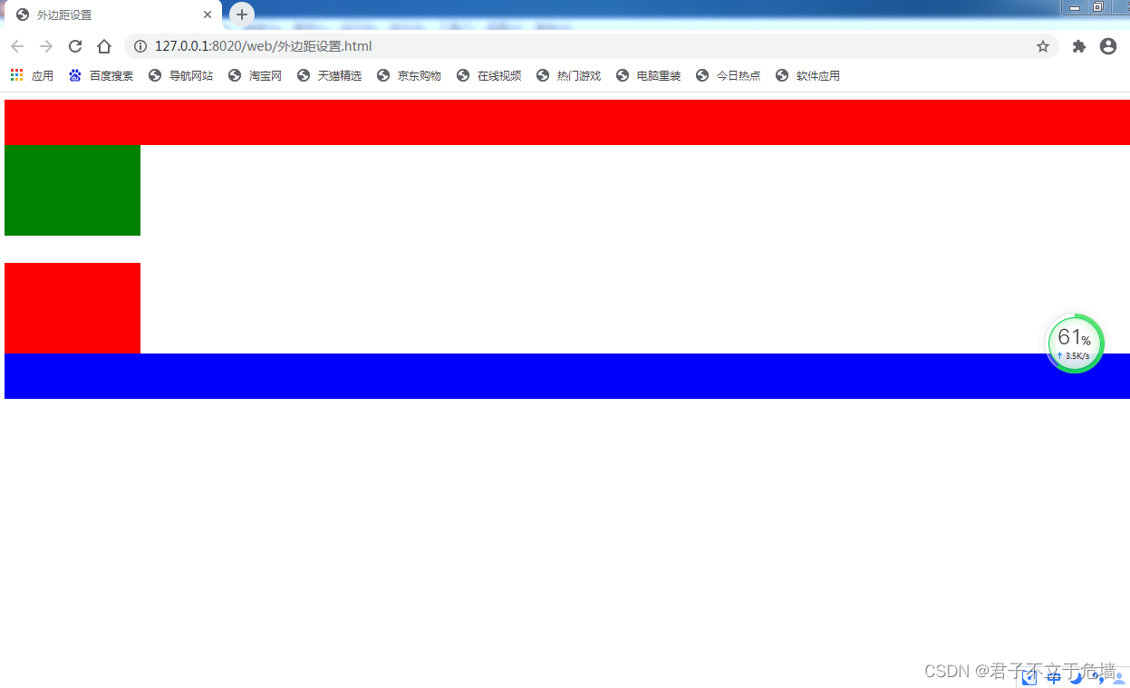
9-2 外边距设置
外边距要素:
1.外边距方向:top bottom left righ
2.外边距尺寸,合法的尺寸单位,百分比
外边距语法:
1.margin-方向:外边距尺寸;
<!DOCTYPE html>
<html>
	<head>
		<meta charset="UTF-8">
		<title>外边距设置</title>
		<style type="text/css">
			.lou{
				width: 150px;height: 100px;background: green;float: right;
				margin-top: 50px;
				margin-bottom: 50px;
				margin-left:50px;
				margin-right: 50px;
			}
		</style>
	</head>
	<body>
		<div style="background: red;height: 50px;"></div>
		<div class="lou"></div>
		<div style="background: blue;height:50px;clear:right;"></div>
	</body>
</html>

2.使用百分比时,参考的是父级尺寸
3.使用正值时,元素领地会扩张,使用负值时,元素领地会收缩
同时设置四个方向的外边距:
1.margin:上 右 下 左;
margin:10px 20px 30px 40px;
<!DOCTYPE html>
<html>
	<head>
		<meta charset="UTF-8">
		<title>外边距设置</title>
		<style type="text/css">
			.lou{
				width: 150px;height: 100px;background: green;float: right;
				/*margin-top: 50px;
				margin-bottom: 50px;
				margin-left:50px;
				margin-right: 50px;*/

				margin: 10px 20px 30px 40px;

			}
		</style>
	</head>
	<body>
		<div style="background: red;height: 50px;"></div>
		<div class="lou"></div>
		<div style="background: blue;height:50px;clear:right;"></div>
	</body>
</html>


2.margin:上 左右 下;
margin:10px 20px 30px;
<!DOCTYPE html>
<html>
	<head>
		<meta charset="UTF-8">
		<title>外边距设置</title>
		<style type="text/css">
			.lou{
				width: 150px;height: 100px;background: green;float: right;
				/*margin-top: 50px;
				margin-bottom: 50px;
				margin-left:50px;
				margin-right: 50px;*/

				/*margin: 10px 20px 30px 40px;*/
				margin: 10px 20px 30px;

			}
		</style>
	</head>
	<body>
		<div style="background: red;height: 50px;"></div>
		<div class="lou"></div>
		<div style="background: blue;height:50px;clear:right;"></div>
	</body>
</html>


3.margin:上下 左右;
margin:10px 30px;
<!DOCTYPE html>
<html>
	<head>
		<meta charset="UTF-8">
		<title>外边距设置</title>
		<style type="text/css">
			.lou{
				width: 150px;height: 100px;background: green;float: right;
				/*margin-top: 50px;
				margin-bottom: 50px;
				margin-left:50px;
				margin-right: 50px;*/

				/*margin: 10px 20px 30px 40px;*/
				/*margin: 10px 20px 30px;*/
				margin: 10px 30px;

			}
		</style>
	</head>
	<body>
		<div style="background: red;height: 50px;"></div>
		<div class="lou"></div>
		<div style="background: blue;height:50px;clear:right;"></div>
	</body>
</html>


4.margin:4个方向一样的值;
margin:30px;
<!DOCTYPE html>
<html>
	<head>
		<meta charset="UTF-8">
		<title>外边距设置</title>
		<style type="text/css">
			.lou{
				width: 150px;height: 100px;background: green;float: right;
				/*margin-top: 50px;
				margin-bottom: 50px;
				margin-left:50px;
				margin-right: 50px;*/

				/*margin: 10px 20px 30px 40px;*/
				/*margin: 10px 20px 30px;*/
				/*margin: 10px 30px;*/
				margin: 30px;

			}
		</style>
	</head>
	<body>
		<div style="background: red;height: 50px;"></div>
		<div class="lou"></div>
		<div style="background: blue;height:50px;clear:right;"></div>
	</body>
</html>


外边距踩坑:
1.元素上下排列时,上下外边距会合并(上下外边距取最大值)
2.元素左右排列时,左右外边距会叠加(左右外边距会相加)
<!DOCTYPE html>
<html>
<head>
<meta charset="UTF-8">
<title>外边距设置</title>
<style type="text/css">
.lou{
width: 150px;height: 100px;background: green;
margin-bottom: 50px;
}
.lou2{
width:150px;height: 100px;background: red;
margin-top: 30px;/*先注释50px,再解开*/
}
</style>
</head>
<body>
<div style="background: red;height: 50px;"></div>
<div class="lou"></div>
<div class="lou2"></div>
<div style="background: blue;height:50px;clear:right;"></div>
</body>
</html>


上下取最大
<!DOCTYPE html>
<html>
	<head>
		<meta charset="UTF-8">
		<title>外边距设置</title>
		<style type="text/css">
			.lou{
				width: 150px;height: 100px;background: green;float: left;
				margin-right: 50px;
			}
			.lou2{
				width:150px;height: 100px;background: red;float: left;
				margin-left: 30px;/*先注释30px,再解开*/
			}


		</style>
	</head>
	<body>
		<div style="background: red;height: 50px;"></div>
		<div class="lou"></div>
		<div class="lou2"></div>
		<div style="background: blue;height:50px;clear:left;"></div>
	</body>
</html>


左右外边距为相加
<!DOCTYPE html>
<html>
	<head>
		<meta charset="UTF-8">
		<title>外边距设置</title>
		<style type="text/css">
			.lou1{
				width: 150px;height: 100px;background: blue;
				margin-top: 50px;
				margin-bottom: 50px;
				margin-left: 50px;
				margin-right: 50px;
			}
			/*.lou2{
				width:150px;height: 100px;background: red;float: left;

			}
				*/

		</style>
	</head>
	<body>
		<div style="background: red;height: 50px;"></div>
		<span class="lou1">我要自学网</span>
		<div style="background: blue;height:50px;clear:left;"></div>
	</body>
</html>

3.行级元素只有左右外边距,没有上下外边距
<!DOCTYPE html>
<html>
	<head>
		<meta charset="UTF-8">
		<title>外边距设置</title>
		<style type="text/css">
			img{
				vertical-align: top;
			}
			.lou1{
				width: 150px;height: 100px;background: blue;
				margin-top: 50px;
				margin-bottom: 50px;
				margin-left: 50px;
				margin-right: 50px;
			}
			.lou2{
				width:150px;height: 100px;background: red;

			}


		</style>
	</head>
	<body>
		<div style="background: red;height: 50px;"></div>
		<!--<span class="lou1">我要自学网</span>-->
		<img class="lou1" src="jie.jpg"/><img class="lou2" src="jie.jpg" />
		<div style="background: blue;height:50px;clear:left;"></div>
	</body>
</html>

4.行内块级元素和块级元素四个方向外边距都生效
9-3 内边距设置
外边距语法:
1.padding-方向:内边距尺寸;
2.使用百分比时,参考的是父级尺寸
3.内边距不能设置负值(设置负值时无效)
同时设置四个方向的:内边距:
1.padding:上 右 下 左;
padding:10px 20px 30px 40px;
2.padding:上 左右 下;
padding:10px 20px 30px;
3.padding:上下 左右;
padding:10px 30px;
4.paddingn:4个方向一样的值;
padding:30px;
和外边距几乎一样
内边距和边框踩坑:
<!DOCTYPE html>
<html>
	<head>
		<meta charset="UTF-8">
		<title>内边距踩坑</title>
		<style type="text/css">
			.div-a{
				width:240px;height: 150px;background: orange ;float: left;
				/*padding: 30px;
				border: 10px solid red;*/
			}
			.img-a{
				width:100%;height: 100%;
			}
			.div-b{
				width:240px;height: 150px;background: green ;float:left;
			}
			.img-b{
				width: 100%;height: 100%;
			}
		</style>
	</head>
	<body>
		<div class="div-a">
			<img class="img-a" src="jie.jpg" />
		</div>
		<div class="div-b">
			<img class="img-b" src="jie.jpg" />
		</div>
	</body>
</html>

两张图片并列排放,要求增大第一张图片的内边距和边框宽度,第一张图片会把第二张图片挤到第二行
<!DOCTYPE html>
<html>
	<head>
		<meta charset="UTF-8">
		<title>内边距踩坑</title>
		<style type="text/css">
			.div-a{
				width:240px;height: 150px;background: orange ;float: left;
				padding: 30px;
				border: 10px solid red;
			}
			.img-a{
				width:100%;height: 100%;
			}
			.div-b{
				width:240px;height: 150px;background: green ;float:left;
			}
			.img-b{
				width: 100%;height: 100%;
			}
		</style>
	</head>
	<body>
		<div class="div-a">
			<img class="img-a" src="jie.jpg" />
		</div>
		<div class="div-b">
			<img class="img-b" src="jie.jpg" />
		</div>
	</body>
</html>

正常情况下,内边距和边框是在元素宽度和高度之外进行绘制
box-sizing:content-box\border-box;
注意:ie9以下浏览器不支持
-moz-box-sizing:border-box;
火狐浏览器专用
-webkit-box-sizing:border-box;
webkit内核浏览器专用(谷歌)
				-moz-box-sizing: border-box;
				-webkit-box-sizing: border-box;
				box-sizing:border-box
这三个一起写,基本上除了ie9以下 都可以使用
content-box:内边距和边框是在元素设置的宽度和高度之外进行绘制(默认值)
border-box:内边距和边框是在元素设置的宽度和高度之内进行绘制
设置的宽度=左边框+右边框+左内边距+右内边距+元素内容的宽度
设置的高度=上边框+下边框+上内边距+下内边距+元素内容的高度
<!DOCTYPE html>
<html>
	<head>
		<meta charset="UTF-8">
		<title>内边距踩坑</title>
		<style type="text/css">
			.div-a{
				width:240px;height: 150px;background: orange ;float: left;
				padding: 30px;
				border: 10px solid red;
				box-sizing:content-box;
			}
			.img-a{
				width:100%;height: 100%;
			}
			.div-b{
				width:240px;height: 150px;background: green ;float:left;
			}
			.img-b{
				width: 100%;height: 100%;
			}
		</style>
	</head>
	<body>
		<div class="div-a">
			<img class="img-a" src="jie.jpg" />
		</div>
		<div class="div-b">
			<img class="img-b" src="jie.jpg" />
		</div>
	</body>
</html>

<!DOCTYPE html>
<html>
	<head>
		<meta charset="UTF-8">
		<title>内边距踩坑</title>
		<style type="text/css">
			.div-a{
				width:240px;height: 150px;background: orange ;float: left;
				padding: 30px;
				border: 10px solid red;
				box-sizing:border-box;
			}
			.img-a{
				width:100%;height: 100%;
			}
			.div-b{
				width:240px;height: 150px;background: green ;float:left;
			}
			.img-b{
				width: 100%;height: 100%;
			}
		</style>
	</head>
	<body>
		<div class="div-a">
			<img class="img-a" src="jie.jpg" />
		</div>
		<div class="div-b">
			<img class="img-b" src="jie.jpg" />
		</div>
	</body>
</html>

9-4 溢出隐藏
overflow属性是规定内容溢出了元素内容框时发生的事情
1.visible:内容不会被修剪,会显示在元素框之外(默认值)
2.hidden:内容会被修剪,溢出的内容不可见
3.scroll:内容会被修剪,会显示滚动条,以便查看溢出的内容
4.auto:当内容大于元素框时,内容会被修剪,会显示滚动条,以便查看溢出的内容。当内容小于元素框时,不会显示滚动条
<!DOCTYPE html>
<html>
	<head>
		<meta charset="UTF-8">
		<title>溢出隐藏</title>
		<style type="text/css">
			div{
				width: 200px;height: 100px;border: 2px solid red;
				overflow: visible;
				/*overflow: hidden;
				overflow: scroll;
				overflow: auto;*/
			}
		</style>
	</head>
	<body>
		<div>
			<img src="jie.jpg" width="300" height="150"/>
		</div>
	</body>
</html>

<!DOCTYPE html>
<html>
	<head>
		<meta charset="UTF-8">
		<title>溢出隐藏</title>
		<style type="text/css">
			div{
				width: 200px;height: 100px;border: 2px solid red;
				/*overflow: visible;*/
				overflow: hidden;
				/*overflow: scroll;
				overflow: auto;*/
			}
		</style>
	</head>
	<body>
		<div>
			<img src="jie.jpg" width="300" height="150"/>
		</div>
	</body>
</html>

<!DOCTYPE html>
<html>
	<head>
		<meta charset="UTF-8">
		<title>溢出隐藏</title>
		<style type="text/css">
			div{
				width: 200px;height: 100px;border: 2px solid red;
				/*overflow: visible;*/
				/*overflow: hidden;*/
				overflow: scroll;
				/*overflow: auto;*/
			}
		</style>
	</head>
	<body>
		<div>
			<img src="jie.jpg" width="300" height="150"/>
		</div>
	</body>
</html>

<!DOCTYPE html>
<html>
	<head>
		<meta charset="UTF-8">
		<title>溢出隐藏</title>
		<style type="text/css">
			div{
				width: 200px;height: 100px;border: 2px solid red;
				/*overflow: visible;*/
				/*overflow: hidden;*/
				/*overflow: scroll;*/
				overflow: auto;
			}
		</style>
	</head>
	<body>
		<div>
			<!--<img src="jie.jpg" width="300" height="150"/>-->
			我要自学网我要自学网我要自学网我要自学网我要自学网我要自学网我要自学网我要自学网我要自学网我要自学网我要自学网我要自学网我要自学网我要自学网我要自学网我要自学网我要自学网我要自学网我要自学网我要自学网我要自学网我要自学网我要自学网我要自学网我要自学网我要自学网我要自学网我要自学网我要自学网我要自学网我要自学网我要自学网我要自学网我要自学网我要自学网我要自学网我要自学网我要自学网我要自学网我要自学网我要自学网我要自学网我要自学网我要自学网我要自学网我要自学网我要自学网我要自学网我要自学网我要自学网我要自学网我要自学网我要自学网我要自学网我要自学网我要自学网我要自学网我要自学网我要自学网我要自学网我要自学网我要自学网我要自学网我要自学网我要自学网我要自学网我要自学网我要自学网我要自学网我要自学网我要自学网我要自学网我要自学网我要自学网我要自学网我要自学网我要自学网我要自学网我要自学网我要自学网我要自学网我要自学网我要自学网我要自学网我要自学网我要自学网我要自学网我要自学网我要自学网我要自学网我要自学网我要自学网我要自学网我要自学网我要自学网我要自学网我要自学网我要自学网我要自学网
		</div>
	</body>
</html>

小技巧 行高控制字体显示完整 有些字体显示了一半,不完整
<!DOCTYPE html>
<html>
	<head>
		<meta charset="UTF-8">
		<title>溢出隐藏</title>
		<style type="text/css">
			div{
				width: 400px;height: 206px;border: 2px solid red;
				/*overflow: visible;*/
				overflow: hidden;
				/*overflow: scroll;*/
				/*overflow: auto;*/
			}
		</style>
	</head>
	<body>
		<div>
			<!--<img src="jie.jpg" width="300" height="150"/>-->
			网我要自学网我要自学网我要自学网我要自学网我要自学网我要自学网我要自学网我要自学网我要自学网我要自学网我要自学网我要自学网我要自学网我要自学网我要自学网我要自学网我要自学网我要自学网我要自学网我要自学网我要自学网我要自学网我要自学网我要自学网我要自学网我要自学网我要自学网我要自学网我要自学网我要自学网我要自学网我要自学网我要自学网我要自学网我要自学网我要自学网我要自学网我要自学网我要自学网我要自学网我要自学网我要自学网我要自学网我要自学网我要自学网我要自学网我要自学网我要自学网我要自学网我要自学网我要自学网我要自学网我要自学网我要自学网我要自学网我要自学网我要自学网我要自学网我要自学网我要自学网我要自学网我要自学网我要自学网我要自学网我要自学网我要自学网我要自学网我要自学网我要自学网我要自学网我要自学网我要自学网我要自学网我要自学网
		</div>
	</body>
</html>

通过改变行高来使字体完整显示
<!DOCTYPE html>
<html>
	<head>
		<meta charset="UTF-8">
		<title>溢出隐藏</title>
		<style type="text/css">
			div{
				width: 400px;height: 206px;border: 2px solid red;
				/*overflow: visible;*/
				overflow: hidden;
				/*overflow: scroll;*/
				/*overflow: auto;*/
				line-height: 23px;
			}
		</style>
	</head>
	<body>
		<div>
			<!--<img src="jie.jpg" width="300" height="150"/>-->
			网我要自学网我要自学网我要自学网我要自学网我要自学网我要自学网我要自学网我要自学网我要自学网我要自学网我要自学网我要自学网我要自学网我要自学网我要自学网我要自学网我要自学网我要自学网我要自学网我要自学网我要自学网我要自学网我要自学网我要自学网我要自学网我要自学网我要自学网我要自学网我要自学网我要自学网我要自学网我要自学网我要自学网我要自学网我要自学网我要自学网我要自学网我要自学网我要自学网我要自学网我要自学网我要自学网我要自学网我要自学网我要自学网我要自学网我要自学网我要自学网我要自学网我要自学网我要自学网我要自学网我要自学网我要自学网我要自学网我要自学网我要自学网我要自学网我要自学网我要自学网我要自学网我要自学网我要自学网我要自学网我要自学网我要自学网我要自学网我要自学网我要自学网我要自学网我要自学网我要自学网我要自学网我要自学网
		</div>
	</body>
</html>

9-5 元素居中及样式重置
1.块级元素水平居中:margin:0 auto;
2.margin:0 auto;只对块级元素有效
行级元素水平居中:
在body中设置文本居中(在父级元素中设置文本居中)
body{
	text-align:center;
	}
补充样式重置reset.css
*{margin: 0;padding: 0;}
body{font-size: 24px;font-family: "楷体";color:#0000FF;}
b{font-weight: normal;}
i{font-style: normal;}
a,a:hover,a:active{text-decoration: none;color:#0000FF}
input,textarea,select{outline:none;}
img{border: none;vertical-align: top;}
每个浏览器的默认外边距和内边距不一样,影响网页的布局,用通用选择器把所有元素之间外边距和内边距设置为零则可避免
img设置vertical-align:top;改变img默认对齐基线的值即可避免和其他元素之间存在空隙
第十章 列表属性
10-1 列表属性
列表标志:list-style-type:标志类型;
列表标志位置:list-style-position:outside/inside;
outside:默认值,列表标志在列表项之外
indide:列表标志在列表项之内
列表项图片:list-style-image:url(图像路径);
简写列表样式:
list-style:列表标志 列表标志位置 列表项图片;
设置了列表图像就不可以设置列表标志
列表样式重置:
list-style-type:none; 去掉列表标志前的小圆点
<!DOCTYPE html>
<html>
	<head>
		<meta charset="UTF-8">
		<title>列表属性</title>
		<style type="text/css">
			ul{
				/*list-style-type: square;*/
				list-style-type: circle;
			}
			li{
				border: 1px solid red;
			}
		</style>
	</head>
	<body>
		<!--ul>li{我要自学网$}*3-->
		<ul>
			<li>我要自学网1</li>
			<li>我要自学网2</li>
			<li>我要自学网3</li>
		</ul>
	</body>
</html>

<!DOCTYPE html>
<html>
	<head>
		<meta charset="UTF-8">
		<title>列表属性</title>
		<style type="text/css">
			ul{
				/*list-style-type: square;*/
				list-style-type: circle;
				list-style-position:outside;
			}
			li{
				border: 1px solid red;
			}
		</style>
	</head>
	<body>
		<!--ul>li{我要自学网$}*3-->
		<ul>
			<li>我要自学网1</li>
			<li>我要自学网2</li>
			<li>我要自学网3</li>
		</ul>
	</body>
</html>

将list-style-position:outside;改为inside,则会

10-2 表格属性
1.单元格间隔,设置相邻的单元格间隔
border-spacing:水平相隔 垂直相隔;
2.边框折叠:
border-collapse:collapse/separate;
separate:默认值,边框会分开
collapse:边框会合并
3.表格宽高:width:300px;height:200px;
4.表格文本对齐:text-align vertical-align
5.表格背景:background属性
<!DOCTYPE html>
<html>
	<head>
		<meta charset="UTF-8">
		<title>表格属性</title>
		<style type="text/css">
			table{
				border-spacing: 20px 30px;
				border-collapse:separate ;/*默认值,边框会分开*/
			}
		</style>
	</head>
	<body>
		<table border="1" >
			<tr>
				<td>我要自学网1</td>
				<td>我要自学网2</td>
				<td>我要自学网3</td>
				<td>我要自学网4</td>
				<td>我要自学网5</td>
			</tr>
			<tr>
				<td>我要自学网1</td>
				<td>我要自学网2</td>
				<td>我要自学网3</td>
				<td>我要自学网4</td>
				<td>我要自学网5</td>
			</tr>
		</table>
	</body>
</html>

<!DOCTYPE html>
<html>
	<head>
		<meta charset="UTF-8">
		<title>表格属性</title>
		<style type="text/css">
			table{
				border-spacing: 20px 30px;
				border-collapse:collapse;
			}
		</style>
	</head>
	<body>
		<table border="1" >
			<tr>
				<td>我要自学网1</td>
				<td>我要自学网2</td>
				<td>我要自学网3</td>
				<td>我要自学网4</td>
				<td>我要自学网5</td>
			</tr>
			<tr>
				<td>我要自学网1</td>
				<td>我要自学网2</td>
				<td>我要自学网3</td>
				<td>我要自学网4</td>
				<td>我要自学网5</td>
			</tr>
		</table>
	</body>
</html>

将默认值改为collapse之后,边框将会合并
10-3 鼠标样式
鼠标样式设置:
cursor:样式单词;(auto是默认值)

<!DOCTYPE html>
<html>
	<head>
		<meta charset="UTF-8">
		<title>鼠标样式</title>
	</head>
	<body>
		<span style="cursor: pointer;">我要自学网1</span>
		<br />
		<span style="cursor:wait">我要自学网2</span>
		<br />
		<span style="cursor:help">我要自学网3</span>
		<br />
		<span style="cursor:auto">我要自学网4</span>
		<br />
	</body>
</html>
当鼠标移动到文本上时,鼠标会显示出不同的形状,常用的是手形状(pointer)和等待(wait),和:hover{}配合使用
10-4 滤镜
高斯模糊和饱和度
滤镜属性:定义图像的可视效果(filter)
语法:filter:属性值;
1.高斯模糊:filter:blur(合法的尺寸单位);
默认值是0,值越大,图像越模糊
不能设置成百分比
<!DOCTYPE html>
<html>
	<head>
		<meta charset="UTF-8">
		<title>高斯模糊和饱和度</title>
		<style type="text/css">
			img{
				filter:blur(1px);
				/*filter:saturate(0%);*/
			}
		</style>
	</head>
	<body>
		<img src="jie.jpg" width="200" height="180">
	</body>
</html>

2.饱和度设置:filter:saturate(百分比);
默认值为100%,图像不变,0%时图像会变成黑白图像
值可以超过100%,有更高的饱和度
<!DOCTYPE html>
<html>
	<head>
		<meta charset="UTF-8">
		<title>高斯模糊和饱和度</title>
		<style type="text/css">
			img{
				/*filter:blur(1px);*/
				filter:saturate(0%);
			}
		</style>
	</head>
	<body>
		<img src="jie.jpg" width="200" height="180">
	</body>
</html>

3.灰度设置:filter:grayscale(百分比);
值i %0-100%之间。默认是0%
值为100%,图像会变成黑白图像
<!DOCTYPE html>
<html>
	<head>
		<meta charset="UTF-8">
		<title>灰度和对比度</title><br />
		<style type="text/css">
			img{
				filter: grayscale(100%);
			}
		</style>
	</head>
	<body>
		<img src="jie.jpg" width="300" height="180">
	</body>
</html>

<!DOCTYPE html>
<html>
	<head>
		<meta charset="UTF-8">
		<title>灰度和对比度</title><br />
		<style type="text/css">
			img{
				filter: grayscale(0%);
			}
		</style>
	</head>
	<body>
		<img src="jie.jpg" width="300" height="180">
	</body>
</html>

4.对比度设置:filter:contrast(百分比);
默认值:100%,图像没有变化。默认值为0%,图像会变成全黑
超过100%时,意味着运用更低的对比度
<!DOCTYPE html>
<html>
	<head>
		<meta charset="UTF-8">
		<title>灰度和对比度</title><br />
		<style type="text/css">
			img{
				filter: contrast(300%);
			}
		</style>
	</head>
	<body>
		<img src="jie.jpg" width="300" height="180">
	</body>
</html>

<!DOCTYPE html>
<html>
	<head>
		<meta charset="UTF-8">
		<title>灰度和对比度</title><br />
		<style type="text/css">
			img{
				filter: contrast(0%);
			}
		</style>
	</head>
	<body>
		<img src="jie.jpg" width="300" height="180">
	</body>
</html>

5.透明度设置:filter:opacity(百分比);
默认值:100%,表示完全不透明,0%时,表示完全透明
值在0%-100%之间
老版谷歌和欧朋浏览器需要加前缀
-webkit-filter:opacity(50%);
注意:
所有ie浏览器都不支持滤镜属性
老版谷歌和欧朋浏览器需要加前缀
<!DOCTYPE html>
<html>
	<head>
		<meta charset="UTF-8">
		<title>灰度和对比度</title><br />
		<style type="text/css">
			div{
				width: 400px;background: red;

			}
			img{
				width:100%;
				filter: opacity(50%);
				vertical-align: top;
			}
		</style>
	</head>
	<body>
		<div>
			<img src="jie.jpg" width="300" height="180">
		</div>
	</body>
</html>

补充reset.css
*{margin: 0;padding: 0;}
body{font-size: 24px;font-family: "楷体";color:#0000FF;}
b{font-weight: normal;}
i{font-style: normal;}
a,a:hover,a:active{text-decoration: none;color:#0000FF}
input,textarea,select{outline:none;}
img{border: none;vertical-align: top;}
li{list-style: none;}/*去掉列表之前的小圆点*/
第十一章 浮动与定位
11-1 浮动初识
浮动:让块级元素能在一行
语法:float:方向;
11-2 浮动元素特点
浮动特点:
浮的特点:
1.浮动元素项浮云一样飘起来了。浮动元素后面的元素会正常补位。
2.浮动元素会脱离正常的文档流,并没有完全脱离文档流。
3.浮动元素会被父级元素宽度所约束,所以浮动元素并没有完全脱离文档流。
4.浮动元素会对它下面正常元素中的文字产生影响。
动的特点:
1.当浮动元素上一行是正常元素,这个浮动元素只能呆在当前行,不能跑到上一行。
2.左浮动:元素会向左跑,会从上一行的右边出来继续跑,直到遇到有浮动属性的元素,才会停止。
3.右浮动:元素会向右跑,会从上一行的左边出来继续跑,直到遇到有浮动属性的元素,才会停止。
<!DOCTYPE html>
<html>
	<head>
		<meta charset="UTF-8">
		<title>浮动元素特点</title>
		<link rel="stylesheet" href="css/reset.css" />
		<style type="text/css">
		ul{width: 300px;margin: 50px;background: #ccc;font-size: 20px; text-indent: 2em;color:white;}
		li{width:100px;height: 100px;float:right;}
		.a{background:red;}
		.b{background: green;}
		.c{background: blue;}
		</style>
	</head>
	<body>
	<ul>
		<li class="a">1</li>
		<li class="b">2</li>
		<li class="c">3</li>
	</ul>
	</body>
</html>

11-3 文字环绕效果
浮动元素会对它下面正常元素中的文字产生影响
<!DOCTYPE html>
<html>
	<head>
		<meta charset="UTF-8">
		<title>文字环绕效果</title>
		<link rel="stylesheet" href="css/reset.css" />
		<style type="text/css">
		p{text-indent: 2em;color: black;}
		img{width: 400px;float:left;margin: 10px;}
		</style>
	</head>
	<body>
	<p>在你使用大招之前,要攒好能量和技能冷却,以最大化【R禁奥义!瞬狱影杀阵】的伤害输出。
快速双击【W影奥义!分身】,将会让劫立刻传送到影分身的位置,从而快速逃生。
在使用死亡印记前使用一次【W影奥义!分身】,能够让劫安全地从战斗中逃脱 [3]  。
对方使用
提升攻击力的装备能提升劫的整体输出,因此在对抗劫时,护甲的作用将非常明显。
在劫使用了他的【W影奥义!分身】之后,他将陷入最无力的状态,因为他的伤害、减速、和机动性都依靠这个技能。
劫的【Q影奥义!诛刃】如果在命中敌方英雄之前,穿过了其它单位的话,那么它的伤害值会降低。
只有中了劫的影分身的【E影奥义!鬼斩】才会被减速,而中了劫的【E影奥义!鬼斩】则不会 [3]  。
英雄优势
劫是LOL中第四位忍者英雄,也是以能量消耗为主的无蓝条英雄。他拥有很高的技能爆发,能够很轻松收割人头,他还能利用影分身进行位移,骚扰,补刀等 [6]  。
英雄劣势
劫的上手难度很高,影分身的使用技巧也需要不断的练习。中后期极度依赖大招的伤害来进行秒杀,影分身的CD时间也过长。对线期,劫的小技能太容易清线,以吸引对面打野GANK [6]  。
连招技巧</p>
	<img src="jie.jpg"/>
	<p>常用连招AE、QE:劫的E没有读条,接在普攻和Q取消他们的后摇
常用连招WEQ:快速按下WEQ,影子准备完成后最快速度打出EQ,一般在对线期打消耗
常用单杀连招RAEWQ:最常用的秒人连招,在目标交掉控制或者重要技能后开R,落地后快速打出AEW,Q稍微留一下,在对手交掉位移技能后打出
三影杀阵WRWEQ(RA):目标有控制技能时,我们直接用R可能被控,先走位接近后往侧面放W的同时开R,在R落地之前多点几下W换位置,然后快速交出EQ打出爆发伤害,最后看情况给出RA
秒脆皮连招WWQRAE:远距离秒脆皮连招,在WQ可以命中的距离下直接WWQR标记目标,落地后AE将其斩杀 [7]  。
核心技巧
R斩杀细节:如果印记储存下的伤害可以斩杀目标英雄,在他身上将会出现大手里剑
影子细节:W技能制造的影分身有最大换位距离,R技能制造的影分身则没有距离限制。交换影子没有施法时间
高伤害重点:劫和影子的Q伤害独立计算,伤害叠加,尽量保证所有手里剑都能打中
回复能量机制:当劫和影子的技能同时命中时为劫回复能量,所以要保证多个手里剑都能打中
E减少WCD:E每命中一个英雄,都会减少W技能的2秒CD,同时命中多个英雄时,减CD效果叠加,团战中利用好这一点可以很快打出第二个W [7]  </p>
	</body>
</html>

11-4 浮动布局商品列表
<!DOCTYPE html>
<html>
	<head>
		<meta charset="UTF-8">
		<title>浮动布局商品列表</title>
		<link rel="stylesheet" href="css/reset.css" />
		<style type="text/css">
			ul{width:840px;height: 280px;background: #CCCCCC;margin: 50px auto;}
			ul .one{width: 200px;height: 280px;}
			ul .two{width:200px;height: 130px;margin: 5px 10px 5px 10px;}
			ul li img{width: 100%;height: 100%;}
			ul li{float: left;}
		</style>
	</head>
	<body>
		<ul>
			<li class="one"><img src="img/1.png"/></li>
			<li class="one"><img src="img/2.png"/></li>
			<li class="two"><img src="img/3.png"/></li>
			<li class="two"><img src="img/4.png"/></li>
			<li class="two"><img src="img/5.png"/></li>
			<li class="two"><img src="img/6.png"/></li>
		</ul>
	</body>
</html>

11-5 清除浮动
规定元哪一侧不能有浮动元素
clear:left;元素左侧不能有浮动元素
clear:right; 元素右侧不能有浮动元素
clear:both;元素左右两侧不能有浮动元素
注意:设置清楚浮动元素属性时,要考虑元素的加载顺序
<!DOCTYPE html>
<html>
	<head>
		<meta charset="UTF-8">
		<title>清除浮动</title>
		<link rel="stylesheet" href="css/reset.css" />
		<style type="text/css">
		ul{width: 300px;margin: 50px auto;background: #ccc;font-size: 20px; text-indent: 2em;color:white;}
		li{width:100px;height: 100px;float:right;}
		.a{background:red;}
		.b{background: green;clear: both;}
		.c{background: blue;}
		</style>
	</head>
	<body>
	<ul>
		<li class="a">1</li>
		<li class="b">2</li>
		<li class="c">3</li>
	</ul>
	</body>
</html>

11-6 父元素高度塌陷
高度塌陷:由于父元素中的子元素设置了浮动属性,会造成父元素高度塌陷
<!DOCTYPE html>
<html>
	<head>
		<meta charset="UTF-8">
		<title>父元素高度塌陷</title>
		<link rel="stylesheet" type="text/css" href="css/reset.css"/>
		<style type="text/css">
			ul{width:300px;margin:50px auto;border:2px solid red;}
			ul li{width:100px;height: 100px;float: left;}
			.a{background: blue;}
			.b{background: yellow;}
			.c{background: orange;}
		</style>
	</head>
	<body>
		<ul>
			<li class="a"></li>
			<li class="b"></li>
			<li class="c"></li>
		</ul>
	</body>
</html>

防止高度塌陷:
1.直接给父元素设置高度
<!DOCTYPE html>
<html>
	<head>
		<meta charset="UTF-8">
		<title>父元素高度塌陷</title>
		<link rel="stylesheet" type="text/css" href="css/reset.css"/>
		<style type="text/css">
			ul{width:300px;height:200px;margin:50px auto;border:2px solid red;}
			ul li{width:100px;height: 100px;float: left;}
			.a{background: blue;}
			.b{background: yellow;}
			.c{background: orange;}
		</style>
	</head>
	<body>
		<ul>
			<li class="a"></li>
			<li class="b"></li>
			<li class="c"></li>
		</ul>
	</body>
</html>

2.在元素内容之后加上一个块级元素,设置左右两侧不能有浮动元素,就可以防止父元素高度塌陷
<!DOCTYPE html>
<html>
	<head>
		<meta charset="UTF-8">
		<title>父元素高度塌陷</title>
		<link rel="stylesheet" type="text/css" href="css/reset.css"/>
		<style type="text/css">
			ul{width:300px;margin:50px auto;border:2px solid red;}
		   .a,.b,.c{width:100px;height: 100px;float: left;}/*并集选择器 用逗号隔开*/
			.a{background: blue;}
			.b{background: yellow;}
			.c{background: orange;}
			.d{clear:both;}
		</style>
	</head>
	<body>
		<ul>
			<li class="a"></li>
			<li class="b"></li>
			<li class="c"></li>
			<li class="d"></li>
		</ul>
	</body>
</html>

3.使用伪元素方法在元素内容之后加上一个空内容,转成表格元素。设置左右两侧不能有浮动元素
ul::after{
content:“”;
display:table;
clear:both;
}
<!DOCTYPE html>
<html>
	<head>
		<meta charset="UTF-8">
		<title>父元素高度塌陷</title>
		<link rel="stylesheet" type="text/css" href="css/reset.css"/>
		<style type="text/css">
			ul{width:300px;margin:50px auto;border:2px solid red;}
		   		li{width:100px;height: 100px;float: left;}
			.a{background: blue;}
			.b{background: yellow;}
			.c{background: orange;}
			ul::after{
				content: "";
				display: table;
				clear: both;
			}
		</style>
	</head>
	<body>
		<ul>
			<li class="a"></li>
			<li class="b"></li>
			<li class="c"></li>
		</ul>
	</body>
</html>

更新reset.css
*{margin: 0;padding: 0;}
body{font-size: 24px;font-family: "楷体";color:#0000FF;}
b{font-weight: normal;}
i{font-style: normal;}
a,a:hover,a:active{text-decoration: none;color:#0000FF}
input,textarea,select{outline:none;}
img{border: none;vertical-align: top;}
li{list-style: none;}
.fl{float: left;}
.fr{float: right;}
.clearfix::after{
		content: "";
		display: table;
		clear: both;
	}
需要左浮动时,在元素中class属性中加fl
需要有浮动时,在元素中class属性中加fr
需要清浮动时,在元素中class属性中加clearfix
注意:父元素设置有高度时,不用清浮动;父元素没有设置高度时,一定要清浮动
11-7 定位初识
定位:固定元素的位置
定位用于没有规律的元素布局
定位的三种类型:相对定位,绝对定位,固定定位
定位使用方法:
1.规定是哪一个定位方式
2.指定方向上的偏移量:top bottom left right;
注意:top和bottom只有一个会生效,left和right只有一个会生效,left和top优先
11-8 相对定位
相对定位:position: relative;
1.指定了相对定位后,元素就是一个定位元素,脱离文档流,但没有完全脱离文档流
2.相对定位元素脱离了文档流,但原来的位置还得保留
3.相对定位是对于原来的位置进行定位
<!DOCTYPE html>
<!DOCTYPE html>
<html>
	<head>
		<meta charset="UTF-8">
		<title>相对定位</title>
		<link rel="stylesheet" href="css/reset.css" />
		<style type="text/css">
		ul{width: 300px;margin: 50px auto;background: #ccc;font-size: 20px; text-indent: 2em;color:white;}
		li{width:100px;height: 100px;;}
		.a{background:red;}
		.b{background: green;position: relative;left:40px;top: 30px;}
		.c{background: blue;}
		</style>
	</head>
	<body>
	<ul>
		<li class="a">1</li>
		<li class="b">2</li>
		<li class="c">3</li>
	</ul>
	</body>
</html>

11-9 绝对定位
绝对定位:
1.指定了绝对定位后,元素就是一个定位元素,完全脱离文档流
2.原来的位置不会保留
3.绝对定位是相对于最近有定位属性的父元素进行定位,如果往上没找到,有定位元素的父元素,才会相对于body元素进行定位
<!DOCTYPE html>
<html>
	<head>
		<meta charset="UTF-8">
		<title>绝对定位</title>
		<link rel="stylesheet" type="text/css" href="css/reset.css"/>
		<style type="text/css">
			.zxw{
				width:500px;height: 500px;border: 2px solid black;margin: 0 auto;
			}
			.box{
				width: 302px;height: 302px;border: 2px solid red;margin: 50px auto;
				position:relative;
			}
			.pst1,.pst2,.pst3{
				width: 100px;height: 100px;
			}
			.pst1{background: red;}
			.pst2{background: green;position: absolute;left:-30px}
			.pst3{background: blue;width: 150px;}
		</style>
	</head>
	<body>
		<div class="zxw">
			<div class="box">
				<div class="pst1"></div>
				<div class="pst2"></div>
				<div class="pst3"></div>
			</div>
		</div>
	</body>
</html>

<!DOCTYPE html>
<html>
	<head>
		<meta charset="UTF-8">
		<title>绝对定位</title>
		<link rel="stylesheet" type="text/css" href="css/reset.css"/>
		<style type="text/css">
			.zxw{
				width:500px;height: 500px;border: 2px solid black;margin: 0 auto;
				position:relative;
			}
			.box{
				width: 302px;height: 302px;border: 2px solid red;margin: 50px auto;

			}
			.pst1,.pst2,.pst3{
				width: 100px;height: 100px;
			}
			.pst1{background: red;}
			.pst2{background: green;position: absolute;left:-30px}
			.pst3{background: blue;width: 150px;}
		</style>
	</head>
	<body>
		<div class="zxw">
			<div class="box">
				<div class="pst1"></div>
				<div class="pst2"></div>
				<div class="pst3"></div>
			</div>
		</div>
	</body>
</html>

<!DOCTYPE html>
<html>
	<head>
		<meta charset="UTF-8">
		<title>绝对定位</title>
		<link rel="stylesheet" type="text/css" href="css/reset.css"/>
		<style type="text/css">
			.zxw{
				width:500px;height: 500px;border: 2px solid black;margin: 0 auto;
				/*position:relative;*/
			}
			.box{
				width: 302px;height: 302px;border: 2px solid red;margin: 50px auto;

			}
			.pst1,.pst2,.pst3{
				width: 100px;height: 100px;
			}
			.pst1{background: red;}
			.pst2{background: green;position: absolute;left:-30px}
			.pst3{background: blue;width: 150px;}
		</style>
	</head>
	<body>
		<div class="zxw">
			<div class="box">
				<div class="pst1"></div>
				<div class="pst2"></div>
				<div class="pst3"></div>
			</div>
		</div>
	</body>
</html>

11-10 定位偏移量
定位偏移量:
1.可以使用合法的尺寸单位(px em rem %)
2.可以使用负值,当使用负值时,元素的偏移方向与正值相反
3.元素相对于哪个元素进行定位,使用百分比时,就是那个元素宽度或高度的百分比
11-11 层级
层级:
语法:z-index:值;
1.每一个定位元素会独占一层
2.改变层级来改变定位元素的堆叠顺序
3.数字越大,层级越高,层级默认值是0
4.当层级一样,后写元素会盖住先写元素,后来居上
<!DOCTYPE html>
<html>
	<head>
		<meta charset="UTF-8">
		<title>绝对定位</title>
		<link rel="stylesheet" type="text/css" href="css/reset.css"/>
		<style type="text/css">
			.box{
				width: 302px;height: 302px;border: 2px solid red;margin: 50px auto;position: relative;

			}
			.pst1,.pst2,.pst3{
				width: 100px;height: 100px;
			}
			.pst1{background: red;position: absolute;}
			.pst2{background: green;position: absolute;left:50px;top: 50px;}
			.pst3{background: blue;position: absolute;left: 100px;top: 100px;}
		</style>
	</head>
	<body>
			<div class="box">
				<div class="pst1"></div>
				<div class="pst2"></div>
				<div class="pst3"></div>
		</div>
	</body>
</html>

<!DOCTYPE html>
<html>
	<head>
		<meta charset="UTF-8">
		<title>绝对定位</title>
		<link rel="stylesheet" type="text/css" href="css/reset.css"/>
		<style type="text/css">
			.box{
				width: 302px;height: 302px;border: 2px solid red;margin: 50px auto;position: relative;

			}
			.pst1,.pst2,.pst3{
				width: 100px;height: 100px;
			}
			.pst1{background: red;position: absolute;z-index:3;}
			.pst2{background: green;position: absolute;left:50px;top: 50px;z-index: 2;}
			.pst3{background: blue;position: absolute;left: 100px;top: 100px;z-index: 1;}
		</style>
	</head>
	<body>
			<div class="box">
				<div class="pst1"></div>
				<div class="pst2"></div>
				<div class="pst3"></div>
		</div>
	</body>
</html>

11-12 实战移入切换
<!DOCTYPE html>
<html>
	<head>
		<meta charset="UTF-8">
		<title>实战移入切换</title>
		<link rel="stylesheet" type="text/css" href="css/reset.css"/>
		<style type="text/css">
			.box{width:1200px;height:600px;border:2px solid black;margin:0 auto;position: relative;}
			.zxw{width:300px;border;2px solid black;text-align:center;color:black}
			.zxw .top{height: 100px;width:100%;line-height: 100px;}
			.zxw .bot{height: 500px;width:100%;line-height:500px;position: absolute;left:0px;top:100px;}
			.zxw:hover .bot{
				z-index: 2;/*当鼠标悬浮在四个zxw上时,bot的层级会变成2,大于第一个bot的默认1层级.使内容显示出来*/
			}
		</style>
	</head>
	<body>
		<div class="box">
			<div class="zxw fl">
				<p class="top" style="background: red;">1</p>
				<p class="bot" style="background:red;z-index: 1;">1</p>
			</div>
			<div class="zxw fl">
				<p class="top" style="background:blue ;">2</p>
				<p class="bot" style="background:blue ;">2</p>
			</div>
			<div class="zxw fl">
				<p class="top" style="background:green ;">3</p>
				<p class="bot" style="background: green;">3</p>
			</div>
			<div class="zxw fl">
				<p class="top" style="background: orange;">4</p>
				<p class="bot" style="background:orange ;">4</p>
			</div>
		</div>
	</body>
</html>

鼠标悬浮在不同颜色时,下面内容会显示相应的颜色,默认是红色
11-13 固定定位
固定定位:
1.指定了固定定位后,元素就是一个定位元素,完全脱离文档流
2.原来的位置不会保留
3.固定定位是相对于浏览器窗口进行定位,注意:不会相对于body元素进行定位
<!DOCTYPE html>
<html>
	<head>
		<meta charset="UTF-8">
		<title>固定定位</title>
		<link rel="stylesheet" type="text/css" href="css/reset.css"/>
		<style type="text/css">
			.zxw-l{
				position: fixed;top:200px; left:40px;
			}
		</style>
	</head>
	<body>
		<img src="1.png"/>
		<img class="zxw-l" src="jie.jpg"/>
	</body>
</html>

图片不会随着页面的滚动而移动
轮播图与幻灯片播放css格式):
<!DOCTYPE html>
<html>
	<head>
		<meta charset="UTF-8">
		<title>轮播图</title>
		<link rel="stylesheet" href="css/reset.css" />
		<style type="text/css">
			.hdp{
				background: #ff9000;/*先给大盒子.hdp设置一个背景颜色使其作为幻灯片的背景*/
			}
			.content-box{
				overflow: hidden;position: relative;height:330px;width: 1200px;margin: 0 auto;
				/*给hdp-img设置出幻灯片的宽高,使用外边距使其居中,并设置相对定位,给hdp-img设置绝对定位,用来控制其中的图片移动,设置超出div。content-box宽高的内容隐藏*/
			}
			.hdp-img{
				width:3600px;position: absolute;left:0px;
				/*将存放三张幻灯片的div.hdp-img盒子的宽度设置为三张幻灯片的宽度,使浮动后图片保持在同一条水平线上*/
				/*给存放三张幻灯片的div.hdp-img盒子,绝对定位向左,当定位距离为0时,div.content-box盒子显示第一章图片;当定位距离为0时,div.content-box盒子显示第1张图片;当定位距离为-1200px时,div.content-box盒子显示第2张图片
				当定位距离为-2400px时,div.content-box盒子显示第3张图片*/
			}
			.hdp-img a{
				display: block; width:1200px;height: 330px;/*先将hdp-img中的a元素转换为块级元素,给他设置幻灯片图片所需要的高度和宽度*/
			}

		</style>
	</head>
	<body>
		<div class="hdp"><!--幻灯片大盒子包小盒子-->
			<div class="content-box">
				<div class="hdp-img"><!--幻灯片不止一个图片设置一个div装起来-->
					<a href="" class="fl">
						<img src="img/202210220908176659.jpg" width="100%" height="100%"/>
						<!--三个图片左浮动排成一行-->
					</a>
					<a href="" class="fl">
						<img src="img/202210280955492649.jpg" width="100%" height="100%"/>
					</a>
					<a href="" class="fl">
						<img src="img/202210220453545538.jpg" width="100%" height="100%"/>
						<!--设置图片的宽度和高度为百分之百,直接给a元素设置宽高即可确定幻灯片的宽高-->
					</a>
				</div>
			</div>
		</div>
	</body>
</html>
logo,搜索栏,用户信息与css格式:

<div class="content-box h-top"><!--一个大盒子包住logo,搜索,用户信息三块内容-->
				<a class="logo" href="#"><!--转换为块级元素 设置宽高 设置定位 左0px 上15px-->
					<img src="img/logo.png" width="100%" height="100%"/>
				</a>
				<form class="search" action="" method="post"><!--表单元素 设置宽高 -->
					<input class="inp-l fl" type="text" name="" placeholder="请输入..." /><!--搜索栏左浮动靠左-->
					<input class="inp-r fr" type="submit" value="搜索"/><!--发送栏右浮动靠右-->
				</form>
				<div class="user">
					<a href="#">帮助中心</a>
					<a href="#">登录/注册</a>
				</div>
			</div>
		/*logo,搜索,用户信息开始*/
.h-top{
	height: 88px;position: relative;
}
.h-top .logo{
	display: block;
	width:214px;height:58px;position: absolute;
	left:0;top:15px;
}
.h-top .search{
	width:330px;height: 36px;border:1px solid #ccc;border-radius:18px ;
	position: absolute;left:50%;margin-left:-165px;top:26px;
	overflow: hidden;position: relative;
}
.h-top .search .inp-l{
	width: 260px;height: 36px;
	border:none;padding: 0 20px;

}
.h-top .search .inp-r{
	width: 60px;height:36px;
	border: none;
	background: #acce22;
	border-radius:18px ;
	position: absolute;right: 0;
}
.h-top .user{
	width:180px;height: 28px;line-height:28px;position: absolute;right: 0px;top:30px;
}
.h-top .user a{
	display: inline-block;width:76px;height:28px;text-align: center; font-size: 16px;color:black;
}
		/*logo,搜索,用户信息结束*/


 787
787

 被折叠的 条评论
为什么被折叠?
被折叠的 条评论
为什么被折叠?
 到【灌水乐园】发言


