


往期鸿蒙5.0全套实战文章必看:(文中附带鸿蒙5.0全栈学习资料)
背景设置
设置组件的背景样式。
说明
从API Version 7开始支持。后续版本如有新增内容,则采用上角标单独标记该内容的起始版本。
background10+
background(builder: CustomBuilder, options?: { align?: Alignment })
设置组件背景。
元服务API: 从API version 11开始,该接口支持在元服务中使用。
系统能力: SystemCapability.ArkUI.ArkUI.Full
参数:
| 参数名 | 类型 | 必填 | 说明 |
|---|---|---|---|
| builder | CustomBuilder | 是 | 自定义背景。 |
| options | {align?:Alignment} | 否 | 设置自定义背景与组件的对齐方式。 同时设置了background,backgroundColor,backgroundImage时,叠加显示,background在最上层。 |
说明
自定义背景渲染会有一定延迟,不能响应事件,不能进行动态更新。该属性不支持嵌套使用,不支持预览器预览。
backgroundColor
backgroundColor(value: ResourceColor)
设置组件背景色。
卡片能力: 从API version 9开始,该接口支持在ArkTS卡片中使用。
元服务API: 从API version 11开始,该接口支持在元服务中使用。
系统能力: SystemCapability.ArkUI.ArkUI.Full
参数:
| 参数名 | 类型 | 必填 | 说明 |
|---|---|---|---|
| value | ResourceColor | 是 | 设置组件的背景色。 |
说明
当通过backgroundBlurStyle中的inactiveColor指定背景色时,不建议再通过backgroundColor设置背景色。
backgroundImage
backgroundImage(src: ResourceStr | PixelMap, repeat?: ImageRepeat)
设置组件的背景图片。
卡片能力: 从API version 9开始,该接口支持在ArkTS卡片中使用。
元服务API: 从API version 11开始,该接口支持在元服务中使用。
系统能力: SystemCapability.ArkUI.ArkUI.Full
参数:
| 参数名 | 类型 | 必填 | 说明 |
|---|---|---|---|
| src | ResourceStr | PixelMap12+ | 是 | 图片地址,支持网络图片资源地址和本地图片资源地址和Base64或者PixelMap资源,不支持svg类型的图片。 |
| repeat | ImageRepeat | 否 | 设置背景图片的重复样式,默认不重复。当设置的背景图片为透明底色图片,且同时设置了backgroundColor时,二者叠加显示,背景颜色在最底部。 |
backgroundImageSize
backgroundImageSize(value: SizeOptions | ImageSize)
设置组件背景图片的宽高。
卡片能力: 从API version 9开始,该接口支持在ArkTS卡片中使用。
元服务API: 从API version 11开始,该接口支持在元服务中使用。
系统能力: SystemCapability.ArkUI.ArkUI.Full
参数:
| 参数名 | 类型 | 必填 | 说明 |
|---|---|---|---|
| value | SizeOptions | ImageSize | 是 | 设置背景图像的高度和宽度。当输入为{width: Length, height: Length}对象时,如果只设置一个属性,则第二个属性保持图片原始宽高比进行调整。默认保持原图的比例不变。 width和height取值范围: [0, +∞) 默认值:ImageSize.Auto 说明: width和height均设置为小于或等于0的值时,按值为0显示。当width和height中只有一个值未设置或者设置为小于等于0的值时,另一个会根据图片原始宽高比进行调整。 |
backgroundImagePosition
backgroundImagePosition(value: Position | Alignment)
设置背景图的位置。
卡片能力: 从API version 9开始,该接口支持在ArkTS卡片中使用。
元服务API: 从API version 11开始,该接口支持在元服务中使用。
系统能力: SystemCapability.ArkUI.ArkUI.Full
参数:
| 参数名 | 类型 | 必填 | 说明 |
|---|---|---|---|
| value | Position | Alignment | 是 | 设置背景图在组件中显示位置,即相对于组件左上角的坐标。 默认值: { x: 0, y: 0 } x和y值设置百分比时,偏移量是相对组件自身宽高计算的。 |
BlurStyle9+
卡片能力: 从API version 9开始,该接口支持在ArkTS卡片中使用。
系统能力: SystemCapability.ArkUI.ArkUI.Full
| 名称 | 描述 |
|---|---|
| Thin | 轻薄材质模糊。 元服务API: 从API version 11开始,该接口支持在元服务中使用。 |
| Regular | 普通厚度材质模糊。 元服务API: 从API version 11开始,该接口支持在元服务中使用。 |
| Thick | 厚材质模糊。 元服务API: 从API version 11开始,该接口支持在元服务中使用。 |
| BACKGROUND_THIN10+ | 近距景深模糊。 元服务API: 从API version 11开始,该接口支持在元服务中使用。 |
| BACKGROUND_REGULAR10+ | 中距景深模糊。 元服务API: 从API version 11开始,该接口支持在元服务中使用。 |
| BACKGROUND_THICK10+ | 远距景深模糊。 元服务API: 从API version 11开始,该接口支持在元服务中使用。 |
| BACKGROUND_ULTRA_THICK10+ | 超远距景深模糊。 元服务API: 从API version 11开始,该接口支持在元服务中使用。 |
| NONE10+ | 关闭模糊。 元服务API: 从API version 11开始,该接口支持在元服务中使用。 |
| COMPONENT_ULTRA_THIN11+ | 组件超轻薄材质模糊。 元服务API: 从API version 12开始,该接口支持在元服务中使用。 |
| COMPONENT_THIN11+ | 组件轻薄材质模糊。 元服务API: 从API version 12开始,该接口支持在元服务中使用。 |
| COMPONENT_REGULAR11+ | 组件普通材质模糊。 元服务API: 从API version 12开始,该接口支持在元服务中使用。 |
| COMPONENT_THICK11+ | 组件厚材质模糊。 元服务API: 从API version 12开始,该接口支持在元服务中使用。 |
| COMPONENT_ULTRA_THICK11+ | 组件超厚材质模糊。 元服务API: 从API version 12开始,该接口支持在元服务中使用。 |
backgroundBlurStyle9+
backgroundBlurStyle(value: BlurStyle, options?: BackgroundBlurStyleOptions)
为当前组件提供一种在背景和内容之间的模糊能力,通过枚举值的方式封装了不同的模糊半径、蒙版颜色、蒙版透明度、饱和度、亮度。
卡片能力: 从API version 9开始,该接口支持在ArkTS卡片中使用。
元服务API: 从API version 11开始,该接口支持在元服务中使用。
系统能力: SystemCapability.ArkUI.ArkUI.Full
参数:
| 参数名 | 类型 | 必填 | 说明 |
|---|---|---|---|
| value | BlurStyle | 是 | 背景模糊样式。模糊样式中封装了模糊半径、蒙版颜色、蒙版透明度、饱和度、亮度五个参数。 |
| options10+ | BackgroundBlurStyleOptions | 否 | 背景模糊选项。 |
说明
当通过backgroundBlurStyle中的inactiveColor指定背景色时,不建议再通过backgroundColor设置背景色。
backdropBlur
backdropBlur(value: number, options?: BlurOptions)
为组件添加背景模糊效果,可以自定设置模糊半径和灰阶参数。
卡片能力: 从API version 9开始,该接口支持在ArkTS卡片中使用。
元服务API: 从API version 11开始,该接口支持在元服务中使用。
系统能力: SystemCapability.ArkUI.ArkUI.Full
参数:
| 参数名 | 类型 | 必填 | 说明 |
|---|---|---|---|
| value | number | 是 | 为当前组件添加背景模糊效果,入参为模糊半径,模糊半径越大越模糊,为0时不模糊。 |
| options11+ | BlurOptions | 否 | 灰阶梯参数。 |
说明
blur和backdropBlur是实时模糊接口,会每帧进行实时渲染,性能负载较高。当模糊内容和模糊半径都不需要变化时,建议使用静态模糊接口。
backgroundEffect11+
backgroundEffect(options: BackgroundEffectOptions)
设置组件背景属性,包含背景模糊半径,亮度,饱和度,颜色等参数。
元服务API: 从API version 11开始,该接口支持在元服务中使用。
系统能力: SystemCapability.ArkUI.ArkUI.Full
参数:
| 参数名 | 类型 | 必填 | 说明 |
|---|---|---|---|
| options | BackgroundEffectOptions | 是 | 设置组件背景属性包括:饱和度,亮度,颜色。 |
BackgroundEffectOptions11+
背景效果参数。
元服务API: 从API version 12开始,该接口支持在元服务中使用。
系统能力: SystemCapability.ArkUI.ArkUI.Full
| 名称 | 类型 | 必填 | 说明 |
|---|---|---|---|
| radius | number | 是 | 模糊半径,取值范围:[0, +∞),默认为0。 |
| saturation | number | 否 | 饱和度,取值范围:[0, +∞),默认为1。推荐取值范围:[0, 50]。 |
| brightness | number | 否 | 亮度,取值范围:[0, +∞),默认为1。推荐取值范围:[0, 2]。 |
| color | ResourceColor | 否 | 颜色,默认透明色。 |
| adaptiveColor | AdaptiveColor | 否 | 背景模糊效果使用的取色模式,默认为DEFAULT。使用AVERAGE时color必须带有透明度,取色模式才生效。 |
| blurOptions | BlurOptions | 否 | 灰阶模糊参数,默认为[0,0]。 |
backgroundImageResizable12+
backgroundImageResizable(value: ResizableOptions)
设置背景图在拉伸时可调整大小的图像选项。
设置合法的ResizableOptions时,backgroundImage属性中的repeat参数设置不生效。
当设置top+bottom大于原图的高或者left+right大于原图的宽时,ResizableOptions属性设置不生效。
元服务API: 从API version 12开始,该接口支持在元服务中使用。
系统能力: SystemCapability.ArkUI.ArkUI.Full
参数:
| 参数名 | 类型 | 必填 | 说明 |
|---|---|---|---|
| value | ResizableOptions | 是 | 图像拉伸时可调整大小的图像选项。 |
BackgroundBlurStyleOptions10+对象说明
元服务API: 从API version 11开始,该接口支持在元服务中使用。
backgroundBrightness12+
backgroundBrightness(params: BackgroundBrightnessOptions)
设置组件背景提亮效果。
元服务API: 从API version 12开始,该接口支持在元服务中使用。
系统能力: SystemCapability.ArkUI.ArkUI.Full
参数:
| 参数名 | 类型 | 必填 | 说明 |
|---|---|---|---|
| params | BackgroundBrightnessOptions | 是 | 设置组件背景提亮效果,包括:亮度变化速率,提亮程度。 |
BackgroundBrightnessOptions12+对象说明
元服务API: 从API version 12开始,该接口支持在元服务中使用。
系统能力: SystemCapability.ArkUI.ArkUI.Full
| 名称 | 类型 | 必填 | 说明 |
|---|---|---|---|
| rate | number | 是 | 亮度变化速率。亮度变化速率越大,提亮程度下降速度越快。若rate为0,则lightUpDegree将不生效,即不会产生任何提亮效果。 默认值:0.0 取值范围:(0.0, +∞) |
| lightUpDegree | number | 是 | 提亮程度。提亮程度越大,亮度提升程度越大。 默认值:0.0 取值范围:[-1.0, 1.0] |
说明
对于组件背景内容,每个像素自身的亮度(灰阶值)的计算公式为:
Y = (0.299R + 0.587G + 0.114B)/ 255.0(R、G、B分别表示像素红色、绿色和蓝色通道的值,Y表示灰阶值),通过上述公式将像素点的灰阶值归一化至0~1的范围。
每个像素的亮度提升计算公式为:ΔY = -rate*Y + lightUpDegree。例如,当rate=0.5,lightUpDegree=0.5时,对于灰阶值为0.2的像素点,亮度增加值为-0.5*0.2 + 0.5 = 0.4,对于灰阶值为1的像素点,亮度增加值为-0.5*1 + 0.5 = 0。
示例
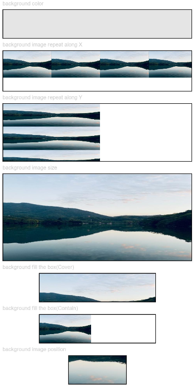
示例1(设置背景基础样式)
该示例通过配置backgroundColor、backgroundImage、backgroundImageSize和backgroundImagePosition设置背景的基础样式。
// xxx.ets
@Entry
@Component
struct BackgroundExample {

  build() {
    Column({ space: 5 }) {
      Text('background color').fontSize(9).width('90%').fontColor(0xCCCCCC)
      Row().width('90%').height(50).backgroundColor(0xE5E5E5).border({ width: 1 })

      Text('background image repeat along X').fontSize(9).width('90%').fontColor(0xCCCCCC)
      Row()
        .backgroundImage('/comment/bg.jpg', ImageRepeat.X)
        .backgroundImageSize({ width: '250px', height: '140px' })
        .width('90%')
        .height(70)
        .border({ width: 1 })

      Text('background image repeat along Y').fontSize(9).width('90%').fontColor(0xCCCCCC)
      Row()
        .backgroundImage('/comment/bg.jpg', ImageRepeat.Y)
        .backgroundImageSize({ width: '500px', height: '120px' })
        .width('90%')
        .height(100)
        .border({ width: 1 })

      Text('background image size').fontSize(9).width('90%').fontColor(0xCCCCCC)
      Row()
        .width('90%').height(150)
        .backgroundImage('/comment/bg.jpg', ImageRepeat.NoRepeat)
        .backgroundImageSize({ width: 1000, height: 500 })
        .border({ width: 1 })

      Text('background fill the box(Cover)').fontSize(9).width('90%').fontColor(0xCCCCCC)
      // 不保证图片完整的情况下占满盒子
      Row()
        .width(200)
        .height(50)
        .backgroundImage('/comment/bg.jpg', ImageRepeat.NoRepeat)
        .backgroundImageSize(ImageSize.Cover)
        .border({ width: 1 })

      Text('background fill the box(Contain)').fontSize(9).width('90%').fontColor(0xCCCCCC)
      // 保证图片完整的情况下放到最大
      Row()
        .width(200)
        .height(50)
        .backgroundImage('/comment/bg.jpg', ImageRepeat.NoRepeat)
        .backgroundImageSize(ImageSize.Contain)
        .border({ width: 1 })

      Text('background image position').fontSize(9).width('90%').fontColor(0xCCCCCC)
      Row()
        .width(100)
        .height(50)
        .backgroundImage('/comment/bg.jpg', ImageRepeat.NoRepeat)
        .backgroundImageSize({ width: 1000, height: 560 })
        .backgroundImagePosition({ x: -500, y: -300 })
        .border({ width: 1 })
    }
    .width('100%').height('100%').padding({ top: 5 })
  }
}
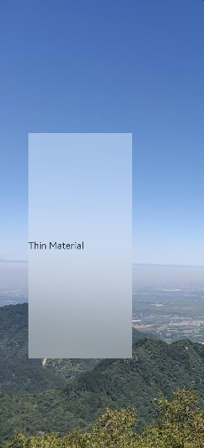
示例2(设置背景模糊样式)
该示例通过backgroundBlurStyle设置背景模糊样式。
// xxx.ets
@Entry
@Component
struct BackgroundBlurStyleDemo {
  build() {
    Column() {
      Row() {
        Text("Thin Material")
      }
      .width('50%')
      .height('50%')
      .backgroundBlurStyle(BlurStyle.Thin, { colorMode: ThemeColorMode.LIGHT, adaptiveColor: AdaptiveColor.DEFAULT, scale: 1.0 })
      .position({ x: '15%', y: '30%' })
    }
    .height('100%')
    .width('100%')
    .backgroundImage($r('app.media.bg'))
    .backgroundImageSize(ImageSize.Cover)
  }
}
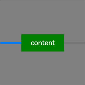
示例3(设置组件背景)
该示例通过background设置组件背景。
// xxx.ets
@Entry
@Component
struct BackgroundExample {
  @Builder renderBackground() {
    Column() {
      Progress({value : 50})
    }
  }

  build() {
    Column() {
      Text("content")
        .width(100)
        .height(40)
        .fontColor("#FFF")
        .position({x:50, y:80})
        .textAlign(TextAlign.Center)
        .backgroundColor(Color.Green)
    }
    .width(200).height(200)
    .background(this.renderBackground)
    .backgroundColor(Color.Gray)
  }
}
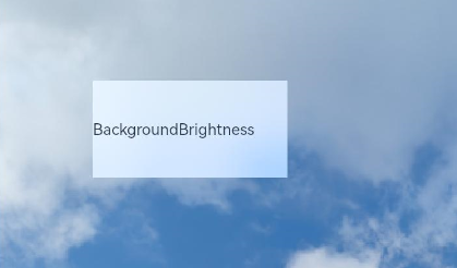
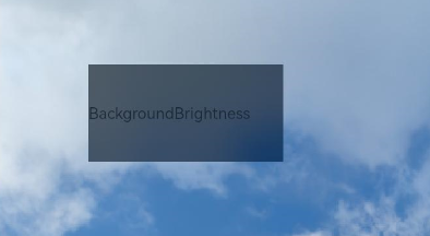
示例4(设置组件背景提亮效果)
该示例通过backgroundBrightness设置组件背景提亮效果。
// xxx.ets
@Entry
@Component
struct BackgroundBrightnessDemo {
  build() {
    Column() {
      Row() {
        Text("BackgroundBrightness")
      }
      .width(200)
      .height(100)
      .position({ x: 100, y: 100 })
      .backgroundBlurStyle(BlurStyle.Thin, { colorMode: ThemeColorMode.LIGHT, adaptiveColor: AdaptiveColor.DEFAULT})
      .backgroundBrightness({rate:0.5,lightUpDegree:0.5}) // 背景提亮效果
    }
    .width('100%')
    .height('100%')
    .backgroundImage($r('app.media.image'))
    .backgroundImageSize(ImageSize.Cover)
  }
}
效果图如下:
rate和lightUpDegree参数值为0.5,0.5:
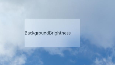
修改rate和lightUpDegree参数值为0.5,-0.1:
去掉backgroundBrightness的设置,效果如下:
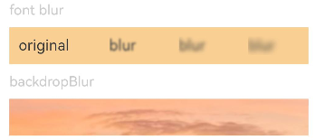
示例5(设置模糊属性)
该示例提供了模糊属性的实现方法。通过blur设置内容模糊,通过backdropBlur设置背景模糊。
// xxx.ets
@Entry
@Component
struct BlurEffectsExample {
  build() {
    Column({ space: 10 }) {
      // 对字体进行模糊
      Text('font blur').fontSize(15).fontColor(0xCCCCCC).width('90%')
      Flex({ alignItems: ItemAlign.Center }) {
        Text('original text').margin(10)
        Text('blur text')
          .blur(5).margin(10)
        Text('blur text')
          .blur(10).margin(10)
        Text('blur text')
          .blur(15).margin(10)
      }.width('90%').height(40)
      .backgroundColor(0xF9CF93)


      // 对背景进行模糊
      Text('backdropBlur').fontSize(15).fontColor(0xCCCCCC).width('90%')
      Text()
        .width('90%')
        .height(40)
        .fontSize(16)
        .backdropBlur(3)
        .backgroundImage($r('app.media.image'))
        .backgroundImageSize({ width: 1200, height: 160 })
    }.width('100%').margin({ top: 5 })
  }
}
示例6(设置文字异形模糊效果)
该示例通过blendMode和backgroundEffect实现文字异形模糊效果。
如果出现漏线问题,开发者应首先确保两个blendMode所在组件大小严格相同。如果确认相同,可能是组件边界落在浮点数坐标上导致,可尝试设置pixelRound通用属性,使产生的白线、暗线两侧的组件边界对齐到整数像素坐标上。
// xxx.ets
@Entry
@Component
struct Index {
  @State shColor: Color = Color.White;
  @State sizeDate: number = 20;
  @State rVal: number = 255;
  @State gVal: number = 255;
  @State bVal: number = 255;
  @State aVal: number = 0.1;
  @State rad: number = 40;
  @State satVal: number = 0.8;
  @State briVal: number = 1.5;
  build() {
    Stack() {
      Image($r('app.media.image'))
      Column() {
        Column({ space: 0 }) {
          Column() {
            Text('11')
              .fontSize(144)
              .fontWeight(FontWeight.Bold)
              .fontColor('rgba(255,255,255,1)')
              .fontFamily('HarmonyOS-Sans-Digit')
              .maxLines(1)
              .lineHeight(120 * 1.25)
              .height(120 * 1.25)
              .letterSpacing(4 * 1.25)
            Text('42')
              .fontSize(144)
              .fontWeight(FontWeight.Bold)
              .fontColor('rgba(255,255,255,1)')
              .fontFamily('HarmonyOS-Sans-Digit')
              .maxLines(1)
              .lineHeight(120 * 1.25)
              .height(120 * 1.25)
              .letterSpacing(4 * 1.25)
              .shadow({
                color: 'rgba(0,0,0,0)',
                radius: 20,
                offsetX: 0,
                offsetY: 0
              })
            Row() {
              Text('10月16日')
                .fontSize(this.sizeDate)
                .height(22)
                .fontWeight('medium')
                .fontColor('rgba(255,255,255,1)')
              Text('星期一')
                .fontSize(this.sizeDate)
                .height(22)
                .fontWeight('medium')
                .fontColor('rgba(255,255,255,1)')
            }
          }
          .blendMode(BlendMode.DST_IN, BlendApplyType.OFFSCREEN)
          .pixelRound({
            start: PixelRoundCalcPolicy.FORCE_FLOOR ,
            top: PixelRoundCalcPolicy.FORCE_FLOOR ,
            end: PixelRoundCalcPolicy.FORCE_CEIL,
            bottom: PixelRoundCalcPolicy.FORCE_CEIL
          })
        }
        .blendMode(BlendMode.SRC_OVER, BlendApplyType.OFFSCREEN)
        .backgroundEffect({
          radius: this.rad,
          saturation: this.satVal,
          brightness: this.briVal,
          color: this.getVolumeDialogWindowColor()
        })
        .justifyContent(FlexAlign.Center)
        .pixelRound({
          start: PixelRoundCalcPolicy.FORCE_FLOOR ,
          top: PixelRoundCalcPolicy.FORCE_FLOOR ,
          end: PixelRoundCalcPolicy.FORCE_CEIL,
          bottom: PixelRoundCalcPolicy.FORCE_CEIL
        })
      }
    }
  }
  getVolumeDialogWindowColor(): ResourceColor | string {
    return `rgba(${this.rVal.toFixed(0)}, ${this.gVal.toFixed(0)}, ${this.bVal.toFixed(0)}, ${this.aVal.toFixed(0)})`;
  }
}
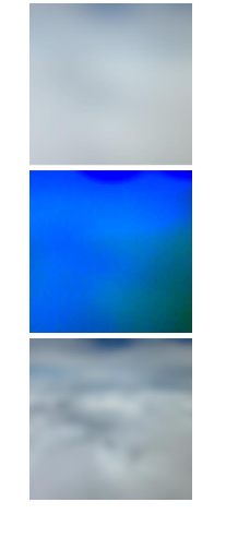
示例7(模糊效果对比)
该示例对比了backgroundEffect、backDropBlur和backgroundBlurStyle三种不同的模糊效果。
// xxx.ets
// xxx.ets
@Entry
@Component
struct BackGroundBlur {
  private imageSize: number = 150;

  build() {
    Column({ space: 5 }) {
      // backgroundBlurStyle通过枚举值的方式设置模糊参数
      Stack() {
        Image($r('app.media.test'))
          .width(this.imageSize)
          .height(this.imageSize)
        Column()
          .width(this.imageSize)
          .height(this.imageSize)
          .backgroundBlurStyle(BlurStyle.Thin)
      }

      // backgroundEffect 可以自定义设置 模糊半径,亮度,饱和度等参数
      Stack() {
        Image($r('app.media.test'))
          .width(this.imageSize)
          .height(this.imageSize)
        Column()
          .width(this.imageSize)
          .height(this.imageSize)
          .backgroundEffect({ radius: 20, brightness: 0.6, saturation: 15 })
      }

      // backdropBlur 只能设置模糊半径和灰阶参数
      Stack() {
        Image($r('app.media.test'))
          .width(this.imageSize)
          .height(this.imageSize)
        Column()
          .width(this.imageSize)
          .height(this.imageSize)
          .backdropBlur(20, { grayscale: [30, 50] })
      }
    }
    .width('100%')
    .padding({ top: 5 })
  }
}


 扫一扫
扫一扫


 1258
1258

 被折叠的 条评论
为什么被折叠?
被折叠的 条评论
为什么被折叠?
 到【灌水乐园】发言


