


一、QT样式表简介
1、QT样式表简介
QSS的主要功能是使界面的表现与界面的元素分离,使得设计皮肤与界面控件分离的软件成为可能。
QT样式表是允许用户定制widgets组件外观的强大机制,此外,子类化QStyle也可以定制widgets组件外观。QT样式表的概念、术语、语法很大程度上受到了CSS层叠样式表的影响。
样式表是使用QApplication::setStyleSheet()设置在应用程序或是使用QWidget::setStyleSheet()设置在具体组件及其子对象的文字说明。
例如,以下样式表指明QLineEdit使用黄色作为背景色,QCheckBox使用红色作为文本颜色。
QLineEdit { background: yellow }

QCheckBox { color: red }
对于这种定制,样式表比QPalette更强大。例如,要获取一个红色的按钮,可以设置QPushButton的QPalette::Button角色为红色。然而,这并不保证对所有的样式有效,因为样式的构造者会被不同平台的原则和本地的主题引擎所限制。
样式表可以实现那些很难或是不可能使用QPalette实现的所有定制。
如果想要某些强制字段为黄色背景,按钮为红色文字,或是绚丽的复选框,样式表可以完成。
本文福利,莬费领取Qt开发学习资料包、技术视频,内容包括(Qt实战项目,C++语言基础,C++设计模式,Qt编程入门,QT信号与槽机制,QT界面开发-图像绘制,QT网络,QT数据库编程,QT项目实战,QSS,OpenCV,Quick模块,面试题等等)↓↓↓↓↓↓见下面↓↓文章底部点击莬费领取↓↓
2、QT样式表编程
A、在代码中直接设置QSS
    QPushButton *button = new QPushButton(this);
    button->setText("hello");
    button->setStyleSheet("QPushButton{background-color:red; color:blue}");
B、通过文件设置QSS
将QSS代码写入.qss文件
将.qss文件加入资源文件qrc.qrc中
在代码中读取QSS文件设置组件QSS
    QPushButton *button = new QPushButton(this);
    button->setText("hello");
    QFile file(":/qss/dev.qss");
    file.open(QIODevice::ReadOnly);
    QString stylesheet = QLatin1String(file.readAll());
    button->setStyleSheet(stylesheet);
    file.close();
二、QT样式表语法
QT样式表的术语和语法规则与HTML CSS很相似。
1、样式规则
样式表由样式规则序列组成。样式规则由选择器和声明组成。选择器指定了那些组件受规则影响,声明指定了组件设置了哪些属性。例如:
QPushButton { color: red }以上样式规则中,QPushButton是选择器,{ color: red }是声明。样式规则指定了QPushButton及其子类应使用红色作为前景色。
QT样式表大小写不敏感,除了类名、对象名、QT属性名是大小写敏感的。
多个选择器可以指定同一个声明,使用逗号分隔选择器。例如以下规则:
QPushButton, QLineEdit, QComboBox { color: red }等效于三个规则:
QPushButton { color: red }

QLineEdit { color: red }

QComboBox { color: red }
样式规则的声明部分是一个“属性:值”对的链表。声明部分在{}内,不同的属性:值”对使用分号分隔。例如:
QPushButton { color: red; background-color: white }2、选择器的类型
到目前为止所有的例子使用的都是最简单的选择器类型。QT样式表支持CSS2定义的所有选择器。下表总结了最常用的选择器类型。

3、子控件选择器
对于样式复杂的组件,需要访问组件的子控件,如QComboBox的下拉按钮或QSpinBox的上下箭头。选择器可以包含子控件来对组件的特定子控件应用规则。
QComboBox::drop-down { image: url(dropdown.png) }以上规则会对所有QComboBox的下拉框应用样式规则。尽管双冒号::很像CSS3的伪元素,但QT子控件选择器在概念上是不同的,有不同的级联语义。
子控件选择器通常根据另一个参考元素进行定位。参考元素可以是组件或是另一个子控件选择器。例如,QComboBox的::drop-down默认放置在QComboBox衬底矩形的右上角。::drop-down默认放置在::drop-down子控件选择器的内容矩形的中心。
可以使用subcontrol-origin属性改变原点矩形。例如,如果想要将drop-down放置在边界矩形而不是默认的衬底矩形,可以指定:
QComboBox {
      margin-right: 20px;
  }

  QComboBox::drop-down {
      subcontrol-origin: margin;
  }
drop-down在边界矩形内的对齐方式通过subcontrol-position属性改变。宽属性和高属性用于控制子控件选择器的大小。注意,设置一幅图片会隐式地设置子控件选择器的大小。
相对定位方法(position:relative)允许子控件选择器的位置偏离它原来的位置。例如,当QComboBox的下拉按钮按下,想要一种被按下的效果可以通过指定如下实现:
    QComboBox::down-arrow {
          image: url(down_arrow.png);
      }

      QComboBox::down-arrow:pressed {
          position: relative;
          top: 1px; left: 1px;
      }
绝对定位方法(position:absolute)允许子控件选择器的位置和大小的改变与参考元素有关。
一旦定位,就可以像组件那样使用盒子模型对其进行造型。
注意,像QComboBox和QScrollBar这样复杂的组件,如果有一个属性或是子控件选择器被定制,所有其他的属性或是子控件选择器也要必须被定制。
常用辅助控制器:
::indicator 单选框、复选框、可选菜单项或可选群组项的指示器
::menu-indicator 按钮的菜单指示器
::item 菜单、菜单栏或状态栏项
::up-button 微调框或滚动条的向下按钮
::down-button 微调框或滚动条的向上按钮
::up-arrow 微调框、滚动条或标题视图的向上按钮
::down-arrow 微调框、滚动条或标题视图的向下按钮
::drop-down 组合框的下拉箭头
::title 群组框的标题
4、伪选择器
选择器可能包含限制基于组件状态的规则应用的伪状态。伪状态出现在选择器的尾部,中间使用分号连接。例如,以下规则用于鼠标悬停在一个QPushButton上:
QPushButton:hover { color: white }伪状态可以使用叹号取反,例如,以下规则用于鼠标不悬停在QRadioButton:
QRadioButton:!hover { color: red }伪状态可以以逻辑与的方式连接使用,例如,以下规则应用于鼠标悬停在一个选中的QCheckBox上:
QCheckBox:hover:checked { color: white }取反伪状态可以出现在伪状态链中。例如,以下规则用于鼠标悬停在一个QPsuButton上,但没有按下:
QPushButton:hover:!pressed { color: blue; }如果需要,使用逗号可以将伪状态以逻辑或连接。
QCheckBox:hover, QCheckBox:checked { color: white }伪状态可以结合子控件选择器使用:
QComboBox::drop-down:hover { image: url(dropdown_bright.png) }常用状态:
:disabled 禁用的窗口部件
:enabled 启用的窗口部件
:focus 窗口部件有输入焦点
:hover 鼠标在窗口部件上悬停
:pressed 鼠标按键点击窗口部件
:checked 按钮已被选中
:unchecked 按钮未被选中
:indeterminate 按钮被部分选中
:open 窗口部件处于打开或扩展的状态
:closed 窗口部件处于关闭或销毁状态
:on 窗口部件的状态是on
:off 窗口部件的状态是on
5、冲突处理
当多个样式规则使用多个值指定同一个属性时会产生冲突。
QPushButton#okButton { color: gray }

QPushButton { color: red }
以上两条规则匹配名为okButton的QPushButton实例,在color属性上有冲突。为了解决冲突,需要考虑选择器的特征。上例中,QPushButton#okButton比QPushButton要更具体,因为QPushButton#okButton指向单个的对象,而不是类的所有实例。
类似,伪选择器比未指定伪状态的选择器更具体。因而,以下样式表指定,当鼠标悬停在QPushButton上时,QPushButton的文本为白色,否则为红色。
QPushButton:hover { color: white }

QPushButton { color: red }
严谨一点应该是:
QPushButton:hover { color: white }

QPushButton:enabled { color: red }
如果鼠标悬停在按钮上,两个选择器有相同的特性,则第二条规则优先。如果想要文本为白色,需要重新排序规则:
QPushButton:enabled { color: red }

QPushButton:hover { color: white }
或者,可以使第一条规则更加具体:
QPushButton:hover:enabled { color: white }

QPushButton:enabled { color: red }
和类型选择器一起使用时,类似的问题也会发生
QPushButton { color: red }
QAbstractButton { color: gray }
以上两条规则用于QPushButton实例(由于QPushButton继承自QAbstractButton),并有color属性的冲突。由于QPushButton继承自QAbstractButton,所以会假设QPushButton比QAbstractButton更具体。然而,对于样式表的计算,所有的类型选择器有相同的特性,最后出现的规则优先。换句话说,所有的QAbstractButton的color属性会被设置为gray,包括QPushButton。如果真的想要QPushButton的文本为red,通常会重新排序规则。
为了确定规则的特性,QT样式表遵循CSS2规范:
选择器特性的计算方法如下:
计算选择器中ID属性的数量(=a)
计算选择器中其他属性和伪状态类的数量(=b)
计算选择器中元素的数量(=c)
忽略伪元素(如子控件选择器)
串联的三个数字a-b-c给出了特性。
* {} /* a=0 b=0 c=0 -> specificity = 0 */
LI {} /* a=0 b=0 c=1 -> specificity = 1 */
UL LI {} /* a=0 b=0 c=2 -> specificity = 2 */
UL OL+LI {} /* a=0 b=0 c=3 -> specificity = 3 */
H1 + *[REL=up]{} /* a=0 b=1 c=1 -> specificity = 11 */
UL OL LI.red {} /* a=0 b=1 c=3 -> specificity = 13 */
LI.red.level {} /* a=0 b=2 c=1 -> specificity = 21 */
#x34y {} /* a=1 b=0 c=0 -> specificity = 100 */
6、级联
QT样式表可以设置在应用程序、父组件、子组件上。通过合并组件的祖先(父亲、祖父等)可以获取任意组件的有效样式表,以及设置在应用程序上的任何样式表。
冲突发生时,不论冲突规则的特性如何,组件自己的样式表总是优先于任何继承而来的样式表。同样,父组件的样式表优先于祖父组件的样式表。
这样的结果是,在一个组件上设置样式规则会自动获得比祖先组件的样式表或是应用程序的样式表指定的其他规则更高的优先级。例如,首先在应用程序设置样式表
qApp->setStyleSheet("QPushButton { color: white }");然后,在QPushButton对象设置一个样式表
myPushButton->setStyleSheet("* { color: blue }");QPushButton的样式表会强制QPushButton(及其任何子组件)显示蓝色文本,尽管应用程序范围的样式表提供了更具体的规则。
下列写法也会得到相同的结果:
myPushButton->setStyleSheet("color: blue");但如果QPushButton有子组件,样式表不会对子组件有效果。
样式表级联是一个复杂的主题,更详细的内容请参考CSS2规范。QT目前没有实现。
7、继承
在经典的CSS中,当元素的字体和颜色没有显示设置时,会自动从父组件继承。使用QT样式表时,一个组件不会自动继承父组件设置的字体和颜色。例如,一个QGroupBox包含一个QPushButton:
qApp->setStyleSheet("QGroupBox { color: red; } ");QPushButton并没有显示设置颜色,因此并不是继承父组件QGroupBox的颜色,而是拥有系统的颜色。如果要设置QGroupBox及其子组件的颜色,如下:
qApp->setStyleSheet("QGroupBox, QGroupBox * { color: red; }");相比之下,使用QWidget::setFont() 和 QWidget::setPalette()为子组件设置字体和画板。
8、C++命名空间内部的组件
类型选择器特殊类型的组件的样式定制。例如:
class MyPushButton : public QPushButton {

// ...

};

// ...

qApp->setStyleSheet("MyPushButton { background: yellow; }");
QT样式表使用组件的QObject::className() 确定何时应选择器。当自定义组件在命名空间内部时,QObject::className()会返回<namespace>::<classname>。这会与子控件选择器的语法产生冲突。为了解决这个问题,当在命名空间内使用组件的类型选择器时,必须使用“--”代替“::”。
namespace ns {
class MyPushButton : public QPushButton {

// ...

};

}

// ...
qApp->setStyleSheet("ns--MyPushButton { background: yellow; }");
9、设置QObject属性
从QT4.3开始,任何可被设计的Q_PROPERTY都可以使用qproperty-<property name>语法设置。
MyLabel { qproperty-pixmap: url(pixmap.png); }

MyGroupBox { qproperty-titleColor: rgb(100, 200, 100); }

QPushButton { qproperty-iconSize: 20px 20px; }
如果属性引用了Q_ENUMS声明的枚举,应该通过名字引用常量值,而不是数字。
三、QT设计器中的样式表
Qt Designer是一款预览样式表的优秀工具,右击设计器中的任何组件,选择Change styleSheet...可以设置样式表。
QT4.2开始,Qt Designer包含了一个样式表语法高亮器和验证器。如果语法合法或非法,验证器可以在Edit Style Sheet对话框的左下角指示。
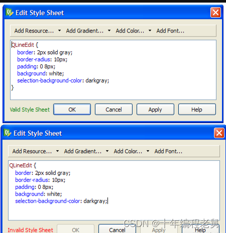
当点击Ok或Apply按钮时,Qt Designer会自动使用新样式表显示组件。
四、使用样式表定制QT组件
当使用样式表时,每个组件会被当作有四个同心矩形:空白矩形、边界矩形、衬底矩形、内容矩形的盒子。
1、盒子模型
四个同心矩形如下所示:
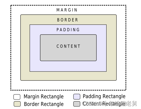
margin, border-width,padding属性默认都是0。此时四个矩形完全相同。
可以使用background-image属性指定组件的背景。默认,background-image只会在边界矩形内被绘制,使用background-clip属性可以修改。使用background-repeat属性和background-origin属性来控制背景图片的重复和来源。
background-image属性不会缩放组件的大小。为了提供随着组件大小缩放的皮肤或背景,必须使用border-image属性。由于border-image属性提供了一个可选择的背景,当指定border-image属性时,不会要求指定background-image属性。当background-image属性和border-image属性都被指定时,border-image属性会被绘制在background-image属性之上。
此外,image属性可以用于在border-image属性上绘制一幅图像。当组件的大小与image的大小不匹配时,指定的image不会伸缩,对齐方式可以使用image-position属性设置。与background-image属性和border-image属性不同,image属性可以指定SVG,使image根据组件的大小自动缩放。
渲染规则的步骤如下:
A、为整个渲染操作设置clip(border-radius)
B、绘制背景(background-image)
C、绘制边界(border-image,border)
D、绘制覆盖图像(image)
2、子控件
一个组件可以看作一颗子控件树。例如QComboBox绘制下拉按钮子控件,下拉按钮子控件绘制了向下箭头子控件。
子控件享有父子关系。QComboBox中,向下箭头的父亲是下拉按钮,下拉按钮的父亲的QComboBox组件本身。子控件可以使用subcontrol-position属性和subcontrol-origin属性定位在父组件内。
一旦定位,子控件就可以使用盒子模型定制样式。
注意,像QComboBox和QScrollBar这样复杂的组件,如果有一个属性或是子控件选择器被定制,所有其他的属性或是子控件选择器也要必须被定制。
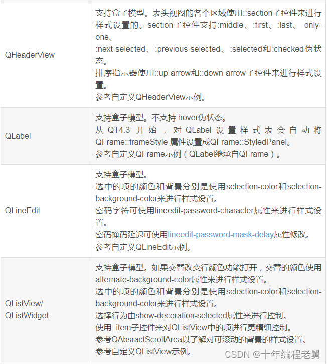
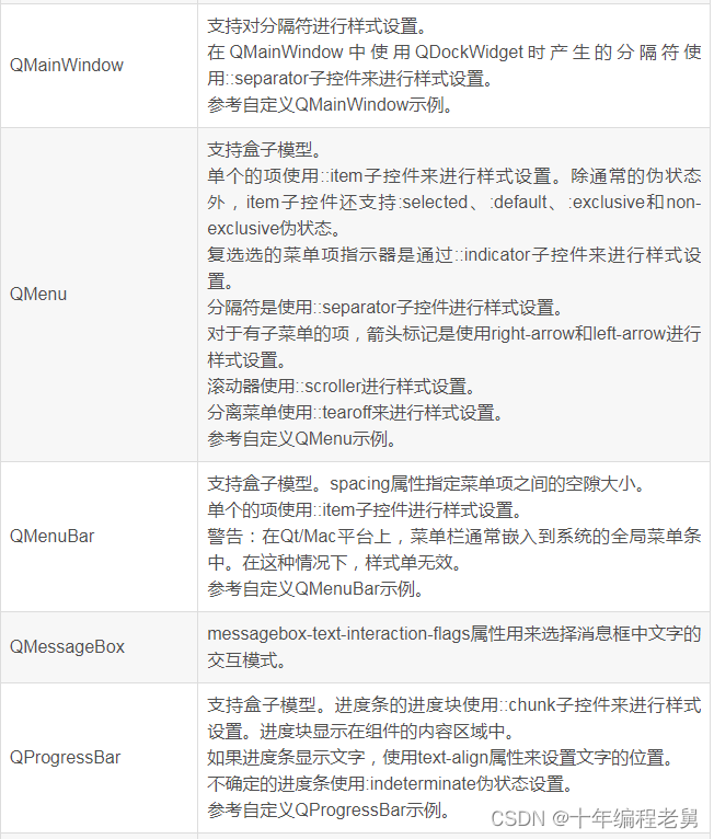
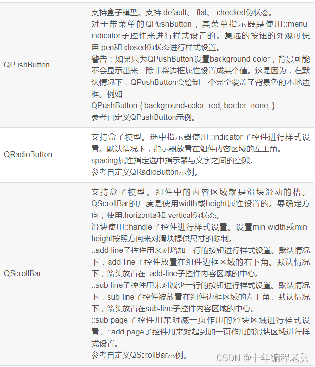
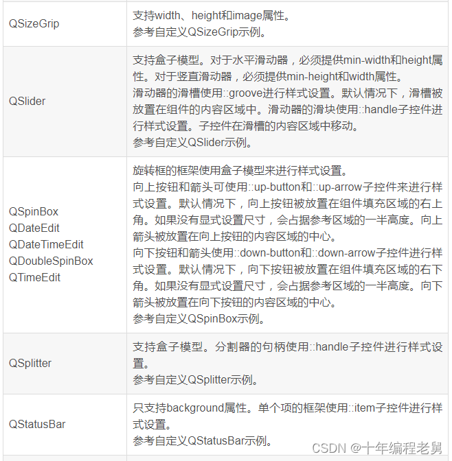
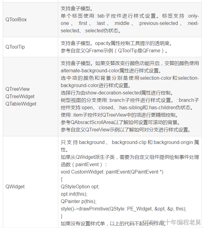
五、QT样式表参考
QT样式表支持多种的属性、状态和子控件,使得定制组件的外观成为可能。
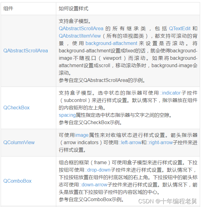
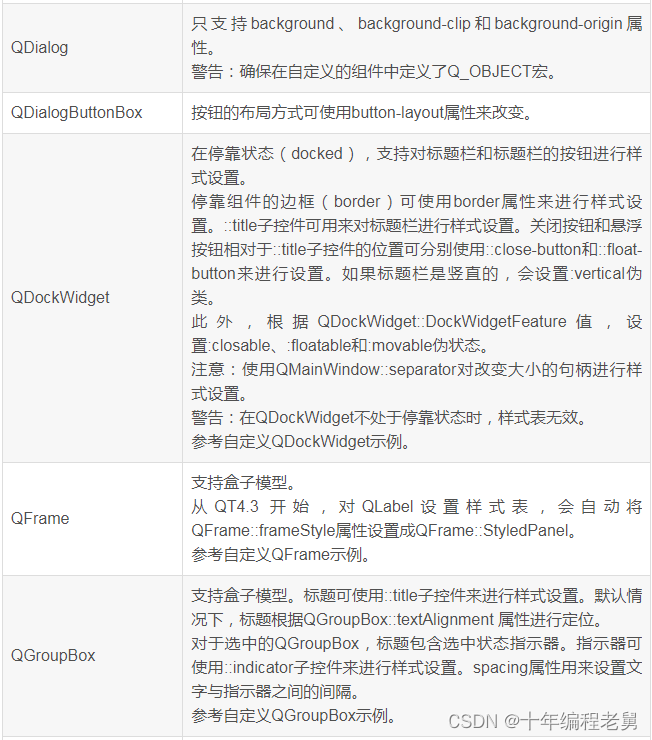
1、组件
以下组件都可以使用样式表定制样式。


六、QT样式表实例
1、样式表的使用
A、定制前景色和背景色
设置应用程序中的所有QLineEdit组件的背景色为黄色
qApp->setStyleSheet("QLineEdit { background-color: yellow }");如果只想要属性用于具体某个对话框的QLineEdit及子类组件。
myDialog->setStyleSheet("QLineEdit { background-color: yellow }");如果只想将属性用于某个具体的QLineEdit组件,可以使用QObject::setObjectName()和ID选择器。
myDialog->setStyleSheet("QLineEdit#nameEdit { background-color: yellow }");可以直接设置QLineEdit组件的background-color属性,忽略选择器
nameEdit->setStyleSheet("background-color: yellow");为了确保对比效果,应该指定文本合适的颜色
nameEdit->setStyleSheet("color: blue; background-color: yellow");修改选中文本的颜色如下:
nameEdit->setStyleSheet("color: blue;"
                          "background-color: yellow;"
                          "selection-color: yellow;"
                          "selection-background-color: blue;");
B、使用动态属性定制样式
为了提示用户字段是必填的,对这些字段使用黄色作为背景色。要使用QT样式表是现实很容易的。首先,应该使用应用程序的样式表:
*[mandatoryField="true"] { background-color: yellow }mandatoryField字段设置为true的组件的背景色为黄色。
对于每个必备字段组件,我们匆忙中简单创建了一个mandatoryField属性并设置为true。
QLineEdit *nameEdit = new QLineEdit(this);
nameEdit->setProperty("mandatoryField", true);

QLineEdit *emailEdit = new QLineEdit(this);
emailEdit->setProperty("mandatoryField", true);

QSpinBox *ageSpinBox = new QSpinBox(this);
ageSpinBox->setProperty("mandatoryField", true);
C、使用盒子模型定制QPushButton
本节我们展示如何创建一个红色的按钮。
QPushButton#evilButton
{
      background-color: red;
      border-style: outset;
      border-width: 2px;
      border-radius: 10px;
      border-color: beige;
      font: bold 14px;
      min-width: 10em;
      padding: 6px;
  }

QPushButton#evilButton:pressed
{
      background-color: rgb(224, 0, 0);
      border-style: inset;
}
D、定制按钮菜单指示器子控件
子控件可以访问组件的子元素。例如,按钮会使用QPushButton::setMenu()关联菜单与菜单指示器。定制红色按钮的菜单指示器如下:
QPushButton#evilButton::menu-indicator
{
      image: url(myindicator.png);
}
默认,菜单指示器定位在衬底区域的右下角。通过改变subcontrol-position、subcontrol-origin属性可以定位指示器。
QPushButton::menu-indicator
{
      image: url(myindicator.png);
      subcontrol-position: right center;
      subcontrol-origin: padding;
      left: -2px;
}
Myindicator.png的位置在按钮衬底区域的右中心。
E、复杂选择器示例
设置应用程序样式表中QLineEdit文本为红色。
QLineEdit { color: red }然而,想要设置一个只读QLineEdit的文本颜色为灰色如下:
QLineEdit { color: red }
QLineEdit[readOnly="true"] { color: gray }
某些情况下,如果要求注册表单中的所有QLineEdit为棕色。
QLineEdit { color: red }
QLineEdit[readOnly="true"] { color: gray }
#registrationDialog QLineEdit { color: brown }
如果要求所有对话框中的QLineEdit为棕色。
QLineEdit { color: red }

QLineEdit[readOnly="true"] { color: gray }

QDialog QLineEdit { color: brown }本文福利,莬费领取Qt开发学习资料包、技术视频,内容包括(Qt实战项目,C++语言基础,C++设计模式,Qt编程入门,QT信号与槽机制,QT界面开发-图像绘制,QT网络,QT数据库编程,QT项目实战,QSS,OpenCV,Quick模块,面试题等等)↓↓↓↓↓↓见下面↓↓文章底部点击莬费领取↓↓
2、定制特殊组件
本节提供使用样式表定制特定组件的实例。
(1)、定制QAbstractScrollArea
任何QAbstractScrollArea组件(项视图、QTextEdit、QTextBrowser)的背景都可以使用bakcground属性设置。例如,设置带有滚动条滚动的背景图属性如下:
QTextEdit, QListView
{
      background-color: white;
      background-image: url(draft.png);
      background-attachment: scroll;
}
如果设置background-image属性在视口中固定。
QTextEdit, QListView
{
      background-color: white;
      background-image: url(draft.png);
      background-attachment: fixed;
}
(2)、定制QCheckBox
进行QCheckBox样式设置与QRadioButton样式设置相同。主要区别在于三态的QCheckBox有一个模糊态。
QCheckBox
{
      spacing: 5px;
}

QCheckBox::indicator
{
      width: 13px;
      height: 13px;
}

QCheckBox::indicator:unchecked
{
      image: url(:/images/checkbox_unchecked.png);
}

QCheckBox::indicator:unchecked:hover
{
      image: url(:/images/checkbox_unchecked_hover.png);
}


QCheckBox::indicator:unchecked:pressed
{
      image: url(:/images/checkbox_unchecked_pressed.png);
}

QCheckBox::indicator:checked
{
      image: url(:/images/checkbox_checked.png);
}

QCheckBox::indicator:checked:hover
{
      image: url(:/images/checkbox_checked_hover.png);
}

QCheckBox::indicator:checked:pressed
{
      image: url(:/images/checkbox_checked_pressed.png);
}

QCheckBox::indicator:indeterminate:hover
{
      image: url(:/images/checkbox_indeterminate_hover.png);
}

QCheckBox::indicator:indeterminate:pressed {
     image: url(:/images/checkbox_indeterminate_pressed.png);
}
(3)、定制组合框QComboBox
QComboBox {
      border: 1px solid gray;
      border-radius: 3px;
      padding: 1px 18px 1px 3px;
      min-width: 6em;
  }

  QComboBox:editable {
      background: white;
  }

  QComboBox:!editable, QComboBox::drop-down:editable {
       background: qlineargradient(x1: 0, y1: 0, x2: 0, y2: 1,
                                   stop: 0 #E1E1E1, stop: 0.4 #DDDDDD,
                                   stop: 0.5 #D8D8D8, stop: 1.0 #D3D3D3);
  }

  /* QComboBox gets the "on" state when the popup is open */
  QComboBox:!editable:on, QComboBox::drop-down:editable:on {
      background: qlineargradient(x1: 0, y1: 0, x2: 0, y2: 1,
                                  stop: 0 #D3D3D3, stop: 0.4 #D8D8D8,
                                  stop: 0.5 #DDDDDD, stop: 1.0 #E1E1E1);
  }

  QComboBox:on { /* shift the text when the popup opens */
      padding-top: 3px;
      padding-left: 4px;
  }

  QComboBox::drop-down {
      subcontrol-origin: padding;
      subcontrol-position: top right;
      width: 15px;

      border-left-width: 1px;
      border-left-color: darkgray;
      border-left-style: solid; /* just a single line */
      border-top-right-radius: 3px; /* same radius as the QComboBox */
      border-bottom-right-radius: 3px;
  }

  QComboBox::down-arrow {
      image: url(/usr/share/icons/crystalsvg/16x16/actions/1downarrow.png);
  }

  QComboBox::down-arrow:on { /* shift the arrow when popup is open */
      top: 1px;
      left: 1px;
  }
组合框的弹出菜单是QAbstractItemView,使用后代选择器进行样式设置。
 QComboBox QAbstractItemView {
      border: 2px solid darkgray;
      selection-background-color: lightgray;
  }
(4)、定制QDockWidget
QDockWidget的标题栏和按钮可以按如下进行样式设置。
QDockWidget
{
    border: 1px solid lightgray;
    titlebar-close-icon: url(close.png);
    titlebar-normal-icon: url(undock.png);
}

QDockWidget::title
{
    text-align: left; /* align the text to the left */
    background: lightgray;
    padding-left: 5px;
}

QDockWidget::close-button, QDockWidget::float-button
{
    border: 1px solid transparent;
    background: darkgray;
    padding: 0px;
}

QDockWidget::close-button:hover, QDockWidget::float-button:hover
{
    background: gray;
}

QDockWidget::close-button:pressed, QDockWidget::float-button:pressed
{
    padding: 1px -1px -1px 1px;
}
如果要移动停靠组件按钮到左侧,可以使用如下样式表设置:
QDockWidget
{
      border: 1px solid lightgray;
      titlebar-close-icon: url(close.png);
      titlebar-normal-icon: url(float.png);
 }

  QDockWidget::title
  {
      text-align: left;
      background: lightgray;
      padding-left: 35px;
  }

  QDockWidget::close-button, QDockWidget::float-button
  {
      background: darkgray;
      padding: 0px;
      icon-size: 14px; /* maximum icon size */
  }

  QDockWidget::close-button:hover, QDockWidget::float-button:hover
  {
      background: gray;
  }

  QDockWidget::close-button:pressed, QDockWidget::float-button:pressed
  {
      padding: 1px -1px -1px 1px;
  }

  QDockWidget::close-button
  {
      subcontrol-position: top left;
      subcontrol-origin: margin;
      position: absolute;
      top: 0px; left: 0px; bottom: 0px;
      width: 14px;
  }

  QDockWidget::float-button
  {
      subcontrol-position: top left;
      subcontrol-origin: margin;
      position: absolute;
      top: 0px; left: 16px; bottom: 0px;
      width: 14px;
  }
(5)、定制QFrame
QFrame, QLabel, QToolTip
{
      border: 2px solid green;
      border-radius: 4px;
      padding: 2px;
      background-image: url(images/welcome.png);
}
(6)、定制QGroupBox
QGroupBox
{
    background-color: qlineargradient(x1: 0, y1: 0, x2: 0, y2: 1,
                                      stop: 0 #E0E0E0, stop: 1 #FFFFFF);
    border: 2px solid gray;
    border-radius: 5px;
    margin-top: 1ex; /* leave space at the top for the title */
}

QGroupBox::title
{
    subcontrol-origin: margin;
    subcontrol-position: top center; /* position at the top center */
    padding: 0 3px;
    background-color: qlineargradient(x1: 0, y1: 0, x2: 0, y2: 1,
                                      stop: 0 #FF0ECE, stop: 1 #FFFFFF);
}

QGroupBox::indicator
{
    width: 13px;
    height: 13px;
}

QGroupBox::indicator:unchecked
{
    image: url(:/images/checkbox_unchecked.png);
}
(7)、定制QHeaderView
QHeaderView::section
{
    background-color: qlineargradient(x1:0, y1:0, x2:0, y2:1,
                                      stop:0 #616161, stop: 0.5 #505050,
                                      stop: 0.6 #434343, stop:1 #656565);
    color: white;
    padding-left: 4px;
    border: 1px solid #6c6c6c;
}


QHeaderView::section:checked
{
    background-color: red;
}

QHeaderView::down-arrow
{
    image: url(down_arrow.png);
}

QHeaderView::up-arrow
{
    image: url(up_arrow.png);
}
(8)、定制QLineEdit
QLineEdit的框架使用盒子模型进行样式设置。
QLineEdit
{
    border: 2px solid gray;
    border-radius: 10px;
    padding: 0 8px;
    background: yellow;
    selection-background-color: darkgray;
}
QLineEdit的密码字符使用QLineEdit::Password显示模式设置。
QLineEdit[echoMode="2"]
{
    lineedit-password-character: 9679;
}
只读QLineEdit的背景可以如下修改:
QLineEdit:read-only
{
    background: lightblue;
}
(9)、定制QListView
交替行背景颜色的样式设置如下:
QListView
{
    alternate-background-color: yellow;
}
为了当鼠标悬停在数据项上时提供一个背景颜色,可以使用::item子控件。
QListView
{
    /* make the selection span the entire width of the view */
    show-decoration-selected: 1;
}

QListView::item:alternate
{
    background: #EEEEEE;
}

QListView::item:selected
{
    border: 1px solid #6a6ea9;
}


QListView::item:selected:!active
{
    background: qlineargradient(x1: 0, y1: 0, x2: 0, y2: 1,
                                stop: 0 #ABAFE5, stop: 1 #8588B2);
}

QListView::item:selected:active
{
    background: qlineargradient(x1: 0, y1: 0, x2: 0, y2: 1,
                                stop: 0 #6a6ea9, stop: 1 #888dd9);
}

QListView::item:hover
{
    background: qlineargradient(x1: 0, y1: 0, x2: 0, y2: 1,
                                stop: 0 #FAFBFE, stop: 1 #DCDEF1);
}
(10)、定制QMainWindow
QMainWindow的分隔符可以如下样式表进行样式设置。
QMainWindow::separator
{
    background: yellow;
    width: 10px; /* when vertical */
    height: 10px; /* when horizontal */
}

QMainWindow::separator:hover
{
    background: red;
}
(11)、定制QMenu
菜单的每个项使用::item子控件进行样式设置。
QMenu
{
    background-color: #ABABAB;
    border: 1px solid black;
}

QMenu::item
{
    background-color: transparent;
}

QMenu::item:selected
{
    background-color: #654321;
}
更复杂的样式设置如下:
QMenu
{
    background-color: white;
    margin: 2px; /* some spacing around the menu */
}

QMenu::item
{
    padding: 2px 25px 2px 20px;
    border: 1px solid transparent;
}

QMenu::item:selected
{
    border-color: darkblue;
    background: rgba(100, 100, 100, 150);
}

QMenu::icon:checked
{ /* appearance of a 'checked' icon */
    background: gray;
    border: 1px inset gray;
    position: absolute;
    top: 1px;
    right: 1px;
    bottom: 1px;
    left: 1px;
}

QMenu::separator
{
    height: 2px;
    background: lightblue;
    margin-left: 10px;
    margin-right: 5px;
}

QMenu::indicator
{
    width: 13px;
    height: 13px;
}

QMenu::indicator:non-exclusive:unchecked
{
    image: url(:/images/checkbox_unchecked.png);
}

QMenu::indicator:non-exclusive:unchecked:selected
{
    image: url(:/images/checkbox_unchecked_hover.png);
}

QMenu::indicator:non-exclusive:checked
{
    image: url(:/images/checkbox_checked.png);
}


QMenu::indicator:non-exclusive:checked:selected
{
    image: url(:/images/checkbox_checked_hover.png);
}

QMenu::indicator:exclusive:unchecked
{
    image: url(:/images/radiobutton_unchecked.png);
}

QMenu::indicator:exclusive:unchecked:selected
{
    image: url(:/images/radiobutton_unchecked_hover.png);
}

QMenu::indicator:exclusive:checked
{
    image: url(:/images/radiobutton_checked.png);
}

QMenu::indicator:exclusive:checked:selected
{
    image: url(:/images/radiobutton_checked_hover.png);
}
(12)、QMenuBar
QMenuBar
{
    background-color: qlineargradient(x1:0, y1:0, x2:0, y2:1,
                                      stop:0 lightgray, stop:1 darkgray);
}

QMenuBar::item
{
    spacing: 3px; /* spacing between menu bar items */
    padding: 1px 4px;
    background: transparent;
    border-radius: 4px;
}

QMenuBar::item:selected
{ /* when selected using mouse or keyboard */
    background: #a8a8a8;
}

QMenuBar::item:pressed
{
    background: #888888;
}
(13)、定制QProgressBar
QProgressBar的border、chunk、text-align可以使用样式表设置。然而,如果一个属性或子控件进行了样式设置,其他属性或子控件也要进行样式设置。
QProgressBar
{
    border: 2px solid grey;
    border-radius: 5px;
    text-align: center;
}

QProgressBar::chunk
{
    background-color: #05B8CC;
    width: 20px;
}
(14)、定制QPushButton
QPushButton
{
    border: 2px solid #8f8f91;
    border-radius: 6px;
    background-color: qlineargradient(x1: 0, y1: 0, x2: 0, y2: 1,
                                      stop: 0 #f6f7fa, stop: 1 #dadbde);
    min-width: 80px;
}

QPushButton:pressed
{
    background-color: qlineargradient(x1: 0, y1: 0, x2: 0, y2: 1,
                                      stop: 0 #dadbde, stop: 1 #f6f7fa);
}

QPushButton:flat
{
    border: none; /* no border for a flat push button */
}

QPushButton:default
{
    border-color: navy; /* make the default button prominent */
}
对于带菜单的按钮,使用::menu-indicator子控件:
QPushButton:open
{ /* when the button has its menu open */
    background-color: qlineargradient(x1: 0, y1: 0, x2: 0, y2: 1,
                                      stop: 0 #dadbde, stop: 1 #f6f7fa);
}

QPushButton::menu-indicator
{
    image: url(menu_indicator.png);
    subcontrol-origin: padding;
    subcontrol-position: bottom right;
}

QPushButton::menu-indicator:pressed, QPushButton::menu-indicator:open
{
     position: relative;
     top: 2px; left: 2px; /* shift the arrow by 2 px */
}
(15)、定制QRadioButton
QRadioButton::indicator
{
    width: 13px;
    height: 13px;
}

QRadioButton::indicator::unchecked
{
    image: url(:/images/radiobutton_unchecked.png);
}

QRadioButton::indicator:unchecked:hover
{
    image: url(:/images/radiobutton_unchecked_hover.png);
}

QRadioButton::indicator:unchecked:pressed
{
    image: url(:/images/radiobutton_unchecked_pressed.png);
}

QRadioButton::indicator::checked
{
    image: url(:/images/radiobutton_checked.png);
}

QRadioButton::indicator:checked:hover
{
    image: url(:/images/radiobutton_checked_hover.png);
}

QRadioButton::indicator:checked:pressed
{
    image: url(:/images/radiobutton_checked_pressed.png);
}
(16)、定制QScrollBar
QScrollBar使用子控件handle、add-line、sub-line等进行样式设置。注意,如果有一个属性或子控件进行了样式定制,所有其他属性或子控件也必须要进行样式设置。
QScrollBar:horizontal
{
    border: 2px solid grey;
    background: #32CC99;
    height: 15px;
    margin: 0px 20px 0 20px;
}

QScrollBar::handle:horizontal
{
    background: white;
    min-width: 20px;
}

QScrollBar::add-line:horizontal
{
    border: 2px solid grey;
    background: #32CC99;
    width: 20px;
    subcontrol-position: right;
    subcontrol-origin: margin;
}

QScrollBar::sub-line:horizontal
{
    border: 2px solid grey;
    background: #32CC99;
    width: 20px;
    subcontrol-position: left;
    subcontrol-origin: margin;
}
left-arrow和right-arrow有带白色背景的粗体灰色边框。
QScrollBar:left-arrow:horizontal, QScrollBar::right-arrow:horizontal
{
    border: 2px solid grey;
    width: 3px;
    height: 3px;
    background: white;
}

QScrollBar::add-page:horizontal, QScrollBar::sub-page:horizontal
{
    background: none;
}
如果想要滚动条的滚动按钮箱MacOS一样放在一起,可以使用如下样式表:
QScrollBar:horizontal
{
    border: 2px solid green;
    background: cyan;
    height: 15px;
    margin: 0px 40px 0 0px;
}

QScrollBar::handle:horizontal
{
    background: gray;
    min-width: 20px;
}

QScrollBar::add-line:horizontal
{
    background: blue;
    width: 16px;
    subcontrol-position: right;
    subcontrol-origin: margin;
    border: 2px solid black;
}

QScrollBar::sub-line:horizontal
{
    background: magenta;
    width: 16px;
    subcontrol-position: top right;
    subcontrol-origin: margin;
    border: 2px solid black;
    position: absolute;
    right: 20px;
}

QScrollBar:left-arrow:horizontal, QScrollBar::right-arrow:horizontal
{
    width: 3px;
    height: 3px;
    background: pink;
}

QScrollBar::add-page:horizontal, QScrollBar::sub-page:horizontal
{
    background: none;
}
使用样式表设置垂直滚动条:
QScrollBar:vertical
{
    border: 2px solid grey;
    background: #32CC99;
    width: 15px;
    margin: 22px 0 22px 0;
}

QScrollBar::handle:vertical
{
    background: white;
    min-height: 20px;
}

QScrollBar::add-line:vertical
{
    border: 2px solid grey;
    background: #32CC99;
    height: 20px;
    subcontrol-position: bottom;
    subcontrol-origin: margin;
}

QScrollBar::sub-line:vertical
{
    border: 2px solid grey;
    background: #32CC99;
    height: 20px;
    subcontrol-position: top;
    subcontrol-origin: margin;
}

QScrollBar::up-arrow:vertical, QScrollBar::down-arrow:vertical
{
    border: 2px solid grey;
    width: 3px;
    height: 3px;
    background: white;
}

QScrollBar::add-page:vertical, QScrollBar::sub-page:vertical
{
    background: none;
}
(17)、定制QSizeGrip
QSizeGrip
{
    image: url(:/images/sizegrip.png);
    width: 16px;
    height: 16px;
}
(18)、定制QSlider
QSlider::groove:horizontal
{
    border: 1px solid #999999;
    height: 8px;
    background: qlineargradient(x1:0, y1:0, x2:0, y2:1, stop:0 #B1B1B1, stop:1 #c4c4c4);
    margin: 2px 0;
}

QSlider::handle:horizontal
{
    background: qlineargradient(x1:0, y1:0, x2:1, y2:1, stop:0 #b4b4b4, stop:1 #8f8f8f);
    border: 1px solid #5c5c5c;
    width: 18px;
    margin: -2px 0;
    border-radius: 3px;
}
如果想要改变滑块移动前后滑块的颜色,可以使用add-page、sub-page子控件。
QSlider::groove:vertical
{
    background: red;
    position: absolute;
    left: 4px; right: 4px;
}

QSlider::handle:vertical
{
    height: 10px;
    background: green;
    margin: 0 -4px; /* expand outside the groove */
}

QSlider::add-page:vertical
{
    background: white;
}

QSlider::sub-page:vertical
{
    background: pink;
}
(19)、定制QSpinBox
QSpinBox
{
    padding-right: 15px; /* make room for the arrows */
    border-image: url(:/images/frame.png) 4;
    border-width: 3;
}

QSpinBox::up-button
{
    subcontrol-origin: border;
    subcontrol-position: top right; /* position at the top right corner */
    width: 16px; /* 16 + 2*1px border-width = 15px padding + 3px parent border */
    border-image: url(:/images/spinup.png) 1;
    border-width: 1px;
}

QSpinBox::up-button:hover
{
    border-image: url(:/images/spinup_hover.png) 1;
}

QSpinBox::up-button:pressed
{
    border-image: url(:/images/spinup_pressed.png) 1;
}

QSpinBox::up-arrow
{
    image: url(:/images/up_arrow.png);
    width: 7px;
    height: 7px;
}

QSpinBox::up-arrow:disabled, QSpinBox::up-arrow:off
{ /* off state when value is max */
    image: url(:/images/up_arrow_disabled.png);
}

QSpinBox::down-button
{
    subcontrol-origin: border;
    subcontrol-position: bottom right; /* position at bottom right corner */
    width: 16px;
    border-image: url(:/images/spindown.png) 1;
    border-width: 1px;
    border-top-width: 0;
}

QSpinBox::down-button:hover
{
    border-image: url(:/images/spindown_hover.png) 1;
}

QSpinBox::down-button:pressed
{
    border-image: url(:/images/spindown_pressed.png) 1;
}

QSpinBox::down-arrow
{
    image: url(:/images/down_arrow.png);
    width: 7px;
    height: 7px;
}


QSpinBox::down-arrow:disabled,
QSpinBox::down-arrow:off
{ /* off state when value in min */
    image: url(:/images/down_arrow_disabled.png);
}
(20)、定制QSplitter
QSplitter继承自QFrame,因此必须像QFrame一样进行样式设置。
QSplitter::handle
{
    image: url(images/splitter.png);
}

QSplitter::handle:horizontal
{
    width: 2px;
}

QSplitter::handle:vertical
{
    height: 2px;
}

QSplitter::handle:pressed
{
    url(images/splitter_pressed.png);
}
(21)、定制QStatusBar
状态栏的背景色和状态栏内项的边框如下:
QStatusBar
{
    background: brown;
}

QStatusBar::item
{
    border: 1px solid red;
    border-radius: 3px;
}
注意,添加到状态栏中的组件可以使用后代声明进行样式设置。
QStatusBar QLabel
{
    border: 3px solid white;
}
(22)、QTabWidget、QTabBar
QTabWidget::pane { /* The tab widget frame */
      border-top: 2px solid #C2C7CB;
}

QTabWidget::tab-bar {
      left: 5px; /* move to the right by 5px */
}

/* Style the tab using the tab sub-control. Note that
      it reads QTabBar _not_ QTabWidget */
QTabBar::tab
{
      background: qlineargradient(x1: 0, y1: 0, x2: 0, y2: 1,
                                  stop: 0 #E1E1E1, stop: 0.4 #DDDDDD,
                                  stop: 0.5 #D8D8D8, stop: 1.0 #D3D3D3);
      border: 2px solid #C4C4C3;
      border-bottom-color: #C2C7CB; /* same as the pane color */
      border-top-left-radius: 4px;
      border-top-right-radius: 4px;
      min-width: 8ex;
      padding: 2px;
}

QTabBar::tab:selected, QTabBar::tab:hover {
      background: qlineargradient(x1: 0, y1: 0, x2: 0, y2: 1,
                                  stop: 0 #fafafa, stop: 0.4 #f4f4f4,
                                  stop: 0.5 #e7e7e7, stop: 1.0 #fafafa);
}

QTabBar::tab:selected {
      border-color: #9B9B9B;
      border-bottom-color: #C2C7CB; /* same as pane color */
}

QTabBar::tab:!selected {
      margin-top: 2px; /* make non-selected tabs look smaller */
}

QTabWidget::pane { /* The tab widget frame */
      border-top: 2px solid #C2C7CB;
}

QTabWidget::tab-bar {
      left: 5px; /* move to the right by 5px */
}

/* Style the tab using the tab sub-control. Note that
      it reads QTabBar _not_ QTabWidget */
QTabBar::tab {
      background: qlineargradient(x1: 0, y1: 0, x2: 0, y2: 1,
                                  stop: 0 #E1E1E1, stop: 0.4 #DDDDDD,
                                  stop: 0.5 #D8D8D8, stop: 1.0 #D3D3D3);
      border: 2px solid #C4C4C3;
      border-bottom-color: #C2C7CB; /* same as the pane color */
      border-top-left-radius: 4px;
      border-top-right-radius: 4px;
      min-width: 8ex;
      padding: 2px;
}

QTabBar::tab:selected, QTabBar::tab:hover {
      background: qlineargradient(x1: 0, y1: 0, x2: 0, y2: 1,
                                  stop: 0 #fafafa, stop: 0.4 #f4f4f4,
                                  stop: 0.5 #e7e7e7, stop: 1.0 #fafafa);
}

QTabBar::tab:selected {
      border-color: #9B9B9B;
      border-bottom-color: #C2C7CB; /* same as pane color */
}

QTabBar::tab:!selected {
      margin-top: 2px; /* make non-selected tabs look smaller */
}

/* make use of negative margins for overlapping tabs */
QTabBar::tab:selected {
      /* expand/overlap to the left and right by 4px */
      margin-left: -4px;
      margin-right: -4px;
}

QTabBar::tab:first:selected {
      margin-left: 0;
}

QTabBar::tab:last:selected {
      margin-right: 0;
}

QTabBar::tab:only-one {
      margin: 0; /* if there is only one tab, we don't want overlapping margins */
}

QTabWidget::pane { /* The tab widget frame */
      border-top: 2px solid #C2C7CB;
      position: absolute;
      top: -0.5em;
}

QTabWidget::tab-bar {
      alignment: center;
}

/* Style the tab using the tab sub-control. Note that
      it reads QTabBar _not_ QTabWidget */
QTabBar::tab {
      background: qlineargradient(x1: 0, y1: 0, x2: 0, y2: 1,
                                  stop: 0 #E1E1E1, stop: 0.4 #DDDDDD,
                                  stop: 0.5 #D8D8D8, stop: 1.0 #D3D3D3);
      border: 2px solid #C4C4C3;
      border-bottom-color: #C2C7CB; /* same as the pane color */
      border-top-left-radius: 4px;
      border-top-right-radius: 4px;
      min-width: 8ex;
      padding: 2px;
}

QTabBar::tab:selected, QTabBar::tab:hover {
      background: qlineargradient(x1: 0, y1: 0, x2: 0, y2: 1,
                                  stop: 0 #fafafa, stop: 0.4 #f4f4f4,
                                  stop: 0.5 #e7e7e7, stop: 1.0 #fafafa);
}

QTabBar::tab:selected {
      border-color: #9B9B9B;
      border-bottom-color: #C2C7CB; /* same as pane color */
}tear指示器和滚动按钮可以被样式设置
tear指示器和滚动按钮可以被样式设置
QTabBar::tear {
      image: url(tear_indicator.png);
}

QTabBar::scroller { /* the width of the scroll buttons */
      width: 20px;
}

QTabBar QToolButton { /* the scroll buttons are tool buttons */
      border-image: url(scrollbutton.png) 2;
      border-width: 2px;
}

QTabBar QToolButton::right-arrow { /* the arrow mark in the tool buttons */
      image: url(rightarrow.png);
}

QTabBar QToolButton::left-arrow {
      image: url(leftarrow.png);
}
QT4.6版本以后,关闭按钮设置如下
QTabBar::close-button
{
    image: url(close.png)
    subcontrol-position: left;
}

QTabBar::close-button:hover
{
    image: url(close-hover.png)
}
(23)、定制QTableView
假设想要QTableView的背景色为白色,选中项颜色为粉色
QTableView
{
    selection-background-color: qlineargradient(x1: 0, y1: 0, x2: 0.5, y2: 0.5,
                                  stop: 0 #FF92BB, stop: 1 white);
}

QTableView QTableCornerButton::section
{
    background: red;
    border: 2px outset red;
}
(24)、定制QToolBar
QToolBar
{
    background: red;
    spacing: 3px; /* spacing between items in the tool bar */
}

QToolBar::handle
{
    image: url(handle.png);
}
(25)、定制QToolBox
QToolBox::tab
{
    background: qlineargradient(x1: 0, y1: 0, x2: 0, y2: 1,
                            stop: 0 #E1E1E1, stop: 0.4 #DDDDDD,
                            stop: 0.5 #D8D8D8, stop: 1.0 #D3D3D3);
    border-radius: 5px;
    color: darkgray;
}

QToolBox::tab:selected
{ /* italicize selected tabs */
    font: italic;
    color: white;
}
(26)、定制QToolButton
QToolButton有三种类型:
A、QToolButton无菜单,QToolButton像QPushButton进行样式设置
B、QToolButton有菜单,并且设置QToolButton::popupMode为QToolButton::DelayedPopup或QToolButton::InstantPopup。QToolButton像带菜单的QPushButton进行样式设置
C、QToolButton设置QToolButton::popupMode为QToolButton::MenuButtonPopup。样式设置如下:
QToolButton { /* all types of tool button */
     border: 2px solid #8f8f91;
     border-radius: 6px;
     background-color: qlineargradient(x1: 0, y1: 0, x2: 0, y2: 1,
                                       stop: 0 #f6f7fa, stop: 1 #dadbde);
 }

 QToolButton[popupMode="1"] { /* only for MenuButtonPopup */
     padding-right: 20px; /* make way for the popup button */
 }

 QToolButton:pressed {
     background-color: qlineargradient(x1: 0, y1: 0, x2: 0, y2: 1,
                                       stop: 0 #dadbde, stop: 1 #f6f7fa);
 }

 /* the subcontrols below are used only in the MenuButtonPopup mode */
 QToolButton::menu-button {
     border: 2px solid gray;
     border-top-right-radius: 6px;
     border-bottom-right-radius: 6px;
     /* 16px width + 4px for border = 20px allocated above */
     width: 16px;
 }

 QToolButton::menu-arrow {
     image: url(downarrow.png);
 }

 QToolButton::menu-arrow:open {
     top: 1px; left: 1px; /* shift it a bit */
 }
(27)、定制QToolTip
QToolTip
{
    border: 2px solid darkkhaki;
    padding: 5px;
    border-radius: 3px;
    opacity: 200;
}
(28)、定制QTreeView
交替行的背景色设置如下:
QTreeView
{
    alternate-background-color: yellow;
}
当鼠标悬停在数据项上时,使用::item子控件提供特定的背景色:
QTreeView {
      show-decoration-selected: 1;
}

QTreeView::item {
       border: 1px solid #d9d9d9;
      border-top-color: transparent;
      border-bottom-color: transparent;
}

QTreeView::item:hover {
      background: qlineargradient(x1: 0, y1: 0, x2: 0, y2: 1, stop: 0 #e7effd, stop: 1 #cbdaf1);
      border: 1px solid #bfcde4;
}

QTreeView::item:selected {
      border: 1px solid #567dbc;
}

QTreeView::item:selected:active{
      background: qlineargradient(x1: 0, y1: 0, x2: 0, y2: 1, stop: 0 #6ea1f1, stop: 1 #567dbc);
}

QTreeView::item:selected:!active {
      background: qlineargradient(x1: 0, y1: 0, x2: 0, y2: 1, stop: 0 #6b9be8, stop: 1 #577fbf);
}
QTreeView的分支样式表设置如下:
QTreeView::branch {
          background: palette(base);
}


QTreeView::branch:has-siblings:!adjoins-item {
          background: cyan;
}

QTreeView::branch:has-siblings:adjoins-item {
          background: red;
}

QTreeView::branch:!has-children:!has-siblings:adjoins-item {
          background: blue;
}

QTreeView::branch:closed:has-children:has-siblings {
          background: pink;
}

QTreeView::branch:has-children:!has-siblings:closed {
          background: gray;
}

QTreeView::branch:open:has-children:has-siblings {
          background: magenta;
}

QTreeView::branch:open:has-children:!has-siblings {
          background: green;
}
上图样式表设置如下:
QTreeView::branch:has-siblings:!adjoins-item {
      border-image: url(vline.png) 0;
}

QTreeView::branch:has-siblings:adjoins-item {
      border-image: url(branch-more.png) 0;
}

QTreeView::branch:!has-children:!has-siblings:adjoins-item {
      border-image: url(branch-end.png) 0;
}

QTreeView::branch:has-children:!has-siblings:closed,
QTreeView::branch:closed:has-children:has-siblings {
          border-image: none;
          image: url(branch-closed.png);
}

QTreeView::branch:open:has-children:!has-siblings,
QTreeView::branch:open:has-children:has-siblings  {
          border-image: none;
          image: url(branch-open.png);
}
3、常见错误
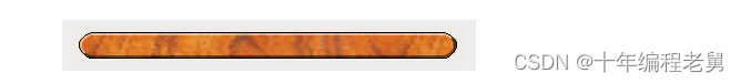
当对QPushButton进行样式设置时,经常想要使用image作为按钮的图像。通常使用background-image属性,但这样有很多缺陷:例如,背景会隐藏显示在按钮装饰后面。此外,如果按钮大小改变,整个背景会被缩放,这样看起来会不太好。
由于border-image属性总是显示图像,使用使用border-image属性会更好,border-image属性对于按钮的缩放有特殊的设置。
QPushButton
{
    color: grey;
    border-image: url(/home/kamlie/code/button.png) 3 10 3 10;
    border-top: 3px transparent;
    border-bottom: 3px transparent;
    border-right: 10px transparent;
    border-left: 10px transparent;
}
以上样式表会产生的按钮如下:

url后的数字分别是图像的顶、右、底、左。这些尺寸相当于边框,大小改变时不会被缩放。无论何时改变按钮大小,图像的中部会在两个方向上缩放,而样式表中指定的图像不会这样。这会使按钮的边框看起来更自然。
本文福利,莬费领取Qt开发学习资料包、技术视频,内容包括(Qt实战项目,C++语言基础,C++设计模式,Qt编程入门,QT信号与槽机制,QT界面开发-图像绘制,QT网络,QT数据库编程,QT项目实战,QSS,OpenCV,Quick模块,面试题等等)↓↓↓↓↓↓见下面↓↓文章底部点击莬费领取↓↓


 1万+
1万+


 被折叠的 条评论
为什么被折叠?
被折叠的 条评论
为什么被折叠?
 到【灌水乐园】发言


