


总结
1.overflo:hidden(溢出 隐藏,超出部分的内容不显示)
2.动画名称 :run 运行一次的时间:5s 运动的速率(匀速运动):linear 无限循环:infinite 往返动作:alternate
使用格式:run+运动时间
3.动画制作的代码
translate: 移动
rotate:旋转
scale:缩放
@keyframes run {
            0% {
                transform: translateX(0) rotate(0) scale(1);
            }
            50% {
                transform: translateX(250px) rotate(180deg) scale(0.5);
            }
            100% {
                transform: translateX(500px) rotate(360deg) scale(1.2);
            }
        }
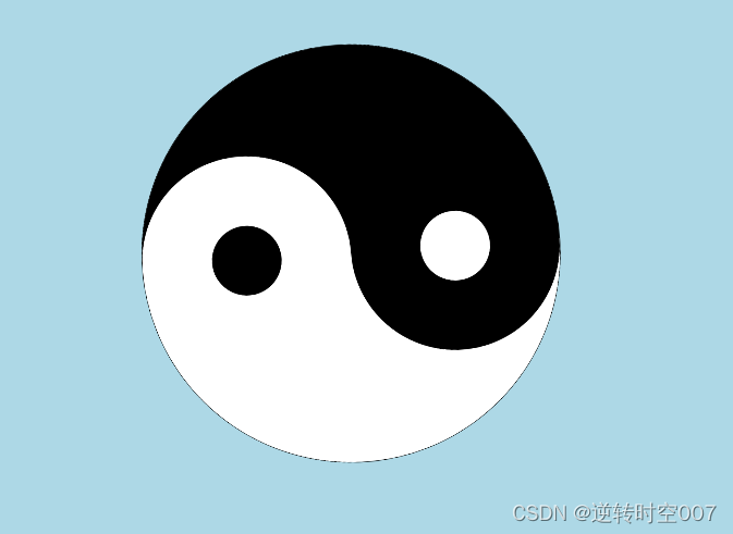
太极动图完整代码
<!DOCTYPE html>
<html lang="en">
<head>
    <meta charset="UTF-8">
    <meta name="viewport" content="width=device-width, initial-scale=1.0">
    <title>Document</title>
    <style>
        body {
            background-color: lightblue;
        }
        .box {
            width: 600px;
            height: 600px;
            position: relative;
            border: 1px solid black;
            border-radius: 50%;
            /* 溢出 隐藏,超出范围的内容不显示 */
            overflow: hidden;
            /*
                动画名称 :run
                运行一次的时间:5s
                运动的速率(匀速运动):linear
                无限循环:infinite
                往返动作:alternate
            */
            animation: run 5s linear infinite alternate;
        }

        /*
            translate: 移动
            rotate:旋转
            scale:缩放
        */
        @keyframes run {
            0% {
                transform: translateX(0) rotate(0) scale(1);
            }
            50% {
                transform: translateX(250px) rotate(180deg) scale(0.5);
            }
            100% {
                transform: translateX(500px) rotate(360deg) scale(1.2);
            }
        }

        .top_div {
            height: 300px;
            background-color: white;
        }
        .bottom_div {
            height: 300px;
            background-color: black;
        }
        .box2 {
            width: 300px;
            height: 300px;
            position: absolute;
            top: 150px;
            border-radius: 50%;
        }
        .left_0 {
            left: 0;
        }
        .right_0 {
            right: 0;
        }
        .box3 {
            width: 100px;
            height: 100px;
            border-radius: 50%;
            position: absolute;
            left: 0;
            right: 0;
            top: 0;
            bottom: 0;
            margin: auto;
        }
        .white_bg {
            background-color: white;
        }
        .black_bg {
            background-color: black;
        }

    </style>
</head>
<body>
    <div class="box">
        <div class="top_div"></div>
        <div class="bottom_div"></div>

        <div class="box2 left_0 black_bg">
            <div class="box3 white_bg"></div>
        </div>

        <div class="box2 right_0 white_bg">
            <div class="box3 black_bg"></div>
        </div>
    </div>
</body>
</html>
效果图:


 9594
9594


 被折叠的 条评论
为什么被折叠?
被折叠的 条评论
为什么被折叠?
 到【灌水乐园】发言


