


一、具体要求:
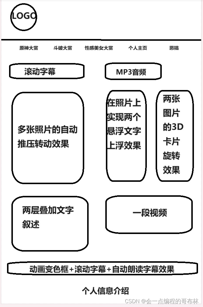
1、站点文件夹结构:img文件夹,css文件夹,js文件夹,文件命名正确(首页为index.html)。站点主题自定,要求站点内至少为6个页面,通过超链接进行连接。从首页能够访问到二级页面,每个二级页面都能够返回首页。
2、网页布局设计:采用CSS+DIV、table或者框架实现都可以,要求布局合理、结构清晰。可使用flex弹性布局,以适应不同浏览器宽度。
3、网页样式设计:采用CSS对网页样式进行设计,至少包括对页面中文本颜色、背景颜色(图像)、段落格式、超链接格式等的样式设计。要求采用外部链接的方式对CSS进行使用,即需要独立的CSS文件,一般保存名为style.css。
4、站点中需要使用到javascript编写的脚本,可以是对表单的验证、简单交互等,JavaScript脚本以独立的.js文件存在,通过<script>标记与html文档关联。
5、网页中的文本、图像等元素比例适中,能够合理反应页面主题即可,不需要放置过多的图像等多媒体元素。
二、以下是一级和二级html文档加注释:
1、主菜单(index.html)与主页面
<!DOCTYPE html>
<html>
	<head>
		<meta charset="utf-8" />
		<title></title>
		<link href="css/index.css" rel="stylesheet" type="text/css">

	</head>
	<body>
		<div id="head2">
			<div id="he1">水光潋滟晴方好</div>
			<div id="he2">山色空蒙雨亦奇</div>
		</div>
		<div id="con">
			<!-- <div id="head">
				<div id="head1"><img src="img/1018.png"/></div>
			</div> -->
			<div id="nav">
				<div id="logo"><img src="img/1018.png"/></div>
				<ul>
					<li>
						<a href="0005.html">你需要的文本内容</a>
					</li>
					<li>
						<a href="0006.html">你需要的文本内容</a>
					</li>
					<li>
						<a href="0002.html">你需要的文本内容</a>
					</li>
					<li>
						<a href="0001.html">你需要的文本内容</a>
					</li>
					<li>
						<a href="0003.html">你需要的文本内容</a>
					</li>
				</ul>
			</div>
			<div id="right">
				<div id="right1">
					<!-- <img src="img/1009.jpg"/> -->
					<div id="right2">
						<p>你需要的文本内容</p>
					</div>
					<div id="right3">
						<p>你需要的文本内容</p>
					</div>
				</div>
				<div id="right4">
					<audio controls loop>
						<source src="img/1011.mp3"/>
					</audio>
				</div>
				<div id="right5">
					<video controls loop>
						<source src="img/1010.mp4"/>
					</video>
				</div>
				<div id="right6">
					<img class="tu1" src="img/1016.jpeg"/>
					<img class="tu2" src="img/116.jpg"/>

				</div>
			</div>
			<div id="left">
				<div id="left1">
					<img src="img/1019.jpg" alt="Photo 1" class="photo"/>
					<img src="img/1020.jpg" alt="Photo 2" class="photo"/>
					<img src="img/1021.jpg" alt="Photo 3" class="photo"/>
					<img src="img/1025.jpg" alt="Photo 4" class="photo"/>
					<img src="img/1026.jpg" alt="Photo 5" class="photo"/>
					<img src="img/1023.jpg" alt="Photo 6" class="photo"/>
					<img src="img/1024.jpg" alt="Photo 7" class="photo"/>
					<!-- <img src="img/117.jpg" alt="Photo 8" class="photo"/> -->
				</div>
				<div id="left2">
				柳神 陆雪琪 小医仙
				</div>
				<div id="left3">你需要的文本内容</div>
			</div>
			<div id="bottom">
				<div id="bottom1">你需要的文本内容</div>
				<button id="bottom2" onclick="speakText()">朗读文本</button>
			</div>
		</div>
		<div id="self">
			<div id="self1">你需要的文本内容</div>
			<div id="self2">
				<button onclick="scrollToTop()" id="backToTop">
					<img src="img/1055.png"/>
				</button>

			</div>
		</div>
		  <script src="js/index.js" defer></script>
		<script>
		function speakText() {
		  // 获取需要朗读的文本
		  var bottom1 = document.getElementById('bottom1');
		  var textToSpeak = bottom1.innerText;
		  // 创建语音合成对象
		  var synth = window.speechSynthesis;

		  // 创建语音消息
		  var utterance = new SpeechSynthesisUtterance(textToSpeak);

		  // 开始朗读
		  synth.speak(utterance);
		}
		</script>
	</body>
</html>
其中图片组要自己插入。
css效果:就是上面index.html中css文件<link href="css/index.css" rel="stylesheet" type="text/css">引入就行了。
           body{
				margin: 0px;

			background: wheat;
			}
			#con{
				width: 1200px;
				height: 1200px;
				background-image: url("../img/1008.jpg");
				background-size: cover;
				border: 0px solid rebeccapurple;
				position: relative;
				margin: 0px auto;
				border-radius: 40px;
			}
			#head,#nav,#left,#right,#bottom{
				position: absolute;
			}
			#head{
				width: 1200px;
				height: 200px;
				background: green;
				top: 0px;left: 0px;
				border-radius: 20px;
				background-image: url("../img/008.jpg");
			}
			#head1{
				width: 100px;
				height: 100px;
				background: green;
				position: absolute;
				top: 50px;left: 50px;
				border-radius: 50%;
			}
			#head1 img{
				width: 100px;
				height: 100px;
				border-radius: 50%;
			}
			#nav{
				width: 1200px;
				height: 50px;
				top: 0px;left: 0px;

			}
			#logo{
				width: 50px;
				height: 50px;
				position: absolute;
				top: 0px;left: 30px;
			}
			#nav img{
				border-radius: 50%;
			}
			ul li{
				float: left;
				margin: 0px 0px 0px 120px;
				list-style-type: none;
			}
			#nav ul li a{
				text-decoration: none;
				color:wheat;
				display: block;
				width: 100px;
				text-align: center;
				line-height: 50px;
			}
			a:hover{
				background: rebeccapurple;
				color: aquamarine;
			}
			#left{
				width: 400px;
				height: 1000px;
				top: 80px;left: 0px;
				border-radius: 20px;
				overflow: hidden;
			}
			#left1{
				width: 400px;
				height: 550px;
				position: absolute;
				top: 100px;left: 0px;
				border-radius: 20px;
				overflow: hidden;
			}
			#left1 img{
				width: 400px;
				height: 550px;
				border-radius: 20px;
				position: absolute;
				opacity: 0;
				transition: opacity 1s, transform 1s;
			}
			#left2{width: 600px;height: 50px;position: absolute; top: 25px;left: 50px;border-radius: 10px;
			      color:transparent;line-height: 50px;text-align: center;font-size: 50px;-webkit-text-stroke: 1px green;filter: drop-shadow(0px 1px 10px #B5E61D);
				  animation: marqueet 10s linear infinite;overflow: hidden;}
				  #left3{width: 300px;height:250px;position: absolute;top: 700px;left: 50px;border-radius: 20px;
				  box-shadow: 20px 10px 0px rgba(228, 197, 169, 0.5);
				  text-indent: 2em;font-family: '正楷';font-size: 20px;color: aliceblue;line-height: 40px;
				  }
			#right{
				width: 800px;
				height: 1000px;
				top: 50px;left: 400px;
				border-radius: 20px;
				position: relative;
			}

			#right1{
				position: absolute;
				width: 300px;
				height: 533px;
				background: rebeccapurple;
				top: 200px;left: 80px;
				overflow: hidden;
				border-radius: 20px;
				background-image: url("../img/1009.jpg");border: 1px solid rebeccapurple;
			}
			#right2{
				box-sizing: border-box;
				width: 100px;
				height: 355px;
				margin: 0px;
				font-size: 25px;
				text-indent: 2em;
				line-height: 25px;
				position: absolute;
				top: 480px;
				transition: 3s;
			}
			#right3{
				position: absolute;
				box-sizing: border-box;
				width: 50px;
				height: 355px;
				top: 450px;left:250px ;
				font-size: 40px;
				font-family: '隶书';
				transition: 1s;}
			#right2:hover{
				top: 0px;
				color: lightcoral;
				background-color: none;}
			#right3:hover{
				top: 20px;
				color: black;}
			#right4{
				position: absolute;
				width: 300px;
				height: 100px;
				top: 30px;left: 80px;}
			audio{
				width: 300px;
				height: 100px;
				}
			#right5{
				position: absolute;
				width: 300px;
				height: 200px;
				top: 760px;left: 80px;}
			video{
				width: 300px;
				height: 200px;
				border-radius: 20px;}
			#right6{
				width: 300px;
				height: 533px;
				position: relative;
				backface-visibility: hidden;
				transform: matrix3d();}
			#right6 img{
				position: absolute;
				width: 300px;
				height: 533px;
				top: 200px;left: 450px;
				border-radius: 20px;
				backface-visibility: hidden;
				transition: 3s;
			}
			.tu1{
				transform: rotateY(180deg);}
			#right6:hover .tu1{
				transform: rotateY(0deg);}
			#right6:hover .tu2{
				transform: rotateY(-180deg);}
			#bottom{
				width: 1200px;
				height: 80px;
				border-radius: 20px;
				background-color: #33ccff;
				top: 1100px;left: 0px;
				animation: vaitly-color 10s 1s ease-in-out infinite alternate;
				overflow: hidden;
			}
			#bottom1{font-size: 50px;font-family: '宋体';
			animation: marqueet 10s linear infinite;
			white-space: nowrap;
			}
			#bottom2{width: 50px;margin: 0px auto;
				animation: vaitly 10s 1s ease-in-out infinite alternate;}
			@keyframes marqueet{
				0%{transform: translateX(30%);}
				100%{transform: translateX(-100%);}
			}
			@keyframes pushanination{
				0%{transform: translateX(0%);opacity: 0;}
				20%{opacity: 1;}
				80%{opacity: 1;}
				100%{transform: translateX(-100%);opacity: 0;}
			}
			.photo:nth-child(1){animation: pushanination 5s infinite;}
			.photo:nth-child(2){animation: pushanination 5s 1s infinite;}
			.photo:nth-child(3){animation: pushanination 5s 2s infinite;}
			.photo:nth-child(4){animation: pushanination 5s 3s infinite;}
			.photo:nth-child(5){animation: pushanination 5s 4s infinite;}
			.photo:nth-child(6){animation: pushanination 5s 5s infinite;}
			.photo:nth-child(7){animation: pushanination 5s 6s infinite;}
			@keyframes vaitly-color {
				0%,21%,31%,51%,60%,80%,90%,92%{
					background-color: #0e3742;
				}
				20%,30%,50%,60%,80%,90%,100%{
					background-color: wheat;
					box-shadow: 0 0 10px #03bcf4,
					             0 0 20px #03bcf4,
								 0 0 40px #03bcf4,
								 0 0 80px #03bcf4;}
	        }
			#head2{
				width: 100%;height: 200px;background: black;
				border-radius: 20px;
				background-image: url("../img/008.jpg");
				position: relative;
			}
			#he1{width: 500px;height: 50px;position: absolute;top: 50px;left: 25%;
			font-size: 50px;line-height: 50px;letter-spacing: 21px;font-family: 'STXingkai';}
			#he2{width: 500px;height: 50px;position: absolute;top: 100px;left: 40%;
			font-size: 50px;line-height: 50px;letter-spacing: 21px;font-family: 'STXingkai';}
			#self{
				width: 100%;height: 150px;background: wheat;position: relative;
				text-align: center;line-height: 80px;
			}
			#self1{position: absolute;width: 15%;height: 250px;
			    left: 40%;
			}
			#self2{position: absolute;width: 57px;height: 87px;top: 80%;left: 80%;border-radius: 20px;}
			#self2 img{border-radius: 10px;}
js文件引入:如何引入javascript文件:在想引入的html文件中的<body><body/>中<script src="js/index.js" defer></script>就行了:
function scrollToTop() {
  window.scrollTo({
    top: 0,
    behavior: 'smooth' // 这将平滑地滚动到顶部
  });
}
js文件的效果:需要自己插入图片上述代码中有示例
index.html实现的效果图:
2、需要的二级HTML文件0001.html
<!DOCTYPE html>
<html lang="en">
<head>
<meta charset="UTF-8">
<meta name="viewport" content="width=device-width, initial-scale=1.0">
<title>你需要的文本内容</title>
<style>
	*{
		margin: 0;padding: 0;
		box-sizing: border-box;
		font-family: arial;
	}
	body{
		display: flex;
		align-items: center;
		justify-content: center;
		min-height: 100vh;
		background-color: #07252d;
	}
	div{
		position: relative;
		font-size: 80px;
		letter-spacing: 15px;
		text-transform: uppercase;
		color: #0e3742;
		text-align: center;
		line-height: 0.7em;
		-webkit-box-reflect: below 10px linear-gradient(transparent,#0008);
		animation: animate 5s linear infinite;
	}
	a{
		text-decoration: none;color: #0e3742;
	}
	@keyframes animate{

		0%,21%,31%,51%,60%,80%,90%,92%{
			color: #0e3742;
		}
		20%,30%,50%,60%,80%,90%,100%{
			color: #fff;
			text-shadow: 0 0 10px #03bcf4,
			             0 0 20px #03bcf4,
						 0 0 40px #03bcf4,
						 0 0 80px #03bcf4;
		}
	}
</style>
</head>
<body>


<div><a href="index.html">你需要的文本内容。</a></div>

</body>
</html>
上述html中实现的是css样式内嵌,无需单独的css文件引入。
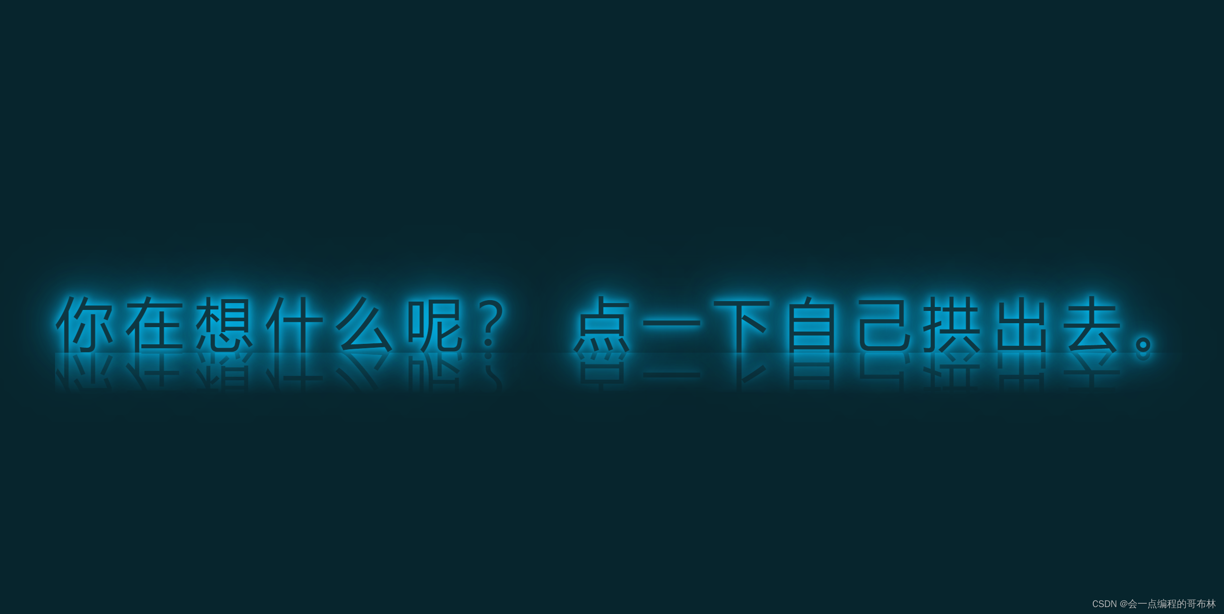
效果:发光,加倒影,文字链接。
3、需要的二级HTML文件0002.html
<!DOCTYPE html>
<html>
	<head>
		<meta charset="utf-8">
		<title></title>
		<style>
			#div1{
				width: 1700px;
				height: 800px;
				/* border: 1px solid rebeccapurple; */
				background-image: url('img/1004.jpg');
				position: relative;
				border-radius: 40px;
			}
			#div2{
				position: absolute;
				width: 120px;
				height: 125px;
				background: rebeccapurple;
				background-image: url('img/1003.jpg');
				top: 330px;left: 650px;
				border-radius: 125px;
				animation: move 3s infinite;
			}
			@keyframes move{
				0%{
					transform: translateY(0px);
				}
				50%{
					transform: translateY(345px);
				}
			}
			/* #div2:hover{
				top: 675px;
				left: 650px;
			} */
			#div3{
				position: absolute;
				width: 120px;
				height: 125px;
				background: rebeccapurple;
				background-image: url('img/1003.jpg');
				top: 330px;left: 1520px;
				border-radius: 125px;
				animation: move 3s infinite;
			}
			@keyframes move{
				0%{
					transform: translateY(0px);
				}
				50%{
					transform: translateY(345px);
				}
			}
			#div4{
				position: absolute;
				top: 200px;left: 720px;
				/* display: none; */
			}
			#div4:hover{
				display: block;
			}

			/* #div3:hover{
				top: 675px;
				left: 1520px;
			} */
			#div8{
				width: 600px;height: 40px;
				position: absolute;top: 100px;left: 630px;
			}
			a{
				text-decoration: none;color: black;line-height: 40px;font-size: 30px;letter-spacing: 5px;
			}
		</style>
	</head>
	<body>
		<div id="div1">
			<div id="div8"><a href="index.html">你需要的文本内容</a></div>
			<div id="div4">
				<audio autoplay controls loop>
					<source src="img/1007.mp3"/>
				</audio>
			</div>
			<div id="div2">
				<!-- <img src="img/1003.jpg"/> -->
			</div>
			<div id="div3">

			</div>

		</div>
	</body>
</html>
很简单的一个css内嵌,实现一个恶搞动画。
4、
<!DOCTYPE html>
<html>
	<head>
		<meta charset="utf-8">
		<title></title>
		<style>
			*{
				margin: 0;padding: 0;

			}
			.con{
				display: flex;
				flex-direction: column;
				width: 100%;height: 100%;
			}
			#con1{
				width: 100%;height: 400px;
				background: rgb(173, 161, 161);
			}
			.con2{
				width: 100%;height: 400px;

				/* border: 1px solid green; */
				margin: 0px 0px 20px 0px;
				position: relative;
				display: flex;flex-direction: column;
			}
			.con #con1 img{
				width: 50%;height: 400px;
			}
			.con2 img{
				width: 100%;height: 400px;
				border-radius: 40px;
			}
			#con3{backface-visibility: hidden;transform: matrix3d();}
			#con3 img{width: 240px;height: 360px;position: absolute;top: 20px;left: 20px;border-radius: 20px;
			backface-visibility: hidden;transition: 3s;
			}
			.tu1{transform: rotateY(180deg);}
			#con3:hover .tu1{transform: rotateY(0deg);}
			#con3:hover .tu2{transform: rotateY(-180deg);}
			#con4{width: 60%;height: 60%;position: absolute;
			top: 40px;left: 600px;font-family: '隶书';font-size: 20px;
		line-height: 1.5;text-indent: 2em;
			}
			#con4:hover{font-family: 'STXingkai
最低0.47元/天 解锁文章


 被折叠的 条评论
为什么被折叠?
被折叠的 条评论
为什么被折叠?
 到【灌水乐园】发言


