


健康生活应用参考了黑马程序员实战案例https://www.bilibili.com/video/BV1Sa4y1Z7B1?p=38&vd_source=49f2a8575dc8ef2586b13f73d3ac1808
首页UI设计与实现:打造动态交互的用户体验
一、引言
在当今数字化时代,用户界面(UI)设计对于提升用户体验至关重要。本文将详细介绍如何设计一个具有吸引力和功能性的首页UI,包括使用tabs组件、列表页UI设计,以及集成自定义弹窗和数字键盘。
二、首页UI设计概述
结构图示:
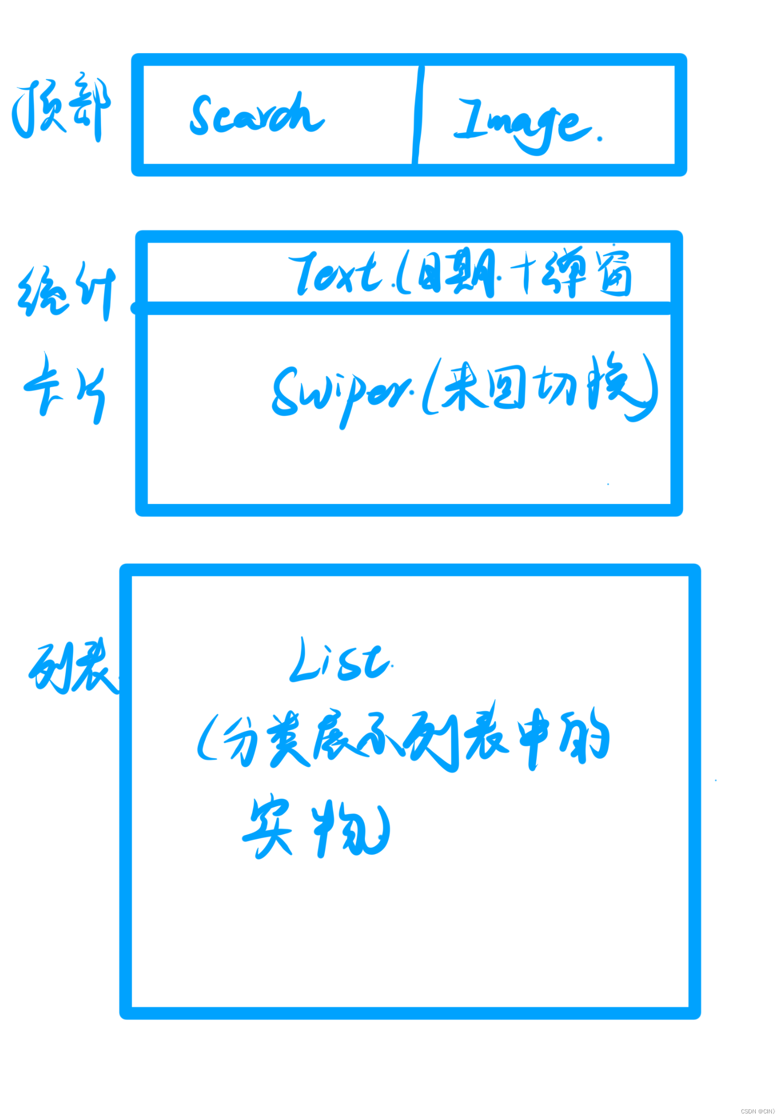
1、首页布局
import DateUtil from '../../common/utils/DateUtil'
import RecordService from '../../service/RecordService'
import RecordVO from '../../viewmodel/RecordVO'
import RecordList from './RecordList'
import SearchHeader from './SearchHeader'
import StatsCard from './StatsCard'
import router from '@ohos.router'
import GroupInfo from '../../viewmodel/GroupInfo'
import RecordType from '../../viewmodel/RecordType'
import AddInformation from './AddInformation'

@Component
export default struct RecordIndex {

  @StorageProp('selectedDate')
  @Watch('aboutToAppear')//检测日期是否变更
  selectedDate: number = DateUtil.beginTimeOfDay(new Date())
  // @StorageProp('selectedDate') selectedDate: number = DateUtil.beginTimeOfDay(new Date())
  @Provide records: RecordVO[] = []

  @Prop @Watch('handlePageShow') isPageShow: boolean
  @State groups: GroupInfo<RecordType, RecordVO>[] = [];

  handlePageShow(){
    if(this.isPageShow){
      this.aboutToAppear()
    }
  }
//当加载的时候查询
  async aboutToAppear() {
    //查询
    this.records=await RecordService.queryRecordByDate(this.selectedDate);
  }

  build() {
    Column(){
      // 1.头部搜索栏
      SearchHeader()
      // 2.统计卡片
      StatsCard()
      // 3.记录列表
      RecordList()
        .layoutWeight(1)
      //4.跳转到添加饮食或者是运动信息
      // AddInformation();
      //5.遍历今天吃的食物或者做的运动


      // List({space: 10}){
      //   ForEach(
      //     this.groups,
      //     (item: any, index) => {
      //       ListItem() {
      //         // 展示每个分组的标题和总热量
      //         Text(item.type.name + ': ' + item.calorie + ' 千卡')
      //           .fontSize(16)
      //           .fontWeight(FontWeight.Bold);
      //         //遍历分组中的记录项并展示
      //         item.items.forEach((record) => {
      //           // 展示记录项的详细信息
      //           Text(`记录项: ${record.recordItem.name}, 数量: ${record.amount}, 热量: ${record.calorie} 千卡`);
      //         }
      //         )
      //       }
      //     }
      //   )
      // }
      // ForEach(
      //   this.groups,
      //   (item:any,index?:number)=>{
      //     // 展示每个分组的标题和总热量
      //     Text(item.type.name + ': ' + item.calorie + ' 千卡')
      //       .fontSize(16)
      //       .fontWeight(FontWeight.Bold);
      //     // 遍历分组中的记录项并展示
      //     item.items.forEach((record) => {
      //       // 展示记录项的详细信息
      //       Text(`记录项: ${record.recordItem.name}, 数量: ${record.amount}, 热量: ${record.calorie} 千卡`);
      //
      //     }
      //   }
      // )
      // // this.groups.forEach((group) => {
      // //   // 展示每个分组的标题和总热量
      // //   Text(group.type.name + ': ' + group.calorie + ' 千卡')
      // //     .fontSize(16)
      // //     .fontWeight(FontWeight.Bold);
      // //   // 遍历分组中的记录项并展示
      // //   group.items.forEach((record) => {
      // //     // 展示记录项的详细信息
      // //     Text(`记录项: ${record.recordItem.name}, 数量: ${record.amount}, 热量: ${record.calorie} 千卡`);
      // //   });
      // // });

    }
    .width('100%')
    .height('100%')
    .backgroundColor($r('app.color.index_page_background'))

  }

}
2、 设计目标
- 提供清晰的导航和直观的用户体验。
- 实现响应式设计,适配不同设备和屏幕尺寸。
- 集成功能性组件,如搜索栏、日期选择器、swiper等。
3、 Tabs组件实现
3.1Tabbar和Tabcontent
使用tabs组件实现页面的动态切换,通过修改barposition和vertical属性,实现不同布局和方向的切换。
Tabbar:
import BreakpointType from '../common/bean/BreanpointType'
import BreakpointConstants from '../common/constants/BreakpointConstants'
import { CommonConstants } from '../common/constants/CommonConstants'
import BreakpointSystem from '../common/utils/BreakpointSystem'
import MyHomePage from '../view/record/MyHomePage'
import FindPage from '../view/record/FindPage'
import RecordIndex from '../view/record/RecordIndex'


@Entry
@Component
struct Index {
  @State currentIndex: number = 0
  @State flag:number=0;
  private breakpointSystem: BreakpointSystem = new BreakpointSystem()
  @StorageProp('currentBreakpoint') currentBreakpoint: string = BreakpointConstants.BREAKPOINT_SM

  @State isPageShow: boolean = false

  onPageShow(){
    this.isPageShow = true
  }
  onPageHide(){
    this.isPageShow = false
  }

  @Builder TabBarBuilder(title: ResourceStr, image: ResourceStr, index: number) {
    Column({ space: CommonConstants.SPACE_8 }) {
      Image(image)
        .width(22)
        .fillColor(this.selectColor(index))
      Text(title)
        .fontSize(14)
        .fontColor(this.selectColor(index))
    }
  }

  aboutToAppear(){
    this.breakpointSystem.register()
  }

  aboutToDisappear(){
    this.breakpointSystem.unregister()
  }

  selectColor(index: number) {
    return this.currentIndex === index ? $r('app.color.primary_color') : $r('app.color.gray')
  }

  build() {
    Tabs({ barPosition: BreakpointConstants.BAR_POSITION.getValue(this.currentBreakpoint) }) {
      TabContent() {
        RecordIndex({isPageShow: this.isPageShow})
      }
      .tabBar(this.TabBarBuilder($r('app.string.tab_record'), $r('app.media.ic_calendar'), 0))

      TabContent() {
         FindPage();
      }
      .tabBar(this.TabBarBuilder($r('app.string.tab_discover'), $r('app.media.discover'), 1))

      TabContent() {
        MyHomePage();
      }
      .tabBar(this.TabBarBuilder($r('app.string.tab_user'), $r('app.media.ic_user_portrait'), 2))

    }
    .width('100%')
    .height('100%')
    .onChange(index => this.currentIndex = index)
    .vertical(new BreakpointType({
      sm: false,
      md: true,
      lg: true
    }).getValue(this.currentBreakpoint))
  }
}
3.2 状态变量
定义状态变量`currentIndex`来跟踪当前激活的tab页面,并根据角标变化实现图标高亮。
onChange(index => this.currentIndex = index)
    .vertical(new BreakpointType({
      sm: false,
      md: true,
      lg: true
    }).getValue(this.currentBreakpoint))
3.3 自定义Tabbar样式
使用builder函数自定义tabbar的样式,包括图标和文字的颜色变化。
 @Builder TabBarBuilder(title: ResourceStr, image: ResourceStr, index: number) {
    Column({ space: CommonConstants.SPACE_8 }) {
      Image(image)
        .width(22)
        .fillColor(this.selectColor(index))
      Text(title)
        .fontSize(14)
        .fontColor(this.selectColor(index))
    }
  }
4、 饮食记录UI设计
4.1 容器和组件
使用column容器,集成搜索栏、卡片和列表,展示饮食记录。
import DateUtil from '../../common/utils/DateUtil'
import RecordService from '../../service/RecordService'
import RecordVO from '../../viewmodel/RecordVO'
import RecordList from './RecordList'
import SearchHeader from './SearchHeader'
import StatsCard from './StatsCard'
import router from '@ohos.router'
import GroupInfo from '../../viewmodel/GroupInfo'
import RecordType from '../../viewmodel/RecordType'
import AddInformation from './AddInformation'

@Component
export default struct RecordIndex {

  @StorageProp('selectedDate')
  @Watch('aboutToAppear')//检测日期是否变更
  selectedDate: number = DateUtil.beginTimeOfDay(new Date())
  // @StorageProp('selectedDate') selectedDate: number = DateUtil.beginTimeOfDay(new Date())
  @Provide records: RecordVO[] = []

  @Prop @Watch('handlePageShow') isPageShow: boolean
  @State groups: GroupInfo<RecordType, RecordVO>[] = [];

  handlePageShow(){
    if(this.isPageShow){
      this.aboutToAppear()
    }
  }
//当加载的时候查询
  async aboutToAppear() {
    //查询
    this.records=await RecordService.queryRecordByDate(this.selectedDate);
  }

  build() {
    Column(){
      // 1.头部搜索栏
      SearchHeader()
      // 2.统计卡片
      StatsCard()
      // 3.记录列表
      RecordList()
        .layoutWeight(1)


    }
    .width('100%')
    .height('100%')
    .backgroundColor($r('app.color.index_page_background'))

  }

}
4.2 搜索栏实现
集成带有搜索图标的搜索框,调整样式以符合设计要求。
import { CommonConstants } from '../../common/constants/CommonConstants'
@Component
export default struct SearchHeader {
  build() {
    Row({space: CommonConstants.SPACE_6}){
      Search({placeholder: '搜索饮食或运动信息'})
        .textFont({size: 18})
        .layoutWeight(1)
      Badge({count: 1, position: BadgePosition.RightTop, style: {fontSize: 12}}){
        Image($r('app.media.ic_public_email'))
          .width(24)
      }
    }
    .width(CommonConstants.THOUSANDTH_940)
  }
}
4.3 卡片设计
设计包含日期信息的卡片,集成弹窗日期选择器和swiper组件,提供左右切换功能。
import BreakpointType from '../../common/bean/BreanpointType'
import BreakpointConstants from '../../common/constants/BreakpointConstants'
import { CommonConstants } from '../../common/constants/CommonConstants'
import DateUtil from '../../common/utils/DateUtil'
import RecordService from '../../service/RecordService'
import RecordVO from '../../viewmodel/RecordVO'
import StatsInfo from '../../viewmodel/StatsInfo'
import CalorieStats from './CalorieStats'
import DatePickDialog from './DatePickDialog'
import NutrientStats from './NutrientStats'

@Component
export default struct StatsCard {

  @StorageProp('selectedDate') selectedDate: number = DateUtil.beginTimeOfDay(new Date())
  @StorageProp('currentBreakpoint') currentBreakpoint: string = BreakpointConstants.BREAKPOINT_SM

  @Consume @Watch('handleRecordsChange') records: RecordVO[]
  @State info: StatsInfo = new StatsInfo();//渲染,当监控到record变化的时候

  //计算
  handleRecordsChange(){
    this.info = RecordService.calculateStatsInfo(this.records)
  }

  controller: CustomDialogController = new CustomDialogController({
    builder: DatePickDialog({selectedDate: new Date(this.selectedDate)})
  })
  build() {
    Column(){
      // 1.日期信息
      Row(){
        Text(DateUtil.formatDate(this.selectedDate))
          .fontColor($r('app.color.secondary_color'))
        Image($r('app.media.ic_public_spinner'))
          .width(20)
          .fillColor($r('app.color.secondary_color'))
      }
      .padding(CommonConstants.SPACE_8)
      .onClick(() => this.controller.open())

      // 2.统计信息
      Swiper(){
        // 2.1.热量统计
        //传参,作为状态变量
        CalorieStats({intake: this.info.intake, expend: this.info.expend})
        // 2.2.营养素统计
        NutrientStats({carbon: this.info.carbon, protein: this.info.protein, fat: this.info.fat})
      }
      .width('100%')
      .backgroundColor(Color.White)
      .borderRadius(CommonConstants.DEFAULT_18)
      .indicatorStyle({selectedColor: $r('app.color.primary_color')})
      .displayCount(new BreakpointType({
        sm: 1,
        md: 1,
        lg: 2
      }).getValue(this.currentBreakpoint))
    }
    .width(CommonConstants.THOUSANDTH_940)
    .backgroundColor($r('app.color.stats_title_bgc'))
    .borderRadius(CommonConstants.DEFAULT_18)
  }
}
4.4 列表实现
使用list组件遍历展示饮食记录,通过@extend定义样式,使用空白组件和swiperaction增强列表美观性和交互性。
Swiper(){
        // 2.1.热量统计
        //传参,作为状态变量
        CalorieStats({intake: this.info.intake, expend: this.info.expend})
        // 2.2.营养素统计
        NutrientStats({carbon: this.info.carbon, protein: this.info.protein, fat: this.info.fat})
      }
      .width('100%')
      .backgroundColor(Color.White)
      .borderRadius(CommonConstants.DEFAULT_18)
      .indicatorStyle({selectedColor: $r('app.color.primary_color')})
      .displayCount(new BreakpointType({
        sm: 1,
        md: 1,
        lg: 2
      }).getValue(this.currentBreakpoint))
5、 列表页UI设计
5.1 整体布局
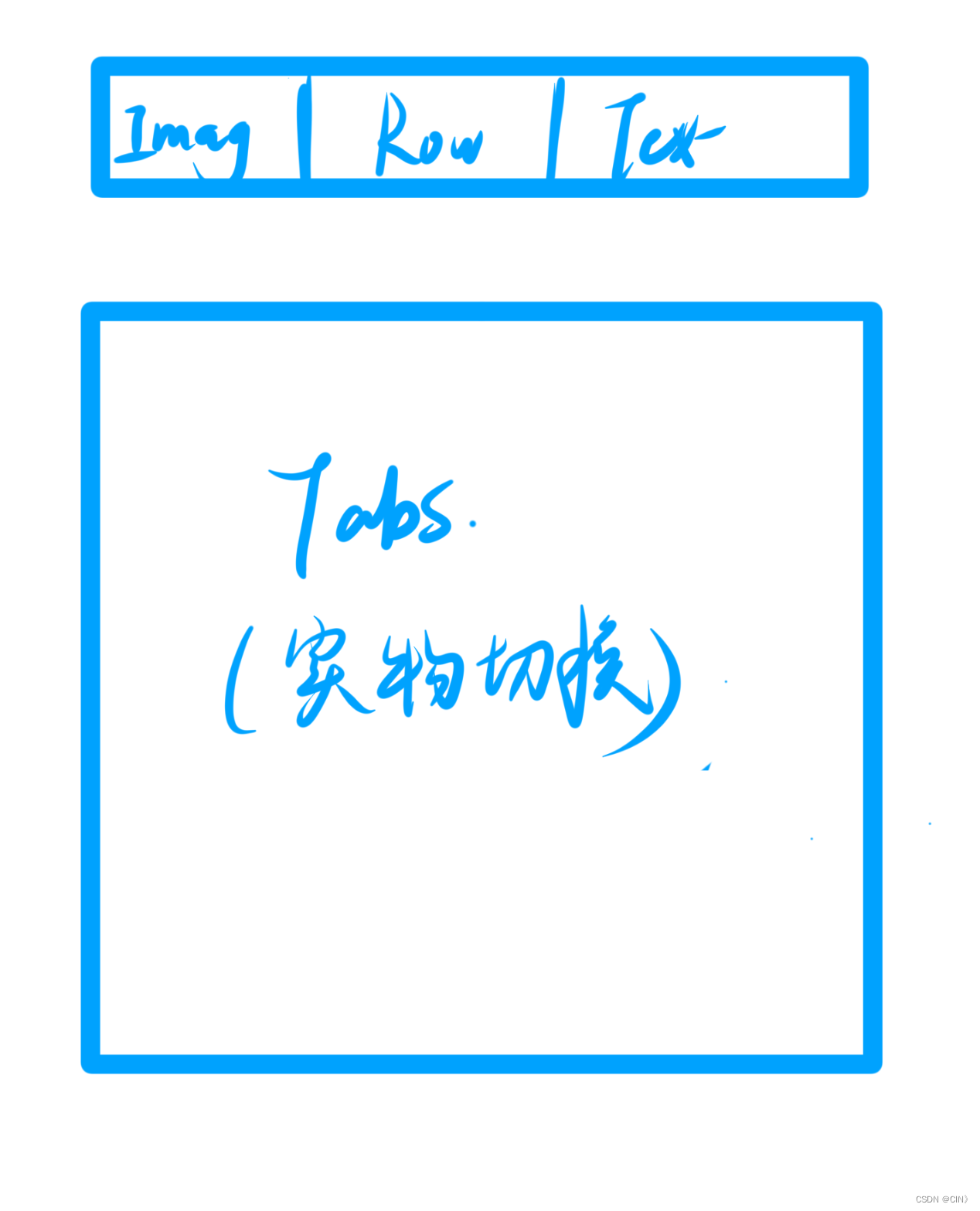
列表页采用column布局,分为头部导航和列表部分,使用@builder设计头部导航。
 @Builder Header() {
    Row() {
      Image($r('app.media.ic_public_back'))
        .width(24)
        .onClick(() => router.back())
      Blank()
      Text(this.type.name).fontSize(18).fontWeight(CommonConstants.FONT_WEIGHT_600)
    }
    .width(CommonConstants.THOUSANDTH_940)
    .height(32)
  }
5.2 列表内容
列表页集成tabs组件和食品展示样式,通过list进行数据遍历和分类展示。
import { CommonConstants } from '../../common/constants/CommonConstants'
import ItemModel from '../../model/ItemModel'
import GroupInfo from '../../viewmodel/GroupInfo'
import ItemCategory from '../../viewmodel/ItemCategory'
import RecordItem from '../../viewmodel/RecordItem'
@Component
export default struct ItemList {
showPanel: (item: RecordItem) => void
@Prop isFood: boolean
build() {
Tabs() {
TabContent() {
this.TabContentBuilder(ItemModel.list(this.isFood))
}
.tabBar('全部')
ForEach(
ItemModel.listItemGroupByCategory(this.isFood),
(group: GroupInfo<ItemCategory, RecordItem>) => {
TabContent() {
this.TabContentBuilder(group.items)
}
.tabBar(group.type.name)
})
}
.width(CommonConstants.THOUSANDTH_940)
.height('100%')
.barMode(BarMode.Scrollable)
}
@Builder TabContentBuilder(items: RecordItem[]) {
List({ space: CommonConstants.SPACE_10 }) {
ForEach(items, (item: RecordItem) => {
ListItem() {
Row({ space: CommonConstants.SPACE_6 }) {
Image(item.image).width(50)
Column({ space: CommonConstants.SPACE_4 }) {
Text(item.name).fontWeight(CommonConstants.FONT_WEIGHT_500)
Text(`${item.calorie}千卡/${item.unit}`).fontSize(14).fontColor($r('app.color.light_gray'))
}.alignItems(HorizontalAlign.Start)
Blank()
Image($r('app.media.ic_public_add_norm_filled'))
.width(18)
.fillColor($r('app.color.primary_color'))
}
.width('100%')
.padding(CommonConstants.SPACE_6)
}
.onClick(() => this.showPanel(item))
})
}
.width('100%')
.height('100%')
}
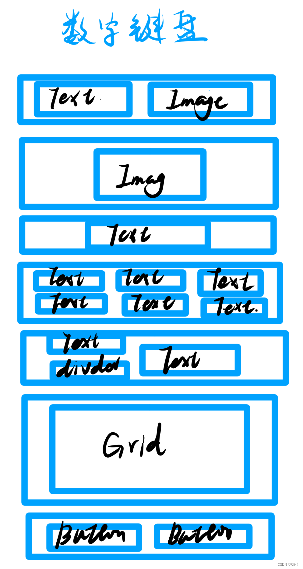
}5.3 底部Panel设计
设计底部固定panel,集成文本、图片、数字键盘和按钮,通过循环创建数字键盘。
 Panel(this.showPanel) {
        // 3.1.顶部日期
        ItemPanelHeader()
        // 3.2.记录项卡片
        if(this.item){
          ItemCard({amount: this.amount, item: $item})
        }
        // 3.3.数字键盘
        NumberKeyboard({amount: $amount, value: $value})
        // 3.4.按钮
        this.PanelButton()
      }
      .mode(PanelMode.Full)
      .dragBar(false)
      .backgroundMask($r('app.color.light_gray'))
      .backgroundColor(Color.White)
数字键盘:
import { CommonConstants } from '../../common/constants/CommonConstants'
@Component
export default struct NumberKeyboard {

  numbers: string[] = ['1', '2', '3', '4', '5', '6', '7', '8', '9', '0', '.']
  @Link amount: number
  @Link value: string


  @Styles keyBoxStyle(){
    .backgroundColor(Color.White)
    .borderRadius(8)
    .height(60)
  }
  build() {
    Grid(){
      ForEach(this.numbers, num => {
        GridItem(){
          Text(num).fontSize(20).fontWeight(CommonConstants.FONT_WEIGHT_900)
        }
        .keyBoxStyle()
        .onClick(() => this.clickNumber(num))
      })
      GridItem(){
        Text('删除').fontSize(20).fontWeight(CommonConstants.FONT_WEIGHT_900)
      }
      .keyBoxStyle()
      .onClick(() => this.clickDelete())
    }
    .width('100%')
    .height(280)
    .backgroundColor($r('app.color.index_page_background'))
    .columnsTemplate('1fr 1fr 1fr')
    .columnsGap(8)
    .rowsGap(8)
    .padding(8)
    .margin({top: 10})
  }

  clickNumber(num: string){
    // 1.拼接用户输入的内容
    let val = this.value + num
    // 2.校验输入格式是否正确
    let firstIndex = val.indexOf('.')
    let lastIndex = val.lastIndexOf('.')
    if(firstIndex !== lastIndex || (lastIndex != -1 && lastIndex < val.length - 2)){
      // 非法输入
      return
    }
    // 3.将字符串转为数值
    let amount = this.parseFloat(val)
    // 4.保存
    if(amount >= 999.9){
      this.amount = 999.0
      this.value = '999'
    }else{
      this.amount = amount
      this.value = val
    }
  }

  clickDelete(){
    if(this.value.length <= 0){
      this.value = ''
      this.amount = 0
      return
    }
    this.value = this.value.substring(0, this.value.length - 1)
    this.amount = this.parseFloat(this.value)
  }

  parseFloat(str: string){
    if(!str){
      return 0
    }
    if(str.endsWith('.')){
      str = str.substring(0, str.length - 1)
    }
    return parseFloat(str)
  }
}
结构图:
三、 结论
通过上述步骤和代码示例,可以实现了一个功能丰富、用户友好的首页UI设计。这不仅增强了用户的交互体验,还提供了清晰的信息架构和直观的操作流程。


 1211
1211

 被折叠的 条评论
为什么被折叠?
被折叠的 条评论
为什么被折叠?
 到【灌水乐园】发言


