


Web前端从入门到精通
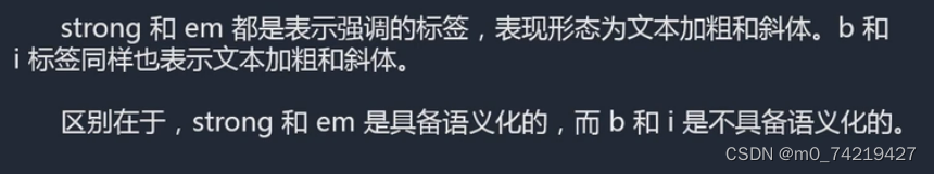
1.加粗与斜体:strong与b,em与i
表现形态都是文本加粗和文本斜体
区别:是否语义化
2.引用标签
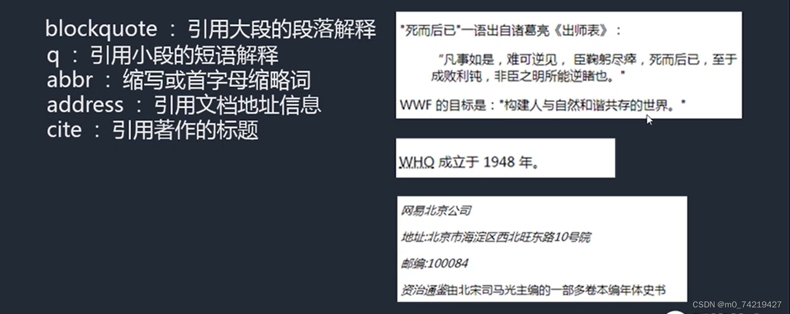
 <p>
        <abbr title="全称"> WHO</abbr>成立于1948年
    </p>
3.iframe嵌套页面
可以引入其他的html到当前html中显示。
主要是利用iframe的属性进行样式调节
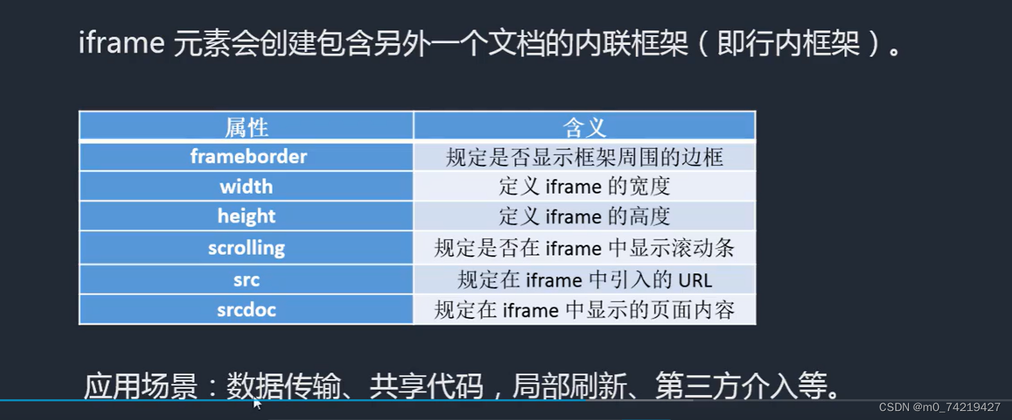
srcdoc和src两个同时存在,只会识别第一个
<p>
        <iframe srcdoc="hello world" src="https://www.bilibili.com/" frameborder="0" scrolling="no"(不加滚动条) width="400" height=""></iframe>
</p>
srcdoc里面也可以加标签<h1> ...<h2>
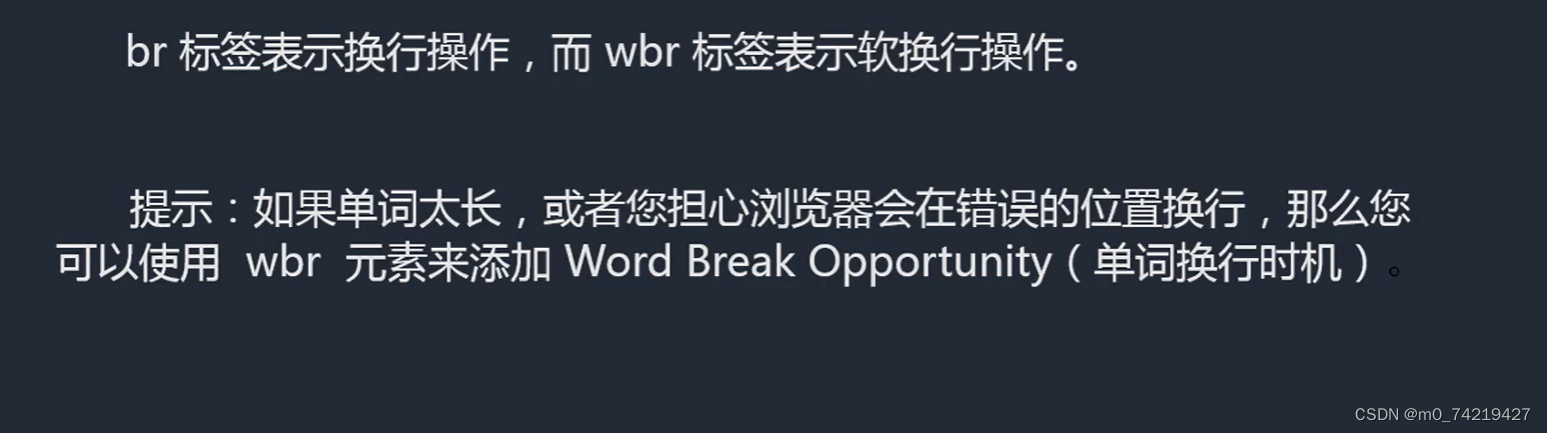
4.换行:br与wbr
5.pre与code组合
针对网页中的程序代码的显示效果。
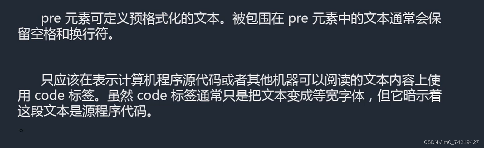
能输出:把<>转义成< >
<body>
<pre>
<code>
<!DOCTYPE html >
<html lang="en">
<head>
<meta charset="UTF-8">
<meta http-equiv="X-UA-Compatible" content="IE=edge">
<meta name="viewport" content="width=device-width, initial-scale=1.0">
<title>Document</title>
</head>
<body>
hello world
</body>
</code>
</pre>
</body>
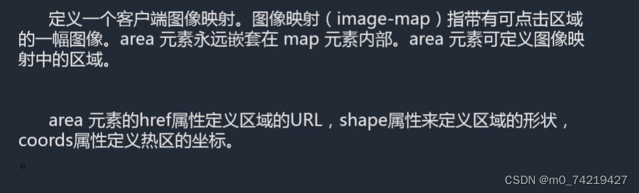
6.map与area(给特殊图像添加链接)
给特殊图形添加链接,area能添加的热区形状:矩形、圆形、多边形
格式:
<body>
    <img src="图片相对路径" alt="" usemap="#名字"> #要写,usemap与下面map对应
    <map name="名字">
    	<area shape="rect(矩形)" coords="205 83 386 173坐标(左上角和右下角的XY)" href="" alt="">
        圆:圆心,半径
        <area shape="poly(多边形)" coords="" href="" alt="">
    </map>
</body
7.embed与object(给flash和一些插件进行渲染操作的标签)
(这俩用的少)
移动端flash兼容较差,一般不用flash
8.audio与video
属于H5的功能。
<audio src="路径" controls(看见控件) loop(重复当前循环) autoplay(自动播放)> </audio>
<video src=""></video>
<div style="width:100%;height:300px;overflow:hidden;">(用个盒子包起来,让video保持正常大小)
        <video style="min-width:100%;min-height:100%;">
            <source src=""></source>
            <source src=""></source>
            <source src=""></source>
        </video>
</div>
设置最小宽高,不会按等比缩放
9.文字注解与文字方向
ruby、rt组合:文字注解
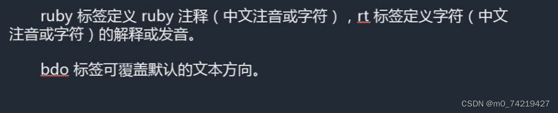
改变方向:dir=“rtl”(反:右向左排列) 与 "ltr"改变
(在head标签里面)
<style>
        span{direction: rtl; unicode-bidi:bidi-override ;}
</style>
10.引入外部资源文件:link标签
加在<tltle></title>下面一排
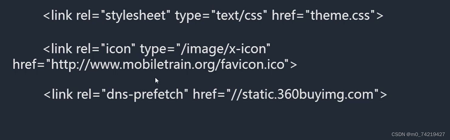
- 通过rel指定文件类型
icon是添加网址标题栏前的小图标
dns解析,加快网站访问速度
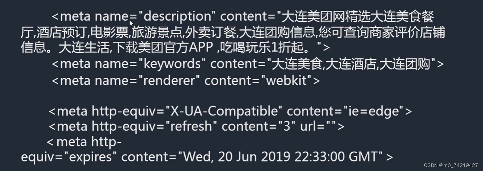
11.meta标签:优化、页面渲染
meta:添加辅助信息
12.html5新语义化标签
(可以用div替代)
1.header,footer,main,hgroup,nav
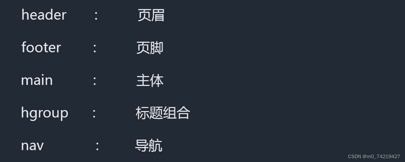
注:header、footer、main标签在一个网页中只能出现一次
header 头部:

里面前两排是 主标题与副标题,两排一起是标题组合hegroup)
导航:博客园、首页 的那一行
footer尾部:
<body>
    <header>
        <hgroup>
            <h1>主标题</h1>
            <h2>副标题</h2>
        </hgroup>

        <nav>
            <ul>
                <li>首页</li>
                <li>论坛</li>
                <li>关于</li>
                <li></li>
            </ul>
        </nav>
    </header>
    <main></main>
    <footer></footer>
</body>
2.article,aside,section,figure,figcaption
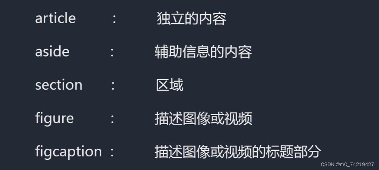
article是一个独立的一整块,section(作用很像div)可以在artivle里面进行划分一个一个列表项
figure、figcaption两个一般组合使用
适合用figure来做的情况:(上面一个图,下面描述)

<main>
        <article>
            <section>
                <ul>
                    <li>
                        <figure>
                            <img src="./img/005Qblgkgy1h7r5cdklx1j30hs0hsn0q.jpg" alt="">
                            <figcaption>
                                海绵宝宝
                                <br>
                                十二生肖
                            </figcaption>
                        </figure>
                    </li>
                </ul>
            </section>
        </article>
    </main>
3.datalist,details/summary,progress/meter,time,mark
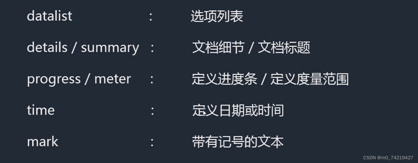
datalist: 用id的方式把联系到一起
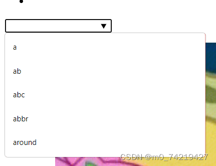
1.datalist
<section>
           <input type="text" list="elems">
              <datalist id="elems">
                    <option value="a"></option>
                    <option value="ab"></option>
                    <option value="abc"></option>
                    <option value="abbr"></option>
                    <option value="around"></option>
              </datalist>
</section>
效果:
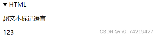
2.details/summary练习:
<details>                        (<details 加open属性>默认展开效果)
                <summary>HTML</summary>
                    <p>超文本标记语言</p>
                    <p>123</p>
</details>
效果:
3.progress/meter
<progress min="0" max="60" value="10"></progress>
<meter min="0" max="10" value="4" low="1" high="8"(value超过这两个最小值最大值,颜色会发生变化) ></meter>

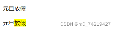
4.time
带有节日这样的时间 ,可以用time包起来
mark增加曝光率
<p>
                <time title="1-1">元旦</time>放假
                <br>
                <br>
                元旦<mark>放假</mark>
</p>
13.flex弹性布局
1.加在父容器上的
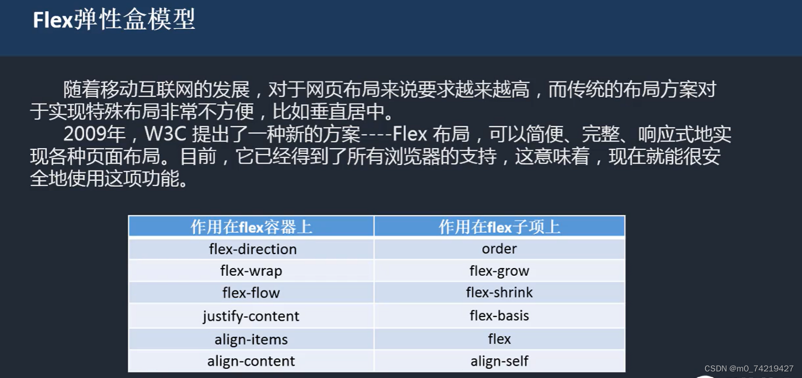
1.flex-direction,flex-wrap
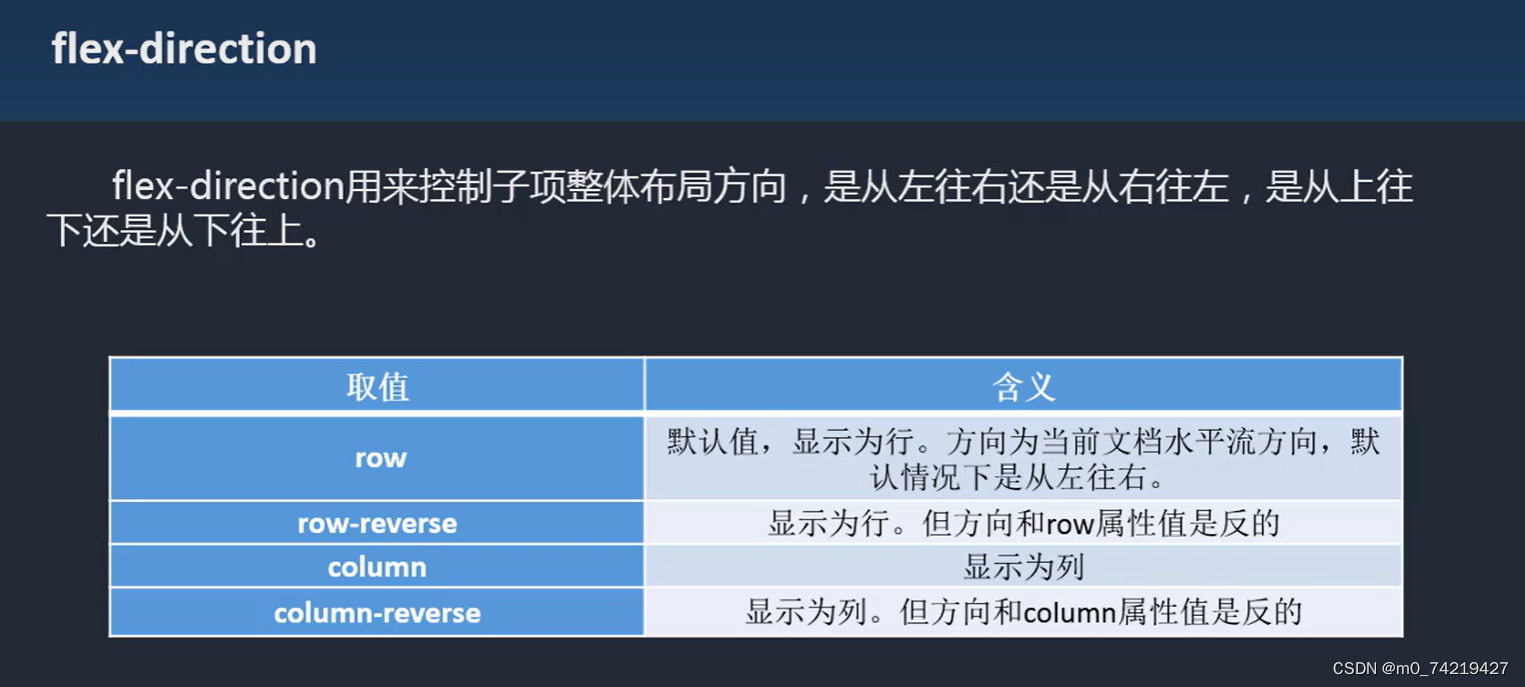
<style>
          #parent{width:300px;height:300px;border:1px black solid;margin:20px auto;display: flex; flex-direction: row-reverse;}    /* display:"flex" 整体形成一个弹性盒子,加上margin:auto可以让元素垂直居中 */
        #box{width:150px;height:50px;background: red;margin: auto;}

        #box{width:300px;height:300px;border:1px black solid;margin:20px auto;display: flex; flex-direction: column-reverse;}
        #box div{width:50px; height:50px;color:aliceblue;line-height: 50px;text-align: center;background: red;}

        #box2{width:300px;height:300px;border:1px black solid;margin:20px auto;display: flex; flex-wrap:wrap;}
        #bo2 div{width:50px; height:50px;color:aliceblue;line-height: 50px;text-align: center;background: red;}
    </style>
</head>
<body>
    <div id="parent">
        <div id="box"></div>
    </div>

    <div id="box">
        <div>1</div>
        <div>2</div>
        <div>3</div>
        <div>4</div>
    </div>
2.flex-flow:
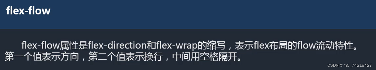
<style>
 #box2{width:300px;height:300px;border:1px black solid;margin:20px auto;display: flex;
  flex-wrap:wrap;  flex-direction: column(列);/*改变方向折行的一种方式  flex-flow: column wrap; 另一种*/}  </style>
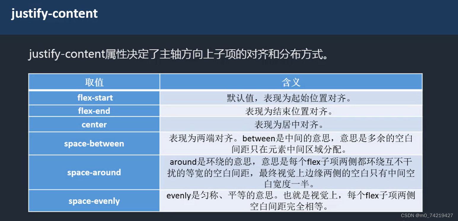
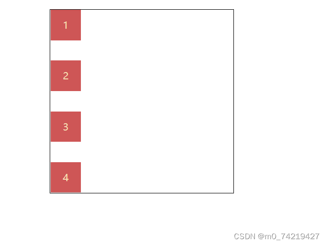
3.justify-content
练习:
#box3{width:300px;height:300px;border:1px black solid;margin:20px auto;display: flex;justify-content: space-between; flex-direction: column;}
#box3 div{width:50px; height:50px;color:wheat;line-height: 50px;text-align: center;background: rgb(206, 86, 86);}
    </style>
</head>
<body>
    <div id="box3">
        <div>1</div>
        <div>2</div>
        <div>3</div>
        <div>4</div>
    </div>
</body>
效果:
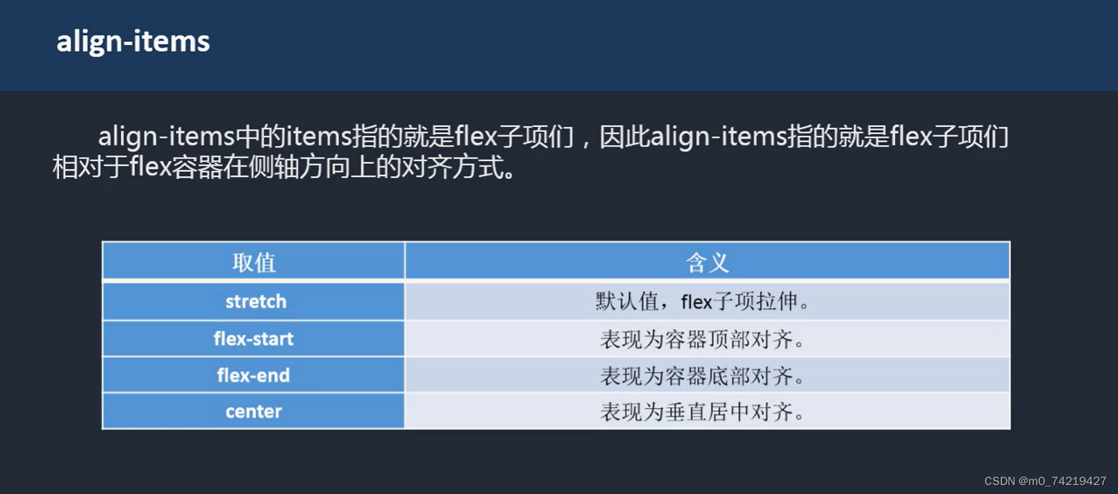
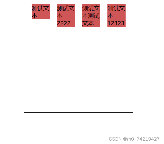
4.align-items(一行)
练习:
<style>
        #box4{width:300px;height:300px;border:1px black solid;margin:20px auto;display: flex;justify-content: space-evenly;align-items: flex-start;}
        #box4 div{width:50px; background: rgb(206, 86, 86);}
    </style>
</head>
<body>
    <div id="box4">
        <div>测试文本</div>
        <div>测试文本2222</div>
        <div>测试文本测试文本</div>
        <div>测试文本12323</div>
    </div>
</body>
效果:
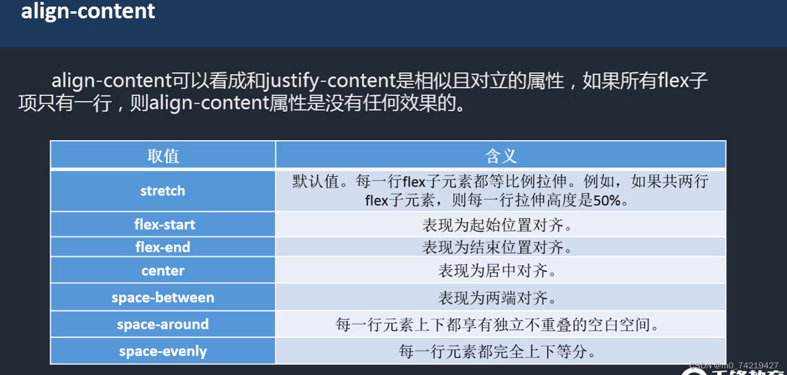
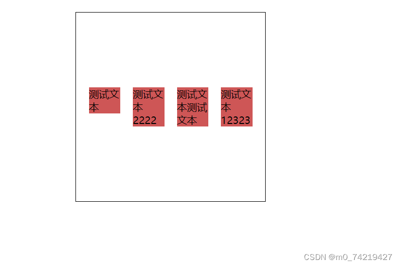
5.align-content (多行)
<style>
        #box4{width:300px;height:300px;border:1px black solid;margin:20px auto;display: flex;justify-content: space-evenly;flex-wrap:wrap; align-items:  flex-start;align-content: space-around;}
        #box4 div{width:50px; background: rgb(206, 86, 86);}
 </style>
2.作用在flex子元素上的CSS属性
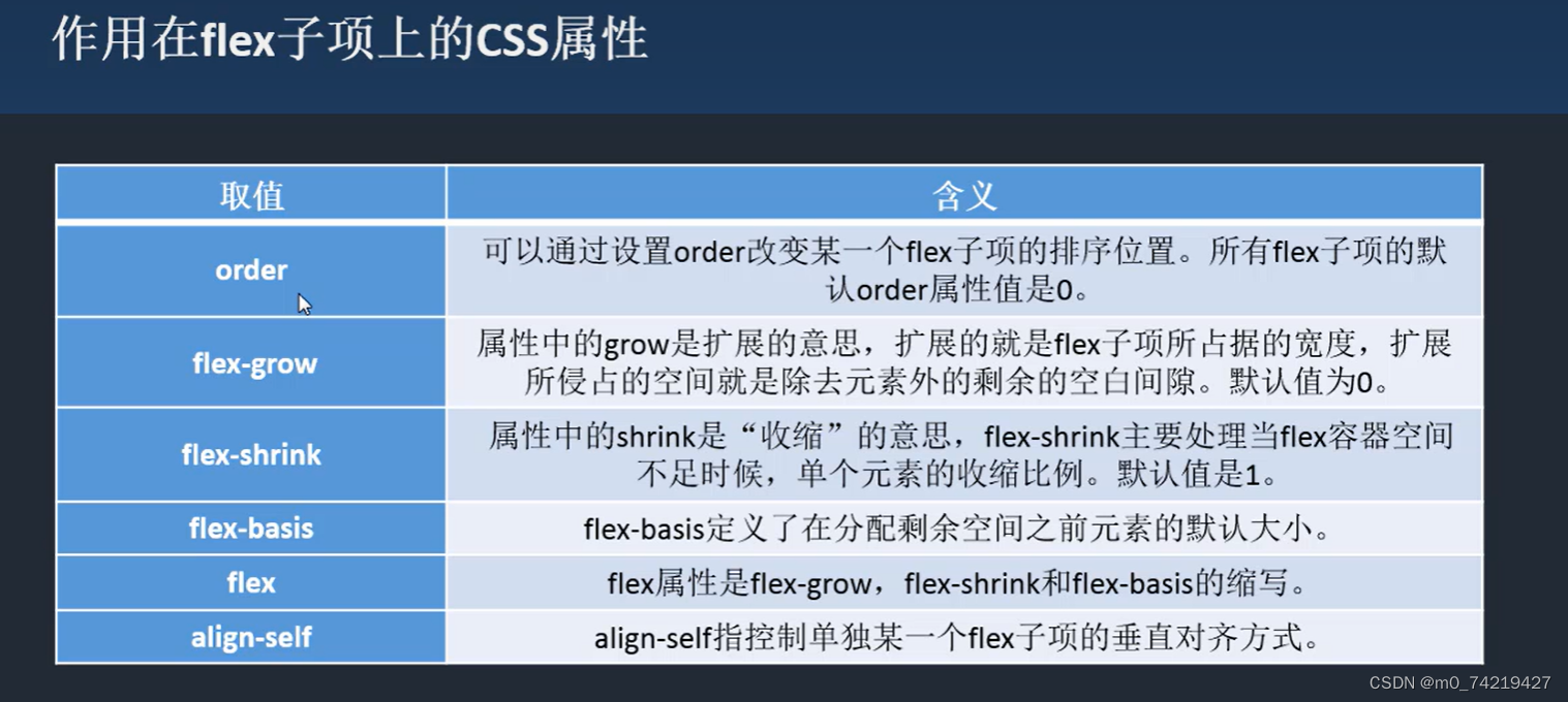
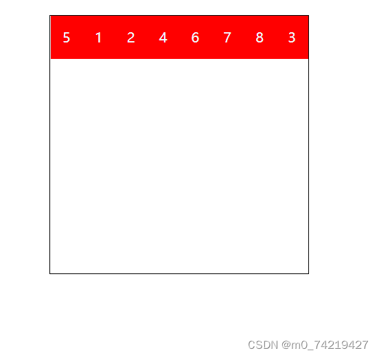
order默认是0,值越大,就会越向后排
order:
<style>
        #box{width:300px;height:300px;border:1px black solid;margin:20px auto;display: flex;}
        #box div{width:50px; height:50px;color:aliceblue;line-height: 50px;text-align: center;background: red;}
        #box div:nth-child(3){order: 1;}
        #box div:nth-child(5){order: -1;}
 </style>
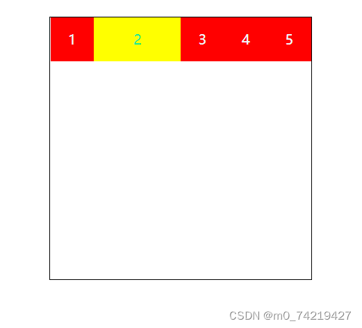
flex-grow (≥1)
全部的空余空间整合是1,超过1的,相同空余空间等比分配
#box div:nth-child(2){background: yellow;color: rgb(17, 235, 151);flex-grow: 1/*把空余的空白全部占满 */;}
flex-basis 给的是像素,不像上面是比例值,优先级高于width
flex属性是flex-grow shrink basis三个的复合写法
flex默认值:0 1 auto(第二三个可省)
想要弹性优先级高于默认宽时,用flex
保留默认宽用 flex-grow
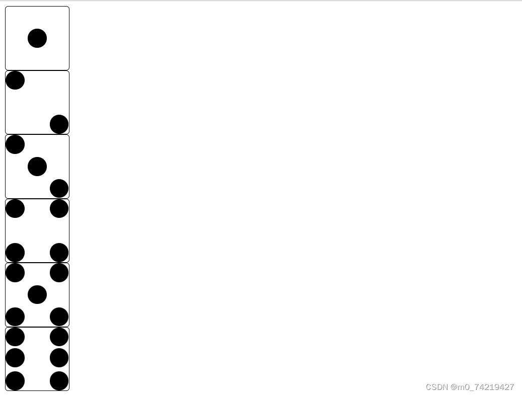
3.flex案例
- 骰子点数
注:1.三个点可以先整体居中align-items: center;,然后第一个放到左上角flex-start起始位置对齐,第二个右下角flex-end
2.四个点可以把两个点做成两行包起来
 <style>
        /* 一个点 */
        #box1{width: 100px;height: 100px;border:1px black solid;border-radius: 5px;display: flex;justify-content: center;align-items: center;}
        #box1 div{width:30%;height:30%;background: black; border-radius:50%;}

        /* 两个点 */
        #box2{width: 100px;height: 100px;border:1px black solid;border-radius: 5px;display: flex;justify-content: space-between;}
        #box2 div{width:30%;height:30%;background: black; border-radius:50%;}
        #box2 div:last-child{align-self: flex-end;}
        /* 三个点 */
        #box3{width: 100px;height: 100px;border:1px black solid;border-radius: 5px;display: flex;justify-content: space-between;align-items: center;}
        #box3 div{width:30%;height:30%;background: black; border-radius:50%;}
        #box3 div:first-child {align-self: flex-start;}
        #box3 div:last-child {align-self: flex-end;}
        /* 四个点 */
        #box4{width: 100px;height: 100px;border:1px black solid;border-radius: 5px;display: flex;flex-wrap: wrap;}
        #box4 div{width:100%;display: flex;justify-content: space-between;}
        #box4 div:last-child{align-items: flex-end;}
        #box4 i{display:block;/* i标签是内联元素,不支持宽高,把转成块 */  width:30%;height:60%;background: black; border-radius:50%;}
        /* 五个点 */
        #box5{width: 100px;height: 100px;border:1px black solid;border-radius: 5px;display: flex;flex-wrap: wrap;}
        #box5 div{width:100%;display: flex;justify-content: center;align-items: center;}
        #box5 div:first-child{align-items: flex-start;justify-content: space-between;}
        #box5 div:last-child{align-items: flex-end;justify-content: space-between;}
        #box5 i{display:block; width:30%;height:90%;background: black; border-radius:50%;}
        /* 六个点 */
        #box6{width: 100px;height: 100px;border:1px black solid;border-radius: 5px;display: flex;flex-wrap: wrap;}
        #box6 div{width:100%;display: flex;justify-content: space-between;}
        #box6 div:first-child{align-items: flex-start;}
        #box6 div:last-child{align-items: flex-end;}
        #box6 i{display:block;width:30%;height:90%;background: black; border-radius:50%;}
    </style>
</head>
<body>
    <div id="box1">
        <div></div>
    </div>
    <div id="box2">
        <div></div>
        <div></div>
    </div>
    <div id="box3">
        <div></div>
        <div></div>
        <div></div>
    </div>

    <div id="box4">
        <div>
            <i></i>
            <i></i>
        </div>

        <div>
            <i></i>
            <i></i>
        </div>
    </div>

    <div id="box5">
        <div>
            <i></i>
            <i></i>
        </div>

        <div>
            <i></i>
        </div>

        <div>
            <i></i>
            <i></i>
        </div>
    </div>

    <div id="box6">
        <div>
            <i></i>
            <i></i>
        </div>

        <div>
            <i></i>
            <i></i>
        </div>

        <div>
            <i></i>
            <i></i>
        </div>
    </div>
</body>
</html>
效果:
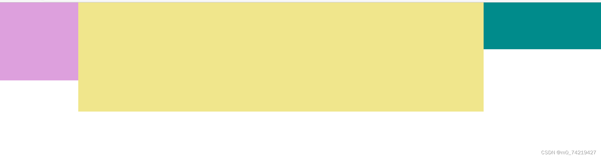
自适应
自适应布局:flex:1,侧边栏大小固定后,内容区会自动放大占满剩余空间。
练习:两列固定,一列自适应
<body>
    <div class="main">
        <div class="main-left"></div>
        <div class="main-center"></div>
        <div class="main-right"></div>
    </div>

<style>
        body{margin:0;padding: 0;}

        .main{display: flex;}
        .main-left{width: 200px;height: 200px;background: plum;}
        .main-center{flex:1;height: 280px;background: khaki;}
        .main-right{width: 300px;height: 120px;background: darkcyan;}
</style>
</body>
效果:
- 百度弹性导航
<body>
    <div class="nav">
        <div class="nav1-top">
        <div class="nav1-li-1"></div>
        <div class="nav1-li-2"></div>
        <div class="nav1-li-3"></div>
        <div class="nav1-li-4"></div>
        <div class="nav1-li-5"></div>
        </div>

        <div class="nav2-bottom">
        <div class="nav2-li-2"></div>
        <div class="nav2-li-1"></div>
        <div class="nav2-li-3"></div>
        <div class="nav2-li-4"></div>
        <div class="nav2-li-5"></div>
        </div>
    </div>

    <style>
        body{margin: 0;padding: 0;}

        .nav{width: 500px;height: 250px;background: bisque;display: flex;flex-flow: row wrap;align-content: center;}
            .nav1-top{width: 100%;height: 50%;text-align: center;display:flex;flex-wrap: wrap;align-items: center;justify-content: space-between;}
            .nav1-top-li{align-self: center;border-radius: 50%;border: 1px black solid;}
                    .nav1-li-1{width:14%;height: 50%;background: blue;border-radius: 50%;}
                    .nav1-li-2{width:14%;height: 50%;background: blue;border-radius: 50%;}
                    .nav1-li-3{width:14%;height: 50%;background: green;border-radius: 50%;}
                    .nav1-li-4{width:14%;height: 50%;background: blue;border-radius: 50%;}
                    .nav1-li-5{width:14%;height: 50%;background: blue;border-radius: 50%;}

            .nav2-bottom{width:100%;height:50%;text-align: center;display:flex;flex-wrap: wrap;align-items: center;justify-content: space-between;}
            .nav2-bottom-li{align-self: center;border-radius: 50%;border: 1px black solid;}
                    .nav2-li-1{width:14%;height: 50%;background: blue;border-radius: 50%;}
                    .nav2-li-2{width:14%;height: 50%;background: blue;border-radius: 50%;}
                    .nav2-li-3{width:14%;height: 50%;background: green;border-radius: 50%;}
                    .nav2-li-4{width:14%;height: 50%;background: blue;border-radius: 50%;}
                    .nav2-li-5{width:14%;height: 50%;background: blue;border-radius: 50%;}

    </style>
效果:
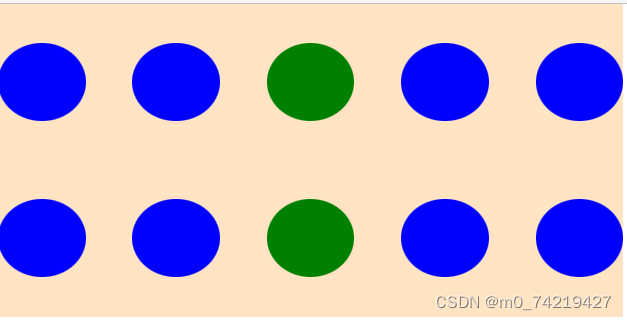
14.grid网格布局
特殊图形不起作用,只能形成矩形
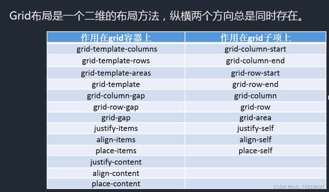
1.加在grid容器上的
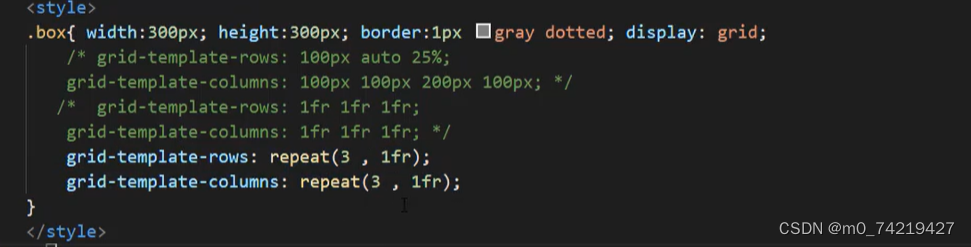
grid-template-colums和grid-template-rows(横纵划分)
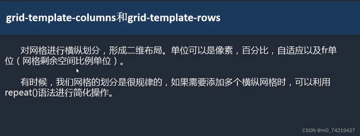
repeat(重复的个数,单位fr),条件是每个网格大小都一样
grid-template-areas和grid-template
grid-template
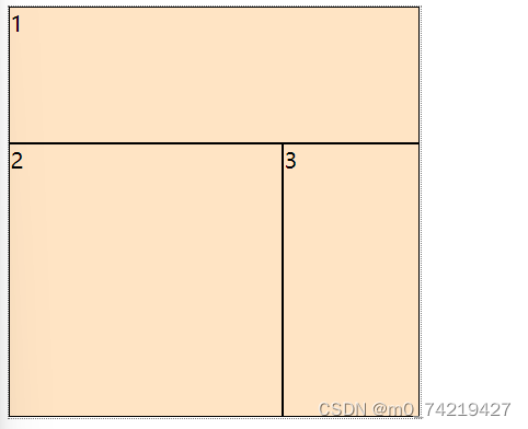
 .box2{width:300px;height:300px;border: 1px gray dotted;display: grid;
            grid-template-rows: repeat(3, 1fr);
            grid-template-columns: repeat(3, 1fr);
            grid-template-areas:
             "a1 a1 a1"
             "a2 a2 a3"
             "a2 a2 a3";}
        .box2 div{background: bisque;border: 1px black solid;}
        .box2 div:nth-child(1){grid-area: a1;}
        .box2 div:nth-child(2){grid-area: a2;}
        .box2 div:nth-child(3){grid-area: a3;}

	<div class="box2">
        <div>1</div>
        <div>2</div>
        <div>3</div>
    </div>
.box2{width:300px;height:300px;border: 1px gray dotted;display: grid;
            grid-template-rows: repeat(3, 1fr);
            grid-template-columns: repeat(3, 1fr);
            grid-template-areas:
             "a1 a1 a1"
             "a2 a2 a3"
             "a2 a2 a3";

             grid-templates:/* 复合写法 */
             "a1 a1 a1" 1fr /* 每一行 分别写1fr*/
             "a2 a2 a3" 1fr
             "a2 a2 a3" 1fr
             /1fr 1fr 1fr; /* 纵向加斜线 */
            }
grid-colum-gap和grid-row-gap


 423
423


 被折叠的 条评论
为什么被折叠?
被折叠的 条评论
为什么被折叠?
 到【灌水乐园】发言


