


目录
Toast
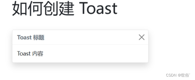
Toast 组件类似警告框,当发生某些事情时(例如当用户单击按钮、提交表单等)时,它只会显示几秒钟。
如何创建 Toast
如需创建 Toast,请使用 .toast 类,并在其中添加 .toast-header 和 .toast-body。
注意:默认情况下,toast 是隐藏的。如果要显示它,请使用 .show 类。如果要关闭它,请使用 <button> 元素并添加 data-bs-dismiss="toast"。
实例
<!DOCTYPE html>
<html>
	<head>
		<title>Bootstrap5 实例</title>
		<meta charset="utf-8">
		<meta name="viewport" content="width=device-width, initial-scale=1">
		<link href="https://cdn.jsdelivr.net/npm/bootstrap@5.1.2/dist/css/bootstrap.min.css" rel="stylesheet">
		<script src="https://cdn.jsdelivr.net/npm/bootstrap@5.1.2/dist/js/bootstrap.bundle.min.js"></script>
	</head>
	<body>
		<div class="container mt-3">
			<h1>如何创建 Toast</h1><br />
			<div class="toast" role="alert" aria-live="assertive" aria-atomic="true" data-bs-autohide="false">
				<div class="toast-header">
					<!-- Toast 标题 -->
					<strong class="me-auto">Toast 标题</strong>
					<!-- 关闭按钮 -->
					<button type="button" class="btn-close" data-bs-dismiss="toast" aria-label="关闭"></button>
				</div>
				<div class="toast-body">
					<!-- Toast 内容 -->
					Toast 内容
				</div>
			</div>

		</div>
		<script>
			//要显示 Toast,您需要使用 JavaScript 控制它的可见性。可以通过以下方式触发 Toast 的显示:
			var toast = document.querySelector('.toast');
			var toastInstance = new bootstrap.Toast(toast);
			toastInstance.show();
			//如果要关闭 Toast,可以在 Toast 组件上调用 hide 方法:
			//toastInstance.hide();
		</script>
	</body>
</html>
运行结果
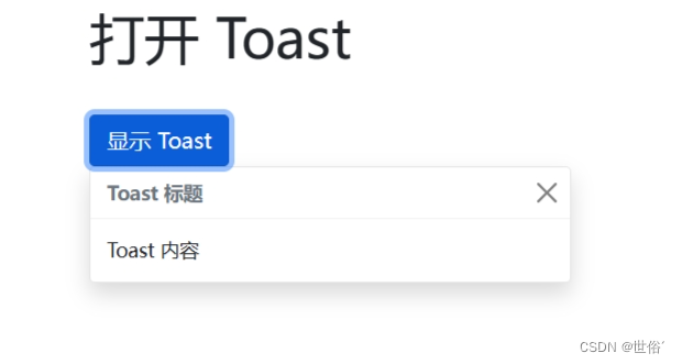
打开 Toast
如需通过单击按钮显示 Toast,将必须使用 JavaScript 对其进行初始化。选取指定的元素并调用 toast() 方法。当单击按钮时,以下代码将显示文档中的所有 toast。
实例
<!DOCTYPE html>
<html>
	<head>
		<title>Bootstrap5 实例</title>
		<meta charset="utf-8">
		<meta name="viewport" content="width=device-width, initial-scale=1">
		<link href="https://cdn.jsdelivr.net/npm/bootstrap@5.1.2/dist/css/bootstrap.min.css" rel="stylesheet">
		<script src="https://cdn.jsdelivr.net/npm/bootstrap@5.1.2/dist/js/bootstrap.bundle.min.js"></script>
	</head>
	<body>
		<div class="container mt-3">
			<h1>打开 Toast</h1><br />
			<!-- 按钮 -->
			<button id="toastTrigger" class="btn btn-primary">显示 Toast</button>
			<!-- Toast -->
			<div class="toast" role="alert" aria-live="assertive" aria-atomic="true" data-bs-autohide="false">
				<div class="toast-header">
					<strong class="me-auto">Toast 标题</strong>
					<button type="button" class="btn-close" data-bs-dismiss="toast" aria-label="关闭"></button>
				</div>
				<div class="toast-body">
					Toast 内容
				</div>
			</div>
		</div>
		<script>
			var toastTrigger = document.getElementById('toastTrigger');
			var toastElementList = [].slice.call(document.querySelectorAll('.toast'));
			var toastList = toastElementList.map(function(toastElement) {
				return new bootstrap.Toast(toastElement);
			});

			toastTrigger.addEventListener('click', function() {
				toastList.forEach(function(toast) {
					toast.show();
				});
			});
		</script>
	</body>
</html>
运行结果
滚动监听(Scrollspy)
滚动监听(Scrollspy)插件,即自动更新导航插件,会根据滚动条的位置自动更新对应的导航目标。其基本的实现是随着您的滚动。
如何创建滚动监听
要创建一个 Bootstrap 5 滚动监听(Scrollspy),需要执行以下步骤:
- 设置导航菜单的基本结构,将其放置在需要滚动监听的容器内。
- 在导航菜单中设置 data-bs-spy="scroll" 属性,以启用滚动监听。
- 在导航菜单中设置 data-bs-target 属性,并指定要监听的容器 ID,例如 data-bs-target="#navbar"。
- 在 JS 中初始化滚动监听插件,例如 var scrollSpy = new bootstrap.ScrollSpy(document.body, { target: '#navbar' })。
实例
<!DOCTYPE html>
<html>
	<head>
		<title>Bootstrap5 实例</title>
		<meta charset="utf-8">
		<meta name="viewport" content="width=device-width, initial-scale=1">
		<link href="https://cdn.jsdelivr.net/npm/bootstrap@5.1.2/dist/css/bootstrap.min.css" rel="stylesheet">
		<script src="https://cdn.jsdelivr.net/npm/bootstrap@5.1.2/dist/js/bootstrap.bundle.min.js"></script>
	</head>
	<body data-bs-spy="scroll" data-bs-target="#navbar" data-bs-offset="0">

		<!-- 导航菜单 -->
		<nav id="navbar" class="navbar fixed-top navbar-expand-lg navbar-light bg-light">
			<div class="container">
				<ul class="nav navbar-nav">
					<li class="nav-item">
						<a class="nav-link active" href="#section1">Section 1</a>
					</li>
					<li class="nav-item">
						<a class="nav-link" href="#section2">Section 2</a>
					</li>
					<li class="nav-item">
						<a class="nav-link" href="#section3">Section 3</a>
					</li>
				</ul>
			</div>
		</nav>

		<!-- 内容部分 -->
		<div id="section1" class="container-fluid bg-success text-white" style="padding:1000px 200px;">
			<h3>Section 1</h3>
		</div>

		<div id="section2" class="container-fluid bg-warning" style="padding:1000px 200px;">
			<h3>Section 2</h3>
		</div>

		<div id="section3" class="container-fluid bg-secondary text-white" style="padding:1000px 200px;">
			<h3>Section 3</h3>
		</div>
		<script>
			// 初始化滚动监听插件
			var scrollSpy = new bootstrap.ScrollSpy(document.body, {
				target: '#navbar' // 指定导航菜单的 ID 或 class
			});
		</script>
	</body>
</html>
将上述代码保存为一个 HTML 文件,并在浏览器中打开,你将看到一个包含滚动监听功能的页面。当你滚动页面时,导航菜单中的链接将根据当前滚动位置自动更新活动状态。
运行结果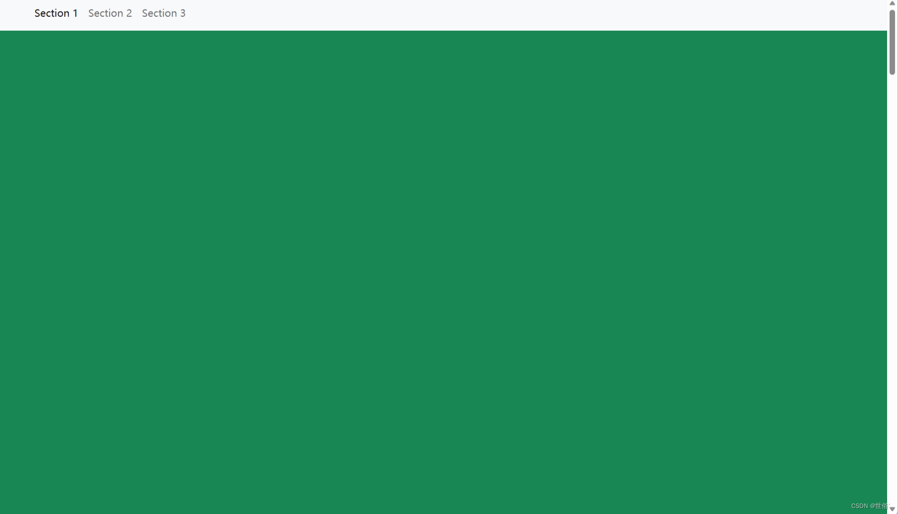
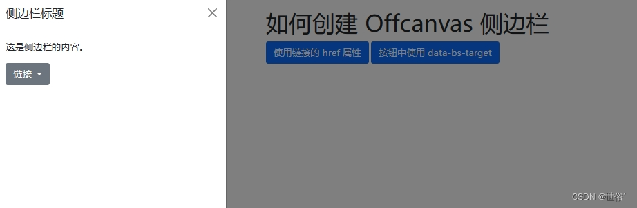
侧边栏导航(Offcanvas)
如何创建 Offcanvas 侧边栏
- 使用 Bootstrap 5 的类 .offcanvas 来创建侧边栏导航。
- 通过 JavaScript 控制是否在 .offcanvas 类后面添加 .show 类来控制侧边栏的显示与隐藏。
- 使用 <a> 链接的 href 属性或 <button> 元素的 data-bs-target 属性来设置侧边栏的目标元素。
- 使用 data-bs-toggle="offcanvas" 来启用侧边栏的切换功能。
实例
<!DOCTYPE html>
<html>
	<head>
		<title>Bootstrap5 实例</title>
		<meta charset="utf-8">
		<meta name="viewport" content="width=device-width, initial-scale=1">
		<link href="https://cdn.jsdelivr.net/npm/bootstrap@5.1.2/dist/css/bootstrap.min.css" rel="stylesheet">
		<script src="https://cdn.jsdelivr.net/npm/bootstrap@5.1.2/dist/js/bootstrap.bundle.min.js"></script>
	</head>
	<body>
		<div class="container mt-4">
			<h1>如何创建 Offcanvas 侧边栏</h1>
			<!-- 导航按钮 -->
			<a class="btn btn-primary" data-bs-toggle="offcanvas" href="#offcanvasExample" role="button"
				aria-controls="offcanvasExample">
				使用链接的 href 属性
			</a>
			<button class="btn btn-primary" type="button" data-bs-toggle="offcanvas" data-bs-target="#offcanvasExample"
				aria-controls="offcanvasExample">
				按钮中使用 data-bs-target
			</button>

			<!-- 侧边栏 -->
			<div class="offcanvas offcanvas-start" tabindex="-1" id="offcanvasExample"
				aria-labelledby="offcanvasExampleLabel">
				<div class="offcanvas-header">
					<h5 class="offcanvas-title" id="offcanvasExampleLabel">侧边栏标题</h5>
					<button type="button" class="btn-close" data-bs-dismiss="offcanvas" aria-label="Close"></button>
				</div>
				<div class="offcanvas-body">
					<!-- 侧边栏内容 -->
					<p>这是侧边栏的内容。</p>
					<div class="dropdown mt-3">
						<button class="btn btn-secondary dropdown-toggle" type="button" id="dropdownMenuButton"
							data-bs-toggle="dropdown">
							链接
						</button>
						<ul class="dropdown-menu" aria-labelledby="dropdownMenuButton">
							<li><a class="dropdown-item" href="#">链接 1</a></li>
							<li><a class="dropdown-item" href="#">链接 2</a></li>
							<li><a class="dropdown-item" href="#">链接 3</a></li>
						</ul>
					</div>
				</div>
			</div>
		</div>
	</body>
</html>
运行结果
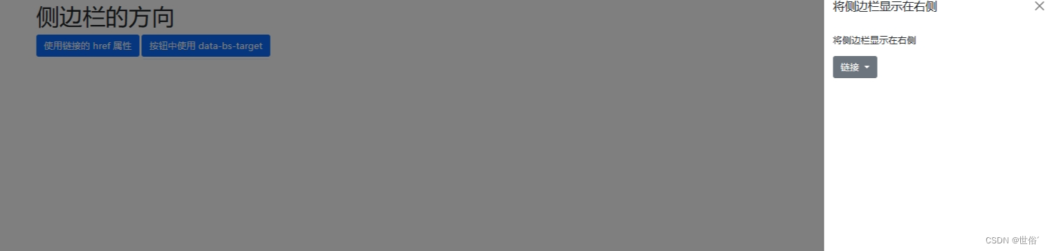
侧边栏的方向
可以使用以下四个类来控制侧边栏的方向:
- .offcanvas-start:将侧边栏显示在左侧。
- .offcanvas-end:将侧边栏显示在右侧。
- .offcanvas-top:将侧边栏显示在顶部。
- .offcanvas-bottom:将侧边栏显示在底部。
通过在侧边栏的外层 <div> 元素上添加相应的类来设置侧边栏的方向。例如,如果希望将侧边栏显示在右侧,可以将 <div> 元素的类设置为 offcanvas offcanvas-end。
实例
下面是一个显示侧边栏在右侧的示例代码:
<!DOCTYPE html>
<html>
	<head>
		<title>Bootstrap5 实例</title>
		<meta charset="utf-8">
		<meta name="viewport" content="width=device-width, initial-scale=1">
		<link href="https://cdn.jsdelivr.net/npm/bootstrap@5.1.2/dist/css/bootstrap.min.css" rel="stylesheet">
		<script src="https://cdn.jsdelivr.net/npm/bootstrap@5.1.2/dist/js/bootstrap.bundle.min.js"></script>
	</head>
	<body>
		<div class="container mt-4">
			<h1>侧边栏的方向</h1>
			<!-- 导航按钮 -->
			<a class="btn btn-primary" data-bs-toggle="offcanvas" href="#offcanvasExample" role="button"
				aria-controls="offcanvasExample">
				使用链接的 href 属性
			</a>
			<button class="btn btn-primary" type="button" data-bs-toggle="offcanvas" data-bs-target="#offcanvasExample"
				aria-controls="offcanvasExample">
				按钮中使用 data-bs-target
			</button>

			<!-- 侧边栏 -->
			<div class="offcanvas offcanvas-end" tabindex="-1" id="offcanvasExample"
				aria-labelledby="offcanvasExampleLabel">
				<div class="offcanvas-header">
					<h5 class="offcanvas-title" id="offcanvasExampleLabel">将侧边栏显示在右侧</h5>
					<button type="button" class="btn-close" data-bs-dismiss="offcanvas" aria-label="Close"></button>
				</div>
				<div class="offcanvas-body">
					<!-- 侧边栏内容 -->
					<p>将侧边栏显示在右侧</p>
					<div class="dropdown mt-3">
						<button class="btn btn-secondary dropdown-toggle" type="button" id="dropdownMenuButton"
							data-bs-toggle="dropdown">
							链接
						</button>
						<ul class="dropdown-menu" aria-labelledby="dropdownMenuButton">
							<li><a class="dropdown-item" href="#">链接 1</a></li>
							<li><a class="dropdown-item" href="#">链接 2</a></li>
							<li><a class="dropdown-item" href="#">链接 3</a></li>
						</ul>
					</div>
				</div>
			</div>
		</div>
	</body>
</html>
运行结果
设置背景及背景是否可滚动
可以使用 data-bs-scroll 属性来设置 <body> 元素是否可以滚动,并使用 data-bs-backdrop 属性来控制是否显示背景画布。
- data-bs-scroll="true":当侧边栏显示时,允许页面内容滚动。
- data-bs-scroll="false":当侧边栏显示时,禁止页面内容滚动。
- data-bs-backdrop="true":当侧边栏显示时,显示一个背景画布。
- data-bs-backdrop="false":当侧边栏显示时,不显示背景画布。
实例
<!DOCTYPE html>
<html>
	<head>
		<title>Bootstrap5 实例</title>
		<meta charset="utf-8">
		<meta name="viewport" content="width=device-width, initial-scale=1">
		<link href="https://cdn.jsdelivr.net/npm/bootstrap@5.1.2/dist/css/bootstrap.min.css" rel="stylesheet">
		<script src="https://cdn.jsdelivr.net/npm/bootstrap@5.1.2/dist/js/bootstrap.bundle.min.js"></script>
	</head>
	<body>
		<div class="container mt-3">
			<button class="btn btn-primary" type="button" data-bs-toggle="offcanvas"
				data-bs-target="#offcanvasScrolling" aria-controls="offcanvasScrolling">body 元素可以滚动</button>
			<button class="btn btn-primary" type="button" data-bs-toggle="offcanvas"
				data-bs-target="#offcanvasWithBackdrop" aria-controls="offcanvasWithBackdrop">显示画布(默认)</button>
			<button class="btn btn-primary" type="button" data-bs-toggle="offcanvas"
				data-bs-target="#offcanvasWithBothOptions" aria-controls="offcanvasWithBothOptions">允许滚动及显示画布</button>

			<div class="offcanvas offcanvas-start" data-bs-scroll="true" data-bs-backdrop="false" tabindex="-1"
				id="offcanvasScrolling" aria-labelledby="offcanvasScrollingLabel">
				<div class="offcanvas-header">
					<h5 class="offcanvas-title" id="offcanvasScrollingLabel">正文内容可以滚动</h5>
					<button type="button" class="btn-close text-reset" data-bs-dismiss="offcanvas"
						aria-label="Close"></button>
				</div>
				<div class="offcanvas-body">
					<p>滚动页面查看效果。</p>
				</div>
			</div>
			<div class="offcanvas offcanvas-start" tabindex="-1" id="offcanvasWithBackdrop"
				aria-labelledby="offcanvasWithBackdropLabel">
				<div class="offcanvas-header">
					<h5 class="offcanvas-title" id="offcanvasWithBackdropLabel">使用背景画布</h5>
					<button type="button" class="btn-close text-reset" data-bs-dismiss="offcanvas"
						aria-label="Close"></button>
				</div>
				<div class="offcanvas-body">
					<p>正文内容不可滚动</p>
				</div>
			</div>
			<div class="offcanvas offcanvas-start" data-bs-scroll="true" tabindex="-1" id="offcanvasWithBothOptions"
				aria-labelledby="offcanvasWithBothOptionsLabel">
				<div class="offcanvas-header">
					<h5 class="offcanvas-title" id="offcanvasWithBothOptionsLabel">使用背景画布,正文内容可滚动</h5>
					<button type="button" class="btn-close text-reset" data-bs-dismiss="offcanvas"
						aria-label="Close"></button>
				</div>
				<div class="offcanvas-body">
					<p>滚动页面查看效果。</p>
				</div>
			</div>
		</div>
		<div class="container mt-3">
			<h3>侧边栏滚动测试</h3>
			<p>侧边栏滚动测试内容。。。。</p>
			<p>侧边栏滚动测试内容。。。。</p>
			<p>侧边栏滚动测试内容。。。。</p>
			<p>侧边栏滚动测试内容。。。。</p>
			<br /><br /><br /><br /><br />
			<p>侧边栏滚动测试内容。。。。</p>
			<p>侧边栏滚动测试内容。。。。</p>
			<p>侧边栏滚动测试内容。。。。</p>
			<p>侧边栏滚动测试内容。。。。</p>
			<br /><br /><br /><br /><br />
			<p>侧边栏滚动测试内容。。。。</p>
			<p>侧边栏滚动测试内容。。。。</p>
			<p>侧边栏滚动测试内容。。。。</p>
			<p>侧边栏滚动测试内容。。。。</p>
			<br /><br /><br /><br /><br />
			<p>侧边栏滚动测试内容。。。。</p>
			<p>侧边栏滚动测试内容。。。。</p>
			<p>侧边栏滚动测试内容。。。。</p>
			<p>侧边栏滚动测试内容。。。。</p>
			<br /><br /><br /><br /><br />
			<p>侧边栏滚动测试内容。。。。</p>
			<p>侧边栏滚动测试内容。。。。</p>
			<p>侧边栏滚动测试内容。。。。</p>
			<p>侧边栏滚动测试内容。。。。</p>
			<br /><br /><br /><br /><br />
			<p>侧边栏滚动测试内容。。。。</p>
			<p>侧边栏滚动测试内容。。。。</p>
			<p>侧边栏滚动测试内容。。。。</p>
			<p>侧边栏滚动测试内容。。。。</p>
			<br /><br /><br /><br /><br />
			<p>侧边栏滚动测试内容。。。。</p>
			<p>侧边栏滚动测试内容。。。。</p>
			<p>侧边栏滚动测试内容。。。。</p>
			<p>侧边栏滚动测试内容。。。。</p>
			<br /><br /><br /><br /><br />
			<p>侧边栏滚动测试内容。。。。</p>
			<p>侧边栏滚动测试内容。。。。</p>
			<p>侧边栏滚动测试内容。。。。</p>
			<p>侧边栏滚动测试内容。。。。</p>
			<br /><br /><br /><br /><br />
		</div>
	</body>
</html>
侧边栏案例
实例
<!DOCTYPE html>
<html>
<head>
  <title>Bootstrap5 实例</title>
  <meta charset="utf-8">
  <meta name="viewport" content="width=device-width, initial-scale=1">
  <link href="https://cdn.staticfile.org/twitter-bootstrap/5.1.1/css/bootstrap.min.css" rel="stylesheet">
  <script src="https://cdn.staticfile.org/twitter-bootstrap/5.1.1/js/bootstrap.bundle.min.js"></script>
  <style>body{min-height:100vh;min-height:-webkit-fill-available}html{height:-webkit-fill-available}main{display:flex;flex-wrap:nowrap;height:100vh;height:-webkit-fill-available;max-height:100vh;overflow-x:auto;overflow-y:hidden}.b-example-divider{flex-shrink:0;width:1.5rem;height:100vh;background-color:rgba(0,0,0,.1);border:solid rgba(0,0,0,.15);border-width:1px 0;box-shadow:inset 0 .5em 1.5em rgba(0,0,0,.1),inset 0 .125em .5em rgba(0,0,0,.15)}.bi{vertical-align:-.125em;pointer-events:none;fill:currentColor}.dropdown-toggle{outline:0}.nav-flush .nav-link{border-radius:0}.btn-toggle{display:inline-flex;align-items:center;padding:.25rem .5rem;font-weight:600;color:rgba(0,0,0,.65);background-color:transparent;border:0}.btn-toggle:hover,.btn-toggle:focus{color:rgba(0,0,0,.85);background-color:#d2f4ea}.btn-toggle::before{width:1.25em;line-height:0;content:url("data:image/svg+xml,%3csvg xmlns='http://www.w3.org/2000/svg' width='16' height='16' viewBox='0 0 16 16'%3e%3cpath fill='none' stroke='rgba%280,0,0,.5%29' stroke-linecap='round' stroke-linejoin='round' stroke-width='2' d='M5 14l6-6-6-6'/%3e%3c/svg%3e");transition:transform .35s ease;transform-origin:.5em 50%}.btn-toggle[aria-expanded="true"]{color:rgba(0,0,0,.85)}.btn-toggle[aria-expanded="true"]::before{transform:rotate(90deg)}.btn-toggle-nav a{display:inline-flex;padding:.1875rem .5rem;margin-top:.125rem;margin-left:1.25rem;text-decoration:none}.btn-toggle-nav a:hover,.btn-toggle-nav a:focus{background-color:#d2f4ea}.scrollarea{overflow-y:auto}.fw-semibold{font-weight:600}.lh-tight{line-height:1.25}.bd-placeholder-img{font-size:1.125rem;text-anchor:middle;-webkit-user-select:none;-moz-user-select:none;user-select:none}@media (min-width:768px){.bd-placeholder-img-lg{font-size:3.5rem}}</style>
</head>
<body>
<svg xmlns="http://www.w3.org/2000/svg" style="display: none;">
  <symbol id="bootstrap" viewBox="0 0 118 94">
    <title>Bootstrap</title>
    <path fill-rule="evenodd" clip-rule="evenodd" d="M24.509 0c-6.733 0-11.715 5.893-11.492 12.284.214 6.14-.064 14.092-2.066 20.577C8.943 39.365 5.547 43.485 0 44.014v5.972c5.547.529 8.943 4.649 10.951 11.153 2.002 6.485 2.28 14.437 2.066 20.577C12.794 88.106 17.776 94 24.51 94H93.5c6.733 0 11.714-5.893 11.491-12.284-.214-6.14.064-14.092 2.066-20.577 2.009-6.504 5.396-10.624 10.943-11.153v-5.972c-5.547-.529-8.934-4.649-10.943-11.153-2.002-6.484-2.28-14.437-2.066-20.577C105.214 5.894 100.233 0 93.5 0H24.508zM80 57.863C80 66.663 73.436 72 62.543 72H44a2 2 0 01-2-2V24a2 2 0 012-2h18.437c9.083 0 15.044 4.92 15.044 12.474 0 5.302-4.01 10.049-9.119 10.88v.277C75.317 46.394 80 51.21 80 57.863zM60.521 28.34H49.948v14.934h8.905c6.884 0 10.68-2.772 10.68-7.727 0-4.643-3.264-7.207-9.012-7.207zM49.948 49.2v16.458H60.91c7.167 0 10.964-2.876 10.964-8.281 0-5.406-3.903-8.178-11.425-8.178H49.948z"></path>
  </symbol>
  <symbol id="home" viewBox="0 0 16 16">
    <path d="M8.354 1.146a.5.5 0 0 0-.708 0l-6 6A.5.5 0 0 0 1.5 7.5v7a.5.5 0 0 0 .5.5h4.5a.5.5 0 0 0 .5-.5v-4h2v4a.5.5 0 0 0 .5.5H14a.5.5 0 0 0 .5-.5v-7a.5.5 0 0 0-.146-.354L13 5.793V2.5a.5.5 0 0 0-.5-.5h-1a.5.5 0 0 0-.5.5v1.293L8.354 1.146zM2.5 14V7.707l5.5-5.5 5.5 5.5V14H10v-4a.5.5 0 0 0-.5-.5h-3a.5.5 0 0 0-.5.5v4H2.5z"/>
  </symbol>
  <symbol id="speedometer2" viewBox="0 0 16 16">
    <path d="M8 4a.5.5 0 0 1 .5.5V6a.5.5 0 0 1-1 0V4.5A.5.5 0 0 1 8 4zM3.732 5.732a.5.5 0 0 1 .707 0l.915.914a.5.5 0 1 1-.708.708l-.914-.915a.5.5 0 0 1 0-.707zM2 10a.5.5 0 0 1 .5-.5h1.586a.5.5 0 0 1 0 1H2.5A.5.5 0 0 1 2 10zm9.5 0a.5.5 0 0 1 .5-.5h1.5a.5.5 0 0 1 0 1H12a.5.5 0 0 1-.5-.5zm.754-4.246a.389.389 0 0 0-.527-.02L7.547 9.31a.91.91 0 1 0 1.302 1.258l3.434-4.297a.389.389 0 0 0-.029-.518z"/>
    <path fill-rule="evenodd" d="M0 10a8 8 0 1 1 15.547 2.661c-.442 1.253-1.845 1.602-2.932 1.25C11.309 13.488 9.475 13 8 13c-1.474 0-3.31.488-4.615.911-1.087.352-2.49.003-2.932-1.25A7.988 7.988 0 0 1 0 10zm8-7a7 7 0 0 0-6.603 9.329c.203.575.923.876 1.68.63C4.397 12.533 6.358 12 8 12s3.604.532 4.923.96c.757.245 1.477-.056 1.68-.631A7 7 0 0 0 8 3z"/>
  </symbol>
  <symbol id="table" viewBox="0 0 16 16">
    <path d="M0 2a2 2 0 0 1 2-2h12a2 2 0 0 1 2 2v12a2 2 0 0 1-2 2H2a2 2 0 0 1-2-2V2zm15 2h-4v3h4V4zm0 4h-4v3h4V8zm0 4h-4v3h3a1 1 0 0 0 1-1v-2zm-5 3v-3H6v3h4zm-5 0v-3H1v2a1 1 0 0 0 1 1h3zm-4-4h4V8H1v3zm0-4h4V4H1v3zm5-3v3h4V4H6zm4 4H6v3h4V8z"/>
  </symbol>
  <symbol id="people-circle" viewBox="0 0 16 16">
    <path d="M11 6a3 3 0 1 1-6 0 3 3 0 0 1 6 0z"/>
    <path fill-rule="evenodd" d="M0 8a8 8 0 1 1 16 0A8 8 0 0 1 0 8zm8-7a7 7 0 0 0-5.468 11.37C3.242 11.226 4.805 10 8 10s4.757 1.225 5.468 2.37A7 7 0 0 0 8 1z"/>
  </symbol>
  <symbol id="grid" viewBox="0 0 16 16">
    <path d="M1 2.5A1.5 1.5 0 0 1 2.5 1h3A1.5 1.5 0 0 1 7 2.5v3A1.5 1.5 0 0 1 5.5 7h-3A1.5 1.5 0 0 1 1 5.5v-3zM2.5 2a.5.5 0 0 0-.5.5v3a.5.5 0 0 0 .5.5h3a.5.5 0 0 0 .5-.5v-3a.5.5 0 0 0-.5-.5h-3zm6.5.5A1.5 1.5 0 0 1 10.5 1h3A1.5 1.5 0 0 1 15 2.5v3A1.5 1.5 0 0 1 13.5 7h-3A1.5 1.5 0 0 1 9 5.5v-3zm1.5-.5a.5.5 0 0 0-.5.5v3a.5.5 0 0 0 .5.5h3a.5.5 0 0 0 .5-.5v-3a.5.5 0 0 0-.5-.5h-3zM1 10.5A1.5 1.5 0 0 1 2.5 9h3A1.5 1.5 0 0 1 7 10.5v3A1.5 1.5 0 0 1 5.5 15h-3A1.5 1.5 0 0 1 1 13.5v-3zm1.5-.5a.5.5 0 0 0-.5.5v3a.5.5 0 0 0 .5.5h3a.5.5 0 0 0 .5-.5v-3a.5.5 0 0 0-.5-.5h-3zm6.5.5A1.5 1.5 0 0 1 10.5 9h3a1.5 1.5 0 0 1 1.5 1.5v3a1.5 1.5 0 0 1-1.5 1.5h-3A1.5 1.5 0 0 1 9 13.5v-3zm1.5-.5a.5.5 0 0 0-.5.5v3a.5.5 0 0 0 .5.5h3a.5.5 0 0 0 .5-.5v-3a.5.5 0 0 0-.5-.5h-3z"/>
  </symbol>
  <symbol id="collection" viewBox="0 0 16 16">
    <path d="M2.5 3.5a.5.5 0 0 1 0-1h11a.5.5 0 0 1 0 1h-11zm2-2a.5.5 0 0 1 0-1h7a.5.5 0 0 1 0 1h-7zM0 13a1.5 1.5 0 0 0 1.5 1.5h13A1.5 1.5 0 0 0 16 13V6a1.5 1.5 0 0 0-1.5-1.5h-13A1.5 1.5 0 0 0 0 6v7zm1.5.5A.5.5 0 0 1 1 13V6a.5.5 0 0 1 .5-.5h13a.5.5 0 0 1 .5.5v7a.5.5 0 0 1-.5.5h-13z"/>
  </symbol>
  <symbol id="calendar3" viewBox="0 0 16 16">
    <path d="M14 0H2a2 2 0 0 0-2 2v12a2 2 0 0 0 2 2h12a2 2 0 0 0 2-2V2a2 2 0 0 0-2-2zM1 3.857C1 3.384 1.448 3 2 3h12c.552 0 1 .384 1 .857v10.286c0 .473-.448.857-1 .857H2c-.552 0-1-.384-1-.857V3.857z"/>
    <path d="M6.5 7a1 1 0 1 0 0-2 1 1 0 0 0 0 2zm3 0a1 1 0 1 0 0-2 1 1 0 0 0 0 2zm3 0a1 1 0 1 0 0-2 1 1 0 0 0 0 2zm-9 3a1 1 0 1 0 0-2 1 1 0 0 0 0 2zm3 0a1 1 0 1 0 0-2 1 1 0 0 0 0 2zm3 0a1 1 0 1 0 0-2 1 1 0 0 0 0 2zm3 0a1 1 0 1 0 0-2 1 1 0 0 0 0 2zm-9 3a1 1 0 1 0 0-2 1 1 0 0 0 0 2zm3 0a1 1 0 1 0 0-2 1 1 0 0 0 0 2zm3 0a1 1 0 1 0 0-2 1 1 0 0 0 0 2z"/>
  </symbol>
  <symbol id="chat-quote-fill" viewBox="0 0 16 16">
    <path d="M16 8c0 3.866-3.582 7-8 7a9.06 9.06 0 0 1-2.347-.306c-.584.296-1.925.864-4.181 1.234-.2.032-.352-.176-.273-.362.354-.836.674-1.95.77-2.966C.744 11.37 0 9.76 0 8c0-3.866 3.582-7 8-7s8 3.134 8 7zM7.194 6.766a1.688 1.688 0 0 0-.227-.272 1.467 1.467 0 0 0-.469-.324l-.008-.004A1.785 1.785 0 0 0 5.734 6C4.776 6 4 6.746 4 7.667c0 .92.776 1.666 1.734 1.666.343 0 .662-.095.931-.26-.137.389-.39.804-.81 1.22a.405.405 0 0 0 .011.59c.173.16.447.155.614-.01 1.334-1.329 1.37-2.758.941-3.706a2.461 2.461 0 0 0-.227-.4zM11 9.073c-.136.389-.39.804-.81 1.22a.405.405 0 0 0 .012.59c.172.16.446.155.613-.01 1.334-1.329 1.37-2.758.942-3.706a2.466 2.466 0 0 0-.228-.4 1.686 1.686 0 0 0-.227-.273 1.466 1.466 0 0 0-.469-.324l-.008-.004A1.785 1.785 0 0 0 10.07 6c-.957 0-1.734.746-1.734 1.667 0 .92.777 1.666 1.734 1.666.343 0 .662-.095.931-.26z"/>
  </symbol>
  <symbol id="cpu-fill" viewBox="0 0 16 16">
    <path d="M6.5 6a.5.5 0 0 0-.5.5v3a.5.5 0 0 0 .5.5h3a.5.5 0 0 0 .5-.5v-3a.5.5 0 0 0-.5-.5h-3z"/>
    <path d="M5.5.5a.5.5 0 0 0-1 0V2A2.5 2.5 0 0 0 2 4.5H.5a.5.5 0 0 0 0 1H2v1H.5a.5.5 0 0 0 0 1H2v1H.5a.5.5 0 0 0 0 1H2v1H.5a.5.5 0 0 0 0 1H2A2.5 2.5 0 0 0 4.5 14v1.5a.5.5 0 0 0 1 0V14h1v1.5a.5.5 0 0 0 1 0V14h1v1.5a.5.5 0 0 0 1 0V14h1v1.5a.5.5 0 0 0 1 0V14a2.5 2.5 0 0 0 2.5-2.5h1.5a.5.5 0 0 0 0-1H14v-1h1.5a.5.5 0 0 0 0-1H14v-1h1.5a.5.5 0 0 0 0-1H14v-1h1.5a.5.5 0 0 0 0-1H14A2.5 2.5 0 0 0 11.5 2V.5a.5.5 0 0 0-1 0V2h-1V.5a.5.5 0 0 0-1 0V2h-1V.5a.5.5 0 0 0-1 0V2h-1V.5zm1 4.5h3A1.5 1.5 0 0 1 11 6.5v3A1.5 1.5 0 0 1 9.5 11h-3A1.5 1.5 0 0 1 5 9.5v-3A1.5 1.5 0 0 1 6.5 5z"/>
  </symbol>
  <symbol id="gear-fill" viewBox="0 0 16 16">
    <path d="M9.405 1.05c-.413-1.4-2.397-1.4-2.81 0l-.1.34a1.464 1.464 0 0 1-2.105.872l-.31-.17c-1.283-.698-2.686.705-1.987 1.987l.169.311c.446.82.023 1.841-.872 2.105l-.34.1c-1.4.413-1.4 2.397 0 2.81l.34.1a1.464 1.464 0 0 1 .872 2.105l-.17.31c-.698 1.283.705 2.686 1.987 1.987l.311-.169a1.464 1.464 0 0 1 2.105.872l.1.34c.413 1.4 2.397 1.4 2.81 0l.1-.34a1.464 1.464 0 0 1 2.105-.872l.31.17c1.283.698 2.686-.705 1.987-1.987l-.169-.311a1.464 1.464 0 0 1 .872-2.105l.34-.1c1.4-.413 1.4-2.397 0-2.81l-.34-.1a1.464 1.464 0 0 1-.872-2.105l.17-.31c.698-1.283-.705-2.686-1.987-1.987l-.311.169a1.464 1.464 0 0 1-2.105-.872l-.1-.34zM8 10.93a2.929 2.929 0 1 1 0-5.86 2.929 2.929 0 0 1 0 5.858z"/>
  </symbol>
  <symbol id="speedometer" viewBox="0 0 16 16">
    <path d="M8 2a.5.5 0 0 1 .5.5V4a.5.5 0 0 1-1 0V2.5A.5.5 0 0 1 8 2zM3.732 3.732a.5.5 0 0 1 .707 0l.915.914a.5.5 0 1 1-.708.708l-.914-.915a.5.5 0 0 1 0-.707zM2 8a.5.5 0 0 1 .5-.5h1.586a.5.5 0 0 1 0 1H2.5A.5.5 0 0 1 2 8zm9.5 0a.5.5 0 0 1 .5-.5h1.5a.5.5 0 0 1 0 1H12a.5.5 0 0 1-.5-.5zm.754-4.246a.389.389 0 0 0-.527-.02L7.547 7.31A.91.91 0 1 0 8.85 8.569l3.434-4.297a.389.389 0 0 0-.029-.518z"/>
    <path fill-rule="evenodd" d="M6.664 15.889A8 8 0 1 1 9.336.11a8 8 0 0 1-2.672 15.78zm-4.665-4.283A11.945 11.945 0 0 1 8 10c2.186 0 4.236.585 6.001 1.606a7 7 0 1 0-12.002 0z"/>
  </symbol>
  <symbol id="toggles2" viewBox="0 0 16 16">
    <path d="M9.465 10H12a2 2 0 1 1 0 4H9.465c.34-.588.535-1.271.535-2 0-.729-.195-1.412-.535-2z"/>
    <path d="M6 15a3 3 0 1 0 0-6 3 3 0 0 0 0 6zm0 1a4 4 0 1 1 0-8 4 4 0 0 1 0 8zm.535-10a3.975 3.975 0 0 1-.409-1H4a1 1 0 0 1 0-2h2.126c.091-.355.23-.69.41-1H4a2 2 0 1 0 0 4h2.535z"/>
    <path d="M14 4a4 4 0 1 1-8 0 4 4 0 0 1 8 0z"/>
  </symbol>
  <symbol id="tools" viewBox="0 0 16 16">
    <path d="M1 0L0 1l2.2 3.081a1 1 0 0 0 .815.419h.07a1 1 0 0 1 .708.293l2.675 2.675-2.617 2.654A3.003 3.003 0 0 0 0 13a3 3 0 1 0 5.878-.851l2.654-2.617.968.968-.305.914a1 1 0 0 0 .242 1.023l3.356 3.356a1 1 0 0 0 1.414 0l1.586-1.586a1 1 0 0 0 0-1.414l-3.356-3.356a1 1 0 0 0-1.023-.242L10.5 9.5l-.96-.96 2.68-2.643A3.005 3.005 0 0 0 16 3c0-.269-.035-.53-.102-.777l-2.14 2.141L12 4l-.364-1.757L13.777.102a3 3 0 0 0-3.675 3.68L7.462 6.46 4.793 3.793a1 1 0 0 1-.293-.707v-.071a1 1 0 0 0-.419-.814L1 0zm9.646 10.646a.5.5 0 0 1 .708 0l3 3a.5.5 0 0 1-.708.708l-3-3a.5.5 0 0 1 0-.708zM3 11l.471.242.529.026.287.445.445.287.026.529L5 13l-.242.471-.026.529-.445.287-.287.445-.529.026L3 15l-.471-.242L2 14.732l-.287-.445L1.268 14l-.026-.529L1 13l.242-.471.026-.529.445-.287.287-.445.529-.026L3 11z"/>
  </symbol>
  <symbol id="chevron-right" viewBox="0 0 16 16">
    <path fill-rule="evenodd" d="M4.646 1.646a.5.5 0 0 1 .708 0l6 6a.5.5 0 0 1 0 .708l-6 6a.5.5 0 0 1-.708-.708L10.293 8 4.646 2.354a.5.5 0 0 1 0-.708z"/>
  </symbol>
  <symbol id="geo-fill" viewBox="0 0 16 16">
    <path fill-rule="evenodd" d="M4 4a4 4 0 1 1 4.5 3.969V13.5a.5.5 0 0 1-1 0V7.97A4 4 0 0 1 4 3.999zm2.493 8.574a.5.5 0 0 1-.411.575c-.712.118-1.28.295-1.655.493a1.319 1.319 0 0 0-.37.265.301.301 0 0 0-.057.09V14l.002.008a.147.147 0 0 0 .016.033.617.617 0 0 0 .145.15c.165.13.435.27.813.395.751.25 1.82.414 3.024.414s2.273-.163 3.024-.414c.378-.126.648-.265.813-.395a.619.619 0 0 0 .146-.15.148.148 0 0 0 .015-.033L12 14v-.004a.301.301 0 0 0-.057-.09 1.318 1.318 0 0 0-.37-.264c-.376-.198-.943-.375-1.655-.493a.5.5 0 1 1 .164-.986c.77.127 1.452.328 1.957.594C12.5 13 13 13.4 13 14c0 .426-.26.752-.544.977-.29.228-.68.413-1.116.558-.878.293-2.059.465-3.34.465-1.281 0-2.462-.172-3.34-.465-.436-.145-.826-.33-1.116-.558C3.26 14.752 3 14.426 3 14c0-.599.5-1 .961-1.243.505-.266 1.187-.467 1.957-.594a.5.5 0 0 1 .575.411z"/>
  </symbol>
</svg>

<main>
  <h1 class="visually-hidden">Sidebars examples</h1>

  <div class="d-flex flex-column flex-shrink-0 p-3 text-white bg-dark" style="width: 280px;">
    <a href="/" class="d-flex align-items-center mb-3 mb-md-0 me-md-auto text-white text-decoration-none">
      <svg class="bi me-2" width="40" height="32"><use xlink:href="#bootstrap"/></svg>
      <span class="fs-4">Sidebar</span>
    </a>
    <hr>
    <ul class="nav nav-pills flex-column mb-auto">
      <li class="nav-item">
        <a href="#" class="nav-link active" aria-current="page">
          <svg class="bi me-2" width="16" height="16"><use xlink:href="#home"/></svg>
          Home
        </a>
      </li>
      <li>
        <a href="#" class="nav-link text-white">
          <svg class="bi me-2" width="16" height="16"><use xlink:href="#speedometer2"/></svg>
          Dashboard
        </a>
      </li>
      <li>
        <a href="#" class="nav-link text-white">
          <svg class="bi me-2" width="16" height="16"><use xlink:href="#table"/></svg>
          Orders
        </a>
      </li>
      <li>
        <a href="#" class="nav-link text-white">
          <svg class="bi me-2" width="16" height="16"><use xlink:href="#grid"/></svg>
          Products
        </a>
      </li>
      <li>
        <a href="#" class="nav-link text-white">
          <svg class="bi me-2" width="16" height="16"><use xlink:href="#people-circle"/></svg>
          Customers
        </a>
      </li>
    </ul>
    <hr>
    <div class="dropdown">
      <a href="#" class="d-flex align-items-center text-white text-decoration-none dropdown-toggle" id="dropdownUser1" data-bs-toggle="dropdown" aria-expanded="false">
        <img src="https://github.com/mdo.png" alt="" width="32" height="32" class="rounded-circle me-2">
        <strong>mdo</strong>
      </a>
      <ul class="dropdown-menu dropdown-menu-dark text-small shadow" aria-labelledby="dropdownUser1">
        <li><a class="dropdown-item" href="#">New project...</a></li>
        <li><a class="dropdown-item" href="#">Settings</a></li>
        <li><a class="dropdown-item" href="#">Profile</a></li>
        <li><hr class="dropdown-divider"></li>
        <li><a class="dropdown-item" href="#">Sign out</a></li>
      </ul>
    </div>
  </div>

  <div class="b-example-divider"></div>

  <div class="d-flex flex-column flex-shrink-0 p-3 bg-light" style="width: 280px;">
    <a href="/" class="d-flex align-items-center mb-3 mb-md-0 me-md-auto link-dark text-decoration-none">
      <svg class="bi me-2" width="40" height="32"><use xlink:href="#bootstrap"/></svg>
      <span class="fs-4">Sidebar</span>
    </a>
    <hr>
    <ul class="nav nav-pills flex-column mb-auto">
      <li class="nav-item">
        <a href="#" class="nav-link active" aria-current="page">
          <svg class="bi me-2" width="16" height="16"><use xlink:href="#home"/></svg>
          Home
        </a>
      </li>
      <li>
        <a href="#" class="nav-link link-dark">
          <svg class="bi me-2" width="16" height="16"><use xlink:href="#speedometer2"/></svg>
          Dashboard
        </a>
      </li>
      <li>
        <a href="#" class="nav-link link-dark">
          <svg class="bi me-2" width="16" height="16"><use xlink:href="#table"/></svg>
          Orders
        </a>
      </li>
      <li>
        <a href="#" class="nav-link link-dark">
          <svg class="bi me-2" width="16" height="16"><use xlink:href="#grid"/></svg>
          Products
        </a>
      </li>
      <li>
        <a href="#" class="nav-link link-dark">
          <svg class="bi me-2" width="16" height="16"><use xlink:href="#people-circle"/></svg>
          Customers
        </a>
      </li>
    </ul>
    <hr>
    <div class="dropdown">
      <a href="#" class="d-flex align-items-center link-dark text-decoration-none dropdown-toggle" id="dropdownUser2" data-bs-toggle="dropdown" aria-expanded="false">
        <img src="https://github.com/mdo.png" alt="" width="32" height="32" class="rounded-circle me-2">
        <strong>mdo</strong>
      </a>
      <ul class="dropdown-menu text-small shadow" aria-labelledby="dropdownUser2">
        <li><a class="dropdown-item" href="#">New project...</a></li>
        <li><a class="dropdown-item" href="#">Settings</a></li>
        <li><a class="dropdown-item" href="#">Profile</a></li>
        <li><hr class="dropdown-divider"></li>
        <li><a class="dropdown-item" href="#">Sign out</a></li>
      </ul>
    </div>
  </div>

  <div class="b-example-divider"></div>

  <div class="d-flex flex-column flex-shrink-0 bg-light" style="width: 4.5rem;">
    <a href="/" class="d-block p-3 link-dark text-decoration-none" title="Icon-only" data-bs-toggle="tooltip" data-bs-placement="right">
      <svg class="bi" width="40" height="32"><use xlink:href="#bootstrap"/></svg>
      <span class="visually-hidden">Icon-only</span>
    </a>
    <ul class="nav nav-pills nav-flush flex-column mb-auto text-center">
      <li class="nav-item">
        <a href="#" class="nav-link active py-3 border-bottom" aria-current="page" title="Home" data-bs-toggle="tooltip" data-bs-placement="right">
          <svg class="bi" width="24" height="24" role="img" aria-label="Home"><use xlink:href="#home"/></svg>
        </a>
      </li>
      <li>
        <a href="#" class="nav-link py-3 border-bottom" title="Dashboard" data-bs-toggle="tooltip" data-bs-placement="right">
          <svg class="bi" width="24" height="24" role="img" aria-label="Dashboard"><use xlink:href="#speedometer2"/></svg>
        </a>
      </li>
      <li>
        <a href="#" class="nav-link py-3 border-bottom" title="Orders" data-bs-toggle="tooltip" data-bs-placement="right">
          <svg class="bi" width="24" height="24" role="img" aria-label="Orders"><use xlink:href="#table"/></svg>
        </a>
      </li>
      <li>
        <a href="#" class="nav-link py-3 border-bottom" title="Products" data-bs-toggle="tooltip" data-bs-placement="right">
          <svg class="bi" width="24" height="24" role="img" aria-label="Products"><use xlink:href="#grid"/></svg>
        </a>
      </li>
      <li>
        <a href="#" class="nav-link py-3 border-bottom" title="Customers" data-bs-toggle="tooltip" data-bs-placement="right">
          <svg class="bi" width="24" height="24" role="img" aria-label="Customers"><use xlink:href="#people-circle"/></svg>
        </a>
      </li>
    </ul>
    <div class="dropdown border-top">
      <a href="#" class="d-flex align-items-center justify-content-center p-3 link-dark text-decoration-none dropdown-toggle" id="dropdownUser3" data-bs-toggle="dropdown" aria-expanded="false">
        <img src="https://github.com/mdo.png" alt="mdo" width="24" height="24" class="rounded-circle">
      </a>
      <ul class="dropdown-menu text-small shadow" aria-labelledby="dropdownUser3">
        <li><a class="dropdown-item" href="#">New project...</a></li>
        <li><a class="dropdown-item" href="#">Settings</a></li>
        <li><a class="dropdown-item" href="#">Profile</a></li>
        <li><hr class="dropdown-divider"></li>
        <li><a class="dropdown-item" href="#">Sign out</a></li>
      </ul>
    </div>
  </div>

  <div class="b-example-divider"></div>

  <div class="flex-shrink-0 p-3 bg-white" style="width: 280px;">
    <a href="/" class="d-flex align-items-center pb-3 mb-3 link-dark text-decoration-none border-bottom">
      <svg class="bi me-2" width="30" height="24"><use xlink:href="#bootstrap"/></svg>
      <span class="fs-5 fw-semibold">Collapsible</span>
    </a>
    <ul class="list-unstyled ps-0">
      <li class="mb-1">
        <button class="btn btn-toggle align-items-center rounded collapsed" data-bs-toggle="collapse" data-bs-target="#home-collapse" aria-expanded="true">
          Home
        </button>
        <div class="collapse show" id="home-collapse">
          <ul class="btn-toggle-nav list-unstyled fw-normal pb-1 small">
            <li><a href="#" class="link-dark rounded">Overview</a></li>
            <li><a href="#" class="link-dark rounded">Updates</a></li>
            <li><a href="#" class="link-dark rounded">Reports</a></li>
          </ul>
        </div>
      </li>
      <li class="mb-1">
        <button class="btn btn-toggle align-items-center rounded collapsed" data-bs-toggle="collapse" data-bs-target="#dashboard-collapse" aria-expanded="false">
          Dashboard
        </button>
        <div class="collapse" id="dashboard-collapse">
          <ul class="btn-toggle-nav list-unstyled fw-normal pb-1 small">
            <li><a href="#" class="link-dark rounded">Overview</a></li>
            <li><a href="#" class="link-dark rounded">Weekly</a></li>
            <li><a href="#" class="link-dark rounded">Monthly</a></li>
            <li><a href="#" class="link-dark rounded">Annually</a></li>
          </ul>
        </div>
      </li>
      <li class="mb-1">
        <button class="btn btn-toggle align-items-center rounded collapsed" data-bs-toggle="collapse" data-bs-target="#orders-collapse" aria-expanded="false">
          Orders
        </button>
        <div class="collapse" id="orders-collapse">
          <ul class="btn-toggle-nav list-unstyled fw-normal pb-1 small">
            <li><a href="#" class="link-dark rounded">New</a></li>
            <li><a href="#" class="link-dark rounded">Processed</a></li>
            <li><a href="#" class="link-dark rounded">Shipped</a></li>
            <li><a href="#" class="link-dark rounded">Returned</a></li>
          </ul>
        </div>
      </li>
      <li class="border-top my-3"></li>
      <li class="mb-1">
        <button class="btn btn-toggle align-items-center rounded collapsed" data-bs-toggle="collapse" data-bs-target="#account-collapse" aria-expanded="false">
          Account
        </button>
        <div class="collapse" id="account-collapse">
          <ul class="btn-toggle-nav list-unstyled fw-normal pb-1 small">
            <li><a href="#" class="link-dark rounded">New...</a></li>
            <li><a href="#" class="link-dark rounded">Profile</a></li>
            <li><a href="#" class="link-dark rounded">Settings</a></li>
            <li><a href="#" class="link-dark rounded">Sign out</a></li>
          </ul>
        </div>
      </li>
    </ul>
  </div>

  <div class="b-example-divider"></div>

  <div class="d-flex flex-column align-items-stretch flex-shrink-0 bg-white" style="width: 380px;">
    <a href="/" class="d-flex align-items-center flex-shrink-0 p-3 link-dark text-decoration-none border-bottom">
      <svg class="bi me-2" width="30" height="24"><use xlink:href="#bootstrap"/></svg>
      <span class="fs-5 fw-semibold">List group</span>
    </a>
    <div class="list-group list-group-flush border-bottom scrollarea">
      <a href="#" class="list-group-item list-group-item-action active py-3 lh-tight" aria-current="true">
        <div class="d-flex w-100 align-items-center justify-content-between">
          <strong class="mb-1">List group item heading</strong>
          <small>Wed</small>
        </div>
        <div class="col-10 mb-1 small">Some placeholder content in a paragraph below the heading and date.</div>
      </a>
      <a href="#" class="list-group-item list-group-item-action py-3 lh-tight">
        <div class="d-flex w-100 align-items-center justify-content-between">
          <strong class="mb-1">List group item heading</strong>
          <small class="text-muted">Tues</small>
        </div>
        <div class="col-10 mb-1 small">Some placeholder content in a paragraph below the heading and date.</div>
      </a>
      <a href="#" class="list-group-item list-group-item-action py-3 lh-tight">
        <div class="d-flex w-100 align-items-center justify-content-between">
          <strong class="mb-1">List group item heading</strong>
          <small class="text-muted">Mon</small>
        </div>
        <div class="col-10 mb-1 small">Some placeholder content in a paragraph below the heading and date.</div>
      </a>

      <a href="#" class="list-group-item list-group-item-action py-3 lh-tight" aria-current="true">
        <div class="d-flex w-100 align-items-center justify-content-between">
          <strong class="mb-1">List group item heading</strong>
          <small class="text-muted">Wed</small>
        </div>
        <div class="col-10 mb-1 small">Some placeholder content in a paragraph below the heading and date.</div>
      </a>
      <a href="#" class="list-group-item list-group-item-action py-3 lh-tight">
        <div class="d-flex w-100 align-items-center justify-content-between">
          <strong class="mb-1">List group item heading</strong>
          <small class="text-muted">Tues</small>
        </div>
        <div class="col-10 mb-1 small">Some placeholder content in a paragraph below the heading and date.</div>
      </a>
      <a href="#" class="list-group-item list-group-item-action py-3 lh-tight">
        <div class="d-flex w-100 align-items-center justify-content-between">
          <strong class="mb-1">List group item heading</strong>
          <small class="text-muted">Mon</small>
        </div>
        <div class="col-10 mb-1 small">Some placeholder content in a paragraph below the heading and date.</div>
      </a>
    </div>
  </div>

  <div class="b-example-divider"></div>
</main>

 <script>
  /* global bootstrap: false */
  (function () {
    'use strict'
    var tooltipTriggerList = [].slice.call(document.querySelectorAll('[data-bs-toggle="tooltip"]'))
    tooltipTriggerList.forEach(function (tooltipTriggerEl) {
      new bootstrap.Tooltip(tooltipTriggerEl)
    })
  })()
  </script>
</body>
</html>
运行结果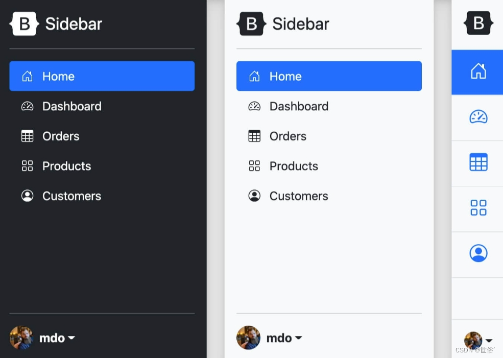


 1080
1080


 被折叠的 条评论
为什么被折叠?
被折叠的 条评论
为什么被折叠?
 到【灌水乐园】发言


