


一、食物列表页
点击某个食物弹出面板展示某个食物的详细信息,如热量、营养素等
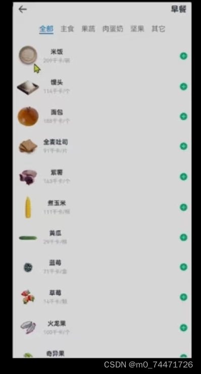
1.食物列表
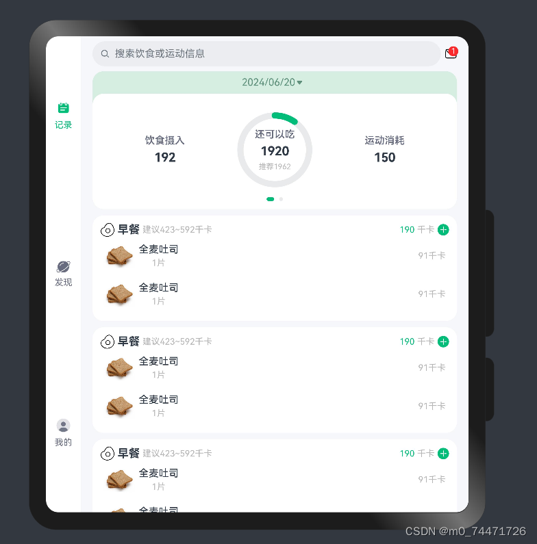
实现页面以及页面布局如图所示:
食物是一个全新的页面,new一个page命名为ItemIndex
import router from '@ohos.router'
import { CommonConstants } from '../common/constants/CommonConstants'
import ItemCard from '../view/item/ItemCard'
import ItemList from '../view/item/ItemList'
import ItemPanelHeader from '../view/item/ItemPanelHeader'
import NumberKeyboard from '../view/item/NumberKeyboard'
@Entry
@Component
struct ItemIndex {
@State amount:number=1//状态变量
@State value:string=''//用户按键的内容记录在value内 amount最终结果
@State showPanel:boolean=false//默认不展示
onPanelShow(){
this.amount=1//每次弹出,需要初始化为原始状态
this.value=''//每次弹出,初始化为原始状态
this.showPanel=true
}
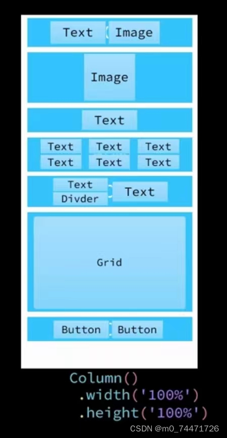
build() {
Column() {
//1.头部导航
this.Header()
//2.列表
ItemList({showPanel:this.onPanelShow.bind(this)})
.layoutWeight(1)//除头部外 剩下都被列表占用,这样高度固定
//3.底部面板
Panel(this.showPanel){
//3.1.顶部日期
ItemPanelHeader()
//3.2.记录顶卡片
ItemCard({amount:this.amount})
//3.3.数字键盘
NumberKeyboard({amount:$amount,value:$value})
//3.4.按钮
Row({space:CommonConstants.SPACE_6}){
Button('取消')
.width(120)
.backgroundColor($r('app.color.light_gray'))
.type(ButtonType.Normal)
.borderRadius(6)
.onClick(()=>this.showPanel=false)
Button('提交')
.width(120)
.backgroundColor($r('app.color.primary_color'))
.type(ButtonType.Normal)
.borderRadius(6)
.onClick(()=>this.showPanel=false)
}
.margin({top:10})
}
.mode(PanelMode.Full)//mode是一个枚举 Full默认展现全部
.dragBar(false)//不能调整高度
.backgroundMask($r('app.color.light_gray'))
.backgroundColor(Color.White)
}
.width('100%')
.height('100%')
}
@Builder Header(){
Row(){
Image($r('app.media.ic_public_back'))
.width(24)
.onClick(() => router.back())
Blank()
Text('早餐').fontWeight(CommonConstants.FONT_WEIGHT_500)
}
.width(CommonConstants.THOUSANDTH_940)
.height(32)
}
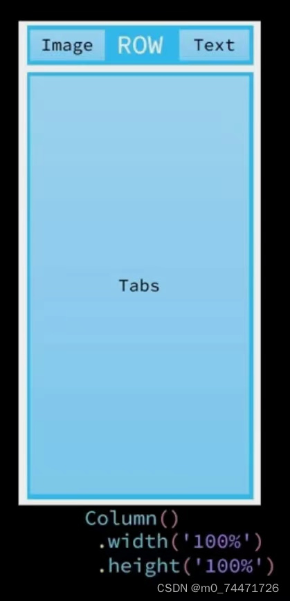
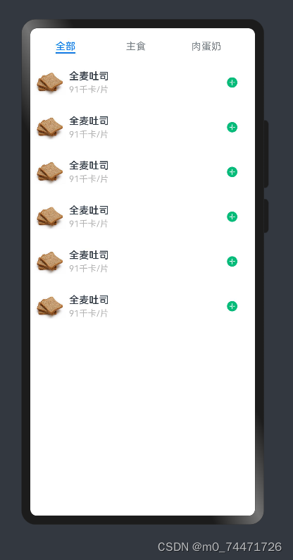
}列表内容较多,新建一个页面,在view下新建item,在item里新建ItemList页面书写列表内容
import { CommonConstants } from '../../common/constants/CommonConstants'
@Component
export default struct ItemList {//导出
  //函数 无参无返回值 将来点击传入
  showPanel:()=>void

  build() {
    Tabs(){
      TabContent() {
        this.TabContentBuilder()
      }
      .tabBar('全部')

      TabContent() {
        this.TabContentBuilder()
      }
      .tabBar('主食')

      TabContent() {
        this.TabContentBuilder()
      }
      .tabBar('肉蛋奶')
     }
    .width(CommonConstants.THOUSANDTH_940)
    .height('100%')
  }

  @Builder TabContentBuilder(){
    List({space:CommonConstants.SPACE_10}) {
      ForEach([1, 2, 3, 4, 5, 6], (item) => {
        ListItem() {
          Row({ space: CommonConstants.SPACE_4 }) {
            Image($r('app.media.toast')).width(50)
            Column({ space: CommonConstants.SPACE_4 }) {
              Text('全麦吐司').fontWeight(CommonConstants.FONT_WEIGHT_500)
              Text('91千卡/片').fontSize(14).fontColor($r('app.color.light_gray'))
            }

            Blank()
            Image($r('app.media.ic_public_add_norm_filled'))
              .width(18)
              .fillColor($r('app.color.primary_color'))
          }
          .width('100%')
          .padding(CommonConstants.SPACE_6)//内边距
        } //饮食不需要删除按钮
        .onClick(()=>this.showPanel())

      })
    }

    .width('100%')
    .height('100%')

  }
}
效果如图所示:
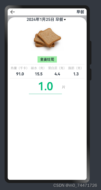
2.具体食物弹窗—底部Panel
实现页面以及页面布局如图所示:
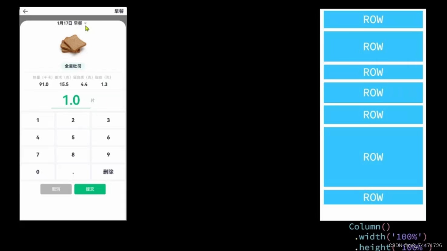
顶部日期在view的item定义一个新的组件ItemPanelHeader
import { CommonConstants } from '../../common/constants/CommonConstants'
@Component
export default struct ItemPanelHeader {
  build() {
    Row(){
      Text('2024年1月25号 早餐')
        .fontSize(18)
        .fontWeight(CommonConstants.FONT_WEIGHT_600)
      Image($r('app.media.ic_public_spinner'))
        .width(20)
        .fillColor(Color.Black)

    }
  }
}
import { CommonConstants } from '../../common/constants/CommonConstants'
@Component
export default struct ItemCard {
@Prop amount: number//状态变量 Prop不能初始化
build() {
Column({space:CommonConstants.SPACE_8}){
//1.图片
Image($r('app.media.toast')).width(150)
//2.名称
Row(){
Text('全麦吐司') .fontWeight(CommonConstants.FONT_WEIGHT_700)//为了添加颜色 将其放入Row容器中
}
.backgroundColor($r('app.color.lightest_primary_color'))
.padding({top:5,bottom:5,left:12,right:12})
Divider()//下划线
.width(CommonConstants.THOUSANDTH_940)
.opacity(0.6)//透明度
//3.营养素
Row({space:CommonConstants.SPACE_8}){
this.NutrientInfo('热量(千卡)',91.0)
this.NutrientInfo('碳水(克)',15.5)
this.NutrientInfo('蛋白质(克)',4.4)
this.NutrientInfo('脂肪(克)',1.3)
}
Divider()//下划线
.width(CommonConstants.THOUSANDTH_940)
.opacity(0.6)//透明度
//4.数量
Row(){
Column({space:CommonConstants.SPACE_4}){
Text(this.amount.toFixed(1))//1位小数
.fontSize(50).fontColor($r('app.color.primary_color'))
.fontWeight(CommonConstants.FONT_WEIGHT_600)
Divider().color($r('app.color.primary_color'))
}
.width(150)
Text('片')
.fontColor($r('app.color.primary_color'))
.fontWeight(CommonConstants.FONT_WEIGHT_600)
}
}
}
@Builder NutrientInfo(label:string,value:number){//其他传过来
Column({space:CommonConstants.SPACE_8}){
Text(label).fontSize(14).fontColor($r('app.color.light_gray'))
Text((value+this.amount).toFixed(1))//一位小数
.fontSize(18).fontWeight(CommonConstants.FONT_WEIGHT_700)
}
}
}效果如图所示:
3.数字键盘
在view的item定义一个新的组件NumberKeyboard
import { CommonConstants } from '../../common/constants/CommonConstants'
@Component
export default struct NumberKeyboard {

  numbers:string[]=['1','2','3','4','5','6','7','8','9','0','.']
  @Link amount:number//双向绑定
  @Link value:string
@Styles keyBoxStyle(){
  .backgroundColor(Color.White)
  .borderRadius(8)
  .height(60)
}
  build() {
    Grid(){
      ForEach(this.numbers,num=>{
        GridItem(){
          Text(num).fontSize(20).fontWeight(CommonConstants.FONT_WEIGHT_900)
        }
        .keyBoxStyle()
        .onClick(()=>this.clickNumber(num))
      })
      GridItem(){
        Text('删除').fontSize(20).fontWeight(CommonConstants.FONT_WEIGHT_900)
      }
      .keyBoxStyle()
      .onClick(()=>this.clickDelete())
    }
    .width('100%')
    .height(280)
    .backgroundColor($r('app.color.index_page_background'))
    .columnsTemplate('1fr 1fr 1fr')
    .columnsGap(8)//列间距
    .rowsGap(8)//行间距
    .padding(8)//内间距
    .margin({top:10})//外边距
  }
  clickNumber(num:string){//点击数值
    //1.拼接用户输入的内容
    let val=this.value+num
    //2.检验输入格式是否正确
    let firstIndex=val.indexOf('.')//从前向后数小数点角标
    let LastIndex=val.indexOf('.')//从后向前数小数点角标
    if(firstIndex!==LastIndex||(LastIndex!=-1&&LastIndex<val.length-2)){
      //非法输入
      return
    }
    //3.将字符串转为数值
    let amount=this.parseFloat(val)
    //4.保存
    if(amount>=999.9){
      this.amount=999.0
      this.value='999'
    }else {
      this.amount=amount
      this.value=val
    }
  }
  clickDelete(){//点击删除
    if(this.value.length<=0){
      this.value=''
      this.amount=0
      return
    }
    this.value=this.value.substring(0,this.value.length-1)
    this.amount=this.parseFloat(this.value)
  }

  parseFloat(str:string){
    if(!str){
      return 0
    }
    if (str.endsWith('.')) {
      str=str.substring(0,str.length-1)//从0开始去,去到字符串的最后一位-1
    }
    return parseFloat(str)
  }

}
效果如图所示:
二、一次开发,多端部署(多设备响应式布局)
用户使用的设备越来越多,屏幕大小不同,如手机、平板、笔记本等,要考虑不同设备的布局,根据屏幕大小的不同渲染不同的效果
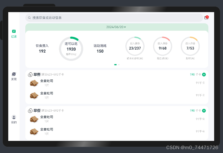
实现效果如下: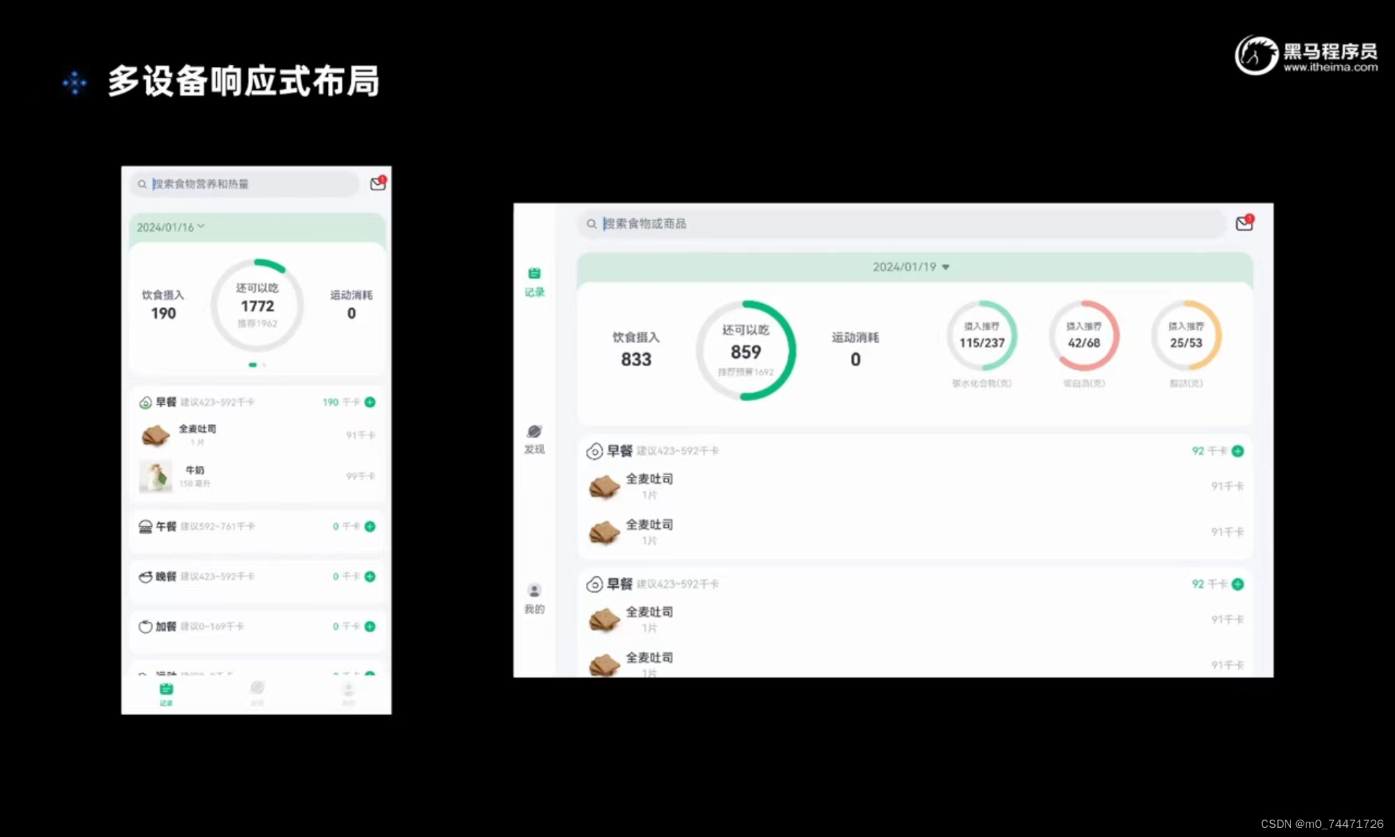
import BreakpointType from '../common/bean/BreanpointType'
import BreakpointConstants from '../common/constants/BreakpointConstants'
import { CommonConstants } from '../common/constants/CommonConstants'
import BreakpointSystem from '../common/utils/BreakpointSystem'
import RecordIndex from '../view/record/RecordIndex'

@Entry
@Component
struct Index {
  @State currentIndex: number = 0
  private breakpointSystem: BreakpointSystem = new BreakpointSystem()
  @StorageProp('currentBreakpoint') currentBreakpoint: string = BreakpointConstants.BREAKPOINT_SM

  @State isPageShow: boolean = false

  onPageShow(){//页面开始显示
    this.isPageShow = true
  }
  onPageHide(){//页面被隐藏
    this.isPageShow = false
  }

  @Builder TabBarBuilder(title: ResourceStr, image: ResourceStr, index: number) {//自定义样式
    Column({ space: CommonConstants.SPACE_8 }) {
      Image(image)
        .width(22)
        .fillColor(this.selectColor(index))
      Text(title)
        .fontSize(14)
        .fontColor(this.selectColor(index))
    }
  }

  aboutToAppear(){
    this.breakpointSystem.register()
  }

  aboutToDisappear(){
    this.breakpointSystem.unregister()
  }

  selectColor(index: number) {
    return this.currentIndex === index ? $r('app.color.primary_color') : $r('app.color.gray')
  }

  build() {
    Tabs({ barPosition: BreakpointConstants.BAR_POSITION.getValue(this.currentBreakpoint) }) {
      TabContent() {
        RecordIndex({isPageShow:this.isPageShow})
      }
      .tabBar(this.TabBarBuilder($r('app.string.tab_record'), $r('app.media.ic_calendar'), 0))

      TabContent() {
        Text('发现页面')
      }
      .tabBar(this.TabBarBuilder($r('app.string.tab_discover'), $r('app.media.discover'), 1))

      TabContent() {
        Text('我的主页')
      }
      .tabBar(this.TabBarBuilder($r('app.string.tab_user'), $r('app.media.ic_user_portrait'), 2))

    }
    .width('100%')
    .height('100%')
    .onChange(index => this.currentIndex = index)
    .vertical(new BreakpointType({
      sm: false,
      md: true,
      lg: true
    }).getValue(this.currentBreakpoint))
  }
}
import BreakpointType from '../bean/BreanpointType';
export default class BreakpointConstants {
  /**
   * 小屏幕设备的 Breakpoints 标记.
   */
  static readonly BREAKPOINT_SM: string = 'sm';

  /**
   * 中等屏幕设备的 Breakpoints 标记.
   */
  static readonly BREAKPOINT_MD: string = 'md';

  /**
   * 大屏幕设备的 Breakpoints 标记.
   */
  static readonly BREAKPOINT_LG: string = 'lg';

  /**
   * 当前设备的 breakpoints 存储key
   */
  static readonly CURRENT_BREAKPOINT: string = 'currentBreakpoint';

  /**
   * 小屏幕设备宽度范围.
   */
  static readonly RANGE_SM: string = '(320vp<=width<600vp)';

  /**
   * 中屏幕设备宽度范围.
   */
  static readonly RANGE_MD: string = '(600vp<=width<840vp)';

  /**
   * 大屏幕设备宽度范围.
   */
  static readonly RANGE_LG: string = '(840vp<=width)';

  static readonly BAR_POSITION: BreakpointType<BarPosition> = new BreakpointType({
    sm: BarPosition.End,
    md: BarPosition.Start,
    lg: BarPosition.Start,
  })
}
定义媒体查询的工具类在utils下定义BreakpointConstants
import BreakpointType from '../bean/BreanpointType';
export default class BreakpointConstants {
  /**
   * 小屏幕设备的 Breakpoints 标记.
   */
  static readonly BREAKPOINT_SM: string = 'sm';

  /**
   * 中等屏幕设备的 Breakpoints 标记.
   */
  static readonly BREAKPOINT_MD: string = 'md';

  /**
   * 大屏幕设备的 Breakpoints 标记.
   */
  static readonly BREAKPOINT_LG: string = 'lg';

  /**
   * 当前设备的 breakpoints 存储key
   */
  static readonly CURRENT_BREAKPOINT: string = 'currentBreakpoint';

  /**
   * 小屏幕设备宽度范围.
   */
  static readonly RANGE_SM: string = '(320vp<=width<600vp)';

  /**
   * 中屏幕设备宽度范围.
   */
  static readonly RANGE_MD: string = '(600vp<=width<840vp)';

  /**
   * 大屏幕设备宽度范围.
   */
  static readonly RANGE_LG: string = '(840vp<=width)';

  static readonly BAR_POSITION: BreakpointType<BarPosition> = new BreakpointType({
    sm: BarPosition.End,
    md: BarPosition.Start,
    lg: BarPosition.Start,
  })
}
优化代码使代码更加优雅
在bean下定义断点类型BreanpointType,并修改相应参数
declare interface BreakpointTypeOptions<T>{
  sm?:T,
  md?:T,
  lg?:T
}

export default class BreakpointType<T>{//从对象类型中取值
  options: BreakpointTypeOptions<T>

  constructor(options: BreakpointTypeOptions<T>) {
    this.options = options
  }

  getValue(breakpoint: string): T{
    return this.options[breakpoint]
  }
}
效果如图所示:

总结
1.食物列表
展示了如何在HarmonyOS应用中使用组件化的方式来构建用户界面。ItemIndex组件作为页面的容器,负责整体布局和状态管理,而ItemList组件则作为子组件,专注于展示商品列表。通过这种方式,代码结构清晰,易于维护和扩展。
2.具体食物弹窗—底部Panel
展示了如何在HarmonyOS应用中使用组件化的方式来构建具有丰富信息展示的用户界面。ItemPanelHeader组件提供了一个简洁的头部展示,而ItemCard组件则提供了一个详细的商品信息展示,包括图片、名称、营养素和数量。通过组件化的方式,代码结构清晰,易于维护和扩展。
3.数字键盘
NumberKeyboard组件是一个简单而实用的数字输入工具,它通过网格布局展示了数字键盘,并提供了输入验证和格式化功能。组件的设计考虑了用户输入的准确性和界面的美观性,适用于需要精确数值输入的场景。
4.一次开发,多端部署(多设备响应式布局)
实现了一个具有自适应布局的首页,通过断点系统来适应不同屏幕尺寸的设备。它使用了自定义的标签栏构建器方法来增强UI的交互性,并通过状态变量来跟踪页面的显示状态。代码结构清晰,易于理解和维护。


 321
321

 被折叠的 条评论
为什么被折叠?
被折叠的 条评论
为什么被折叠?
 到【灌水乐园】发言


