


1.利用CSS盒模型
盒模型上下左右边框交界处出呈现平滑的斜线. 利用这个特点, 通过设置不同的上下左右边框宽度或者颜色可以得到小三角
调整宽高大小可以调节三角形形状.
2.设置盒子宽高
<style>
.box {
width: 400px;
height: 400px;
background-color: aquamarine;
}
</style>
<div class="box"></div>
3.设置盒子边框
<style>
.box {
width: 100px;
height: 100px;
border-top:100px solid red;
border-bottom: 100px solid red;
border-left: 100px solid yellow;
border-right: 100px solid yellow;
}
</style>
<div class="box"></div>

然后得到上图一个宽高为100px,边框宽度100pxd的盒子
4.接下来把盒子宽高设为0 ,其中三面的border的颜色为透明 transparent
<style>
.box {
width: 0;
height: 0;
border-top:100px solid transparent;
border-bottom: 100px solid red;
border-left: 100px solid transparent;
border-right: 100px solid transparent;
}
</style>
<div class="box"></div>

得到一个宽高为0,下边框为100px,红色的盒子,因为其他三面边框为透明,所以看起来就是一个红色的三角形。
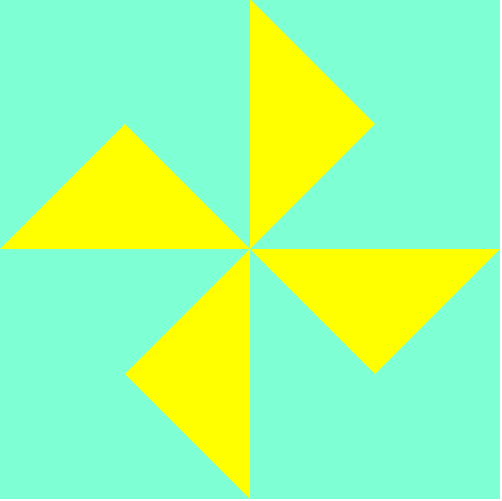
5.制作风车模型
那么利用这个原理,我们就可以在一个大盒子里嵌套四个小盒子,让它们浮动成田字型,改变每个小盒子的边框就可以做一个风车出来了。代码如下:
<style>
.box {
width: 400px;
height: 400px;
background-color: aquamarine;
}
.box1 {
width: 0;
height: 0;
border-top:100px solid transparent;
border-left: 100px solid transparent;
border-bottom: 100px solid yellow;
border-right: 100px solid transparent;
float: left;
}
.box2 {
width: 0;
height: 0;
border-top:100px solid transparent;
border-bottom: 100px solid transparent;
border-left: 100px solid yellow;
border-right: 100px solid transparent;
float: left;
}
.box3 {
width: 0;
height: 0;
border-top:100px solid transparent;
border-bottom: 100px solid transparent;
border-left: 100px solid transparent;
border-right: 100px solid yellow;
float: left;
}
.box4 {
width: 0;
height: 0;
border-top:100px solid yellow;
border-bottom: 100px solid transparent;
border-left: 100px solid transparent;
border-right: 100px solid transparent;
float: left;
}
</style>
<div class="box">
<div class="box1"></div>
<div class="box2"></div>
<div class="box3"></div>
<div class="box4"></div>
</div>
效果图:


 1万+
1万+


 被折叠的 条评论
为什么被折叠?
被折叠的 条评论
为什么被折叠?
 到【灌水乐园】发言


