


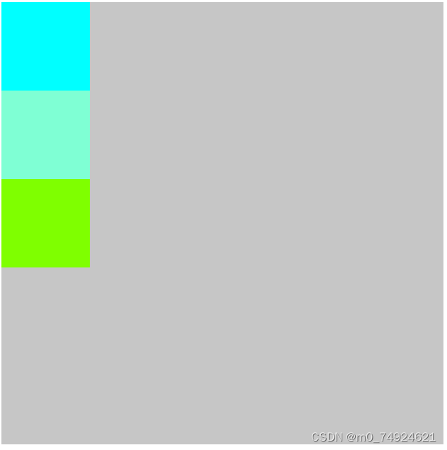
正常盒子内摆放为竖直摆放
<!DOCTYPE html>
<html lang="en">
<head>
<meta charset="UTF-8">
<meta name="viewport" content="width=device-width, initial-scale=1.0">
<title>Document</title>
<style>
.container{
height: 500px;
width: 500px;
background-color: #5555;
}
.box1{
height: 100px;
width: 100px;
background-color: aqua;
}
.box2{
height: 100px;
width: 100px;
background-color:aquamarine;
}
.box3{
height: 100px;
width: 100px;
background-color: chartreuse;
}
</style>
</head>
<body>
<div class="container">
<div class="box1"></div>
<div class="box2"></div>
<div class="box3"></div>
</div>
</body>
</html>
显示效果:
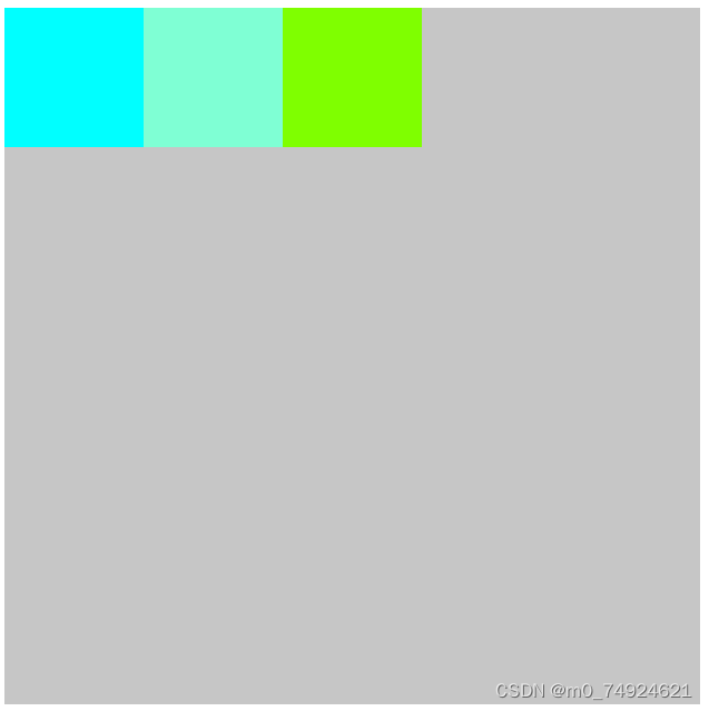
设置弹性盒子模型,即往container设置display:flex后
显示效果:
弹性盒子可以设置的属性:flex-direction(盒子摆放的方向):row(水平)||row-reverse(水平翻转)||column(竖直)||column-reverse(竖直翻转)
justify-content(内容水平摆放):flex-start(默认)||flex-end||center
align-items(内容竖直摆放):flex-start||flex-end||center
子盒子可以设置的属性:flew(占据父盒子的比例):任意数字


 被折叠的 条评论
为什么被折叠?
被折叠的 条评论
为什么被折叠?
 到【灌水乐园】发言


