


目录

前言:
本篇文章我将用三种方式来实现轮播图,分别为以下三种:
- css+js实现轮播图效果(常规轮播图)
- css3动画实现轮播图效果(进阶,3d轮播图)
- three.js实现轮播图效果(扩展)
希望观众老爷可以从本篇文章得到自己的思路,这也是我创作的最终目的啦!!
不嫌弃的话,给个关注,点赞,再安利给别的宝子们就更好了!!!!
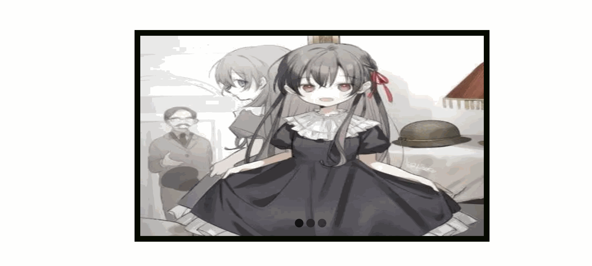
第一种:常规css+js实现轮播图效果
效果图:
代码:
<!DOCTYPE html>
<html lang="en">
<head>
  <meta charset="UTF-8">
  <meta name="viewport" content="width=device-width, initial-scale=1.0">
  <title>Document</title>
  <style>
          * {
			margin: 0px;
			padding: 0px;
		}

		.banner {
			width: 600px;
			margin: auto;
			border: 10px solid rgb(6, 10, 0);
			height: 350px;
			position: relative;
			overflow: hidden;
		}

		.imgList {
			list-style: none;
			/* width: 2480px; */
			position: absolute;
			/* left:-620px; */
		}
    .imgList img {
			width: 600px;
			height: 350px;
		}

		.imgList li {
			float: left;
			margin-right: 20px;
		}
    .circle {
			position: absolute;
			bottom: 15px;
			left: 50%;
			transform: translateX(-50%);
		}
        .circle a {
			width: 15px;
			height: 15px;
			background: rgb(4, 0, 0);
			display: block;
			border-radius: 50%;
			opacity: .5;
			float: left;
			margin-right: 5px;
			cursor: pointer;
		}

		.circle a.hover {
			background: black;
			opacity: .8;
		}
  </style>
</head>
<body style="margin-top: 200px;">
  <div class="banner">
		<ul class="imgList">
			<li><img src="02.webp" alt=""></li>
			<li><img src="01.jpg" alt=""></li>
			<li><img src="03.webp" alt=""></li>
		</ul>
		<div class="circle">   </div>
	</div>
  <script>
    window.onload = function () {
			var imgList = document.querySelector('.imgList');
			var circle = document.querySelector('.circle');
			var thisIndex = 0;
			var imgListLi = imgList.children;
			var circleA = circle.children;
			var flag = true;
			imgList.style.width = imgList.children.length * 620 + 'px';
			for (var i = 0; i < imgList.children.length; i++) {
				var aNode = document.createElement('a');
				aNode.setAttribute('index', i);	//设置自定义属性
				if (i == 0) {
					aNode.className = 'hover';
				}
				circle.appendChild(aNode);
			}

    circle.addEventListener('click', function (e) {
				if (flag) {
					flag = false;
					// console.log(e.target);
					if (e.target.nodeName != 'A') {
						return false;
					}
					thisIndex = e.target.getAttribute('index');
					// imgList.style.left = -thisIndex * 620 + 'px';
					slow(imgList, -thisIndex * 620, function () {
						flag = true;
					});
					circleChange();
				}
			})

      function antoChange() {
				setInterval(function () {
					if (flag) {
						flag = false;
						if (thisIndex >= circleA.length) {
							thisIndex = 0;
						}
						slow(imgList, -thisIndex * 620, function () {
							flag = true;
						});
						circleChange();
						thisIndex++;
					}
				}, 3000);
			}

      function circleChange() {
				for (var i = 0; i < circleA.length; i++) {
					circleA[i].className = '';
				}
				circleA[thisIndex].className = 'hover';
			}
			function slow(obj, target, callback) {
				obj.myInter = setInterval(function () {
					var offsetLeft = obj.offsetLeft;
					var num = (target - offsetLeft) / 10;
					num > 0 ? num = Math.ceil(num) : num = Math.floor(num);
					if (offsetLeft == target) {
						clearInterval(obj.myInter);
						callback && callback();
					} else {
						obj.style.left = offsetLeft + num + 'px';
					}
				}, 10)
			}
			antoChange();

    }

  </script>
</body>
</html>
思路:
-
初始化:
- 使用
window.onload确保在DOM完全加载后再执行脚本。 - 获取
.imgList(图片列表)和.circle(圆形导航点容器)元素。 - 初始化
thisIndex为0,表示当前显示的图片索引。 - 根据图片数量设置
.imgList的宽度,这里假设每张图片的宽度为620px。
- 使用
-
创建圆形导航点:
- 遍历
.imgList的子元素(即图片),并为每个图片创建一个对应的导航点(<a>元素)。 - 每个导航点都设置了一个自定义属性
index,表示其对应的图片索引。 - 将这些导航点添加到
.circle容器中,并为第一个导航点添加hover类(可能用于样式高亮)。
- 遍历
-
点击导航点切换图片:
- 为
.circle添加一个点击事件监听器。 - 如果点击的不是导航点(
<a>元素),则不执行任何操作。 - 获取被点击的导航点的
index属性,并更新thisIndex。 - 调用
slow函数,以动画形式将.imgList移动到对应位置。 - 调用
circleChange函数,更新圆形导航点的样式。 - 使用
flag变量确保在动画执行期间不会触发新的切换。
- 为
-
自动切换图片:
antoChange函数使用setInterval实现图片的自动切换。- 在每次切换之前,检查
flag变量,确保不会与手动切换冲突。 - 如果
thisIndex超出范围,则重置为0。 - 与点击导航点类似,使用
slow函数移动.imgList并更新圆形导航点。 - 在动画结束后,增加
thisIndex的值。
-
更新圆形导航点样式:
circleChange函数遍历所有的导航点,并移除它们的hover类。- 为当前显示的图片对应的导航点添加
hover类。
-
平滑移动效果:
slow函数实现了图片的平滑移动效果。- 它使用
setInterval来定期更新.imgList的left属性。 - 每次更新时,计算当前位置与目标位置之间的差值,并取一个较小的步长(这里为差值的1/10)。
- 当
.imgList到达目标位置时,清除定时器并调用回调函数。
-
启动自动切换:
最后,调用antoChange函数来启动图片的自动切换。
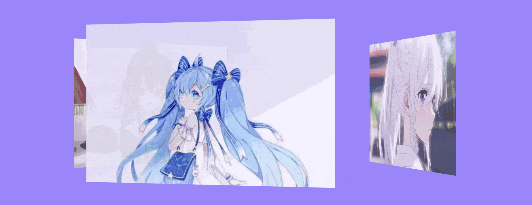
第二种:纯css动画实现轮播图效果
效果图:
代码:
<!DOCTYPE html>
<html lang="en">
<head>
  <meta charset="UTF-8">
  <meta name="viewport" content="width=device-width, initial-scale=1.0">
  <title>练习</title>
  <style>
  body{
            background-color: rgb(154, 133, 250);
        }
        .a{
            position: relative;
            perspective: 1600px;
            top: 350px;
            display: flex;
            /* flex在主轴居中对齐 */
            justify-content: center;
            /* flex在交叉项对齐方式 */
            align-items: center;
        }
        .b{
            width: 400px;
            height: 250px;
            position: absolute;
            /* 指定子元素如何在 3D 空间内显示。具体来说,当设置为 preserve-3d 时,表示子元素会在 3D 空间内进行变换,并保持其相对于父元素的位置关系 */
            transform-style: preserve-3d;
            animation: move 8s infinite
            /* 动画执行的时间函数 */
            cubic-bezier(.7,0,0.17,1);
        }
        .b div{
            position: absolute;
            background-size: cover;
            opacity: .9;
            width: 400px;
            height: 250px;
            transform: rotateY(calc(var(--i)*120deg))
             translateZ(300px);
        }
        .c{
            background-image: url("01.jpg");
        }
        .d{
            background-image: url("02.webp");
        }
        .e{
            background-image: url("03.webp");
        }
        @keyframes move{
            0%{
                transform: translateZ(-100px) rotateY(0);
            }
            33%{
                transform: translateZ(-100px) rotateY(-120deg);
            }
            66%{
                transform: translateZ(-100px) rotateY(-240deg);
            }
            100%{
                transform: translateZ(-100px) rotateY(-360deg);
            }
        }
  </style>
</head>
<body>
  <div class="a">
    <div class="b">
        <div class="c" style="--i:0"></div>
        <div class="d" style="--i:1"></div>
        <div class="e" style="--i:2"></div>
    </div>
</body>
</html>
思路:
代码的思路解析:
-
HTML结构:
- 一个主容器
<div class="a">,用于设置背景色和布局位置。 - 在主容器内,有一个
<div class="b">,它包含三个子<div>元素,每个都有各自的背景图片(class="c",class="d",class="e")。
- 一个主容器
-
CSS样式:
- body样式:设置了页面的背景色。
- .a样式:
- 使用
position: relative;来定位其子元素。 - 设置
perspective: 1600px;来定义3D空间的透视距离。 - 使用
justify-content: center;和align-items: center;来使子元素在水平和垂直方向上居中。
- 使用
- .b样式:
position: absolute;使其相对于.a进行定位。transform-style: preserve-3d;表示子元素将在3D空间内进行变换,并保持其相对于父元素的位置关系。- 定义了一个动画
move,使.b在8秒内无限循环。动画的时间函数是cubic-bezier(.7,0,0.17,1),这提供了动画的速度曲线。
- .b div样式:
position: absolute;使其相对于.b进行定位。- 使用
background-size: cover;来确保背景图片覆盖整个div。 opacity: .9;设置透明度。- 使用
transform: rotateY(calc(var(--i)*120deg)) translateZ(300px);进行3D变换。其中,--i是一个CSS变量,用于计算每个子div的旋转角度。每个子div分别被旋转了0度、120度和240度。translateZ(300px);将它们都移动到Z轴的300px处,从而在3D空间中分离它们。
- .c, .d, .e样式:分别设置了各自的背景图片。
- @keyframes move:定义了动画
move的关键帧。在0%、33%、66%和100%的进度时,.b在Z轴上移动并绕Y轴旋转。虽然.b在旋转,但由于其子div已经通过transform: rotateY(...) translateZ(300px);进行了旋转和位移,所以在视觉上会看到一个连续的3D旋转效果。
-
动画效果:
- 当页面加载时,
.b开始执行move动画。在动画过程中,它沿着Z轴稍微向后移动(translateZ(-100px)),并绕Y轴旋转。然而,由于子div已经通过transform: rotateY(...) translateZ(300px);进行了3D变换,所以你会看到它们以3D方式旋转和显示。
- 当页面加载时,
第三种:three.js实现轮播图效果
效果图:
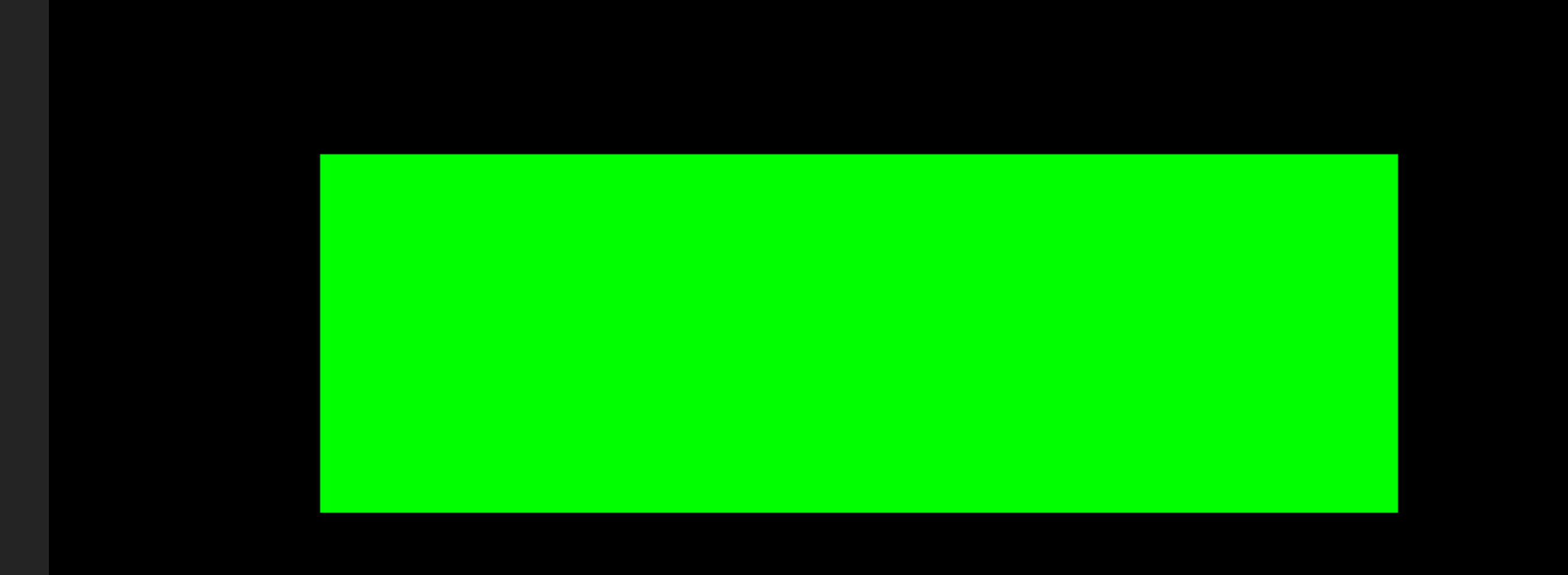
这里我将图片用平面替代,平面颜色不同,相当于就是图片的不同
代码:
<template>
  <div>
  </div>
</template>
<script>
import * as THREE from 'three';
export default {
  data() {
    return {
      flaght:1
    }
  },
  methods: {

  },
  mounted() {
    let that
    =this
    // 创建一个场景
const scene = new THREE.Scene();
  // 创建一个相机
  const camera = new THREE.PerspectiveCamera(35, window.innerWidth / window.innerHeight, 0.1, 1000);
  camera.position.z = 4; // 将相机向后移动一些,以便可以看到平面
  // 创建一个渲染器并添加到DOM中
  const renderer = new THREE.WebGLRenderer();
  renderer.setSize(window.innerWidth, window.innerHeight);
  document.body.appendChild(renderer.domElement);
  // 创建一个平面几何体
  const planeGeometry1 = new THREE.PlaneGeometry(3, 1); // 宽度和高度都为1的平面
  // 创建一个材质
  const planeMaterial1 = new THREE.MeshBasicMaterial({
    color: 0x00ff00,
    side: THREE.DoubleSide // 设置两面都可见
  }); // 绿色的材质
  const planeMaterial2 = new THREE.MeshBasicMaterial({
    color: 0x00ffff,
    side: THREE.DoubleSide // 设置两面都可见
  }); // 蓝色的材质
  const planeMaterial3 = new THREE.MeshBasicMaterial({
    color: 0x99ff99,
    side: THREE.DoubleSide // 设置两面都可见
  }); // 黄色的材质
  // 使用几何体和材质来创建一个网格
  const plane1 = new THREE.Mesh(planeGeometry1, planeMaterial1);
  plane1.position.x=0
  // 将网格添加到场景中
  scene.add(plane1);
  // 使用几何体和材质来创建一个网格
  const plane2 = new THREE.Mesh(planeGeometry1, planeMaterial2);
  plane2.position.x=5
  // 将网格添加到场景中
  scene.add(plane2);
  // 使用几何体和材质来创建一个网格
  const plane3 = new THREE.Mesh(planeGeometry1, planeMaterial3);
  // 将网格添加到场景中
  plane3.position.x=10
    scene.add(plane3);
    //
    function Callback2(ww) {
      while (ww == 0) {
        camera.position.x = camera.position.x - 5
        if (camera.position.x == 0) {
          ww = 1;
          return ww
        }
      }
    }
  // 设置定时器
  setInterval(timerCallback, 1000); // 每秒执行一次
  // 这是你的定时器回调函数
  function timerCallback() {
    if (that.flaght==1) {
      camera.position.x = camera.position.x + 5
      // 检查条件是否满足
      if (camera.position.x == 15) {
        // 如果条件满足,清除定时器
        // clearInterval(timerId);
      that.flaght=0
      that.flaght= Callback2(that.flaght)
      }
    }
  }
  // 渲染循环
  function animate() {
    requestAnimationFrame(animate);
    // controls.update();
      renderer.render(scene, camera);
  }
  animate();
  }
}
</script>
<style>
*{
  padding: 0;
  margin: 0;
}
body{
  padding: 0;
  margin: 0;
}
</style>
思路:
我自己是用三张平面代替图片,然后通过相机位置移动来造成平面切换思路
Vue组件结构
- 模板:
<template>标签内定义了一个空的<div>元素,因为所有的3D渲染都将通过Three.js直接添加到body元素中。 - 脚本:
<script>标签内定义了Vue组件的逻辑。 - 样式:
<style>标签定义了全局样式,确保没有默认的边距和填充。
Three.js逻辑
- 场景创建:使用
new THREE.Scene()创建一个新的场景。 - 相机创建:使用
new THREE.PerspectiveCamera()创建一个透视相机,并设置其位置和视野。 - 渲染器创建:使用
new THREE.WebGLRenderer()创建一个WebGL渲染器,并将其大小设置为窗口大小,然后将渲染器的DOM元素添加到body中。 - 平面几何体和材质:创建了三个平面几何体,每个都使用不同的材质(颜色)。
- 网格创建:为每个平面几何体创建一个网格(
THREE.Mesh),并将它们添加到场景中。 - 定时器:使用
setInterval设置一个定时器,每秒调用timerCallback函数。这个函数根据flaght变量的值移动相机的位置,并在满足特定条件时改变flaght的值和调用Callback2函数。 - 动画循环:使用
requestAnimationFrame创建一个动画循环,用于渲染场景。
结尾:
感谢各位观众老爷的观看,如果各位对代码有什么问题,请观众老爷评论区留言,俺会及时回复的,谢谢大家ヾ(≧▽≦*)/


 1694
1694

 被折叠的 条评论
为什么被折叠?
被折叠的 条评论
为什么被折叠?
 到【灌水乐园】发言


