


目录
前言
这是一个充满想象力和创意的数字时代,电子商务已成为人们日常购物的主要渠道。在这样的背景下,拥有一款优秀的电子商务网站和APP,成为了现代社会商业竞争的必备武器。本篇文稿将为大家详细介绍如何构建一个优秀的电子商务网站首页,涵盖了底部导航、头部搜索框、轮播图、导航条和楼层等主要内容。
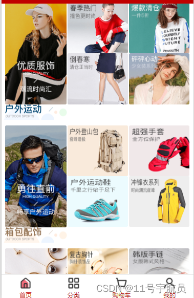
效果图:

首页包括5个部分
1.底部导航
2.头部搜索框
3.轮播图
4.导航条
5.楼层
1.底部导航
要实现底部导航,我们就要使用tabbar方法。
我们在创建的项目中找到pages.json文件

在其中使用tabbar方法设置底部导航
"tabBar": {
		"backgroundColor": "#fff",
		"color": "#aa0000",
		"selectedColor": "#c00000",
		"list": [{
			"iconPath": "./static/优购商城图片/tabBar/home.png",
			"selectedIconPath": "./static/优购商城图片/tabBar/home-on.png",
			"text": "首页",
			"pagePath": "pages/index/index"
		}, {
			"iconPath": "./static/优购商城图片/tabBar/category.png",
			"selectedIconPath": "./static/优购商城图片/tabBar/category-on.png",
			"text": "分类",
			"pagePath": "pages/category/category"
		}, {
			"iconPath": "./static/优购商城图片/tabBar/cart.png",
			"selectedIconPath": "./static/优购商城图片/tabBar/cart-on.png",
			"text": "购物车",
			"pagePath": "pages/cart/cart"
		}, {
			"iconPath": "./static/优购商城图片/tabBar/user.png",
			"selectedIconPath": "./static/优购商城图片/tabBar/user-on.png",
			"text": "我的",
			"pagePath": "pages/user/user"
		}]
	}
2.头部搜索框
设置完底部导航后,我们创建一个名为components的目录,在其中创建自定义一个组件用于搜索框的制作。
页面结构:
<template>
<view class="header">
<navigator class="search">
<text class="iconfont icon-sousuo"></text>
<text>搜索</text>
</navigator>
</view>
</template>其中navigator是一个内置组件,用于在页面之间进行跳转和导航。它类似于网页中的超链接,可以通过点击按钮、文本或图片等元素来触发页面跳转。通过设置不同的属性,可以实现不同的跳转方式。
搜索图标则是使用了uni-icon图标组件

样式结构:
<style lang="scss">
	.header{
		width:750rpx;
		height: 90rpx;
		background-color: var(--themColor);
		display: flex;
		align-items: center;
		justify-content: center;
		position: fixed;
		left: 0;
		top:var(--window-top);
		z-index: 10;
	}
	.search{
		width: 720rpx;
		height: 60rpx;
		border-radius: 20rpx;
		background-color: #fff;
		display: flex;
		align-items: center;
		justify-content: center;
	}
</style>
最后将我们的组件引入页面便可显示搜索框。

3.轮播图
制作轮播图,我们可以通过定义一个data对象,将swiperList数组作为该对象的一个属性,用于存储从远程服务器获取的轮播图数据。在onLoad生命周期函数中,调用getSwiperList方法,通过uni.request方法向远程服务器发送请求,获取轮播图数据。在请求成功后,将获取到的数据中的message字段赋值给swiperList数组,从而实现轮播图的展示。
	export default {
		data() {
			return {
				swiperList: [],
			}
		},
		onLoad() {
			this.getSwiperList();
		},
		methods: {
			//轮播图
			getSwiperList() {
				uni.request({
					url: 'https://api-hmugo-web.itheima.net/api/public/v1/home/swiperdata',
					success: (res) => {
						console.log(res);
						this.swiperList = res.data.message;
					}
				})
			},
完成了请求轮播图数据之后,我们在页面中显示;
		<view class="index-swiper">
			<swiper indicator-dots="true" autoplay="true" interval="3000">
				<swiper-item v-for="(item,index) in swiperList" :key="index">
					<image :src="item.image_src" mode="widthFix"></image>
				</swiper-item>
			</swiper>
		</view>
在这当中我们引用了uni-app的内置组件swiper;它是一个可以用来展示轮播图的组件。swiper组件可以自动播放轮播图,也可以手动滑动切换轮播图。同时,swiper组件也提供了丰富的事件和属性,可以满足各种不同的需求。

样式结构:
	.index-swiper {
		swiper {
			width: 750rpx;
			height: 340rpx;

			image {
				width: 100%;
			}
		}
	}
4.导航条
制作导航条与轮播图相似,通过定义一个data对象,将navList数组作为该对象的一个属性,用于存储从远程服务器获取的轮播图数据。
navList: []在onLoad生命周期函数中,调用getNavList方法。
this.getNavList();通过uni.request方法向远程服务器发送请求,获取导航条数据。在请求成功后,将获取到的数据中的message字段赋值给getNavList数组,从而实现导航条的展示。
getNavList() {
				uni.request({
					url: 'https://api-hmugo-web.itheima.net/api/public/v1/home/catitems',
					success: (res) => {
						console.log(res);
						this.navList = res.data.message;
					}
				})
			},
导航条页面结构:
		<!-- 导航 -->
		<view class="index-cate">
			<view class="image-box" v-for="(item,index) in navList">
				<image :src="item.image_src"></image>
			</view>
		</view>
样式结构:
	.index-cate {
		width: 750rpx;
		display: flex;

		.image-box {
			display: flex;
			justify-content: space-around;
			margin: 30rpx 0;

			image {
				width: 180rpx;
				height: 140rpx;
			}
		}
	}
5.楼层
对照之前的办法,我们进行对楼层数据的获取。
定义一个data对象,将floorList数组作为该对象的一个属性,用于存储从远程服务器获取的轮播图数据。
floorList: [],在onLoad生命周期函数中,调用getfloorList方法。
this.getfloorList();通过uni.request方法向远程服务器发送请求,获取楼层数据。在请求成功后,将获取到的数据中的message字段赋值给floorList数组,从而实现轮播图的展示。
getfloorList() {
				uni.request({
					url: 'https://api-hmugo-web.itheima.net/api/public/v1/home/floordata',
					success: (res) => {
						console.log(res);
						this.floorList = res.data.message;
					}
				})
			},
由于楼层数据有结构性,在进行页面设计时要将视图进行分层:
<view class="index-floor">
			<view class="floor-group" v-for="(item,index) in floorList" :key="index">
				<view class="floor-title">
					<image mode="widthFix" :src="item.floor_title.image_src"></image>
				</view>
				<view class="floor-list">
					<view class="image-box" v-for="(item2,index2) in item.product_list" :key="index2">
						<image mode="scaleToFill" :src="item2.image_src"></image>
					</view>
				</view>

			</view>
		</view>
样式结构:
.index-floor{
		width: 750rpx;

		.floor-title{

			image{
				width: 100%;
			}
		}
		.floor-list{
			padding: 15rpx;
			.image-box{

				width: 240rpx;
				height: calc(240rpx * 386/232);
				float: left;

				&:nth-last-child(-n+4){
					height: calc(240rpx * 386/232/2);
					border-left: 10rpx solid #ffffff;
				}

				&:nth-child(2),&:nth-child(3){
					border-left:5rpx solid #ffffff ;
				}

				&:nth-child(4),&:nth-child(5){
					border-left:5rpx solid #ffffff ;
				}

				image{
					width: 100%;
					height: 100%;
				}
			}

		}
	}
这段代码表示楼层列表的填充为 15rpx,并包含多个图像框。每个图像框的宽度为 240rpx,高度使用公式 240rpx * 386/232 计算。图像框向左浮动。
前四个图像框的高度使用公式 240rpx * 386/232/2 减半,左边框为 10rpx。其余图像框的左边框为 5rpx,但第二个和第三个图像框以及第四和第五个图像框共享相同的左边框。
这样便完成了商城首页。
总结
在这里我们使用uni-app进行商城首页的开发。通过对底部导航、头部搜索框、轮播图、导航条和楼层的制作,使得商城首页具有良好的用户交互体验和美观的界面设计。其中,通过使用内置组件、自定义组件、uni.request方法等技术手段,实现了数据的请求和展示。同时,本文还介绍了如何通过设置不同属性和样式,实现组件和页面的美化。


 2843
2843


 被折叠的 条评论
为什么被折叠?
被折叠的 条评论
为什么被折叠?
 到【灌水乐园】发言


