


技巧:将input按钮和美化内容都放在label标签内,再通过定位将input按钮溢出隐藏!使用CSS3中的E:checked伪类选择器触发美化表单!
纯CSS3美化复选框
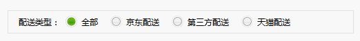
效果图:
HTML:
<!--纯css3实现单选框美化 -->
<!-- IE8以及一下版本不支持,edge也不支持,在ie9/ie10兼容显示 -->
<div class="type">
    <dl id="type">
        <dt>配送类型:</dt>
        <!-- 技巧:将input按钮和美化内容都放在label标签内,在通过定位将input按钮溢出隐藏! -->
        <dd><label><input type="radio" name='radioButton'><a ><b></b>全部</a></label></dd>
        <dd><label><input type="radio" name='radioButton'><a ><b></b>京东配送</a></label></dd>

        <dd><label><input type="radio" name='radioButton'><a><b></b>第三方配送</a></label></dd>
        <dd><label><input type="radio" name='radioButton'><a><b></b>京东配送</a></label></dd>
    </dl>
</div>
CSS:
@charset "UTF-8";
/* CSS Document */
body{font:12px/22px "微软雅黑";}
a{text-decoration:none;color:#000;}
.type{width:500px;height:32px;border:1px solid #DFDFDF;margin:30px auto 0;overflow: hidden;}
.type dl{height:32px;line-height:32px;padding-left:15px;}
.type dl dt{float:left;}
.type dl dd{float:left;margin:0 10px 0 8px;position:relative;padding-left:23px;}
.type dl dd a{display:block;}
.type dl dd a:hover{color:#CC0000;text-decoration:underline;}
.type dl dd b{width:20px;height:20px;background:url(../images/radiobutton.gif) no-repeat -15px -18px;display:block;position:absolute;left:0;top:6px;}
.type dl dd a:hover b{background-position:-15px -118px;}
/*定位隐藏原生radio*/
.type dl dd input[type='radio']{
position: absolute;
top:-100px
}
/*checked伪类选择器*/
.type dl dd input[type='radio']:checked~a b{
background-position:-15px -218px;
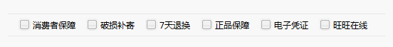
}同理可得,checkbox按钮也能通过类似的技巧实现按钮美化!


 7696
7696


 被折叠的 条评论
为什么被折叠?
被折叠的 条评论
为什么被折叠?
 到【灌水乐园】发言


