Android 圆角图片,CardView使用实例,阴影和圆角


<com.arc.fast.view.rounded.RoundedConstraintLayout
    app:rounded_radius="12dp"
    android:layout_width="wrap_content"
    android:layout_height="match_parent">
implementation 'com.github.Arcns.arc-fast:rounded:1.23.1'
<androidx.cardview.widget.CardView
    android:layout_width="match_parent"
    android:layout_height="wrap_content"
    android:layout_gravity="center"
    android:layout_marginTop="5dp"
    android:layout_marginLeft="10dp"
    android:layout_marginRight="10dp"
    android:layout_marginBottom="10dp"
    app:cardCornerRadius="8dp"
    app:cardElevation="5dp">

implementation 'androidx.cardview:cardview:1.0.0'
<androidx.cardview.widget.CardView
    android:layout_width="match_parent"
    android:layout_height="330pt"
    android:layout_marginLeft="30pt"
    android:layout_marginRight="30pt"
    android:layout_marginBottom="20pt"
    app:cardCornerRadius="12pt">

    <com.youth.banner.Banner
        android:id="@+id/banner"
        android:layout_width="match_parent"
        android:layout_height="match_parent"
        app:delay_time="5000"
        app:indicator_height="11pt"
        app:indicator_width="11pt" />

</androidx.cardview.widget.CardView>

引入schemas

xmlns:tools="http://schemas.android.com/tools"
xmlns:app="http://schemas.android.com/apk/res-auto"

4、关于各个属性介绍

android:cardCornerRadius                                  在xml文件中设置card圆角的大小

CardView.setRadius                                            在代码中设置card圆角的大小

android:cardBackgroundColor                            在xml文件中设置card背景颜色

android:elevation                                                   在xml文件中设置阴影的大小

card_view:cardElevation                                       在xml文件中设置阴影的大小

card_view:cardMaxElevation                                在xml文件中设置阴影最大高度

card_view:cardCornerRadius                               在xml文件中设置卡片的圆角大小

card_view:contentPadding                                    在xml文件中设置卡片内容于边距的间隔

card_view:contentPaddingBottom                       在xml文件中设置卡片内容于下边距的间隔

card_view:contentPaddingTop                             在xml文件中设置卡片内容于上边距的间隔

card_view:contentPaddingLeft                             在xml文件中设置卡片内容于左边距的间隔

card_view:contentPaddingRight                          在xml文件中设置卡片内容于右边距的间隔

card_view:contentPaddingStart                           在xml文件中设置卡片内容于边距的间隔起始

card_view:contentPaddingEnd                           在xml文件中设置卡片内容于边距的间隔终止

card_view:cardUseCompatPadding                  在xml文件中设置内边距,V21+的版本和之前的版本仍旧具有一样的计算方式

card_view:cardPreventConrerOverlap               在xml文件中设置内边距,在V20和之前的版本中添加内边距,这个属性为了防止内容和边角的重叠
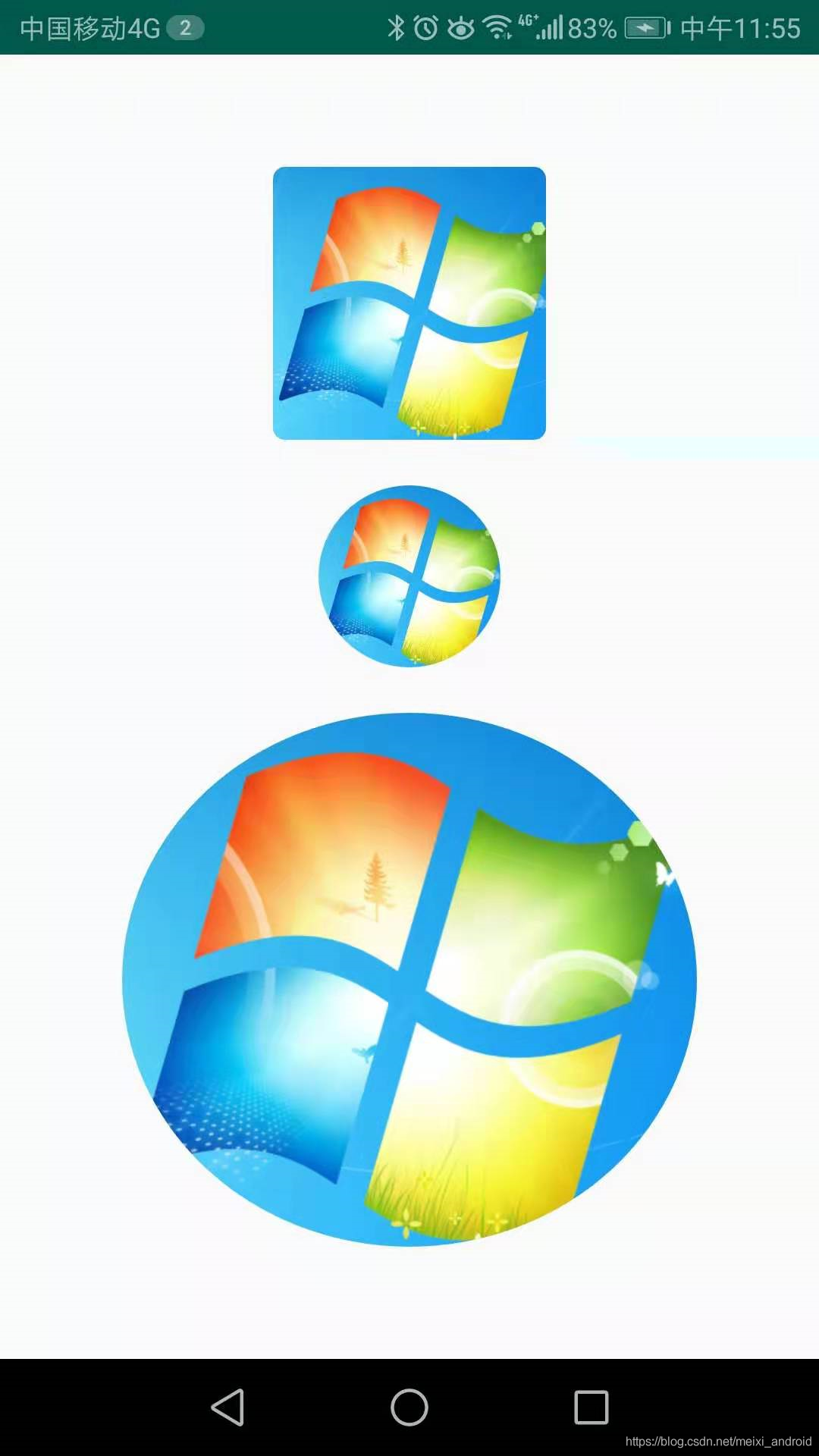
效果:圆角,圆形,椭圆形

实现方法:

工具方法

/**
 * 设置BitmapShader
 */
private void setBitmapShader() {
    Drawable drawable = getDrawable();
    if (null == drawable) {
        return;
    }
    Bitmap bitmap = drawableToBitmap(drawable);
    // 将bitmap作为着色器来创建一个BitmapShader
    mBitmapShader = new BitmapShader(bitmap, Shader.TileMode.CLAMP, Shader.TileMode.CLAMP);
    float scale = 1.0f;
    if (mType == TYPE_CIRCLE) {
        // 拿到bitmap宽或高的小值
        int bSize = Math.min(bitmap.getWidth(), bitmap.getHeight());
        scale = mWidth * 1.0f / bSize;

    } else if (mType == TYPE_ROUND || mType == TYPE_OVAL) {
        // 如果图片的宽或者高与view的宽高不匹配,计算出需要缩放的比例;缩放后的图片的宽高,一定要大于我们view的宽高;所以我们这里取大值;
        scale = Math.max(getWidth() * 1.0f / bitmap.getWidth(), getHeight() * 1.0f / bitmap.getHeight());
    }
    // shader的变换矩阵,我们这里主要用于放大或者缩小
    mMatrix.setScale(scale, scale);
    // 设置变换矩阵
    mBitmapShader.setLocalMatrix(mMatrix);
    mPaint.setShader(mBitmapShader);

}

/**
 * drawable转bitmap
 *
 * @param drawable
 * @return
 */
private Bitmap drawableToBitmap(Drawable drawable) {
    if (drawable instanceof BitmapDrawable) {
        BitmapDrawable bitmapDrawable = (BitmapDrawable) drawable;
        return bitmapDrawable.getBitmap();
    }
    int w = drawable.getIntrinsicWidth();
    int h = drawable.getIntrinsicHeight();
    Bitmap bitmap = Bitmap.createBitmap(w, h, Bitmap.Config.ARGB_8888);
    Canvas canvas = new Canvas(bitmap);
    drawable.setBounds(0, 0, w, h);
    drawable.draw(canvas);
    return bitmap;
}

绘制方法

@Override
protected void onDraw(Canvas canvas) {

    if (null == getDrawable()) {
        return;
    }
    setBitmapShader();
    if (mType == TYPE_CIRCLE) {
        canvas.drawCircle(mRadius, mRadius, mRadius, mPaint);
    } else if (mType == TYPE_ROUND) {
        mPaint.setColor(Color.RED);
        canvas.drawRoundRect(mRect, mRoundRadius, mRoundRadius, mPaint);
    }else if(mType == TYPE_OVAL){
        canvas.drawOval(mRect, mPaint);
    }
}

demo地址:Android自定义imageview实现图片圆角_androidimageview圆角,android圆角imageview-Android代码类资源-CSDN下载

demo云盘:百度网盘 请输入提取码

在线bug交流:QQ1085220040

  • 0
    点赞
  • 5
    收藏
    觉得还不错? 一键收藏
  • 1
    评论
1. 首先,在布局文件中添加一个RecyclerView: ```xml <androidx.recyclerview.widget.RecyclerView android:id="@+id/recyclerView" android:layout_width="match_parent" android:layout_height="match_parent" android:padding="8dp" /> ``` 2. 在Fragment中,定义一个变量来保存RecyclerView的实例: ```java private RecyclerView recyclerView; ``` 3. 在Fragment的onCreateView方法中,初始化RecyclerView: ```java @Override public View onCreateView(LayoutInflater inflater, ViewGroup container, Bundle savedInstanceState) { View view = inflater.inflate(R.layout.fragment_product_list, container, false); recyclerView = view.findViewById(R.id.recyclerView); recyclerView.setLayoutManager(new LinearLayoutManager(getContext())); recyclerView.setAdapter(new ProductListAdapter(getProductList())); return view; } ``` 这里我们使用LinearLayoutManager来实现垂直方向的列表布局,并将适配器设置为ProductListAdapter,该适配器需要传入一个商品列表的数据源。 4. 创建一个ProductListAdapter类来实现RecyclerView的适配器: ```java public class ProductListAdapter extends RecyclerView.Adapter<ProductListAdapter.ViewHolder> { private List<Product> productList; public ProductListAdapter(List<Product> productList) { this.productList = productList; } @NonNull @Override public ViewHolder onCreateViewHolder(@NonNull ViewGroup parent, int viewType) { View view = LayoutInflater.from(parent.getContext()).inflate(R.layout.item_product, parent, false); return new ViewHolder(view); } @Override public void onBindViewHolder(@NonNull ViewHolder holder, int position) { Product product = productList.get(position); holder.productName.setText(product.getName()); holder.productPrice.setText(product.getPrice()); holder.productImage.setImageResource(product.getImageResource()); } @Override public int getItemCount() { return productList.size(); } public static class ViewHolder extends RecyclerView.ViewHolder { private CardView cardView; private ImageView productImage; private TextView productName; private TextView productPrice; public ViewHolder(@NonNull View itemView) { super(itemView); cardView = itemView.findViewById(R.id.cardView); productImage = itemView.findViewById(R.id.productImage); productName = itemView.findViewById(R.id.productName); productPrice = itemView.findViewById(R.id.productPrice); } } } ``` 在ProductListAdapter中,我们需要实现三个方法: - onCreateViewHolder:创建ViewHolder实例,并将item_product布局文件作为其视图。 - onBindViewHolder:将数据绑定到ViewHolder实例上。在这里,我们将商品名称、价格和图像资源绑定到ViewHolder的各个控件上。 - getItemCount:返回商品列表的大小。 5. 在item_product布局文件中,添加一个CardView来显示商品信息: ```xml <androidx.cardview.widget.CardView android:id="@+id/cardView" android:layout_width="match_parent" android:layout_height="wrap_content" android:layout_margin="8dp" app:cardCornerRadius="8dp" app:cardElevation="4dp"> <LinearLayout android:layout_width="match_parent" android:layout_height="wrap_content" android:orientation="horizontal" android:padding="8dp"> <ImageView android:id="@+id/productImage" android:layout_width="80dp" android:layout_height="80dp" android:layout_gravity="center_vertical" android:scaleType="centerCrop" /> <LinearLayout android:layout_width="match_parent" android:layout_height="wrap_content" android:layout_gravity="center_vertical" android:layout_marginStart="16dp" android:orientation="vertical"> <TextView android:id="@+id/productName" android:layout_width="match_parent" android:layout_height="wrap_content" android:textSize="16sp" /> <TextView android:id="@+id/productPrice" android:layout_width="match_parent" android:layout_height="wrap_content" android:textSize="14sp" /> </LinearLayout> </LinearLayout> </androidx.cardview.widget.CardView> ``` 在CardView中,我们使用了LinearLayout来实现水平方向的布局,并在其中添加了一个ImageView和两个TextView来显示商品图像、名称和价格。在CardView中,我们还设置了圆角半径和阴影效果。 6. 最后,定义一个Product类来保存商品信息: ```java public class Product { private String name; private String price; private int imageResource; public Product(String name, String price, int imageResource) { this.name = name; this.price = price; this.imageResource = imageResource; } public String getName() { return name; } public String getPrice() { return price; } public int getImageResource() { return imageResource; } } ``` 在这个类中,我们定义了商品名称、价格和图像资源三个属性,并提供了对应的get方法。 这样,一个使用CardView实现商品列表的Fragment就完成了。

“相关推荐”对你有帮助么?

  • 非常没帮助
  • 没帮助
  • 一般
  • 有帮助
  • 非常有帮助
提交
评论 1
添加红包

请填写红包祝福语或标题

红包个数最小为10个

红包金额最低5元

当前余额3.43前往充值 >
需支付:10.00
成就一亿技术人!
领取后你会自动成为博主和红包主的粉丝 规则
hope_wisdom
发出的红包
实付
使用余额支付
点击重新获取
扫码支付
钱包余额 0

抵扣说明:

1.余额是钱包充值的虚拟货币,按照1:1的比例进行支付金额的抵扣。
2.余额无法直接购买下载,可以购买VIP、付费专栏及课程。

余额充值