


 本文介绍了完全使用CSS和XHTML构建图像地图的方法。作者受Gina Trappini博客启发,尝试仅用CSS实现类似功能,结合Doug Bowman的滑动门技术和定义列表。代码能优雅降级,还给出了示例代码,不过存在CSS和JS配合及浏览器兼容性问题。
CSS Image Maps
 Below is a sample image map that's built entirely using CSS and XHTML. While I've added support for Javascript (item titles are simply displayed beneath the image), I've disabled it in this example -- I've run into a bit of a problem when JS is enabled and CSS is disabled (more details below).
The initial idea for this came from a blog posting I read over at Gina Trappini's blog, Scribbling.net. Her example was well done, but I wanted to attempt the same (or similar) using only CSS.
I then found a link to The Daily Kryogenix site (via Gina's post) that led to an image map that made use of ligher DHTML, and made use of the <title> tag to display notes about a hotspot. Still, somewhat dependant on Javascript/DHTML.
In the end, I decided to make use of Doug Bowman's Sliding Doors technique combined with a definition list (<dl></dl>).
The sliding doors technique allows you to contain all your image rollover effects in one image file, and make use of the background-position CSS property to "shift" the image in any direction. By adding a :hover effect to your CSS (in this case to the <a> tag contained within the <dd> tag), you can shift the image to a desired position.
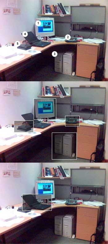
What I did was build the image map in Photoshop. As you can see by this image, the map is made up of 3 copies of the same image, each with different markings. The top (1 of 3) simply marks the hotspots with numbers, and middle and bottom images (2 and 3 of 3) each contain the rollover effects (white transparancy). You may be wondering why the rollover effect is separated into two separate images. The reason for the separation is due to the overlap in adjacent items (ie: the monitor, the notebook and the floppy disk on the desk). Rather than having a collision between the two items, the rollover effects for neighboring items were separated onto multiple copies of the same image.
Essentially, the way this works is by placing the title of the item hotspot into the definition-term tag (<dt></dt>) of your list, followed by the description in the definition-description tag (<dd></dd>). The CSS then hides the definition-term (which is really used for when CSS is disabled), as well as the definition-description (displayed upon hover of the anchor) and displays the definition description (in this case, the description of the hotspot(s) you've chosen for your imagemap), and absolutely positions and displays the description upon rolling over the hotspot (also defined in the CSS).
The code also degrades gracefully. An <img> tag, which displays a non-mapped version of the image map, is hidden using CSS. For those who have CSS disabled, the mapped version of the image (3-piece image) does not display, since it is part of the background CSS property. Rather the non-mapped version will display, along with an unstyled definition list. If you've got the Web Developer extension for Firefox, go ahead and disable styles. You'll get a better idea of the degredation.
A sample of the code is displayed below (view source for full CSS and XHTML):
CSS:
dd#monitorDef{ top: 65px; left: 114px; }
dd#monitorDef a{ position: absolute; width: 73px; height: 69px; text-decoration: none; }
dd#monitorDef a span{ display: none; }
dd#monitorDef a:hover{ position: absolute; background: transparent url(office.jpg) -109px -317px no-repeat; top: -10px; left: -5px; }

dd#monitorDef a:hover span{
 display: block;
 text-indent: 0;
 vertical-align: top;
 color: #000;
 background-color: #F4F4F4;
 font-weight: bold;
 position: absolute;
 border: 1px solid #BCBCBC;
 bottom: 100%;
 margin: 0;
 padding: 5px;
 width: 250%;
}
HTML:
<dl id="officeMap">
 <dt id="monitor">1. Monitor</dt>
 <dd id="monitorDef"><a href="#"><span>Here's my 17" Monitor.  I wish I had an LCD!</span></a></dd>
 <dt id="phone">2. Phone</dt>
 <dd id="phoneDef"><a href="#"><span>Does this thing ever stop ringing?</span></a></dd>
 <dt id="case">3. PC Case</dt>
 <dd id="caseDef"><a href="#"><span>This is my crazy Linux box! Gotta love that Linux...</span></a></dd>
 <dt id="notebook">4. IBM ThinkPad</dt>
 <dd id="notebookDef"><a href="#"><span>Here's my Linux notebook.  Some crazy coding going on.</span></a></dd>
 <dt id="floppy">5. External Floppy Drive</dt>
 <dd id="floppyDef"><a href="#"><span>Floppy Drive.  Ancient... I know!</span></a></dd>
</dl>
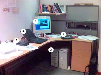
A working example can be viewed below (the image below was taken from The Daily Kryogenix):
-
1. Monitor
- Here's my 17" Monitor. I wish I had an LCD! 2. Phone
- Does this thing ever stop ringing? 3. PC Case
- This is my crazy Linux box! Gotta love that Linux... 4. IBM ThinkPad
- Here's my Linux notebook. Some crazy coding going on. 5. External Floppy Drive
- Floppy Drive. Ancient... I know!
While this may not be the most "ideal" solution out there, it certainly expands upon the examples listed above. I absolutely loved Gina's idea, which is why I attempted to expand on it. Unfortunately, with the current limitations of CSS (as well as certain browsers), I wasn't able to fully replicate the exact functionality of Gina's example.
Here's an example that makes use of both CSS and Javascript. One problem I ran into is when CSS is disabled, but Javascript is enabled. Something weird occurs with the definition list. If you know how to correct this, let me know. I'd love to get it working.
I did manage to come across another attempt at a CSS-based image map, which looks really great. Unfortunately, due to IE's limitations (specifically with only support of the :hover effect on the <a> tag), it's not cross-browser compatible (yet!).
If you have any questions, concerns, and/or suggestions for improvement, please feel free to send me a note: frankmanno [-at-] gmail [-dot-] com.
The examples have been succesfully tested in Safari, Firefox (Mac/Win), IE6/Win, and Opera 7.5/Mac. For some odd reason, the Javascript version works in IE5/Mac, whereas the non-Javascript version doesn't.


 扫一扫
扫一扫


 1774
1774

 被折叠的 条评论
为什么被折叠?
被折叠的 条评论
为什么被折叠?
 到【灌水乐园】发言


