


这系列文章主要是完成一个图谱的自定义修改(最近太忙了长篇分段更新自己使用流程)
1. 连接线修改成动态,并添加跟随线移动的光圈上一篇地址➡️点击这里
2. 自定义卡片样式和文字内容
3. 自定义伸缩节点的样式,并添加动画样式
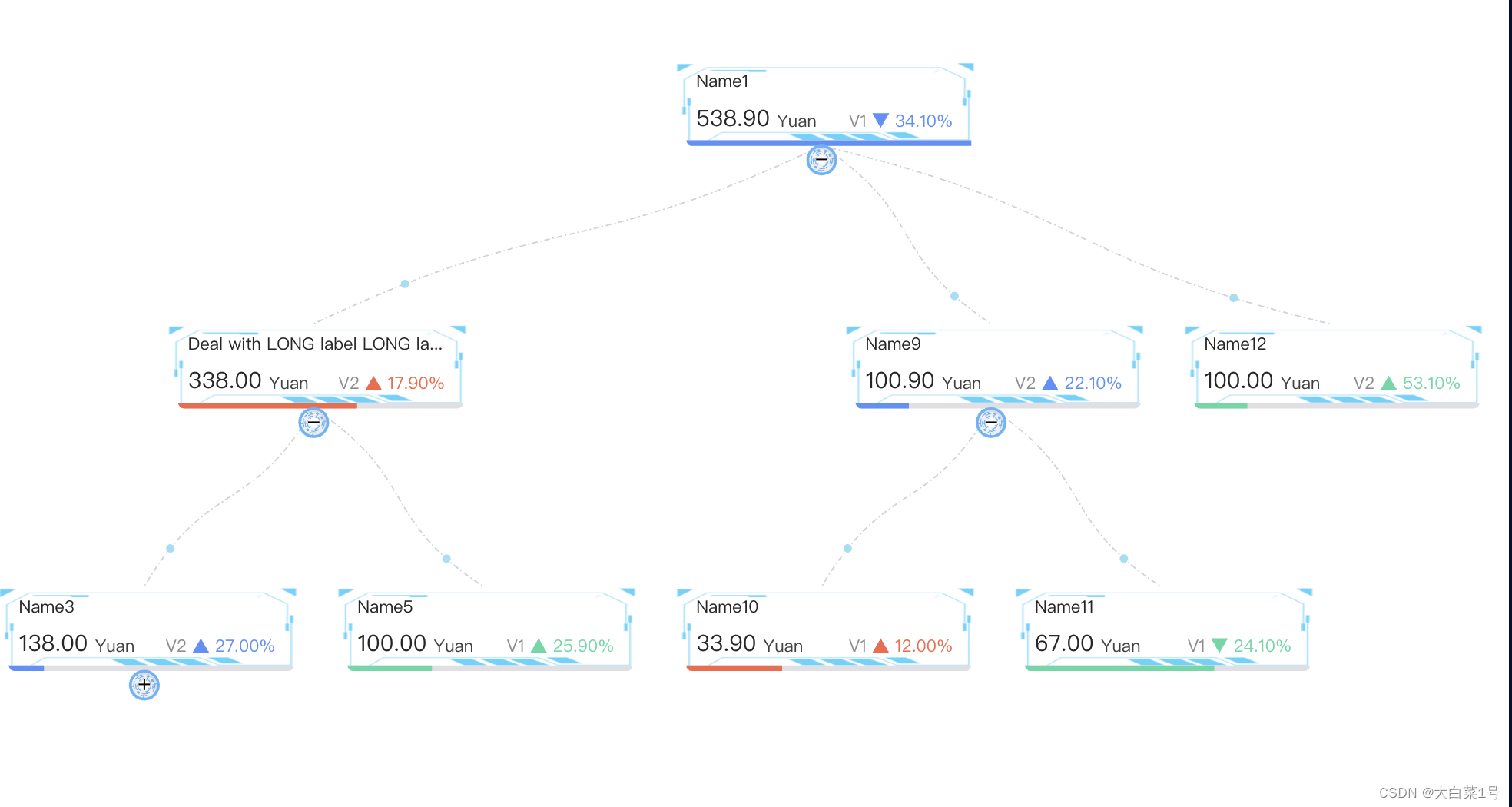
3. 由左右结构换成上下结构的图谱
4. 修改弹窗默认样式
antv-G6知识图谱使用(实例)
前言
提示:antv-G6初次使用(实例+分析注释)项目需要时间紧,直接网上找的加上官网信息,主要内容都有注释
想要达到的样式(视频)
1. 添加卡片背景图片
1. 先添加背景图片
  // 背景图片
        const shape = group.addShape('image', {
               attrs: {
                   width:rectConfig.width+25,//图片宽度
                   height: rectConfig.height,//图片高度
                   x: nodeOrigin.x-10,//图片相对定位x轴
                   y: nodeOrigin.y,//图片相对定位y轴
                   img:require('../../assets/img/try_play.png'),
          },
         // 在 G6 3.3 及之后的版本中,必须指定 name,可以是任意字符串,但需要在同一个自定义元素类型中保持唯一性
       name: 'image-shape',
       });
// 禁止点击
 shape.set('capture', false);
2. 之后调整下矩形卡片大小和百分比条位置
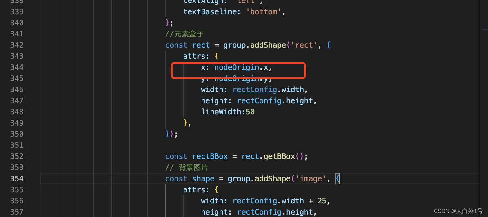
 //元素盒子
     const rect = group.addShape('rect', {
        attrs: {
        x: nodeOrigin.x,
        y: nodeOrigin.y,
        width:rectConfig.width,
        height: rectConfig.height,
       },
  });
// bottom line background
  const bottomBackRect = group.addShape('rect', {
        attrs: {
           x: nodeOrigin.x+5, //这里添加了5
           y: rectBBox.maxY - 4,//这里减去了4
           width: rectConfig.width,
           height: 4,
           radius: [0, 0, rectConfig.radius, rectConfig.radius],
           fill: '#E0DFE3',
       },
   });
   bottomBackRect.set('capture', false);
  // bottom percent
 const bottomRect = group.addShape('rect', {
         attrs: {
               x: nodeOrigin.x+5,//这里添加了5
               y: rectBBox.maxY - 4,//这里减去了4
               width: rate * rectBBox.width,
               height: 4,
               radius: [0, 0, 0, rectConfig.radius],
               fill: colors[status],
         },
  });
bottomRect.set('capture', false);
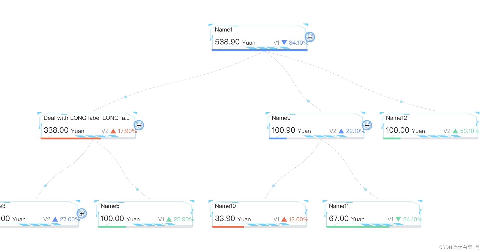
3. 运行后效果
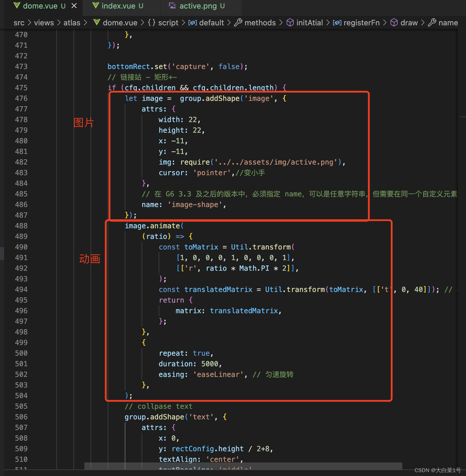
2. 收缩节点样式更改成图片样式并添加动画
1. 先将收缩节点更换成图片形式并添加动画
有用到Util 需要引入样式const { Util } = G6;
2. 调整加减号位置
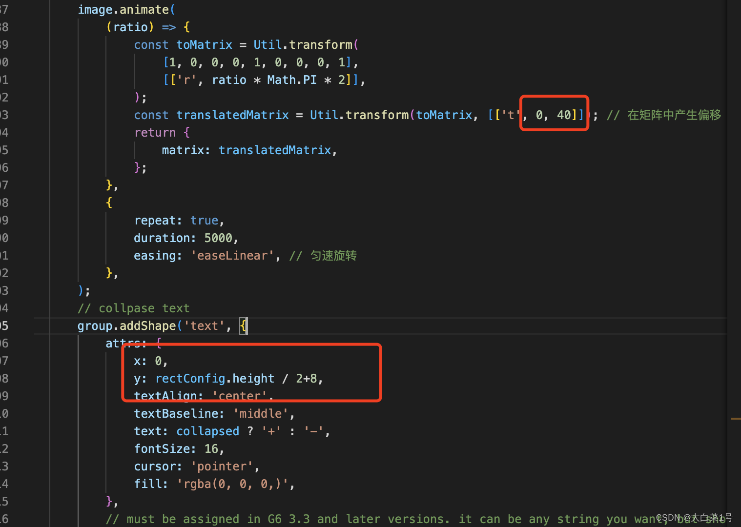
        group.addShape('text', {
            attrs: {
                x: rectConfig.width / 2 + 10,//调整这里
                y: -1,//调整这里
                textAlign: 'center',
                textBaseline: 'middle',
                text: collapsed ? '+' : '-',
                fontSize: 16,
                cursor: 'pointer',
                fill: 'rgba(0, 0, 0,)',
            },
            // must be assigned in G6 3.3 and later versions. it can be any string you want, but should be unique in a custom item type
            name: 'collapse-text',
            modelId: cfg.id,
        });
3. 运行后样式
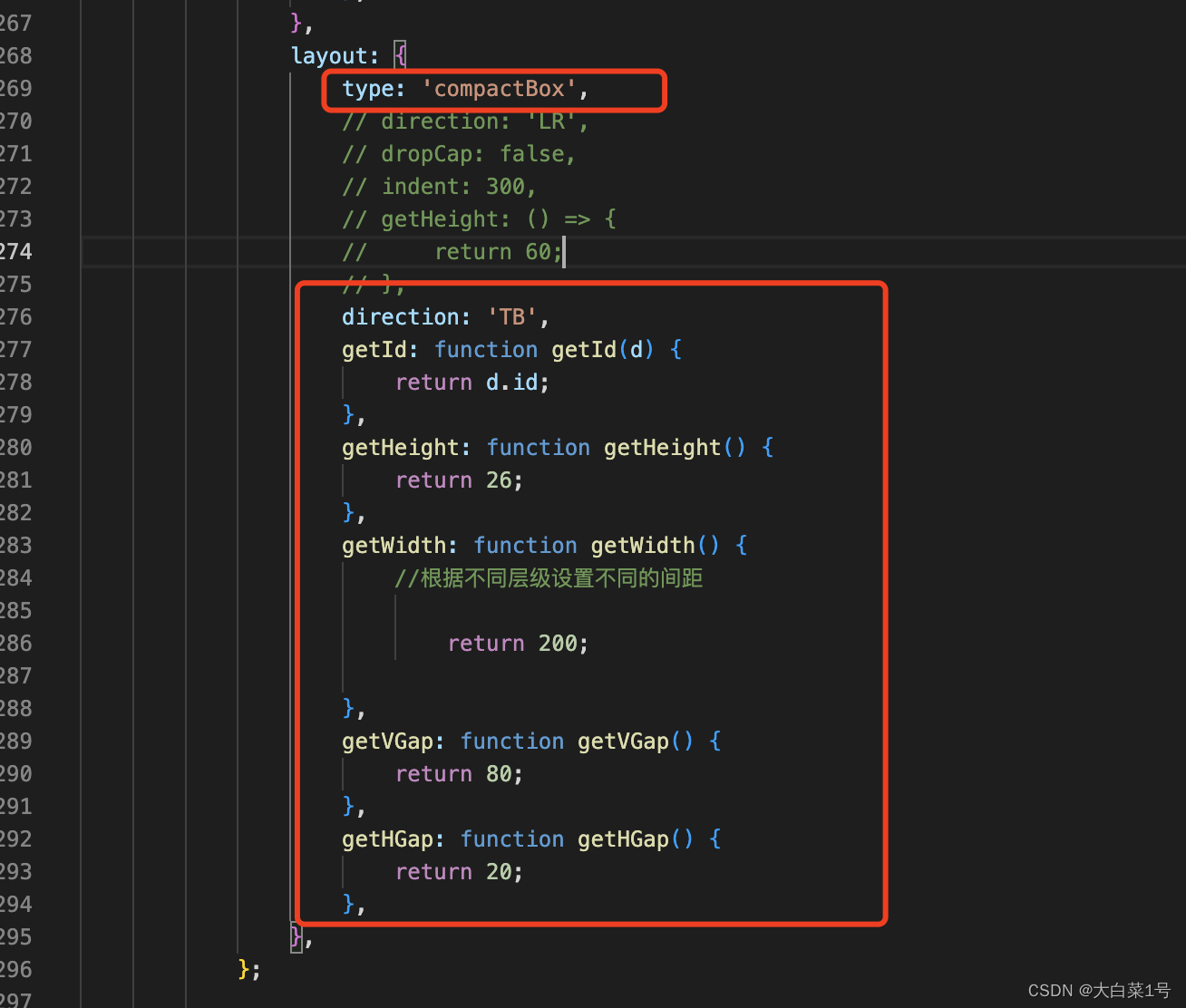
3. 由左右结构换成上下结构的图谱
1. 修改基本配置
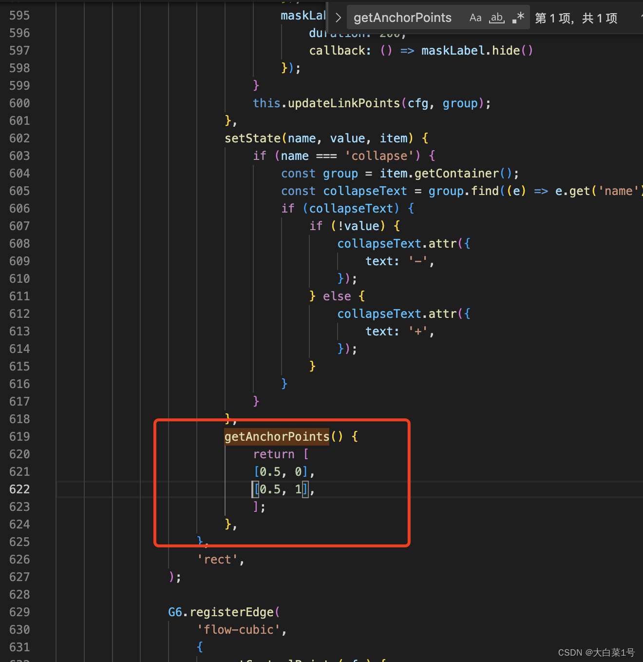
2. 修改线初始位置点
在自定义节点样式 'flow-rect’中改
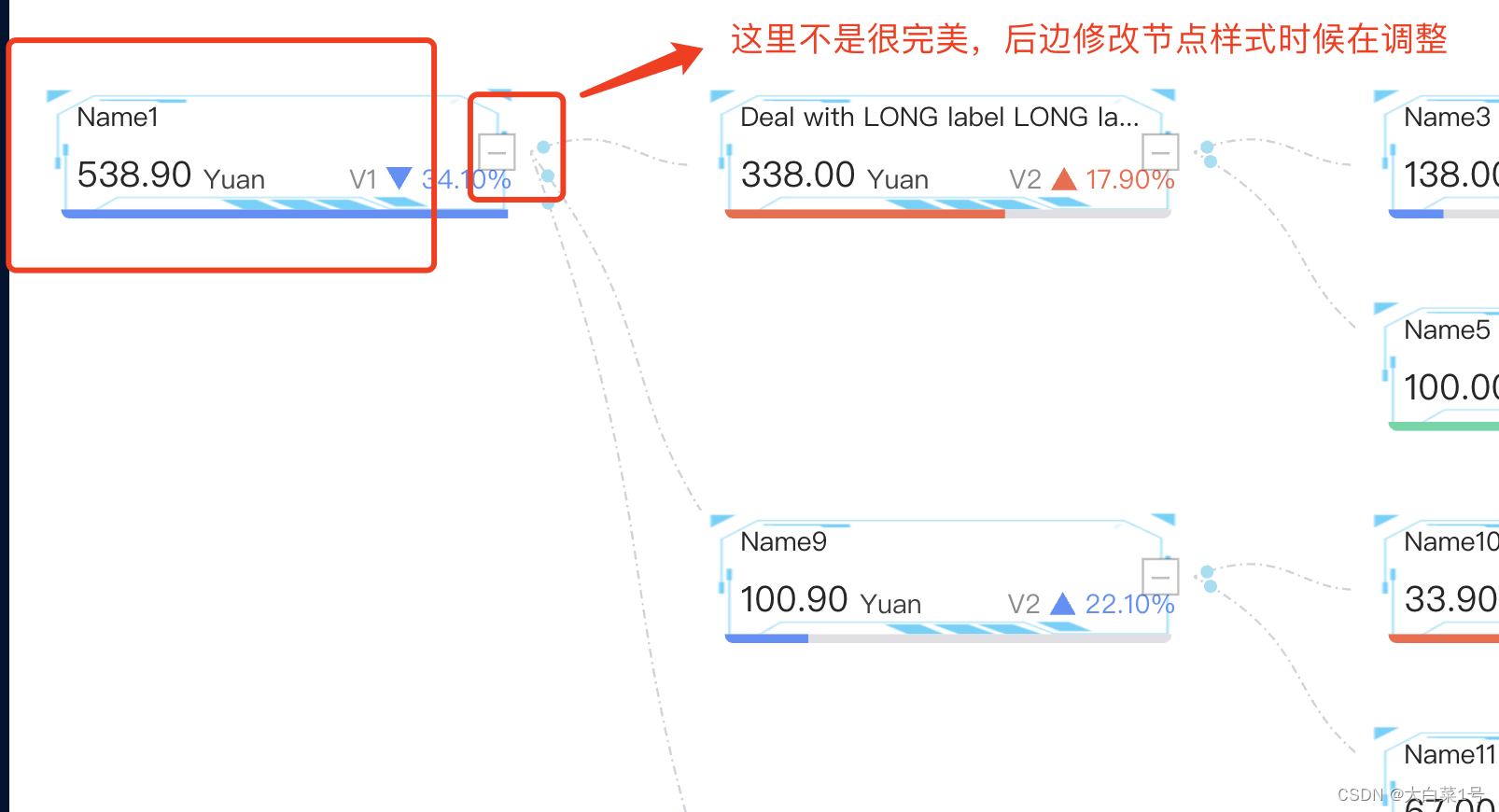
3. 之后需要调整下收缩节点位置
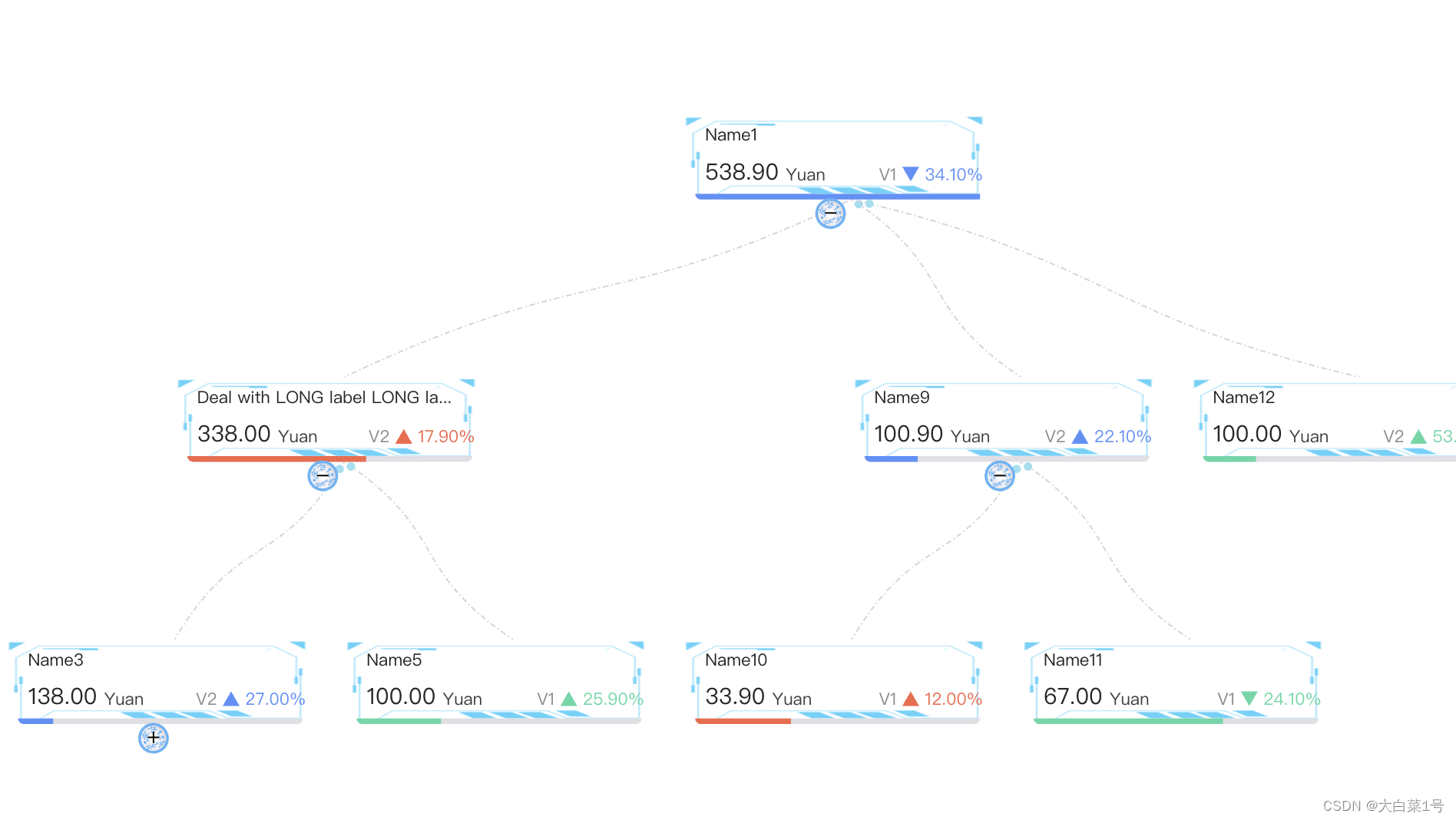
之后更改下卡片高度
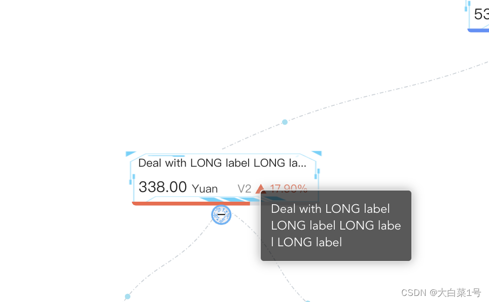
4. 修改弹窗默认样式
1. 安装npm install insert-css
insert-css是一个JavaScript库,用于动态向网页中插入CSS样式。
2. 引入使用
import insertCss from 'insert-css';

// 我们用 insert-css 演示引入自定义样式
// 推荐将样式添加到自己的样式文件中
// 若拷贝官方代码,别忘了 npm install insert-css
insertCss(`
  .g6-component-tooltip {
    background-color: rgba(0,0,0, 0.65);
    padding: 10px;
    box-shadow: rgb(174, 174, 174) 0px 0px 10px;
    width: fit-content;
    color: #fff;
    border-radius = 4px;
  }
`);
3. 运行效果


 8664
8664


 被折叠的 条评论
为什么被折叠?
被折叠的 条评论
为什么被折叠?
 到【灌水乐园】发言


