


CSS
CSS:层叠样式表
作用:用来修饰网页元素(HTML标记)的外观(给字加大小,字体,颜色等),W3C规定尽量 用CSS样式代替HTML属性
CSS和HTML的关系:HTML制作网页结构,CSS用来修饰网页的外观。
一、使用方式(优先级:内联最高,内部和外部相同,一旦冲突后面的样式覆盖前面的样式)
1.内联样式
<标记名称 style="css代码">
2.内部样式
写在head中
<style>
css代码
</style>
3.外部样式
(1)新建一个xx.css文件
(2)写在head中
<link rel="stylesheet" href="css文件路径">
<!DOCTYPE html>
<html lang="en">
<head>
	<meta charset="UTF-8">
	<title>Document</title>

	<style>
   /*2.内部样式*/
   i{color: blue;}
   u{color: pink;}
   s{color: red;}
	</style>
	<!-- 3.外部样式 -->
	<link rel="stylesheet" href="01.css">
</head>
<body>
<!-- 1.内联样式 -->
	<b style="color:red;">加粗</b>
	<i>倾斜</i>
	<u>下划线</u>
	<s>删除线</s>
</body>
</html>
01.css
u{color:pink;}
s{color: yellow;}
二、选择器
1.通配选择器(选中所有) *{}
2.标记选择器 标记名称{}
3.类选择器 .class名称{} (类选择器 一般该样式可以有多个类名)
{class、id不能用汉字和以数字开头命名}
4.id选择器 #id名称{} (id选择器 一般js 只有一个id)
5.群组选择器 选择器,选择器{}
<!DOCTYPE html>
<html lang="en">
<head>
	<meta charset="UTF-8">
	<title>Document</title>
	<style>
    /*1.通配选择器*/
    *{color: pink;}
    /*2.标记选择器*/
    b{color:green;}
    /*3.类选择器 一般该样式可以有多个类名*/
    .b5{color: yellow;}
    /*4.id选择器 一般js 只有一个id*/
    #u1{color: blue;}
    /*5.群组选择器*/
    s,i,.u2{color: purple;}
	</style>
</head>
<body>
<!-- class不要用汉字,不要以数字开头 -->
	<b class="b1 b2 b5">加粗1</b>
	<s>删除线</s>
	<u id="u1">下划线1</u>
	<b>加粗2</b>
	<i>倾斜</i>
	<u class="u2">下划线2</u>
</body>
</html>
6.子代选择器 选择器>选择器{}
7.后代选择器 选择器 选择器{}
<!DOCTYPE html>
<html lang="en">
<head>
	<meta charset="UTF-8">
	<title>Document</title>
	<style>
    /*6.子代选择器*/
   p>b{color:pink;}
    /*7.后代选择器*/
   p b{color: red;}
	</style>
</head>
<body>
	<p>
		<i>倾斜<b>加粗1</b></i>
		<b>加粗1</b>
	</p>
	<b>加粗3</b>
</body>
</html>
三、优先级
继承<通配<标记<class<id<内联
<!DOCTYPE html>
<html lang="en">
<head>
	<meta charset="UTF-8">
	<title>Document</title>
	<style>
	/*继承<通配<标记<类(class)<id<内联*/
	#d2{color: yellow;}
    .d1{color: pink;}
	  b{color: blue;}
     *{color: red;}
     p{color: purple;}
	</style>
</head>
<body>
	<b class="d1" id="d2" style="color:green;">加粗</b>
	<p>段落<i>倾斜</i></p>
</body>
</html>
四、伪类选择器
1.超链接(顺序必须是L V H A)
:link 未访问
:visited 访问过
:hover 鼠标滑过
:active 鼠标激活
<!DOCTYPE html>
<html lang="en">
<head>
	<meta charset="UTF-8">
	<title>Document</title>
	<style>
  /*伪类选择器 顺序只能是LVHA*/
  /*未访问的状态*/
   a:link{color: pink;}
  /*访问过的状态*/
  a:visited{color:purple; }
  /*鼠标滑过*/
  a:hover{color: red;}
  /*鼠标激活*/
  a:active{color: yellow;}
	</style>
</head>
<body>
	<a href="http://www.baidu.com">百度</a>
</body>
</html>
2.表单
:focus 获取焦点
<!DOCTYPE html>
<html lang="en">
<head>
	<meta charset="UTF-8">
	<title>Document</title>
	<style>
     /*获取焦点状态*/
     .i1:focus{color: blue;
     	background: yellow;}
     	.i2:focus{width: 15px;height: 15px;}
	</style>
</head>
<body>

	用户名:<input type="text" class="i1"><br>
	性别:<input type="radio" name="a" class="i2">男
	      <input type="radio" name="a" class="i2">女
</body>
</html>
3.其他
:before 元素之前
:after 元素之后
eg:
p:after{content:"文字"|url();}
<!DOCTYPE html>
<html lang="en">
<head>
	<meta charset="UTF-8">
	<title>Document</title>
	<style>
     p:after{content:"是花园";}
     p:before{content:url(../04.jpg); }
	</style>
</head>
<body>
	<p>我们的祖国</p>
	<p>我们的祖国</p>
	<p>我们的祖国</p>
</body>
</html>
五、css3新增选择器
父元素中第一个子元素
:first-child{}
父元素中最后一个子元素
:last-child{}
父元素中第n个子元素
:nth-child(n){}
父元素中唯一子元素(必须是唯一的孩子)
:only-child{}
<!DOCTYPE html>
<html lang="en">
<head>
	<meta charset="UTF-8">
	<title>Document</title>
	<style>
	/*获取父元素中的第一个子元素*/
      b:first-child{color: red;}
      /*获取父元素中的最后一个子元素*/
      s:last-child{color: blue;}
      /*获取父元素中第N个子元素*/
      b:nth-child(4){color: green;}
      /*获取父元素中唯一的子元素*/
      i:only-child{color: pink;}
	</style>
</head>
<body>
<p>
	<b>加粗1</b>
	<u>下划线</u>
	<s>删除线1</s>
	<b>加粗2</b>
	<i>倾斜</i>
	<s>删除线2</s>
	</p>
<p>
	<i>倾斜2</i>
</p>
</body>
</html>
文本样式
1.字体颜色
color:red;
color:#ff0000; 十六进制
color:rgb(255,0,0); (0-255)
2.字体大小
font-size:20px;
3.字体
font-family:楷体;
4.水平对齐方式
text-align:left|center|right;
5.加粗
font-weight:bold;
6.倾斜
font-style:italic;
7.修饰线(none(没有线)|underline(下划线)|overline(上划线)|line-through(中间线))
text-decoration:none|underline|overline|line-through;
<!DOCTYPE html>
<html lang="en">
<head>
	<meta charset="UTF-8">
	<title>Document</title>
	<style>
     p{
     	/*文本样式*/
     	/*1字体颜色*/
        /*color:red; *//*单词*/
     	/*color:#abc555;*//*16进制 0 1 2 3 4 5 6 7 8 9 a b c d e f*/
     	/*color:rgb(100,200,50);*//*RGB*/
     	color: pink;
     	/*2字体大小*/
     	font-size: 25px;
     	/*3字体*/
     	font-family: 华文彩云;
     	/*4水平对齐方式 left/center/right*/
     	text-align: center;
     	/*5加粗*/
     	font-weight: bold;
     	/*6倾斜*/
     	font-style: italic;
     	/*7修饰线 underline/overline/line-through/none*/
     	text-decoration: overline;
     }
	</style>
</head>
<body>
	<p>段落</p>
</body>
</html>
8.缩进
text-indent:2em;
9.行高
line-height:30px;
缩写: font:倾斜 加粗 大小/行高 字体;(顺序不能变)
<!DOCTYPE html>
<html lang="en">
<head>
	<meta charset="UTF-8">
	<title>Document</title>
	<style>
       p{
       	width: 100px;
       	height: 100px;
       	background: pink;
       	color: purple;
       	/*font-size: 20px;
       	font-family: 华文彩云;*/
       	text-align: center;
       	/*font-weight: bold;
       	font-style: italic;*/
       	text-decoration: underline;
       	/*line-height: 100px;*/
       	font:italic bold 20px/100px 华文彩云;

       }
	</style>
</head>
<body>
	<p>段落</p>
</body>
</html>
盒子
块元素p的宽度是父级的100%
行元素b的宽度与文本的宽度一致
<!DOCTYPE html>
<html lang="en">
<head>
	<meta charset="UTF-8">
	<title>Document</title>
</head>
<body>
	<p>段落</p>
	<p>段落</p>
	<b>加粗就是</b>
	<b>加粗</b>
</body>
</html>


div:没实际意义的块元素(块元素宽度是父级的100%)
span:没实际意义的行元素(行元素宽度与文本的宽度一致)
只能给块元素和有宽高属性的标记设置宽高,行元素不能设置宽高
<!DOCTYPE html>
<html lang="en">
<head>
	<meta charset="UTF-8">
	<title>Document</title>
	<style>
      div{width: 100px;height: 100px;background: red;}
      span{width: 100px;height: 100px;background:pink;}
	</style>
</head>
<body>
	<div>段落</div>
	<span>加粗</span>
</body>
</html>
1.内边距--只能是正数
padding-top 上内边距
padding-right 右内边距
padding-bottom 下内边距
padding-left 左内边距
padding:值; 四个方向
padding:值 值; 上下 左右
padding:值 值 值;上 左右 下
padding:值 值 值 值;上右下左
<!DOCTYPE html>
<html lang="en">
<head>
	<meta charset="UTF-8">
	<title>Document</title>
	<style>
     .d1{
     	width: 100px;
     	height: 100px;
     	background: pink;
     	padding: 10px 20px 30px;
     }
	</style>
</head>
<body>
	<div class=d1></div>
</body>
</html>
2.外边距
margin-top 上外边距
margin-right 右外边距
margin-bottom 下外边距
margin-left 左外边距
margin:值; 四个方向
margin:值 值; 上下 左右
margin:值 值 值;上 左右 下
margin:值 值 值 值;上右下左
(1)值可以是正数、负数、auto
实现盒子水平居中
margin:0 auto;
(2)全局样式(清楚块元素的空隙)
*{margin:0;padding:0;}
<!DOCTYPE html>
<html lang="en">
<head>
	<meta charset="UTF-8">
	<title>Document</title>
	<style>
	    *{margin: 0;padding: 0;]}
 		.d1{
			width: 100px;
			height: 100px;
			background: red;
			/*margin: 10px 15px 20px 25px;*/
			margin:0 auto;

 		}
	</style>
</head>
<body>
	<div class="d1"></div>
</body>
</html>
(3)兄弟关系冲突
上下取大值,左右相加
<!DOCTYPE html>
<html lang="en">
<head>
	<meta charset="UTF-8">
	<title>Document</title>
	<style>
	    *{margin: 0;padding: 0;]}
 		.d1{
			width: 100px;
			height: 100px;
			background: red;
			/*margin: 10px 15px 20px 25px;*/
			margin-bottom: 40px;

 		}
 		.d2{width: 100px;height: 100px;background: blue;margin-top: 20px;}
 		.s1{background: pink; margin-right: 20px;}
 		.s2{background: purple; margin-left: 20px;}
	</style>
</head>
<body>
	<div class="d1"></div>
	<div class="d2"></div>
	<span class="s1">span1</span><span class="s2">span2</span>
</body>
</html>
(4)嵌套关系冲突
子元素设置的上下外边距会传递给父元素,冲突取大值
<!DOCTYPE html>
<html lang="en">
<head>
	<meta charset="UTF-8">
	<title>Document</title>
	<style>
	    *{margin: 0;padding: 0;]}
 		.d1{
			width: 100px;
			height: 100px;
			background: red;
			/*margin: 10px 15px 20px 25px;*/
			margin-bottom: 40px;

 		}
 		.d2{width: 100px;height: 100px;background: blue;margin-top: 20px;}
 		.s1{background: pink; margin-right: 20px;}
 		.s2{background: purple; margin-left: 20px;}
 		.d3{width: 200px;height: 200px;background: green;}
 		.d4{width: 20px;height: 20px;background: yellow;margin-top: 40px;}
	</style>
</head>
<body>
	<div class="d1"></div>
	<div class="d2"></div>
	<span class="s1">span1</span><span class="s2">span2</span>
	<div class="d3">
			哈哈
		<div class="d4"></div>
	</div>
</body>
</html>
<!DOCTYPE html>
<html lang="en">
<head>
	<meta charset="UTF-8">
	<title>Document</title>
	<style>
	    *{margin: 0;padding: 0;]}
 		.d1{
			width: 100px;
			height: 100px;
			background: red;
			/*margin: 10px 15px 20px 25px;*/
			margin-bottom: 40px;

 		}
 		.d2{width: 100px;height: 100px;background: blue;margin-top: 20px;}
 		.s1{background: pink; margin-right: 20px;}
 		.s2{background: purple; margin-left: 20px;}
 		.d3{width: 200px;height: 200px;background: green;}
 		.d4{width: 20px;height: 20px;background: yellow;margin-top: 40px;}
	</style>
</head>
<body>
	<div class="d1"></div>
	<div class="d2"></div>
	<span class="s1">span1</span><span class="s2">span2</span>
	<div class="d3">
		<div class="d4"></div>
	</div>
</body>
</html> 
3.边框(soild直线 dashed虚线 dotted点 double双线)
border-top:2px solid red;
border-right:2px dashed red;
border-bottom:2px dotted red;
border-left:2px double red;
border:宽度 样式 颜色;(顺序)
<!DOCTYPE html>
<html lang="en">
<head>
	<meta charset="UTF-8">
	<title>Document</title>
	<style>
        .d1{
        	width: 100px;
        	height: 100px;
        	background: red;
        	border: 2px solid blue;
        	border-top: 2px dashed yellow;
        	border-bottom: 10px dotted pink;
        	border-left: 5px double purple;
        }
	</style>
</head>
<body>
	<div class="d1"></div>
</body>
</html> 
盒子总宽度计算:左外边距+左边框+左内边距+盒子宽度+右内边距+右边框+右外边距
布局
1.文档流布局(默认布局)
2.浮动布局
3.定位布局
一、浮动布局
float:left|right;
1.浮动的元素脱离文档流(不占位)
<!DOCTYPE html>
<html lang="en">
<head>
	<meta charset="UTF-8">
	<title>Document</title>
	<style>
      .d1{width: 100px;height: 100px;background: red;float:left; }
      .d2{width: 150px;height: 150px;background: green;}
	</style>
</head>
<body>
	 <div class="d1"></div>
	 <div class="d2"></div>
	</body>
</html>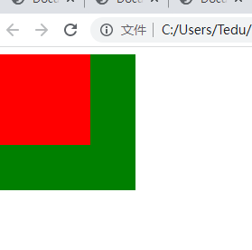
2.无论是左浮动还是右浮动都在靠在另一个元素上或父元素的边界上
<!DOCTYPE html>
<html lang="en">
<head>
	<meta charset="UTF-8">
	<title>Document</title>
	<style>
      .d1{width: 100px;height: 100px;background: red;float: right; }
      .d2{width: 100px;height: 100px;background: green;float: right;}
      .d3{width: 200px;height: 200px;background: green;float: right;}
      .d4{width: 10px;height: 10px;background: red;float: right;}
	</style>
</head>
<body>
	 <div class="d1"></div>
	 <div class="d2"></div>
	 <br><br><br><br><br>
	 <div class="d3">
	 	<div class="d4"></div>
	 </div>
</body>
</html>
3.浮动的块元素:没有设置宽度,宽度是文本宽度
4.浮动的行元素:可以设置宽高
<!DOCTYPE html>
<html lang="en">
<head>
	<meta charset="UTF-8">
	<title>Document</title>
	<style>
		.d1{background: red;float:left;}
		.s1{background: green;float: left;width: 50px;height: 50px;}
	</style>
</head>
<body>
	<div class="d1">div</div>
	<span class="s1">span</span>
</body>
</html>
5.浮动元素对后面元素的影响是能够实现文本环绕效果
<!DOCTYPE html>
<html lang="en">
<head>
	<meta charset="UTF-8">
	<title>Document</title>
	<style>
     	*{margin:0;padding: 0;}
     .d1{
     	width: 500px;
     	height:500px;
     	margin: 0 auto;
     	border: 5px solid green;
     }
     .d2{
     	width:150px;
     	height: 150px;
     	border: 2px solid green;
     	float: left;
     }
     .d2 img{width:150px;
     	height: 150px;}
     .d3{
     	width: 500px;
     	height: 500px;
     	border: 2px solid green;
     	text-decoration: underline;
     	font-size: 20px;
     	font-family: 华文彩云;
     	color: green;

     }
     a:link{color: red;}
     a:visited{color: green;}
     a:hover{color: pink;}
     a:active{color: blue;}
	</style>
</head>
<body>
	<div class="d1">
		<div class="d2"><img src="../04.jpg"></div>
		<div class="d3"><a href="http://baidu.com">1、百度百度百度百度百度百度百度百度百度百度百度百度百度百度百度百度百度百度百度百度百度百度百度百度百度百度百度百度百度百度百度百度百度百度百度百度百度百度百度百度百度百度百度百度百度百度百度百度百度百度百度百度百度百度百度百度百度百度百度百度百度百度百度百度百度百度百度百度百度百度百度百度百度百度百度百度百度百度</a></div>
	</div>
</body>
</html>
布局显示
display:none(不占位隐藏)|inline(块变行)|block(行变块)|inline-block(内联块);
visibility:hidden(占位隐藏);
<!DOCTYPE html>
<html lang="en">
<head>
	<meta charset="UTF-8">
	<title>Document</title>
	<style>
     .d1{width: 100px;height: 100px;background: red;
     /*不占位隐藏display: none;*/
  		/*占位隐藏visibility: hidden;*/
  		/*块变行*/display:inline;}
     .d2{width: 100px;height: 100px;background: green;display: inline;}
     /*行变块display: block;*/
     .s1{width: 100px;height: 100px;background: pink;display:inline-block;}
     .s2{width: 100px;height: 100px;background:red;display:inline-block;}
	</style>
</head>
<body>
	<div class="d1">div1</div>
	<div class="d2">div2</div>
	<span class="s1">span1</span><span class="s2">span</span>
</body>
</html>
清除浮动
1.clear:both清除两边浮动
left清除左边浮动
right清除右边浮动
2.高度塌陷:父元素中的子元素都浮动,并且父元素没有设置高度,那父元素的高度为零
解决高度塌陷:
1.子元素都浮动
2.父元素没设置高度
万能清除浮动:
1.给父元素加class="clear"
2.css代码
.clear{clear:both;zoom:1;}
.clear:after{clear:both;display:block;height:0;
visibility:hidden;content:".";}
<!DOCTYPE html>
<html lang="en">
<head>
	<meta charset="UTF-8">
	<title>Document</title>
	<style>
	/*清楚浮动both两边浮动、left左边、right右边
	.clear{clear: both;}*/

	/*万能清楚浮动*/
 		.clear{clear: both;zoom:1;}
 		.clear:after{content: ".";clear: both;display: block;
 			height: 0;visibility: hidden;}
     /*高度塌陷*/
     .d1{background: red;}
     .d2{width: 100px;height: 100px;background: green;float: left;}
     .d3{width: 100px;height: 100px;background: yellow;float: right;}

	</style>
</head>
<body>
	<div class="d1 clear">
		<div class="d2"></div>
		<div class="d3"></div>
		<!-- <div class="clear"></div> -->
	</div>
</body>
</html>
列表样式
list-style-type:none;
list-style-image:url();
list-style-position:inside;
list-style:type image position;(顺序)
<!DOCTYPE html>
<html lang="en">
<head>
	<meta charset="UTF-8">
	<title>Document</title>
	<style>
         ul{
         	/*list-style-type: none;
         	list-style-image: url(01.gif);
         	list-style-position: inside;*/
         	list-style:none url(01.gif) inside;
         	border: 2px solid red;
         }
         li{border: 2px solid green;padding-left: 20px;}
	</style>
</head>
<body>
	<ul>
		<li>新闻1</li>
		<li>新闻2</li>
		<li>新闻3</li>
	</ul>
</body>
</html>
背景样式
background-color:red;
background-image:url();
background-size:宽度 高度;
background-repeat:repeat-x|repeat-y|no-repeat;(是否重复)
background-attachment:fixed;(是否移动)
background-position:水平值 垂直值;
background-position:(1)方向值 水平方向:left center right
垂直方向:top center bottom
(2)如果只有一个值,代表水平方向的值
而垂直方向默认值是center
(3)如果值是负值 背景图往左或上走,
如果值是正值 背景图往右或下走,
如果是大盒子小背景图一般是正值
如果是小盒子大背景图一般是负值
background:color image repeat attachment position;(顺序)
<!DOCTYPE html>
<html lang="en">
<head>
	<meta charset="UTF-8">
	<title>Document</title>
	<style>
        .d1{
        	width: 200px;
        	height: 200px;
        	/*background-color: yellow;
        	background-image:url(01.gif);*/
        	/*background-size: 200px 200px; */
        	/*是否重复repeat|repeat-x|repeat-y|no-repeat*/
        	/*background-repeat: no-repeat;
        	background-position: 10px 10px;*/
        	/*(是否移动)定义背景图片随滚动轴的移动方式scroll移动|fixed不移动*/
            /*	background-attachment: fixed;*/
        	background: yellow url(01.gif) no-repeat fixed 10px 10px;

        }
	</style>
</head>
<body>
	<div class="d1"></div>
	<br>..<br>..<br>..<br>..<br>..<br>..<br>..<br>..<br>..<br>..<br>..<br>..<br>..<br>..<br>..<br>..<br>..<br>..<br>..<br>..<br>..<br>..<br>..<br>..<br>..<br>..<br>..<br>..<br>..<br>..<br>..<br>..<br>..<br>..<br>..<br>..<br>..<br>..<br>..<br>..<br>..<br>..<br>..<br>..<br>..<br>..<br>..<br>..<br>..<br>..<br>..<br>..<br>..<br>..<br>..<br>..<br>..<br>..<br>..<br>..<br>..<br>..<br>..<br>..<br>..<br>..<br>..<br>..<br>..<br>..<br>..<br>..<br>..<br>..<br>..<br>..<br>..<br>..
</body>
</html>
二、定位布局
1.格式
position:static默认值 fixed固定定位 absolute绝对定位 relative相对定位
2.fixed固定定位
说明:a.脱离文档流,不占位
b.默认坐标点浏览器左上角,通过top,left,right,bottom属性来移动元素
c.当有滚动条时元素被固定到浏览器位置
<!DOCTYPE html>
<html lang="en">
<head>
	<meta charset="UTF-8">
	<title>Document</title>
	<style>
      .d1{width: 100px;height: 100px;background: red;
      	/*固定定位*/
      	position:fixed;top:0px;left: 0px;}
      	a{width:64px;height:64px;position: fixed;bottom: 0px;right: 0px;}
	</style>
</head>
<body>
	<div class="d1"></div>
	w我是我是我是我是
	<br>..<br>..<br>..<br>..<br>..<br>..<br>..<br>..<br>..<br>..<br>..<br>..<br>..<br>..<br>..<br>..<br>..<br>..<br>..<br>..<br>..<br>..<br>..<br>..<br>..<br>..<br>..<br>..<br>..<br>..<br>..<br>..<br>..<br>..<br>..<br>..<br>..<br>..<br>..<br>..<br>..<br>..<br>..<br>..<br>..<br>..<br>..<br>..<br>..<br>..<br>..<br>..<br>..<br>..<br>..<br>..<br>..<br>..<br>..<br>..<br>..<br>..<br>..<br>..<br>..<br>..<br>..<br>..<br>..<br>..<br>..<br>..<br>..<br>..<br>..<br>..<br>..<br>..<br>..<br>..<br>..<br>..<br>..<br>..<br>..<br>..<br>..<br>..<br>..<br>..<br>..<br>..<br>..
	<a href="#"><img src="top.png"</a>
</body>
</html>
3.absolute绝对定位
说明:a.脱离文档流,不占位
b.默认坐标点浏览器左上角,通过top,left,right,bottom属性来移动元素
c.当有滚动条时,元素随滚动条滚动
<!DOCTYPE html>
<html lang="en">
<head>
	<meta charset="UTF-8">
	<title>Document</title>
	<style>
		.d1{width: 100px;height: 100px;background: red;
			/*绝对定位*/
			position: absolute;bottom: -20px;right: 0px;}
		.d2{width: 100px;height: 100px;background: green;}
	</style>
</head>
<body>
	<div class="d1"></div>
	<div class="d2"></div>
	<br>..<br>..<br>..<br>..<br>..<br>..<br>..<br>..<br>..<br>..<br>..<br>..<br>..<br>..<br>..<br>..<br>..<br>..<br>..<br>..<br>..<br>..<br>..<br>..<br>..<br>..<br>..<br>..<br>..<br>..<br>..<br>..<br>..<br>..<br>..<br>..<br>..<br>..<br>..<br>..<br>..<br>..<br>..<br>..<br>..<br>..<br>..<br>..<br>..<br>..<br>..<br>..<br>..<br>..<br>..<br>..<br>..<br>..<br>..<br>..<br>..<br>..<br>..<br>..<br>..<br>..<br>..<br>..<br>..<br>..<br>..<br>..
</body>
</html>
4.relative相对定位
说明:a.占自身文档流,占位
b.默认坐标点自身元素左上角,通过top,left,right,bottom属性来移动元素
<!DOCTYPE html>
<html lang="en">
<head>
	<meta charset="UTF-8">
	<title>Document</title>
	<style>
		.d1{width: 100px;height: 100px;background: red;
				/*相对定位(相对于自身文档流)(实际位置与写的方向相反:右下-左上)*/position:relative;bottom:10px;right:10px;}

		.d2{width: 100px;height: 100px;background: green;}
	</style>
</head>
<body>
	<div class="d1"></div>
	<div class="d2"></div>
</body>
</html>5.常用:relative相对定位和absolute绝对定位结合使用
原理:先给父元素或祖先元素相对定位,然后给子元素绝对定位,目的将坐标定在父元素或祖先元素的左上角,通过top,left,bottom属性来移动子元素
<!DOCTYPE html>
<html lang="en">
<head>
	<meta charset="UTF-8">
	<title>Document</title>
	<style>
		.d1{width: 300px;height: 300px;background: red;position: relative;top: -10px;left: -10px;}
		.d11{width: 150px;height: 150px;background: yellow;position: absolute;top: 0px;right: 0px;}
		.d2{width: 100px;height: 100px;background: green;position: absolute;bottom: 0px;right: 0px;}
	</style>
</head>
<body>
	<div class="d1">
	     <div class="d11">
	<div class="d2">
	</div>
	</div>
	</div>

</body>
</html>
叠放次序(z-index)
说明:a.可以有正值,负值,默认值0
值越大元素越在上,没单位
· b.z-index必须结合fixed固定定位,absolute绝对定位,relative相对定位属性
<!DOCTYPE html>
<html lang="en">
<head>
	<meta charset="UTF-8">
	<title>Document</title>
	<style>
		.d1{width: 100px;height: 100px;background: red;position: absolute;top: 0px;left: 0px;}
		.d2{width: 100px;height: 100px;background: green;position: absolute;top: 30px;left: 30px;}
		.d3{width: 100px;height: 100px;background: blue;position: absolute;top: 60px;left: 60px;z-index: -1;}
	</style>
</head>
<body>
	<div class="d1"></div>
	<div class="d2"></div>
	<div class="d3"></div>
</body>
</html>
透明度(opacity)
opacity:0-1;
说明:0完全透明 1不透明
<!DOCTYPE html>
<html lang="en">
<head>
	<meta charset="UTF-8">
	<title>Document</title>
	<style>
		.d1{width: 500px;height: 500px;border: 2px dashed gray;}
		.d1:hover{opacity: 0.2;}
	</style>
</head>
<body>
	<div class="d1">
		<a href="#"><img src="../04.jpg" alt=""></a>
	</div>
</body>
</html>
CSS精灵
将多个小的背景图像整合到一张大图里
目的:减轻服务器的请求负担
说明:CSS精灵(小盒子大图)背景图像的位置都是负值,最大值(0,0)
04.png
<!DOCTYPE html>
<html lang="en">
<head>
	<meta charset="UTF-8">
	<title>Document</title>
	<style>
		.d1{width: 120px;
			height: 18px;
			background-image: url(04.png);
		    background-repeat: no-repeat;
			background-position: 0px -250px;
			border: 1px solid red;}
	</style>
</head>
<body>
	<div class="d1"></div>
</body>
</html>
案例
<!DOCTYPE html>
<html lang="en">
<head>
	<meta charset="UTF-8">
	<title>Document</title>
	<style>
      *{margin: 0;padding: 0;}
      .d1{width: 660px;height: 440px;margin: 0 auto;border: 2px solid black;}
      .d2{width: 220px;height: 220px;float: left;opacity: 0.5;position: relative;}
      .d2:hover{opacity: 1;}
      .d3,.d4{width: 50px;height: 50px;background: url(sale.gif) no-repeat;position: absolute;right: 0;top: 0;}
      .d3{background-position: -160px  -54px;}
      .d4{background-position: -265px 0px; }
	</style>
</head>
<body>
	<div class="d1">
		<div class="d2"><a href=""><img src="1.jpg"></a></div>
		<div class="d2"><a href=""><img src="2.jpg"></a>
		<div class="d3"></div></div>
		<div class="d2"><a href=""><img src="3.jpg"></a></div>
		<div class="d2"><a href=""><img src="4.jpg"></a><div class="d4"></div></div>
		<div class="d2"><a href=""><img src="5.jpg"></a></div>
		<div class="d2"><a href=""><img src="6.jpg"></a></div>
	</div>
</body>
</html>


 172
172


 被折叠的 条评论
为什么被折叠?
被折叠的 条评论
为什么被折叠?
 到【灌水乐园】发言


