


上期读取subplot,并出图
但是存在一些不完美,本期修饰
本期内容
共用colorbar
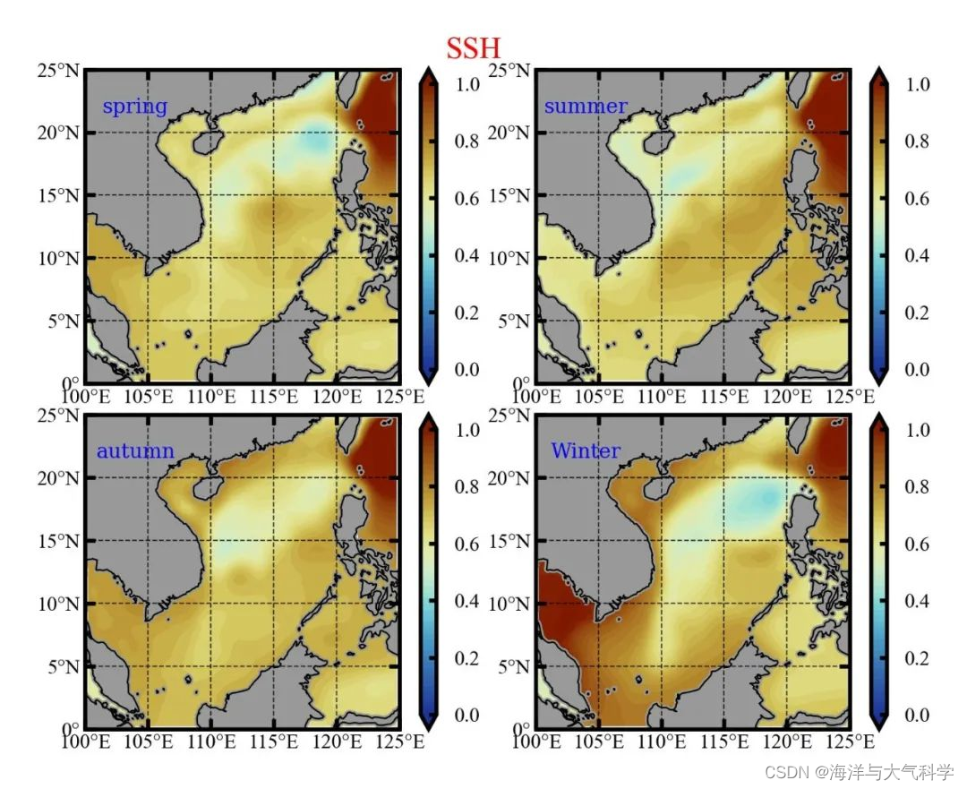
1:未共用colorbar
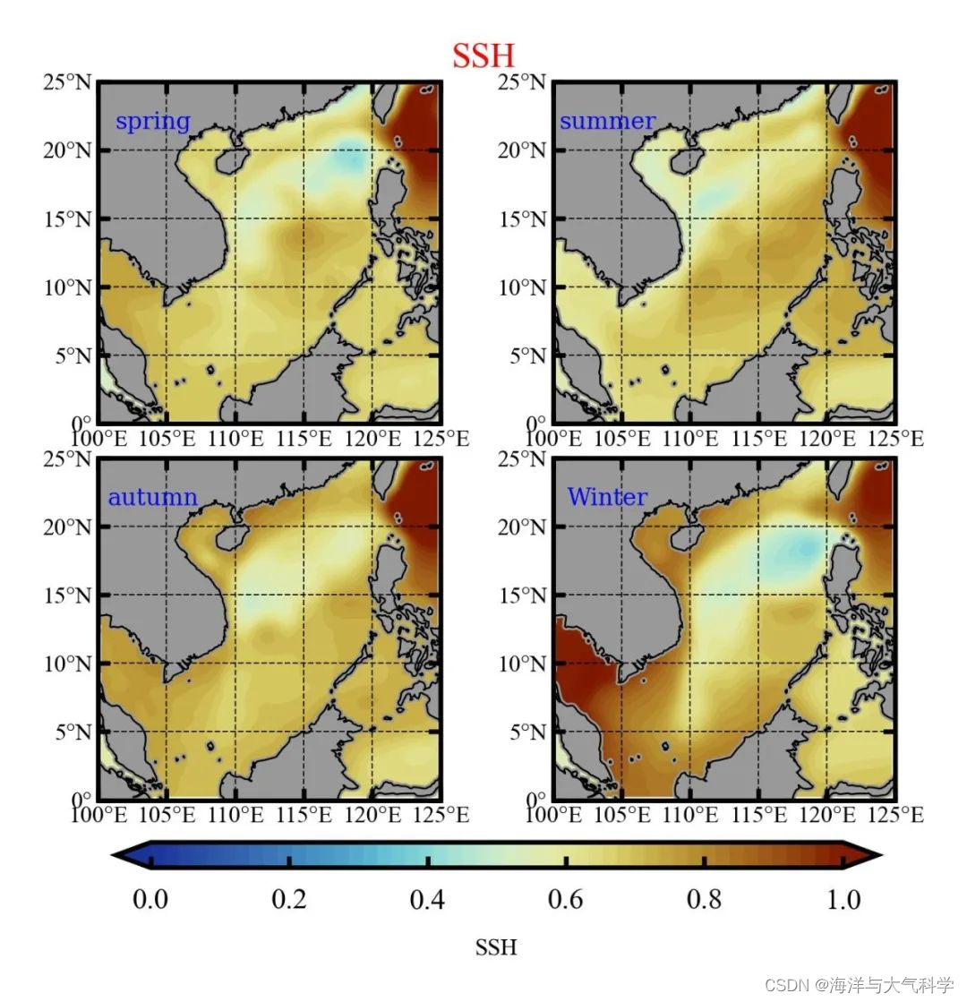
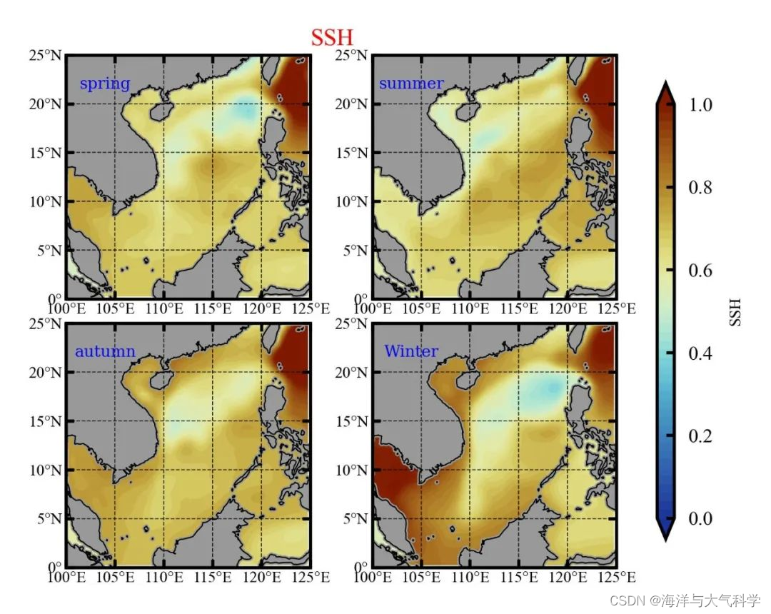
共用colorbar
1:横
2:纵
关键语句
图片
cb_ax = fig.add_axes([0.15, 0.02, 0.6, 0.03]) #设置colarbar位置
cbar = fig.colorbar(cs, cax=cb_ax, ax=ax, extend=‘both’, orientation=‘horizontal’, ticks=[0, 0.2, 0.4, 0.6, 0.8, 1.0]) #共享colorbar
cbar.set_label(‘SSH’, fontsize=4, color=‘k’) # 设置color-bar的标签字体及其大小cbar.ax.tick_params(labelsize=5, direction=‘in’, length=2, color=‘k’) # 设置color-bar刻度字体大小。
往期推荐
图片
【python海洋专题一】查看数据nc文件的属性并输出属性到txt文件
【python海洋专题二】读取水深nc文件并水深地形图
【python海洋专题三】图像修饰之画布和坐标轴
【Python海洋专题四】之水深地图图像修饰
【Python海洋专题五】之水深地形图海岸填充
【Python海洋专题六】之Cartopy画地形水深图
【python海洋专题】测试数据
【Python海洋专题七】Cartopy画地形水深图的陆地填充
【python海洋专题八】Cartopy画地形水深图的contourf填充间隔数调整
【python海洋专题九】Cartopy画地形等深线图
【python海洋专题十】Cartopy画特定区域的地形等深线图
【python海洋专题十一】colormap调色
【python海洋专题十二】年平均的南海海表面温度图
【python海洋专题十三】读取多个nc文件画温度季节变化图
【python海洋专题十四】读取多个盐度nc数据画盐度季节变化图
【python海洋专题十五】给colorbar加单位
【python海洋专题十六】对大陆周边的数据进行临近插值
【python海洋专题十七】读取几十年的OHC数据,画四季图
【python海洋专题十八】读取Soda数据,画subplot的海表面高度四季变化图
【python海洋专题十九】找范围的语句进阶版本
【python海洋专题二十】subplots_adjust布局调整
参考文献及其在本文中的作用
1:Matplotlib的subplot画图, 共享colorbar - 华东博客 - 博客园 (cnblogs.com)
全文代码
# -*- coding: utf-8 -*-
# ---导入数据读取和处理的模块-------
from netCDF4 import Dataset
from pathlib import Path
import xarray as xr
import numpy as np
# ------导入画图相关函数--------
import matplotlib.pyplot as plt
from matplotlib.font_manager import FontProperties
import matplotlib.ticker as ticker
from cartopy import mpl
import cartopy.crs as ccrs
import cartopy.feature as feature
from cartopy.mpl.ticker import LongitudeFormatter, LatitudeFormatter
from pylab import *
# -----导入颜色包---------
import seaborn as sns
from matplotlib import cm
import palettable
from palettable.cmocean.diverging import Delta_4
from palettable.colorbrewer.sequential import GnBu_9
from palettable.colorbrewer.sequential import Blues_9
from palettable.scientific.diverging import Roma_20
from palettable.cmocean.diverging import Delta_20
from palettable.scientific.diverging import Roma_20
from palettable.cmocean.diverging import Balance_20
from matplotlib.colors import ListedColormap
#     -------导入插值模块-----
from scipy.interpolate import interp1d  # 引入scipy中的一维插值库
from scipy.interpolate import griddata  # 引入scipy中的二维插值库
from scipy.interpolate import interp2d

# ----define reverse_colourmap定义颜色的反向函数----
def reverse_colourmap(cmap, name='my_cmap_r'):
    reverse = []
    k = []

    for key in cmap._segmentdata:
        k.append(key)
        channel = cmap._segmentdata[key]
        data = []

        for t in channel:
            data.append((1 - t[0], t[2], t[1]))
        reverse.append(sorted(data))

    LinearL = dict(zip(k, reverse))
    my_cmap_r = mpl.colors.LinearSegmentedColormap(name, LinearL)
    return my_cmap_r


# ---colormap的读取和反向----
cmap01 = Balance_20.mpl_colormap
cmap0 = Blues_9.mpl_colormap
cmap_r = reverse_colourmap(cmap0)
cmap1 = GnBu_9.mpl_colormap
cmap_r1 = reverse_colourmap(cmap1)
cmap2 = Roma_20.mpl_colormap
cmap_r2 = reverse_colourmap(cmap2)
# ---read_data---
f1 = xr.open_dataset(r'E:\data\soda\soda3.12.2_5dy_ocean_reg_2017.nc')
print(f1)
# # 提取经纬度(这样就不需要重复读取)
lat = f1['yt_ocean'].data
lon = f1['xt_ocean'].data
ssh = f1['ssh'].data
time = f1['time'].data
print(time)
# # -------- find scs 's temp-----------
ln1 = np.where(lon >= 100)[0][0]
ln2 = np.where(lon >= 125)[0][0]
la1 = np.where(lat >= 0)[0][0]
la2 = np.where(lat >= 25)[0][0]
# # # 画图网格
lon1 = lon[ln1:ln2]
lat1 = lat[la1:la2]
X, Y = np.meshgrid(lon1, lat1)
ssh_aim = ssh[:, la1:la2, ln1:ln2]
# # ----------对时间维度求平均 得到春夏秋冬的ssh------------------
ssh_spr_mean = np.mean(ssh_aim[2:5, :, :], axis=0)
ssh_sum_mean = np.mean(ssh_aim[5:8, :, :], axis=0)
ssh_atu_mean = np.mean(ssh_aim[8:11, :, :], axis=0)
ssh_win_mean = (ssh_aim[0, :, :]+ssh_aim[1, :, :]+ssh_aim[11, :, :])/3
# # -------------# plot  ------------
scale = '50m'
plt.rcParams['font.sans-serif'] = ['Times New Roman']  # 设置整体的字体为Times New Roman
fig = plt.figure(dpi=300, figsize=(3, 2), facecolor='w', edgecolor='blue')  # 设置一个画板,将其返还给fig
# 通过subplots_adjust()设置间距配置
fig.subplots_adjust(left=0.1, bottom=0.05, right=0.8, top=0.95, wspace=0.05, hspace=0.1)
# --------第一个子图----------
ax = fig.add_subplot(2, 2, 1, projection=ccrs.PlateCarree(central_longitude=180))
ax.set_extent([100, 125, 0, 25], crs=ccrs.PlateCarree())  # 设置显示范围
land = feature.NaturalEarthFeature('physical', 'land', scale, edgecolor='face',
                                   facecolor=feature.COLORS['land'])
ax.add_feature(land, facecolor='0.6')
ax.add_feature(feature.COASTLINE.with_scale('50m'), lw=0.3)  # 添加海岸线:关键字lw设置线宽; lifestyle设置线型
cs = ax.contourf(X, Y, ssh_spr_mean, extend='both', cmap=cmap_r2, levels=np.linspace(0, 1, 50),
                 transform=ccrs.PlateCarree())  #
# ------------------利用Formatter格式化刻度标签-----------------
ax.set_xticks(np.arange(100, 126, 5), crs=ccrs.PlateCarree())  # 添加经纬度
ax.set_xticklabels(np.arange(100, 126, 5), fontsize=4)
ax.set_yticks(np.arange(0, 26, 5), crs=ccrs.PlateCarree())
ax.set_yticklabels(np.arange(0, 26, 5), fontsize=4)
ax.xaxis.set_major_formatter(LongitudeFormatter())
ax.yaxis.set_major_formatter(LatitudeFormatter())
ax.tick_params(axis='x', top=True, which='major', direction='in', length=2, width=0.8, labelsize=4, pad=1,
               color='k')  # 刻度样式
ax.tick_params(axis='y', right=True, which='major', direction='in', length=2, width=0.8, labelsize=4, pad=1,
               color='k')  # 更改刻度指向为朝内,颜色设置为蓝色
gl = ax.gridlines(crs=ccrs.PlateCarree(), draw_labels=False, xlocs=np.arange(100, 126, 5), ylocs=np.arange(0, 26, 5),
                  linewidth=0.25, linestyle='--', color='k', alpha=0.8)  # 添加网格线
gl.top_labels, gl.bottom_labels, gl.right_labels, gl.left_labels = False, False, False, False

# --------第二个子图----------
ax = fig.add_subplot(2, 2, 2, projection=ccrs.PlateCarree(central_longitude=180))
ax.set_extent([100, 125, 0, 25], crs=ccrs.PlateCarree())  # 设置显示范围
land = feature.NaturalEarthFeature('physical', 'land', scale, edgecolor='face',
                                   facecolor=feature.COLORS['land'])
ax.add_feature(land, facecolor='0.6')
ax.add_feature(feature.COASTLINE.with_scale('50m'), lw=0.3)  # 添加海岸线:关键字lw设置线宽; lifestyle设置线型
cs = ax.contourf(X, Y, ssh_sum_mean, extend='both', cmap=cmap_r2, levels=np.linspace(0, 1, 50),
                 transform=ccrs.PlateCarree())  #
# ------------------利用Formatter格式化刻度标签-----------------
ax.set_xticks(np.arange(100, 126, 5), crs=ccrs.PlateCarree())  # 添加经纬度
ax.set_xticklabels(np.arange(100, 126, 5), fontsize=4)
ax.set_yticks(np.arange(0, 26, 5), crs=ccrs.PlateCarree())
ax.set_yticklabels(np.arange(0, 26, 5), fontsize=4)
ax.xaxis.set_major_formatter(LongitudeFormatter())
ax.yaxis.set_major_formatter(LatitudeFormatter())
ax.tick_params(axis='x', top=True, which='major', direction='in', length=2, width=0.8, labelsize=4, pad=1,
               color='k')  # 刻度样式
ax.tick_params(axis='y', right=True, which='major', direction='in', length=2, width=0.8, labelsize=4, pad=1,
               color='k')  # 更改刻度指向为朝内,颜色设置为蓝色
gl = ax.gridlines(crs=ccrs.PlateCarree(), draw_labels=False, xlocs=np.arange(100, 126, 5), ylocs=np.arange(0, 26, 5),
                  linewidth=0.25, linestyle='--', color='k', alpha=0.8)  # 添加网格线
gl.top_labels, gl.bottom_labels, gl.right_labels, gl.left_labels = False, False, False, False

# --------第三个子图----------
ax = fig.add_subplot(2, 2, 3, projection=ccrs.PlateCarree(central_longitude=180))
ax.set_extent([100, 125, 0, 25], crs=ccrs.PlateCarree())  # 设置显示范围
land = feature.NaturalEarthFeature('physical', 'land', scale, edgecolor='face',
                                   facecolor=feature.COLORS['land'])
ax.add_feature(land, facecolor='0.6')
ax.add_feature(feature.COASTLINE.with_scale('50m'), lw=0.3)  # 添加海岸线:关键字lw设置线宽; lifestyle设置线型
cs = ax.contourf(X, Y, ssh_atu_mean, extend='both', cmap=cmap_r2, levels=np.linspace(0, 1, 50),
                 transform=ccrs.PlateCarree())  #
# ------------------利用Formatter格式化刻度标签-----------------
ax.set_xticks(np.arange(100, 126, 5), crs=ccrs.PlateCarree())  # 添加经纬度
ax.set_xticklabels(np.arange(100, 126, 5), fontsize=4)
ax.set_yticks(np.arange(0, 26, 5), crs=ccrs.PlateCarree())
ax.set_yticklabels(np.arange(0, 26, 5), fontsize=4)
ax.xaxis.set_major_formatter(LongitudeFormatter())
ax.yaxis.set_major_formatter(LatitudeFormatter())
ax.tick_params(axis='x', top=True, which='major', direction='in', length=2, width=0.8, labelsize=4, pad=1,
               color='k')  # 刻度样式
ax.tick_params(axis='y', right=True, which='major', direction='in', length=2, width=0.8, labelsize=4, pad=1,
               color='k')  # 更改刻度指向为朝内,颜色设置为蓝色
gl = ax.gridlines(crs=ccrs.PlateCarree(), draw_labels=False, xlocs=np.arange(100, 126, 5), ylocs=np.arange(0, 26, 5),
                  linewidth=0.25, linestyle='--', color='k', alpha=0.8)  # 添加网格线
gl.top_labels, gl.bottom_labels, gl.right_labels, gl.left_labels = False, False, False, False
# 添加文本注释

# --------第四个子图----------
ax = fig.add_subplot(2, 2, 4, projection=ccrs.PlateCarree(central_longitude=180))
ax.set_extent([100, 125, 0, 25], crs=ccrs.PlateCarree())  # 设置显示范围
land = feature.NaturalEarthFeature('physical', 'land', scale, edgecolor='face',
                                   facecolor=feature.COLORS['land'])
ax.add_feature(land, facecolor='0.6')
ax.add_feature(feature.COASTLINE.with_scale('50m'), lw=0.3)  # 添加海岸线:关键字lw设置线宽; lifestyle设置线型
cs = ax.contourf(X, Y, ssh_win_mean, extend='both', cmap=cmap_r2, levels=np.linspace(0, 1, 50),
                 transform=ccrs.PlateCarree())  #

# ------------------利用Formatter格式化刻度标签-----------------
ax.set_xticks(np.arange(100, 126, 5), crs=ccrs.PlateCarree())  # 添加经纬度
ax.set_xticklabels(np.arange(100, 126, 5), fontsize=4)
ax.set_yticks(np.arange(0, 26, 5), crs=ccrs.PlateCarree())
ax.set_yticklabels(np.arange(0, 26, 5), fontsize=4)
ax.xaxis.set_major_formatter(LongitudeFormatter())
ax.yaxis.set_major_formatter(LatitudeFormatter())
ax.tick_params(axis='x', top=True, which='major', direction='in', length=2, width=0.8, labelsize=4, pad=1,
               color='k')  # 刻度样式
ax.tick_params(axis='y', right=True, which='major', direction='in', length=2, width=0.8, labelsize=4, pad=1,
               color='k')  # 更改刻度指向为朝内,颜色设置为蓝色
gl = ax.gridlines(crs=ccrs.PlateCarree(), draw_labels=False, xlocs=np.arange(100, 126, 5), ylocs=np.arange(0, 26, 5),
                  linewidth=0.25, linestyle='--', color='k', alpha=0.8)  # 添加网格线
gl.top_labels, gl.bottom_labels, gl.right_labels, gl.left_labels = False, False, False, False
# -------添加子图的大标题--------
plt.suptitle("SSH", x=0.44, y=0.9965, fontsize=6, color='red')
# ---------共用colorbar------
cb_ax = fig.add_axes([0.82, 0.1, 0.02, 0.8]) #设置colarbar位置
cbar = fig.colorbar(cs, cax=cb_ax, ax=ax, extend='both', orientation='vertical', ticks=[0, 0.2, 0.4, 0.6, 0.8, 1.0])     #共享colorbar
cbar.set_label('SSH', fontsize=4, color='k')  # 设置color-bar的标签字体及其大小
cbar.ax.tick_params(labelsize=5, direction='in', length=2, color='k')  # 设置color-bar刻度字体大小。
plt.savefig('SSH_1.jpg', dpi=600, bbox_inches='tight', pad_inches=0.1)  # 输出地图,并设置边框空白紧密
plt.show()
# -----坐标轴为横-------
# # -------------# plot  ------------
scale = '50m'
plt.rcParams['font.sans-serif'] = ['Times New Roman']  # 设置整体的字体为Times New Roman
fig = plt.figure(dpi=300, figsize=(3, 2), facecolor='w', edgecolor='blue')  # 设置一个画板,将其返还给fig
# 通过subplots_adjust()设置间距配置
fig.subplots_adjust(left=0.1, bottom=0.1, right=0.8, top=0.95, wspace=0.05, hspace=0.1)
# --------第一个子图----------
ax = fig.add_subplot(2, 2, 1, projection=ccrs.PlateCarree(central_longitude=180))
ax.set_extent([100, 125, 0, 25], crs=ccrs.PlateCarree())  # 设置显示范围
land = feature.NaturalEarthFeature('physical', 'land', scale, edgecolor='face',
                                   facecolor=feature.COLORS['land'])
ax.add_feature(land, facecolor='0.6')
ax.add_feature(feature.COASTLINE.with_scale('50m'), lw=0.3)  # 添加海岸线:关键字lw设置线宽; lifestyle设置线型
cs = ax.contourf(X, Y, ssh_spr_mean, extend='both', cmap=cmap_r2, levels=np.linspace(0, 1, 50),
                 transform=ccrs.PlateCarree())  #
# ------------------利用Formatter格式化刻度标签-----------------
ax.set_xticks(np.arange(100, 126, 5), crs=ccrs.PlateCarree())  # 添加经纬度
ax.set_xticklabels(np.arange(100, 126, 5), fontsize=4)
ax.set_yticks(np.arange(0, 26, 5), crs=ccrs.PlateCarree())
ax.set_yticklabels(np.arange(0, 26, 5), fontsize=4)
ax.xaxis.set_major_formatter(LongitudeFormatter())
ax.yaxis.set_major_formatter(LatitudeFormatter())
ax.tick_params(axis='x', top=True, which='major', direction='in', length=2, width=0.8, labelsize=4, pad=1,
               color='k')  # 刻度样式
ax.tick_params(axis='y', right=True, which='major', direction='in', length=2, width=0.8, labelsize=4, pad=1,
               color='k')  # 更改刻度指向为朝内,颜色设置为蓝色
gl = ax.gridlines(crs=ccrs.PlateCarree(), draw_labels=False, xlocs=np.arange(100, 126, 5), ylocs=np.arange(0, 26, 5),
                  linewidth=0.25, linestyle='--', color='k', alpha=0.8)  # 添加网格线
gl.top_labels, gl.bottom_labels, gl.right_labels, gl.left_labels = False, False, False, False

# --------第二个子图----------
ax = fig.add_subplot(2, 2, 2, projection=ccrs.PlateCarree(central_longitude=180))
ax.set_extent([100, 125, 0, 25], crs=ccrs.PlateCarree())  # 设置显示范围
land = feature.NaturalEarthFeature('physical', 'land', scale, edgecolor='face',
                                   facecolor=feature.COLORS['land'])
ax.add_feature(land, facecolor='0.6')
ax.add_feature(feature.COASTLINE.with_scale('50m'), lw=0.3)  # 添加海岸线:关键字lw设置线宽; lifestyle设置线型
cs = ax.contourf(X, Y, ssh_sum_mean, extend='both', cmap=cmap_r2, levels=np.linspace(0, 1, 50),
                 transform=ccrs.PlateCarree())  #
# ------------------利用Formatter格式化刻度标签-----------------
ax.set_xticks(np.arange(100, 126, 5), crs=ccrs.PlateCarree())  # 添加经纬度
ax.set_xticklabels(np.arange(100, 126, 5), fontsize=4)
ax.set_yticks(np.arange(0, 26, 5), crs=ccrs.PlateCarree())
ax.set_yticklabels(np.arange(0, 26, 5), fontsize=4)
ax.xaxis.set_major_formatter(LongitudeFormatter())
ax.yaxis.set_major_formatter(LatitudeFormatter())
ax.tick_params(axis='x', top=True, which='major', direction='in', length=2, width=0.8, labelsize=4, pad=1,
               color='k')  # 刻度样式
ax.tick_params(axis='y', right=True, which='major', direction='in', length=2, width=0.8, labelsize=4, pad=1,
               color='k')  # 更改刻度指向为朝内,颜色设置为蓝色
gl = ax.gridlines(crs=ccrs.PlateCarree(), draw_labels=False, xlocs=np.arange(100, 126, 5), ylocs=np.arange(0, 26, 5),
                  linewidth=0.25, linestyle='--', color='k', alpha=0.8)  # 添加网格线
gl.top_labels, gl.bottom_labels, gl.right_labels, gl.left_labels = False, False, False, False

# --------第三个子图----------
ax = fig.add_subplot(2, 2, 3, projection=ccrs.PlateCarree(central_longitude=180))
ax.set_extent([100, 125, 0, 25], crs=ccrs.PlateCarree())  # 设置显示范围
land = feature.NaturalEarthFeature('physical', 'land', scale, edgecolor='face',
                                   facecolor=feature.COLORS['land'])
ax.add_feature(land, facecolor='0.6')
ax.add_feature(feature.COASTLINE.with_scale('50m'), lw=0.3)  # 添加海岸线:关键字lw设置线宽; lifestyle设置线型
cs = ax.contourf(X, Y, ssh_atu_mean, extend='both', cmap=cmap_r2, levels=np.linspace(0, 1, 50),
                 transform=ccrs.PlateCarree())  #
# ------------------利用Formatter格式化刻度标签-----------------
ax.set_xticks(np.arange(100, 126, 5), crs=ccrs.PlateCarree())  # 添加经纬度
ax.set_xticklabels(np.arange(100, 126, 5), fontsize=4)
ax.set_yticks(np.arange(0, 26, 5), crs=ccrs.PlateCarree())
ax.set_yticklabels(np.arange(0, 26, 5), fontsize=4)
ax.xaxis.set_major_formatter(LongitudeFormatter())
ax.yaxis.set_major_formatter(LatitudeFormatter())
ax.tick_params(axis='x', top=True, which='major', direction='in', length=2, width=0.8, labelsize=4, pad=1,
               color='k')  # 刻度样式
ax.tick_params(axis='y', right=True, which='major', direction='in', length=2, width=0.8, labelsize=4, pad=1,
               color='k')  # 更改刻度指向为朝内,颜色设置为蓝色
gl = ax.gridlines(crs=ccrs.PlateCarree(), draw_labels=False, xlocs=np.arange(100, 126, 5), ylocs=np.arange(0, 26, 5),
                  linewidth=0.25, linestyle='--', color='k', alpha=0.8)  # 添加网格线
gl.top_labels, gl.bottom_labels, gl.right_labels, gl.left_labels = False, False, False, False


# --------第四个子图----------
ax = fig.add_subplot(2, 2, 4, projection=ccrs.PlateCarree(central_longitude=180))
ax.set_extent([100, 125, 0, 25], crs=ccrs.PlateCarree())  # 设置显示范围
land = feature.NaturalEarthFeature('physical', 'land', scale, edgecolor='face',
                                   facecolor=feature.COLORS['land'])
ax.add_feature(land, facecolor='0.6')
ax.add_feature(feature.COASTLINE.with_scale('50m'), lw=0.3)  # 添加海岸线:关键字lw设置线宽; lifestyle设置线型
cs = ax.contourf(X, Y, ssh_win_mean, extend='both', cmap=cmap_r2, levels=np.linspace(0, 1, 50),
                 transform=ccrs.PlateCarree())  #

# ------------------利用Formatter格式化刻度标签-----------------
ax.set_xticks(np.arange(100, 126, 5), crs=ccrs.PlateCarree())  # 添加经纬度
ax.set_xticklabels(np.arange(100, 126, 5), fontsize=4)
ax.set_yticks(np.arange(0, 26, 5), crs=ccrs.PlateCarree())
ax.set_yticklabels(np.arange(0, 26, 5), fontsize=4)
ax.xaxis.set_major_formatter(LongitudeFormatter())
ax.yaxis.set_major_formatter(LatitudeFormatter())
ax.tick_params(axis='x', top=True, which='major', direction='in', length=2, width=0.8, labelsize=4, pad=1,
               color='k')  # 刻度样式
ax.tick_params(axis='y', right=True, which='major', direction='in', length=2, width=0.8, labelsize=4, pad=1,
               color='k')  # 更改刻度指向为朝内,颜色设置为蓝色
gl = ax.gridlines(crs=ccrs.PlateCarree(), draw_labels=False, xlocs=np.arange(100, 126, 5), ylocs=np.arange(0, 26, 5),
                  linewidth=0.25, linestyle='--', color='k', alpha=0.8)  # 添加网格线
gl.top_labels, gl.bottom_labels, gl.right_labels, gl.left_labels = False, False, False, False
# -------添加子图的大标题--------
plt.suptitle("SSH", x=0.44, y=0.9965, fontsize=6, color='red')
# ---------共用colorbar------
cb_ax = fig.add_axes([0.15, 0.02, 0.6, 0.03]) #设置colarbar位置
cbar = fig.colorbar(cs, cax=cb_ax, ax=ax, extend='both', orientation='horizontal', ticks=[0, 0.2, 0.4, 0.6, 0.8, 1.0])     #共享colorbar
cbar.set_label('SSH', fontsize=4, color='k')  # 设置color-bar的标签字体及其大小
cbar.ax.tick_params(labelsize=5, direction='in', length=2, color='k')  # 设置color-bar刻度字体大小。
plt.savefig('SSH_1.jpg', dpi=600, bbox_inches='tight', pad_inches=0.1)  # 输出地图,并设置边框空白紧密
plt.show()


 3281
3281


 被折叠的 条评论
为什么被折叠?
被折叠的 条评论
为什么被折叠?
 到【灌水乐园】发言


