html结构
 <div class="test">
    <span></span>
    <span></span>
    <span></span>
    <span></span>
  </div>
css结构
.test {
width: 300px;
height: 300px;
background-color: springgreen;
margin: 0 auto;
box-shadow: inset 0px 0px 67px 37px #cccccc;
position: relative;
}
.test span:nth-child(1) {
display: block;
width: 50px;
height: 50px;
border-top: 3px solid #00d3e7;
border-left: 3px solid #00d3e7;
position: absolute;
}
.test span:nth-child(2) {
display: block;
width: 50px;
height: 50px;
border-top: 3px solid #00d3e7;
border-right: 3px solid #00d3e7;
position: absolute;
right: 0;
top: 0;
}
.test span:nth-child(3) {
display: block;
width: 50px;
height: 50px;
border-left: 3px solid #00d3e7;
border-bottom: 3px solid #00d3e7;
position: absolute;
left: 0;
bottom: 0;
}
.test span:nth-child(4) {
display: block;
width: 50px;
height: 50px;
border-right: 3px solid #00d3e7;
border-bottom: 3px solid #00d3e7;
position: absolute;
right: 0;
bottom: 0;
}
.test span:nth-child(4)::after {
content: '';
display: block;
width: 50px;
height: 50px;
position: absolute;
background-color: #fff;
z-index: 10;
border: 2px solid transparent;
top: 26px;
left: 26px;
transform: rotate(45deg);
border-left-color: yellow;
}
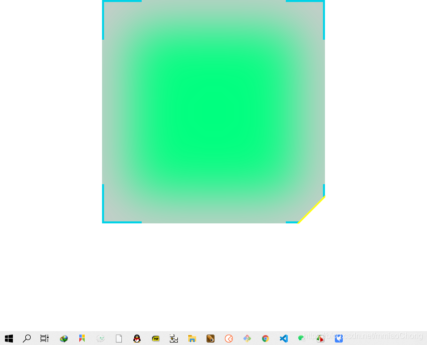
整体效果
完整代码
<!DOCTYPE html>
<html lang="en">
<head>
<meta charset="UTF-8">
<meta name="viewport" content="width=device-width, initial-scale=1.0">
<title>Document</title>
<style>
* {
margin: 0;
padding: 0;
}
html,
body {
width: 100%;
height: 100%;
}
section {
width: 300px;
height: 300px;
background-color: blue;
display: flex;
justify-content: center;
align-items: center;
position: absolute;
top: 50px;
left: 50px;
}
.test {
width: 300px;
height: 300px;
background-color: springgreen;
margin: 0 auto;
box-shadow: inset 0px 0px 67px 37px #cccccc;
position: relative;
}
.test span:nth-child(1) {
display: block;
width: 50px;
height: 50px;
border-top: 3px solid #00d3e7;
border-left: 3px solid #00d3e7;
position: absolute;
}
.test span:nth-child(2) {
display: block;
width: 50px;
height: 50px;
border-top: 3px solid #00d3e7;
border-right: 3px solid #00d3e7;
position: absolute;
right: 0;
top: 0;
}
.test span:nth-child(3) {
display: block;
width: 50px;
height: 50px;
border-left: 3px solid #00d3e7;
border-bottom: 3px solid #00d3e7;
position: absolute;
left: 0;
bottom: 0;
}
.test span:nth-child(4) {
display: block;
width: 50px;
height: 50px;
border-right: 3px solid #00d3e7;
border-bottom: 3px solid #00d3e7;
position: absolute;
right: 0;
bottom: 0;
}
.test span:nth-child(4)::after {
content: '';
display: block;
width: 50px;
height: 50px;
position: absolute;
background-color: #fff;
z-index: 10;
border: 2px solid transparent;
top: 26px;
left: 26px;
transform: rotate(45deg);
border-left-color: yellow;
}
</style>
</head>
<body>
<div class="test">
<span></span>
<span></span>
<span></span>
<span></span>
</div>
</body>
</html>


 3766
3766


 被折叠的 条评论
为什么被折叠?
被折叠的 条评论
为什么被折叠?
 到【灌水乐园】发言


