


前言
👏不要图片?CSS实现大屏常见不规则边框(系列一) ,速速来Get吧~
🥇文末分享源代码。记得点赞+关注+收藏!
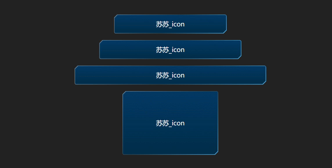
1.实现效果
2.实现原理
2.1 边框圆角渐变色
- 我们都知道,实现一个边框渐变色可以用border-image,但是border-image不支持圆角;
border-image:
border-image CSS 属性允许在元素的边框上绘制图像。这使得绘制复杂的外观组件更加简单,也不用在某些情况下使用九宫格了。使用 border-image 时,其将会替换掉border-style 属性所设置的边框样式。
  div{
    width: 200px;
    height: 80px;
    border: 2px solid;
    border-image: linear-gradient(180deg, red, orange) 1;
  }
2.1.1 background-clip (案例未使用,背景无法透明,无兴趣的小伙伴略过即可)
- 实现边框圆角 渐变的方法蛮多的,这里说一下background-clip吧(缺点:内容背景无法透明)~
background-clip:规定背景的绘制区域
语法:
background-clip: border-box|padding-box|content-box;
| 值 | 描述 |
|---|---|
| border-box | 背景被裁剪到边框盒 |
| padding-box | 背景被裁剪到内边距框 |
| content-box | 背景被裁剪到内容框 |
background-origin:
background-Origin属性指定background-position属性应该是相对位置。
注意如果背景图像background-attachment是"固定",这个属性没有任何效果。
语法:
background-origin: padding-box|border-box|content-box;
| 值 | 描述 |
|---|---|
| border-box | 背景图像边界框的相对位置 |
| padding-box | 背景图像填充框的相对位置 |
| content-box | 背景图像的相对位置的内容框 |
  :root {
        --bg: #222;
    }
  div {
    width: 100px;
    height: 100px;
    border: 2px solid transparent;
    background-image: linear-gradient(var(--bg), var(--bg)),
      linear-gradient(180deg, red, orange);
    /* 前一个为内容背景色,后面为边框渐变色 */
    background-origin: border-box;
    background-clip: content-box, border-box;
    border-radius: 0px;
    animation: 2s toBorder linear infinite alternate;
  }

  @keyframes toBorder {
    100% {
      border-radius: 50%;
    }
  }
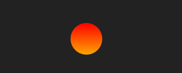
2.1.2 伪元素叠加 (本文使用,背景色无法透明)
- 将边框渐变色设置为背景
div{
	position: relative;
	width: 100px;
	height: 100px;
	border-radius: 50%;
	background: linear-gradient(180deg, red, orange);
}
- 添加伪元素,颜色与页面背景色一致(所以当背景色透明的时候,是无法实现的)
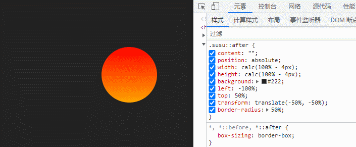
div::after {
  content: "";
  position: absolute;
  width: calc(100% - 4px);
  height: calc(100% - 4px);
  background: #222;
  left: 50%;
  top: 50%;
  transform: translate(-50%, -50%);
  border-radius: 50%;
}
2.2 clip-path
clip-path:clip-path CSS 属性使用裁剪方式创建元素的可显示区域。区域内的部分显示,区域外的隐藏。
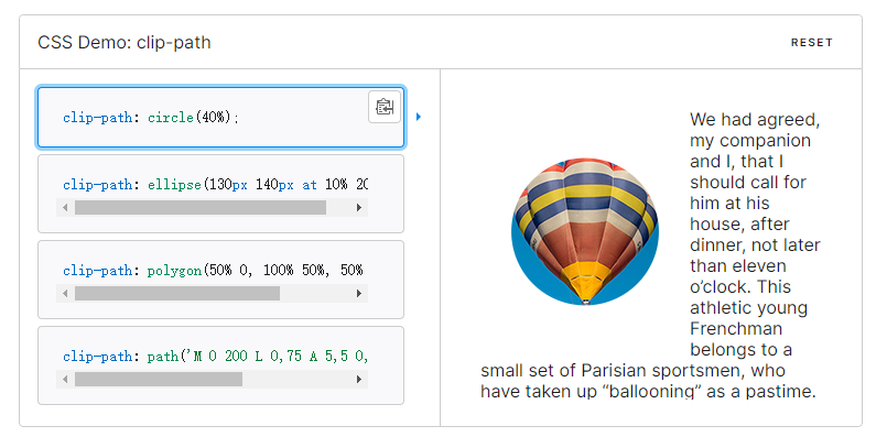
路径不太了解的小伙伴可以使用clip-path在线网站,帮我们拖拽出一些简单的图案
3.实现步骤
- 定义全局变量,宽度为–w,高度为–h
 :root {
	/* 宽度 */
	 --w: 353px;
	/* 高度 */
	--h: 60px;
}
- 定义元素的宽高为上述变量,边框渐变色设置为当前元素的背景
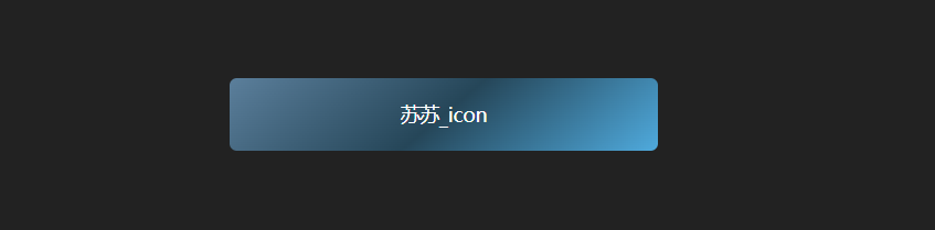
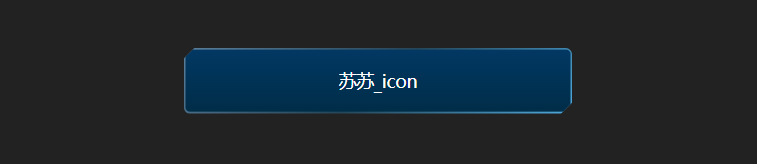
<div class="box flex-row j_c">苏苏_icon</div>
.box{
	position: relative;
	width: var(--w);
	height: var(--h);
	/* 圆角 */
	border-radius: 6px;
	background: linear-gradient(
	  140deg,
	  rgba(138, 203, 255, 0.55),
	  rgba(41, 106, 143, 0.5),
	  rgba(79, 170, 221, 1)
	);
}
- 绘制出我们需要裁剪的clip-path路径,需要在左上角和右下角裁剪出小三角形,定义大小为10px
:root{
	/* clip-path裁剪形状 */
	--path: polygon(
		 10px 0,
		 100% 0,
		 100% calc(100% - 10px),
		 calc(100% - 10px) 100%,
		 0 100%,
		 0 10px
	);
}
- 为元素设置clip-path裁剪
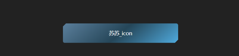
.box{
	+ clip-path: var(--path);
}
- 添加伪元素,宽度为100% - 3px,减去的数值越大,边框越大,高度与宽度一致;
.box::after {
	content: "";
	width: calc(100% - 3px);
	height: calc(100% - 3px);
	position: absolute;
	/* 水平垂直居中 */
	left: 50%;
	top: 50%;
	transform: translate(-50%, -50%);
}
- 设置伪元素的背景色,圆角,并设置z-index为-1,置于底层,不遮挡元素内容
.box::after {
	/* 置于底层 */
	z-index: -1;
	/* 设置背景色 */
	background: linear-gradient(180deg, #023863 0%, #002d48 100%);
	border-radius: 4px;
}
- 为伪元素设置同样的clip-path,进行裁剪,到这一步,就实现了~
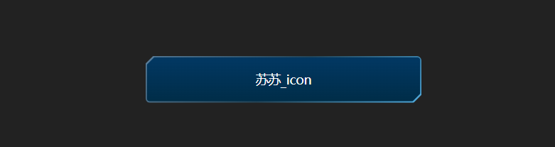
.box::after {
	/* 设置裁剪 */
    clip-path: var(--path);
}
- 接下来,我们可以多写几个元素,设置不同的宽高,看看效果吧~
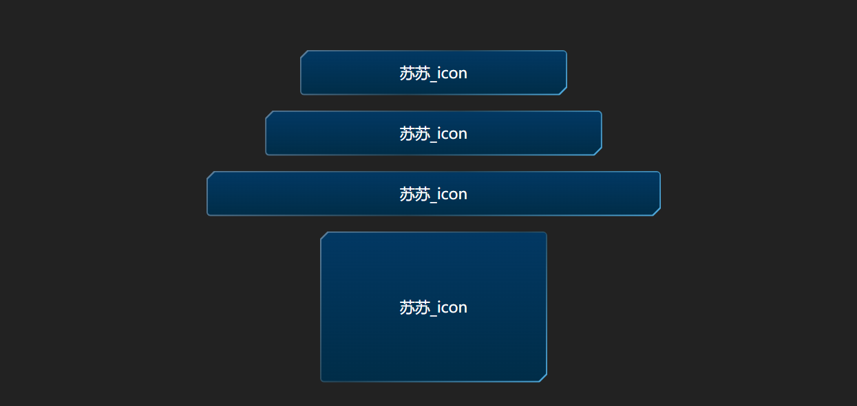
<div class="box flex-row j_c">苏苏_icon</div>
<div class="box flex-row j_c" style="--w: 445px">苏苏_icon</div>
<div class="box flex-row j_c" style="--w: 600px">苏苏_icon</div>
<div class="box flex-row j_c" style="--w: 300px; --h: 200px">
  苏苏_icon
</div>
- 为每个元素,设置hover效果,并设置过渡效果,就完成了啦~

.box:hover {
  filter: brightness(1.5);
}
.box{
	transition: all 0.5s;
}
4.实现代码
<style>
   :root {
     /* 宽度 */
     --w: 353px;
     /* 高度 */
     --h: 60px;
     /* clip-path裁剪形状 */
     --path: polygon(
       10px 0,
       100% 0,
       100% calc(100% - 10px),
       calc(100% - 10px) 100%,
       0 100%,
       0 10px
     );
   }
   .box {
     position: relative;
     width: var(--w);
     height: var(--h);
     border-radius: 6px;
     background: linear-gradient(
       140deg,
       rgba(138, 203, 255, 0.55),
       rgba(41, 106, 143, 0.5),
       rgba(79, 170, 221, 1)
     );
     /* 进行裁剪 */
     clip-path: var(--path);
     font-size: 20px;
     color: #fff;
     margin-bottom: 20px;
     cursor: pointer;
     transition: all 0.5s;
   }
   .box:last-child {
     margin-bottom: 0;
   }
   .box:hover {
     filter: brightness(1.5);
   }
   /* 添加伪元素背景 */
   .box::after {
     content: "";
     width: calc(100% - 3px);
     height: calc(100% - 3px);
     position: absolute;
     /* 水平垂直居中 */
     left: 50%;
     top: 50%;
     transform: translate(-50%, -50%);
     /* 置于底层 */
     z-index: -1;
     /* 设置背景色 */
     background: linear-gradient(180deg, #023863 0%, #002d48 100%);
     border-radius: 4px;
     /* 设置裁剪 */
     clip-path: var(--path);
   }
 </style>
 <body>
   <section class="flex-column j_c">
     <div class="box flex-row j_c">苏苏_icon</div>
     <div class="box flex-row j_c" style="--w: 445px">苏苏_icon</div>
     <div class="box flex-row j_c" style="--w: 600px">苏苏_icon</div>
     <div class="box flex-row j_c" style="--w: 300px; --h: 200px">
       苏苏_icon
     </div>
   </section>
 </body>


 扫一扫
扫一扫


 733
733

 被折叠的 条评论
为什么被折叠?
被折叠的 条评论
为什么被折叠?
 到【灌水乐园】发言


