


1 安装Plotly库
关于库的选择,这里不再对常用的可视化库作对比,直接用Plotly。首先安装:
pip install -i https://pypi.tuna.tsinghua.edu.cn/simple Plotly # 其中-i选项是清华源,可加快下载速度
2 常用图表绘制
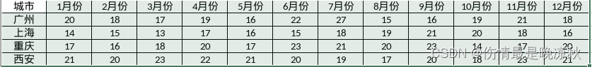
示例尽量采用同一组数据源去生成不同的图表。以下是简单的数据示例,数据是虚拟的,模拟四个城市的降雨量:
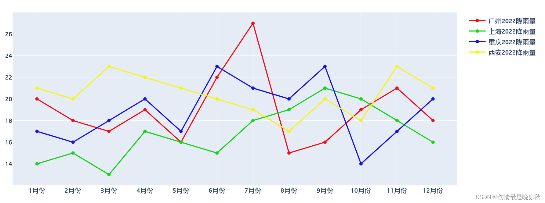
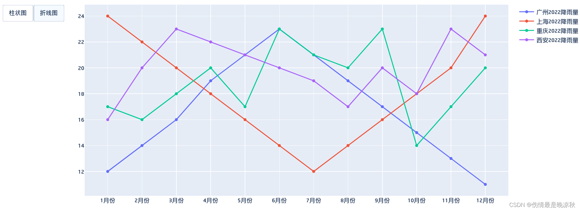
2.1 折线图示例
# -*- coding: utf-8 -*-
import plotly.offline as py
import plotly.graph_objs as go
import plotly.express as px
# x轴显示月份
month = ['1月份', '2月份', '3月份', '4月份', '5月份', '6月份', '7月份', '8月份', '9月份',
'10月份', '11月份', '12月份']
# y轴显示降雨量
guangzhou = [20,18,17,19,16,22,27,15,16,19,21,18]
shanghai = [14,15,13,17,16,15,18,19,21,20,18,16]
chongqing = [17,16,18,20,17,23,21,20,23,14,17,20]
xian = [21,20,23,22,21,20,19,17,20,18,23,21]
#折线图,x,y指定x,y轴显示的数据集,name是图例,line指定线样式
line1 = go.Scatter(
x = month,
y = guangzhou,
name = '广州2022降雨量',
line = dict(color = ('rgb(245, 12, 20)'), width = 2)
)
line2 = go.Scatter(
x = month,
y = shanghai,
name = '上海2022降雨量',
line = dict(color = ('rgb(20, 213, 24)'), width = 2)
)
line3 = go.Scatter(
x = month,
y = chongqing,
name = '重庆2022降雨量',
line = dict(color = ('rgb(20, 14, 245)'), width = 2)
)
line4 = go.Scatter(
x = month,
y = xian,
name = '西安2022降雨量',
line = dict(color = ('rgb(245, 245, 20)'), width = 2)
)
lines = [line1,line2,line3,line4]
fig = go.Figure(lines)
fig.show()
'''
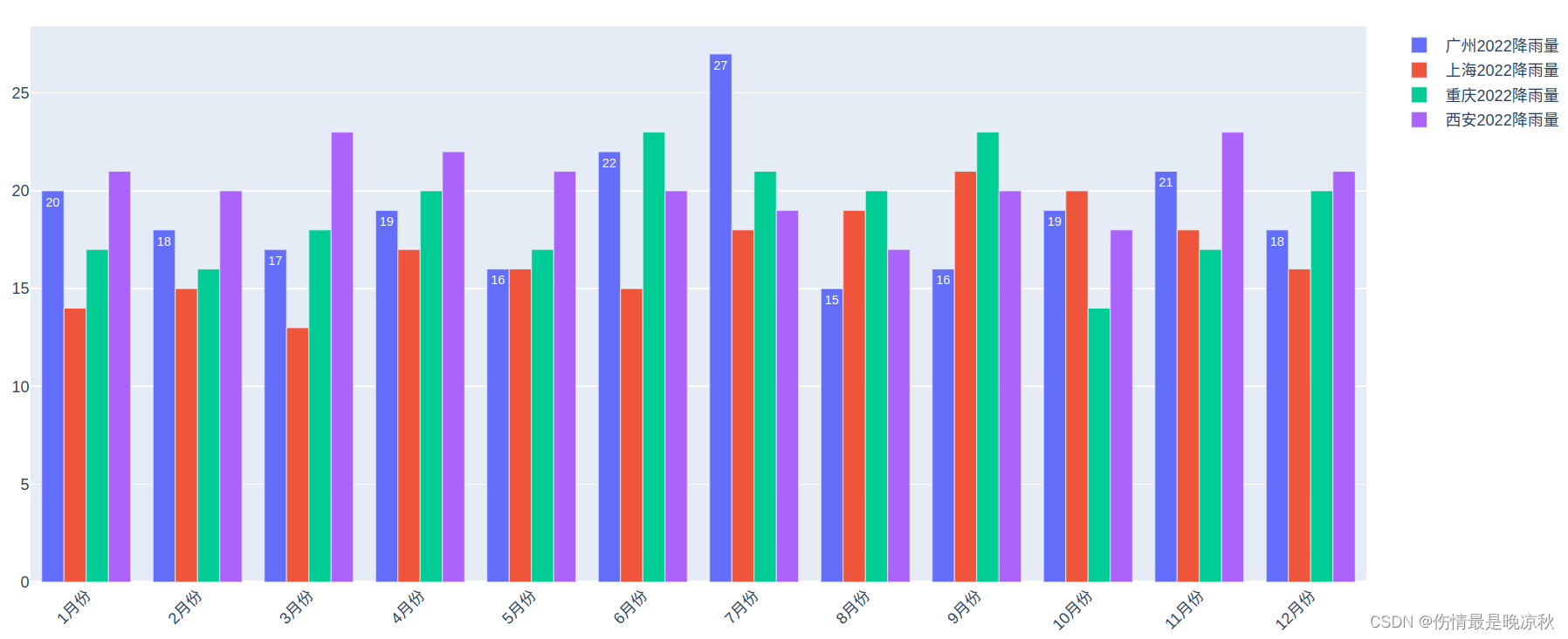
#柱状图
#text为标注,textposition标注位置
bar1 = go.Bar(x = month, y = guangzhou,name = '广州2022降雨量',text=guangzhou,textposition='auto')
bar2 = go.Bar(x = month, y = shanghai,name = '上海2022降雨量')
bar3 = go.Bar(x = month, y = chongqing,name = '重庆2022降雨量')
bar4 = go.Bar(x = month, y = xian,name = '西安2022降雨量')
bars = [bar1,bar2,bar3,bar4]
fig = go.Figure(bars)
#旋转座标轴(x轴旋转45度)用于x轴字符串过长
fig.update_layout(xaxis_tickangle=-45)
fig.show()
'''
'''
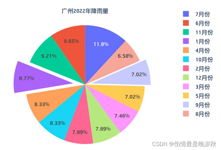
#饼图
#pull参数是爆炸饼图效果,即将这两个月份的块拉出到圆形外边一部分
pie = go.Pie(values= guangzhou, labels=month, title='广州2022年降雨量',
pull=[0.2,0,0,0,0,0,0,0,0.1,0,0,0])
fig = go.Figure(pie)
fig.show()
'''
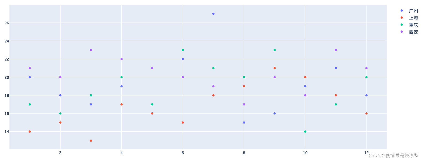
'''
#散点图
#散点图横纵均为数字
month_list = [1,2,3,4,5,6,7,8,9,10,11,12]
#markers为散点图
points_1 = go.Scatter(x=month_list,y=guangzhou,mode='markers',name='广州')
points_2 = go.Scatter(x=month_list,y=shanghai,mode='markers',name='上海')
points_3 = go.Scatter(x=month_list,y=chongqing,mode='markers',name='重庆')
points_4 = go.Scatter(x=month_list,y=xian,mode='markers',name='西安')
data = [points_1,points_2,points_3,points_4]
fig = go.Figure(data)
fig.show()
'''
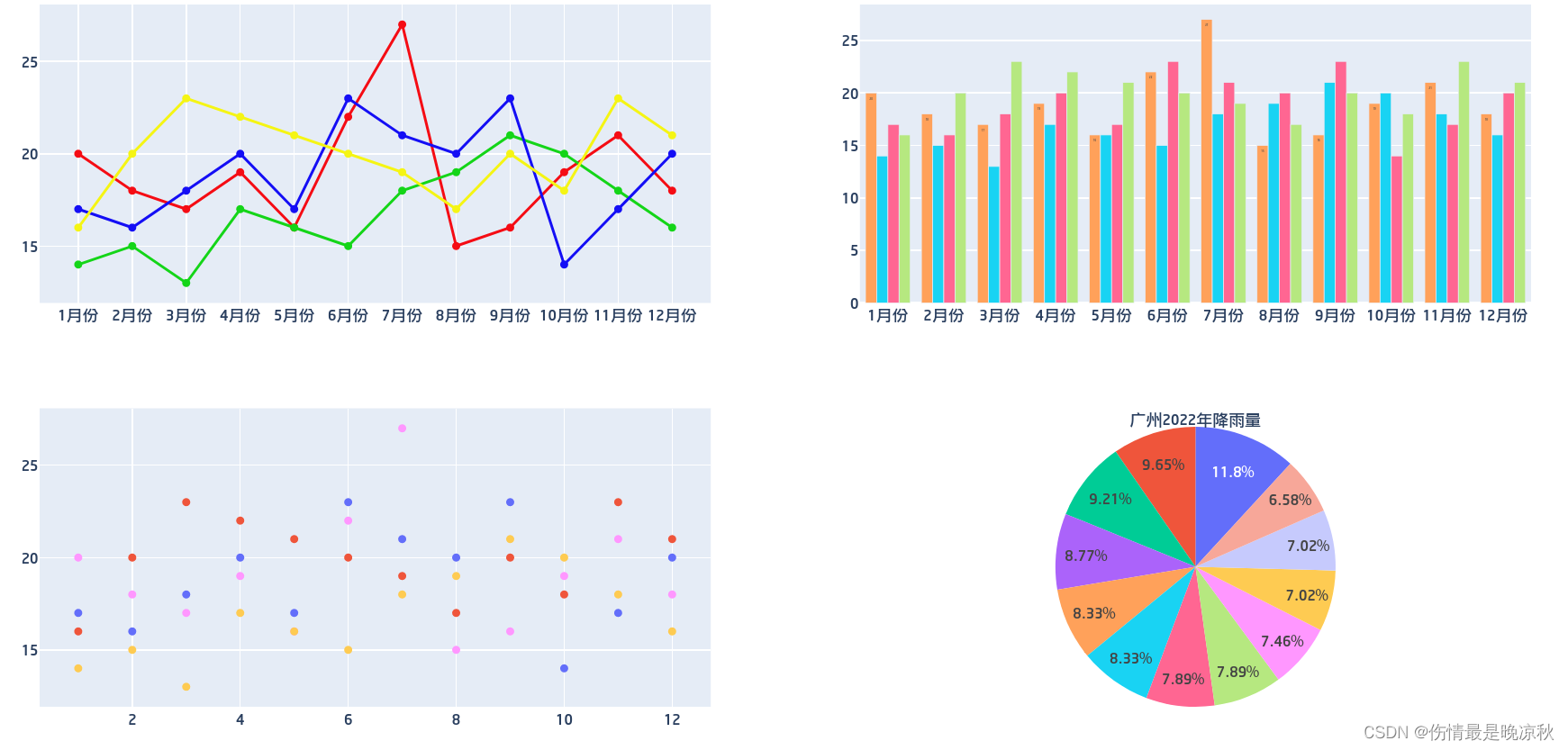
运行代码会生成一个包含js的html页面,并直接在默认浏览器打开,效果如下所示:
以下示例图表的代码均在第一个示例代码中给出,分别打开注释的部分即可。
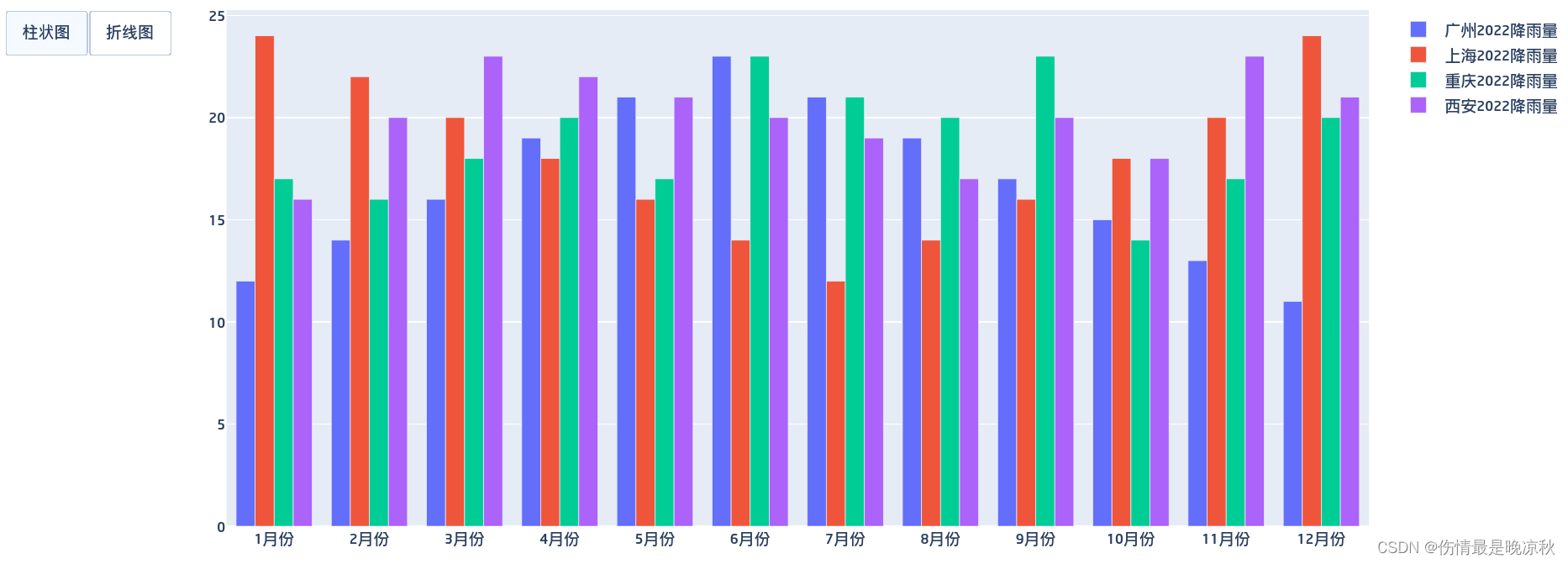
2.2 柱状图
2.3 饼图
2.4 散点图
3 Plotly模块
Plotly库包含三个主要的模块:
- plotly.plotly :包含需要Plotly服务器响应的函数。
- plotly.graph_objs: 最主要的模块,主要包含以下对象:
- Figure: 图
- Data:数据
- Layout:布局
- 一些基本的图表绘制方法:散点,直方图等。
- Figure: 图
- plotly.tools:工具模块,包含许多有用的功能。
Plotly 还包含许多子包,来自官网部分子包的截图:
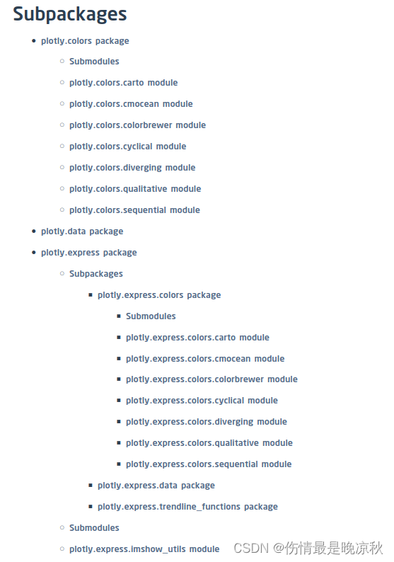
可以 单击此处 进行了解。
4 导出静态图像
导出静态图像依赖kaleido库,使用pip install kaleido 安装。导出图像很简单:
import plotly.io as pio # 引入plotly的io库
pio.write_image(fig, '01.png') # 在代码结尾处,将fig导出为图像
导出图像示例:
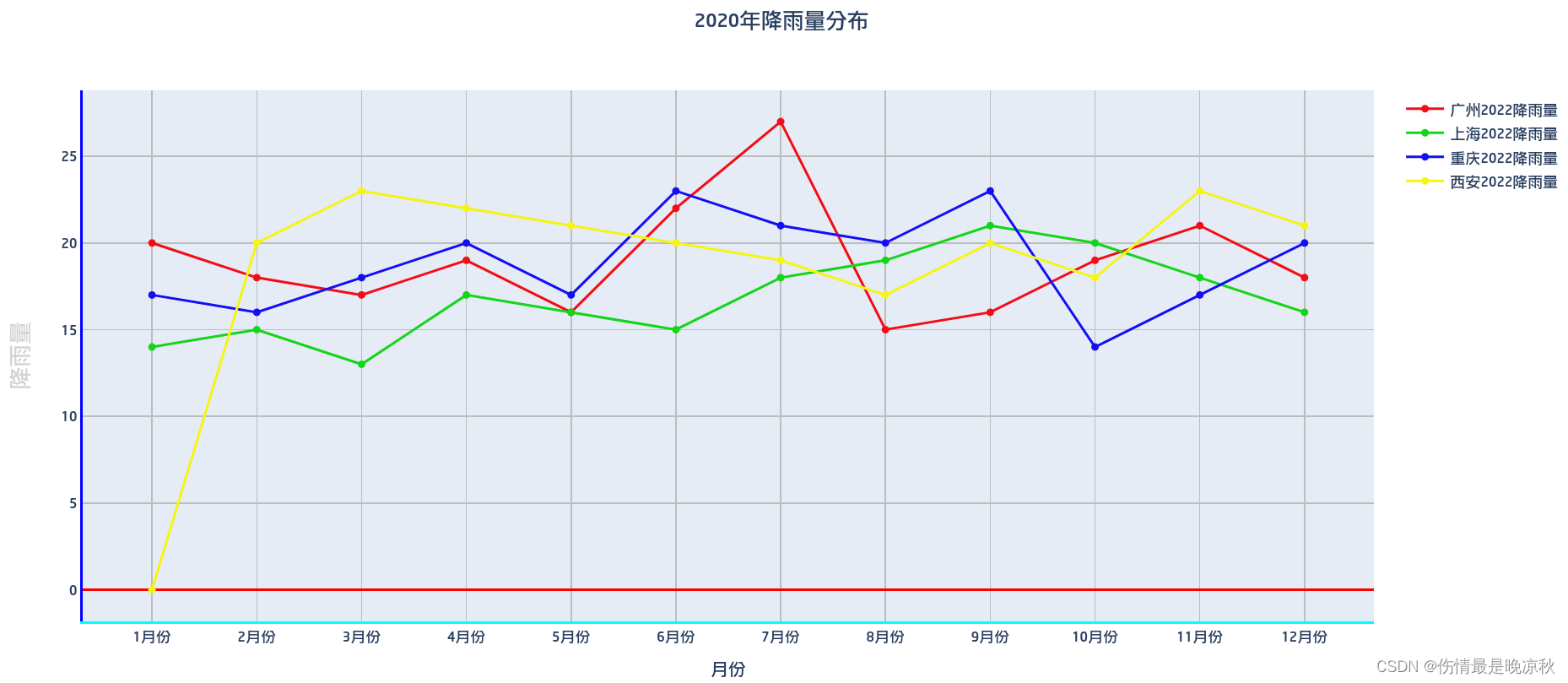
5 定制
5.1 定制轴外观
示例代码中添加一个布局:
#布局
layout=go.Layout(
    #标题,x是位置,距离左边50%,大致居中。
    title=dict(text="2020年降雨量分布",x=0.5),

    #x轴定义
    xaxis=dict(
        title='月份', # 轴标题
        showgrid=True, # 显示网格线,默认True
        showline=True, #是否显示座标轴
        linecolor='#00ffff', #座标轴颜色
        linewidth=2, #座标轴宽度
        gridcolor='#bdbdbd', # 网格线颜色
        gridwidth=1 # 网格线宽度

    ),
    #y轴定义
    yaxis=dict(
        showgrid=True,#是否显示网格线
        zeroline=True,#是否绘制0刻度线
        showline=True,#是否显示座标轴
        gridcolor='#bdbdbd',
        gridwidth=1,
        zerolinecolor='#ff0000',#0刻度线颜色
        zerolinewidth=2,# 0刻度线宽度
        linecolor='#0000ff', #座标轴颜色
        linewidth=2, #座标轴宽度
        title='降雨量',
        titlefont=dict( #字体
            family='Arial, sans-serif',
            size=18,
            color='lightgrey'
        )
    )
)

#更多参数参见官方文档
生成图表时采用fig = go.Figure(lines,layout=layout) ,比原来的方法增加一个参数,传入上面定义的布局,生成的图表:
5.2 转换数据属性
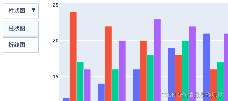
通过修改layout.Updatemenu属性可修改同一个图表的展现样式,如:从柱状图切换到折线图。代码种增加修改updatemenu属性的代码如下,在调用fig.show()之前:
fig.layout.update(
    updatemenus=[
        go.layout.Updatemenu(
            type = "buttons",
            direction = "left",
            buttons=list([
                dict(
                    args=["type", "bar"], label="柱状图", method="restyle"
                ),
                dict(
                    args=["type", "scatter"], label="折线图", method="restyle"
                )
            ])
        )
    ]
)
# 其中method可设置为以下四种:
# restyle: 修改数据或数据属性
# relayout: 修改布局属性
# update: 修改数据和布局属性
# animate: 修改数据和布局属性
效果如下,默认显示为柱状图,当点击折线图按钮时,图表即可显示为折线图,点击柱状图又会显示为柱状图。
按钮同样可以修改为下拉列表:
fig.layout.update(
    updatemenus=[
        go.layout.Updatemenu(
        		#下拉列表
            type = "dropdown",
            #列表弹出方向
            direction = "down",
            buttons=list([
                dict(
                    args=["type", "bar"], label="柱状图", method="restyle"
                ),
                dict(
                    args=["type", "scatter"], label="折线图", method="restyle"
                )
            ])
        )
    ]
)
效果如下:
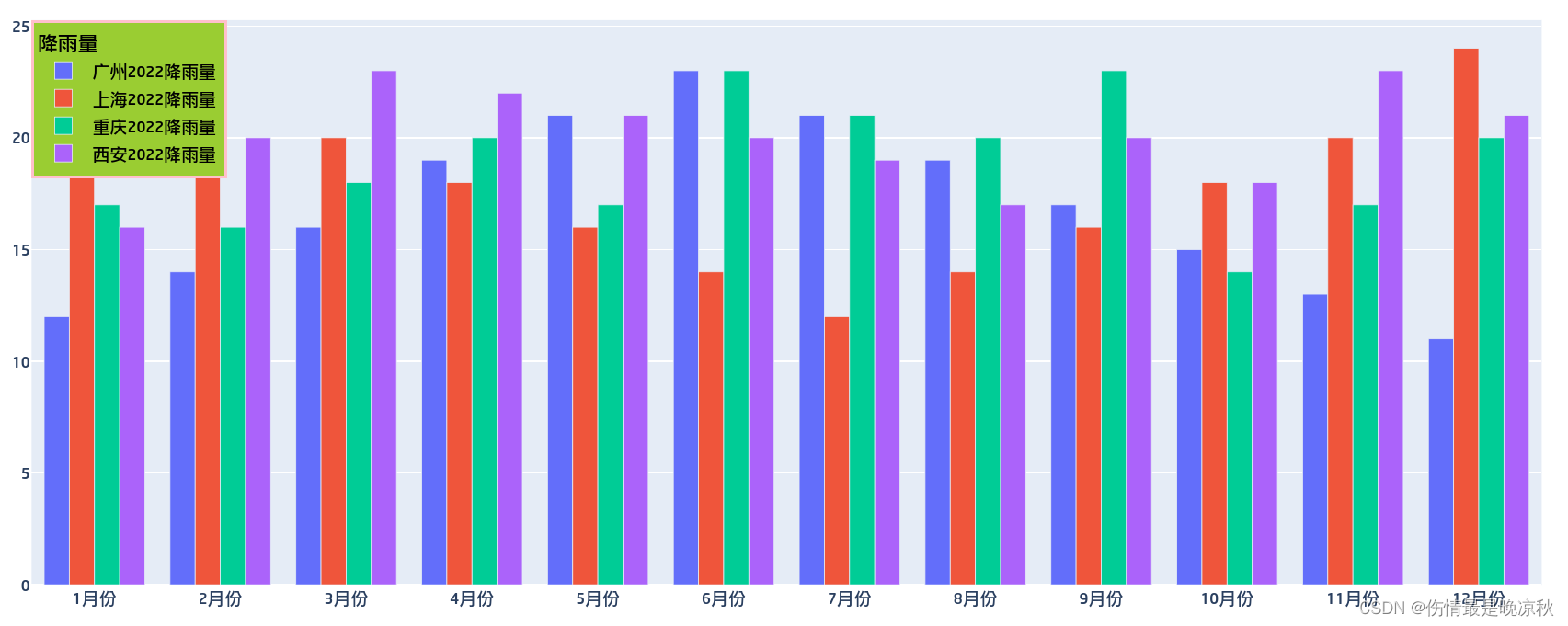
5.3 图例(legend)定制
fig.update_layout(
    legend=dict(
        #图例按照座标定位,表示位于左上角
        x=0,
        y=1,
        #图例名称
        title_text='降雨量',
        #字体
        font=dict(
            size=12,
            color="black"
        ),
        #背景色
        bgcolor="yellowgreen",
        #边框色
        bordercolor="Pink",
        #边框宽度
        borderwidth=2
    )
)
效果如下:
颜色的取值范围:
				aliceblue, antiquewhite, aqua, aquamarine, azure,
            beige, bisque, black, blanchedalmond, blue,
            blueviolet, brown, burlywood, cadetblue,
            chartreuse, chocolate, coral, cornflowerblue,
            cornsilk, crimson, cyan, darkblue, darkcyan,
            darkgoldenrod, darkgray, darkgrey, darkgreen,
            darkkhaki, darkmagenta, darkolivegreen, darkorange,
            darkorchid, darkred, darksalmon, darkseagreen,
            darkslateblue, darkslategray, darkslategrey,
            darkturquoise, darkviolet, deeppink, deepskyblue,
            dimgray, dimgrey, dodgerblue, firebrick,
            floralwhite, forestgreen, fuchsia, gainsboro,
            ghostwhite, gold, goldenrod, gray, grey, green,
            greenyellow, honeydew, hotpink, indianred, indigo,
            ivory, khaki, lavender, lavenderblush, lawngreen,
            lemonchiffon, lightblue, lightcoral, lightcyan,
            lightgoldenrodyellow, lightgray, lightgrey,
            lightgreen, lightpink, lightsalmon, lightseagreen,
            lightskyblue, lightslategray, lightslategrey,
            lightsteelblue, lightyellow, lime, limegreen,
            linen, magenta, maroon, mediumaquamarine,
            mediumblue, mediumorchid, mediumpurple,
            mediumseagreen, mediumslateblue, mediumspringgreen,
            mediumturquoise, mediumvioletred, midnightblue,
            mintcream, mistyrose, moccasin, navajowhite, navy,
            oldlace, olive, olivedrab, orange, orangered,
            orchid, palegoldenrod, palegreen, paleturquoise,
            palevioletred, papayawhip, peachpuff, peru, pink,
            plum, powderblue, purple, red, rosybrown,
            royalblue, rebeccapurple, saddlebrown, salmon,
            sandybrown, seagreen, seashell, sienna, silver,
            skyblue, slateblue, slategray, slategrey, snow,
            springgreen, steelblue, tan, teal, thistle, tomato,
            turquoise, violet, wheat, white, whitesmoke,
            yellow, yellowgreen
也可以直接使用16进制颜色值 如bgcolor:#ff0000.
6 同一个布局显示多图
import plotly.subplots as sp #首先在文件头部引入子图的包

#定义显示图的行列数和图表的类型,类型不指定默认是xy
#饼图的类型不是xy。所以此处定义了图形类型。
fig = sp.make_subplots(
    rows=2,
    cols=2,
    specs=[[{"type": "xy"}, {"type": "xy"}],
           [{"type": "xy"}, {"type": "domain"}]],
)
#然后添加数据集
fig.add_traces(lines,1,1) # lines在上面的示例代码中有定义,篇幅太长这里不再列出。
fig.add_traces(bars,1,2) # bars数据集也在上面示例代码里
fig.add_traces(data,2,1) # data也在示例代码有定义
fig.add_trace(pie,2,2)  # pie在上面的示例代码中

#更新视图高度,关闭图例,宽度是width
#这一步可省略,会有默认宽高,而且四个图的图例都都在右边。
fig.update_layout(height=700, showlegend=False)
fig.show()
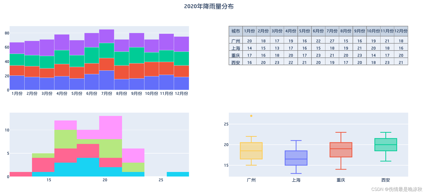
生成的图表效果如下:
6.1 关于图形类型的说明
- xy: 二维的散点scatter、柱状图bar等。
- scene: 3维的scatter3d、球体cone.
- polar: 极坐标图形如scatterpolar, barpolar等.
- ternary: 三元图如scatterternary
- mapbox: 地图如scattermapbox
- domain: .针对有一定域的图形,如饼图pie, parcoords, parcats
7 其它图表示例
7.1 堆叠条状图,表格,直方图,箱图
# -*- coding: utf-8 -*-
import plotly.offline as py
import plotly.graph_objs as go
import plotly.express as px
import plotly.io as pio
import plotly.subplots as sp
import numpy as np

# x轴显示月份
month = ['1月份', '2月份', '3月份', '4月份', '5月份', '6月份', '7月份', '8月份', '9月份',
         '10月份', '11月份', '12月份']

# y轴显示降雨量
guangzhou = [20,18,17,19,16,22,27,15,16,19,21,18]
shanghai = [14,15,13,17,16,15,18,19,21,20,18,16]
chongqing = [17,16,18,20,17,23,21,20,23,14,17,20]
xian = [16,20,23,22,21,20,19,17,20,18,23,21]


#布局
layout=go.Layout(
    title=dict(text="2020年降雨量分布",x=0.5),
    barmode='stack',#堆积柱状图
    showlegend=False
)

#堆叠柱状图
bar1 = go.Bar(x = month, y = guangzhou,name = '广州2022降雨量',)
bar2 = go.Bar(x = month, y = shanghai,name = '上海2022降雨量')
bar3 = go.Bar(x = month, y = chongqing,name = '重庆2022降雨量')
bar4 = go.Bar(x = month, y = xian,name = '西安2022降雨量')

bars = [bar1,bar2,bar3,bar4]


#表格
#准备表格数据
header_list = month.insert(0,'城市') #表头
city_column = ['广州','上海','重庆','西安'] #第1列
table_cells = []
table_cells.append(city_column) # piotly表格数据按列追加
for i in range(0,12):
    column = []
    column.append(guangzhou[i])
    column.append(shanghai[i])
    column.append(chongqing[i])
    column.append(xian[i])
    table_cells.append(column)

table = go.Table(
    #表头
    header=dict(
        values=month,
        line_color='gray',
        align='center'
    ),
    #单元格
    cells=dict(
        values=table_cells,
        line_color='gray',#线颜色
        align='center'
    )
)

data = [table]


#直方图
his1 = go.Histogram(x=guangzhou,name='广州')
his2 = go.Histogram(x=shanghai,name='上海')
his3 = go.Histogram(x=chongqing,name='重庆')
his4 = go.Histogram(x=xian,name='西安')
his = [his1,his2,his3,his4]

#箱图
box1 = go.Box(y=guangzhou,name='广州')
box2 = go.Box(y=shanghai,name='上海')
box3 = go.Box(y=chongqing,name='重庆')
box4 = go.Box(y=xian,name='西安')
box = [box1,box2,box3,box4]


#定义显示图的行列数和图表的类型,类型不指定默认是xy
fig = sp.make_subplots(
    rows=2,
    cols=2,
    specs=[
        [
            {"type": "xy"},
            {"type": "domain"}
        ],
        [
            {"type": "xy"},
            {"type": "xy"},
        ]
    ],
)
fig.add_traces(bars,1,1)
fig.add_traces(table,1,2)
fig.add_traces(his,2,1)
fig.add_traces(box,2,2)

fig.update_layout(layout)

fig.show()
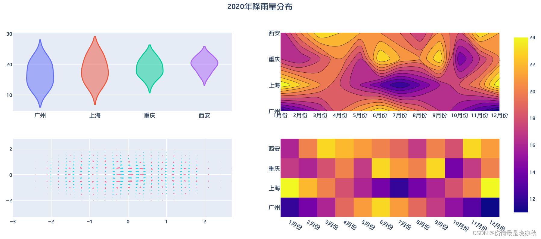
7.2 小提琴图,密度图,箭袋图,热力图
# -*- coding: utf-8 -*-
import plotly.offline as py
import plotly.graph_objs as go
import plotly.express as px
import plotly.io as pio
import plotly.subplots as sp
import numpy as np
import plotly.figure_factory as ff


month = ['1月份', '2月份', '3月份', '4月份', '5月份', '6月份', '7月份', '8月份', '9月份',
         '10月份', '11月份', '12月份']


guangzhou = [12,14,16,19,21,23,21,19,17,15,13,11]
shanghai = [24,22,20,18,16,14,12,14,16,18,20,24]
chongqing = [17,16,18,20,17,23,21,20,23,14,17,20]
xian = [16,20,23,22,21,20,19,17,20,18,23,21]

#布局
layout=go.Layout(
    title=dict(text="2020年降雨量分布",x=0.5),
    showlegend=False,
)

#小提琴图
vi1 = go.Violin(y = guangzhou,name = '广州')
vi2 = go.Violin(y = shanghai,name = '上海')
vi3 = go.Violin(y = chongqing,name = '重庆')
vi4 = go.Violin(y = xian,name = '西安')

vi = [vi1,vi2,vi3,vi4]

#等高线图
#等高线图是对三维平面的二维描述,需要z轴。
data = [guangzhou,shanghai,chongqing,xian]
#showscale是显示颜色条,参见热力图的颜色条显示
con = go.Contour(x=month,y=['广州','上海','重庆','西安'],z=data,name='降雨量',showscale=False)


#箭袋图(速度图)
#降雨量的数据在这里不适用,这里用numpy模拟出数据
x,y = np.meshgrid(np.arange(-2, 2, .2), np.arange(-2, 2, .25))
z = x*np.exp(-x**2 - y**2)
v, u = np.gradient(z, .2, .2)

a,b = np.meshgrid(np.arange(-3, 3, .3), np.arange(-3, 3, .50))
c = a*np.exp(-a**2 - b**2)
n, m = np.gradient(c, .2, .2)
#x:箭头位置的x坐标,y:箭头位置的y坐标
#u: 箭头向量的 x 个分量,v:箭头向量的y分量
fig1 = ff.create_quiver(x, y, u, v,name='A数据集')
fig2 = ff.create_quiver(a, b, m, n,name='B数据集')
#箭袋图多数据集添加
fig1.add_traces(data=fig2.data)

#热力图
city=['广州','上海','重庆','西安']
h_data = [guangzhou,shanghai,chongqing,xian]
heat = go.Heatmap(x=month,y=city,z=h_data,type='heatmap',name='降雨量')
#定义显示图的行列数和图表的类型,类型不指定默认是xy
fig = sp.make_subplots(
    rows=2,
    cols=2,
    specs=[
        [
            {"type": "xy"},
            {"type": "xy"}
        ],
        [
            {"type": "xy"},
            {"type": "xy"},
        ]
    ],
)
fig.add_traces(vi,1,1)
fig.add_traces(con,1,2)
fig.add_traces(fig1.data,2,1)
fig.add_traces(heat,2,2)

fig.update(layout=layout)

fig.show()
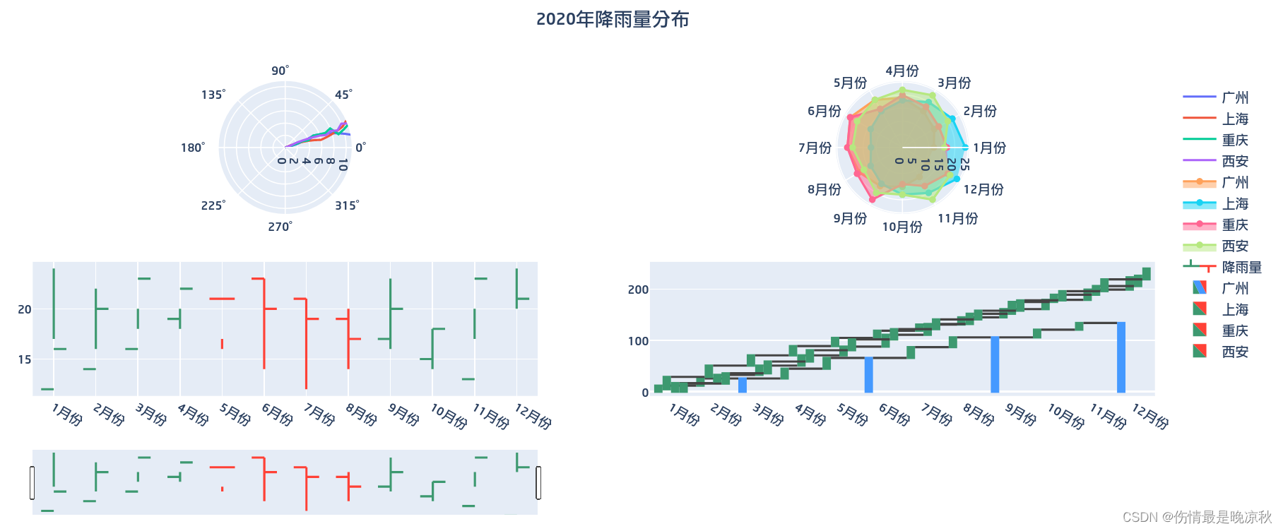
7.3 极座标图,雷达图,OHLC图,瀑布图
# -*- coding: utf-8 -*-
import plotly.offline as py
import plotly.graph_objs as go
import plotly.express as px
import plotly.io as pio
import plotly.subplots as sp
import numpy as np
import plotly.figure_factory as ff


month = ['1月份', '2月份', '3月份', '4月份', '5月份', '6月份', '7月份', '8月份', '9月份',
         '10月份', '11月份', '12月份']


guangzhou = [12,14,16,19,21,23,21,19,17,15,13,11]
shanghai = [24,22,20,18,16,14,12,14,16,18,20,24]
chongqing = [17,16,18,20,17,23,21,20,23,14,17,20]
xian = [16,20,23,22,21,20,19,17,20,18,23,21]


#布局
layout=go.Layout(
    title=dict(text="2020年降雨量分布",x=0.5),
)

#极座标图
polar1 = go.Scatterpolar( theta = guangzhou,name = '广州',mode='lines')
polar2 = go.Scatterpolar( theta = shanghai,name = '上海',mode='lines')
polar3 = go.Scatterpolar( theta = chongqing,name = '重庆',mode='lines')
polar4 = go.Scatterpolar( theta = xian,name = '西安',mode='lines')
polar = [polar1,polar2,polar3,polar4]

#雷达图
radar1 = go.Scatterpolar(r=guangzhou, theta = month,name = '广州',fill='toself')
radar2 = go.Scatterpolar(r=shanghai, theta = month,name = '上海',fill='toself')
radar3 = go.Scatterpolar(r=chongqing, theta = month,name = '重庆',fill='toself')
radar4 = go.Scatterpolar(r=xian, theta = month,name = '西安',fill='toself')
radar = [radar1,radar2,radar3,radar4]

#OHLC 图
#这里用四个城市的降雨量分别模拟 开,关,高,低数据
ohlc1 = go.Ohlc(x=month,open=guangzhou,high=shanghai,low=chongqing,close=xian,name='降雨量')
ohlc=[ohlc1]

#瀑布图
water1 = go.Waterfall(
    x=month,
    y=guangzhou,
    measure = [
        "relative", "relative", "total", "relative", "relative", "total",
        "relative", "relative", "total", "relative", "relative", "total"
    ],
    name='广州',
)
water2 = go.Waterfall(x=month,y=shanghai,base=5,name='上海')
water3 = go.Waterfall(x=month,y=chongqing,name='重庆')
water4 = go.Waterfall(x=month,y=xian,name='西安')
water = [water1,water2,water3,water4]


#定义显示图的行列数和图表的类型,类型不指定默认是xy
fig = sp.make_subplots(
    rows=2,
    cols=2,
    specs=[
        [
            {"type": "polar"},
            {"type": "polar"}
        ],
        [
            {"type": "xy"},
            {"type": "xy"},
        ]
    ],
)
fig.add_traces(polar,1,1)

fig.add_traces(radar,1,2)
fig.add_traces(ohlc,2,1)
fig.add_traces(water,2,2)

fig.update(layout=layout)

fig.show()
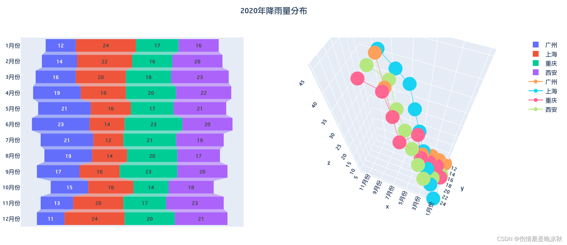
7.4 漏斗图,3D散点图
# -*- coding: utf-8 -*-
import plotly.offline as py
import plotly.graph_objs as go
import plotly.express as px
import plotly.io as pio
import plotly.subplots as sp
import numpy as np
import plotly.figure_factory as ff


month = ['1月份', '2月份', '3月份', '4月份', '5月份', '6月份', '7月份', '8月份', '9月份',
         '10月份', '11月份', '12月份']


guangzhou = [12,14,16,19,21,23,21,19,17,15,13,11]
shanghai = [24,22,20,18,16,14,12,14,16,18,20,24]
chongqing = [17,16,18,20,17,23,21,20,23,14,17,20]
xian = [16,20,23,22,21,20,19,17,20,18,23,21]


#布局
layout=go.Layout(
    title=dict(text="2020年降雨量分布",x=0.5),
)

#漏斗图
funnel1 = go.Funnel(x=guangzhou,y = month,name = '广州')
funnel2 = go.Funnel(x=shanghai,y=month,name = '上海')
funnel3 = go.Funnel(x=chongqing,y=month,name = '重庆')
funnel4 = go.Funnel(x=xian,y=month,name = '西安')
funnel = [funnel1,funnel2,funnel3,funnel4]

#3D 散点图
z=[5,10,15,20,25,30,35,40,45]
d1 = go.Scatter3d(x=month,y=guangzhou,name = '广州',z=z,)
d2 = go.Scatter3d(x=month,y=shanghai,name = '上海',z=z)
d3 = go.Scatter3d(x=month,y=chongqing,name = '重庆',z=z)
d4 = go.Scatter3d(x=month,y=xian,name = '西安',z=z)
d = [d1,d2,d3,d4]


#定义显示图的行列数和图表的类型,类型不指定默认是xy
fig = sp.make_subplots(
    rows=1,
    cols=2,
    specs=[
        [
            {"type": "xy"},
            {"type": "scene"}
        ],

    ],
)
fig.add_traces(funnel,1,1)
fig.add_traces(d,1,2)

fig.update(layout=layout)

fig.show()
8 生成离线图表供html使用
8.1 第一种方式,生成离线html
生成图表时不要使用fig.show(),使用如下方式,生成一个离线的html文件。
#fig.show()

#import plotly.offline as py
#auto_open=False可以避免在批量生成html时在本地浏览器打开
py.plot(data, filename='file.html',auto_open=False)
之后可以在页面中使用iframe来包含这个html。如果这个html文件需要在外网环境上使用,则可以借助github pages 或者 giteepages。需要将这个页面上传到github,或者gitee。
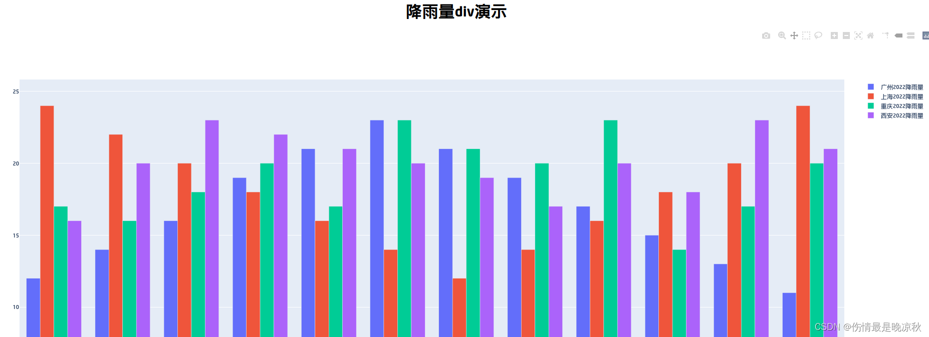
8.2 第二种方式,直接生成div,以dom节点的方式放入html
演示方便,随便创建了一个html文件,项目中用什么模板技术可相对调整:
#生成div代码,这里先去除js,防止js插入到div中
div = py.plot(data, include_plotlyjs=False, output_type='div')

#创建演示html,并在头部引入plotly js
html = '''
<html>
    <head>
    <title>Test</title>
    <script src="https://cdn.plot.ly/plotly-latest.min.js"></script>
    </head>
<body>
    <h1 style="text-align:center;">降雨量div演示</h1>'''
html += div
html += '</body>'
html += '</html>'


f = open('test.html','w')
f.write(html)
f.close()
生成的html效果如下:


 6320
6320


 被折叠的 条评论
为什么被折叠?
被折叠的 条评论
为什么被折叠?
 到【灌水乐园】发言


