


flutter 组件
文中大部分实例代码,来自官方实例
stack 堆叠,多层级
stack默认左上角对齐,组件内部子元素层级关系:后面的在前面的组件上层。
单个组件定位使用Positioned支持top,bottom、left、right设置
import 'package:flutter/material.dart';

class Layout extends StatelessWidget {
  const Layout({Key? key}) : super(key: key);
  @override
  Widget build(BuildContext context) {
    return Scaffold(
        appBar: new AppBar(
          title: Text('Stack'),
        ),
        body: Stack(
          alignment: Alignment.center,
          children: <Widget>[
            Container(
              width: 100,
              height: 100,
              color: Colors.red,
            ),
            Container(
              width: 90,
              height: 90,
              color: Colors.green,
            ),
            Container(
              width: 80,
              height: 80,
              color: Colors.blue,
            ),
            Positioned(child: Text('定位',style: TextStyle(backgroundColor: Colors.yellowAccent),),top: 0,left: 0,)
          ],
        ));
  }
}
IndexedStack 指定stack中显示那个
index 属性可指定显示那个组件
import 'package:flutter/material.dart';

class Layout extends StatelessWidget {
  const Layout({Key? key}) : super(key: key);
  @override
  Widget build(BuildContext context) {
    return Scaffold(
        appBar: new AppBar(
          title: Text('Stack'),
        ),
        body: IndexedStack(
          index: 2,
          alignment: Alignment.center,
          children: <Widget>[
            Container(
              width: 100,
              height: 100,
              color: Colors.red,
            ),
            Container(
              width: 90,
              height: 90,
              color: Colors.green,
            ),
            Container(
              width: 80,
              height: 80,
              color: Colors.blue,
            ),
            Positioned(
              child: Text(
                '定位',
                style: TextStyle(backgroundColor: Colors.yellowAccent),
              ),
              top: 0,
              left: 0,
            )
          ],
        ));
  }
}
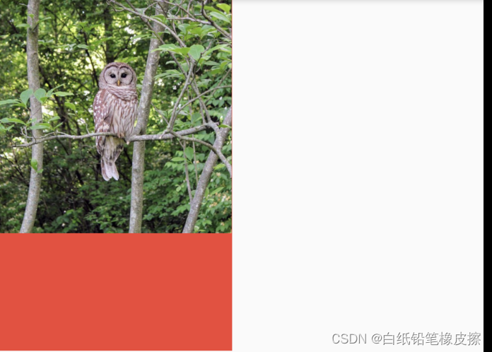
FittedBox 适配盒模型
- 如果父组件有约束,则按照父组件约束调整child的大小。
- 如果父组件没有约束条件,则按照child大小展示,指定的fit方式和对齐方式不起作用。
FittedBox 和web端背景填充容器类似,fit的方式有:
要隐藏超出父容器部分,请使用clipBehavior: clip.hardEdge和这个放在一个[FittedBox]里。
-
BoxFit.contain保持宽高比尽可能大的适配容器
-
BoxFit.cover尽可能的小,同时仍然覆盖整个目标框。 要剪辑内容,请使用clipBehavior: clip.hardEdge和这个放在一个[FittedBox]里。
-
fit: BoxFit.none没有任何填充样式
-
fit: BoxFit.fill填充父容器(会引起形变) -
BoxFit.fitWidth保持子容器宽高比例,宽度占满父容器 -
BoxFit.fitHeight保持子容器宽高比例,高度占满父容器 -
BoxFit.scaleDown子组件是Image(不设置宽高)和BoxFit.contain效果相同,其余情况和BoxFit.none情况相同
import 'package:flutter/material.dart';

class Layout extends StatelessWidget {
  const Layout({Key? key}) : super(key: key);
  @override
  Widget build(BuildContext context) {
    return Scaffold(
        appBar: new AppBar(
          title: Text('FittedBox 适配盒模型'),
        ),
        body: Container(
          height: 300,
          width: 200,
          color: Colors.red,
          child: FittedBox(
            child: Image.network(
              'https://flutter.github.io/assets-for-api-docs/assets/widgets/owl-2.jpg',
              width: 100,
              height: 100,
            ),
            fit: BoxFit.contain,
            alignment: Alignment.topLeft,
            // clipBehavior: Clip.hardEdge,
          ),
        ));
  }
}
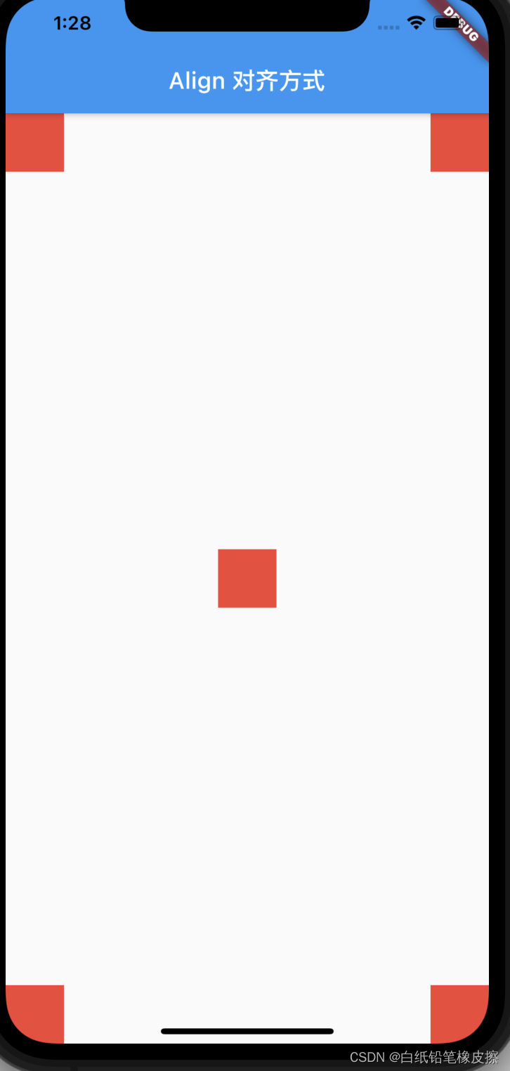
Align 对齐方式
屏幕坐标系(FractionalOffset),左上角为(0,0)右下角为(1,1)
const Alignment(this.x, this.y), 左上角为(-1,-1),右下角为(1,1)
import 'package:flutter/material.dart';

class Layout extends StatelessWidget {
  const Layout({Key? key}) : super(key: key);
  @override
  Widget build(BuildContext context) {
    return Scaffold(
        appBar: new AppBar(
          title: Text('Align 对齐方式'),
        ),
        body: Stack(
          children: [
            Align(
              // alignment: Alignment.topLeft,
              alignment: FractionalOffset(0,0),
              child:colorBlock(),
            ),
            Align(
              // alignment: Alignment.topRight,
              alignment: FractionalOffset(1,0),
              child:colorBlock(),
            ),
            Align(
              // alignment: Alignment.center,
              alignment: FractionalOffset(0.5,0.5),
              child:colorBlock(),
            ),
            Align(
              // alignment: Alignment.bottomLeft,
              alignment: FractionalOffset(0,1),
              child:colorBlock(),
            ),
            Align(
              // alignment: Alignment.bottomRight,
              alignment: FractionalOffset(1,1),
              child:colorBlock(),
            ),
          ],
        ));
  }
}
FractionallySizedBox 百分比布局
FractionallySizedBox 根据父组件的空间,按比例约束子控件,
- 设置了对应的宽高比,则父组件必须有对应的宽度或高度设置,否则异常(比例因子大于1,对应的宽高超出父组件的范围),此时这是子组件的宽高没有效果
- 不设置宽高比,子组件设置宽高,按子组件的宽高显示
- 不设置宽高比,子组件不设宽高,子组件尽可能的填满父组件
import 'package:flutter/material.dart';

class Layout extends StatelessWidget {
 const Layout({Key? key}) : super(key: key);
 @override
 Widget build(BuildContext context) {
   return Scaffold(
       appBar: new AppBar(
         title: Text('FractionallySizedBox'),
       ),
       body: Column(
         children: [
           Container(
               width: 100,
               height: 100,
               alignment: Alignment.topLeft,
               color: Colors.green,
               child: FractionallySizedBox(
                 alignment: Alignment.topLeft,
                 widthFactor: 0.5,
                 heightFactor: 1.5,
                 child: Container(color: Colors.red, height: 10, width: 50),
               ))
         ],
       ));
 }
}
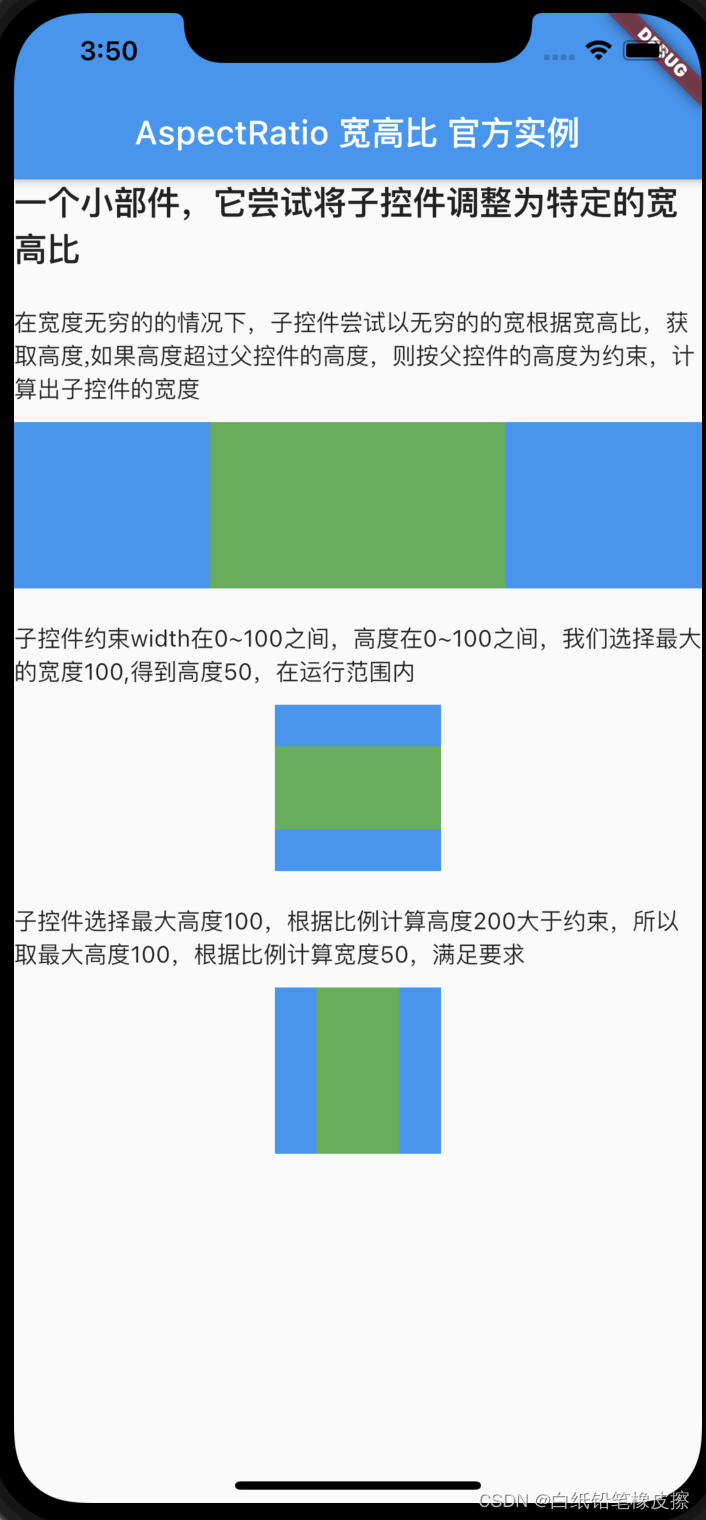
AspectRatio 组件的宽高比例
如果子部件在查询每个约束后没有找到一个可行的大小,则子部件
将最终为子对象选择一个满足布局约束但不满足纵横比约束的大小。
代码中,需要在父组件中添加对齐方式:alignment,否则可能想要效果
import 'package:flutter/material.dart';

class Layout extends StatelessWidget {
  const Layout({Key? key}) : super(key: key);
  @override
  Widget build(BuildContext context) {
    return Scaffold(
        appBar: new AppBar(
          title: Text('AspectRatio 宽高比 官方实例'),
        ),
        body: Column(
          children: [
            Text(
              "一个小部件,它尝试将子控件调整为特定的宽高比",
              style: TextStyle(fontSize: 20, fontWeight: FontWeight.bold),
            ),
            Padding(
              padding: EdgeInsets.only(top: 20, bottom: 10),
              child: Text(
                  '在宽度无穷的的情况下,子控件尝试以无穷的的宽根据宽高比,获取高度,如果高度超过父控件的高度,则按父控件的高度为约束,计算出子控件的宽度'),
            ),
            Container(
              color: Colors.blue,
              alignment: Alignment.center,
              width: double.infinity,
              height: 100.0,
              child: AspectRatio(
                aspectRatio: 16 / 9,
                child: Container(
                  color: Colors.green,
                ),
              ),
            ),
            Padding(
              padding: EdgeInsets.only(top: 20, bottom: 10),
              child: Text(
                  '子控件约束width在0~100之间,高度在0~100之间,我们选择最大的宽度100,得到高度50,在运行范围内'),
            ),
            Container(
              color: Colors.blue,
              alignment: Alignment.center,
              width: 100.0,
              height: 100.0,
              child: AspectRatio(
                aspectRatio: 2.0,
                child: Container(
                  width: 100.0,
                  height: 50.0,
                  color: Colors.green,
                ),
              ),
            ),
            Padding(
              padding: EdgeInsets.only(top: 20),
              child: Text(
                  '子控件选择最大高度100,根据比例计算高度200大于约束,所以取最大高度100,根据比例计算宽度50,满足要求'),
            ),
            Container(
              margin: EdgeInsets.only(top: 10),
              color: Colors.blue,
              alignment: Alignment.center,
              width: 100.0,
              height: 100.0,
              child: AspectRatio(
                aspectRatio: 0.5,
                child: Container(
                  width: 100.0,
                  height: 50.0,
                  color: Colors.green,
                ),
              ),
            )
          ],
        ));
  }
}
wrap 布局
wrap 布局可根据子组件的宽高进行换行,row 和 column 只能在单行或单列展示内容,wrap在direction为Axis.vertical时,在父容器范围内,单列填满后,换下一列,不能达到平时看到的瀑布流的效果。

import 'package:flutter/material.dart';

class Layout extends StatelessWidget {
  const Layout({Key? key}) : super(key: key);
  @override
  Widget build(BuildContext context) {
    List list = [
      {'label': '一年级 6~7 岁', 'short': 'one'},
      {'label': '二年级', 'short': 'two'},
      {'label': '一年级 少先队员', 'short': 'three'},
      {'label': '二年级', 'short': 'two'},
      {'label': '二年级', 'short': 'two'},
      {'label': '二年级', 'short': 'two'},
      {'label': '一年级 少先队员', 'short': 'three'},
    ];
    return Scaffold(
        appBar: new AppBar(
          title: Text('wrap 按宽高自动换行'),
        ),
        body: Wrap(
          // 主轴方向,默认水平
          direction: Axis.horizontal,
          // 主轴上的对象方式,默认start
          // alignment: WrapAlignment.spaceBetween,
          // 主轴方向上的间距
          spacing: 10,
          ///   spacing: 8.0, // gap between adjacent chips
          ///   runSpacing: 4.0, // gap between lines
          // runAlignment: WrapAlignment.end,
          runSpacing: 10,
          //水平方向 从左到右 ltr  从右向左 rtl
          // textDirection: TextDirection.rtl,
          verticalDirection: VerticalDirection.up,
          children: list.map((e) => layoutItem(e)).toList(),
        ));
  }

  Widget layoutItem(item) {
    return Chip(
      label: Text(item['label']),
      avatar: CircleAvatar(
        backgroundColor: Colors.lightBlue.shade700,
        child: Text(
          item['short'],
          style: TextStyle(fontSize: 10.0),
        ),
      ),
    );
  }
}
Flex 布局 Expanded 布局
Expanded 在 Column 和 Row 中代表着平均充满的作用,当有两个存在的时候默认均分充满。同时可以设置 flex 属性决定比例

        child: Column(
          mainAxisAlignment: MainAxisAlignment.center,
          children: <Widget>[
            Expanded(
              flex: 2,
              child:
                  Container(color: Colors.pinkAccent, child: const Text('111')),
            ),
            Expanded(
                flex: 1,
                child: Container(
                    color: Colors.blueAccent, child: const Text('222'))),
          ],
        ),
ExpansionTile 可折叠展开的组件
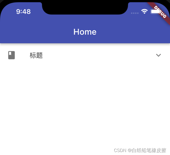

            ExpansionTile(
              //左边布局
              leading:const Icon(Icons.book),
              title:const Text('标题'),
              backgroundColor: Colors.blue,
              onExpansionChanged: (isExpand) {
                print('isExpand-$isExpand');
              },
              expandedCrossAxisAlignment:CrossAxisAlignment.start,
              //可更改右边显示的Widget,而不是旋转的箭头
              // trailing:Text('箭头'),
              //默认是否展开
              initiallyExpanded: false,
              children: <Widget>[
                Container(
                  height: 60,
                  color: Colors.blue,
                  child: Text('我是一个Container 的text'*1),
                ),
                Container(
                  color: Colors.yellow,
                  child: Text('我是一个Container 的text'*1),
                ),
                const ListTile(
                  title: Text('我是一个ListTile'),
                  leading: Icon(Icons.android, color: Colors.white),
                ),
              ],
            ),
更多内容,补充中~~~


 1505
1505


 被折叠的 条评论
为什么被折叠?
被折叠的 条评论
为什么被折叠?
 到【灌水乐园】发言


