


1. 前言
到此 我们对 HTML , CSS , JavaScript 已经有了个简单的了解 , 但是还不太熟悉 ,下面就通过 写一个博客系统的 网站 (静态网页) 来 熟悉他们 ,
等后面 我们学习了 HTTP , servlet , Tomcat , spring 系列框架 就能完成一个前后端交互的小项目 .
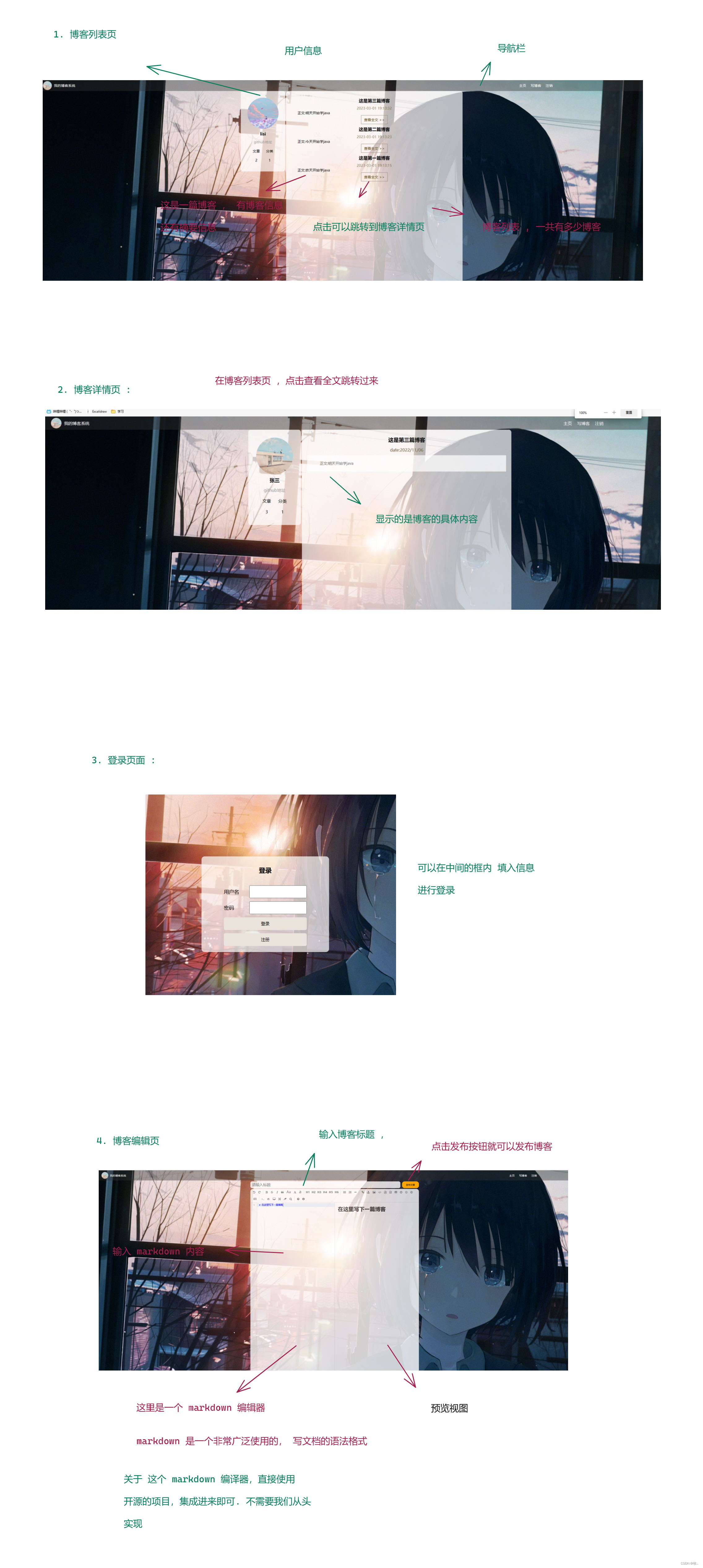
2. 页面展示
这里我们先来构造出博客系统的页面 , 这里总共有四个页面
3. 实现
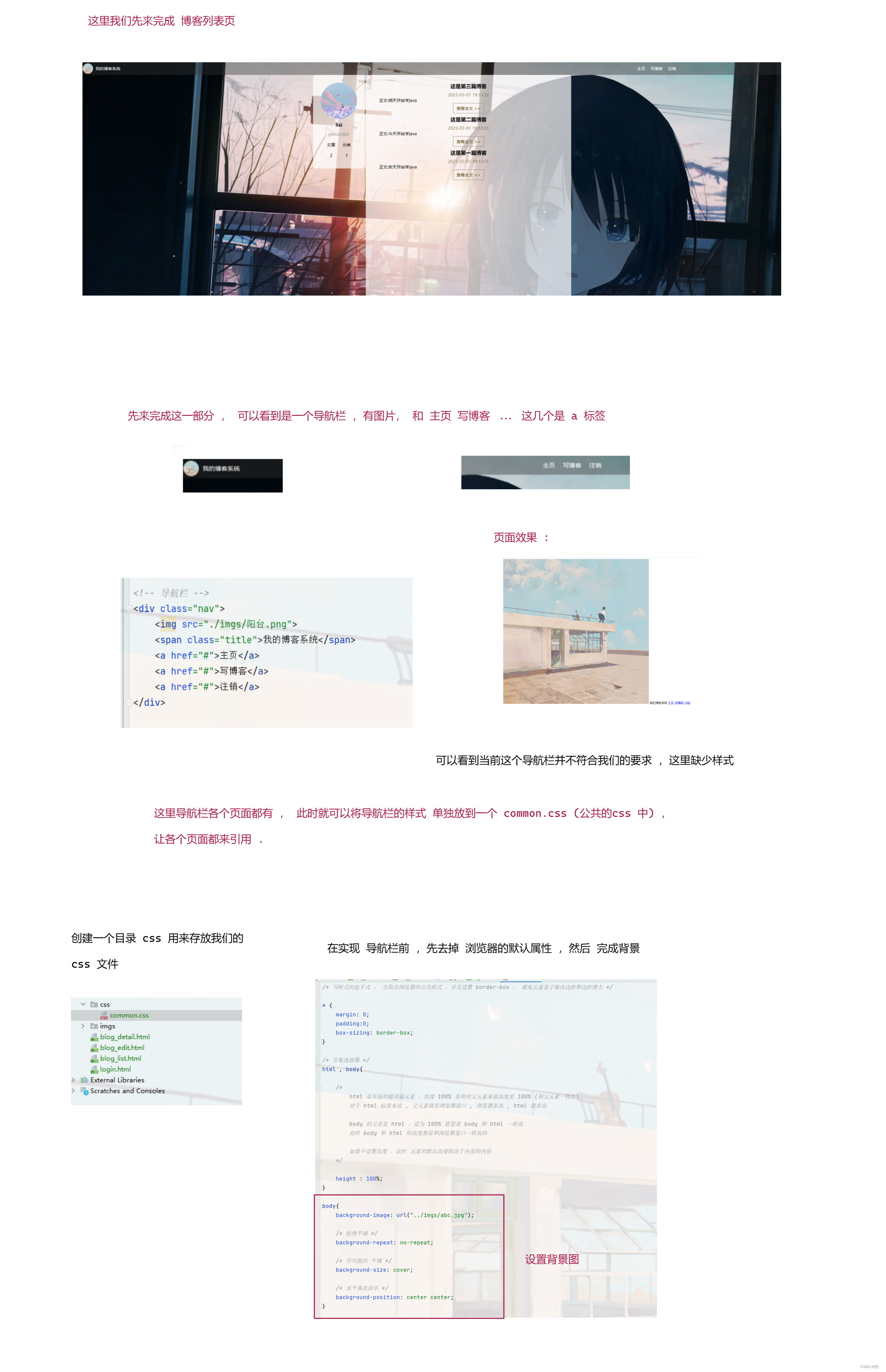
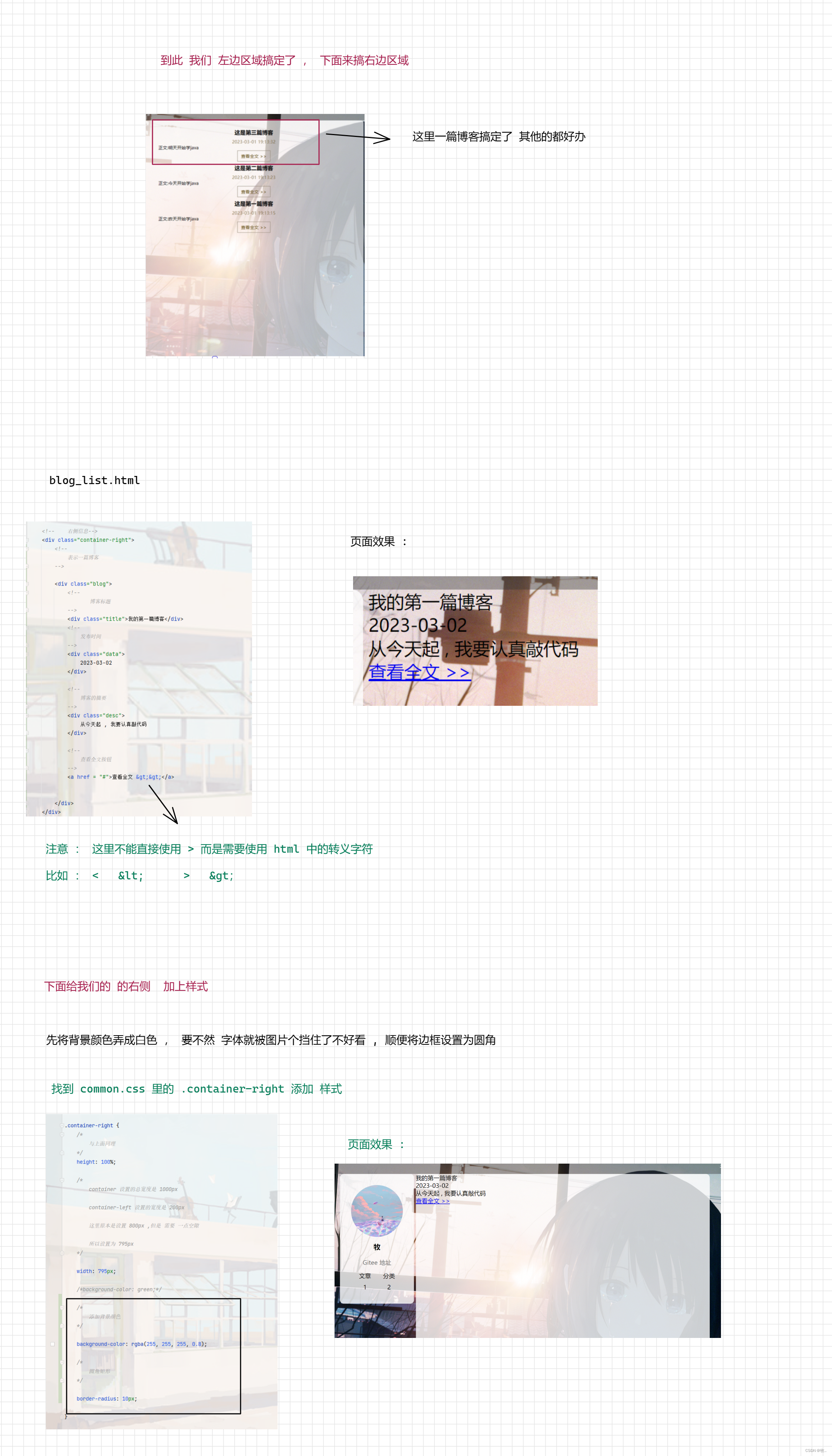
下面先来完成我们的博客列表页
3.1 博客列表页
图一 :
图二 :
图三 :
图四 :
图五 :
图六 :
图七 :
图八 :
图九 :
图十 :
图十一 :
到此我们的博客列表页已经基本完成了,但是还有一个 小 bug , 下面来修改一下 .
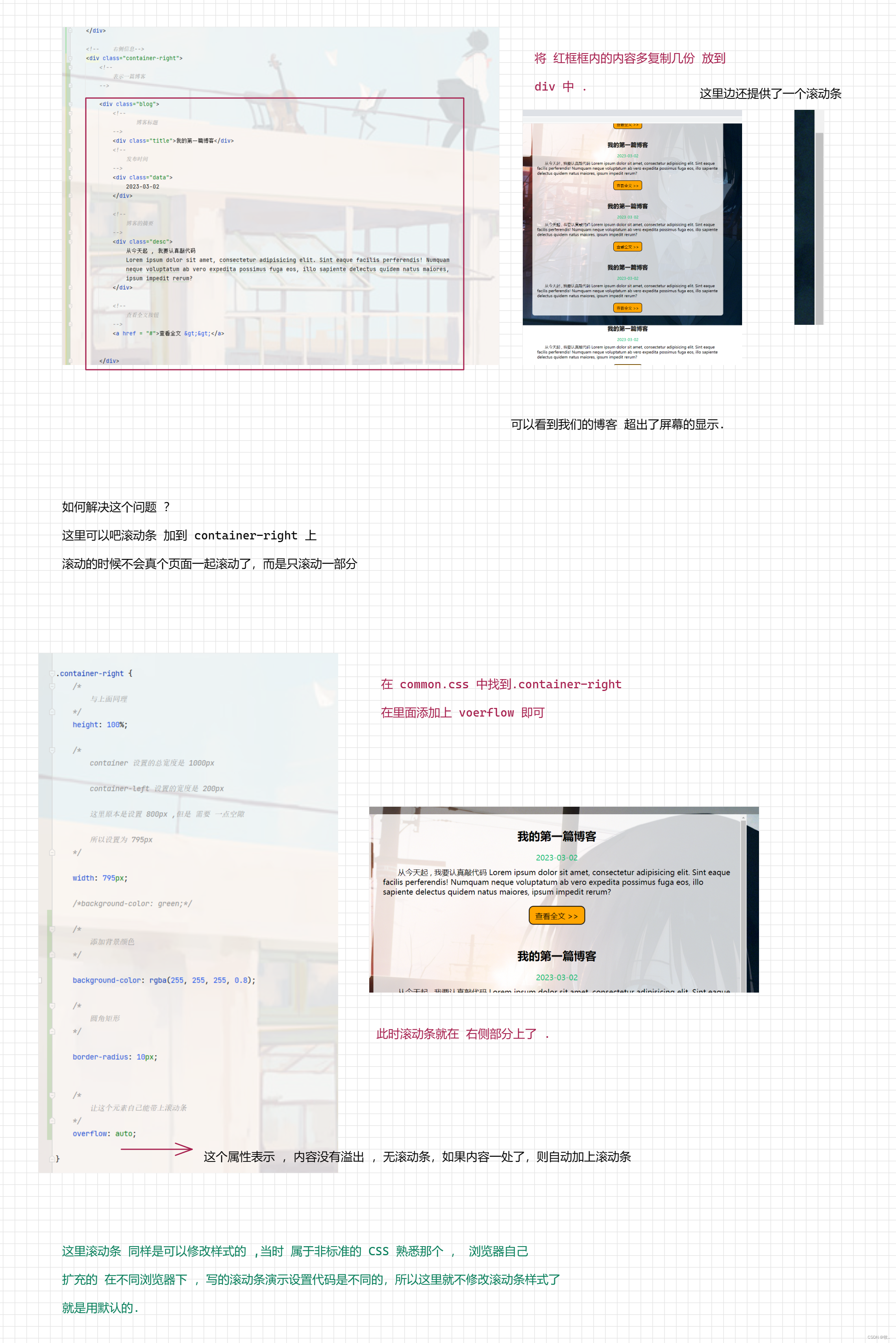
到此我们的博客列表页就完成了 .
附上代码 :
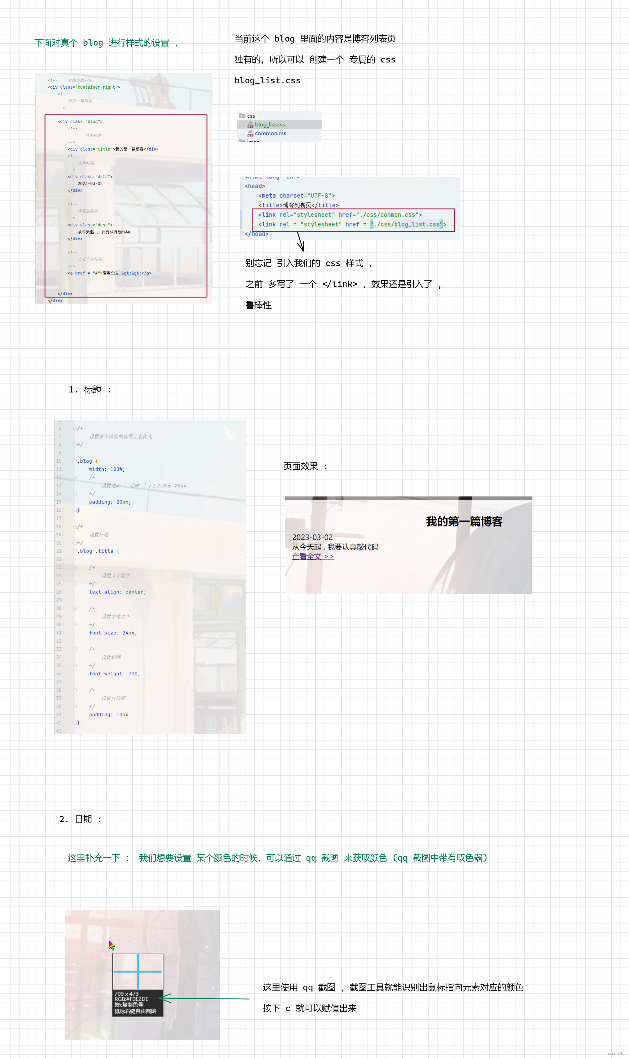
1. blog_list.html
<!DOCTYPE html>
<html lang="en">
<head>
<meta charset="UTF-8">
<title>博客列表页</title>
<link rel="stylesheet" href="./css/common.css">
<link rel = "stylesheet" href = "./css/blog_list.css">
</head>
<body>
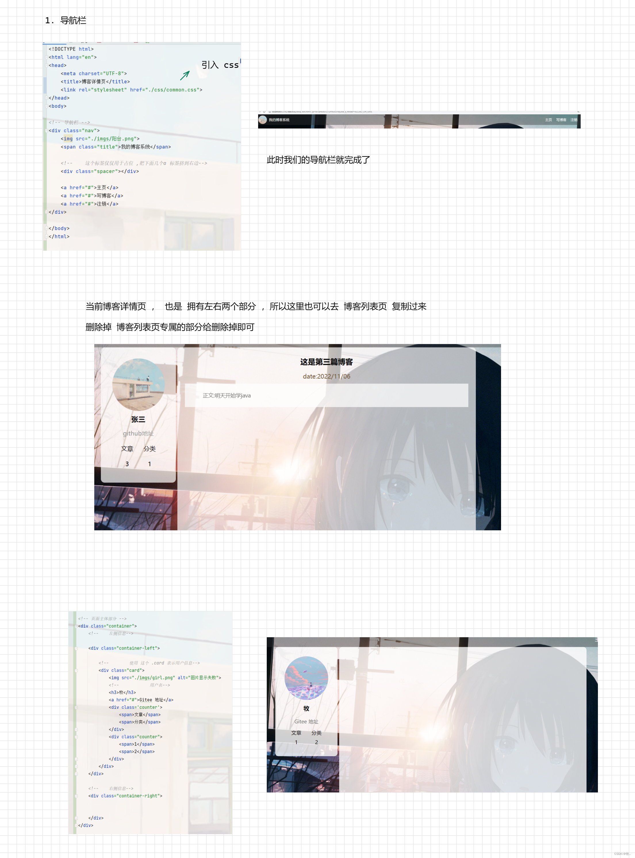
<!-- 导航栏 -->
<div class="nav">
<img src="./imgs/阳台.png">
<span class="title">我的博客系统</span>
<!-- 这个标签仅仅用于占位 ,把下面几个a 标签挤到右边-->
<div class="spacer"></div>
<a href="#">主页</a>
<a href="#">写博客</a>
<a href="#">注销</a>
</div>
<!-- 页面主体部分 -->
<div class="container">
<!-- 左侧信息-->
<div class="container-left">
<!-- 使用 这个 .card 表示用户信息-->
<div class="card">
<img src="./imgs/girl.png" alt="图片显示失败">
<!-- 用户名-->
<h3>牧</h3>
<a href="#">Gitee 地址</a>
<div class='counter'>
<span>文章</span>
<span>分类</span>
</div>
<div class="counter">
<span>1</span>
<span>2</span>
</div>
</div>
</div>
<!-- 右侧信息-->
<div class="container-right">
<!--
表示一篇博客
-->
<div class="blog">
<!--
博客标题
-->
<div class="title">我的第一篇博客</div>
<!--
发布时间
-->
<div class="data">
2023-03-02
</div>
<!--
博客的摘要
-->
<div class="desc">
从今天起 , 我要认真敲代码
Lorem ipsum dolor sit amet, consectetur adipisicing elit. Sint eaque facilis perferendis! Numquam
neque voluptatum ab vero expedita possimus fuga eos, illo sapiente delectus quidem natus maiores,
ipsum impedit rerum?
</div>
<!--
查看全文按钮
-->
<a href = "#">查看全文 >></a>
</div>
</div>
</div>
</body>
</html>
common.css
/* 写样式的起手式 , 先取出浏览器的公共样式 ,并且设置 border-box , 避免元素盒子被内边距和边距撑大 */
* {
margin: 0;
padding: 0;
box-sizing: border-box;
}
/* 并集选择器 */
html, body {
/*
html 是页面的最顶成元素 ,高度 100% 是相对父元素来说高度是 100% (和父元素一样高)
对于 html 标签来说 , 父元素就是浏览器窗口 , 浏览器多高 , html 就多高
body 的父亲是 html ,设为 100% 意思是 body 和 html 一样高
此时 body 和 html 的高度都是和浏览器窗口一样高的
如果不设置高度 ,此时 元素的默认高度取决于内部的内容
*/
height: 100%;
}
body {
background-image: url("../imgs/abc.jpg");
/* 拒绝平铺 */
background-repeat: no-repeat;
/* 尽可能扩展 */
background-size: cover;
/* 水平垂直居中 */
background-position: center center;
}
/* 实现导航栏样式 */
.nav {
/*
设置 宽度和父元素一样宽
块级元素来说 , 默认就是 width : 100%
*/
width: 100%;
/*
这里的高度可以自己调整
*/
height: 50px;
background-color: rgba(51, 51, 51, 0.4);
color: white;
/*
导航栏里面的元素都是水平排列, 弹性布局来设置
*/
display: flex;
/*
垂直方向子元素居中 :
*/
align-items: center;
}
.nav img {
width: 40px;
height: 40px;
/* 左侧外边距 */
margin-left: 30px;
margin-right: 10px;
/* 设置圆角矩形 : 把内切圆设置为宽度的一般,就正好是一个圆形 */
border-radius: 50%;
}
.nav a {
color: white;
/* 去掉下划线 */
text-decoration: none;
margin: 0 10px;
}
.nav .spacer {
width: 70%
}
/*
编写页面主体样式
*/
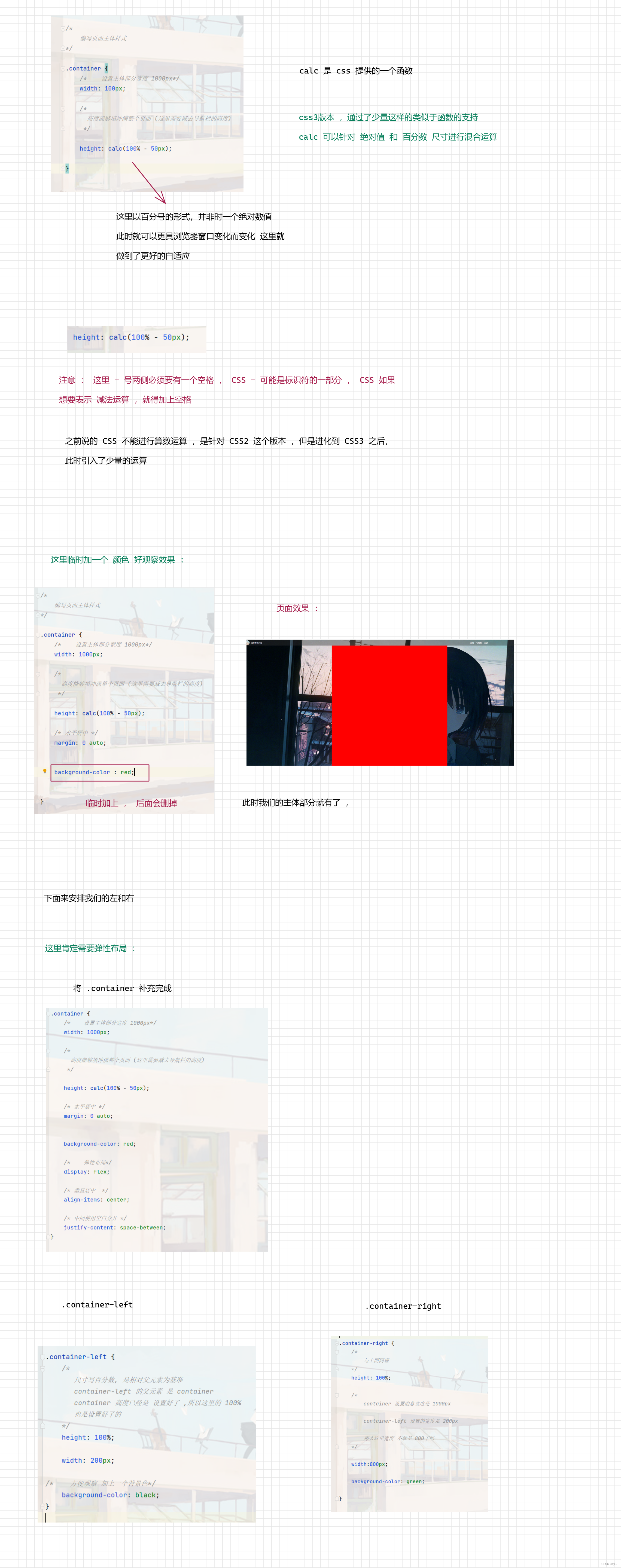
.container {
/* 设置主体部分宽度 1000px*/
width: 1000px;
/*
高度能够填冲满整个页面 (这里需要减去导航栏的高度)
*/
height: calc(100% - 50px);
/* 水平居中 */
margin: 0 auto;
/*background-color: red;*/
/* 弹性布局*/
display: flex;
/* 垂直居中 */
align-items: center;
/* 中间使用空白分开 */
justify-content: space-between;
}
.container-left {
/*
尺寸写百分数, 是相对父元素为基准
container-left 的父元素 是 container
container 高度已经是 设置好了 ,所以这里的 100%
也是设置好了的
*/
height: 100%;
width: 200px;
/* 方便观察 加上一个背景色*/
/* background-color: black;*/
}
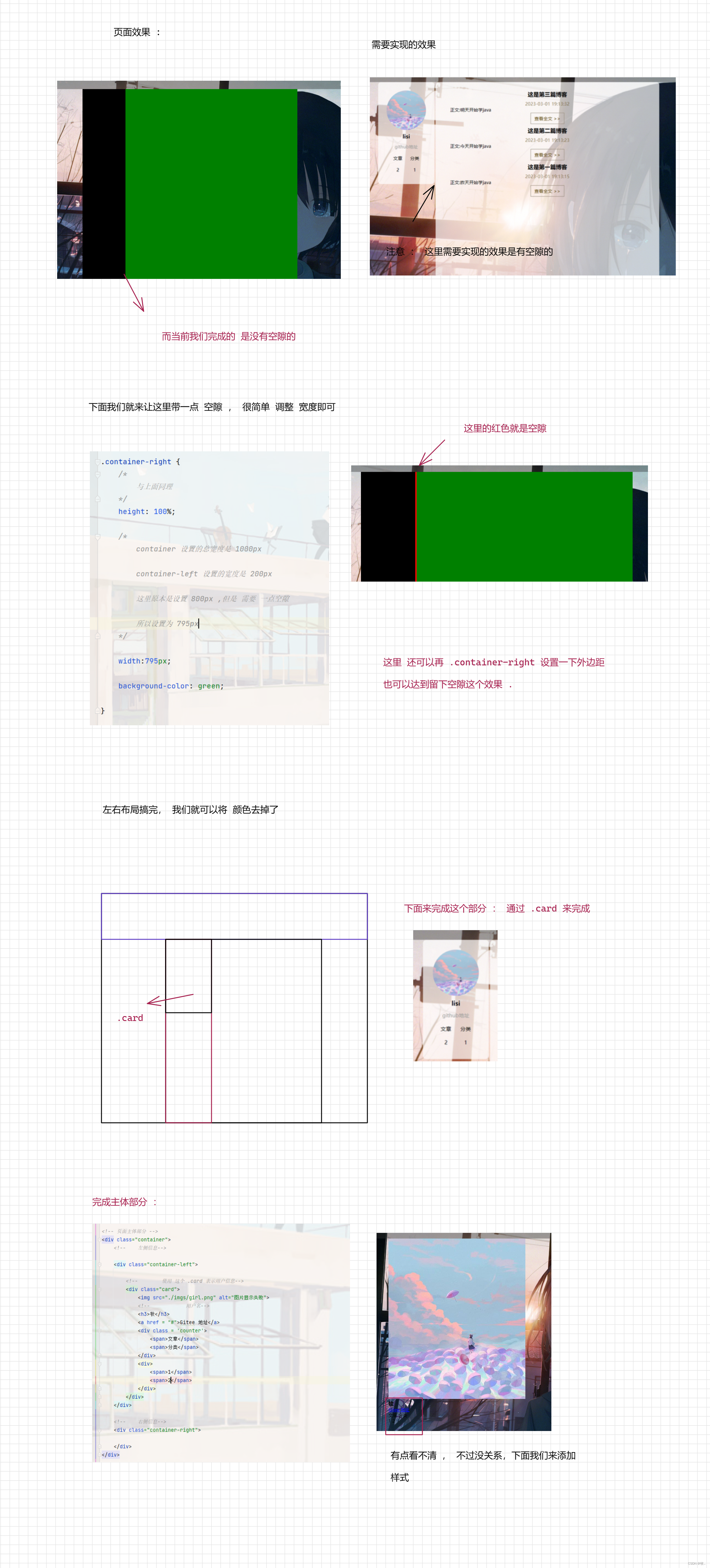
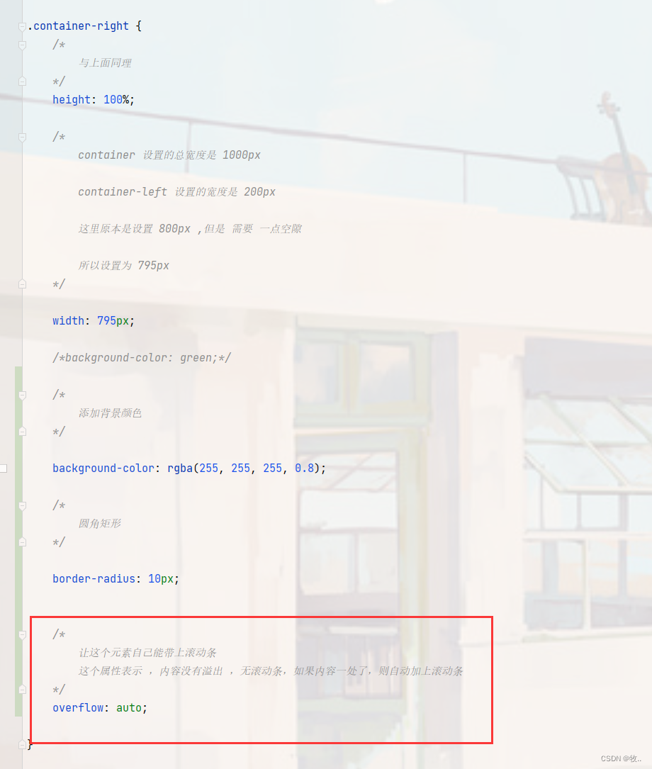
.container-right {
/*
与上面同理
*/
height: 100%;
/*
container 设置的总宽度是 1000px
container-left 设置的宽度是 200px
这里原本是设置 800px ,但是 需要 一点空隙
所以设置为 795px
*/
width: 795px;
/*background-color: green;*/
/*
添加背景颜色
*/
background-color: rgba(255, 255, 255, 0.8);
/*
圆角矩形
*/
border-radius: 10px;
/*
让这个元素自己能带上滚动条
这个属性表示 ,内容没有溢出 ,无滚动条,如果内容一处了,则自动加上滚动条
*/
overflow: auto;
}
/*
左侧用户信息
*/
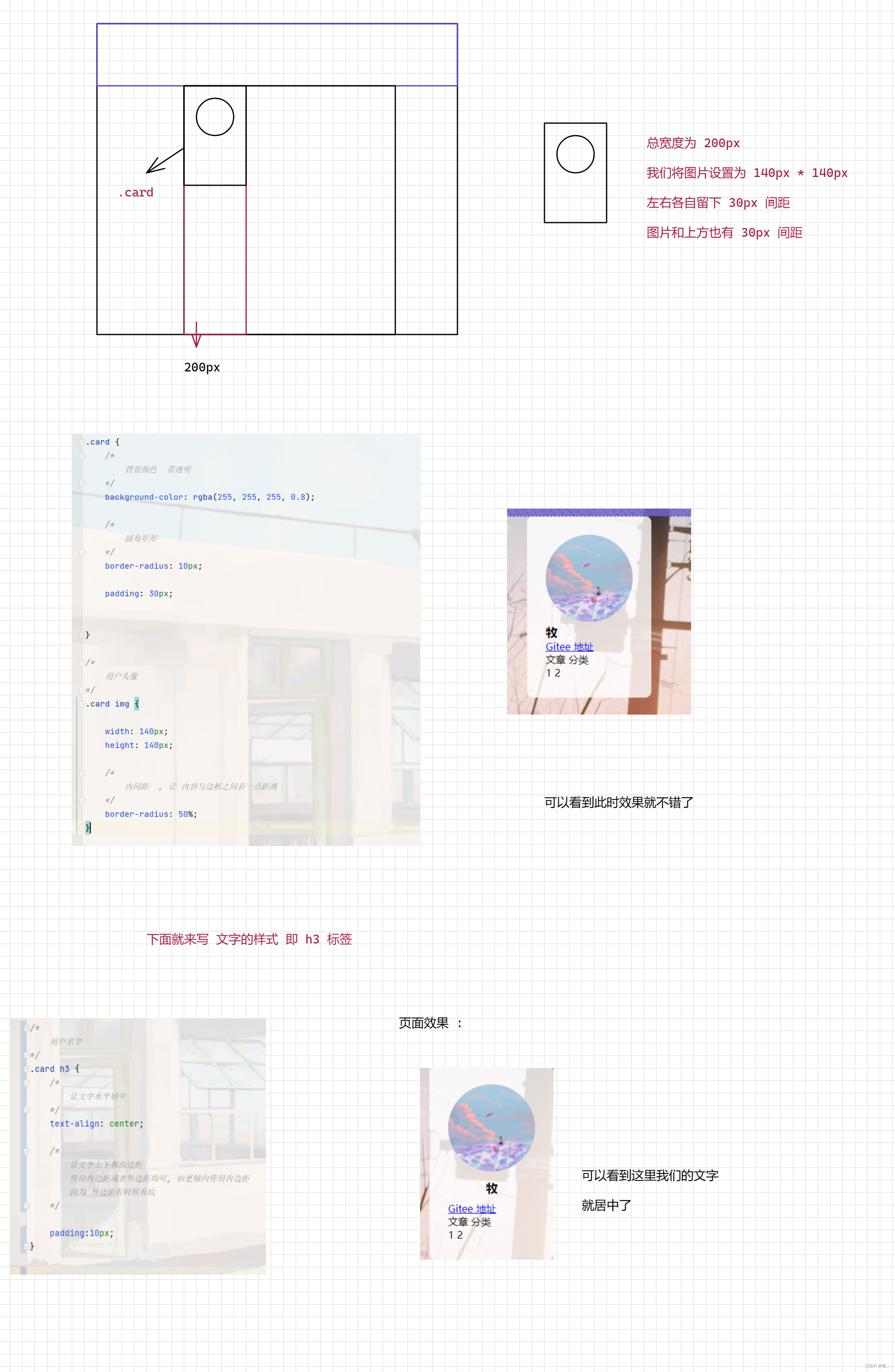
.card {
/*
背景颜色 带透明
*/
background-color: rgba(255, 255, 255, 0.8);
/*
圆角矩形
*/
border-radius: 10px;
padding: 30px;
}
/*
用户头像
*/
.card img {
width: 140px;
height: 140px;
/*
内间距 , 让 内容与边框之间有一点距离
*/
border-radius: 50%;
}
/*
用户名字
*/
.card h3 {
/*
让文字水平居中
*/
text-align: center;
/*
让文字上下都由边距
使用内边距或者外边距均可, 但更倾向使用内边距
因为 外边距有时候有坑
*/
padding: 10px;
}
/*
用户的 Gitee 链接
*/
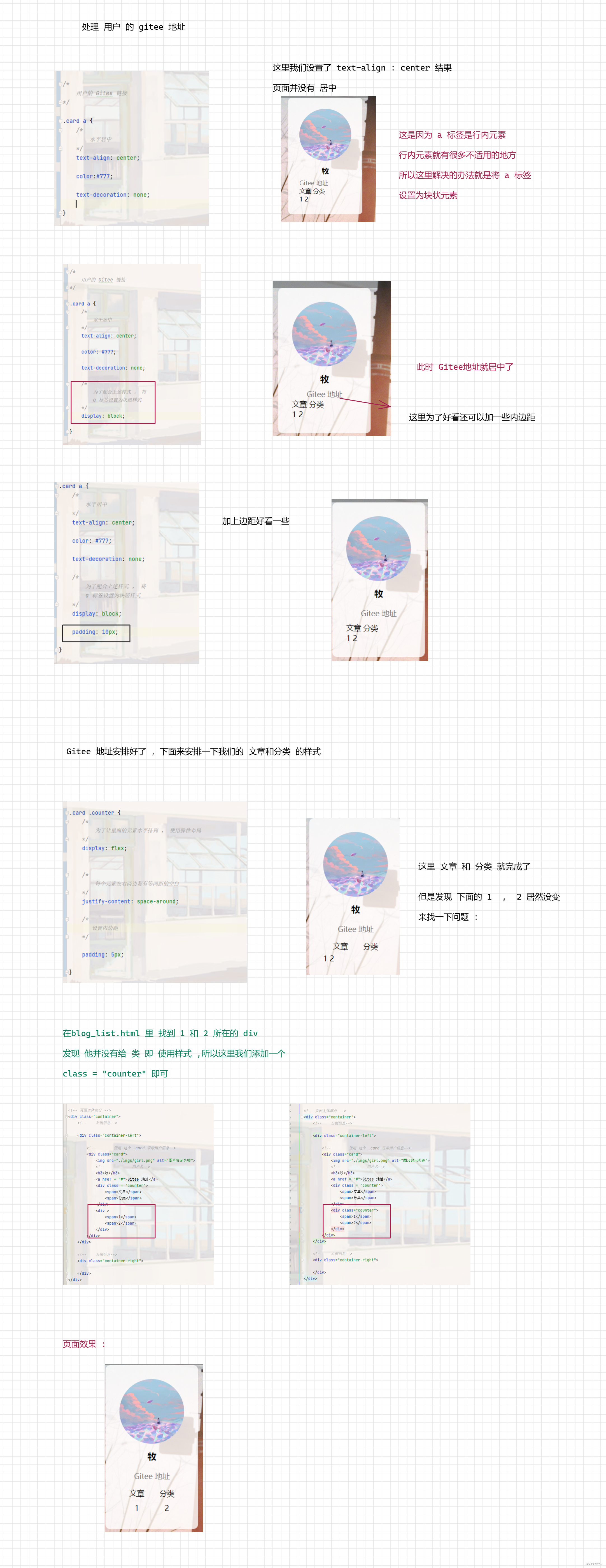
.card a {
/*
水平居中
*/
text-align: center;
color: #777;
text-decoration: none;
/*
为了配合上述样式 , 将
a 标签设置为块级样式
*/
display: block;
padding: 10px;
}
.card .counter {
/*
为了让里面的元素水平排列 , 使用弹性布局
*/
display: flex;
/*
每个元素左右两边都有等间距的空白
*/
justify-content: space-around;
/*
设置内边距
*/
padding: 5px;
}
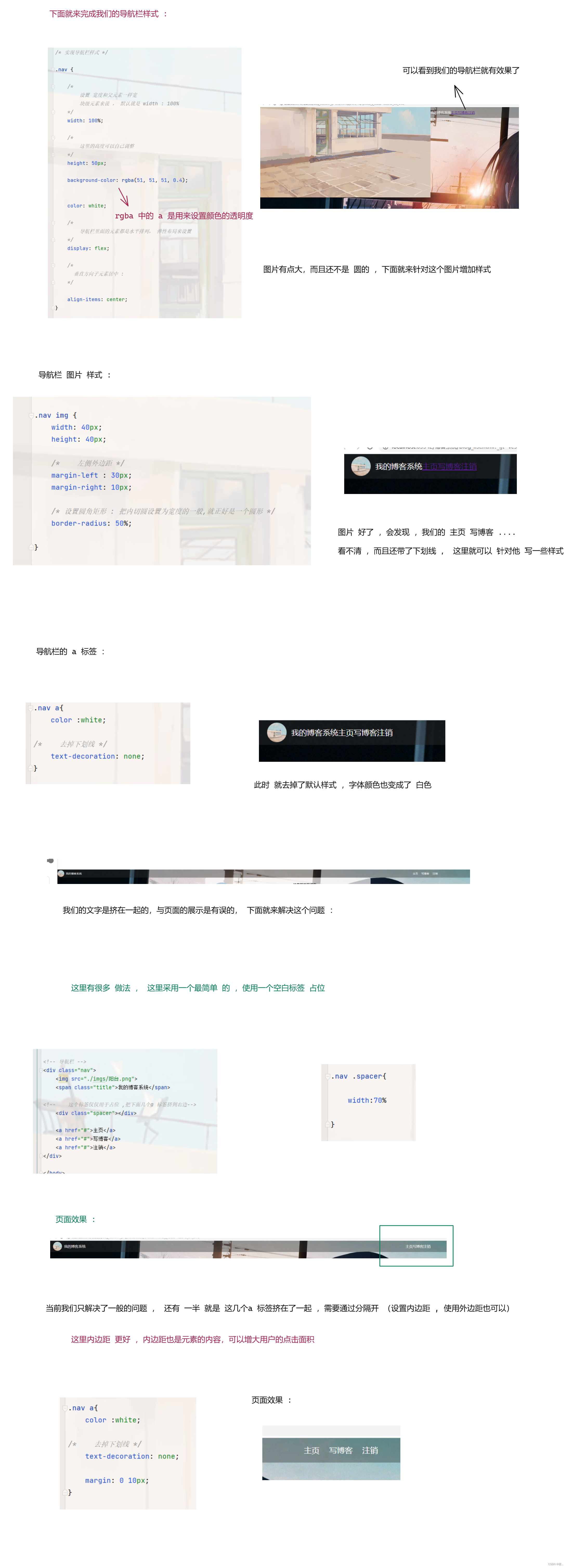
关于这个公共的 css 后面还会添加样式的 .
3. blog_list.css
/*
这个文件是给博客列表页实现样式的
*/
/*
设置整个博客的容器元素样式
*/
.blog {
width: 100%;
/*
设置边距 : 此时 上下左右都有 20px
*/
padding: 20px;
}
/*
设置标题 :
*/
.blog .title {
/*
设置文字居中
*/
text-align: center;
/*
设置字体大小
*/
font-size: 24px;
/*
设置粗细
*/
font-weight: 700;
/*
设置内边距
*/
padding: 10px
}
/*
设置日期 :
*/
.blog .data {
/*
文本居中
*/
text-align: center;
/*
设置颜色
*/
color: rgb(15, 189, 114);
/*
设置内边距
*/
padding: 10px
}
/*
设置摘要
*/
.blog .desc {
/*
设置缩进 2 个汉字
*/
text-indent: 2em;
}
/*
设置 查看全文
*/
.blog a {
/*
a 标签不方便设置样式 , 转为块级元素
*/
display: block;
width: 120px;
height: 40px;
/*
设置上边距
*/
margin-top: 20px;
/*
设置水平居中 : 通过
margin-left 和 margin-right 来设置
*/
margin-left: auto;
margin-right: auto;
/*
设置边框
*/
border: 2px solid black;
/*
让文字水平居中
*/
text-align: center;
/*
让文字垂直居中
*/
line-height: 40px;
/*
去掉下划线
*/
text-decoration: none;
/*
文字颜色
*/
color: black;
/*
背景颜色
*/
background-color: orange;
transition: all 0.8s;
border-radius: 10px;
}
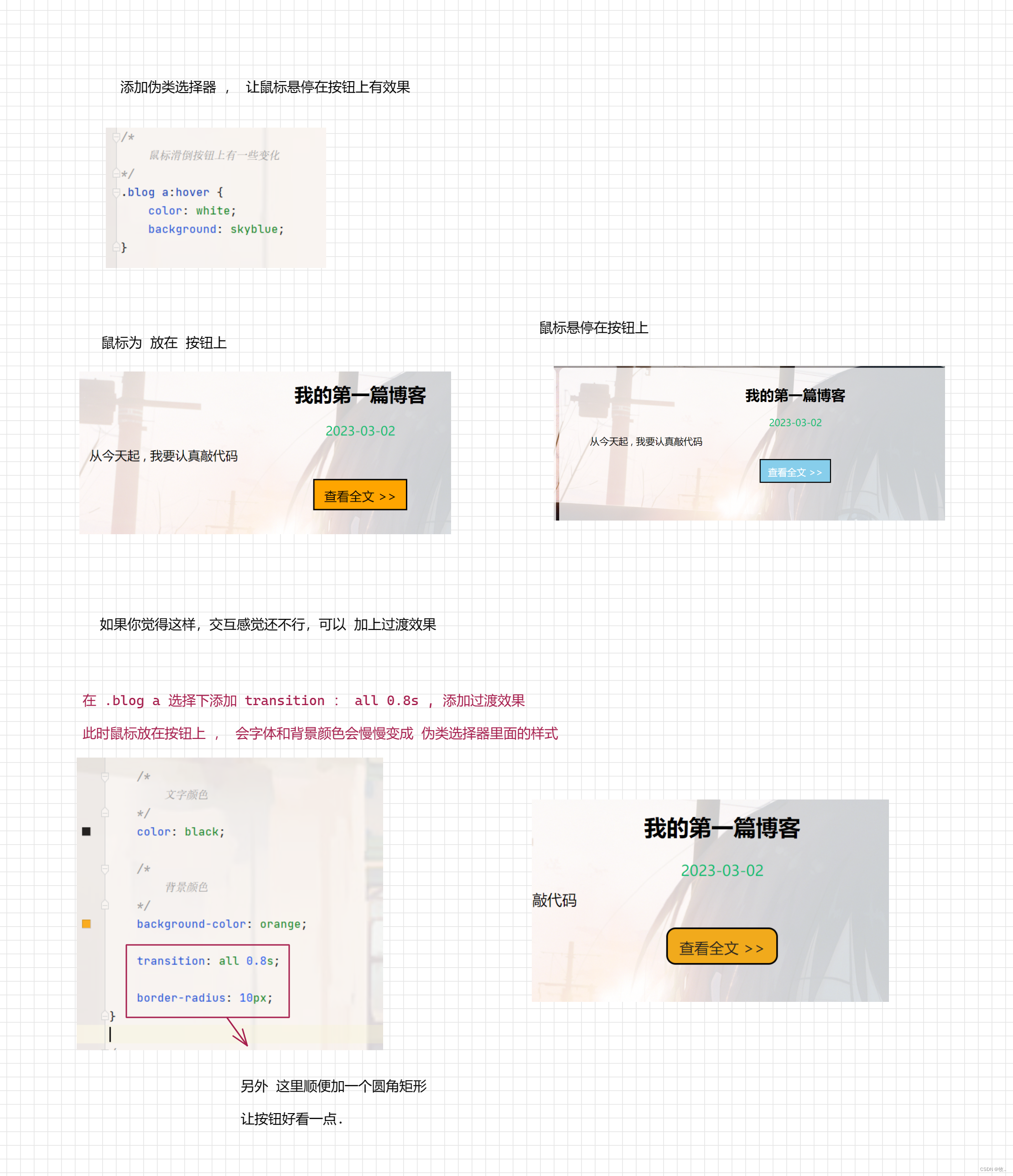
/*
鼠标滑倒按钮上有一些变化
*/
.blog a:hover {
color: white;
background: skyblue;
}
博客列表页写完了, 来完成博客 详情页
3.2 博客详情页
图一 :

图二 :
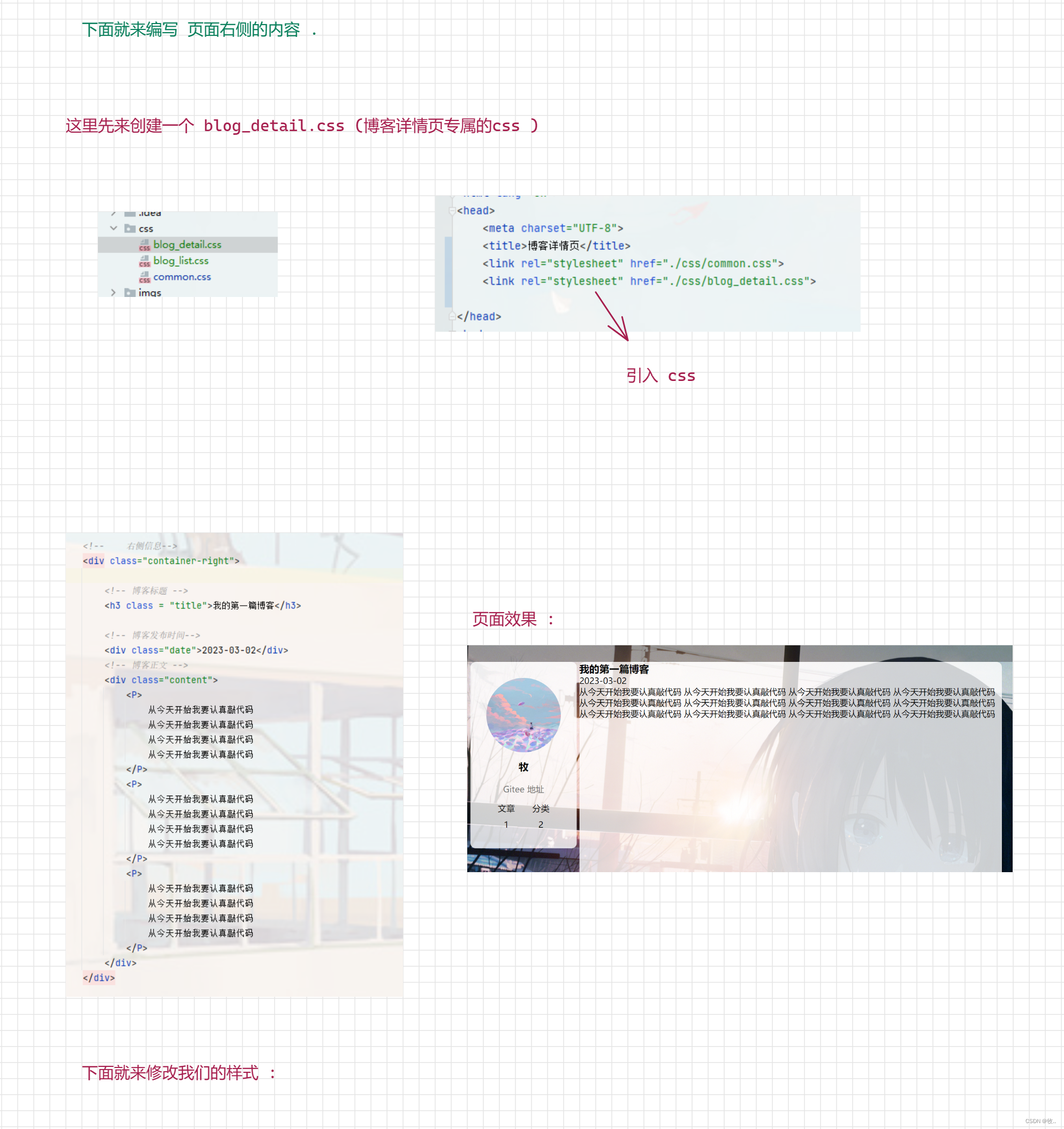
附上 样式代码 (blog_detail.css)
/*
    这个样式文件给博客详情页使用
*/

/*
    设置标题样式
*/

.container-right .title {
    /*
        文字居中
    */
    text-align: center;

    /*
        边距 : 距离产生美
    */
    padding: 30px

}


/*
    设置日期样式
*/

.container-right .date {
    /*
        文字颜色
    */
    color: rgb(15, 189, 114);

    /*
        位子居中
    */
    text-align: center;

    /*
        设置内边距 (下) 为 20px
    */
    padding-bottom: 20px;
}

/*
    设置 段落
*/

.container-right .content p {
    /*
        缩进 两字符
    */
    text-indent: 2em;

    /*
        内边距
    */
    padding: 10px 30px;
}
注意: 这里我们博客详情页 并不需要添加滚动条,因为滚动条是再 common 公共css 中已经添加过了 .
博客详情页 blog_detail.html
<!DOCTYPE html>
<html lang="en">
<head>
    <meta charset="UTF-8">
    <title>博客详情页</title>
    <link rel="stylesheet" href="./css/common.css">
    <link rel="stylesheet" href="./css/blog_detail.css">

</head>
<body>

<!-- 导航栏 -->
<div class="nav">
    <img src="./imgs/阳台.png">
    <span class="title">我的博客系统</span>

    <!--    这个标签仅仅用于占位 ,把下面几个a 标签挤到右边-->
    <div class="spacer"></div>

    <a href="#">主页</a>
    <a href="#">写博客</a>
    <a href="#">注销</a>
</div>

<!-- 页面主体部分 -->
<div class="container">
    <!--    左侧信息-->

    <div class="container-left">

        <!--        使用 这个 .card 表示用户信息-->
        <div class="card">
            <img src="./imgs/girl.png" alt="图片显示失败">
            <!--            用户名-->
            <h3>牧</h3>
            <a href="#">Gitee 地址</a>
            <div class='counter'>
                <span>文章</span>
                <span>分类</span>
            </div>
            <div class="counter">
                <span>1</span>
                <span>2</span>
            </div>
        </div>
    </div>

    <!--    右侧信息-->
    <div class="container-right">

        <!-- 博客标题 -->
        <h3 class = "title">我的第一篇博客</h3>

        <!-- 博客发布时间-->
        <div class="date">2023-03-02</div>
        <!-- 博客正文 -->
        <div class="content">
            <P>
                从今天开始我要认真敲代码
                从今天开始我要认真敲代码
                从今天开始我要认真敲代码
                从今天开始我要认真敲代码
            </P>
            <P>
                从今天开始我要认真敲代码
                从今天开始我要认真敲代码
                从今天开始我要认真敲代码
                从今天开始我要认真敲代码
            </P>
            <P>
                从今天开始我要认真敲代码
                从今天开始我要认真敲代码
                从今天开始我要认真敲代码
                从今天开始我要认真敲代码
            </P>
        </div>
    </div>

</div>


</body>
</html>
到此 博客详情页 就完成了, 是不是感觉非常快呀 , 这里主要是开头难 ,后面 我们可以直接拷贝开头写的代码 , 下面就来实现一下我们的登录页面
3.3 登录页面
图一 :
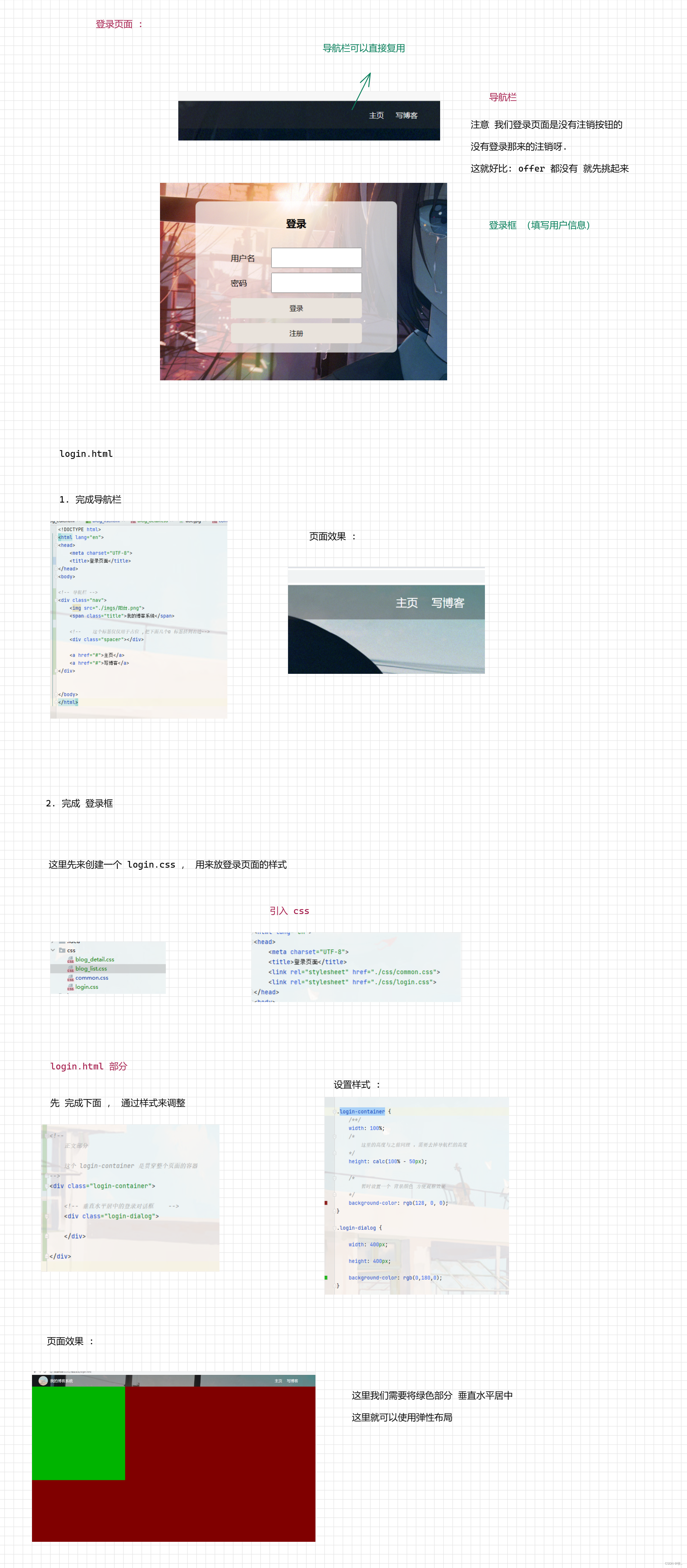
图二 :
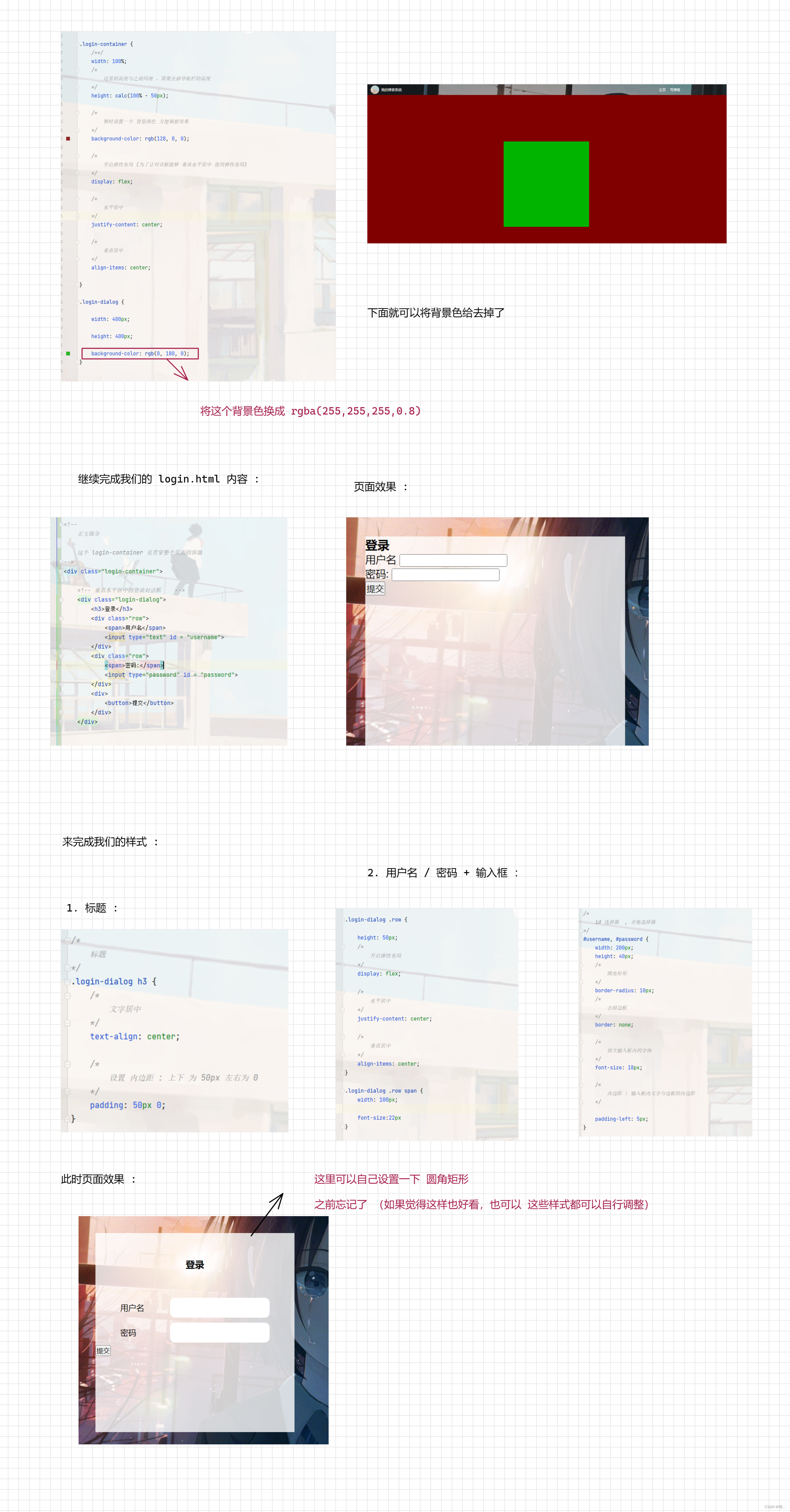
图三 :
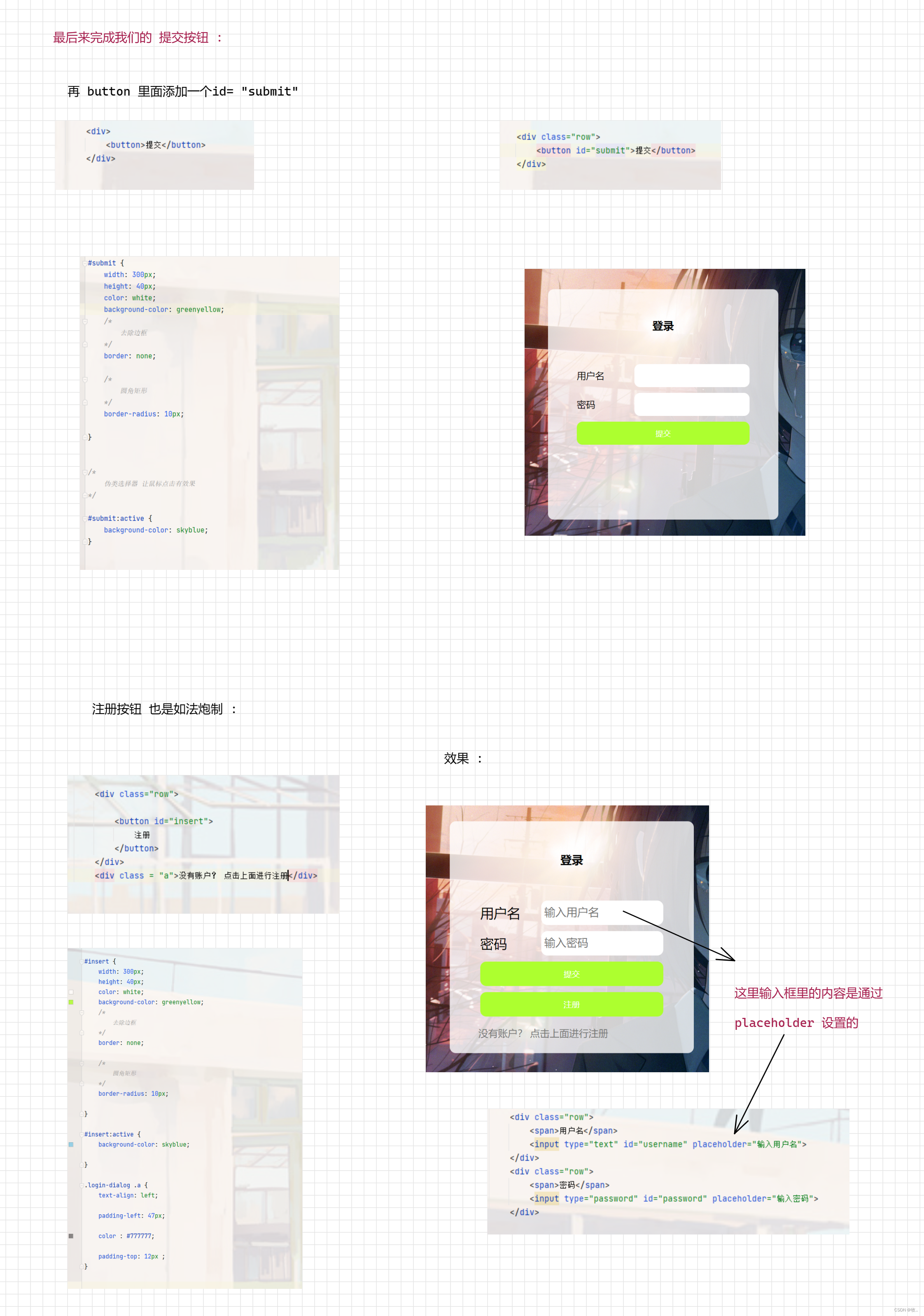
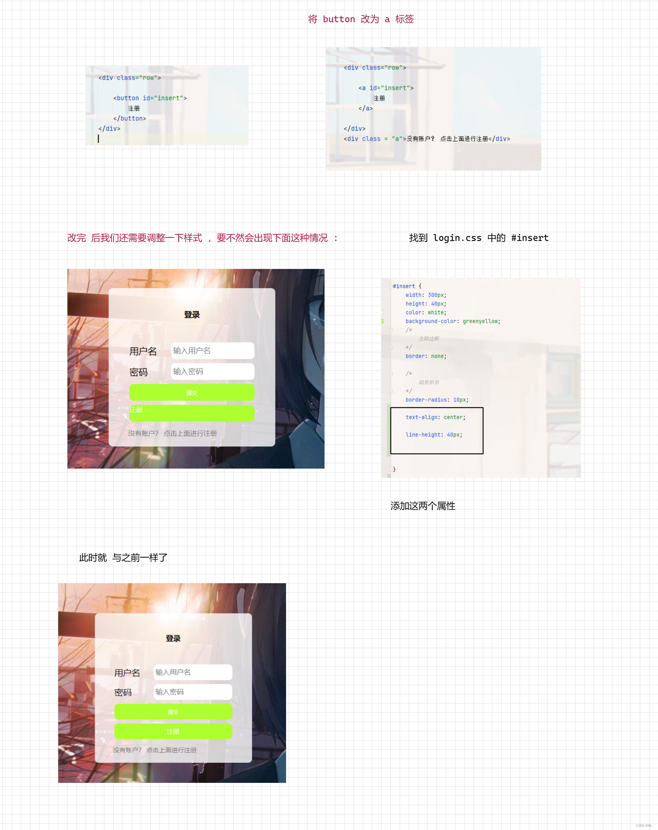
注意 : 注册按钮 我写成了 一个 button ,这里 可以使用 a 标签 后面 点击注册按钮的时候 好跳转 , 下面修改一下
到此我们的登录页面就完成了,下面就来完成我们的博客编辑页 .
3.4 博客编辑页
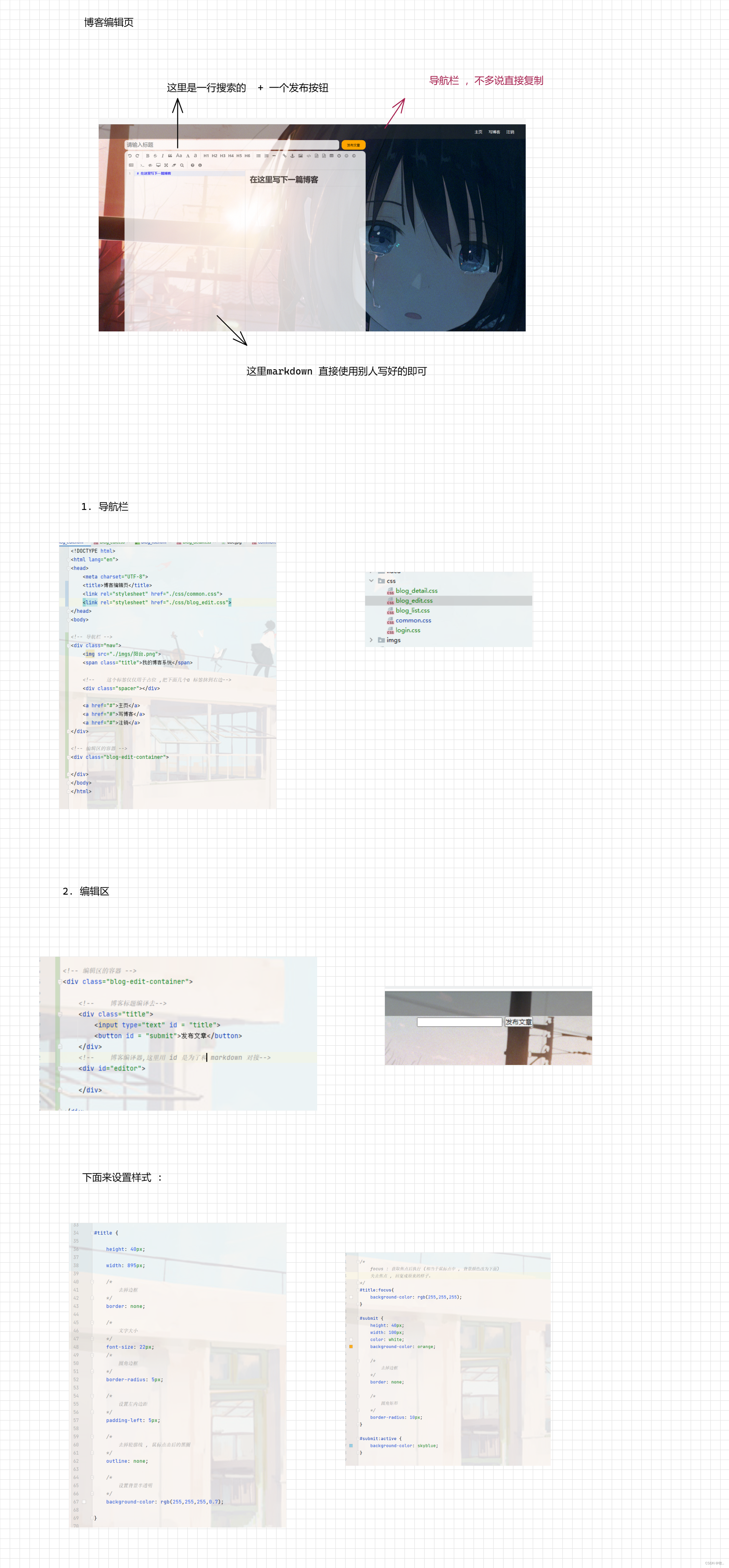
下面来引入 markdown 就可以完成我们的博客编辑页了 .
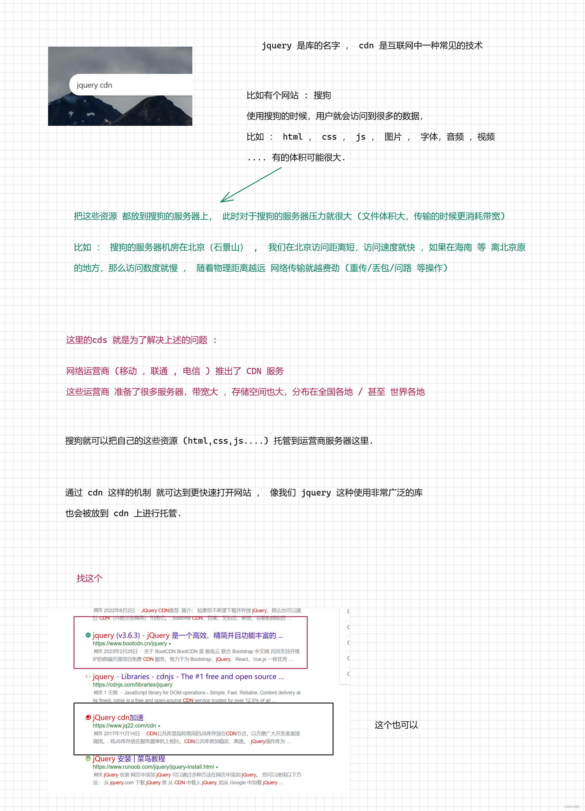
在引入markdowm 之前, 我们还需要 引入一个库 jquery 他是前端圈子里最知名的库之一 (放在 10 年前 没有之一) .
这里为啥引入 jquery 这个库呢? ,是因为markdowm 依赖这个库 .
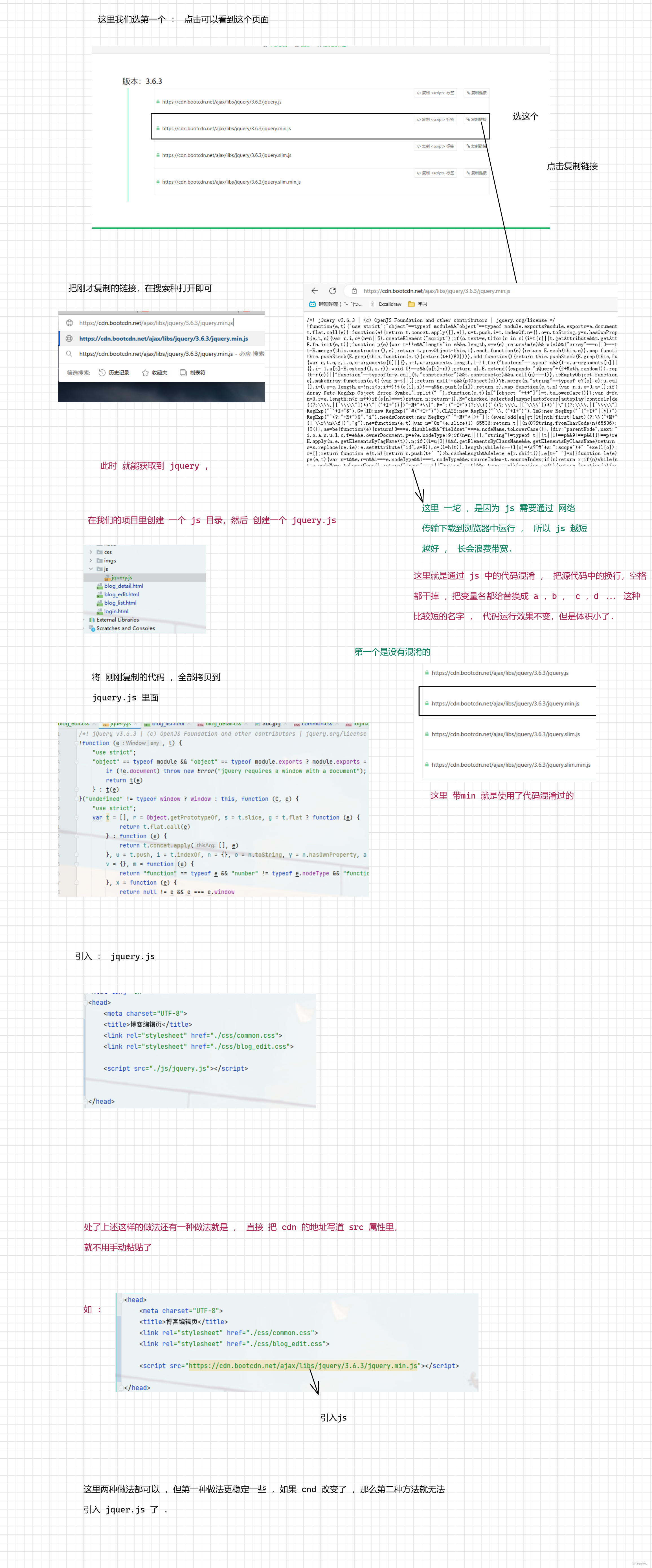
1. 引入 jquery
这里可以直接在网上找到他的源码 :
图一 :
图二 :
获取 jquery.js : jquery (v3.6.3) - jQuery
2. 引入 markdown 编译器
图一 :
图二 :
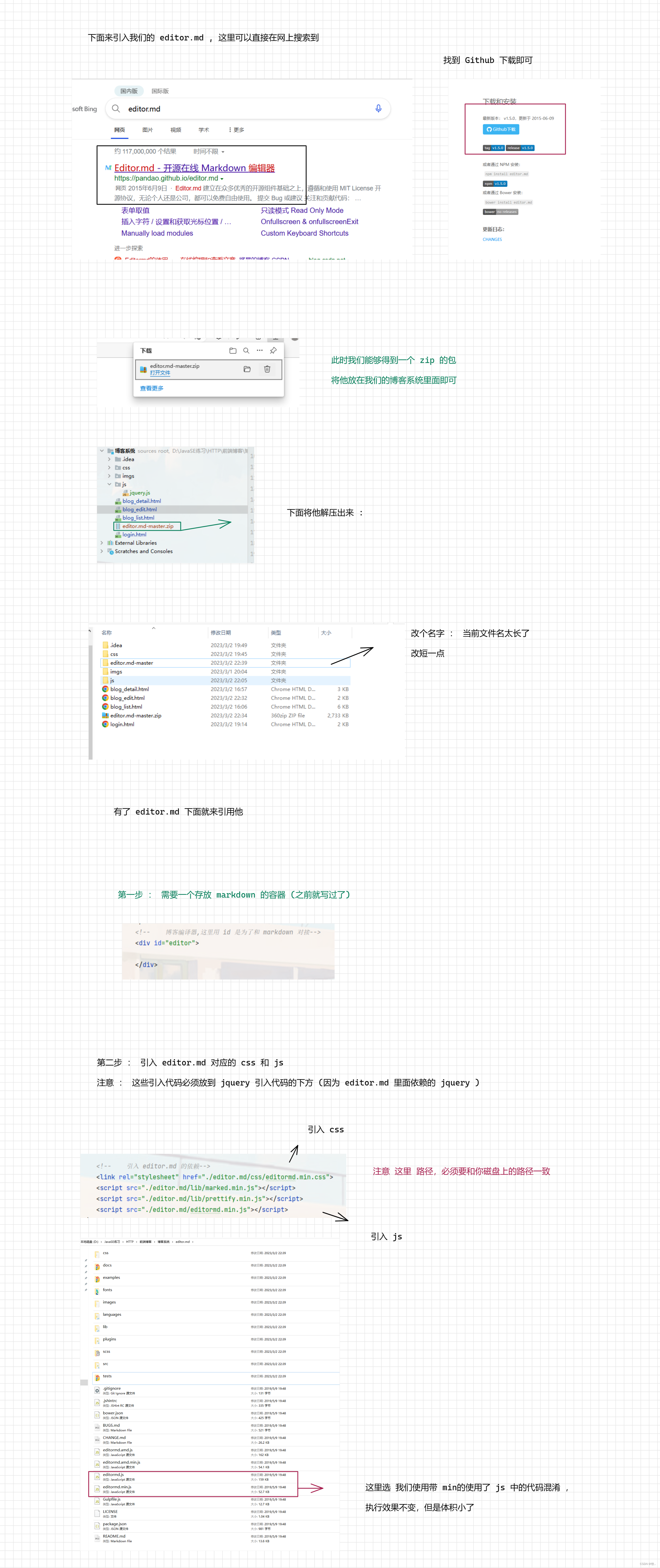
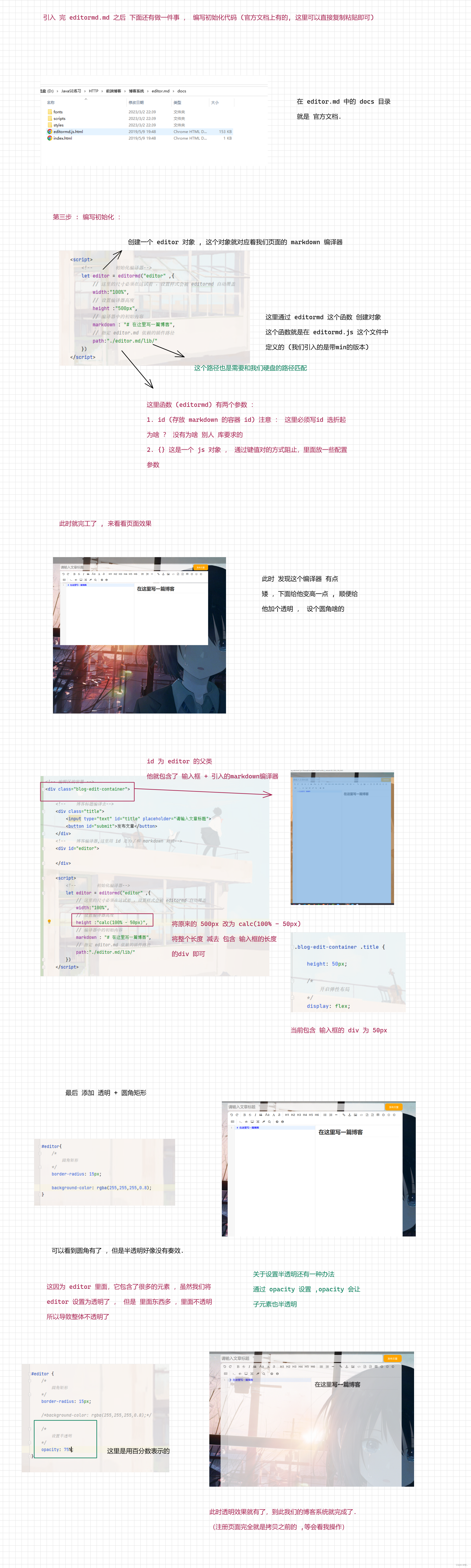
这里补充一下 : 通过 GitHub 找 这个 markdown 编译器 (后面找其他开源项目 就知道咋找了)
如果你打开过 GitHub 肯定遇到过 有时打的开, 有时打不开的问题 , 这就是和 你打开stream 商店一样 , 别人的服务器是在外国的 .
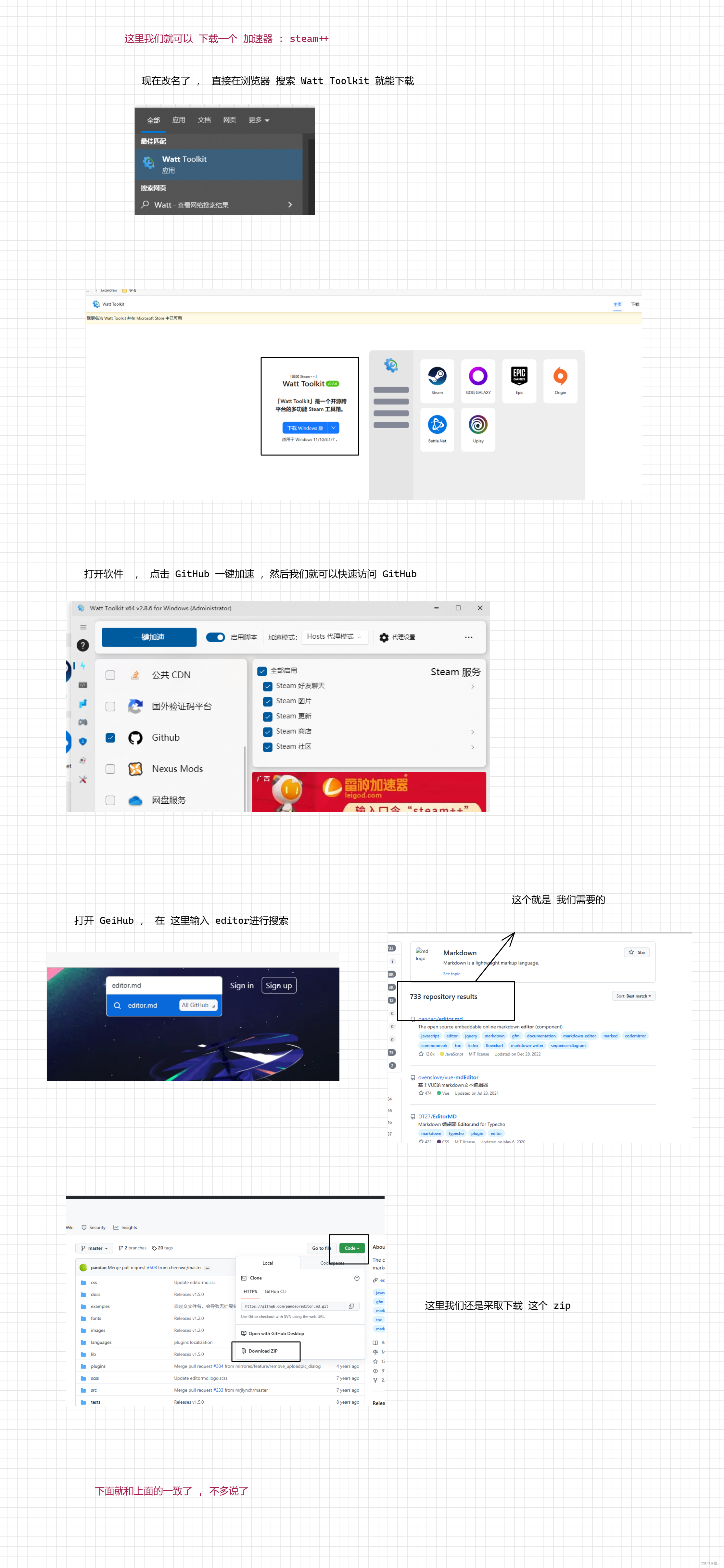
Steam++ : Watt Toolkit - 瓦特工具箱(Steam++官网) (steampp.net)
4. 整体代码
这里就附上 各个页面的代码 :
1.登录页面
<!DOCTYPE html>
<html lang="en">
<head>
    <meta charset="UTF-8">
    <title>登录页面</title>
    <link rel="stylesheet" href="./css/common.css">
    <link rel="stylesheet" href="./css/login.css">
</head>
<body>

<!-- 导航栏 -->
<div class="nav">
    <img src="./imgs/阳台.png">
    <span class="title">我的博客系统</span>

    <!--    这个标签仅仅用于占位 ,把下面几个a 标签挤到右边-->
    <div class="spacer"></div>

    <a href="#">主页</a>
    <a href="#">写博客</a>
</div>

<!--
    正文部分

    这个 login-container 是贯穿整个页面的容器
-->
<div class="login-container">

    <!-- 垂直水平居中的登录对话框    -->
    <div class="login-dialog">
        <h3>登录</h3>
        <div class="row">
            <span>用户名</span>
            <input type="text" id="username" placeholder="输入用户名">
        </div>
        <div class="row">
            <span>密码</span>
            <input type="password" id="password" placeholder="输入密码">
        </div>

        <div class="row">
            <button id="submit">提交</button>
        </div>


        <div class="row">

            <a id="insert">
                注册
            </a>
        </div>

        <div class = "a">没有账户? 点击上面进行注册</div>


    </div>


</div>


</body>
</html>
2.博客列表页
<!DOCTYPE html>
<html lang="en">
<head>
<meta charset="UTF-8">
<title>博客列表页</title>
<link rel="stylesheet" href="./css/common.css">
<link rel = "stylesheet" href = "./css/blog_list.css">
</head>
<body>
<!-- 导航栏 -->
<div class="nav">
<img src="./imgs/阳台.png">
<span class="title">我的博客系统</span>
<!-- 这个标签仅仅用于占位 ,把下面几个a 标签挤到右边-->
<div class="spacer"></div>
<a href="#">主页</a>
<a href="#">写博客</a>
<a href="#">注销</a>
</div>
<!-- 页面主体部分 -->
<div class="container">
<!-- 左侧信息-->
<div class="container-left">
<!-- 使用 这个 .card 表示用户信息-->
<div class="card">
<img src="./imgs/girl.png" alt="图片显示失败">
<!-- 用户名-->
<h3>牧</h3>
<a href="#">Gitee 地址</a>
<div class='counter'>
<span>文章</span>
<span>分类</span>
</div>
<div class="counter">
<span>1</span>
<span>2</span>
</div>
</div>
</div>
<!-- 右侧信息-->
<div class="container-right">
<!--
表示一篇博客
-->
<div class="blog">
<!--
博客标题
-->
<div class="title">我的第一篇博客</div>
<!--
发布时间
-->
<div class="data">
2023-03-02
</div>
<!--
博客的摘要
-->
<div class="desc">
从今天起 , 我要认真敲代码
Lorem ipsum dolor sit amet, consectetur adipisicing elit. Sint eaque facilis perferendis! Numquam
neque voluptatum ab vero expedita possimus fuga eos, illo sapiente delectus quidem natus maiores,
ipsum impedit rerum?
</div>
<!--
查看全文按钮
-->
<a href = "#">查看全文 >></a>
</div>
<div class="blog">
<!--
博客标题
-->
<div class="title">我的第一篇博客</div>
<!--
发布时间
-->
<div class="data">
2023-03-02
</div>
<!--
博客的摘要
-->
<div class="desc">
从今天起 , 我要认真敲代码
Lorem ipsum dolor sit amet, consectetur adipisicing elit. Sint eaque facilis perferendis! Numquam
neque voluptatum ab vero expedita possimus fuga eos, illo sapiente delectus quidem natus maiores,
ipsum impedit rerum?
</div>
<!--
查看全文按钮
-->
<a href = "#">查看全文 >></a>
</div>
<div class="blog">
<!--
博客标题
-->
<div class="title">我的第一篇博客</div>
<!--
发布时间
-->
<div class="data">
2023-03-02
</div>
<!--
博客的摘要
-->
<div class="desc">
从今天起 , 我要认真敲代码
Lorem ipsum dolor sit amet, consectetur adipisicing elit. Sint eaque facilis perferendis! Numquam
neque voluptatum ab vero expedita possimus fuga eos, illo sapiente delectus quidem natus maiores,
ipsum impedit rerum?
</div>
<!--
查看全文按钮
-->
<a href = "#">查看全文 >></a>
</div>
<div class="blog">
<!--
博客标题
-->
<div class="title">我的第一篇博客</div>
<!--
发布时间
-->
<div class="data">
2023-03-02
</div>
<!--
博客的摘要
-->
<div class="desc">
从今天起 , 我要认真敲代码
Lorem ipsum dolor sit amet, consectetur adipisicing elit. Sint eaque facilis perferendis! Numquam
neque voluptatum ab vero expedita possimus fuga eos, illo sapiente delectus quidem natus maiores,
ipsum impedit rerum?
</div>
<!--
查看全文按钮
-->
<a href = "#">查看全文 >></a>
</div>
<div class="blog">
<!--
博客标题
-->
<div class="title">我的第一篇博客</div>
<!--
发布时间
-->
<div class="data">
2023-03-02
</div>
<!--
博客的摘要
-->
<div class="desc">
从今天起 , 我要认真敲代码
Lorem ipsum dolor sit amet, consectetur adipisicing elit. Sint eaque facilis perferendis! Numquam
neque voluptatum ab vero expedita possimus fuga eos, illo sapiente delectus quidem natus maiores,
ipsum impedit rerum?
</div>
<!--
查看全文按钮
-->
<a href = "#">查看全文 >></a>
</div>
</div>
</div>
</body>
</html>
3.博客详情页
<!DOCTYPE html>
<html lang="en">
<head>
    <meta charset="UTF-8">
    <title>博客详情页</title>
    <link rel="stylesheet" href="./css/common.css">
    <link rel="stylesheet" href="./css/blog_detail.css">

</head>
<body>

<!-- 导航栏 -->
<div class="nav">
    <img src="./imgs/阳台.png">
    <span class="title">我的博客系统</span>

    <!--    这个标签仅仅用于占位 ,把下面几个a 标签挤到右边-->
    <div class="spacer"></div>

    <a href="#">主页</a>
    <a href="#">写博客</a>
    <a href="#">注销</a>
</div>

<!-- 页面主体部分 -->
<div class="container">
    <!--    左侧信息-->

    <div class="container-left">

        <!--        使用 这个 .card 表示用户信息-->
        <div class="card">
            <img src="./imgs/girl.png" alt="图片显示失败">
            <!--            用户名-->
            <h3>牧</h3>
            <a href="#">Gitee 地址</a>
            <div class='counter'>
                <span>文章</span>
                <span>分类</span>
            </div>
            <div class="counter">
                <span>1</span>
                <span>2</span>
            </div>
        </div>
    </div>

    <!--    右侧信息-->
    <div class="container-right">

        <!-- 博客标题 -->
        <h3 class = "title">我的第一篇博客</h3>

        <!-- 博客发布时间-->
        <div class="date">2023-03-02</div>
        <!-- 博客正文 -->
        <div class="content">
            <P>
                从今天开始我要认真敲代码
                从今天开始我要认真敲代码
                从今天开始我要认真敲代码
                从今天开始我要认真敲代码
            </P>
            <P>
                从今天开始我要认真敲代码
                从今天开始我要认真敲代码
                从今天开始我要认真敲代码
                从今天开始我要认真敲代码
            </P>
            <P>
                从今天开始我要认真敲代码
                从今天开始我要认真敲代码
                从今天开始我要认真敲代码
                从今天开始我要认真敲代码
            </P>
        </div>
    </div>

</div>


</body>
</html>
4.写博客页面
<!DOCTYPE html>
<html lang="en">
<head>
    <meta charset="UTF-8">
    <title>博客编辑页</title>
    <link rel="stylesheet" href="./css/common.css">
    <link rel="stylesheet" href="./css/blog_edit.css">

    <script src="./js/jquery.js"></script>
    <!--    <script src="https://cdn.bootcdn.net/ajax/libs/jquery/3.6.3/jquery.min.js"></script>-->

    <!--    引入 editor.md 的依赖-->
    <link rel="stylesheet" href="./editor.md/css/editormd.min.css">
    <script src="./editor.md/lib/marked.min.js"></script>
    <script src="./editor.md/lib/prettify.min.js"></script>
    <script src="./editor.md/editormd.min.js"></script>
</head>
<body>


<!-- 导航栏 -->
<div class="nav">
    <img src="./imgs/阳台.png">
    <span class="title">我的博客系统</span>

    <!--    这个标签仅仅用于占位 ,把下面几个a 标签挤到右边-->
    <div class="spacer"></div>

    <a href="#">主页</a>
    <a href="#">写博客</a>
    <a href="#">注销</a>
</div>

<!-- 编辑区的容器 -->
<div class="blog-edit-container">

    <!--    博客标题编译去-->
    <div class="title">
        <input type="text" id="title" placeholder="请输入文章标题">
        <button id="submit">发布文章</button>
    </div>
    <!--    博客编译器,这里用 id 是为了和 markdown 对接-->
    <div id="editor">

    </div>

    <script>
        <!--        初始化编译器-->
        let editor = editormd("editor" ,{
            // 这里的尺寸必须在这试着 ,设置样式会被 editormd 自动覆盖
            width:"100%",
            // 设置编译器高度
            height :"calc(100% - 50px)",
            // 编译器中的初始内容
            markdown : "# 在这里写一篇博客",
            // 指定 editor.md 依赖的插件路径
            path:"./editor.md/lib/"
        })
    </script>

</div>
</body>
</html>
5.common.css
/* 写样式的起手式 , 先取出浏览器的公共样式 ,并且设置 border-box , 避免元素盒子被内边距和边距撑大 */

* {
    margin: 0;
    padding: 0;
    box-sizing: border-box;
}

/* 并集选择器 */
html, body {

    /*
        html 是页面的最顶成元素 ,高度 100% 是相对父元素来说高度是 100% (和父元素一样高)
        对于 html 标签来说 , 父元素就是浏览器窗口 , 浏览器多高 , html 就多高

        body 的父亲是 html ,设为 100% 意思是 body 和 html 一样高
        此时 body 和 html 的高度都是和浏览器窗口一样高的

        如果不设置高度 ,此时 元素的默认高度取决于内部的内容
    */

    height: 100%;
}

body {
    background-image: url("../imgs/abc.jpg");

    /* 拒绝平铺 */
    background-repeat: no-repeat;

    /* 尽可能扩展 */
    background-size: cover;

    /* 水平垂直居中 */
    background-position: center center;
}

/* 实现导航栏样式 */

.nav {

    /*
        设置 宽度和父元素一样宽
        块级元素来说 , 默认就是 width : 100%
    */
    width: 100%;

    /*
        这里的高度可以自己调整
    */
    height: 50px;

    background-color: rgba(51, 51, 51, 0.4);


    color: white;

    /*
        导航栏里面的元素都是水平排列, 弹性布局来设置
    */
    display: flex;

    /*
      垂直方向子元素居中 :
    */

    align-items: center;
}


.nav img {
    width: 40px;
    height: 40px;

    /*    左侧外边距 */
    margin-left: 30px;
    margin-right: 10px;

    /* 设置圆角矩形 : 把内切圆设置为宽度的一般,就正好是一个圆形 */
    border-radius: 50%;

}


.nav a {
    color: white;

    /*    去掉下划线 */
    text-decoration: none;

    margin: 0 10px;
}


.nav .spacer {

    width: 70%

}


/*
    编写页面主体样式
*/

.container {
    /*    设置主体部分宽度 1000px*/
    width: 1000px;

    /*
      高度能够填冲满整个页面 (这里需要减去导航栏的高度)
     */

    height: calc(100% - 50px);

    /* 水平居中 */
    margin: 0 auto;


    /*background-color: red;*/

    /*    弹性布局*/
    display: flex;

    /* 垂直居中  */
    align-items: center;

    /* 中间使用空白分开 */
    justify-content: space-between;

}


.container-left {
    /*
       尺寸写百分数, 是相对父元素为基准
       container-left 的父元素 是 container
       container 高度已经是 设置好了 ,所以这里的 100%
       也是设置好了的
    */
    height: 100%;

    width: 200px;

    /*    方便观察 加上一个背景色*/
    /*    background-color: black;*/
}

.container-right {
    /*
        与上面同理
    */
    height: 100%;

    /*
        container 设置的总宽度是 1000px

        container-left 设置的宽度是 200px

        这里原本是设置 800px ,但是 需要 一点空隙

        所以设置为 795px
    */

    width: 795px;

    /*background-color: green;*/

    /*
        添加背景颜色
    */

    background-color: rgba(255, 255, 255, 0.8);

    /*
        圆角矩形
    */

    border-radius: 10px;


    /*
        让这个元素自己能带上滚动条
        这个属性表示 ,内容没有溢出 ,无滚动条,如果内容一处了,则自动加上滚动条
    */
    overflow: auto;

}

/*
    左侧用户信息
*/

.card {
    /*
        背景颜色  带透明
    */
    background-color: rgba(255, 255, 255, 0.8);

    /*
        圆角矩形
    */
    border-radius: 10px;

    padding: 30px;


}

/*
    用户头像
*/
.card img {

    width: 140px;
    height: 140px;

    /*
        内间距  , 让 内容与边框之间有一点距离
    */
    border-radius: 50%;

}

/*
    用户名字
*/
.card h3 {
    /*
        让文字水平居中
    */
    text-align: center;

    /*
        让文字上下都由边距
        使用内边距或者外边距均可, 但更倾向使用内边距
        因为 外边距有时候有坑
    */

    padding: 10px;
}


/*
    用户的 Gitee 链接
*/

.card a {
    /*
        水平居中
    */
    text-align: center;

    color: #777;

    text-decoration: none;

    /*
        为了配合上述样式 , 将
        a 标签设置为块级样式
    */
    display: block;

    padding: 10px;

}

.card .counter {
    /*
        为了让里面的元素水平排列 , 使用弹性布局
    */
    display: flex;


    /*
        每个元素左右两边都有等间距的空白
    */
    justify-content: space-around;

    /*
       设置内边距
    */

    padding: 5px;

}
6.login.css
/*
    这个文件专门放登录页面的样式
*/


.login-container {
    /**/
    width: 100%;
    /*
        这里的高度与之前同理 ,需要去掉导航栏的高度
    */
    height: calc(100% - 50px);

    /*
        暂时设置一个 背景颜色 方便观察效果
    */
    /*background-color: rgb(128, 0, 0);*/

    /*
        开启弹性布局 (为了让对话框能够 垂直水平居中 使用弹性布局)
    */
    display: flex;

    /*
        水平居中
    */
    justify-content: center;

    /*
        垂直居中
    */
    align-items: center;

}

.login-dialog {

    width: 400px;

    height: 380px;

    /*background-color: rgb(0, 180, 0);*/
    background-color: rgba(255, 255, 255, 0.8);

    border-radius: 10px;

}

/*
    标题
*/
.login-dialog h3 {
    /*
        文字居中
    */
    text-align: center;

    /*
        设置 内边距 : 上下 为 50px 左右为 0
    */
    padding: 50px 0;
}

.login-dialog .row {

    height: 50px;
    /*
        开启弹性布局
    */
    display: flex;

    /*
        水平居中
    */
    justify-content: center;

    /*
        垂直居中
    */
    align-items: center;
}

.login-dialog .row span {
    width: 100px;

    font-size: 22px
}

/*
    id 选择器  , 并集选择器
*/
#username, #password {
    width: 200px;
    height: 40px;
    /*
        圆角矩形
    */
    border-radius: 10px;
    /*
        去掉边框
    */
    border: none;

    /*
        放大输入框内的字体
    */
    font-size: 18px;

    /*
        内边距 : 输入框内文字与边框的内边距
    */

    padding-left: 5px;
}

#submit {
    width: 300px;
    height: 40px;
    color: white;
    background-color: greenyellow;
    /*
        去除边框
    */
    border: none;

    /*
        圆角矩形
    */
    border-radius: 10px;

}


/*
    伪类选择器 让鼠标点击有效果
*/

#submit:active {
    background-color: skyblue;
}

#insert {
    width: 300px;
    height: 40px;
    color: white;
    background-color: greenyellow;
    /*
        去除边框
    */
    border: none;

    /*
        圆角矩形
    */
    border-radius: 10px;

    text-align: center;

    line-height: 40px;


}


#insert:active {
    background-color: skyblue;

}

.login-dialog .a {

    text-align: left;

    padding-left: 47px;

    color : #777777;

    padding-top: 12px ;
}
7.blog_list.css
/*
       这个文件是给博客列表页实现样式的
*/


/*
    设置整个博客的容器元素样式
*/

.blog {
    width: 100%;
    /*
        设置边距 : 此时 上下左右都有 20px
    */
    padding: 20px;
}

/*
    设置标题 :
*/
.blog .title {

    /*
        设置文字居中
    */
    text-align: center;

    /*
        设置字体大小
    */
    font-size: 24px;

    /*
        设置粗细
    */
    font-weight: 700;

    /*
        设置内边距
    */
    padding: 10px
}


/*
    设置日期 :
*/

.blog .data {

    /*
        文本居中
    */
    text-align: center;

    /*
        设置颜色
    */
    color: rgb(15, 189, 114);

    /*
        设置内边距
    */
    padding: 10px
}

/*
    设置摘要
*/

.blog .desc {

    /*
        设置缩进 2 个汉字
    */

    text-indent: 2em;
}

/*
    设置 查看全文
*/
.blog a {
    /*
        a 标签不方便设置样式 , 转为块级元素
    */

    display: block;

    width: 120px;

    height: 40px;

    /*
       设置上边距
    */
    margin-top: 20px;

    /*
       设置水平居中 : 通过
       margin-left 和 margin-right 来设置
   */
    margin-left: auto;

    margin-right: auto;

    /*
        设置边框
    */
    border: 2px solid black;

    /*
        让文字水平居中
    */
    text-align: center;

    /*
        让文字垂直居中
    */
    line-height: 40px;

    /*
        去掉下划线
    */
    text-decoration: none;

    /*
        文字颜色
    */
    color: black;

    /*
        背景颜色
    */
    background-color: orange;

    transition: all 0.8s;

    border-radius: 10px;
}

/*
    鼠标滑倒按钮上有一些变化
*/
.blog a:hover {
    color: white;
    background: skyblue;
}
8.blog_edit.css
/*
    这个文件用来写博客编辑页的样式
*/

.blog-edit-container {
    width: 1000px;
    height: calc(100% - 50px);
    /*
        外边距
    */
    margin: 0 auto;
}

.blog-edit-container .title {

    height: 50px;

    /*
        开启弹性布局
    */
    display: flex;

    /*
        垂直居中
    */
    align-items: center;

    /*
       中间空白环绕 左右两边没有
    */
    justify-content: space-between;
}

#title {

    height: 40px;

    width: 895px;

    /*
        去掉边框
    */
    border: none;

    /*
        文字大小
    */
    font-size: 22px;
    /*
        圆角边框
    */
    border-radius: 5px;

    /*
        设置左内边距
    */
    padding-left: 5px;

    /*
        去掉轮廓线 , 鼠标点击后的黑圈
    */
    outline: none;

    /*
        设置背景半透明
    */
    background-color: rgb(255, 255, 255, 0.7);

}

/*
    focus : 获取焦点后执行 (相当于鼠标点中 , 背景颜色改为下面)
    失去焦点 , 回复成原来的样子.
*/
#title:focus {
    background-color: rgb(255, 255, 255);
}

#submit {
    height: 40px;
    width: 100px;
    color: white;
    background-color: orange;

    /*
        去掉边框
    */
    border: none;

    /*
        圆角矩形
    */
    border-radius: 10px;
}

#submit:active {
    background-color: skyblue;
}

#editor {
    /*
        圆角矩形
    */
    border-radius: 15px;

    /*background-color: rgba(255,255,255,0.8);*/

    /*
        设置半透明
    */
    opacity: 75%;
}
9.blog_detail.css
/*
    这个样式文件给博客详情页使用
*/

/*
    设置标题样式
*/

.container-right .title {
    /*
        文字居中
    */
    text-align: center;

    /*
        边距 : 距离产生美
    */
    padding: 30px

}


/*
    设置日期样式
*/

.container-right .date {
    /*
        文字颜色
    */
    color: rgb(15, 189, 114);

    /*
        位子居中
    */
    text-align: center;

    /*
        设置内边距 (下) 为 20px
    */
    padding-bottom: 20px;
}

/*
    设置 段落
*/

.container-right .content p {
    /*
        缩进 两字符
    */
    text-indent: 2em;

    /*
        内边距
    */
    padding: 10px 30px;
}
到此博客系统的前端页面就完成了 。


 1182
1182


 被折叠的 条评论
为什么被折叠?
被折叠的 条评论
为什么被折叠?
 到【灌水乐园】发言


