


文章目录
前言
使用CSV来处理CSV格式存储天气数据,找出两个地区在一段时间内的最高温度和最低温度。然后使用MATPLOTLIB根据下载的数据创建一个图表,展示温度变化。
往期画图文章见链接:
https://blog.csdn.net/mzy20010420/article/details/126047773?spm=1001.2014.3001.5501![]() https://blog.csdn.net/mzy20010420/article/details/126047773?spm=1001.2014.3001.5501https://blog.csdn.net/mzy20010420/article/details/126083397?spm=1001.2014.3001.5501
https://blog.csdn.net/mzy20010420/article/details/126047773?spm=1001.2014.3001.5501https://blog.csdn.net/mzy20010420/article/details/126083397?spm=1001.2014.3001.5501![]() https://blog.csdn.net/mzy20010420/article/details/126083397?spm=1001.2014.3001.5501
https://blog.csdn.net/mzy20010420/article/details/126083397?spm=1001.2014.3001.5501
一、CSV文件格式
在文本文件中存储数据,以逗号作为分隔。以下操作均是对某一列进行操作
1. 分析CSV文件头
代码:
import csv

#表格题头(每列代表的含义)
filename = 'C:/Users/Administrator/Desktop/sitka_weather_07-2014.csv'
with open(filename) as f:
    reader = csv.reader(f)
    header_row = next(reader) #只调用了一次next(),因此读取文件第一行
    print(header_row)
结果:
['STATION', 'NAME', 'DATE', 'PRCP', 'TAVG', 'TMAX', 'TMIN']分析:
(1)模块csv包含函数next(),调用它并传入阅读器对象时,它将返回文件的下一行。由于只调用了next()一次,因此得到文件第一行,包含文件头。将返回的数据存储到header_row中,并打印。
(2)reader处理文件中以逗号分隔的第一行数据。
2. 分析每个文件头的索引
想要知道每个文件头在第几列
代码:
import csv

#表格题头(每列代表的含义)
filename = 'C:/Users/Administrator/Desktop/sitka_weather_07-2018_simple.csv'
with open(filename) as f:
    reader = csv.reader(f)
    header_row = next(reader) #只调用了一次next(),因此读取文件第一行

    for index, colum_header in enumerate(header_row):
        print(index, colum_header)
结果:
0 STATION
1 NAME
2 DATE
3 PRCP
4 TAVG
5 TMAX
6 TMIN
评价:
目前看来该功能意义不大
3. 提取并读取数据
想要读取TMAX这一列的数据
代码:
import csv

#表格题头(每列代表的含义)
filename = 'C:/Users/Administrator/Desktop/sitka_weather_07-2018_simple.csv'
with open(filename) as f:
    reader = csv.reader(f)
    header_row = next(reader) #只调用了一次next(),因此读取文件第一行

    highs = []
    for row in reader:
        high = int(row[5]) #用int()将字符串转化为数值格式
        highs.append(high)

print(highs)
结果:
[62, 58, 70, 70, 67, 59, 58, 62, 66, 59, 56, 63, 65, 58, 56, 59, 64, 60, 60, 61, 65, 65, 63, 59, 64, 65, 68, 66, 64, 67, 65]注意:
(1)由于CSV文件中都是字符串,因此在对high进行赋值时,要用int()将字符串转化为数值格式。
(2)row代表2*2矩阵的每一行,每一行的第五个就是TMAX的其中一个值。
4. 绘制温度图表
绘制温度曲线图
代码:
import csv
import matplotlib.pyplot as plt

#表格题头(每列代表的含义)
filename = 'C:/Users/Administrator/Desktop/sitka_weather_07-2018_simple.csv'
with open(filename) as f:
    reader = csv.reader(f)
    header_row = next(reader) #只调用了一次next(),因此读取文件第一行

    highs = []
    for row in reader:
        high = int(row[5]) #用int()将字符串转化为数值格式
        highs.append(high)

#绘制最高温度曲线
plt.style.use('seaborn')
fig, ax = plt.subplots()
ax.plot(highs, c = 'red')

#显示中文字符套餐
from pylab import *
mpl.rcParams['font.sans-serif']=['SimHei']


#设置图形格式
ax.set_title('2018年7月每日最高温度', fontsize = 24)
ax.set_xlabel('', fontsize = 16)
ax.set_ylabel('温度(F)', fontsize = 16)
ax.tick_params(axis = 'both', which = 'major', labelsize = 16)

plt.show()
结果:

4.1 模块datetime添加日期
代码:
import csv
import matplotlib.pyplot as plt
from datetime import datetime

#表格题头(每列代表的含义)
filename = 'C:/Users/Administrator/Desktop/sitka_weather_07-2018_simple.csv'
with open(filename) as f:
    reader = csv.reader(f)
    header_row = next(reader) #只调用了一次next(),因此读取文件第一行

    #获取最高温度和日期
    dates, highs = [], []
    for row in reader:
        current_date = datetime.strptime(row[2], '%Y-%m-%d')
        high = int(row[5]) #用int()将字符串转化为数值格式
        dates.append(current_date)
        highs.append(high)


#绘制最高温度曲线
plt.style.use('seaborn')
fig, ax = plt.subplots()
ax.plot(dates, highs, c = 'red')

#显示中文字符套餐
from pylab import *
mpl.rcParams['font.sans-serif']=['SimHei']


#设置图形格式
ax.set_title('2018年7月每日最高温度', fontsize = 24)
ax.set_xlabel('', fontsize = 16)
fig.autofmt_xdate() #使日期标签倾斜,不会彼此重叠
ax.set_ylabel('温度(F)', fontsize = 16)
ax.tick_params(axis = 'both', which = 'major', labelsize = 16)

plt.show()
结果:

注意:
(1)获取最高温度和时间时一定要在一起,不可分开获取。如下代码会报错,具体原因不清楚。
代码:
 #获取最高温度和日期
    highs = []
    for row in reader:

        high = int(row[5]) #用int()将字符串转化为数值格式

        highs.append(high)

    dates = []
    for row in reader:
        current_date = datetime.strptime(row[2], '%Y-%m-%d')
        dates.append(current_date)
结果:
ValueError: x and y must have same first dimension, but have shapes (0,) and (31,)(2)在画图时一定要有fig.autofmt_xdate()这一行代码,否则x轴的日期会彼此重叠。如下图:

4.2 再绘制一个数据系列
将最高温度、最低温度绘制在同一张图中。
代码:
# -*- coding: utf-8 -*-
"""
Created on Sat Aug  6 14:42:34 2022

@author: Administrator
"""
import csv
import matplotlib.pyplot as plt
from datetime import datetime

#表格题头(每列代表的含义)
filename = 'C:/Users/Administrator/Desktop/sitka_weather_2018_simple.csv'
with open(filename) as f:
    reader = csv.reader(f)
    header_row = next(reader) #只调用了一次next(),因此读取文件第一行

    #获取最高温度、最低温度和日期
    dates, highs, lows = [], [], []
    for row in reader:
        current_date = datetime.strptime(row[2], '%Y-%m-%d')
        high = int(row[5]) #用int()将字符串转化为数值格式
        low = int(row[6])
        dates.append(current_date)
        highs.append(high)
        lows.append(low)


#绘制最高温度曲线
plt.style.use('seaborn')
fig, ax = plt.subplots()
ax.plot(dates, highs, c = 'red')
ax.plot(dates, lows, c = 'blue')

#显示中文字符套餐
from pylab import *
mpl.rcParams['font.sans-serif']=['SimHei']


#设置图形格式
ax.set_title('2018年每日最高、最低温度', fontsize = 24)
ax.set_xlabel('', fontsize = 16)
fig.autofmt_xdate() #使日期标签倾斜,不会彼此重叠
ax.set_ylabel('温度(F)', fontsize = 16)
ax.tick_params(axis = 'both', which = 'major', labelsize = 16)

plt.show()
结果:

4.3 中间区域着色
代码:
# -*- coding: utf-8 -*-
"""
Created on Sat Aug  6 14:42:34 2022

@author: Administrator
"""
import csv
import matplotlib.pyplot as plt
from datetime import datetime

#表格题头(每列代表的含义)
filename = 'C:/Users/Administrator/Desktop/sitka_weather_2018_simple.csv'
with open(filename) as f:
    reader = csv.reader(f)
    header_row = next(reader) #只调用了一次next(),因此读取文件第一行

    #获取最高温度、最低温度和日期
    dates, highs, lows = [], [], []
    for row in reader:
        current_date = datetime.strptime(row[2], '%Y-%m-%d')
        high = int(row[5]) #用int()将字符串转化为数值格式
        low = int(row[6])
        dates.append(current_date)
        highs.append(high)
        lows.append(low)


#绘制最高温度曲线
plt.style.use('seaborn')
fig, ax = plt.subplots()
ax.plot(dates, highs, c = 'red', alpha = 1)
ax.plot(dates, lows, c = 'blue', alpha = 1)
#着色
ax.fill_between(dates, highs, lows, facecolor = 'purple', alpha = 0.2)

#显示中文字符套餐
from pylab import *
mpl.rcParams['font.sans-serif']=['SimHei']


#设置图形格式
ax.set_title('2018年每日最高、最低温度', fontsize = 24)
ax.set_xlabel('', fontsize = 16)
fig.autofmt_xdate() #使日期标签倾斜,不会彼此重叠
ax.set_ylabel('温度(F)', fontsize = 16)
ax.tick_params(axis = 'both', which = 'major', labelsize = 16)

plt.show()
结果:

注意:
(1)使用方法fill_between()进行着色。他接受一个x值系列和两个y值系列,并填充两个y值系列之间的空间。
(2)alpha指定颜色的透明度,0为完全透明,1为完全不透明。
二、练习

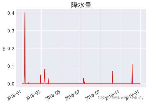
16-1
代码:
import csv
import matplotlib.pyplot as plt
from datetime import datetime

#表格题头(每列代表的含义)
filename = 'C:/Users/Administrator/Desktop/death_valley_2018_simple.csv'
with open(filename) as f:
    reader = csv.reader(f)
    header_row = next(reader) #只调用了一次next(),因此读取文件第一行


    #注意,以下部分一定要在with内部进行
    dates, prcps = [], []
    for row in reader:
        current_date = datetime.strptime(row[2], '%Y-%m-%d')
        prcp = float(row[3])
        dates.append(current_date)
        prcps.append(prcp)

#绘制降水量曲线
plt.style.use('seaborn')
fig, ax = plt.subplots()
ax.plot(dates, prcps, c = 'red')

#显示中文字符套餐
from pylab import *
mpl.rcParams['font.sans-serif']=['SimHei']

#设置图形格式
ax.set_title('降水量', fontsize = 24)
ax.set_xlabel('', fontsize = 16)
fig.autofmt_xdate() #使日期标签倾斜,不会彼此重叠
ax.set_ylabel('mm', fontsize = 16)
ax.tick_params(axis = 'both', which = 'major', labelsize = 16)

plt.show()
结果:
总结
画图看似简单,对数据类型有严格要求。需要具体实践时不断发现新的问题。


 647
647


 被折叠的 条评论
为什么被折叠?
被折叠的 条评论
为什么被折叠?
 到【灌水乐园】发言


