【数据可视化】Stackplot

Matplotlib.pyplot.stackplot() in Python

Example #1 : Using Stackplot 
The code describes the x-axis as number of days from Monday to Friday while Y-axis is represented by No of Study and playing time is represented by red and cyan color respectively. 

import matplotlib.pyplot as plt

# List of Days
days = [1, 2, 3, 4, 5]

# No of Study Hours
Studying = [7, 8, 6, 11, 7]

# No of Playing Hours
playing =  [8, 5, 7, 8, 13]

# Stackplot with X, Y, colors value
plt.stackplot(days, Studying, playing,colors =['r', 'c'])

# Days
plt.xlabel('Days')

# No of hours
plt.ylabel('No of Hours')

# Title of Graph
plt.title('Representation of Study and \
Playing wrt to Days')

# Displaying Graph
plt.show()

9a245f21ae984f1daa5ffb1a11f386de.png

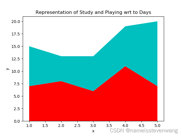
Example #2 : Using Stackplot 

Python3


import matplotlib.pyplot as plt

# List of 7-days
days = [x for x in range(0, 7)]


# List of Suspected cases
Suspected = [12, 18, 35, 50, 72, 90, 100]


# List of Cured Cases
Cured = [4, 8, 15, 22, 41, 55, 62]


# List of Number of deaths
Deaths = [1, 3, 5, 7, 9, 11, 13]


# Plot x-labels, y-label and data
plt.plot([], [], color ='blue',label ='Suspected')

plt.plot([], [], color ='orange',label ='Cured')

plt.plot([], [], color ='brown',label ='Deaths')


# Implementing stackplot on data
plt.stackplot(days, Suspected, Cured,
              Deaths, baseline ='zero',
              colors =['blue', 'orange','brown'])

plt.legend()


plt.title('No of Cases')
plt.xlabel('Day of the week')
plt.ylabel('Overall cases')

plt.show()

Output: 
Below represents the output of graph if the value of baseline is set to zero

  • 0
    点赞
  • 0
    收藏
    觉得还不错? 一键收藏
  • 2
    评论

“相关推荐”对你有帮助么?

  • 非常没帮助
  • 没帮助
  • 一般
  • 有帮助
  • 非常有帮助
提交
评论 2
添加红包

请填写红包祝福语或标题

红包个数最小为10个

红包金额最低5元

当前余额3.43前往充值 >
需支付:10.00
成就一亿技术人!
领取后你会自动成为博主和红包主的粉丝 规则
hope_wisdom
发出的红包
实付
使用余额支付
点击重新获取
扫码支付
钱包余额 0

抵扣说明:

1.余额是钱包充值的虚拟货币,按照1:1的比例进行支付金额的抵扣。
2.余额无法直接购买下载,可以购买VIP、付费专栏及课程。

余额充值