


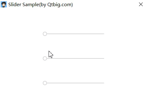
通过自定义样式美化Slider
- 起始值0处标识同心圆;
- 拖动动画变化颜色;
- 气泡显示数值.
示例源码
import QtQuick 2.0
import "../" as My

Rectangle {
    width: 320; height: 240

    Row {
        anchors.centerIn: parent
        spacing: 20

        Column {
            spacing: 50
            /* handle is rectangle */

            Repeater {

                model: ["red", "blue", "green"]

                My.Slider {
                    id: slider
                    to: 100

                    handle: Item {
                        width: 14
                        height: width

                        Rectangle {
                            width: 14
                            height: width
                            radius: width/2
                            color: slider.position === 0 ? "#d5d5d5" : modelData
                            anchors.verticalCenter: parent.verticalCenter

                            NumberAnimation on width { running: slider.pressed; from: 14; to: 20; duration: 100 }
                            NumberAnimation on width { running: !slider.pressed; from: 20; to: 14; duration: 100 }

                            Rectangle {
                                anchors.centerIn: parent
                                width: 10; height: width
                                radius: width/2
                                visible: slider.position === 0
                                color: "white"

                                NumberAnimation on width { running: slider.pressed; from: 10; to: 14; duration: 100 }
                                NumberAnimation on width { running: !slider.pressed; from: 14; to: 10; duration: 100 }
                            }

                            Image {
                                anchors.horizontalCenter: parent.horizontalCenter
                                anchors.bottom: parent.top
                                width: 0; height: width
                                smooth: true
                                source: "./" + modelData + "_64_64.svg"

                                NumberAnimation on width { running: slider.pressed; from: 0; to: 48; duration: 100 }
                                NumberAnimation on width { running: !slider.pressed; from: 48; to: 0; duration: 100 }

                                Text {
                                    visible: slider.pressed
                                    anchors.centerIn: parent
                                    color: "white"
                                    text: parseInt(slider.position * slider.to)
                                }
                            }
                        }
                    }

                    background: Rectangle {
                        width: 200
                        height: 2
                        radius: 2
                        color: "#d5d5d5"

                        /* available rectangle */
                        Rectangle {
                            width:  slider.position*parent.width
                            height: parent.height
                            radius: parent.radius
                            color: modelData
                        }
                    }
                }
            }
        }
    }
}
源码地址
https://github.com/QtComponent/Slider.git


 扫一扫
扫一扫
 418
418

 被折叠的 条评论
为什么被折叠?
被折叠的 条评论
为什么被折叠?
 到【灌水乐园】发言


