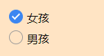
<div class="radio">
   <input id="item1" type="radio" name="sex" checked />
   <label for="item1"></label>
   <span>女孩</span>
 </div>
 <div class="radio">
   <input id="item2" type="radio" name="sex" />
   <label for="item2"></label>
   <span>男孩</span>
 </div>
.radio {
position: relative;
line-height: 30px;
}
input[type="radio"] {
width: 18px;
height: 18px;
opacity: 0;
}
.radio label {
position: absolute;
left: 5px;
top: 3px;
width: 18px;
height: 18px;
border-radius: 50%;
border: 1px solid #999;
}
input[type="radio"]:checked + label {
background-color: #3c86f1;
border: 1px solid #3c86f1;
}
input[type="radio"]:checked + label::after {
position: absolute;
content: "";
width: 4px;
height: 9px;
top: 2px;
left: 6px;
border: 2px solid #fff;
border-top: none;
border-left: none;
transform: rotate(45deg);
}
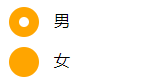
<!DOCTYPE html>
<html>
	<head>
		<meta charset="utf-8">
		<title>属性选择器</title>
		<link href="style.css" rel="stylesheet" type="text/css">
	</head>
	<body>
		<form action="#">
		  <div class="wrapper">
		    <div class="box">
		      <input type="radio" checked="checked"  id="boy" name="1" /><span></span>
		    </div>
		    <label for="boy">男</label>
		  </div>

		  <div class="wrapper">
		    <div class="box">
		      <input type="radio"  id="girl" name="1"  /><span></span>
		    </div>
		    <label for="girl">女</label>
		  </div>
		</form>
	</body>
</html>
form {
border: 1px solid #ccc;
padding: 20px;
width: 300px;
margin: 30px auto;
}
.wrapper {
margin-bottom: 10px;
}
.box {
display: inline-block;
width: 30px;
height: 30px;
margin-right: 10px;
position: relative;
background: orange;
vertical-align: middle;
border-radius: 100%;
}
.box input {
opacity: 0;
position: absolute;
top:0;
left:0;
width: 100%;
height:100%;
z-index:100;
}
.box span {
display: block;
width: 10px;
height: 10px;
border-radius: 100%;
position: absolute;
background: #fff;
top: 50%;
left:50%;
margin: -5px 0 0 -5px;
z-index:1;
}
input[type="radio"] + span {
opacity: 0;
}
input[type="radio"]:checked + span {
opacity: 1;
}
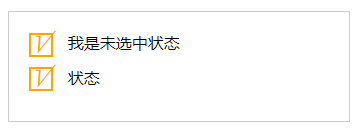
<!DOCTYPE html>
<html>
	<head>
		<meta charset="utf-8">
		<title>属性选择器</title>
		<link href="style.css" rel="stylesheet" type="text/css">
	</head>
	<body>
		<form action="#">
	      <div class="wrapper">
	        <div class="box">
	          <input type="checkbox" id="usepwd" /><span>√</span>
	        </div>
	        <label for="usepwd">我是未选中状态</label>
	      </div>
	      <div class="wrapper">
	        <div class="box">
	          <input type="checkbox" id="usepwd2" /><span>√</span>
	        </div>
	        <label for="usepwd2">状态</label>
	      </div>
	    </form>
	</body>
</html>
form {
   border: 1px solid #ccc;
   padding: 20px;
   width: 300px;
   margin: 30px auto;
 }
 .wrapper {
   margin-bottom: 10px;
 }
 .box {
   display: inline-block;
   width: 20px;
   height: 20px;
   margin-right: 10px;
   position: relative;
   border: 2px solid orange;
   vertical-align: middle;
 }
 .box input {
   opacity: 0;
   position: absolute;
   top: 0;
   left: 0;
   z-index: 100;
 }
 .box span {
   position: absolute;
   top: -10px;
   right: 3px;
   font-size: 30px;
   font-weight: bold;
   font-family: Arial;
   -webkit-transform: rotate(30deg);
   transform: rotate(30deg);
   color: orange;
 }
 input[type="checkbox"] + span {
   opacity: 0;
 }
 input[type="checkbox"]:checked + span {
   opacity: 1;
 }


 599
599


 被折叠的 条评论
为什么被折叠?
被折叠的 条评论
为什么被折叠?
 到【灌水乐园】发言


