【CSS】单选框的默认样式修改-----input type=‘radio’

使用css 修改 <input type='radio'> 单选框的默认样式

  • 直接修改默认样式

先了解使用 css appearance 属性

  • appearance属性 为none去除该标签的默认样式,保留其原有功能
  • appearance 还有其他值(设置功能不同)

input/radio#styling_radio_inputs–MDN


源码

<input type="radio" name="dot" id="" class="dot">
/* 单选框 的默认样式 */
.dot{
	margin: 0 5px;
	/* appearance属性 为none去除该标签的默认样式,保留其原有功能 */
	appearance: none;
	display: block;

	outline: none;
	background-color: rgba(0, 0, 0, 0.5);
	border: 1px solid #eee;
	border-radius: 50%;
	width: 16px;
	height: 16px;
	transition: all .2s;
}
/* 设置 单选框 被选中后的样式 */
.dot:checked{
	background-color: rgba(255, 99, 71, 0.568);
	transition: all .2s;
}

效果

在这里插入图片描述

  • 效果展示

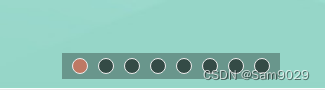
codepen-SAM9029---- 修改 单选框 的默认样式

说明

  • 若不使用 appearance:none 单选框就会被默认样式设定
    • 默认样式下 <input type='radio'> 是行内块级元素,(目前了解)只有宽高可设置
    • 默认样式下 backgroundColor border无法设置
    • 默认样式下 input[type=radio]:checked样式无法设置

  • 2
    点赞
  • 2
    收藏
    觉得还不错? 一键收藏
  • 0
    评论
几个风格好看的CSS3单选复选按钮美化样式,简单的表单单选框、复选框美化代码。 <!DOCTYPE HTML> <html> <head> <title>好看的CSS3单选复选按钮美化样式</title> <link rel="stylesheet" type="text/css" href="css/style.css?3.1.64" /> </head> <body>[removed][removed] <div id="holder"> <div> <div class="tag">Checkbox Small</div> <input type="checkbox" id="checkbox-1-1" class="regular-checkbox" /><label for="checkbox-1-1"></label> <input type="checkbox" id="checkbox-1-2" class="regular-checkbox" /><label for="checkbox-1-2"></label> <input type="checkbox" id="checkbox-1-3" class="regular-checkbox" /><label for="checkbox-1-3"></label> <input type="checkbox" id="checkbox-1-4" class="regular-checkbox" /><label for="checkbox-1-4"></label> </div> <div> <div class="tag">Checkbox Big</div> <input type="checkbox" id="checkbox-2-1" class="regular-checkbox big-checkbox" /><label for="checkbox-2-1"></label> <input type="checkbox" id="checkbox-2-2" class="regular-checkbox big-checkbox" /><label for="checkbox-2-2"></label> <input type="checkbox" id="checkbox-2-3" class="regular-checkbox big-checkbox" /><label for="checkbox-2-3"></label> <input type="checkbox" id="checkbox-2-4" class="regular-checkbox big-checkbox" /><label for="checkbox-2-4"></label> </div> <div> <div class="tag">Radio Small</div> <div class="button-holder"> <input type="radio" id="radio-1-1" name="radio-1-set" class="regular-radio" checked /><label for="radio-1-1"></label><br /> <input type="radio" id="radio-1-2" name="radio-1-set" class="regular-radio" /><label for="radio-1-2"></label><br /> <input type="radio" id="radio-1-3" name="radio-1-set" class="regular-radio" /><label for="radio-1-3"></label><br /> <input type="radio" id="radio-1-4" name="radio-1-set" class="regular-radio" /><label for="radio-1-4"></label><br /> </div> </div> <div> <div class="tag">Radio Big</div> <div class="button-holder"> <input type="radio" id="radio-2-1" name="radio-2-set" class="regular-radio big-radio" /><label for="radio-2-1"></label><br /> <input type="radio" id="radio-2-2" name="radio-2-set" class="regular-radio big-radio" /><label for="radio-2-2"></label><br /> <input type="radio" id="radio-2-3" name="radio-2-set" class="regular-radio big-radio" checked /><label for="radio-2-3"></label><br /> <input type="radio" id="radio-2-4" name="radio-2-set" class="regular-radio big-radio" /><label for="radio-2-4"></label><br /> <input type="radio" id="radio-2-5" name="radio-2-set" class="regular-radio big-radio" /><label for="radio-2-5"></label><br /> </div> </div> </div> <div 0; font:normal 14px/24px 'MicroSoft YaHei';">  </div> </body> </html>
CSS3样式复选框和单选按钮看起来更漂亮。只有一个input元素。在线demo源码:https://github.com/dcsite/magic-input使用$ npm install magic-input你需要引入 dist/magic-input.css或者dist/magic-input.min.css 文件到你的工程或者HTML。如果你使用Stylus 你就可以使用 magic-input.styl 文件<link rel="stylesheet" type="text/css" href="dist/magic-input.min.css">Checkbox iPhone 的样式<input type="checkbox" class="mgc-switch mgc-sm" checked /> <input type="checkbox" class="mgc-switch" /> <input type="checkbox" class="mgc-switch mgc-lg" checked />Checkbox<input type="checkbox" class="mgc" checked/> Default <input type="checkbox" class="mgc mgc-primary" checked /> Primary <input type="checkbox" class="mgc mgc-success" /> Success <input type="checkbox" class="mgc mgc-info" checked /> Info <input type="checkbox" class="mgc mgc-warning" checked /> Warning <input type="checkbox" class="mgc mgc-danger" checked /> DangerRadios<input type="radio" name="radio3" class="mgr mgr-sm"/> Default <input type="radio" name="radio3" class="mgr mgr-primary" /> Primary <input type="radio" name="radio3" class="mgr mgr-success mgr-lg" checked/> Success <input type="radio" name="radio3" class="mgr mgr-info mgr-sm" /> Info <input type="radio" name="radio3" class="mgr mgr-warning" /> Warning <input type="radio" name="radio3" class="mgr mgr-danger mgr-lg" /> Danger设置input大小的classsm 是 small的缩写 , lg 是 large缩写在 Checkbox设置下面class    mgc-sm mgc-lg在 Radio Button设置下面    mgr-sm mgr-lg改变颜色的 Class在 Checkbox设置下面class    mgc-primary mgc-info mgc-success mgc-warning mgc-danger在 Radio Button设置下面mgr-primary mgr-info mgr-success mgr-warning mgr-danger 标签:Magic  CSS框架
修改el-radio单选框样式,可以使用HTML和CSS代码来实现。首先,你可以使用HTML代码来创建el-radio单选框组件,如下所示: ```html <el-radio-group v-model="newlyAdded.discount"> <el-radio label="0">工品</el-radio> <el-radio label="1">供应商</el-radio> </el-radio-group> ``` 然后,你可以使用CSS代码来修改el-radio单选框样式。例如,你可以添加以下CSS代码来改变单选框选择按钮的背景样式和图案样式: ```css .el-radio__input.is-checked .el-radio__inner { border-color: #409EFF; background: #FFF; } .el-radio__inner::after { width: 7px; height: 7px; background-color: #409EFF; } .el-radio__input.is-checked .el-radio__inner::after { border-radius: 0px; } ``` 如果你想将el-radio单选框的小圆圈改为方框,你可以添加以下CSS代码: ```css /deep/ .el-radio__inner { border-radius: 2px !important; } /deep/ .el-radio__input.is-checked .el-radio__inner::after { content: ''; width: 8px; height: 3px; border: 1px solid white; border-top: transparent; border-right: transparent; text-align: center; display: block; position: absolute; top: 3px; left: 2px; transform: rotate(-45deg); border-radius: 0px; background: none; } ``` 通过使用以上CSS代码,你可以修改el-radio单选框样式,包括背景、图案以及小圆圈的形状。<span class="em">1</span><span class="em">2</span><span class="em">3</span> #### 引用[.reference_title] - *1* *2* [CSS修改单选框样式(element)](https://blog.csdn.net/weixin_48998573/article/details/124507719)[target="_blank" data-report-click={"spm":"1018.2226.3001.9630","extra":{"utm_source":"vip_chatgpt_common_search_pc_result","utm_medium":"distribute.pc_search_result.none-task-cask-2~all~insert_cask~default-1-null.142^v93^chatsearchT3_2"}}] [.reference_item style="max-width: 50%"] - *3* [el-radio单选框样式修改为多选框样式](https://blog.csdn.net/qq_45479398/article/details/129120162)[target="_blank" data-report-click={"spm":"1018.2226.3001.9630","extra":{"utm_source":"vip_chatgpt_common_search_pc_result","utm_medium":"distribute.pc_search_result.none-task-cask-2~all~insert_cask~default-1-null.142^v93^chatsearchT3_2"}}] [.reference_item style="max-width: 50%"] [ .reference_list ]

“相关推荐”对你有帮助么?

  • 非常没帮助
  • 没帮助
  • 一般
  • 有帮助
  • 非常有帮助
提交
评论
添加红包

请填写红包祝福语或标题

红包个数最小为10个

红包金额最低5元

当前余额3.43前往充值 >
需支付:10.00
成就一亿技术人!
领取后你会自动成为博主和红包主的粉丝 规则
hope_wisdom
发出的红包
实付
使用余额支付
点击重新获取
扫码支付
钱包余额 0

抵扣说明:

1.余额是钱包充值的虚拟货币,按照1:1的比例进行支付金额的抵扣。
2.余额无法直接购买下载,可以购买VIP、付费专栏及课程。

余额充值