


在上一篇文章 android中shape的使用介绍-1 中,主要介绍shape的常用属性,那么,这篇文章就给出环形具体的代码示例:
1 环形
(1)环形效果1
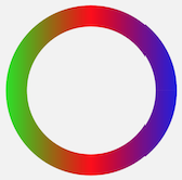
<?xml version="1.0" encoding="utf-8"?>
<shape xmlns:android="http://schemas.android.com/apk/res/android"
       android:shape="ring"
       android:useLevel="false">
    <gradient
        android:centerColor="#ff0000"
        android:endColor="#0000ff"
        android:startColor="#00ff00"/>
</shape>- 注意:
- 这里既没有定义innerRadius , 也没有定义thickness , 也就是说,系统默认使用了innerRadiusRatio 取值3,也使用了thicknessRatio 取值 9
- 在shape根节点中设置了useLevel=false , 圆环才能显示出来
- gradient没有指定type,默认type为linear (线性渐变);没有指定rangle,默认取值0,渐变方向是从左往右
(2) 环形效果2

<?xml version="1.0" encoding="utf-8"?>
<shape xmlns:android="http://schemas.android.com/apk/res/android"
       android:innerRadiusRatio="4"
       android:shape="ring"
       android:thicknessRatio="13"
       android:useLevel="false">
    <gradient
        android:endColor="#0000ff"
        android:startColor="#fff"
        android:type="sweep"/>
</shape>- 注意:
- 实现上面这个效果,只是给gradient增加了一个type属性,并取值sweep,表示成扫描型渐变
- shape节点中,android:innerRadiusRatio =”4” 表示环的内半径为屏幕宽度的1/4 ; android:thicknessRatio=”13”,表示圆环的厚度为当前屏幕宽度的1/13
- 这种扫描渐变效果的shape一般在自定义ProgressBar的时候用的比较多
(3)环形效果3
<?xml version="1.0" encoding="utf-8"?>
<shape xmlns:android="http://schemas.android.com/apk/res/android"
       android:innerRadiusRatio="4"
       android:shape="ring"
       android:thicknessRatio="13"
       android:useLevel="false">

    <stroke android:width="2dp" android:color="#0000ff"/>
</shape>- 给圆环设置了stroke边线
(4)环形效果4
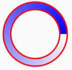
<?xml version="1.0" encoding="utf-8"?>
<shape xmlns:android="http://schemas.android.com/apk/res/android"

       android:innerRadiusRatio="4"
       android:shape="ring"
       android:thicknessRatio="13"
       android:useLevel="false">

    <gradient
        android:endColor="#0000ff"
        android:startColor="#fff"
        android:type="sweep"/>
    <stroke android:width="2dp" android:color="#ff0000"/>
</shape>- 同时设置了环形的gradient渐变色和stroke边线
2 环形效果拓展 –修改progressBar的旋转图片为自定义的环形shape
自定义一个shape圆环,然后替代progressBar默认的旋转图片
图还是这张图,只是我不会截gif图,大家脑补一下这是一个会转动的图就好了
1)自定义圆环shape
<?xml version="1.0" encoding="utf-8"?>
<rotate xmlns:android="http://schemas.android.com/apk/res/android"
        android:fromDegrees="0"
        android:pivotX="50%"
        android:pivotY="50%"
        android:toDegrees="720">
    <shape
        android:innerRadiusRatio="4"
        android:shape="ring"
        android:thicknessRatio="13"
        android:useLevel="false">

        <gradient
            android:endColor="#0000ff"
            android:startColor="#fff"
            android:type="sweep"/>
    </shape>
</rotate>- 注意:
- 为了让圆环能够旋转起来,需要用 rotate 将shape包裹起来,不包裹,就不换旋转
- rotate节点中的四个属性及其含义如下
- fromDregress 起始的旋转角度,一般是0
- toDregress 终止的旋转角度,一般是360的倍数
- piovtX 旋转中心点相对于当前圆环所在矩形的右下角的X轴坐标,取值 XX%(安卓中,任意一个图片的外层都是一个矩形区域)
- piovtY 旋转中心点相对于当前圆环所在矩形的右下角的Y轴坐标 , 取值 XX%
- 一般piovtX和piovtY取值都是50%,表示已当前圆环的圆心为旋转中心点
2)修改progressBar的旋转图片为自定义的圆环shape
  <ProgressBar
        android:layout_width="80dp"
        android:indeterminateDrawable="@drawable/shape_test"
        android:layout_height="80dp"/>
通过ProgressBar中的
android:indeterminateDrawable="@drawable/shape_test"实现旋转图片的替换这样部署代码之后,progressBar的旋转图片就被替换成了我们自定义的圆环


 扫一扫
扫一扫
 268
268

 被折叠的 条评论
为什么被折叠?
被折叠的 条评论
为什么被折叠?
 到【灌水乐园】发言


